Tag: 1900s
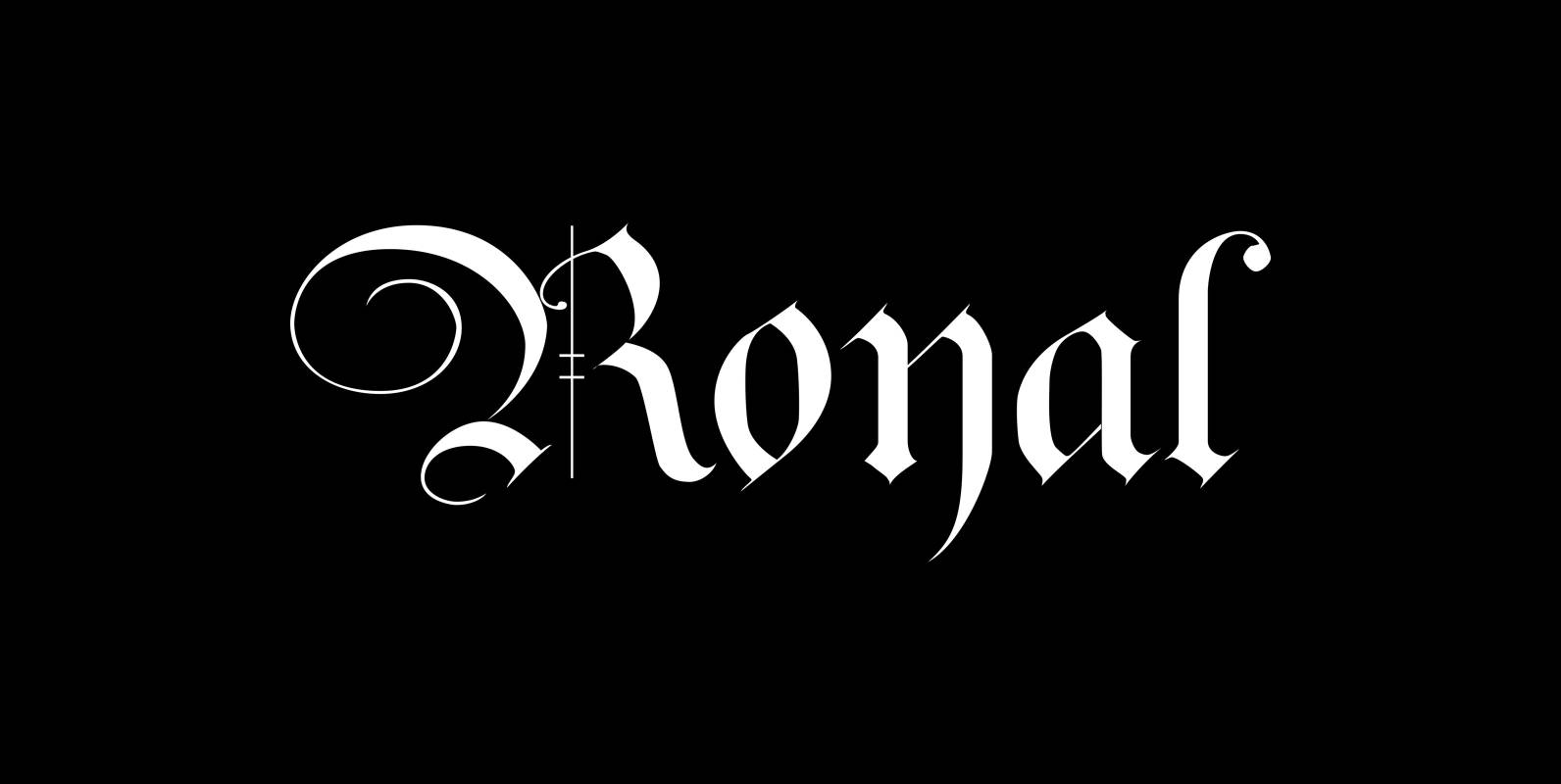
Royal Font
The “Royal Fonts” value pack contains the famous blackletter “Royal Bavarian”, “Ayres Royal”, “Royal Blossom” and “Monkey Initials”. Plus “Romain Royal” in two cuts, this used to be the text face once designed exclusively for the king of France, the
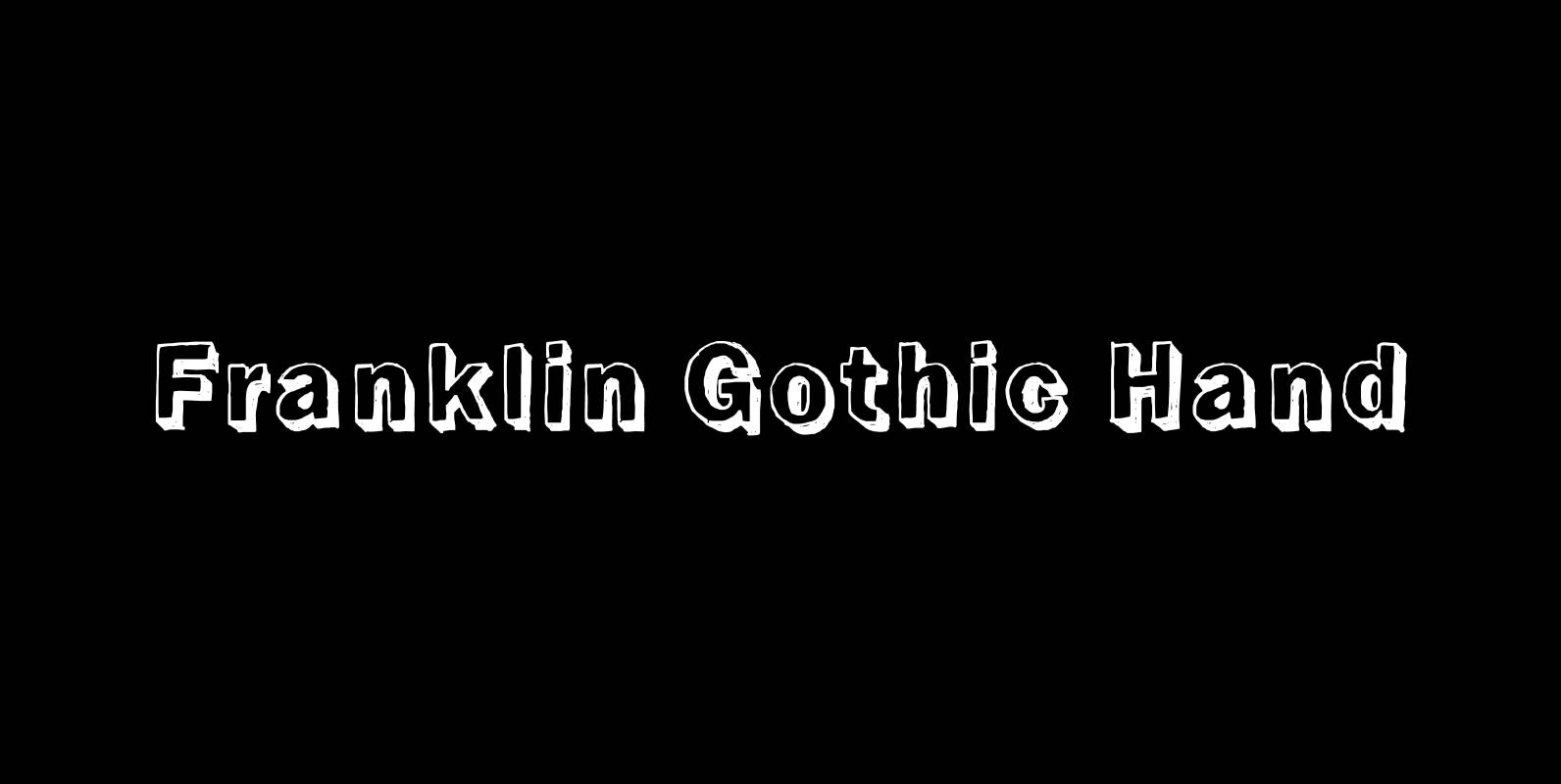
Franklin Gothic Hand Font
Franklin Gothic Hand Demi Shadow is another one in my series of hand-drawn fonts from way back in time – before computers changed the way we worked in advertising. This one was especially used for what we called “pork-belly-ads”: ads
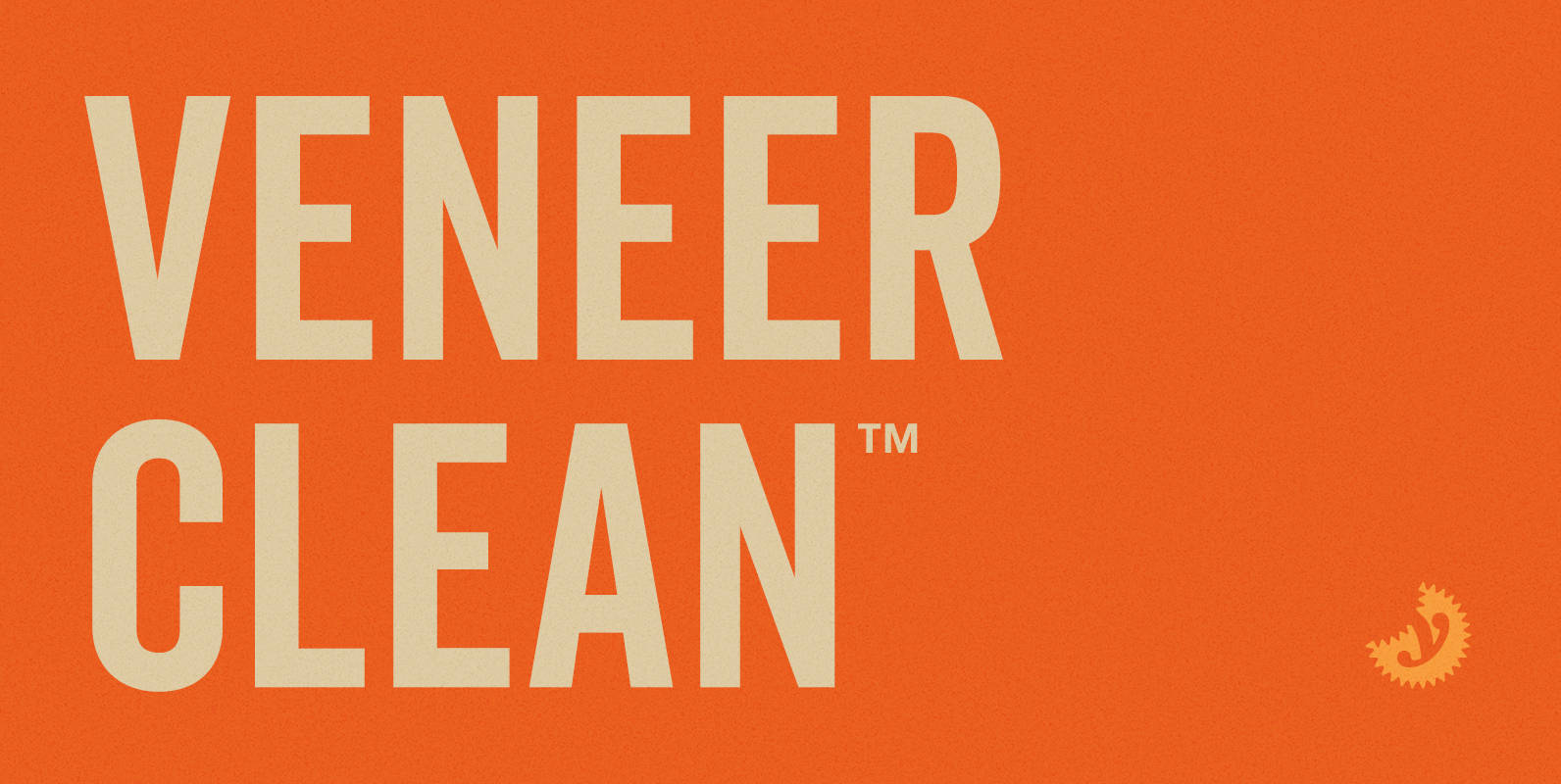
Veneer Clean Font
Veneer Clean from Yellow Design Studio is the non-distressed version of the Veneer letterpress type family. The 8-font family includes Regular, Soft and Round versions with italics plus a free set of funky icons. Published by Yellow Design StudioDownload Veneer
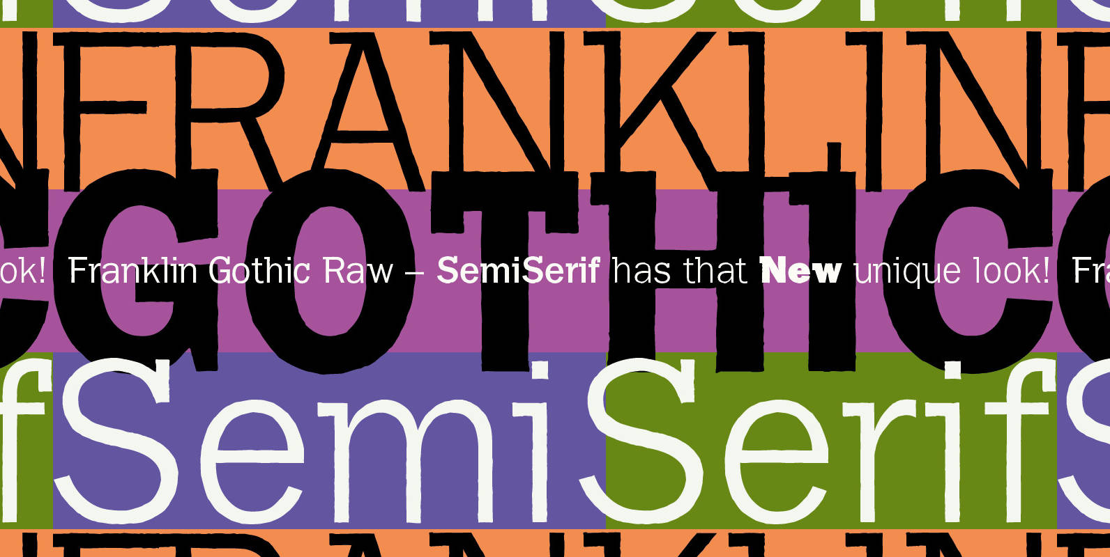
Franklin Gothic Raw Semi Serif Font
When drawing a new font, there is a time when the final form is found – almost – but the curves are not slick and clean yet, that’s what I call the “raw” form. Raw – no sweeteners added! In
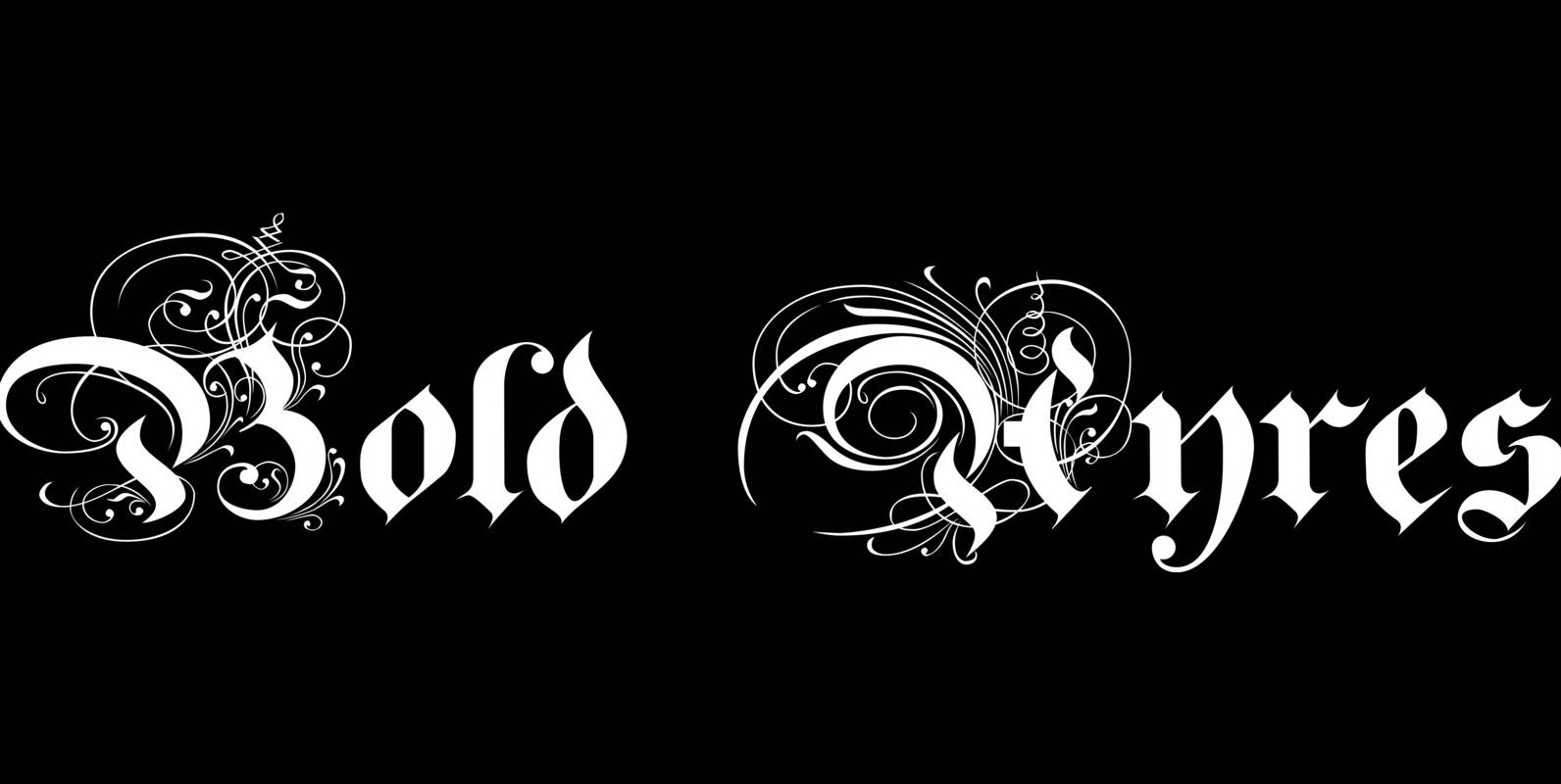
Bold Ayres Font
BoldAyres is the heavy version of my Ayres Royal that was inspired by famous calligrapher Ayres and a little bit by a Bavarian King. Published by Wiescher DesignDownload Bold Ayres

Supra Extended Font
Supra Extended – designed by Gert Wiescher in 2013 – is the extended version to this new sans typeface family of eight weights. The extended version is designed for sheer elegance and has no italics because they didn’t look nice
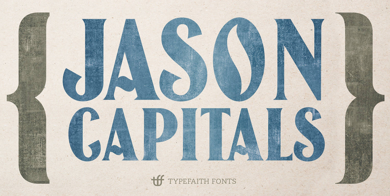
Jason Caps Font
Jason Caps is an old woodblock font design from the early 20th century and redesigned by TypeFaith Fonts. Jason Caps is an all-caps font with some lovely ornaments. Use the glyph pallet to select the ornaments. With the PhotoShop add-on
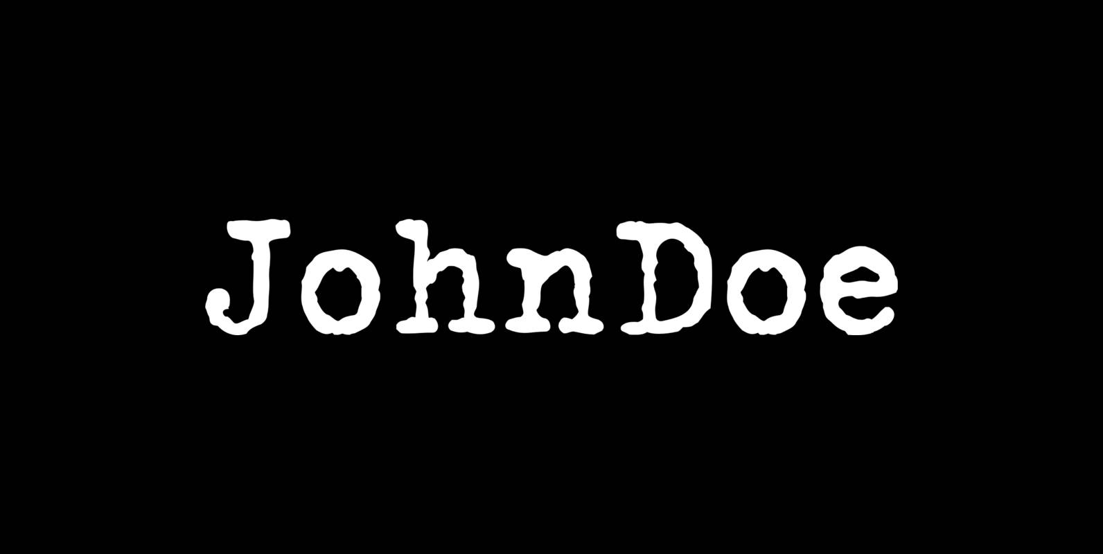
John Doe Font
John Doe is a font design published by Fonthead. Published by Fonthead Design Inc.Download John Doe

True North Textures Font
True North is back but now in a distressed version and new styles! True North Textures is a vintage typeface with 18 fonts and a monoline script. True North Textures comes with distressed labels, extras and free banners. Extras include
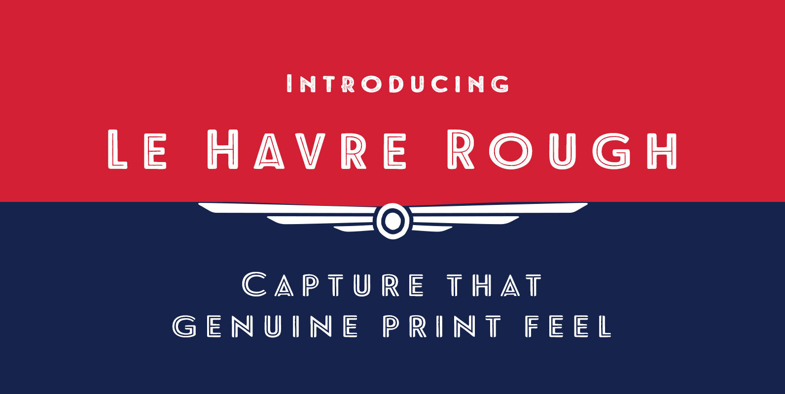
Le Havre Rough Font
Rough’s eroded, printed look is extremely customizable, offering eleven distressed choices that appear fantastic even at large output sizes. Go ahead. Try it on, say, a billboard. Maybe even Times Square. The font includes hand-printed texture and distinctive shadow choices,
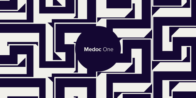
Polytype Medoc I Frames Font
Designed by Karl Nayeri, Polytype-Medoc I Frames is a font released for the Prime Graphics Type Collection. Copyright Prime Graphics. Published by Prime GraphicsDownload Polytype Medoc I Frames
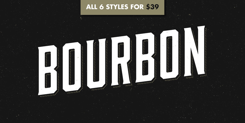
Bourbon Font
Like a brother to Gin, Bourbon is a condensed display typeface inspired by the likes of whiskey bottles and vintage serifs. It enjoys long walks with subtle, distressed textures or a nice, good-ole script. Bourbon Rough works great in larger
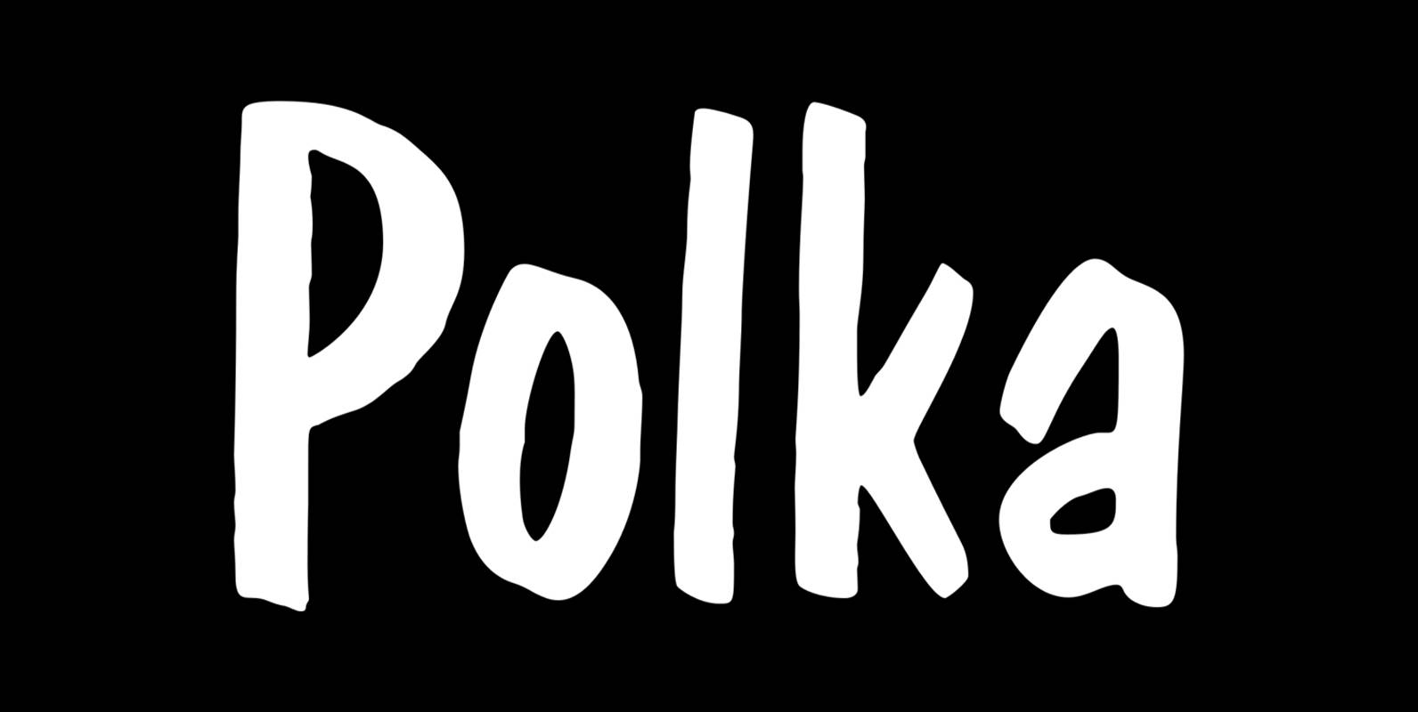
Polka Font
Polka is a font design released for the Mecanorma Type Collection. Copyright 2004 Trip Productions BV. Published by MecanormaDownload Polka
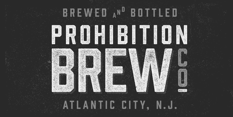
Prohibition Font
The ban on serifs is at hand! Bourbon and Gin thought they could get away with their spirited serifs, but Prohibition has arrived and cut them off. Packed with some new surprises, this vintage sans typeface takes queues from classic
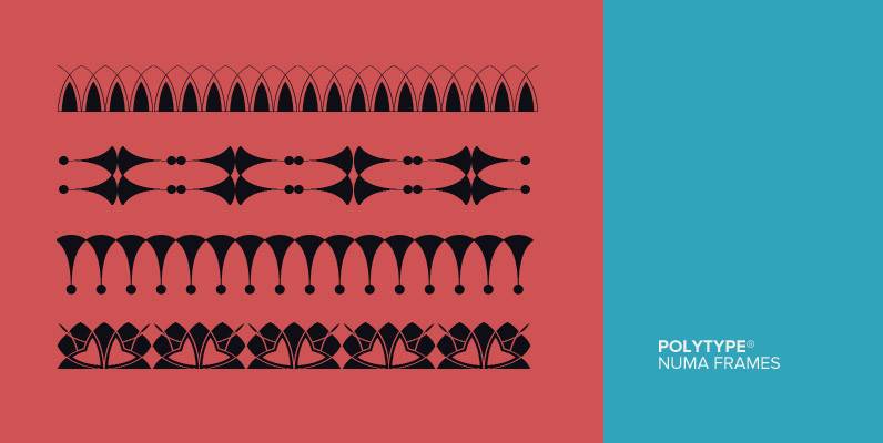
Polytype Numa Frames Font
Designed by Karl Nayeri, Polytype-Numa Frames is a font released for the Prime Graphics Type Collection. Copyright Prime Graphics. Published by Prime GraphicsDownload Polytype Numa Frames
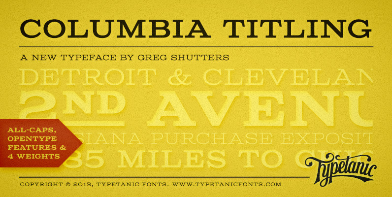
Columbia Titling Font
Columbia Titling is an titling-caps display family based on wide Clarendon-style wood type and industrial signage design from the late-19th and early-20th Century. Columbia Titling includes a small set of OpenType features, including both tabular and proportional figures, special superscript

Rilke Font
An adaptation of the lettering of Gustav Klimt on his poster for the 1st Vienna Secession exhibition in 1898. It is named for the poet Rainer Maria Rilke, a contemporary of Klimt’s. Its subtle curving strokes and the idiosyncratic set
Copacabana Font
Copacabana is heavily based on one of my favourite typefaces Goudy Old Style Italic. It is sharper and more clearly defined than Goudy yet still retains it old style characteristics. The face is slightly angled so is basically upright whilst