Tag: weddings
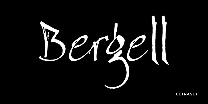
Bergell Font
The work of Alberto Giacometti inspired this spontaneous, calligraphic style created by German graphic designer Thomas Finke. Although somewhat abstract, this typeface is highly legible and benefits from generous letter spacing. Will enhance any work where an elegant, artistic appearance

Bertie Font
British designer Alan Meeks incorporated an unusual internal pattern into this Bodoni style letterform. The result is a reserved, 1930’s appearance. Bertie is an excellent choice for a variety of subjects where word settings in larger display sizes are required.

Academy Engraved Font
Letraset’s talented type designer, Vince Whitlock, was inspired by the elegant Caslon series when he created Academy Engraved. The exquisite letterforms of this traditional Roman typestyle make it ideal wherever a refined, classical appearance is desired. Published by LetrasetDownload Academy
Bible Script Font
A textured edge enhances this traditional, calligraphic font featuring many swash alternative letters and additional flourishes. Word settings look as though they have been rendered by hand. Perfect for use on certificates, diplomas, citations, greeting cards as well as many
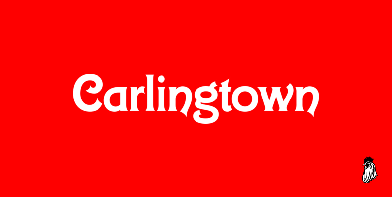
Carlingtown Font
This old victorian typeface was originally called Constantia. Since that name was already in use, we decided on a the new name of Carlingtown. Digitally engineered by Steve Jackaman and Ashley Muir. Published by Red RoosterDownload Carlingtown

Burlington Font
This stately modern Roman face was designed by eminent English lettering artist Alan Meeks. It evokes a 1940’s style with its strong upright characters emphasized by the half-solid, half-open feature throughout. This regal typeface benefits from wide letter spacing. Published

Challenge Font
English brush lettering specialist Martin Wait created Challenge Bold with all the fresh spontaneity of hand rendered lettering. For maximum effect, the capitals should be set closely and the lowercase letters should be overlapped to achieve an authentic appearance. Perfect

Tannhauser Font
This sans serif typeface features standard capital letters complemented by an unconventional lowercase. Tannhauser looks best when closely letter spaced; especially the lowercase, where extensions on the bottom right side of many characters are designed to overlap or join the

Freestyle Script Font
An outstanding informal display typeface that beautifully captures the spontaneous qualities of hand-rendered brush lettering. Freestyle Script features an extensive lower case font including ligatures so that every conceivable letter combination can be linked, ensuring a fluid, brush-rendered effect. The

Avenida Font
Architect and designer John Chippindale was inspired by the lettering styles found on buildings constructed in Spain’s Andalucian region in the 1930s and 1940s when he created Avenida. The Art Deco, condensed geometric capitals are supplemented by a smaller, slightly

Becka Script Font
A wide casual typeface based on a refined brush stroke style makes this font suitable for a wide variety of large display work. For maximum visual impact, Becka Script should be closely letter and word spaced. Created by talented British

Aquitaine Initials Font
These beautifully designed initials were created by talented American designer Steven Albert. Aquitaine looks best when the more straightforward characters are used to set words and the decorative alternatives are used to provide exciting initialling complements. A unique style with

Carlton Font
Designed during the early 1900s for the Stephenson Blake Typefoundry, Carlton has recently become a popular roman alphabet again. It is used extensively in display sizes when a discreet, elegant appearance is needed. Carlton’s qualities are maximised by generous letter

Citation Font
Eminent British lettering artist Trevor Loane created this distinguished, all capital, Roman typeface. The elegant, stately letters evoke the effect of type incised in stone or slate. Excellent for work where an expensive, upscale appearance is desired. Published by LetrasetDownload

Coptek Font
Coptek derives its name from the high-tech, computer-generated look based on the traditional lines of a copperplate script. Once again David Quay has succeeded in making a difficult design objective work to good effect. The capitals are initials which provide
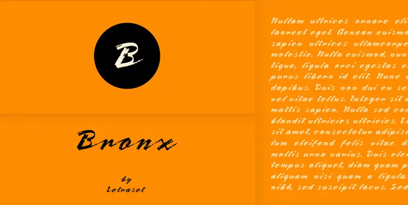
Bronx Font
A contemporary, highly stylized script style that captures the effect of a quickly rendered brush letter. The capitals are intended only for initialling purposes, but may be joined with the lower case letters, which can also be linked together. Bronx

Rapier Font
A dashing, contemporary script typeface with glossy appeal that’s bound to make its mark on the pop scene. For maximum effect, the lower case letters should be joined together. The calligraphic looking capitals make excellent initial compliments. Produced by distinguished

Willow Font
This fanciful, imaginative typeface is of the Viennese Secessionist style. The work of Scottish architect Charles Rennie Mackintosh inspired this condensed sans serif style with its rough edges and selection of alternative and ligatured letters. Due to renewed interest in