Tag: versal eszett
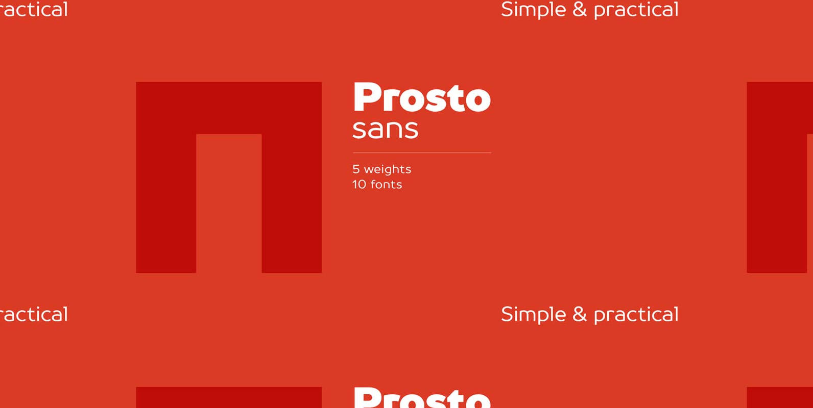
TT Prosto Sans Font
Prosto Sans – this font family for any occasion. You can use these fonts almost everywhere. The modern open grotesque forms and classic font family formula: Thin, Light, Regular, Bold, Black and Italics. Prosto Sans is the assistant to work
TT Souses Font
Souses — original fontfamily, which are made by hand. Universal typefaces formula of 10 fonts: Thin, Light, Regular, Bold, Black and Italics. Souses ideal for use in themes: ecology, village, natural, handmade & toys. Handmade style of the fonts —
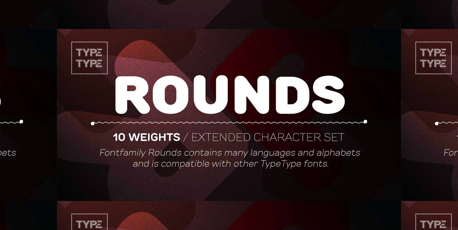
TT Rounds Font
Rounds — fontfamily with a very kind and gentle temperament. Most popular typefaces formula: Thin, Light, Regular, Bold, Black and Italics. Stylistic features of Rounds fonts — rounded elements. All fonts are made so that they can be used as
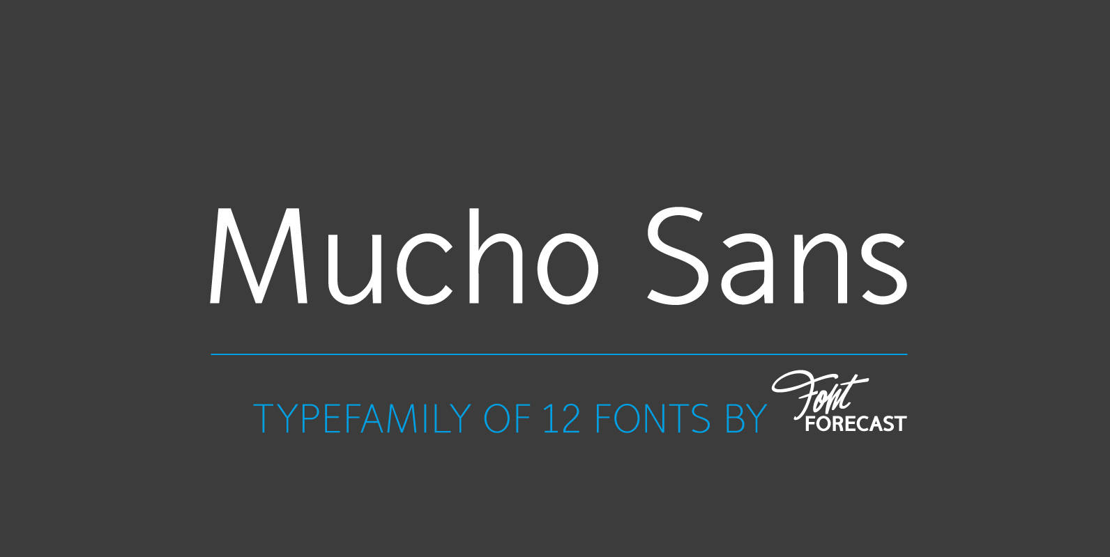
Mucho Sans Font
Mucho Sans is a geometric sans serif type family that comes in six weights with matching Italics. The design is very clean, yet friendly and modern. Some of its characteristics are the generous x-height, the Ascender-height that matches the Cap-height,
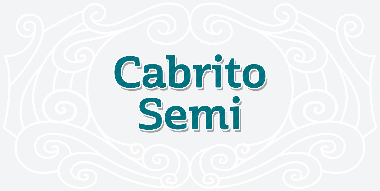
Cabrito Semi Font
Relax. Deep breath. And step away to font nirvana with Cabrito Semi. Like its Cabrito relatives, Semi’s handwriting-inspired feel is mellow and care-free. But don’t misunderstand us. Even with its fun-loving peculiarities, this free spirit will command whatever party you
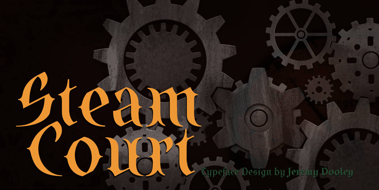
SteamCourt Font
A bit of background if you will: In early 2014, some friends from my college days banded together to form their own game company. Their first launch? A current Kickstarter they named SteamCourt. I love Kickstarter. It’s a fantastic platform,
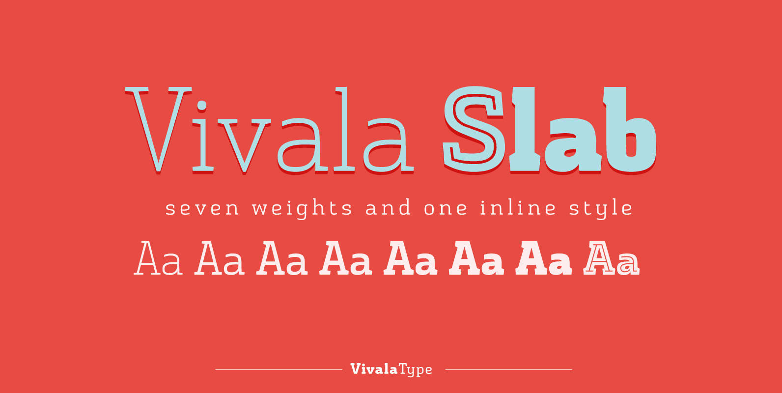
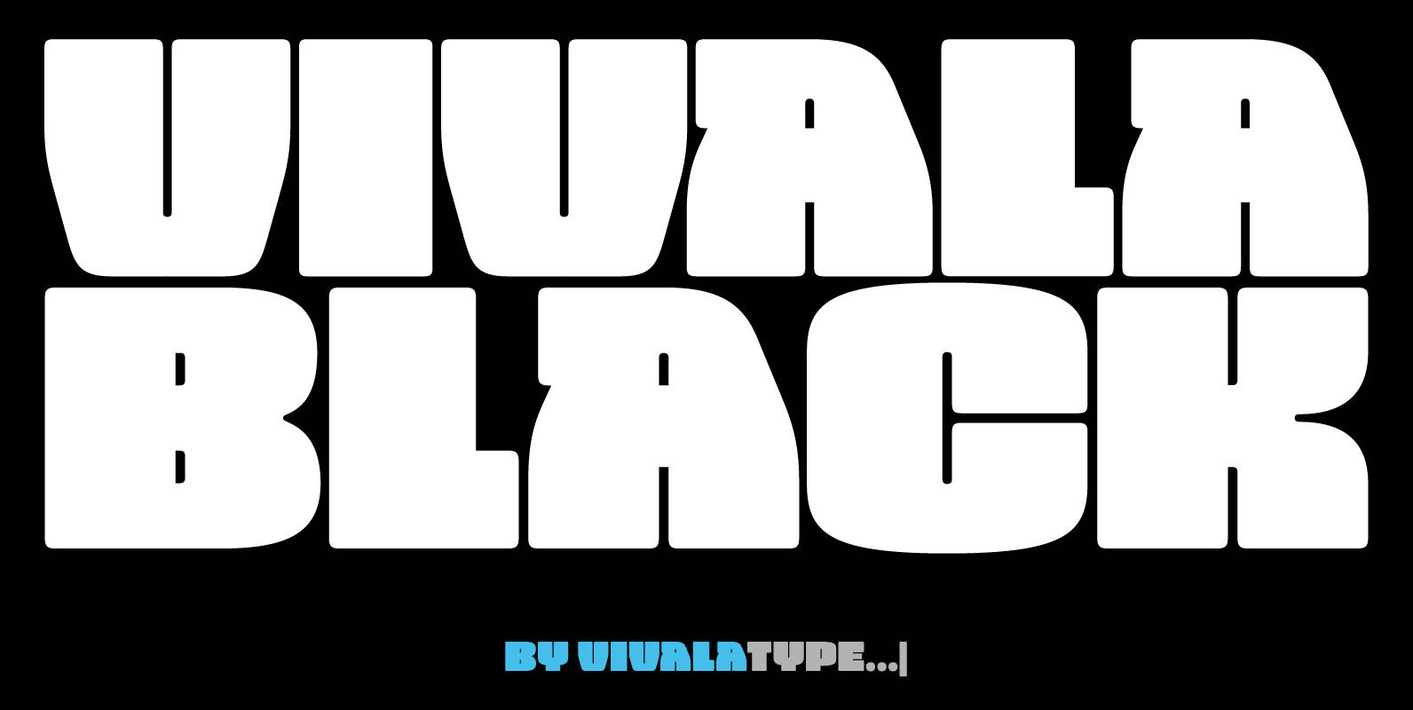
Vivala Slab Font
The family includes seven weights being seven uprights and an inline style. Vivala Slab is ideal for use in headline sizes, but it also works properly within text blocks and information design. Opentype features are ligatures, ordinal, fractions, numerator, denominator,
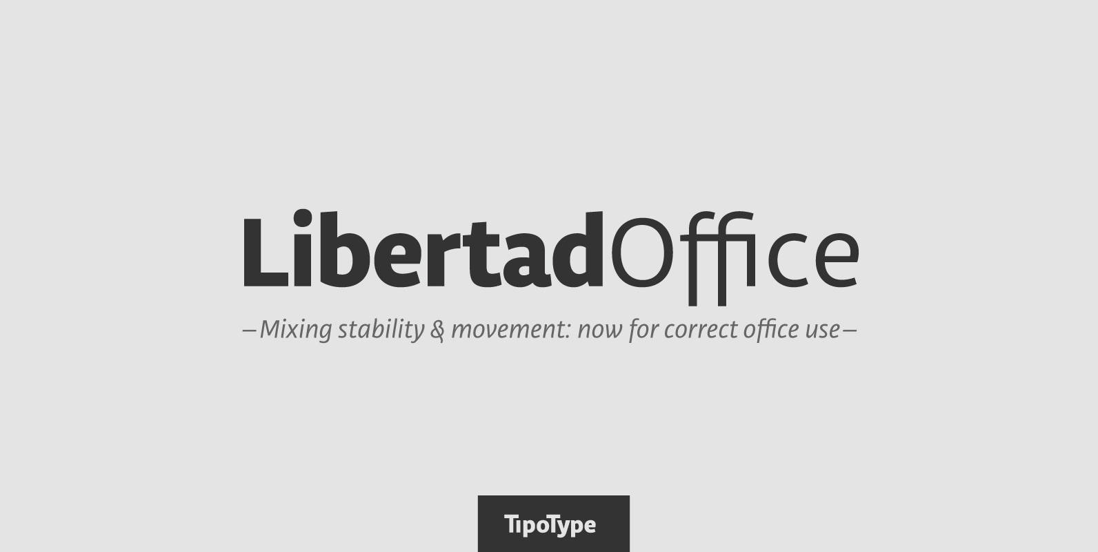
Libertad Office Font
Libertad is a sans-serif typeface that mixes humanist and grotesk models – It’s most interesting feature is the combination of balanced regulars with dynamic italics, which makes it a very versatile font for different uses. This special package is a
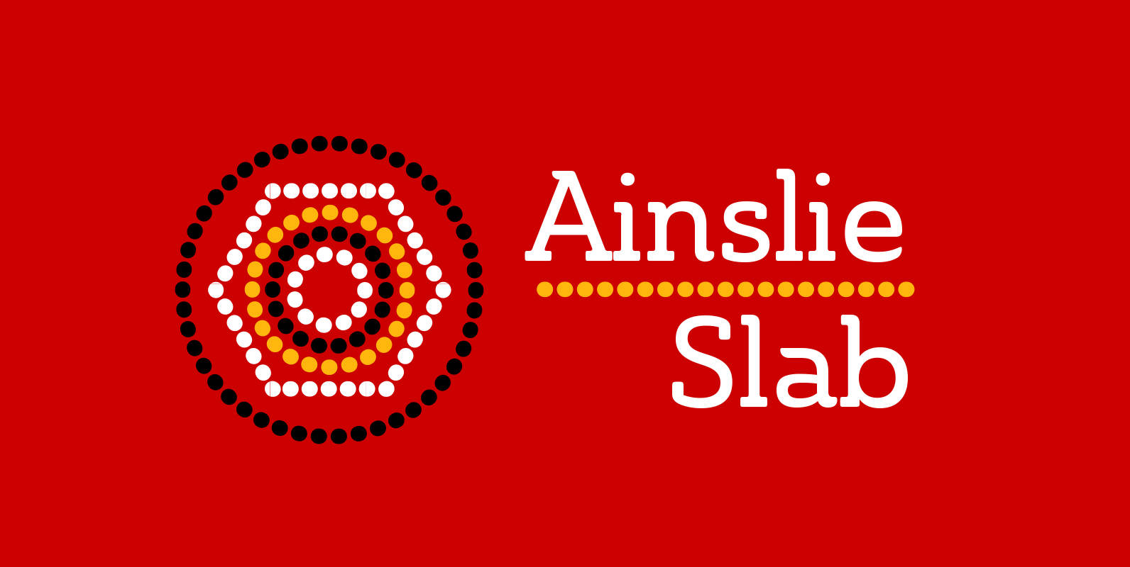
Ainslie Slab Font
Based on the inspiration from Mt. Ainslie and the Ainslie suburb outside Canberra, the original Ainslie adds [these characteristics] to the project. And now the muses of Ainslie are back at work, lending their structure as the foundation of Ainslie
Vivala Black Font
The idea was to create a unicase typeface with a high black ratio that supports a compact typographic style. The four widths of Vivala Black share similar metrics, so they can be easily interchanged in a body of the text.
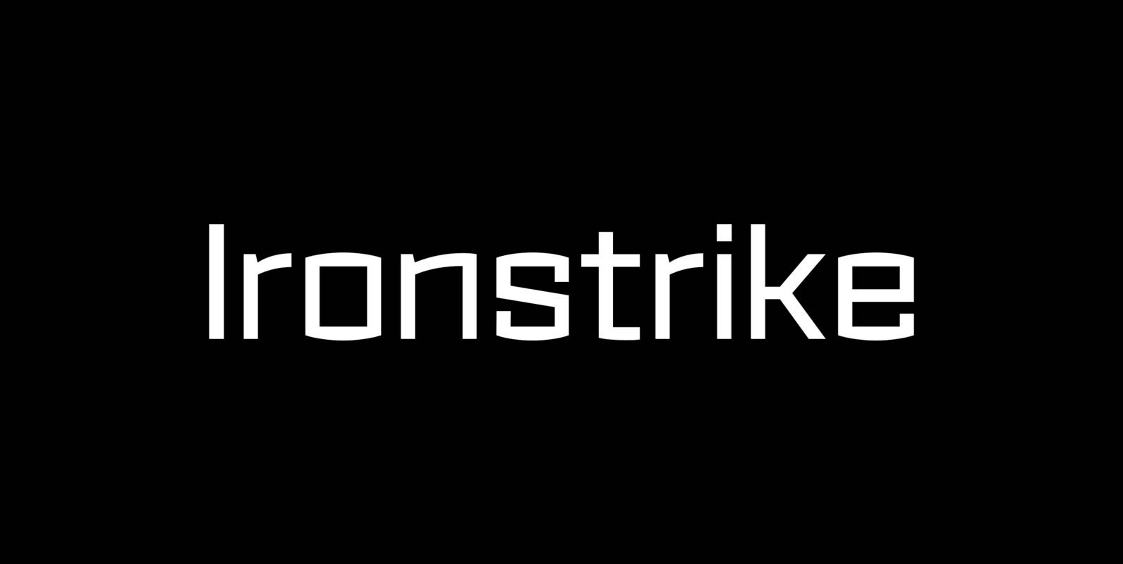
Ironstrike Font
Ironstrike pays homage to industrial and constructivist lettering. Rigid shapes and tall lowercase letters evoke strength and technology. Seven weights with matching italic fonts step up to your tough design challenges. Fine light weights emphasize white space and powerful heavy
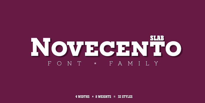
Novecento Slab Font
Novecento Slab is the “slab serif” companion of Novecento Sans, a font family inspired on european typographic tendencies between the second half of 19th century and first half of the 20th. This font face is designed to be used mostly
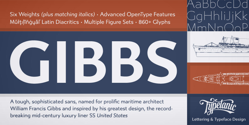
Gibbs Font
Gibbs is a tough, sophisticated sans, named for prolific maritime architect William Francis Gibbs and inspired by his greatest design, the record-breaking mid-century luxury liner SS United States. Taking various cues from the unique cast aluminum signs found on board,
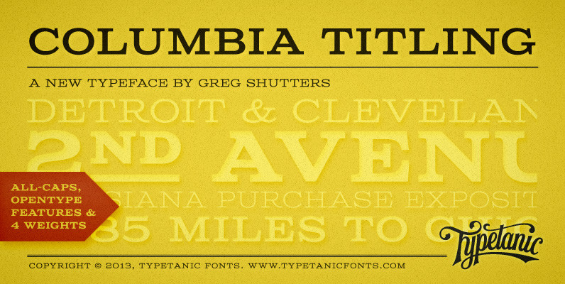
Columbia Titling Font
Columbia Titling is an titling-caps display family based on wide Clarendon-style wood type and industrial signage design from the late-19th and early-20th Century. Columbia Titling includes a small set of OpenType features, including both tabular and proportional figures, special superscript
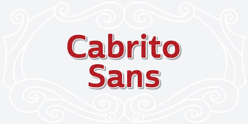
Cabrito Sans Font
A quick recap: the original Cabrito is an insigne Design slab serif produced for the kid’s book The Clothes Letters Wear. It’s been pretty well-received–even more than I expected. I promised to grow the family with a free-standing inverted style
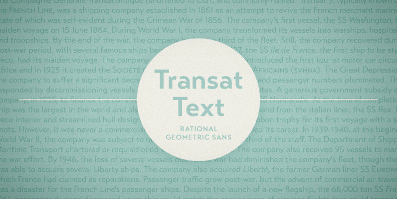
Transat Text Font
Transat Text is a geometric sans serif typeface, and is the more rational sibling to the unabashedly Art Deco “Transat”. Transat Text has a slightly taller x-height than its counterpart, making it easier to read at small sizes, but also
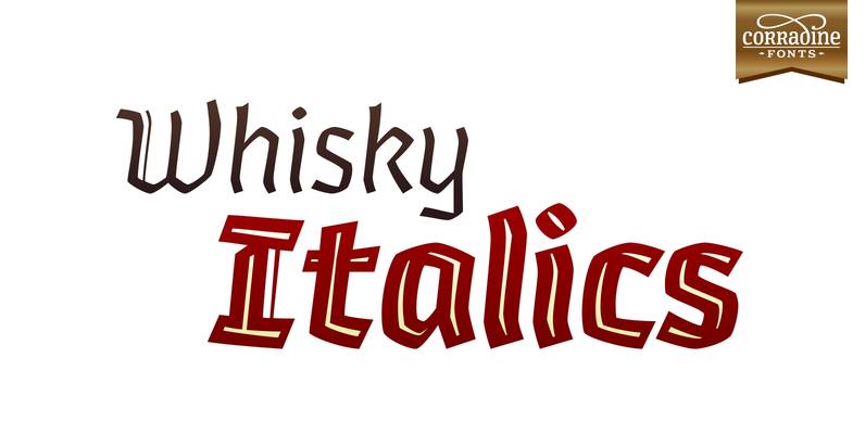
Whisky Italics Font
Whisky is a blackletter font family with a casual touch that makes it look friendly and current. The stroke varies its thickness and angle endings making it form very dynamic bodies of text. Whisky Italics are the corresponding versions to
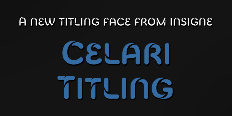
Celari Titling Font
The speed and agility of Celari is built for nothing less than a headline. Use the larger-than-life power of this face for any number of oversized applications–mastheads, posters, web headlines, flyers. It provides excellent performance for service-oriented ads where efficiency