Tag: typewriter

Special Elite Pro Font
Our Special Elite Pro brings the unique individuality of the Special Elite Type No. NR6 vintage typewriter keyset to the digital age. Antique typewriters would type with a warmth and appeal to them, primarily because of their unpredictable “grunge” results

Click Clack Font
Click Clack is a font design published by Fonthead. Published by Fonthead Design Inc.Download Click Clack
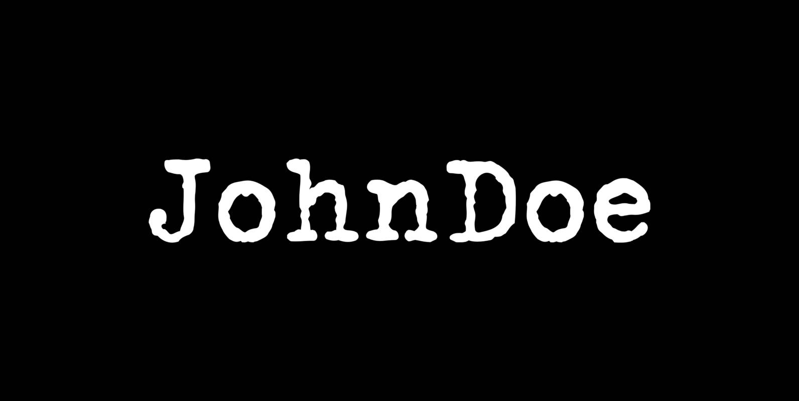
John Doe Font
John Doe is a font design published by Fonthead. Published by Fonthead Design Inc.Download John Doe

Remi-Rand Font
Based on the old Remington Rand typewriter logo from the the 1940’s, Remi-Rand is an approachable humanistic typeface suited for a wide array of applications. It’s packed with expressive alternates, a beautifully crafted numeral set and ligatures. Published by Mike
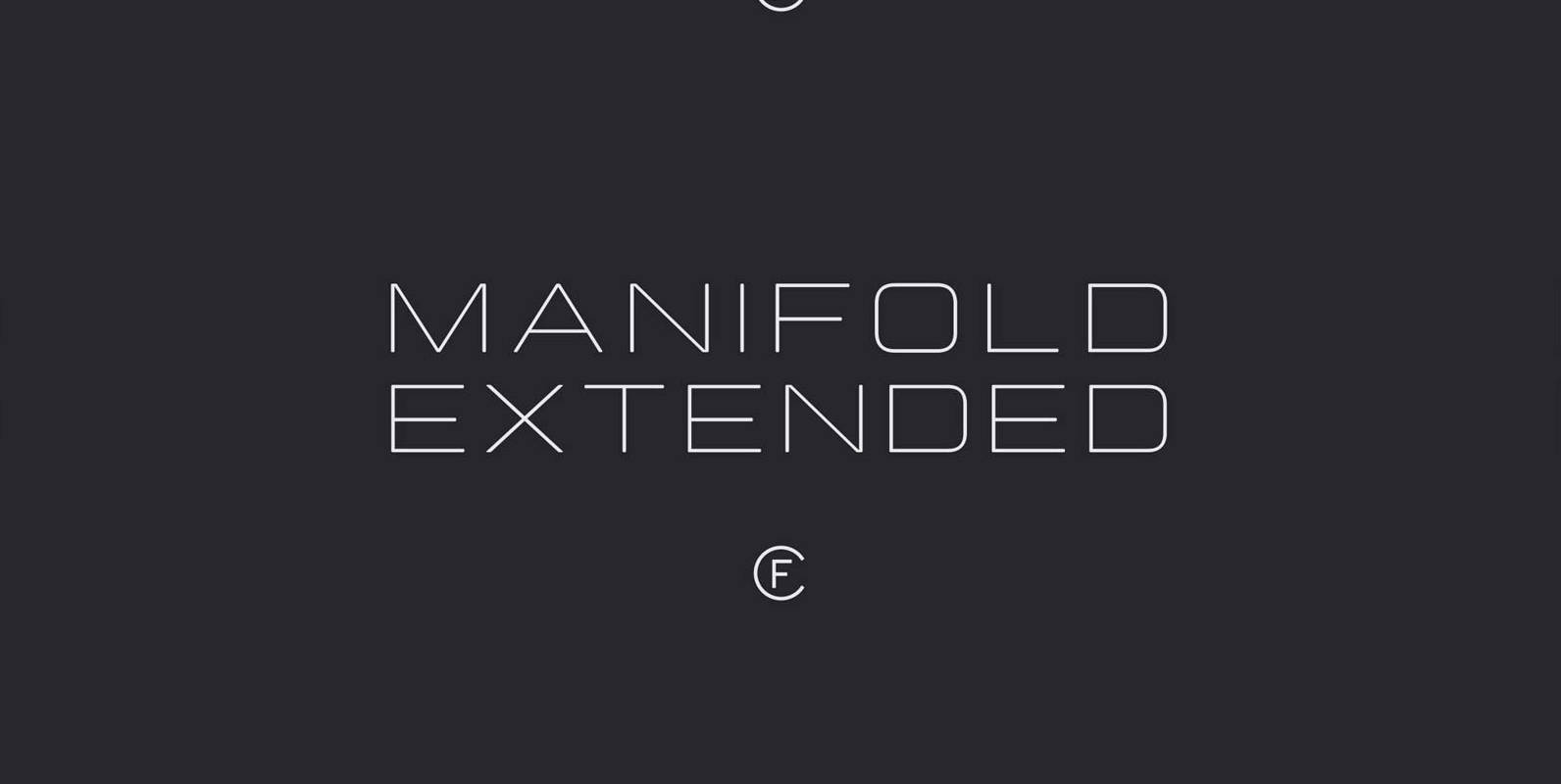
Manifold Extended CF Font
Manifold Extended is a wide, sweeping variation on the classic Manifold font family. Its clean, elongated shapes are both technical and elegant. An excellent typeface for titles, logotypes, user interfaces, and short texts. Feature Summary – Eight weights and obliques
P22 Typewriter Font
This typewriter font is offered for free and without any pretensions. This font is not overly distressed, nor is it overly clean. It is a typewriter font. It is perfect for when you want a document to look like it

Chennai Slab Font
Chennai Slab is a simplified slab serif with over sixty OpenType alternates. These alternates include alternates for the ball terminals, unique simplified alternates and more traditional capital forms. Use Chennai Slab when you need a fun and versatile slab serif.
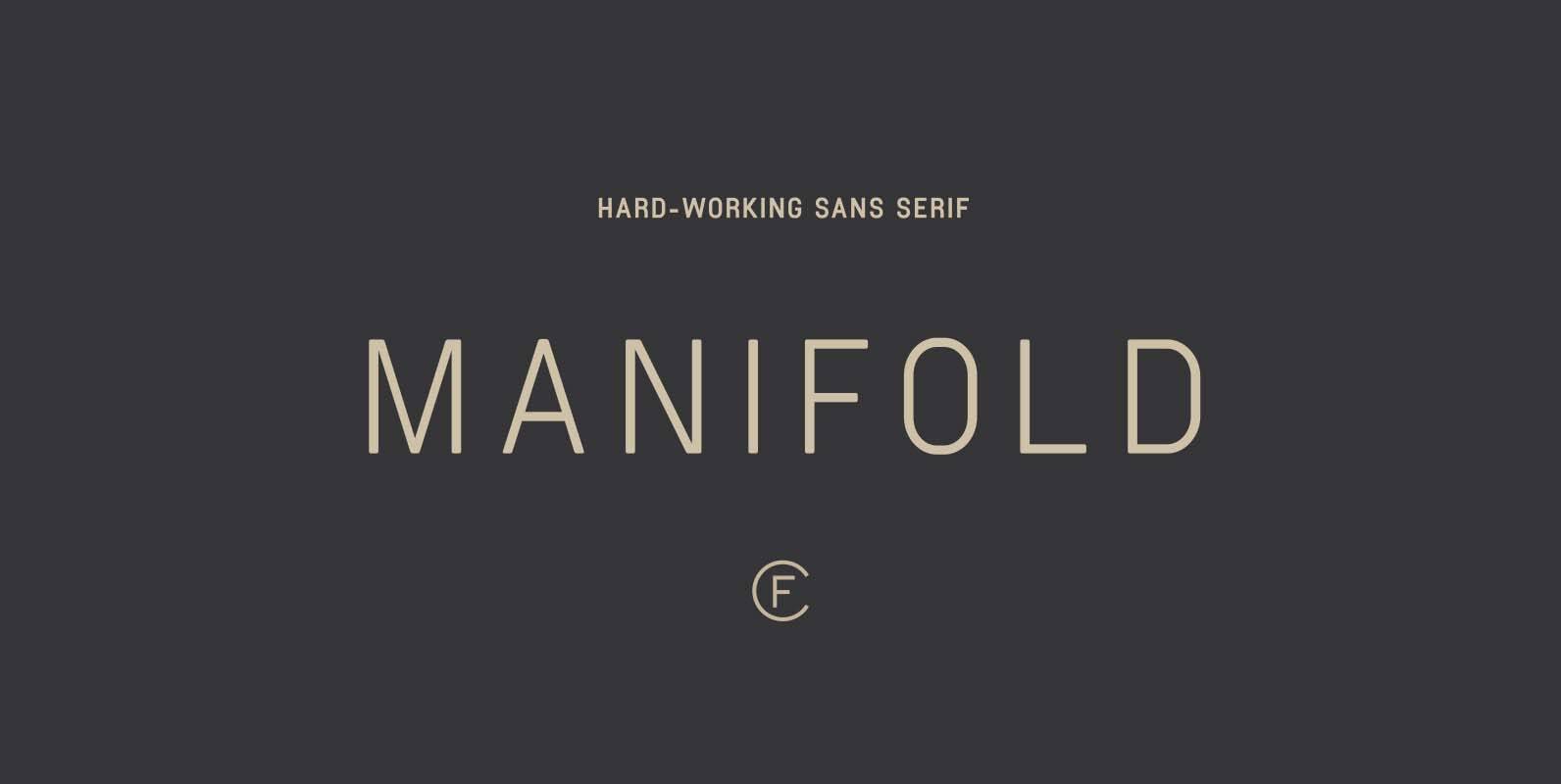
Manifold CF Font
Strong, unified, and articulate. Manifold is a utilitarian typeface inspired by the precision of a computer terminal, then tempered and softened with a hint of warmth. Manifold’s unified letterforms and tall x-height are excel in user interfaces and short copy
Tailor Font
Tailor was a study of slab serif style with round and comfortable feel. I wanted to merge round shapes with exaggerated ink traps for legibility. Published by Suomi Type FoundryDownload Tailor
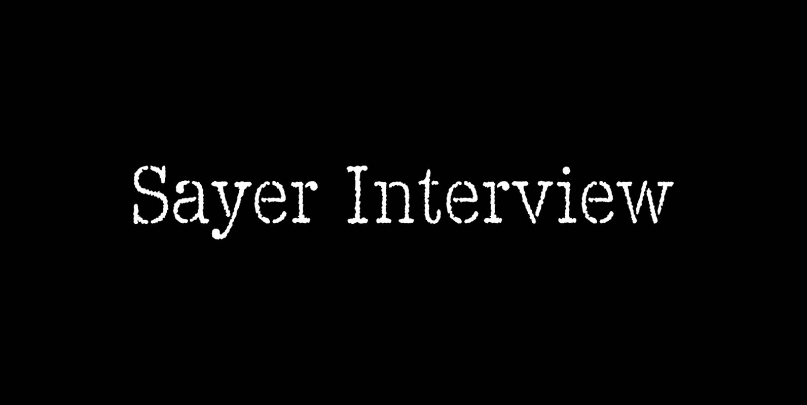
Sayer Interview Font
Sayer Interview is a font design released for the Mecanorma Type Collection. Copyright 2004 Trip Productions BV. Published by MecanormaDownload Sayer Interview
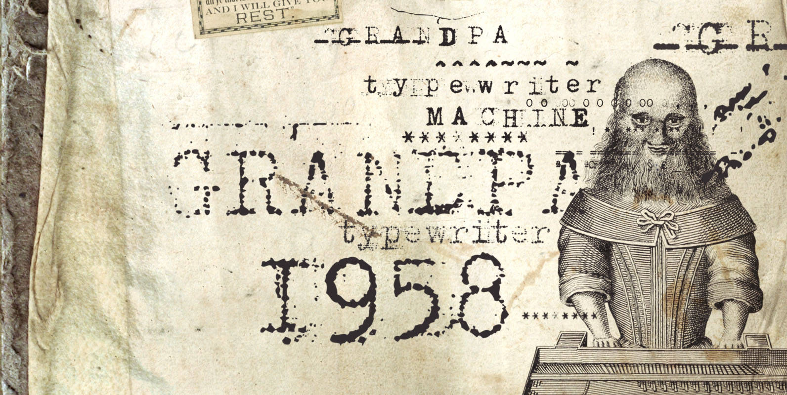
Grandpas Typewriter Font
Granpa’s typewriter comes from an antique Olivetti Typewriter Machine I have. This font has all of the effects a typewriter machine can offer you: a regular version, a strong hit version, a light distressed version, a double-hit version and X
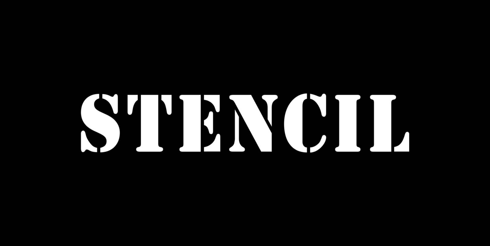
Stencil Font
Stencil is a font design released for the Mecanorma Type Collection. Copyright 2004 Trip Productions BV. Published by MecanormaDownload Stencil
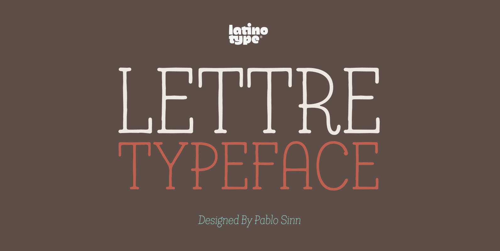
Lettre Font
Lettre is a geometric serif font designed by Pablo Sinn. Thanks to its imperfections, this font looks like it is hand-lettered. Lettre brings back nostalgic feelings of mechanical typewriter characters and recovers the essence of the rustic and natural, what
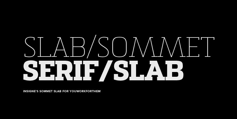
Sommet Slab Font
The Sommet family of typefaces has been updated with a new slab serif variant. Expanding on Sommet’s successful design principals, Sommet Slab is there when you need more impact and power. Sommet Slab is available with six weights and complementary
Suomi Slab Serif Font
All typewriter types are rounded and especially American Typewriter has an almost too-slick appearance. Suomi Slab Serif has the glyph shapes similar to typewriting, but the serifs, terminals and connections are crisp and sharp. Published by Suomi Type FoundryDownload Suomi
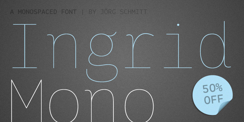
Ingrid Mono Font
The birth of the monospaced types dates back to the past. There was a need for the creation of typesets for typewriters. The difficulty was to align the different glyphs in the same width. This led to particular problems with
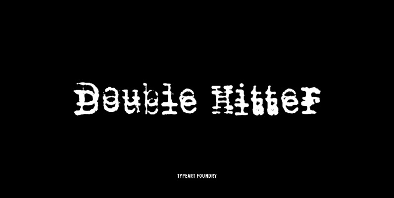
Double Hitter Font
This font was created mostly to be a companion set for our other Typewriter families, allowing you to introduce the typewriter flaw where you end up with a double impression of a character. A Typewriter emulation with slight inking imperfections,
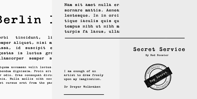
Secret Service Typewriter Font
Designed by Steve Jackaman. Based on proofs of an early Remington typewriter font from the Keystone Type Foundry, circa 1905. Published by Red RoosterDownload Secret Service Typewriter