Tag: typewriter
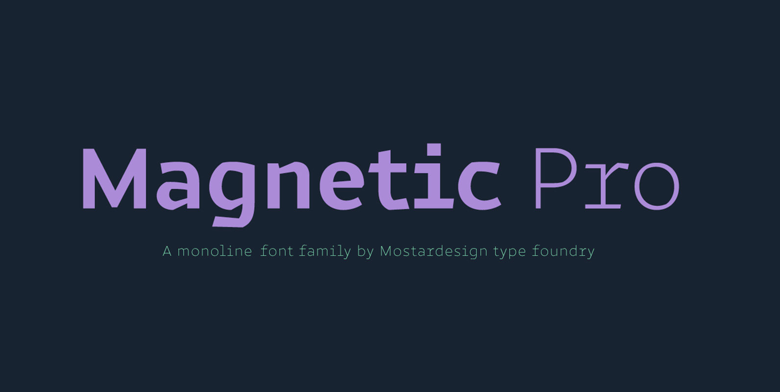
Magnetic Pro Font
Magnetic Pro is a typeface inspired by typewriter characters with a mechanical aspect. Equipped for professional typography, this font family has many OpenType features such as small caps, case sensitive forms, tabular and oldstyle figures, pro kerning, circled numerals, ligatures,
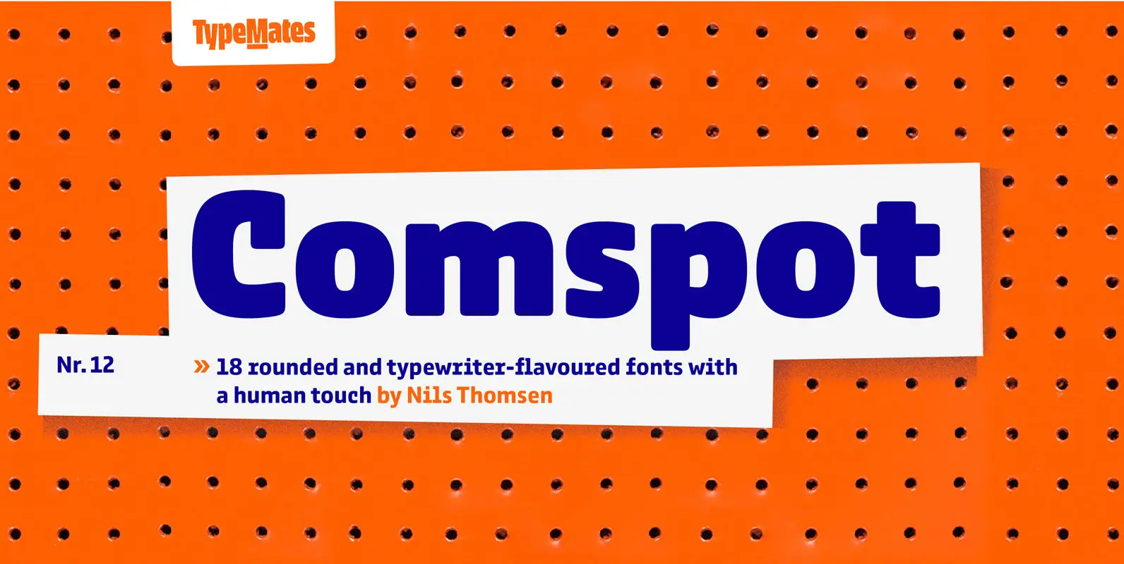
Comspot Font
Comspot is a rounded, typewriter-flavoured font family with a human touch. Originally designed as a custom typeface Comspot’s nine weights — razor-thin hairline to ultra black — and 14 stylistic alternates fulfil every need, from extended to display text. Comspot’s

Odisseia Font
Plau presents Odisseia, a monospace type family in 8 styles designed with simplicity of shapes and a humanist touch. We’ve ventured into monospace territory, where all letters must occupy the same amount of space. This style is usually associated with
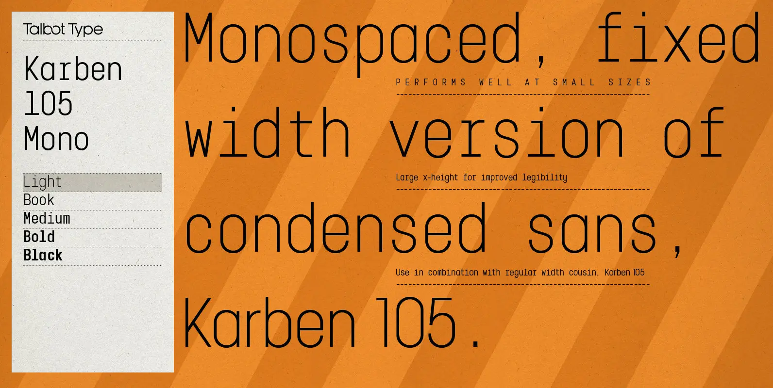
Karben 105 Mono Font
Karben 105 Mono is a monospaced variation of Karben 105. The clean and pure geometry of Karben 105 makes it highly suitable for adaptation to this monospaced variant. It has an even look and retains its legibility at very small
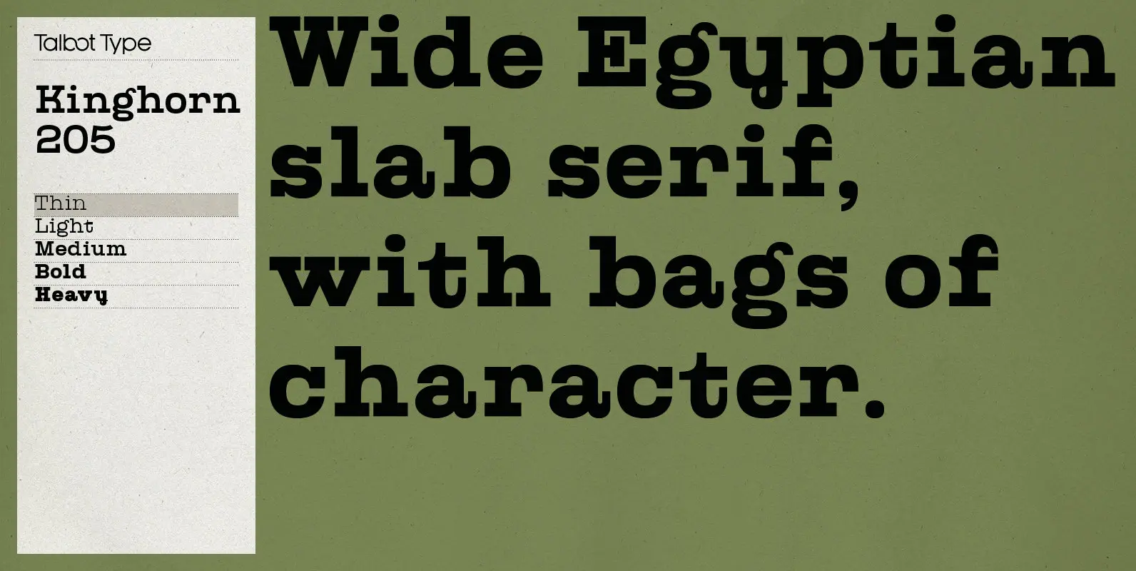
Kinghorn 205 Font
Kinghorn 205 is an Egyptian style slab-serif. The strokes are all of a roughly equal weight for an even, geometric look. Although original Egyptian slabs date from the early 19th century, the even look gives the font a balanced, contemporary
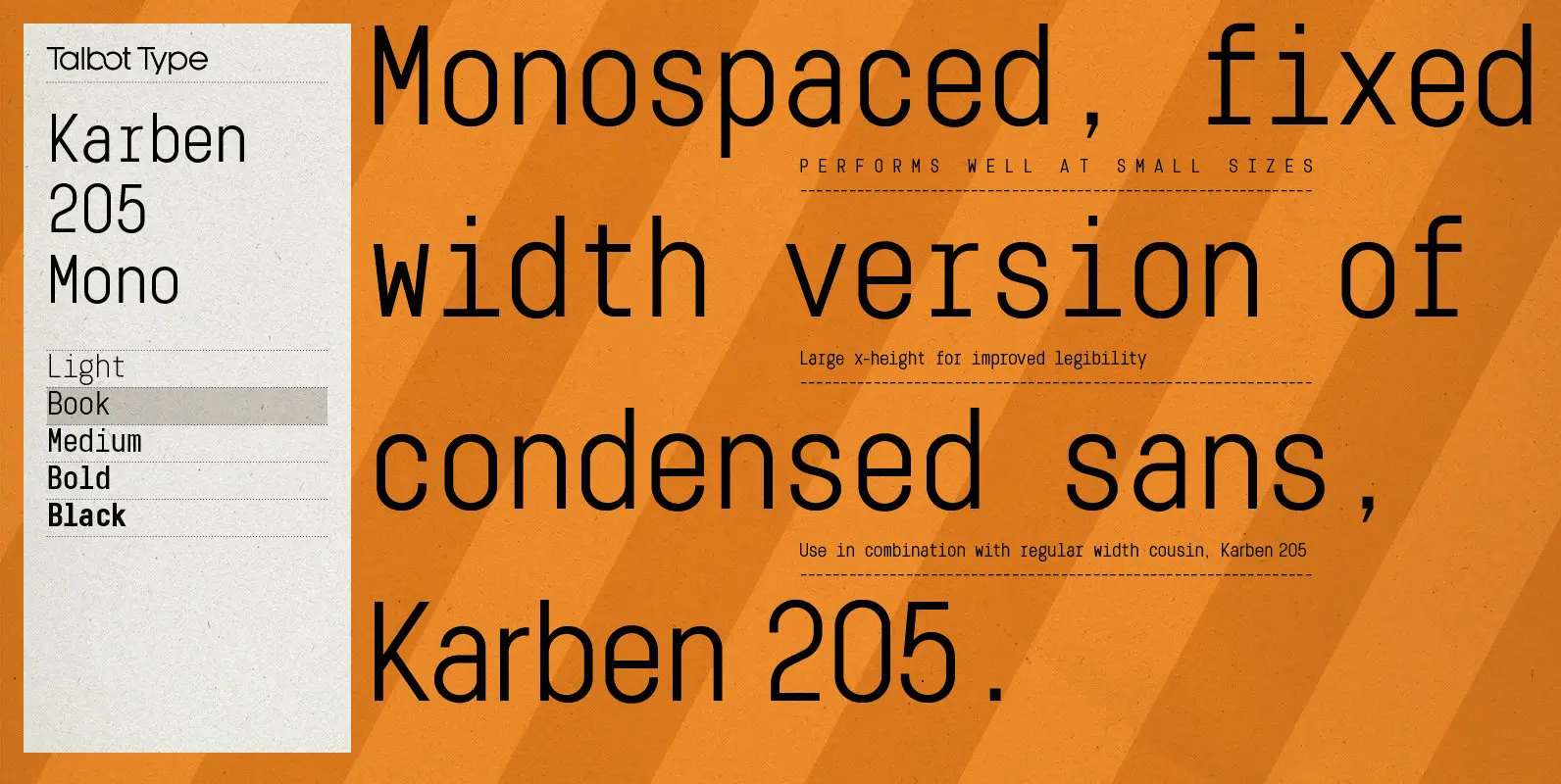
Karben 205 Mono Font
Karben 205 Mono is a monospaced variation of Karben 205. The clean and pure geometry of Karben 105 makes it highly suitable for adaptation to this monospaced variant. It has an even look and retains its legibility at very small
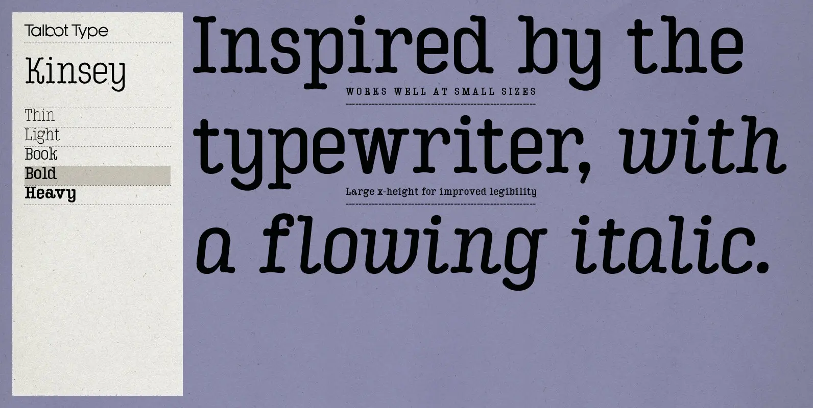
Kinsey Font
Kinsey is inspired by traditional typewriter font styles. Although now largely consigned to history, the bulbous slab serifs and soft curves of typewriter fonts have left a lasting legacy; they’re paradoxically easy on the eye, yet utilitarian and business-like. Kinsey
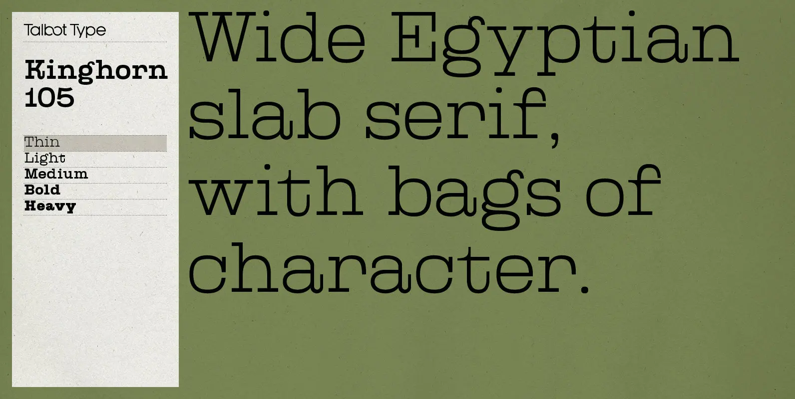
Kinghorn 105 Font
Kinghorn 105 is an Egyptian style slab-serif. The strokes are all of a roughly equal weight for an even, geometric look. Although original Egyptian slabs date from the early 19th century, the even look gives the font a balanced, contemporary
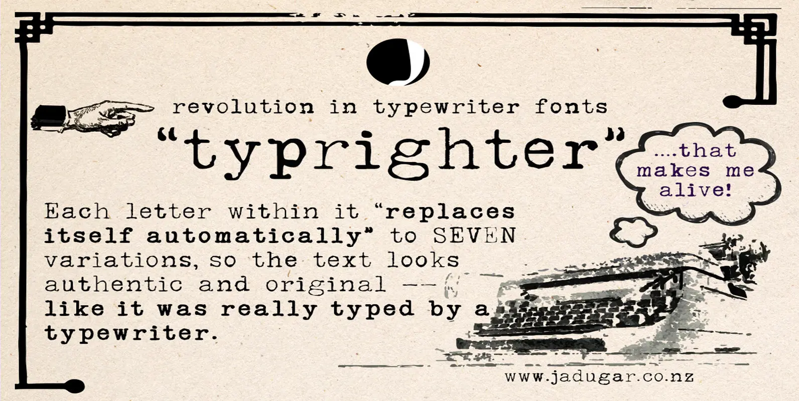
Typrighter Font
Here is a revolution in typewriter fonts…typrighter…yes! Applied Contextual Substitutions feature in fontlab with 6 different alternative of each letter (standard English alphabets). No more repeating same contours of letters which a typical typewriter font does…a letter replaces itself automatically
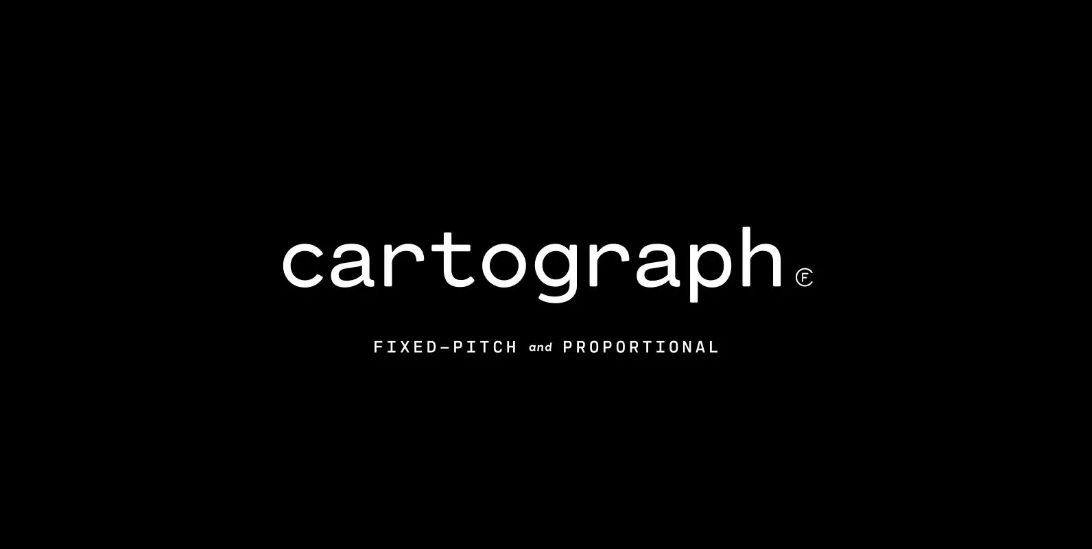
Cartograph CF Font
A monospaced typeface with character and warmth, Cartograph© CF is a handsome font family featuring a lush, cursive italic, code-friendly ligatures, and a proportional set accessible via OpenType. A tribute to the utilitarian beauty of terminals and typewriters, Cartograph excels
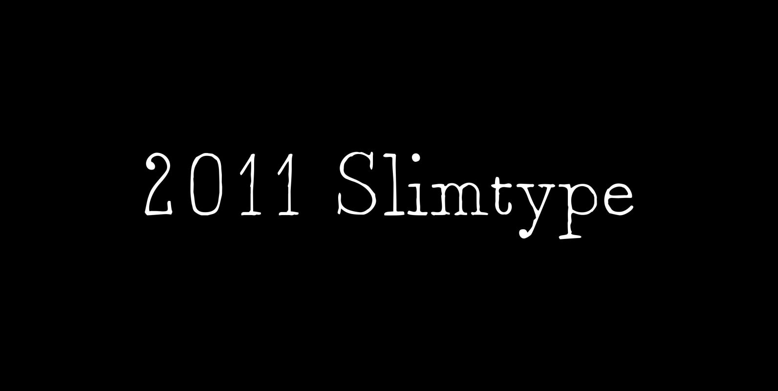
2011 Slimtype Font
This light manual font, with two styles, is a looking like slab serif or typewriter pattern. It is containing Western and Northern European, Icelandic, Baltic, Eastern, Central European and Turkish specific characters, plus old style numerals, ct, st and f
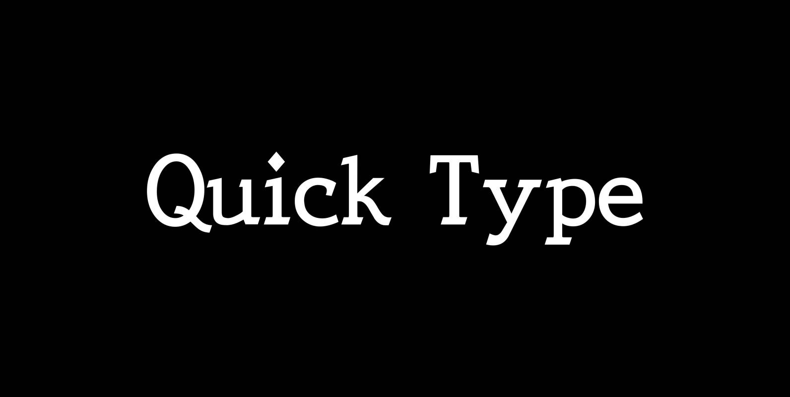
Quick Type Font
QuickType is a typeface I designed for demonstration purposes. I used it to illustrate my first book about type design. I has crooked slab serifs and looks very much like a typewriter font. But in order to make things clear
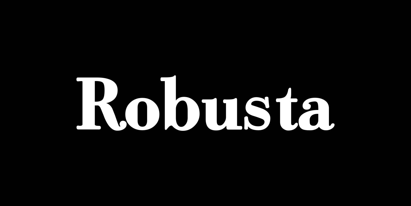
Robusta Font
“Robusta” is somehow more elegant than Courier and sturdier than Bodoni. Published by Wiescher DesignDownload Robusta
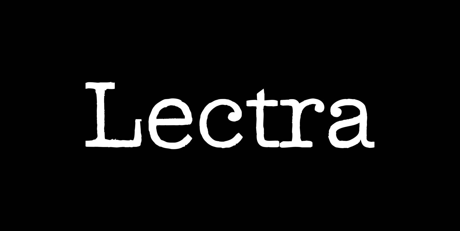
Lectra Font
“Lectra” is a typical typewriter-family with 5 normal cuts and 5 – not so typical for typewriter-fonts – swashes. Published by Wiescher DesignDownload Lectra
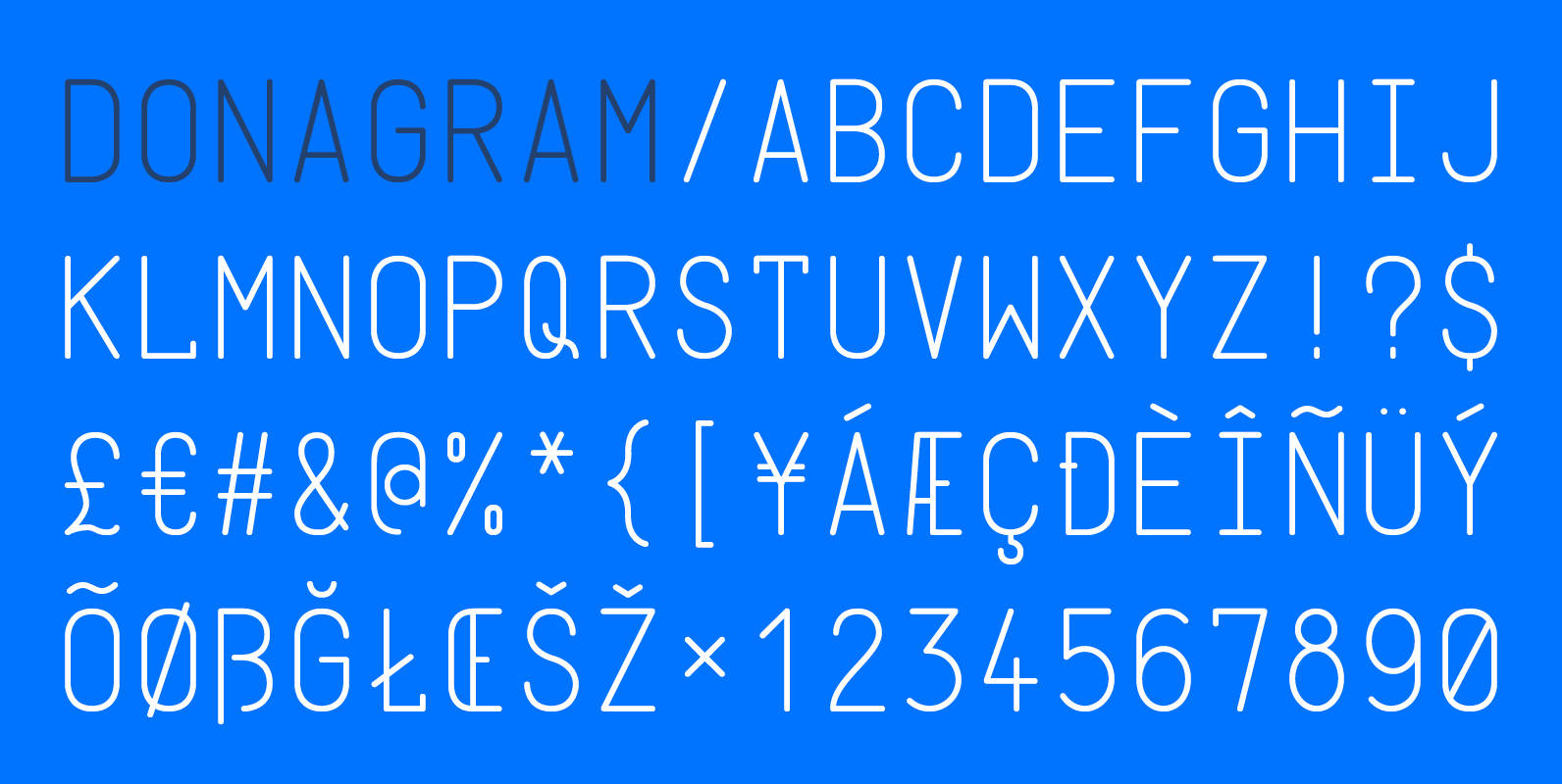
Donagram Font
Donagram is a typeface inspired by telegrams from the 1940s. Available in three weights, it’s roots are in the functional usage of the telegraph machine. Donagram has been developed into a modern, clean and elegant typeface. Published by AtworkDownload Donagram
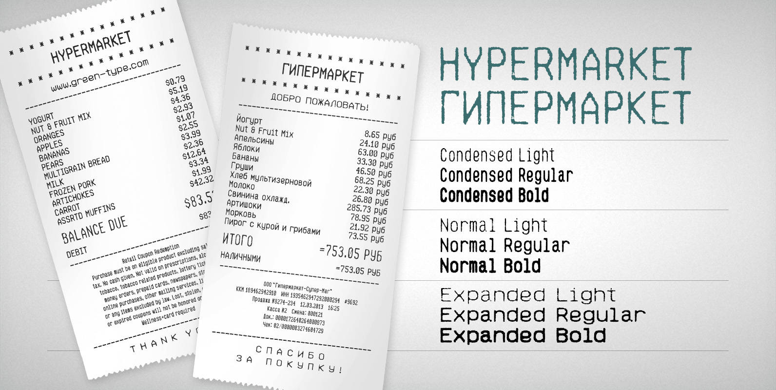
Hypermarket Font
Hypermarket is a font family inspired by shopping receipts. Published by Green TypeDownload Hypermarket