Tag: tough
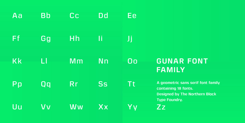
Gunar Font
A geometric sans serif with a square chiseled appearance. Precise curves are met with straight lines and tapered angles to produce a fresh, technical typeface. It’s large x-height and neutral width give it good legibility at small point sizes. These
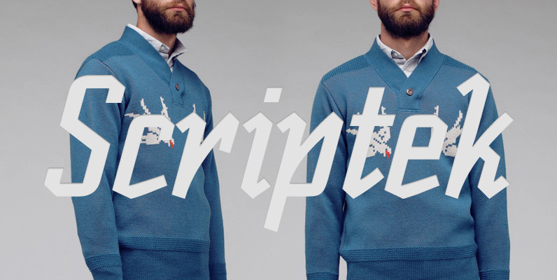
Scriptek Font
British designer David Quay was inspired by the work of the Russian Constructivists and, more recently, by Neville Brody’s influence on display typography when he created Scriptek. This strong, geometric slab serif typeface with its angled element in the lowercase
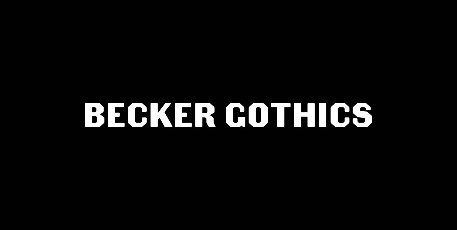
Becker Gothics Font
The Becker Gothics pay homage to the nineteenth century American lettering master George Becker. Designer James Puckett has given new life to the ingenious gothic alphabets found in Becker’s 1854 lettering manual Ornamental Penmanship. Use this quintet of typographic voices
Militia Font
Militia is the face of well-orchestrated military coups, tanks and gun barrels, maps and covert plans, camouflage and war paint. It has no irony, patience, or give-and-take politic. It is strong, successful, swift and significantly in your face. Militia comes
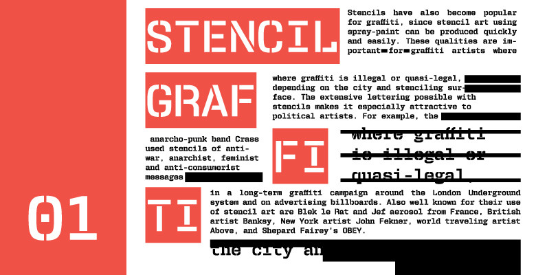
User Stencil Font
User is a monospaced type family with 30 styles, from Hairline to Bold, divided in Regular, Upright and Stencil, with five weights (Hairline, ExtraLight, Light, Medium and Bold) all with Cameo versions. Complexity and versatility are the keywords for this

Robotik Font
This slab serif Egyptian typeface follows the trend for simple, mechanically constructed typefaces and is an ideal choice for communicating a feeling of precision and strength. Robotik is equally effective when set with normal or wide letter and word spacing.

Cornelia Font
Cornelia, an ‘undesigned’ typeface. Made by Novo Typo. Designers from Amsterdam, The Netherlands. Published by Novo TypoDownload Cornelia
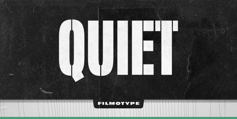
Filmotype Quiet Font
Initially designed in the early-to-mid 1950s, Filmotype Quiet was among the first of its Novelty font designs. Remastered and expanded from the original source, Filmotype Quiet includes a full international character compliment, automatic fractionals, ordinals, and a suite of period
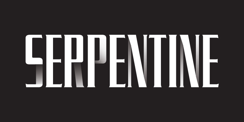
Serpentine Font
Designed by Dick Jensen in 1972, Serpentine is a glyphic sans font design. Serpentine is a font design owned by Linotype. Published by URW Type Foundry GmbHDownload Serpentine

URW Urban Font
URW Urban follows the trend of pattern fonts. Each character has been provided with an individual pattern created with a special stamp technique. To create a vivid typeface, there is a stylistic alternate for nearly every character. In this way
Refrigerator Deluxe Font
Refrigerator Deluxe (2008) was inspired by generic block-style lettering typical of the mid-20th century. It follows the typical American model that can be seen in old lettering manuals, although I designed it purely from memory. I originally released it in

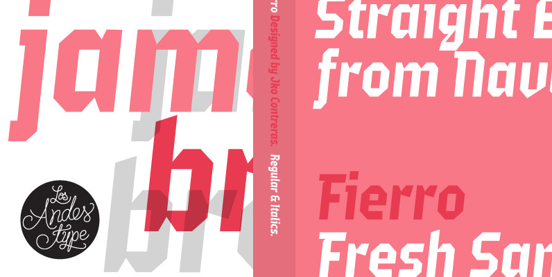
Fierro Font
Fierro is a heavy-geometric-retrofuturistic typographic construction that, without any curve, still retains good legibility. These shapes are based on great bended metal pieces, which represent its name, meaning “hardware store”. It has been designed to be used in large sizes
Steelworks Font
Steelworks is a headline font based on lettering on a plaque of the Henry Avenue Forge in Winnipeg, Manitoba, Canada. Published by Suomi Type FoundryDownload Steelworks

Ginza Narrow Font
Here’s what I said about the original Ginza: Sometimes you get an idea stuck in your head and the only way to get rid of that demon is to put something down on paper. A year later the doodles became

YWFT Jute Font
YWFT Jute is a masculine, military, sans-serif design that was realized through a series of revisions to another typeface design called Flier. The constant reworking of Flier gave it a completely different look and feel, and thus was YWFT Jute
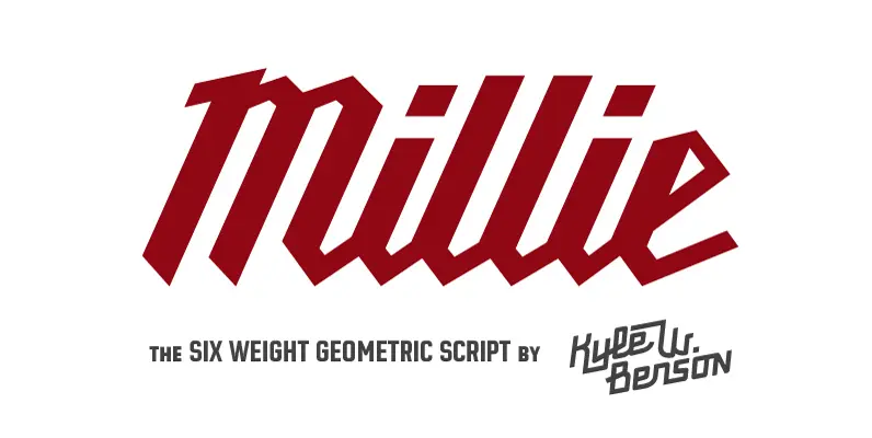
Millie Font
Millie is a stressed, geometric script who spends her days as industrial lettering and her nights paired with blackletter on the patches of motorcycle gangs. Millie was weighted by the conventions of broad nib calligraphy, inspired by the Milwaukee Tools
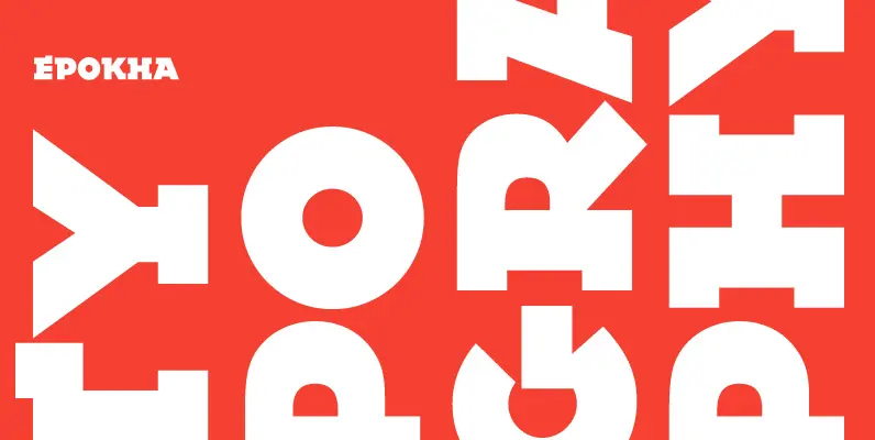
Epokha Font
This unusual slab serif typeface is the exciting creation of Type Director Colin Brignall. Influenced by poster styles of the 1910-1920’s, Epokha features strong geometric construction and commands attention in a fresh, contemporary way. Alternative letters add even more flexibility