Tag: squarish
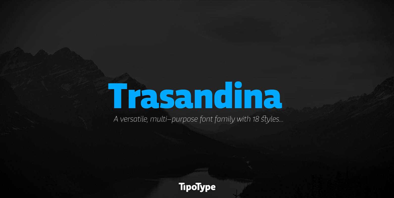
Trasandina Font
Trasandina is a very unique font-family: a modern, versatile, workhorse typeface with a special personality, given by the mix of humanist and geometric models, remaining far from both extremes. This typeface has 9 styles plus their matching italics, it has

Solitas Slab Font
Slab serif, meet the curves of Solitas. The new slab sister of Insigne’s successful Solitas family will turn your head with its soft, but distinct look. Solitas Slab defies the typical feel of the robust slab category with her more
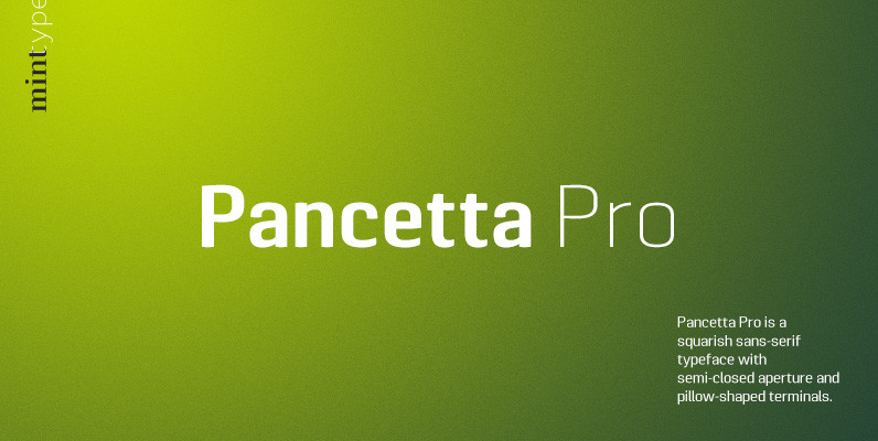
Pancetta Pro Font
Pancetta Pro is a squarish sans-serif typeface with semi-closed aperture and pillow-shaped terminals. The shape of a pillow is furthermore used to enliven the boring horizontal stems which are very frequent in Cyrillic script, and get rid of the right

Nikaia Font
Nikaia started as an experimental typeface (the script weights) and was then expanded to its logical conclusion (italic & regular), producing the fastest look typeface in the world. Nikaia looks clean and sharp at any size, with 5 weights for
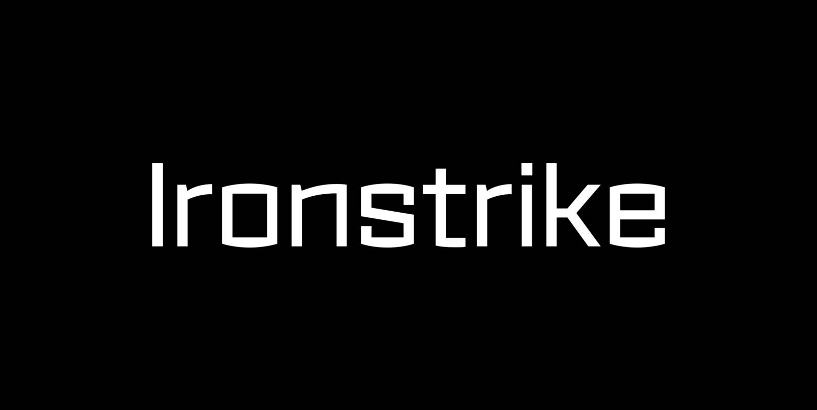
Ironstrike Font
Ironstrike pays homage to industrial and constructivist lettering. Rigid shapes and tall lowercase letters evoke strength and technology. Seven weights with matching italic fonts step up to your tough design challenges. Fine light weights emphasize white space and powerful heavy
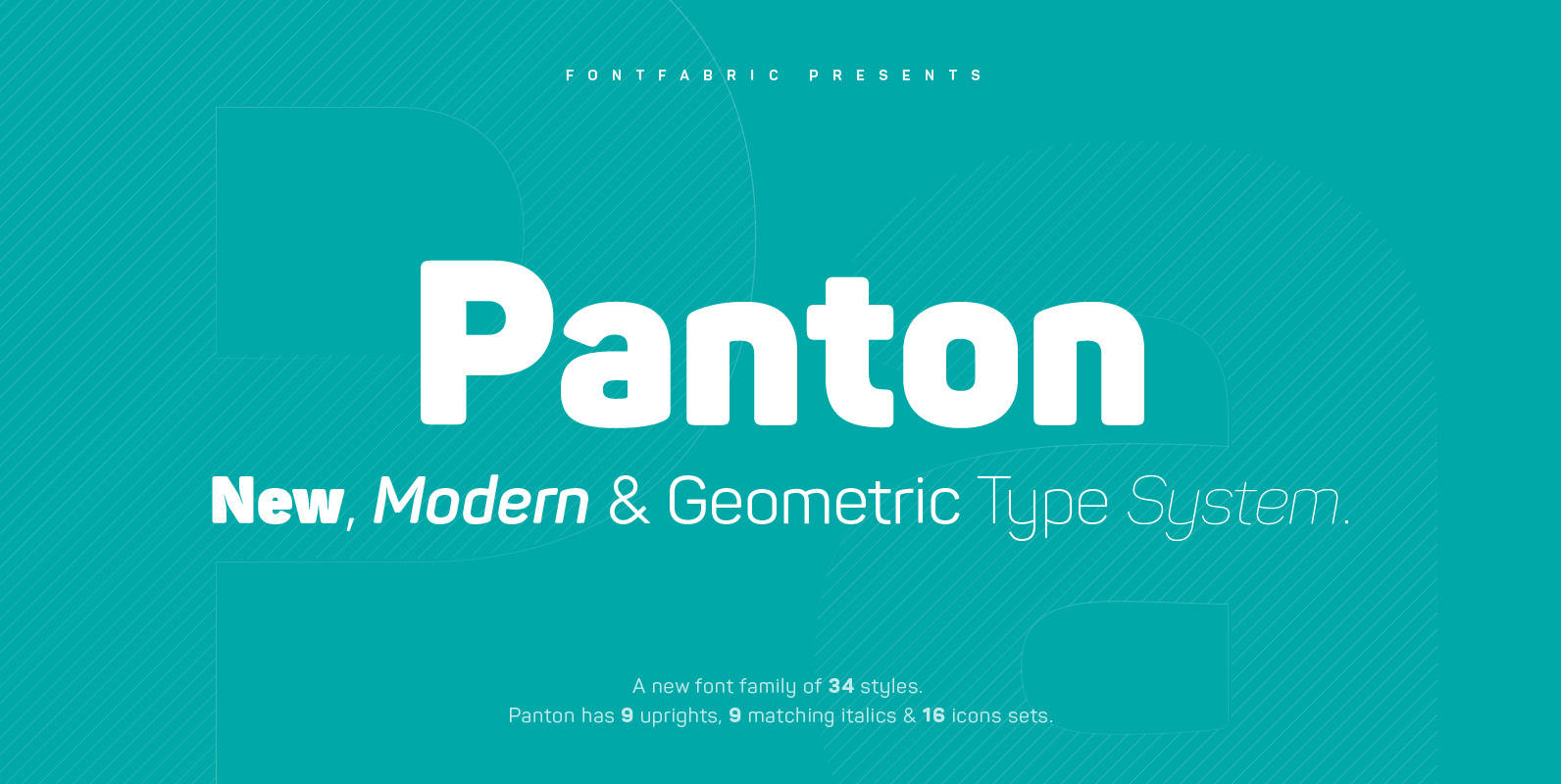
Panton Font
Panton has been expanded with Panton Narrow! It has 9 uprights and 9 matching italics ranging from Thin to Heavy. NEW! Update 3.0 What’s New: • New Narrow version of 18 weights • Bulgarian Localization Support • Tabular Figures •
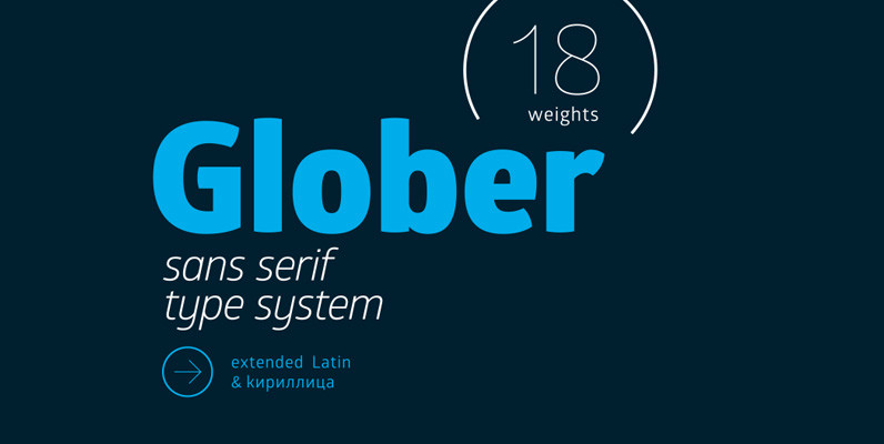
Glober Font
The Glober font family includes 18 weights – nine uprights with nine italics. It is characterized by excellent legibility in both – web & print design areas, well-finished geometric designs, optimized kerning, excellent web-font performance and legibility etc. Inspired by
Tailor Font
Tailor was a study of slab serif style with round and comfortable feel. I wanted to merge round shapes with exaggerated ink traps for legibility. Published by Suomi Type FoundryDownload Tailor

Swagg Font
Swagg is a unique and friendly sans that looks great at any size. Originally starting as a branding project, Swagg is now a full fledged family with 5 weights. Swagg is loaded with goodies like old style figures, tabular figures,
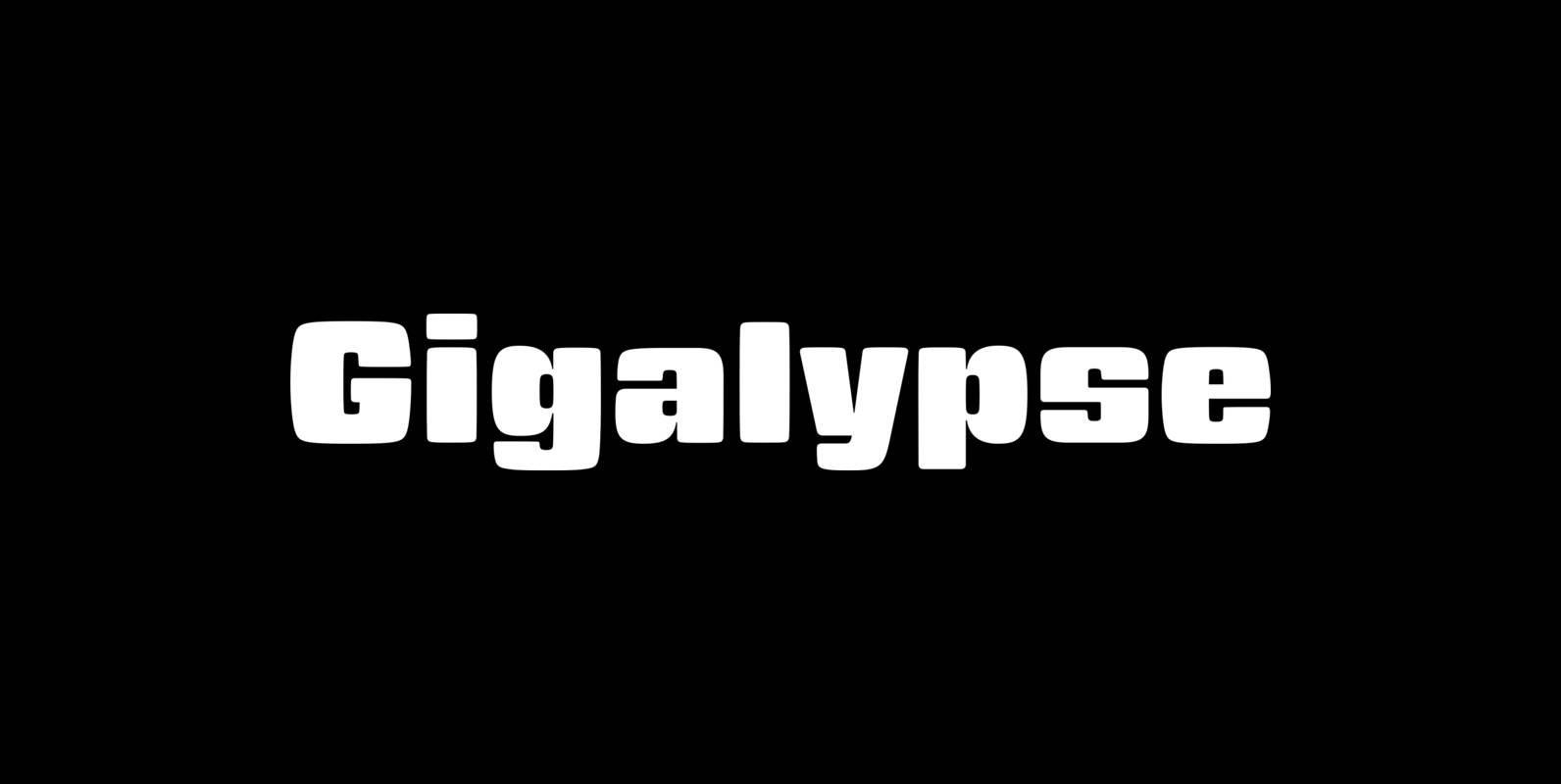
Gigalypse Font
Gigalypse is a one-weight workhorse. As a square sans Gigalypse can look smart, serious, and even futuristic. Round corners and curved sides add warmth and humor tempered by sophisticated geometry. This soft sophistication makes Gigalypse work whenever heavy display type
Sabotage Font
Sabotage is inspired on the iconic Vertigo movie poster by Saul Bass. It is a bold all-caps font that will fit surprisingly well a wide range of eye-catching design projects. Check it out! Sabotage brings two versions for each letter,
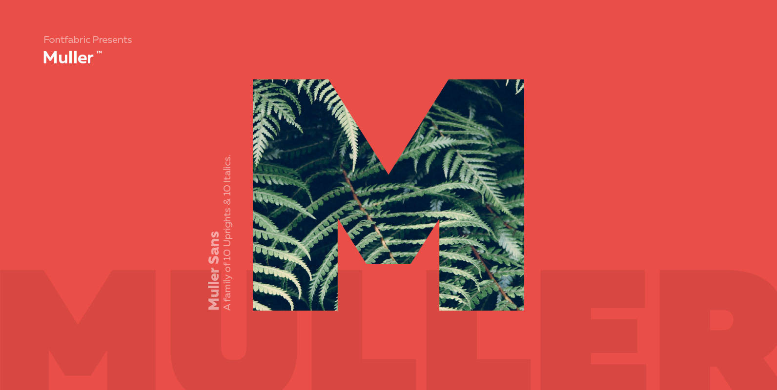
Muller Font
The very first sketches of Muller were made about four years ago. In the process, they changed to the point where they had nothing in common with the original idea. As it is with most work we do, when we
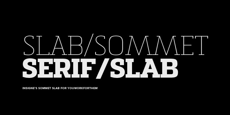
Sommet Slab Font
The Sommet family of typefaces has been updated with a new slab serif variant. Expanding on Sommet’s successful design principals, Sommet Slab is there when you need more impact and power. Sommet Slab is available with six weights and complementary

Pancetta Serif Pro Font
Pancetta Serif Pro is a squarish serif typeface – a natural companion to Pancetta Pro. Its skeleton is a blend of modern serif and slab faces, featuring prominent obtuse pillow-shaped serifs. Pancetta Serif Pro comes in 8 weights with real

Quarca Font
Quarca’s masculine power runs strong across the page with bold self-assurance and a raw energy that courses through its thick veins. Don’t think the continuous, smooth geometry of this semi-modular face is captively chained to the grid, though. Quarca has
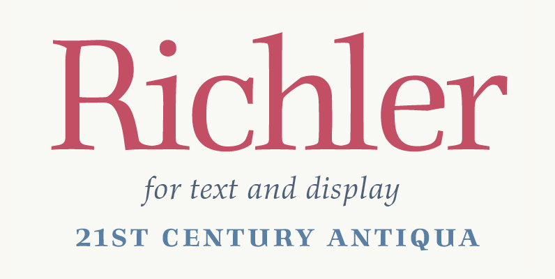
Richler Font
An open, evenly spaced book face designed for quality headlines and enhanced readability in text. Published by ShinntypeDownload Richler

Vivala Unicase Font
This square sans is suitable for a small line feed and the spaces between characters are wide enough to be readable even in small sizes. The WebFont numerals are slightly narrow. Published by Johannes HoffmannDownload Vivala Unicase
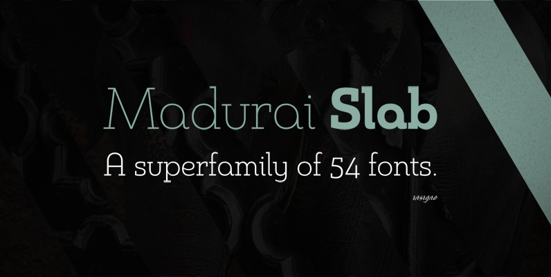
Madurai Slab Font
Chennai’s market-tested type styles have taken new form once again. The geometric forms of Chennai and its derivant Madurai, both successful in web-based applications and logotypes, have now been adapted for the superfamily Madurai Slab, a potent, square slab serif