Tag: quaint
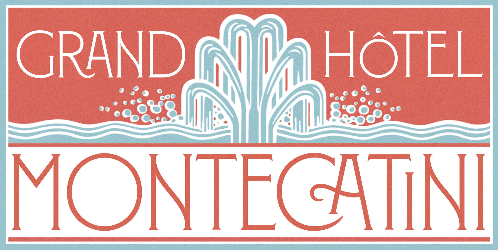
Montecatini Font
Montecatini Pro takes its cues from the elegant Stile Liberty travel posters of Italy in the early 1900s. In its successful first release by Louise Fili Ltd in 2017, the typeface introduced distinctive ligatures typical of the time when Art

Dollyn Script Font
Introducing Dollyn Script, a casual handwriting versatile script font with undoubtedly vintage vibes. Support for multiple languages (check the display) and there’s a ligatures feature for double letters to get the seamless handwriting feels on your design project. Published by
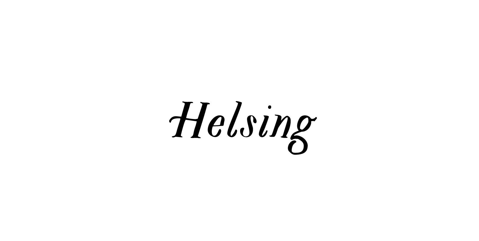
Helsing Font
Helsing is a serif style font inspired by Bram Stoker’s 1897 Dracula as well as Edward Gorey’s rendition of the story. Helsing is characterized by his slighting skewed baseline, subtle texture, thick and thin contrasts, and decorative legs. Made as
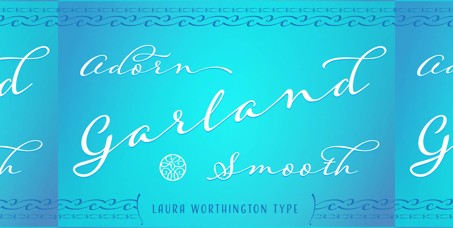
Adorn Garland Smooth Font
Adorn Garland is a script face that runs along a different, and somewhat “vintage” direction. Rather than deriving its strength from a heavy skeleton or structure, it uses its sense of contrast, its light touch upon the page, and its
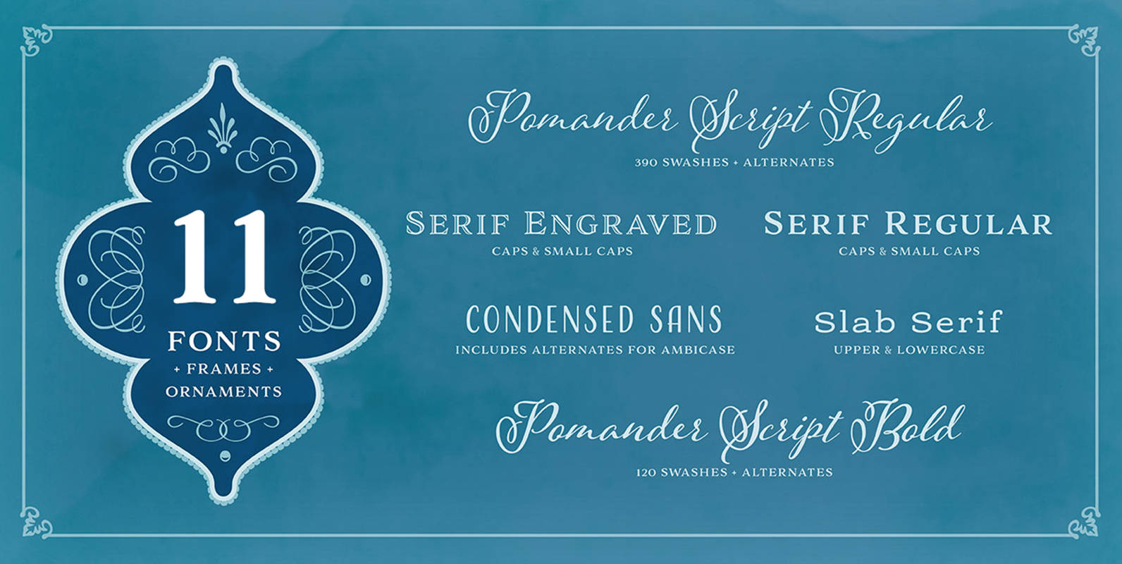
Adorn Pomander Smooth Collection Font
Like the original Adorn family on which it’s based, Adorn Smooth provides a suite of distinctive typeface designs designed to complement each other rather than match exactly. Adorn Smooth revisits 6 faces from Adorn — Pomander, Serif, Slab Serif, Engraved,
Azalea Rough Font
Azalea’s careful, inky strokes reference classic brush script styles of the 1950s, but its jaunty angularity is distinctly modern. Artfully irregular thicks and thins lend it an organic feel. This rough-edged version is a rustic complement to Azalea Smooth. Azalea
Becker Gothics Font
The Becker Gothics pay homage to the nineteenth century American lettering master George Becker. Designer James Puckett has given new life to the ingenious gothic alphabets found in Becker’s 1854 lettering manual Ornamental Penmanship. Use this quintet of typographic voices

Canterbury Sans Font
Based on the Morris F. Benton for ATF in 1920, it was not completed for production until 1926. The serif version we released a few years ago was so popular, that we decided to design a complementary sans serif version
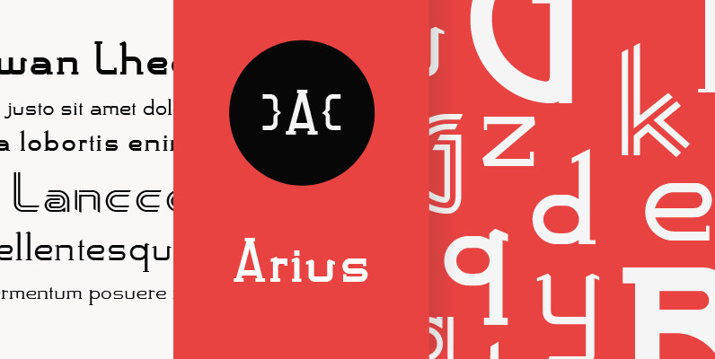
Arius Font
Designed by Karl Nayeri, Arius is a font released for the Prime Graphics Type Collection. Copyright Prime Graphics. Published by Prime GraphicsDownload Arius
Azalea Smooth Font
Azalea’s careful, inky strokes reference classic brush script styles of the 1950s, but its jaunty angularity is distinctly modern. Artfully irregular thicks and thins lend it an organic and slightly rustic feel, which is further enhanced in its rough-edged counterpart

Canterbury Old Style Font
Canterbury Old Style was originally designed by Morris F. Benton for ATF in 1920, it was not completed for production until 1926. Published by Red RoosterDownload Canterbury Old Style

Organicon Font
Organicon is based on geometrical forms used in chemical formulas and tables. It is the best possible font for usage in scientific areas, last but not least because of its handwriting character and excellent legibility. Organicon was designed by Dr.