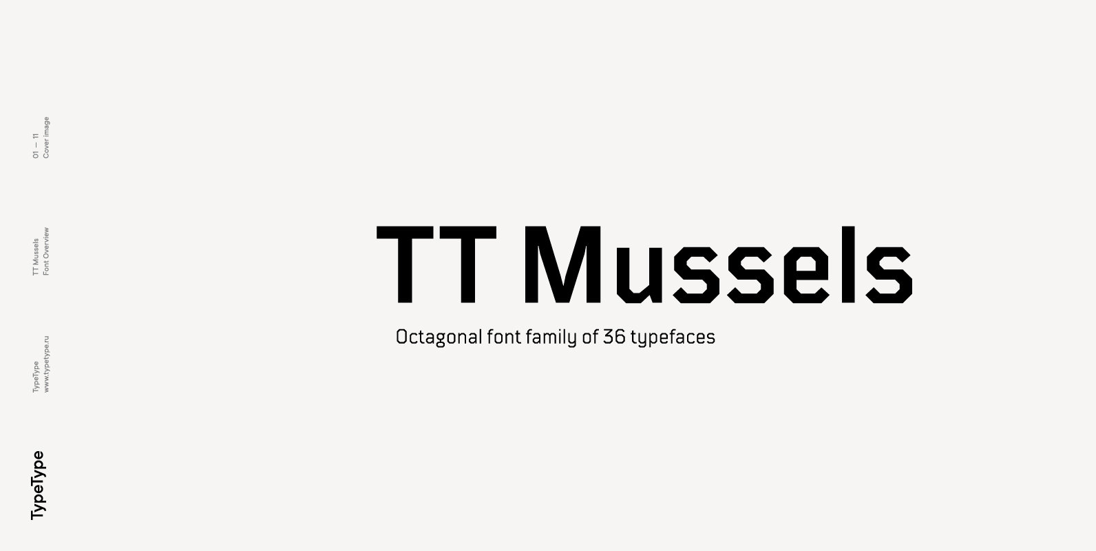
TT Mussels Font
The TT Mussels font family is the successor of such popular fonts as Bender and TT Squares. At the same time, TT Mussels has a number of fundamental differences that make it a unique font family that stands out from
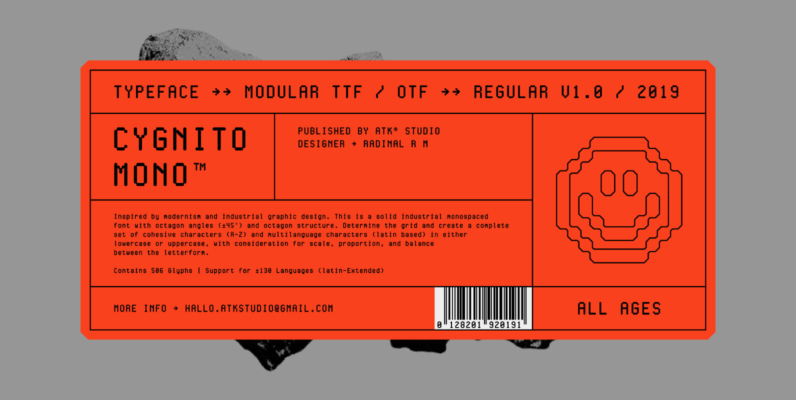
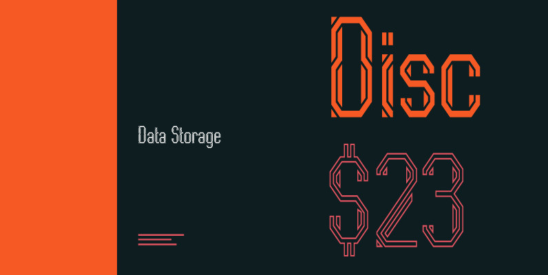
Cygnito Mono is the debut font from ATK® Studio. Inspired by modernism and industrial graphic design. This is a solid industrial monospaced font with octagon angles (±45°) and octagon structure. Determine the grid and create a complete set of cohesive
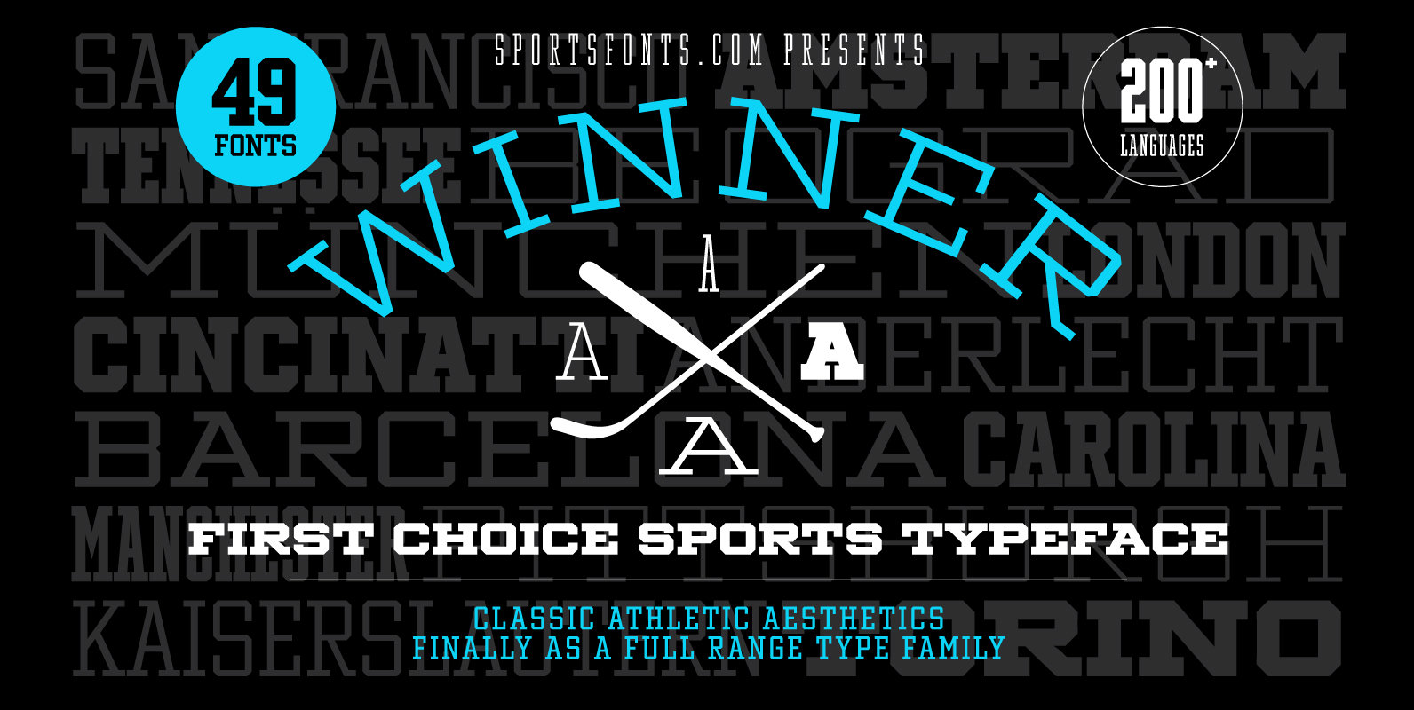
Winner—Classic athletic aesthetics, finally as a versatile contemporary font family. Just when you thought there was nothing left to add to the classic sports design, we lifted it to a whole new level. Whatever you want to set in whatever
The TT Mussels font family is the successor of such popular fonts as Bender and TT Squares. At the same time, TT Mussels has a number of fundamental differences that make it a unique font family that stands out from
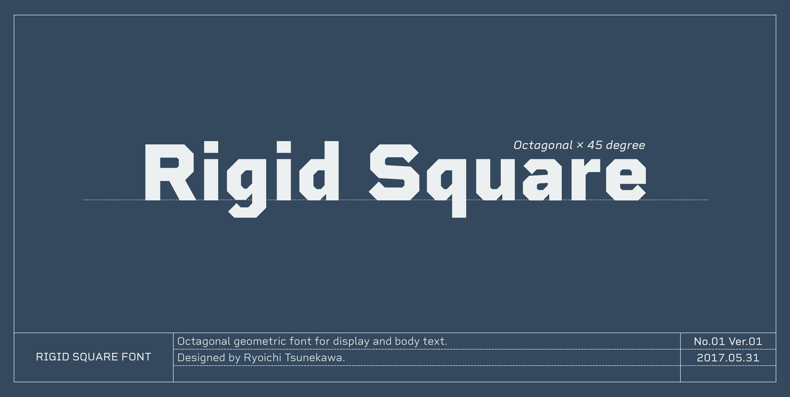
Rigid Square, There is a rule, Octagonal shape and 45 degree cuts. Very geometric shape but designed especially for body text, long sentence such like a mechanical instructions. Capital I and lower l have distinguishable shape. Neo-humanist shape on lowercase
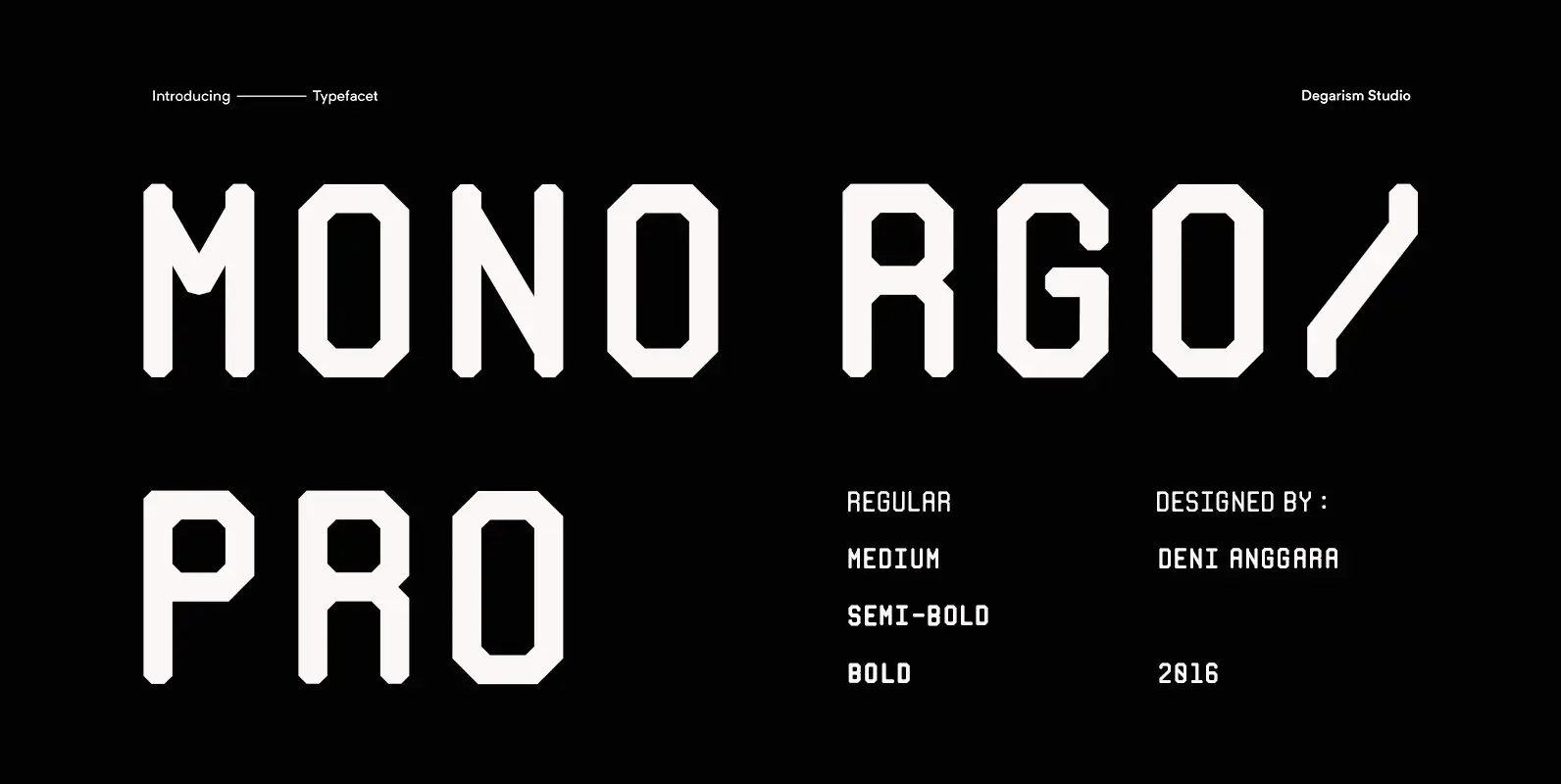
Mono RGO Pro is a clean, technical styled sans-serif typeface inspired by boarding passes. Published by Degarism Studio Download Mono RGO Pro
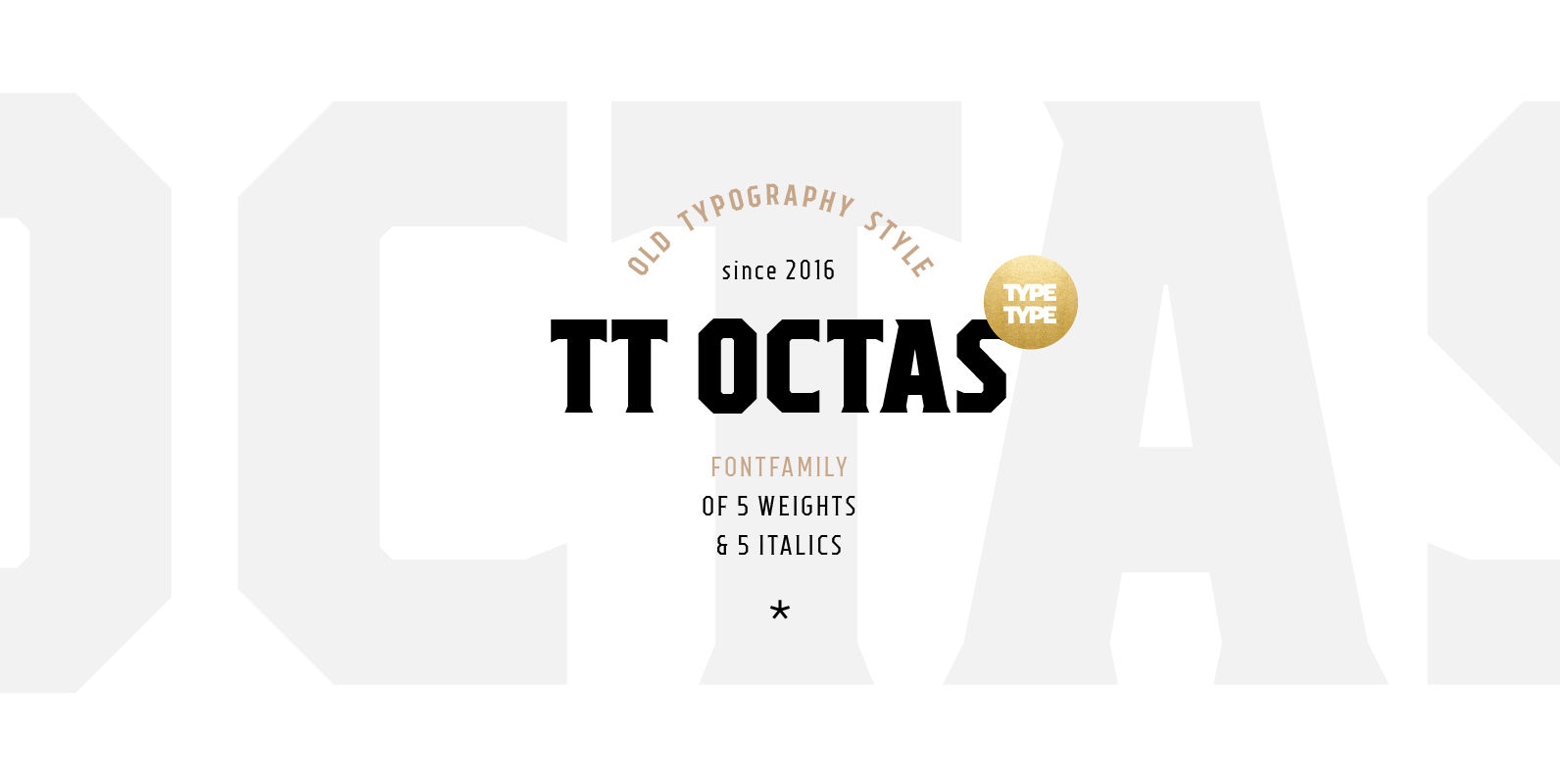
TT Octas is a narrowly proportioned font family built upon the principle of octagonal forms: all circles in this font family are actually octagons. Thanks to small serifs, TT Octas has a saturated and vintage character to it. Simple depiction
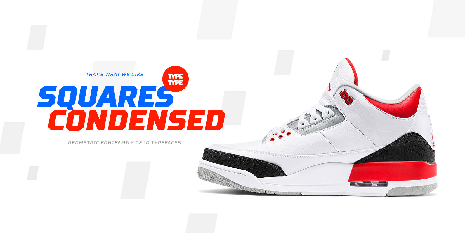
We’ve expanded the Squares font family and created a narrow version of the typeface. Just as its older brother, Squares Condensed fits perfectly for any engineering, military, and technological theme. The font is ideal for implementation in interior design, packaging
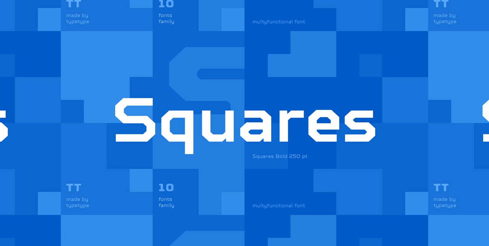
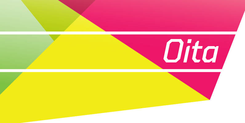
Exclusive font family style: octagonal and simple at the same time. Squares created for infographics and statistics. This is the font that will be good to exist in the design of the future, as well as any military attributes. Most
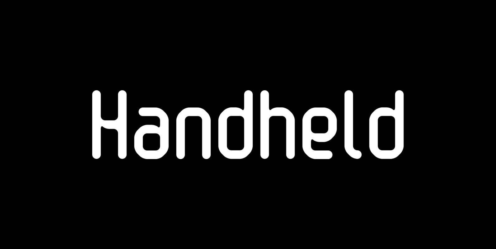
Handheld is a font design published by Fonthead. Published by Fonthead Design Inc.Download Handheld
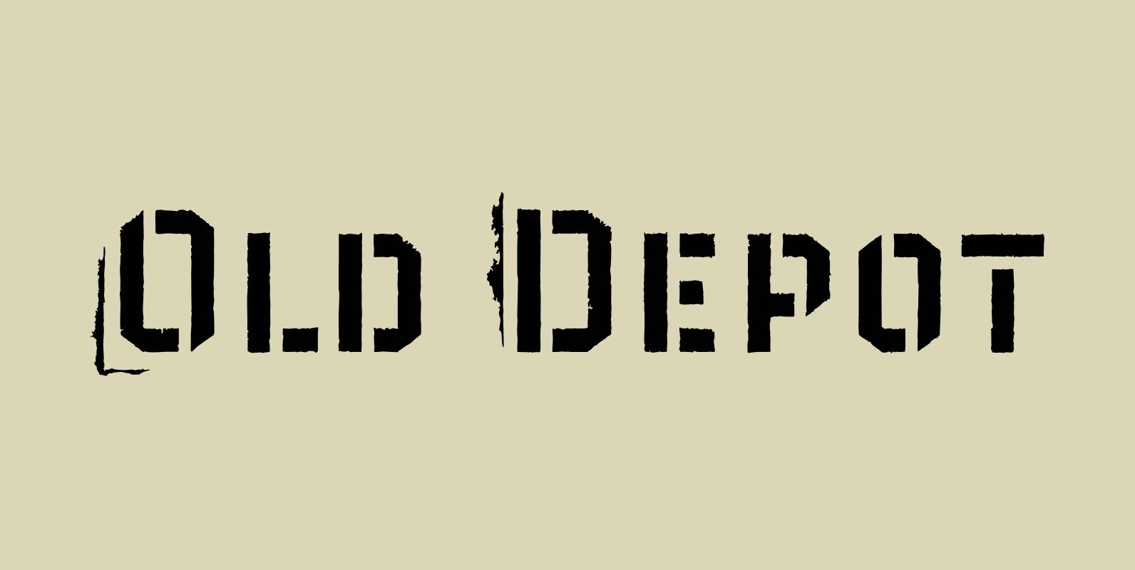
Old Depot is a newly reworked idea for the Depot Trapharet 2D font. It supports more languages and is available in more lettering. Old Depot stands out with its industrial nature of archaic spirit. It is a wonderful choice for
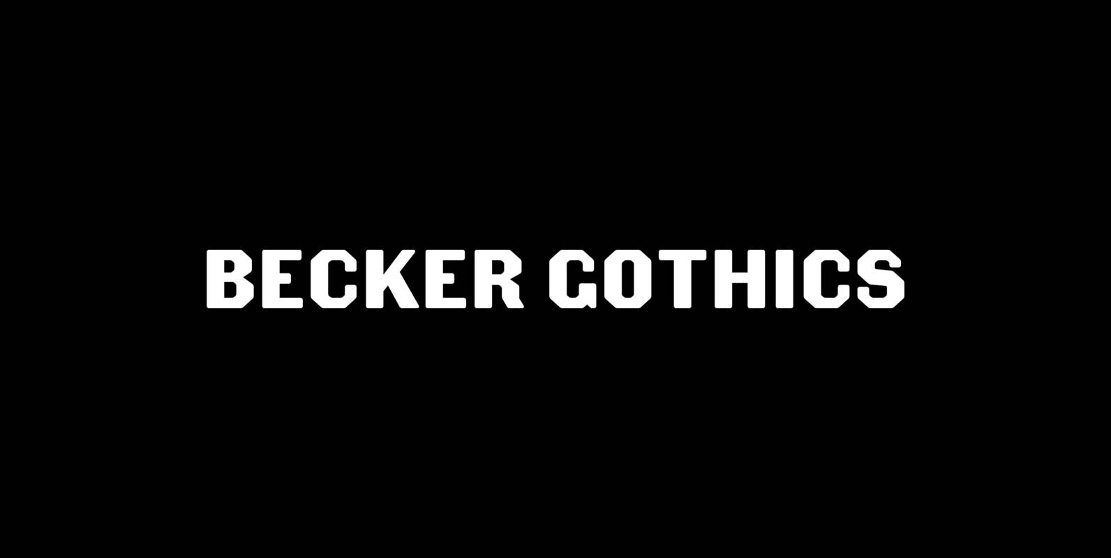
The Becker Gothics pay homage to the nineteenth century American lettering master George Becker. Designer James Puckett has given new life to the ingenious gothic alphabets found in Becker’s 1854 lettering manual Ornamental Penmanship. Use this quintet of typographic voices
Alexander Quill was originally designed in the early 1980s to be cut in 14 point for casting into foundry type for the setting and printing of limited edition books at Pie Tree Press, Jim Rimmer’s private sanctum. This alphabet exhibits
Cigar is a revival of a 1970s and 1980s typeface called Cucumber or Nassel Black or Scanner. It has been carefully redrawn and expanded into a full-featured OpenType font. Cigar Octo and Cigar Quarto are new angular reinterpretations of Cigar.
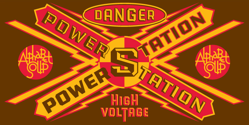
Originally conceived as part of a unique display design created for Hershey’s Times Square flagship store, the PowerStation family is the perfect choice when looking for a font that speaks of strength, solidity and character. It comes in two faceted