Tag: legibility
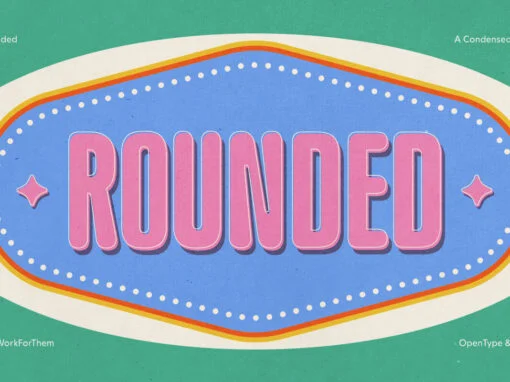
YWFT Rounded: Redefining Design Tradition with Modern Adaptability
Introducing the YWFT Rounded font, the graphic design paragon that hails from a rich lineage while integrating seamlessly into today’s hyper-digital landscape. This unique font marries the historical warmth and accessibility of the renowned VAG Rounded with a contemporary spin,
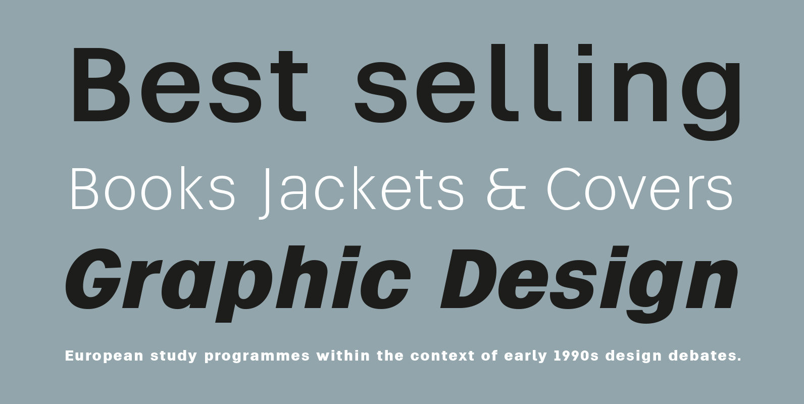
The Power and Significance of Corporate Fonts
Dive into the world of corporate fonts and their role in creating compelling brand identities. From their origins to notable examples, explore typography’s strategic potency.
Y2K Fonts Style in Modern Design: Reviving Nostalgia
Do you remember the vibrant and futuristic design styles of the late 1990s and early 2000s? If so, you may be familiar with Y2K fonts, which were widely popular during that era.
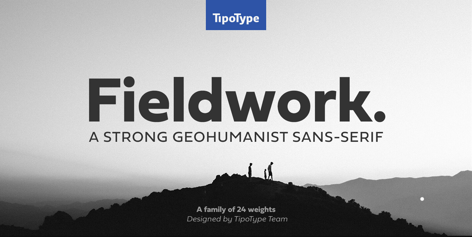
Fieldwork Font
Fieldwork brings back the manual tradition of typography production, veering away from lab interpolations. Each of its 24 variants was drawn based on optical evaluation; many of its curves and details were specifically adjusted for each weight, reformulating them to
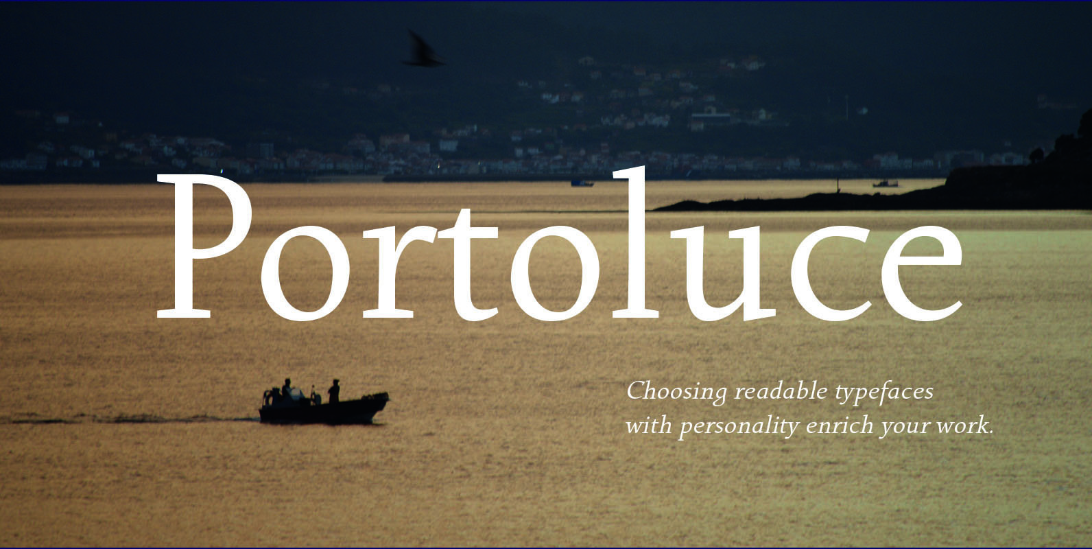
Portoluce Font
Portoluce is a Roman typeface. These fonts are delicate and highly readable at very small sizes but reveals all its strength and personality when used at big sizes. The contrast of the sharped serifs provides a fresh and very contemporary
Vikive Font
Vikive is a family of Sans Serif fonts, better known in its origins as “Gothic” in America or “Grotesque” in Europe. Some authors divide them into three categories: Grotesque, Geometric and Humanistic. Probably, it can be defined that Vikive has
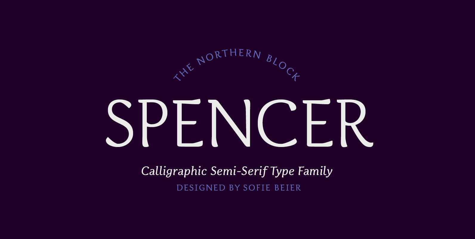
Spencer Font
Spencer is a calligraphic semi-serif type family that has been carefully designed to provide easily distinguishable letterforms that are practical in use, as well as aesthetically appealing. It's natural and organic forms comes from a deep consideration of the efficiency
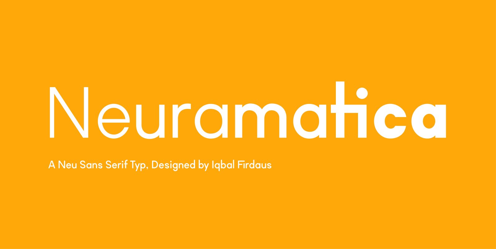
TG Neuramatica Font
TG Neuramatica is a sans serif font design published by Tegami Type Published by Tegami TypeDownload TG Neuramatica
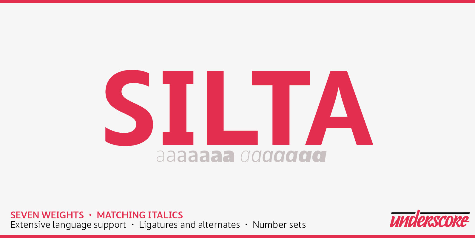
Silta Font
Silta is a humanist sans designed for interface typography and screen legibility. Sharp where it counts, flexible where you need it — and always a friendly tone. With seven weights and matching italics it has the range required for complex
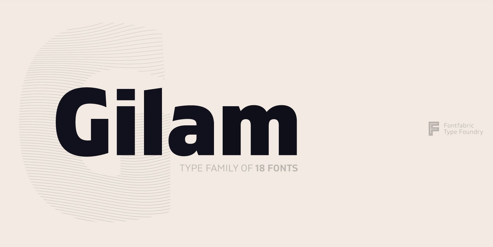
Gilam Font
Gilam is a sans serif font with semi-condensed proportions. The typeface was based on the famous DIN but combines its popular neo-grotesque look with characteristics, such as the pointed edges in the “W” and “M” as well as the outward cut terminals, which
Kurstiva Font
Kurstiva is a narrow, sans serif typeface family available in ten weights ranging from a hairline, thin weight to a dark, black style. Conceived as a contemporary text face, this typeface aims to convey a strong personality while remaining very
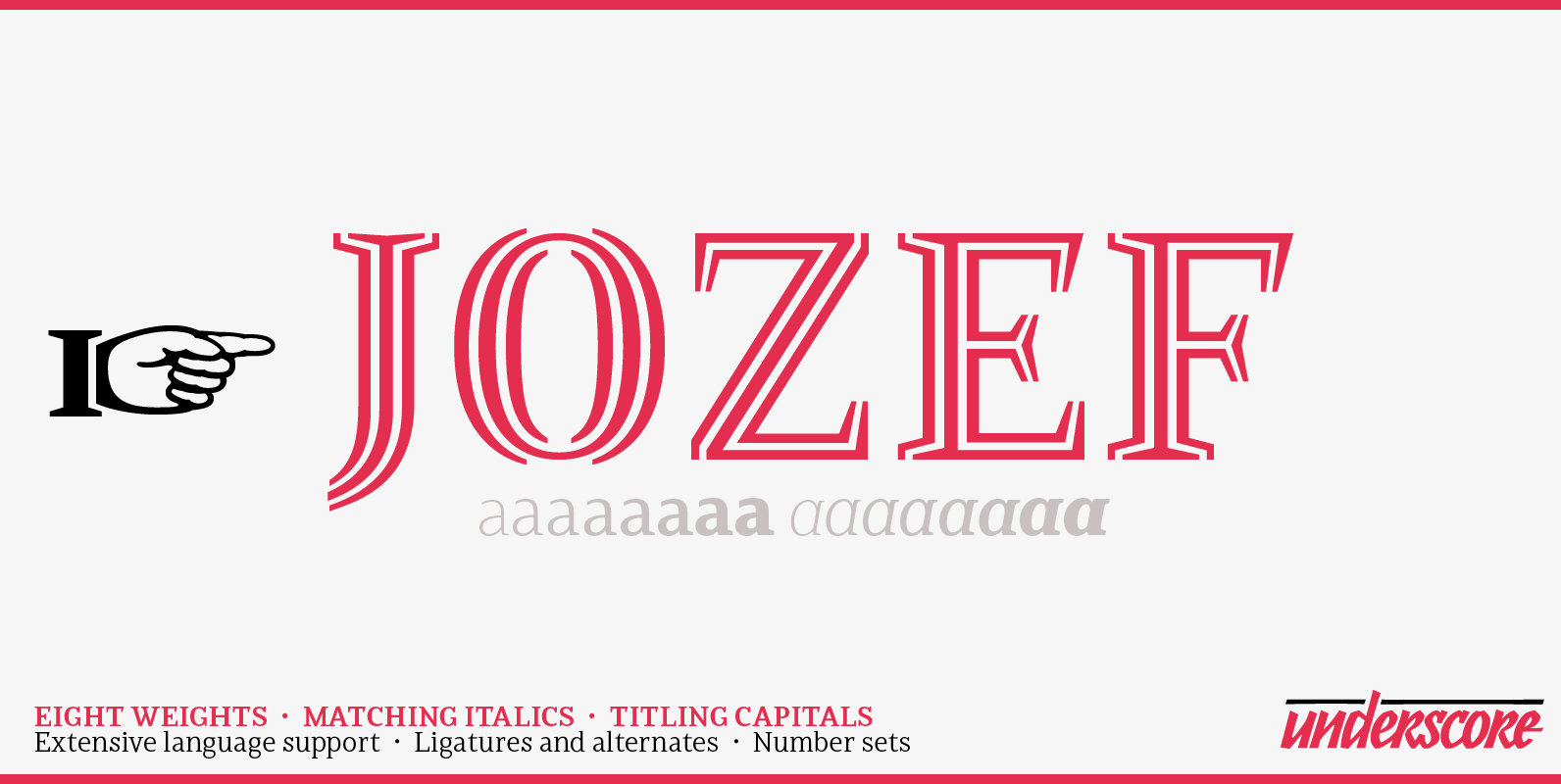
Jozef Font
Jozef is a serif typeface family with modern character and a firm voice. It is equally suited to setting text on screen and in print. With eight weights, matching italics, and decorative capitals it offers a plentiful typographic range, and
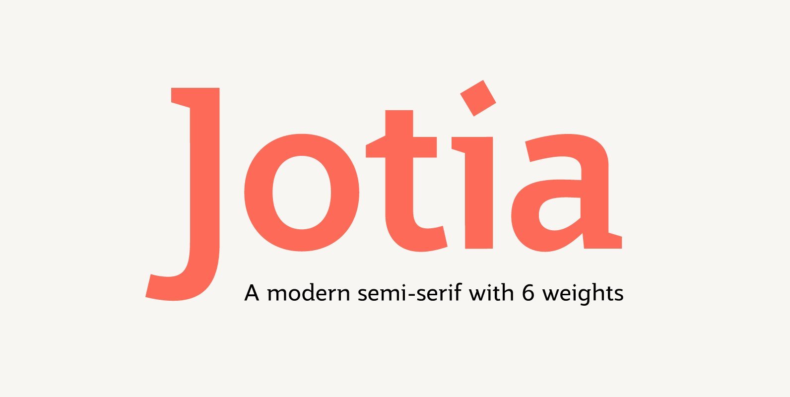
Jotia Font
Creating a combination between serif and sans serif typefaces, Jotia utilises the best of both worlds, resulting in a unique and modern neo-humanist font family. Taking its inspiration from lapidary inscriptions rather than pen drawn text, Jotia uses triangular serif
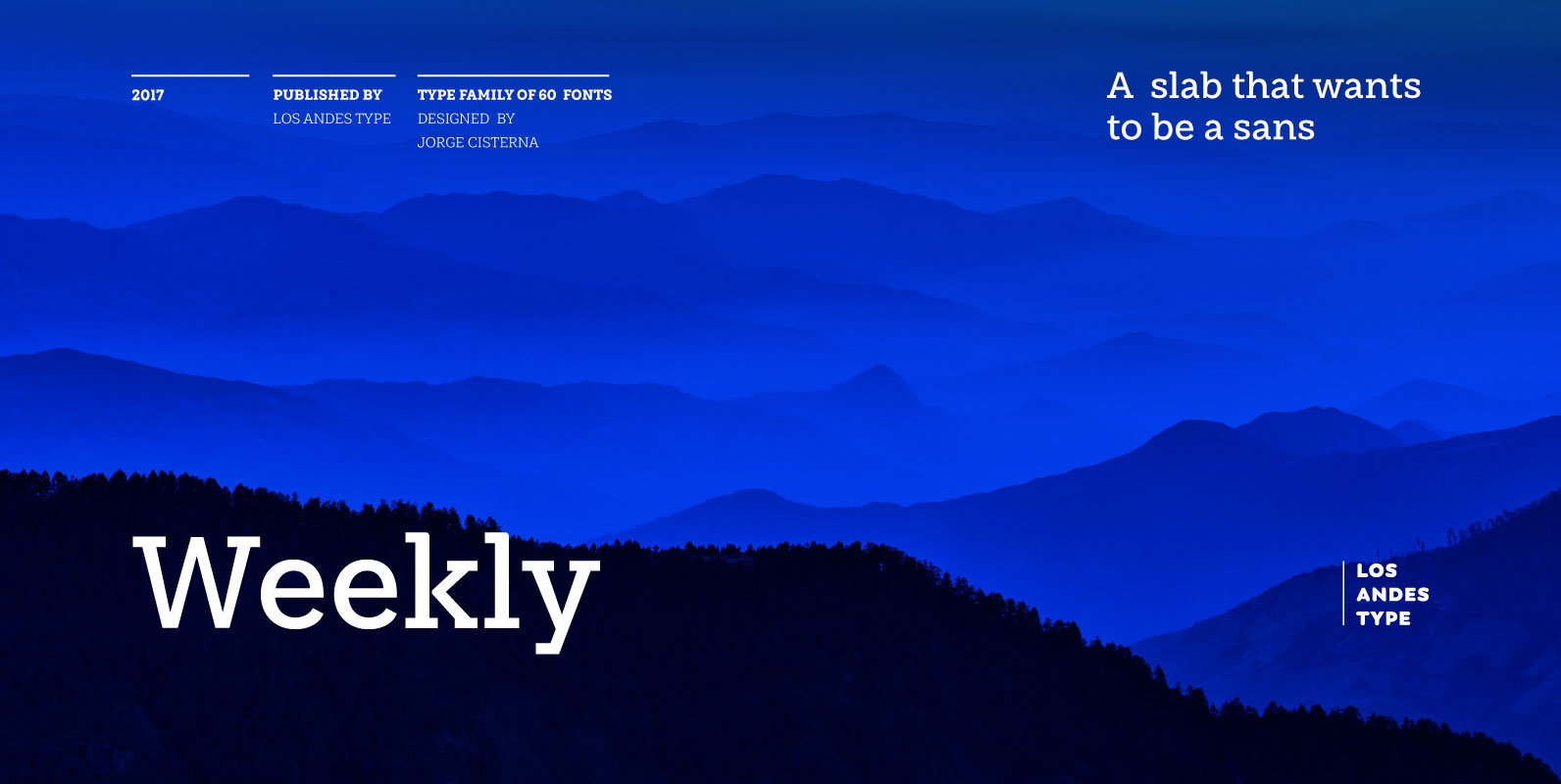
Weekly Font
Weekly: a slab serif that wants to be a sans. The font was created under the premise that it can be used as a sans: a fresh design without that retro feel typical of slab fonts. As a result, we
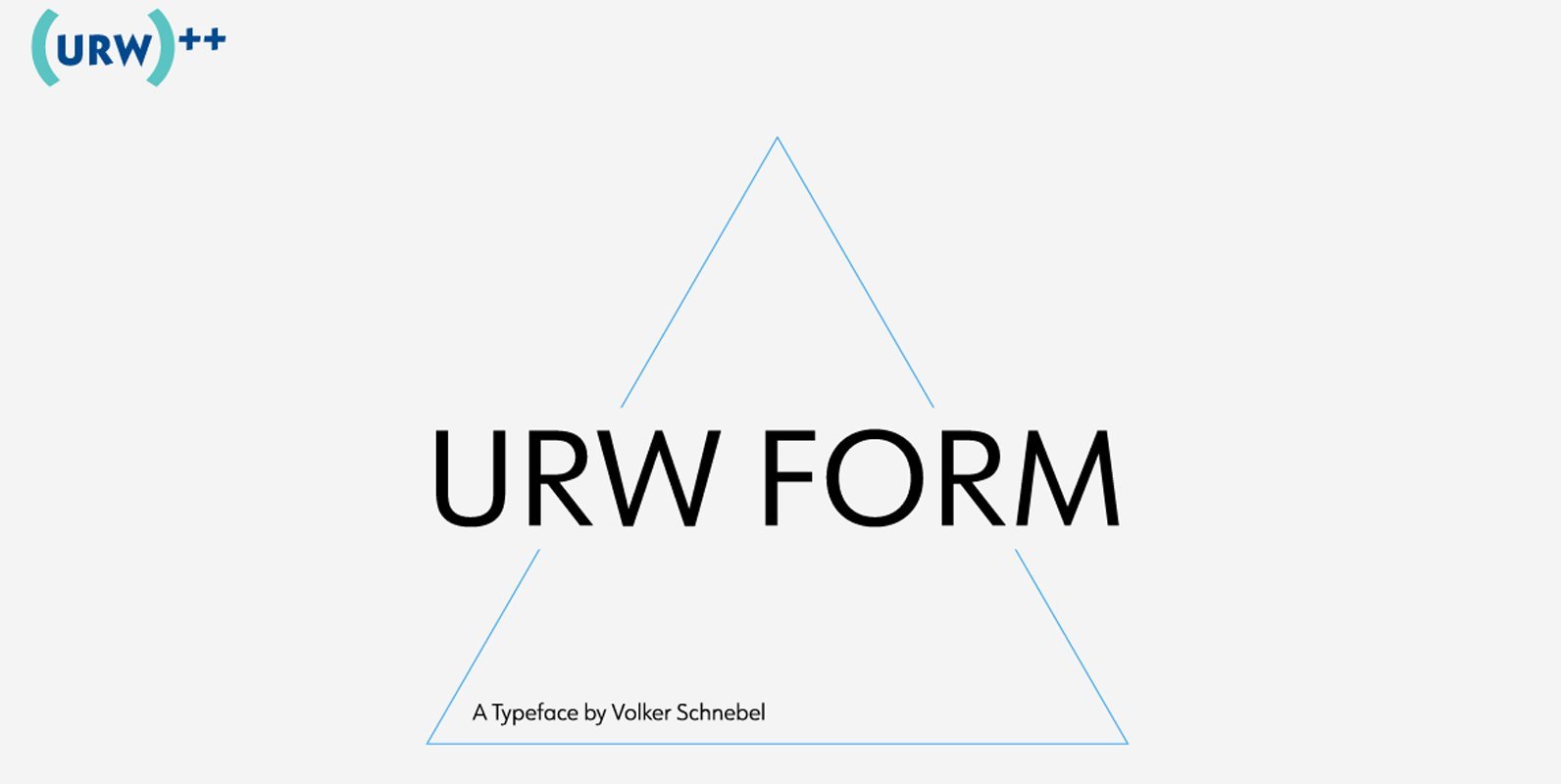
URW Form Font
URW Form by Volker Schnebel is the quintessence of a modern sans. Originally inspired by the timeless classic Futura, URW Form is a mix of classic and modern geometric typefaces, yet still incorporates the fundamental rules of design and looks
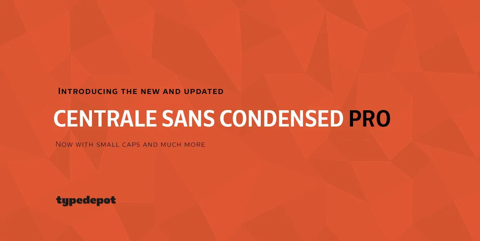
Centrale Sans Condensed Pro Font
Here comes the updated Pro version of Centrale Sans Condensed – not just a “squished” version of the normal Centrale Sans but designed from scratch with all the family characteristics in mind – combination of the grotesque and the humanist
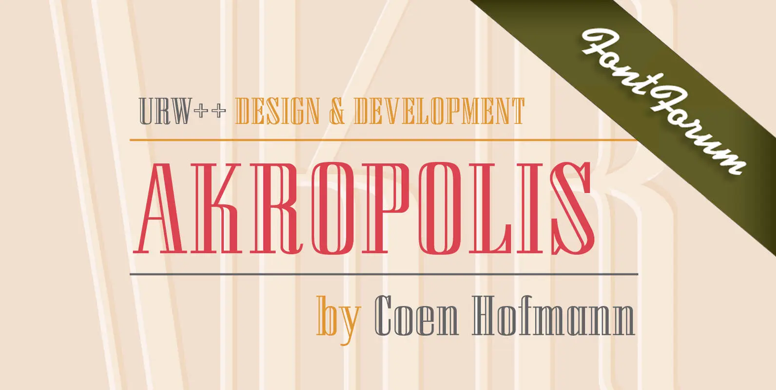
URW Akropolis Font
The design of this display face is based on the hot metal typeface Acropolis, issued by the German type foundry Ludwig Wagner in Leipzig in 1940. To further increase its usefulness a Cyrillic was added to it: URW Akropolis, redrawn
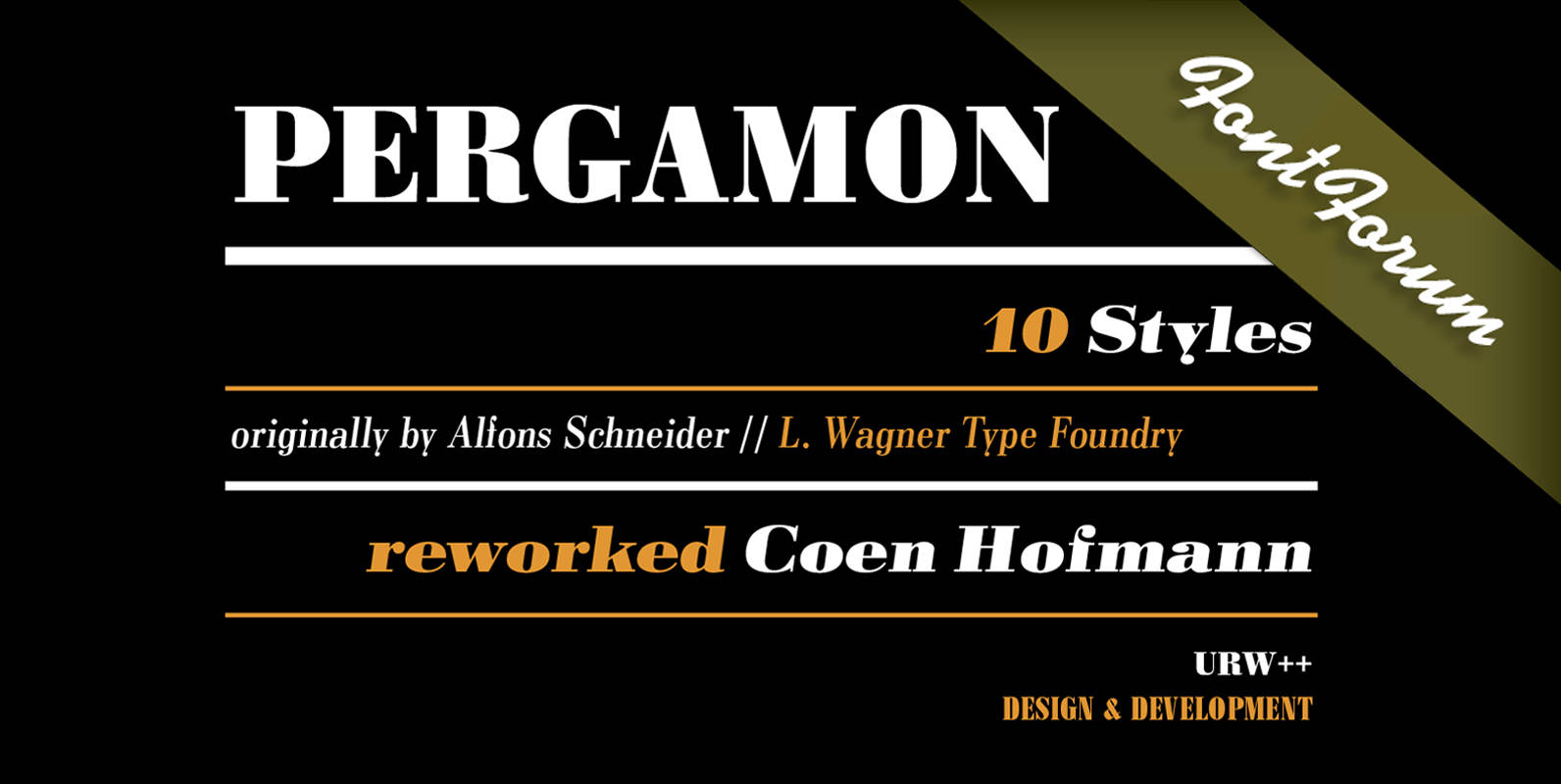
Pergamon Font
The Pergamon series is a creation of Alfons Schneider (1890–1946) and was issued by the foundry of Ludwig Wagner in Leipzig in 1937/1940, though the website of the Klingspor-Museum says that several of the faces were probably produced after the