Tag: Din
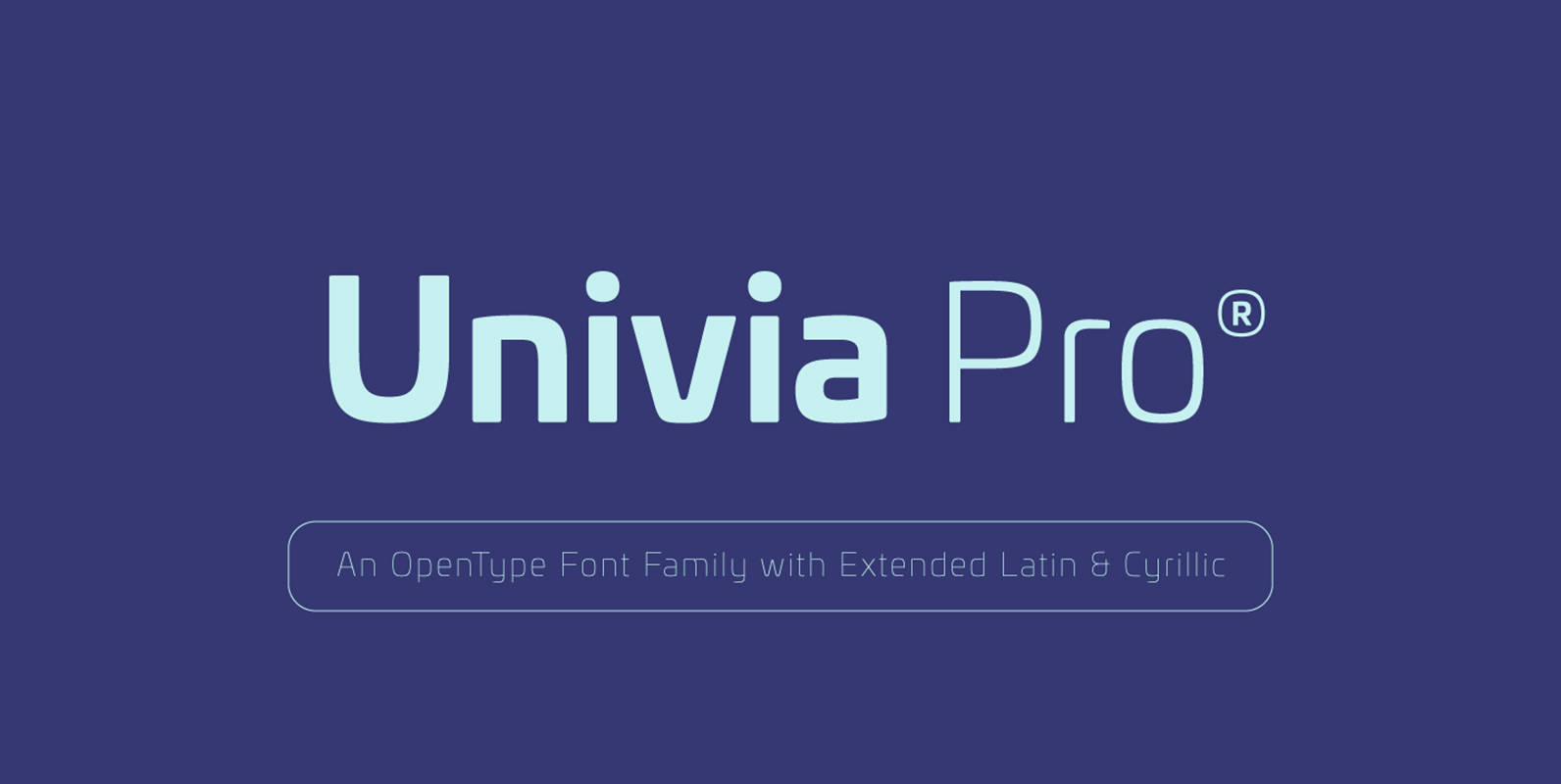
Univia Pro Font
Univia Pro is a new contemporary OpenType font family with modernity and versatility in mind. Distinctive with its pleasant look extremely modern, Univia Pro have a lot of personalty mostly achieved by smooth curves and round corners that forms a
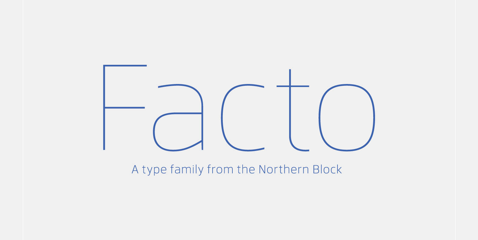
Facto Font
A simple, mechanical typeface without distractions. Slightly condensed curves are developed from a compact grid layout to produce a crisp, fresh and legible type family. The unadorned letterforms work perfectly with complex information-based applications such as user interfaces, mobile devices
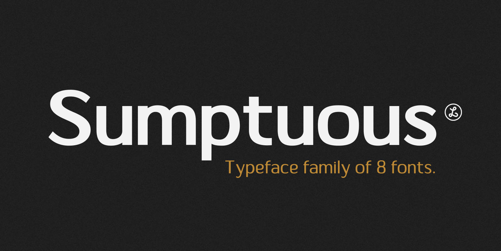
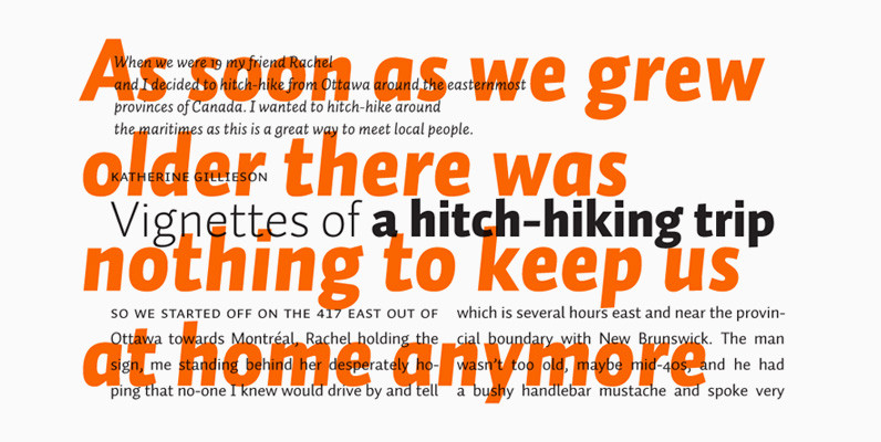
Sumptuous Font
Sumptuous is a sans-serif family combining the geometric and the humanist models. presented by Locomotype. Suitable for magazine, paragraph, headline, body text and logo design. Complete family make your job is so easy to mix and match your designs to
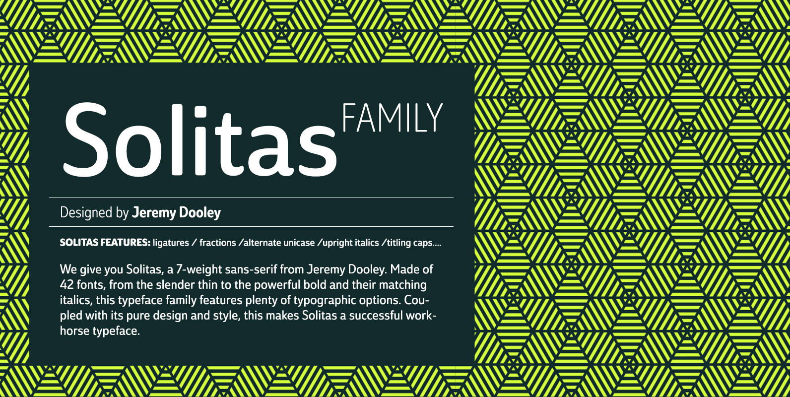
Solitas Font
We give you Solitas, a 7-weight sans-serif from Jeremy Dooley. Made of 42 fonts, from the slender thin to the powerful bold and their matching italics, this typeface family features typographic options including ligatures, fractions, alternate unicase, upright italics, and
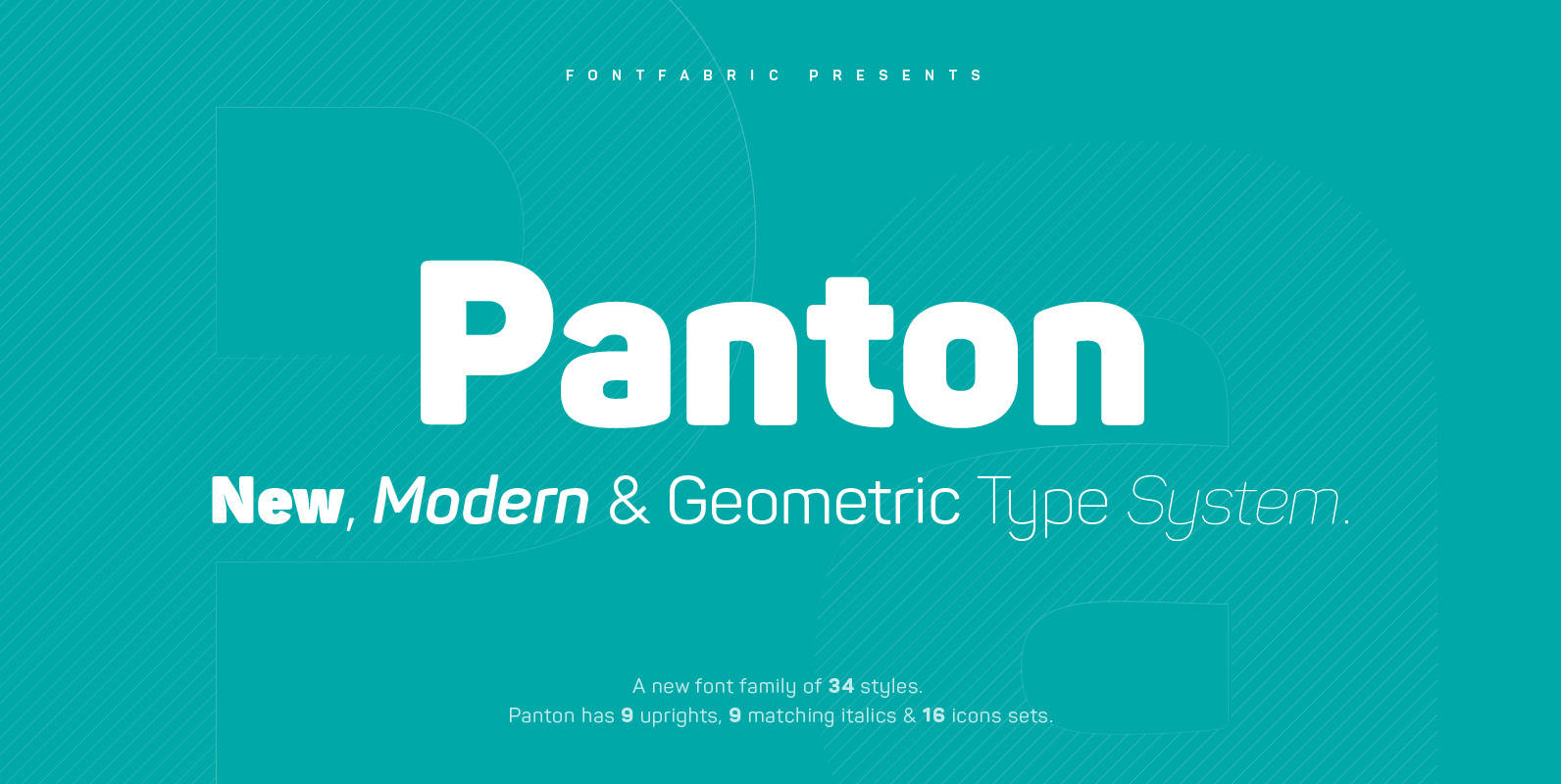
Panton Font
Panton has been expanded with Panton Narrow! It has 9 uprights and 9 matching italics ranging from Thin to Heavy. NEW! Update 3.0 What’s New: • New Narrow version of 18 weights • Bulgarian Localization Support • Tabular Figures •
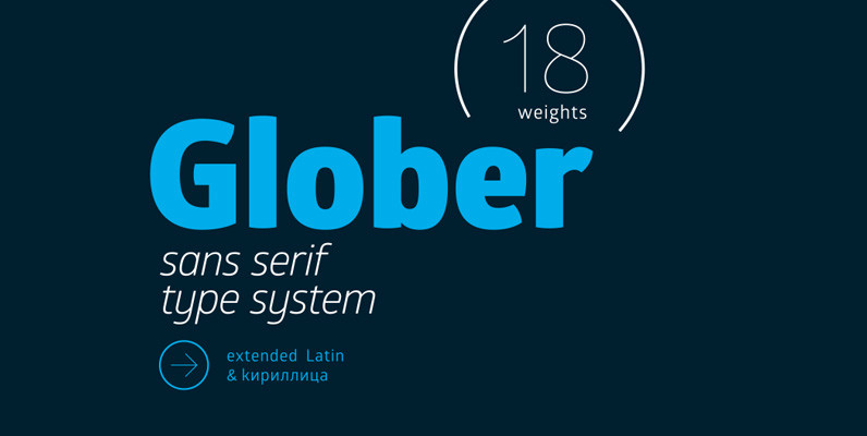
Glober Font
The Glober font family includes 18 weights – nine uprights with nine italics. It is characterized by excellent legibility in both – web & print design areas, well-finished geometric designs, optimized kerning, excellent web-font performance and legibility etc. Inspired by
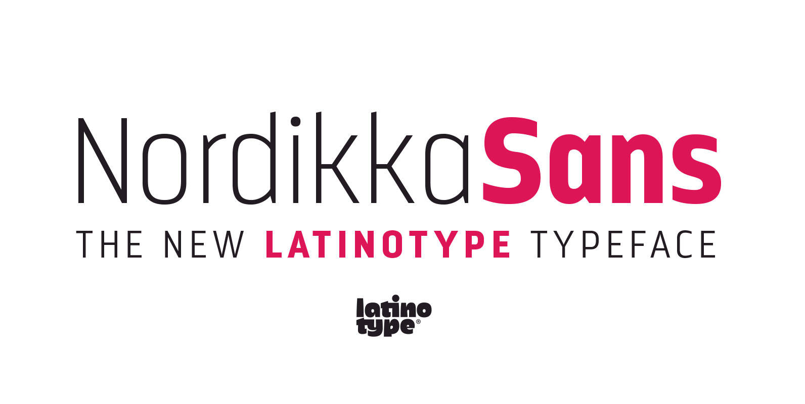
Nordikka Font
Nordikka is a 10-style sans-serif simple pure typeface designed by Luciano Vergara. Nordikka is a condensed font with a large x-height and straight terminals well-suited for headlines and short texts. A good option for clean and visually appealing designs. Nordikka

Webnar Font
Webnar is a modern geometric sans serif font family of 7 weights, including italics, created with information and technology in mind. It is a functional, versatile and highly legible typeface designed to perform well in print and on screen. Webnar
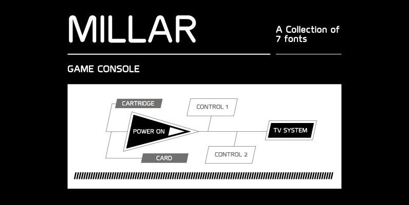
Millar Font
An elegant monoline typeface with smooth corner detailing. The simple linear design is best suited to identity, editorial and on screen uses. Details include 7 weights, a complete character set, manually edited kerning and Euro symbol. Published by The Northern
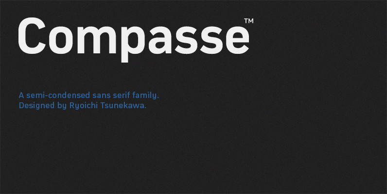
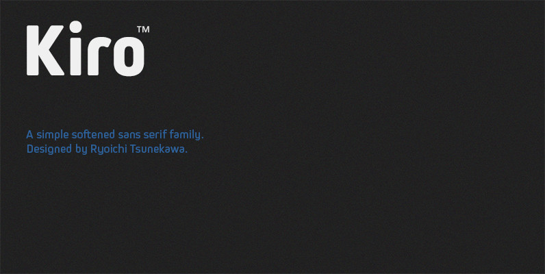
Compasse Font
Compasse is a semi-condensed sans-serif family designed by Ryoichi Tsunekawa and the whole family consists of 12 style: six weights from Thin to ExtraBold and their matching Italics. The range of styles provides flexibility for title, headline and body text.

Estandar Rounded Font
Estandar Rounded is a retro and vintage wayfinding sans serif font, inspired by old signal in central park and Europe. Is a Condensed sans with their tall x-height, the family has 6 Weight, its italics and a dingbat. It is
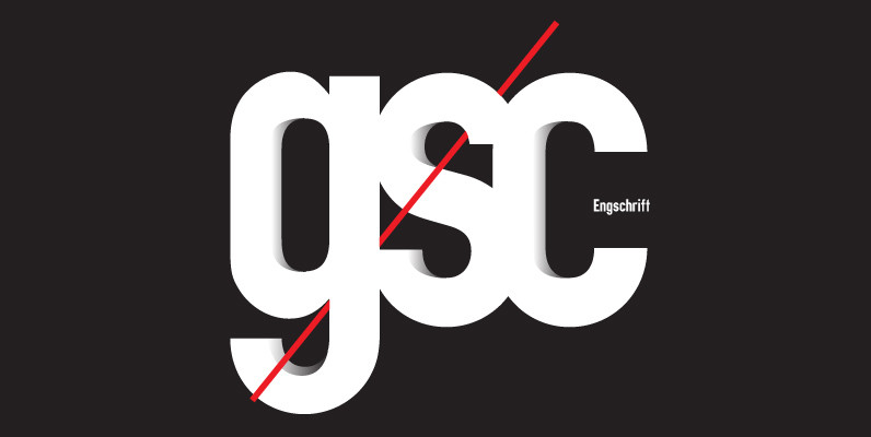
Engschrift Font
Designed by various designers for signage use, Engschrift is a sans-serif font release by URW. Contains language support for West, East, Turkish, Baltic, and Romanian. Published by URW Type Foundry GmbHDownload Engschrift
PF Handbook Pro Font
This typeface is the result of an attempt to modernize DIN, by introducing round smooth corners and distinct design elements to several characters like ‘a, g, k, m’, without compromising legibility. In order to retain its sharpness, inner corners as
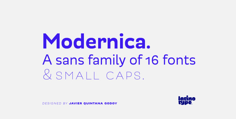
Modernica Font
Modernica is an excellent tool that provides a large range of possibilities in design work. It is a sans serif font that contains eight weights plus matching italics. All Modernica typefaces include a set of small caps, ligatures, contextual alternates,