Tag: Din
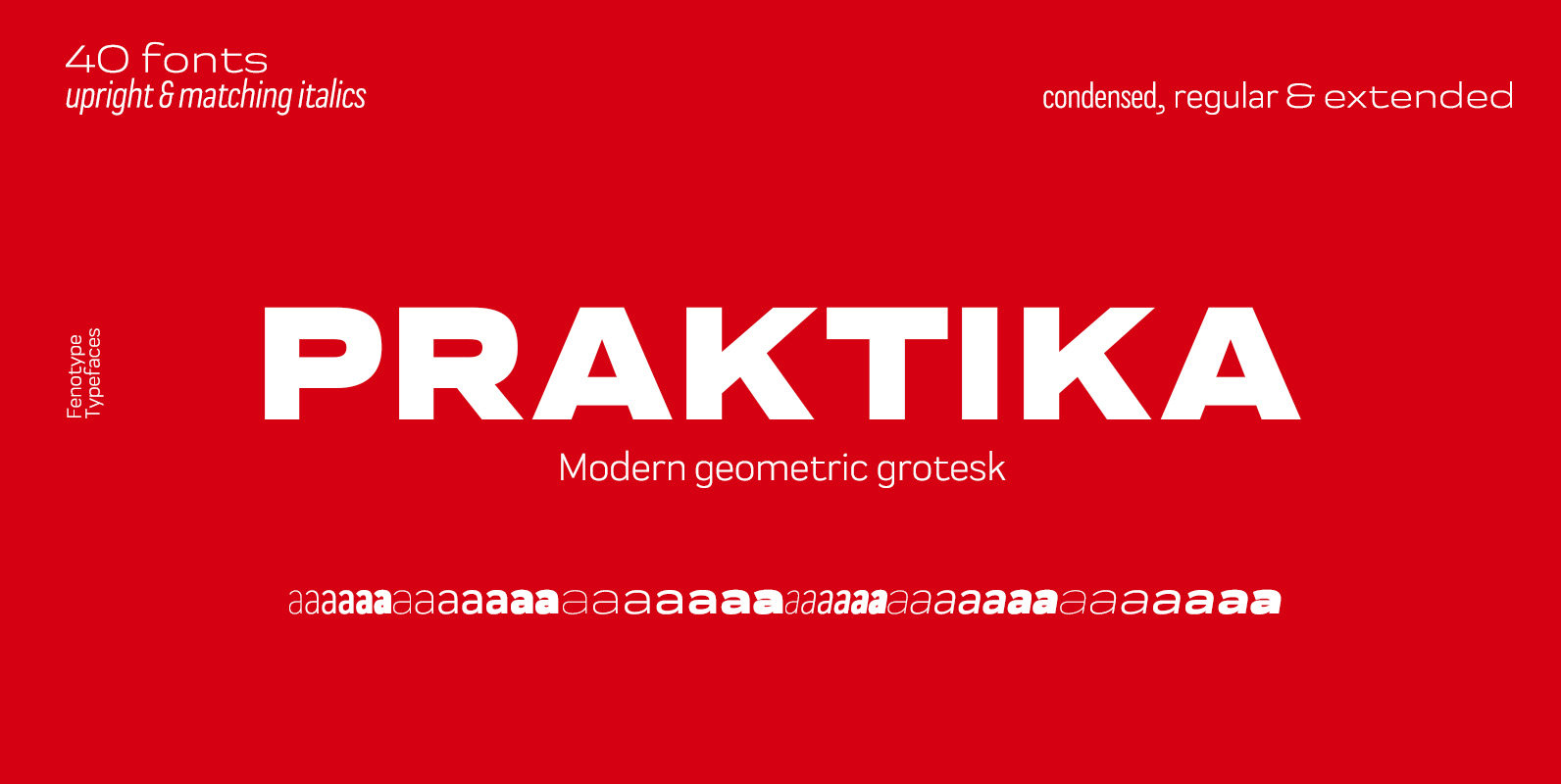
Praktika Font
Praktika is a multifunctional super family of 40 fonts. It consists of three distinct widths and weights from extra light to extra bold. Conceptually, it is a rendition of the familiar early 20th century European grotesque styles, used in road
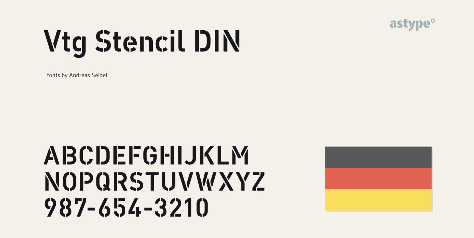
Vtg Stencil DIN Font
The Vtg Stencil DIN fonts were developed to made the most common stencil type of Germany available in digital type. Vtg Stencil DIN comes in many styles – Regular, Alt, Fabric, Halftone and Rough. The Alt style features older designs
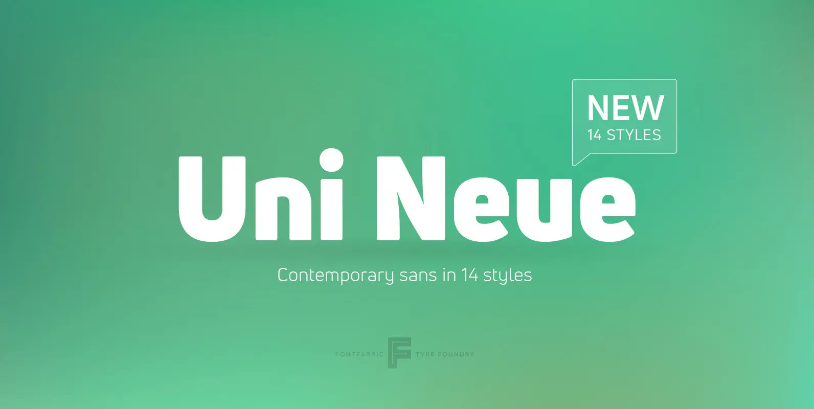
Uni Neue Font
Uni Neue is the whole new redesigned version (remake) of Uni Sans – one the most recognizable and signature font families of Fontfabric type foundry. From major changes like proportions, widths and thickness (weights) to the smaller details, this new

URW DIN Font
The digital outline fonts, DIN 1451 Fette Engschrift and Fette Mittelschrift were created by URW in 1984 and are the basis for all DIN font families. Both typefaces were designed for the URW SIGNUS system and were mainly used for
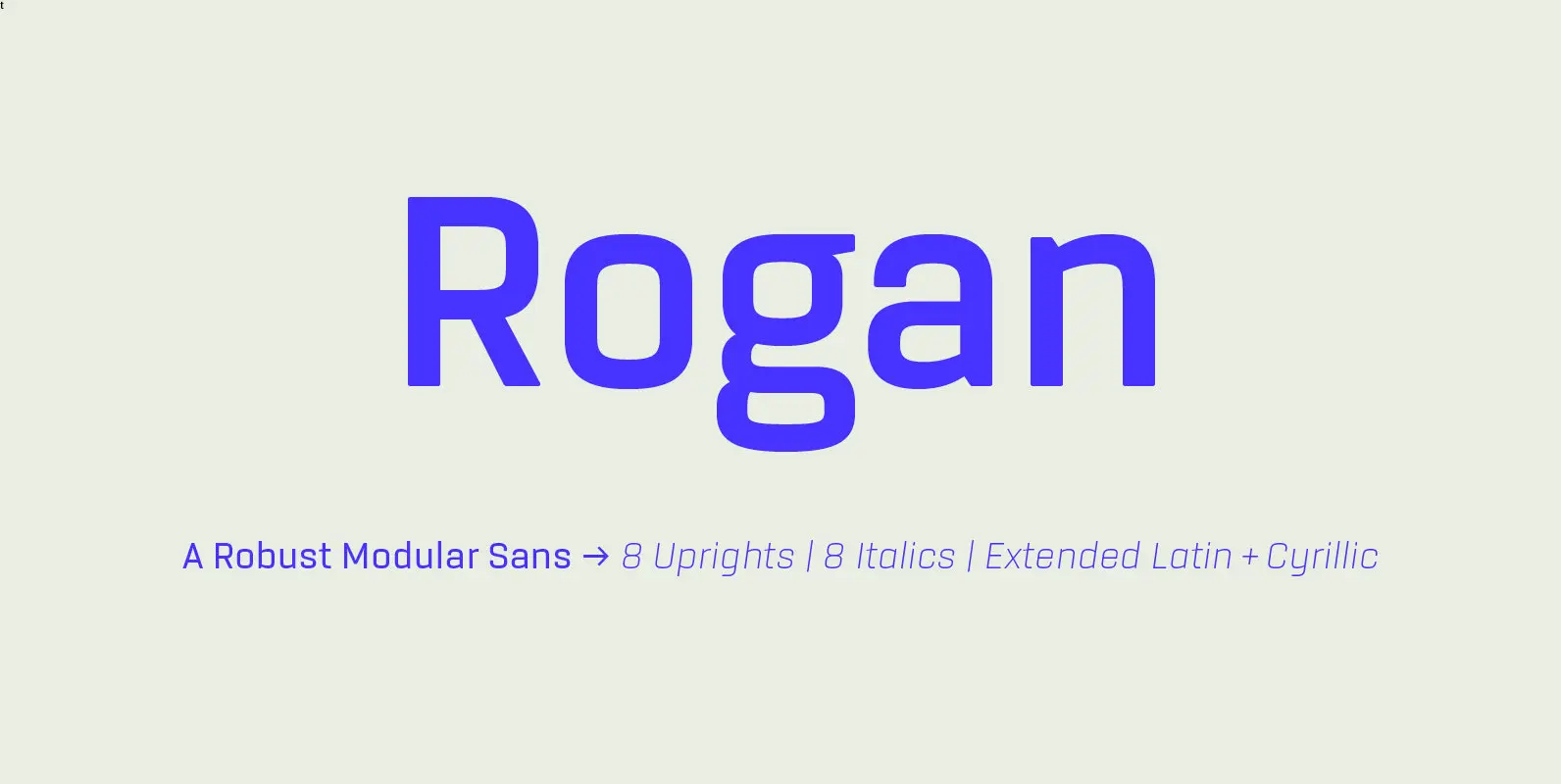
Rogan Font
Rogan: A Robust Modular Sans. Rogans clean lines started out as an exercise in modularity and geometric forms. This initial construction approach was then adapted to improve the functionality of the family; Breaking away from the strictly modular system in
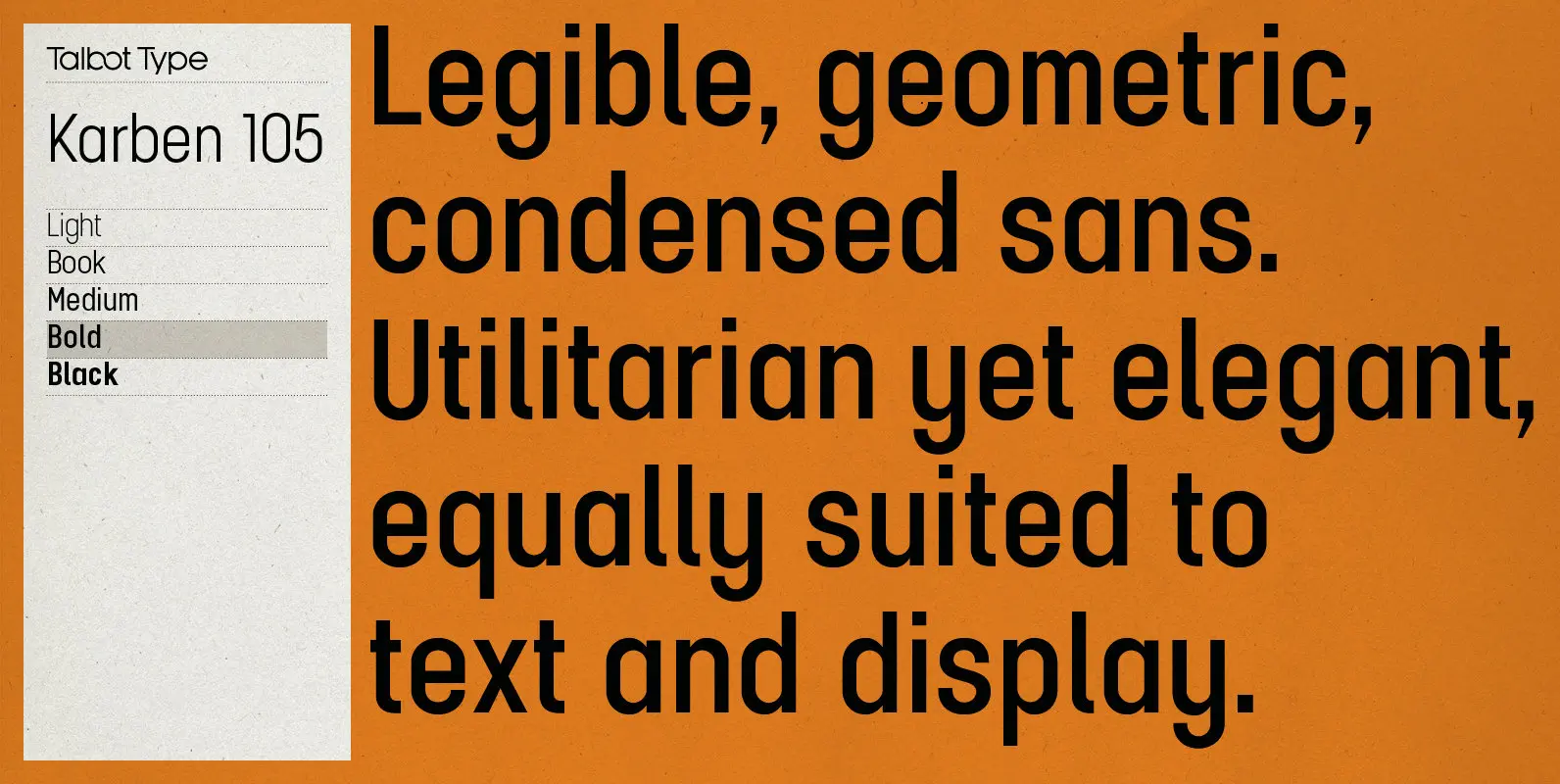
Karben 105 Font
Karben 105 is inspired by the classic, no nonsense DIN, and has a form that follows its highly legible function. Based on a lozenge, it has a clean and pure geometry with even stroke weights. Karben 105 is available in
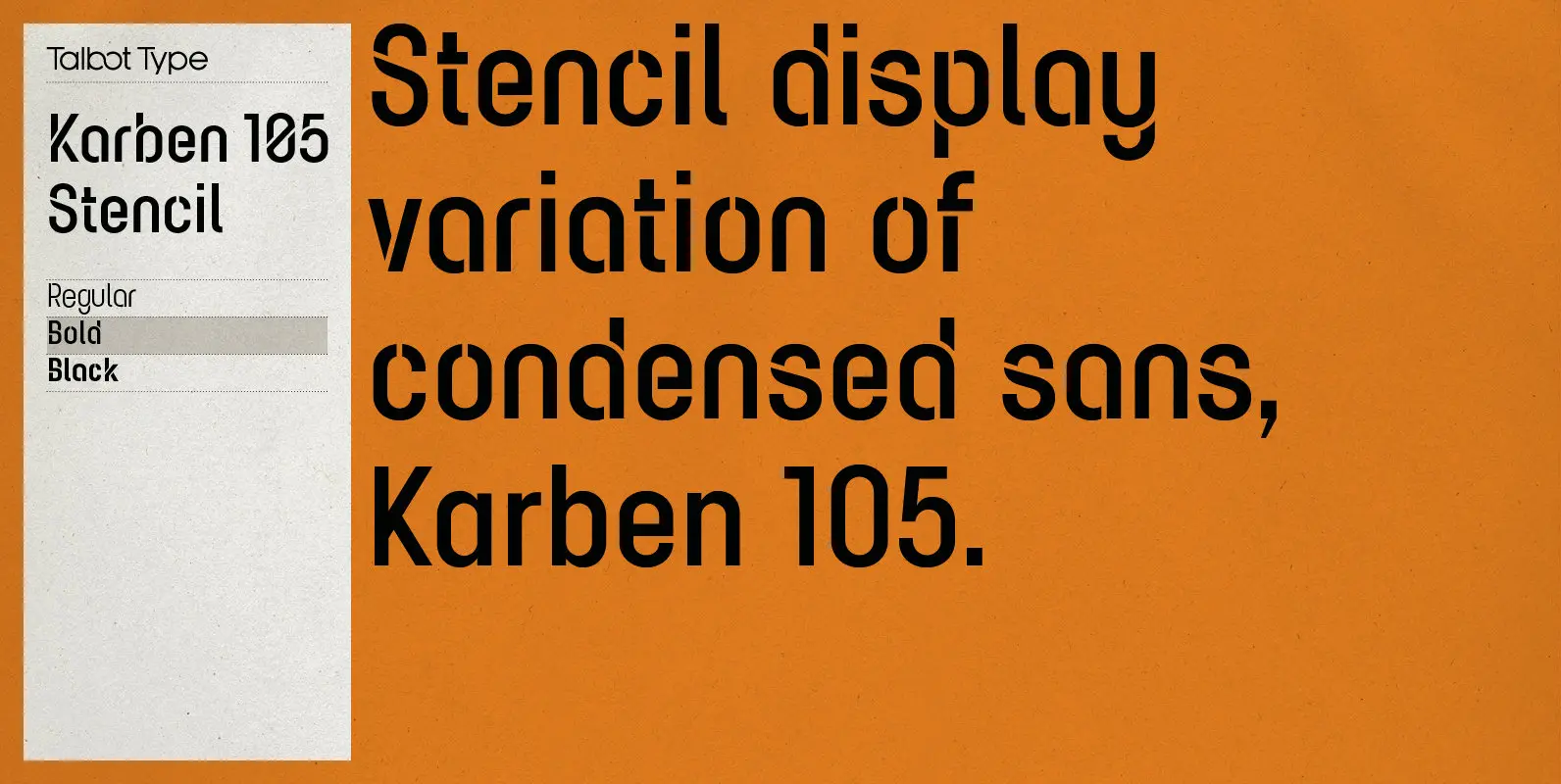
Karben 105 Stencil Font
Karben 105 Stencil is a contemporary stencil font. The stencil breaks in the letters are applied in a way that is sensitive to the forms of the character in pursuit of a more elegant stencil. Karben 105 Stencil is available
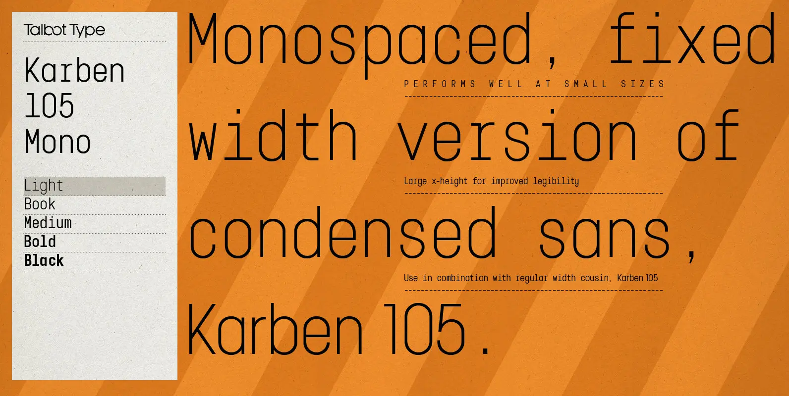
Karben 105 Mono Font
Karben 105 Mono is a monospaced variation of Karben 105. The clean and pure geometry of Karben 105 makes it highly suitable for adaptation to this monospaced variant. It has an even look and retains its legibility at very small
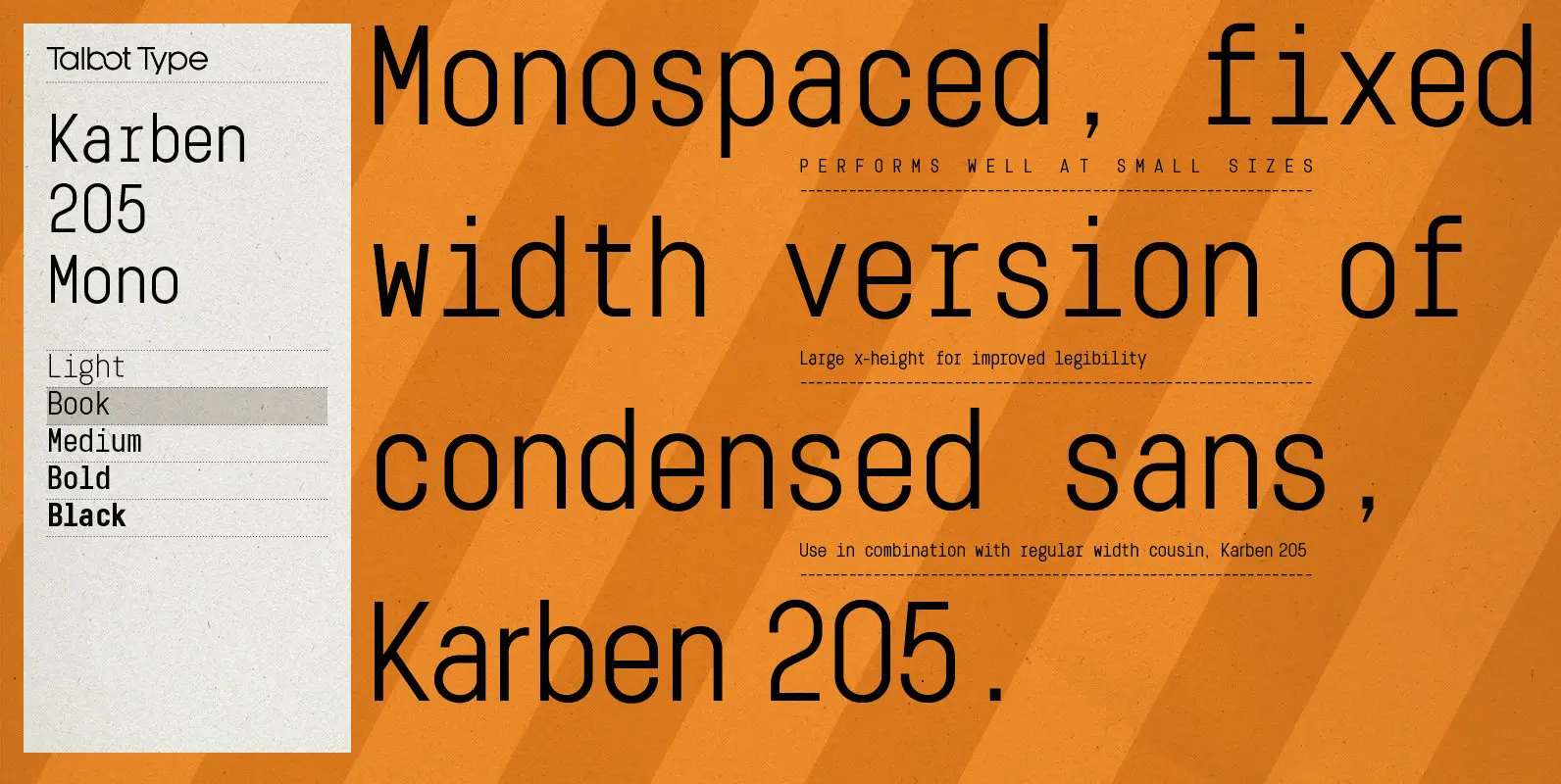
Karben 205 Mono Font
Karben 205 Mono is a monospaced variation of Karben 205. The clean and pure geometry of Karben 105 makes it highly suitable for adaptation to this monospaced variant. It has an even look and retains its legibility at very small
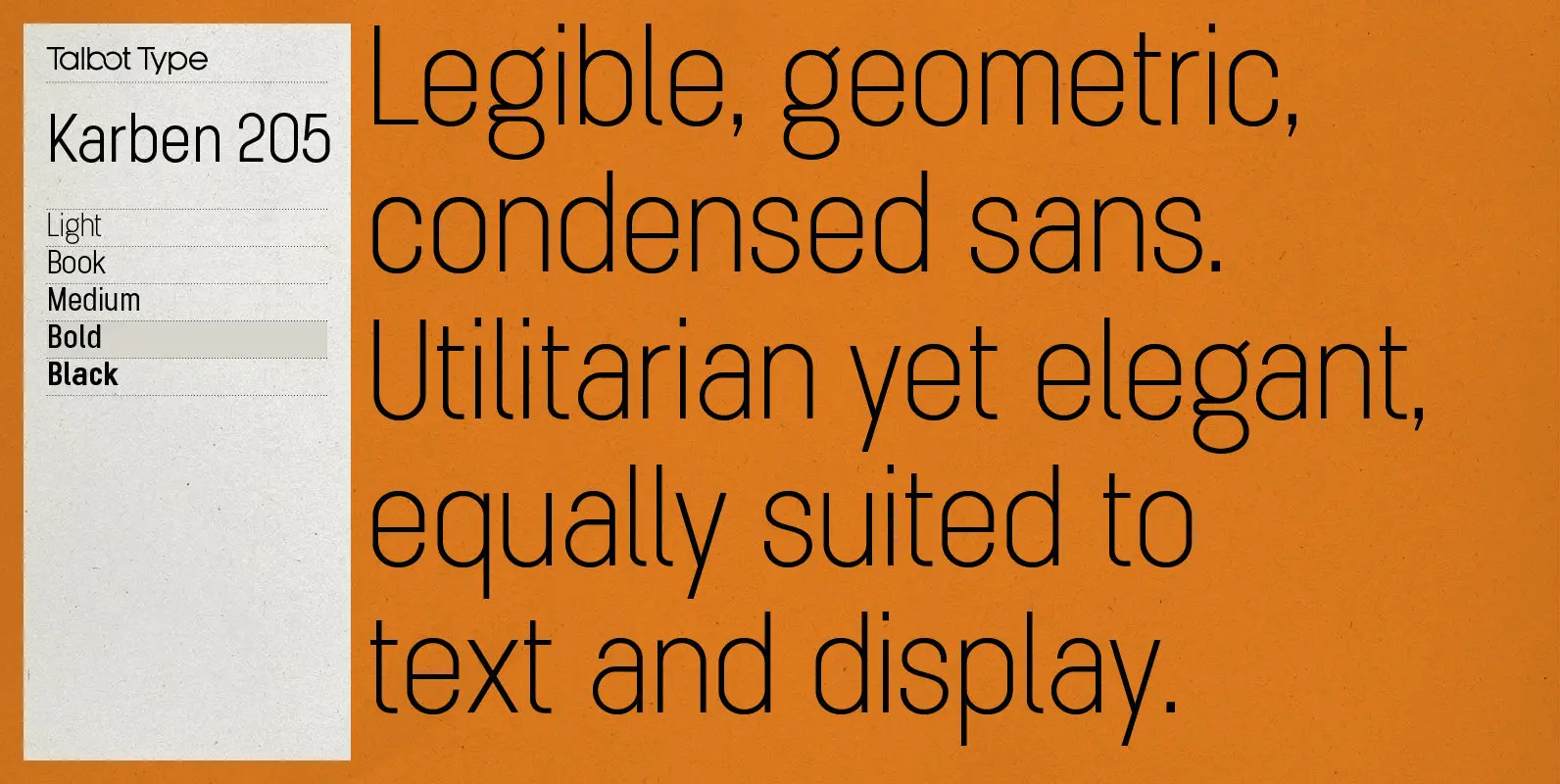
Karben 205 Font
Karben 205 is inspired by the classic, no nonsense DIN, and has a form that follows its highly legible function. Based on a lozenge, it has a clean and pure geometry with even stroke weights. Karben 205 is available in
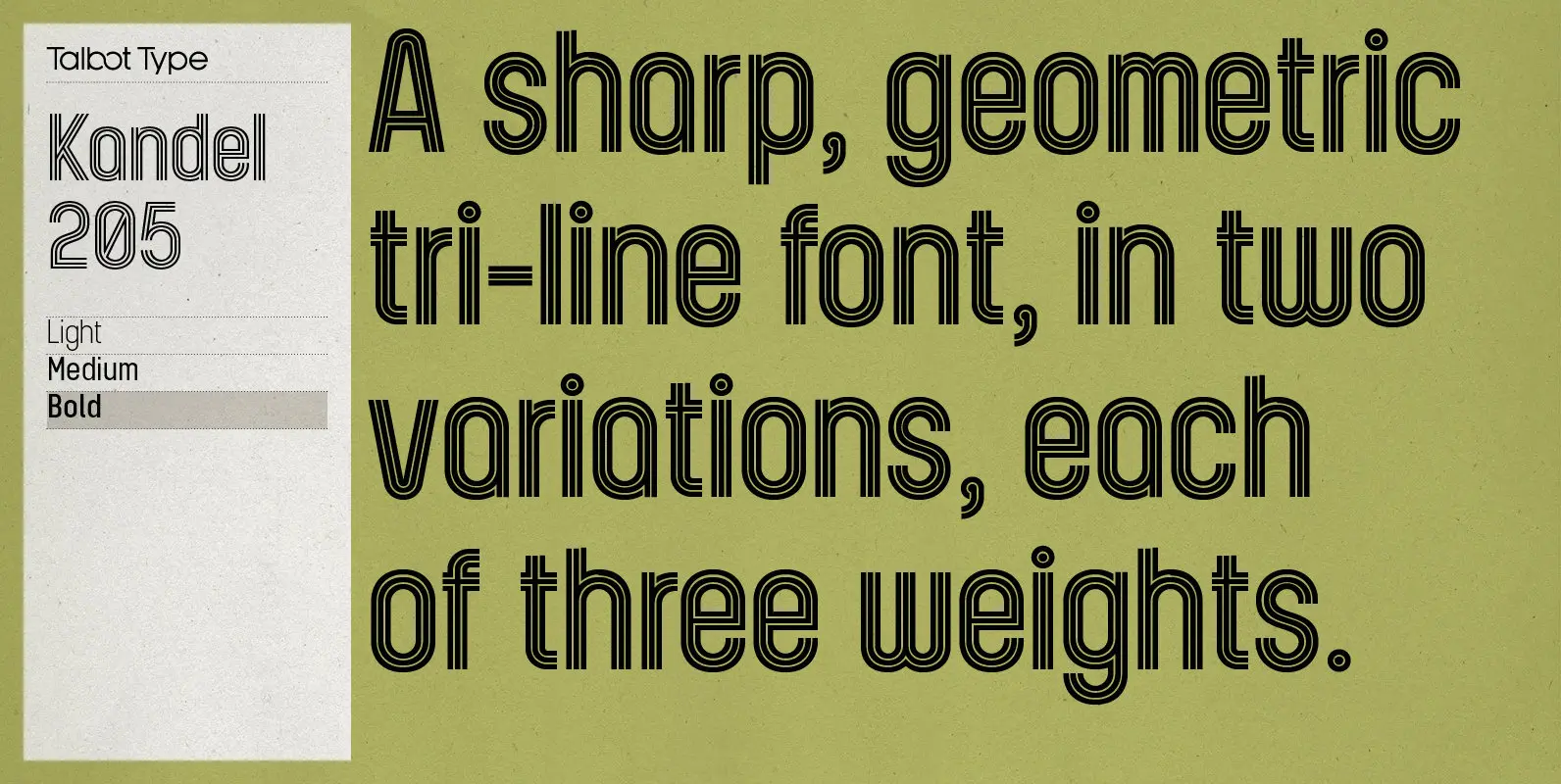
Kandel 205 Font
Kandel 205 is a geometric, tri-line, display and headline font available in a family of three weights. Its bold, graphic styling gives it great stand-out qualities and a highly individual look. It’s particularly well suited to bringing energy to designs,
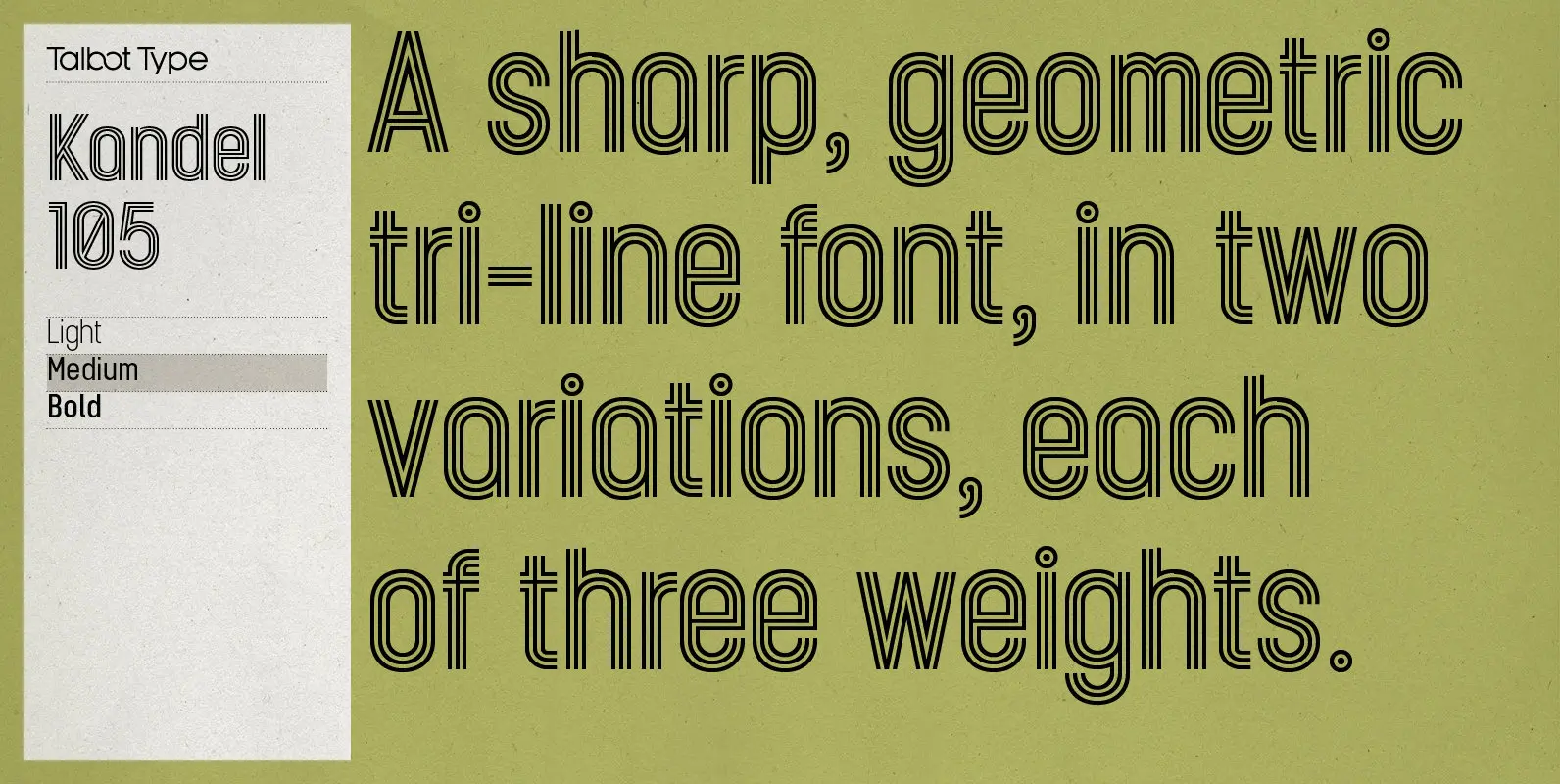
Kandel 105 Font
Kandel 105 is a geometric, tri-line, display and headline font available in a family of three weights. Its bold, graphic styling gives it great stand-out qualities and a highly individual look. It’s particularly well suited to bringing energy to designs,

CA Geheimagent Font
CA Geheimagent is perfect for setting text about restrictions, or permissions if you prefer. Not quite a text font, not quite a headline font, it’s a bit of both. The Italic style break up the strictness of the regular fonts.
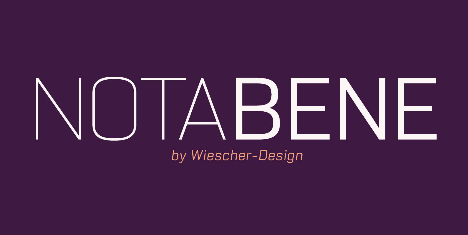
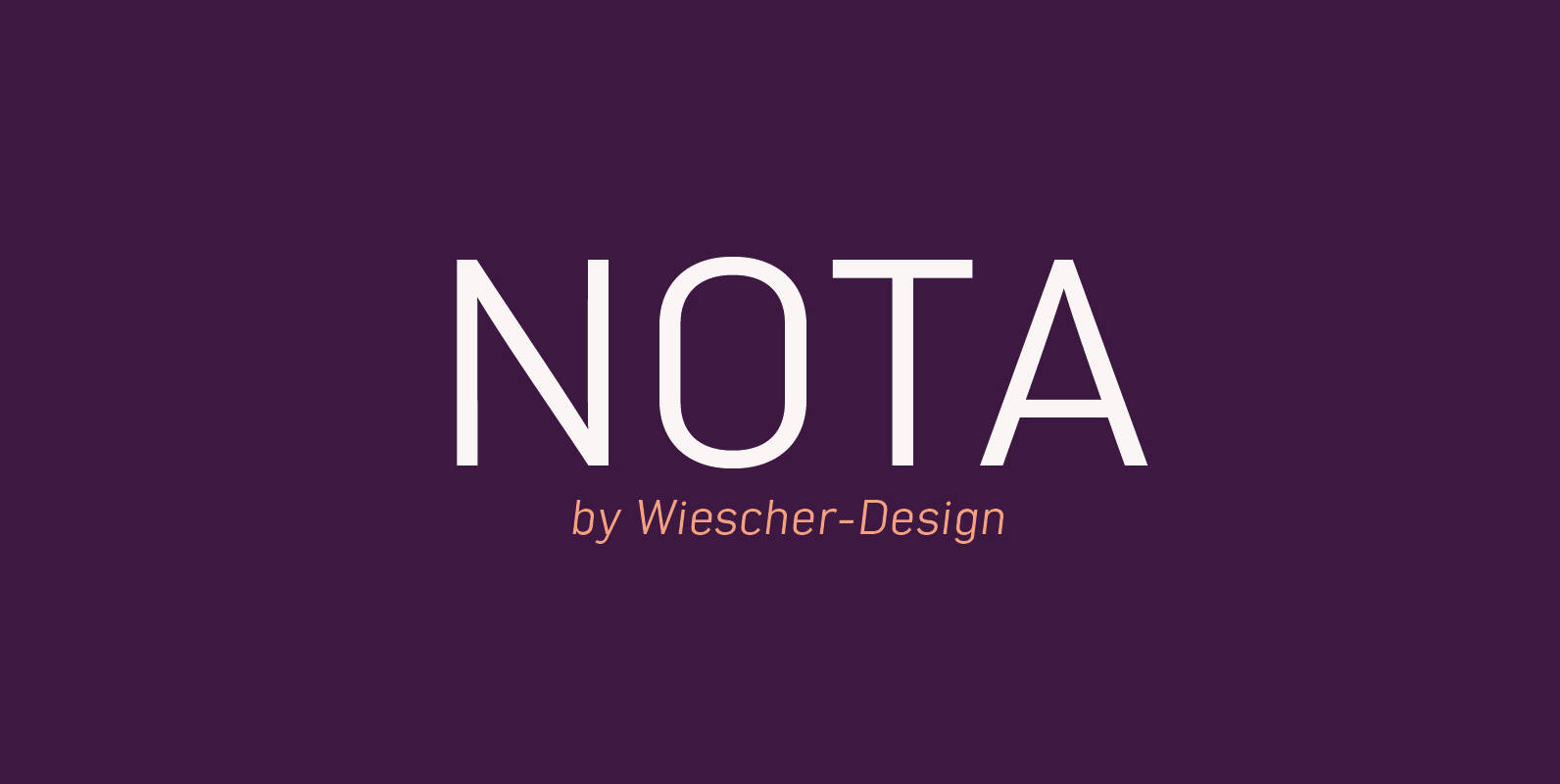
NotaBene Font
“NOTABENE” is a new, squarish, narrow, technical font– designed by Gert Wiescher in 2015 – has 7 weights with corresponding oblique cuts. “NOTABENE” is well suited for advertising, logo, billboards, small text, signage, branding, packaging, editorial, posters, web and screen
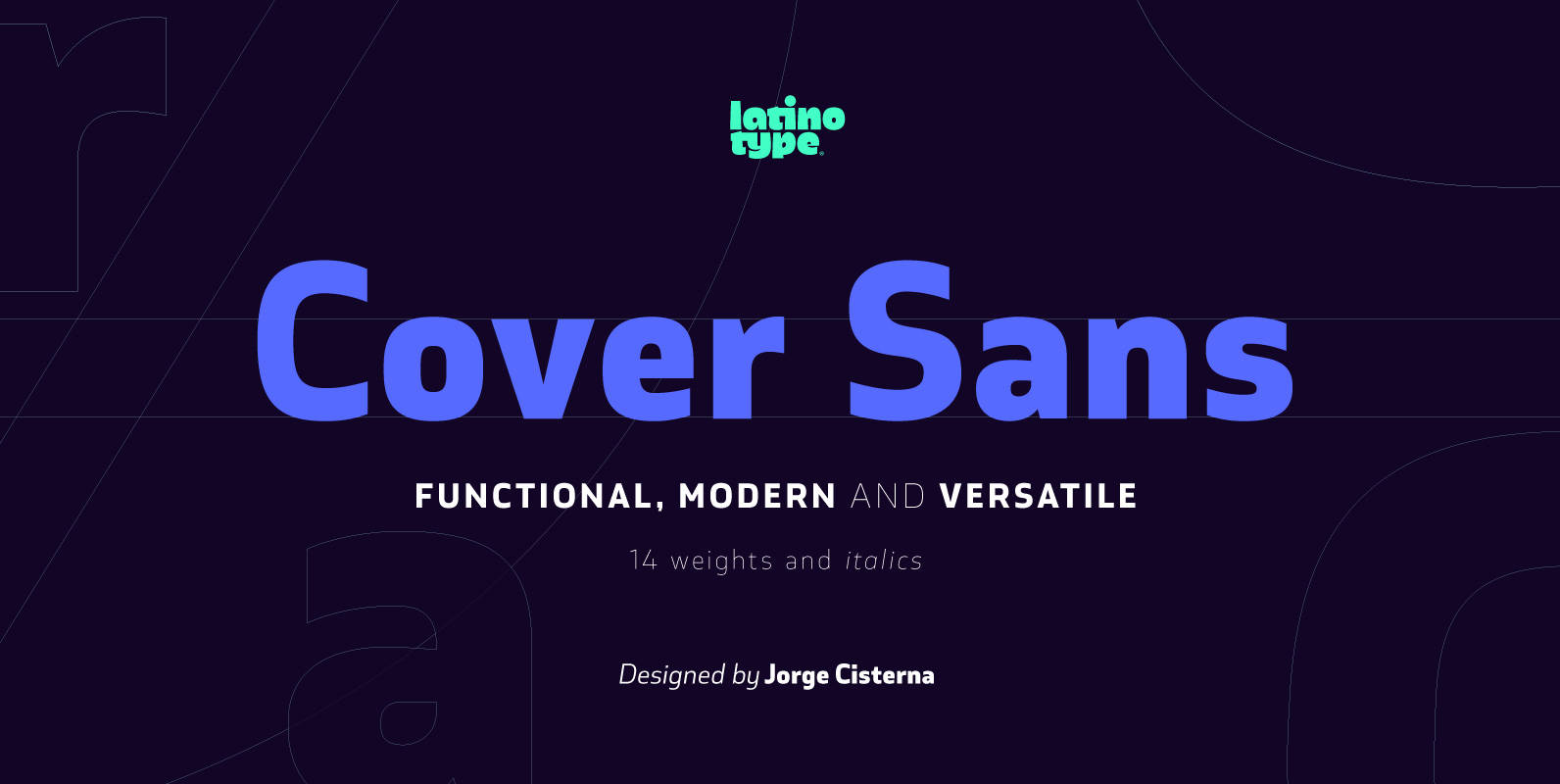
Cover Sans Font
Cover Sans is a humanist geometric typeface with an orthogonal structure, which provides stability when composing a text. Open shapes and low x-height give this font balance and make it an air-breathing typeface. Cover Sans is a stable and strong
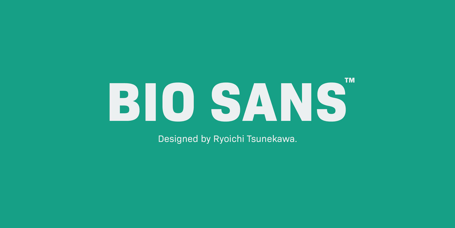
Bio Sans Font
Bio Sans is a super neutral sans-serif family for text designed by Ryoichi Tsunekawa and the whole family consists of 6 weights from ExtraLight to ExtraBold and their matching Italics. The basic concept of this family is the same as
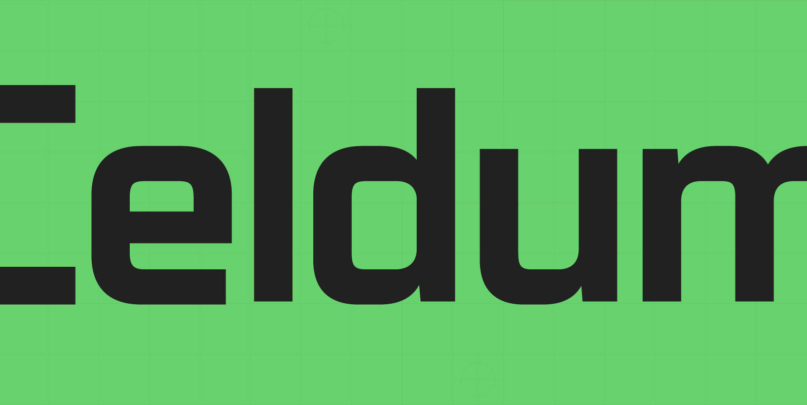
Celdum Font
Celdum, a modern geometric type family, constructed from a rectangular grid. Smooth, precise curves meet horizontal and vertical lines to create a monoline design with no apparent contrast. Each letter shape has unique subtleties creating a purposeful type family suited