Tag: Din
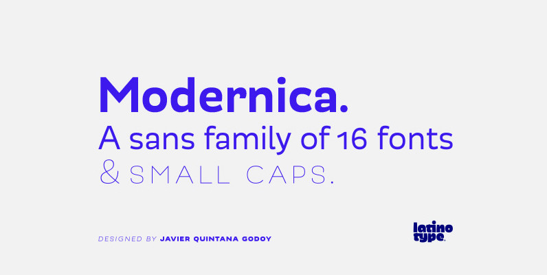
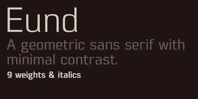
Modernica Font
Modernica is an excellent tool that provides a large range of possibilities in design work. It is a sans serif font that contains eight weights plus matching italics. All Modernica typefaces include a set of small caps, ligatures, contextual alternates,

Lintel Font
A modern san serif typeface with a pure clean line form. The idea has been to design a font with a proportioned and balanced structure that is applicable to a wide variety of uses. Details include 6 weights with italics,
PF DIN Text Condensed Pro Font
The DIN Text series was based on the original standards but was completely redesigned to fit typographic requirements. Completed in 2002, it was first released in 2003 and published in our catalog, as a group of 4 separate families each
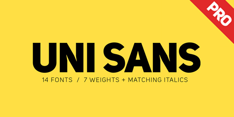
Uni Sans Font
Looking for a type that will work in blocks of text for callouts, captions and headlines? Well, find that unique balance by using Uni Sans – a custom sans font which is applicable for any type of graphic design –
PF DIN Display Pro Font
DIN Display was designed as an alternative to Parachute’s Din Text series. While Din Display seems to retain DIN’s basic characteristics, it shines with its sharper corners and contemporary look. Completed in 2002, it was first released and published in
PF DIN Text Compressed Pro Font
In 1936 the German Standards committee Deutsches Institut Normung (DIN) proposed DIN 1451 as the standard type of lettering to be used in the field of road traffic. The purpose of this standard was to lay down a style of
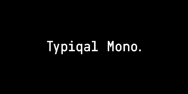
Typiqal Mono Font
Typiqal Mono is a monospaced typeface in a medium weight based on solid geometric structures. Merging the technical feel of upright sans-serifs like Din and Interstate with the clinical mechanics of monospaced coding fonts, Typiqal Mono is a manifestation of

Intropol Font
A modern journalistic style typeface. The subtle condensed characters create great economy of space best suited to brochure, editorial and magazine layouts. Also using the contrasting weights you can add great dimension across headline and body copy. Details include 6

PF DIN Monospace Font
PF Din Mono is the latest addition to the ever-growing set of DIN superfamilies by Parachute. It was based on its proportional counterpart DIN Text Pro but was completely redesigned to reflect its new identity. DIN Mono is a monospace

Antartida Rounded Font
Antartida Rounded is a sans serif with rounded terminals, its simple, kind of neutral feeling, is functional, clean and minimal, rounded terminals make it friendly and warm. Is a family of 8 fonts, weights 4 and in italics. This font
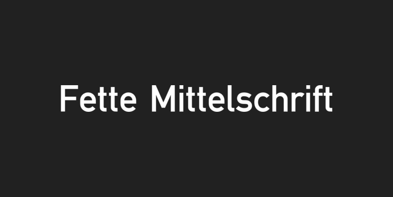
Fette Mittelschrift Font
Fette Mittelschrift is a san-serif font design, originally created for technical and traffic signage. Fette Mittelschrift was published and released by URW, contains language support for West, East, Turkish, Baltic, and Romanian. Published by URW Type Foundry GmbHDownload Fette Mittelschrift

Spoon Font
Spoon is a fresh and contemporary sans-serif that can be used in wide range of project. Its skeleton of letterform is geometrically-based and minimal but the body was designed with a touch of humanistic outlines as though they were handwritten.
PF DIN Text Pro Font
In 1936 the German Standards committee Deutsches Institut Normung (DIN) proposed DIN 1451 as the standard type of lettering to be used in the field of road traffic. The purpose of this standard was to lay down a style of
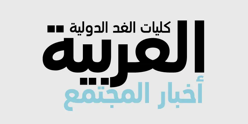
PF DIN Text Arabic Font
The Arabic version of DIN Text Pro is one of Parachute’s most ambitious text typefaces. This is the first ever contemporary arabic equivalent to the comprehensive DIN series of fonts designed. Completed and released in 2010, this set of fonts