Tag: damaged
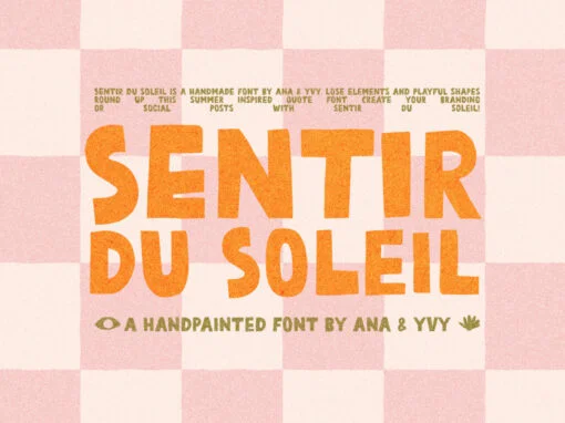
Sentir Du Soleil Font
Sentir Du Soleil is a retro font design published by ana yvy Published by ana & yvyDownload Sentir Du Soleil
Bad TV Font
Nothing on TV? Get creative with this fuzzy and static stylized font with an rounded, comic book feel. Two weights for get creative with when cables cut, the dish is broken and the wi-fi is off! Published by Graphics BamDownload
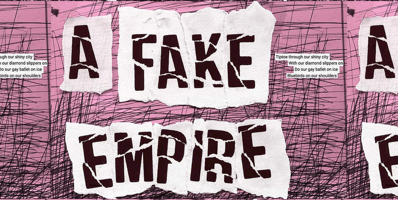
Fake Empire Font
A man far cleverer than me once said that we strive for excellence when mediocrity will do. Not perfect—That pretty much sums up my new font called Fake Empire. It’s faulty, flawed and defective. It celebrates the fact that it’s
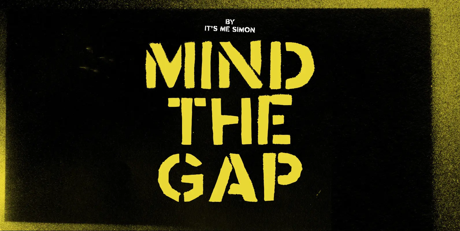
Mind The Gap Font
Mind the gap is a stencil font created with real hand cut stencils and a can of black spray paint. It looks dirty and industrial and has an almost military look and feel. It includes one stylistic alternative for uppercase
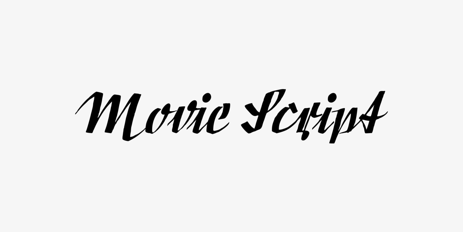
Movie Script Font
“Movie Script” is the script that was used in German movie-brochures. Those were small four page leaflets with a lot of sepia-colored pictures about the movie one was about to see. Today those things are collectors items. The script was
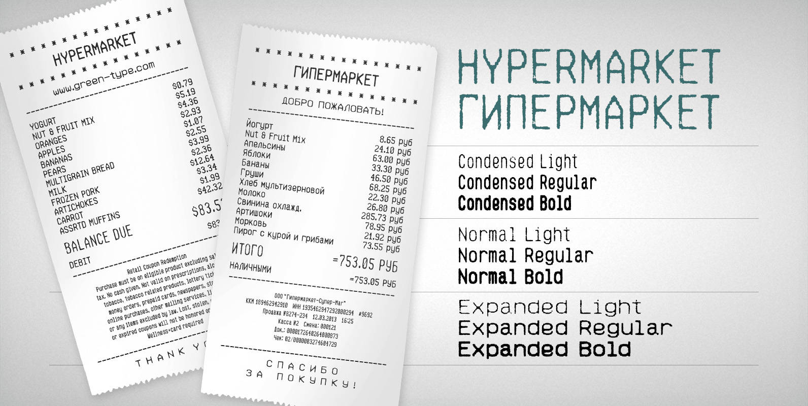
Hypermarket Font
Hypermarket is a font family inspired by shopping receipts. Published by Green TypeDownload Hypermarket
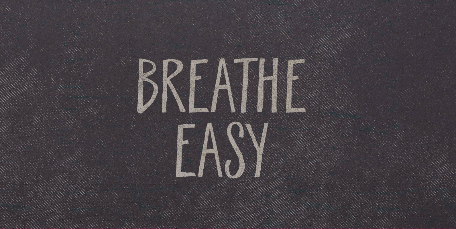
Breathe Easy Font
Dawn broke above them, first greying the sky, then streaking it with color as it kissed the mesa tops. They walked up out of the gulch and the sun finally warmed their faces. Breathe Easy, he said, wreathed in steam,
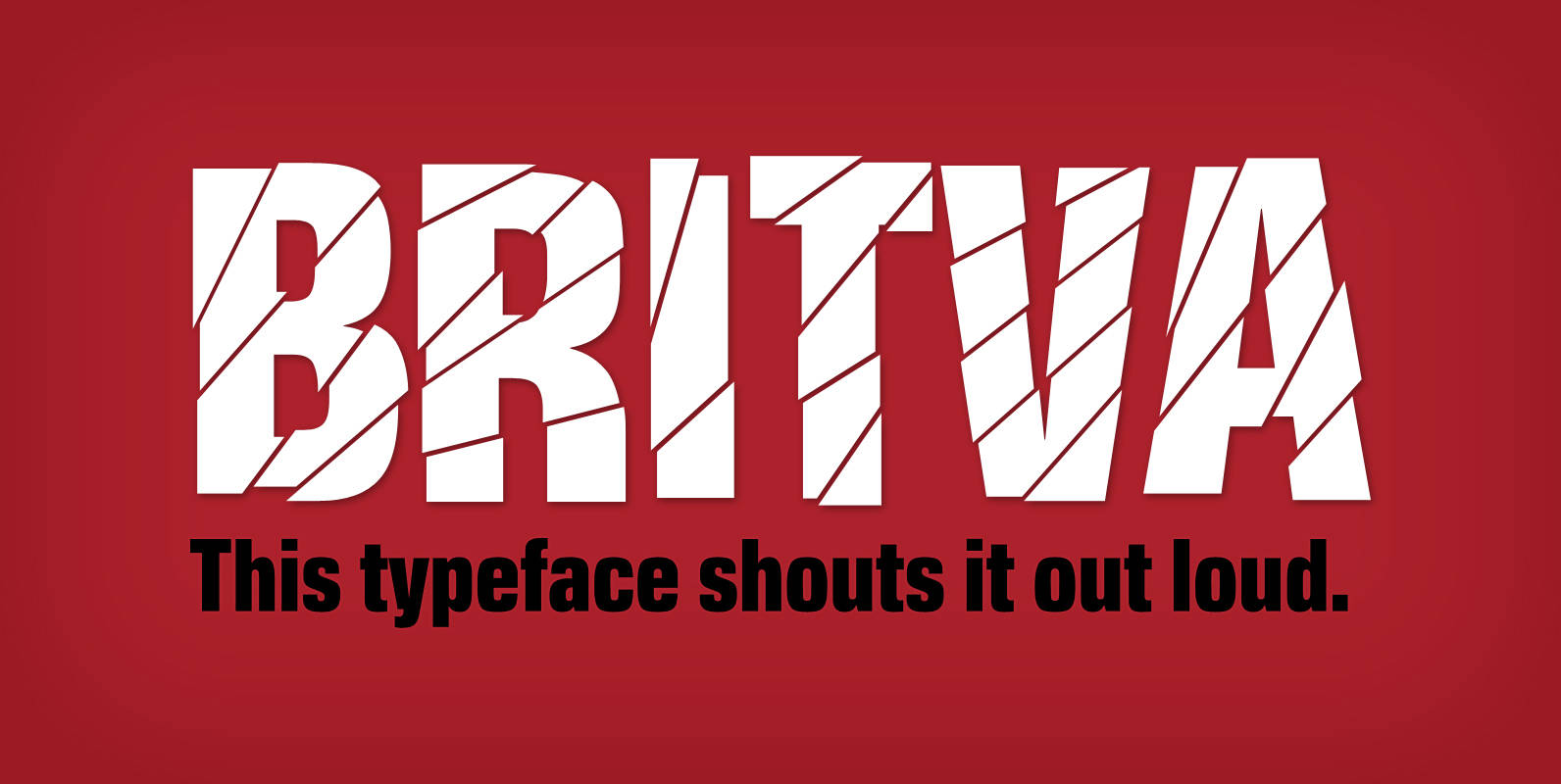
Britva Font
Derived from Valibuk, Britva is designed like from broken glass for eye-catching headlines. It’s a heavy, condensed face with a high x-height and tight spacing. While Valibuk can write it loud, Britva literally shouts it out even louder. The unbroken

Galeb Texture Font
Galeb Texture is textured version of the Galeb font family. Published by Tour de Force Font FoundryDownload Galeb Texture
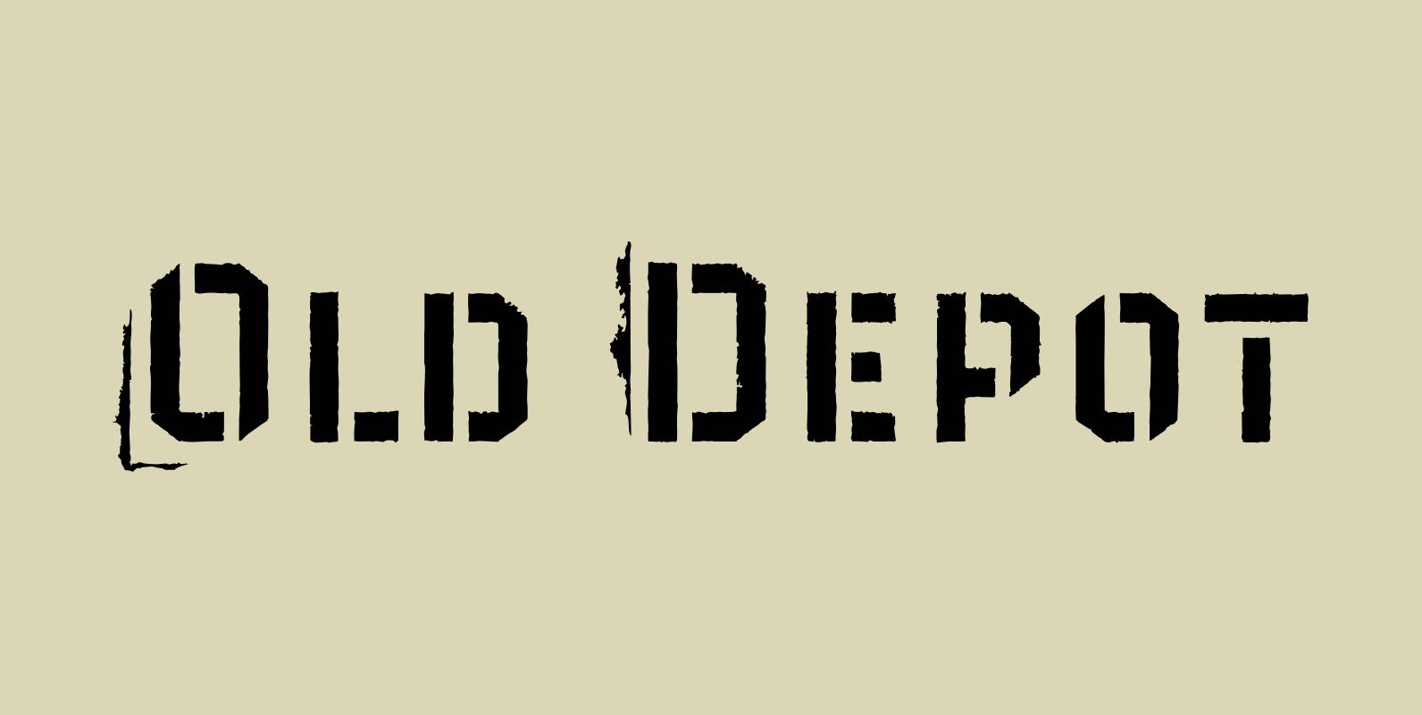
Old Depot Font
Old Depot is a newly reworked idea for the Depot Trapharet 2D font. It supports more languages and is available in more lettering. Old Depot stands out with its industrial nature of archaic spirit. It is a wonderful choice for
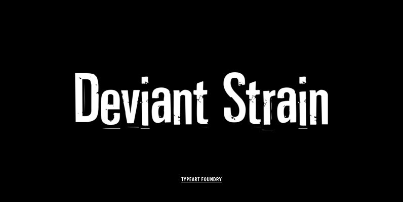
Deviant Strain Font
This family of four conists of two versions of the same font, plus their obliques. The “version” fonts have the IDENTICAL kerning and spacing as found in the regular fonts, so it is easy to substitute characters from either version,
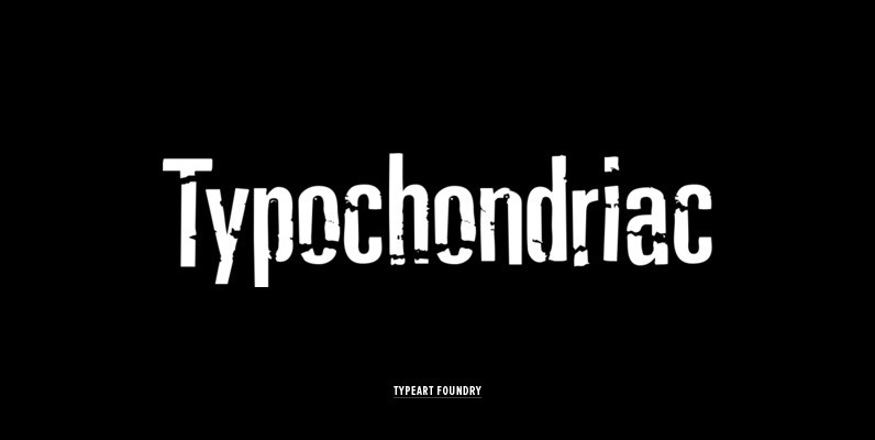
Typochondriac Font
The Typochondriac™ family is a variation on our Deviant Strain™ family. ALTERNATE VOWEL CHARACTERS All of the accented vowel characters in the Typochondriac™ fonts are slightly different from their unaccented root characters. To break up the visual monotony when you
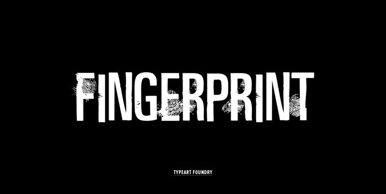
Fingerprint Font
The Fingerprint™ Regular font has fingerprint markings on only certain selected characters, in the hope of allowing most basic text to be set with a pleasing blend of marked and unmarked characters. Inevitably, you will set words with letter combinations
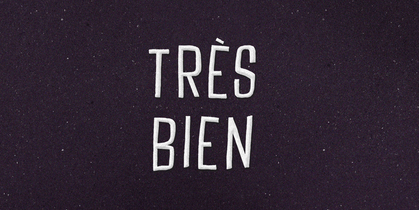
Tres Bien Font
We may say that a thing is good when on its own account it ought to exist, and bad when on its own account it ought not to exist. If it seems to be in our power to cause a
Shelton Font
Shelton is a Typeface with a eroded, printed look. The letters seem to be from different alphabets to support the wood type feeling. Every letter has an alternate character. Shelton has a wide language support and also contains arrows and
Stalker Font
Stalker is one of those necessary fonts in a designer’s toolbox: Grungy sans serif caps that are most useful for entertainment project chores. Originally made in the summer of 2003 for set and prop design of an Alliance film, Stalker
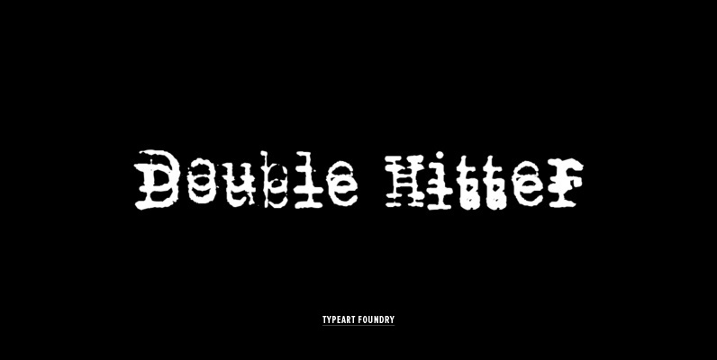
Double Hitter Font
This font was created mostly to be a companion set for our other Typewriter families, allowing you to introduce the typewriter flaw where you end up with a double impression of a character. A Typewriter emulation with slight inking imperfections,
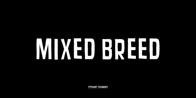
Mixed Breed Font
ALTERNATE CHARACTER SET While there are no lowercase characters in the Mixed Breed™ fonts, there are alternate versions of the uppercase characters in the lowercase character slots. Not only are the character shapes slightly different, but they are also have