Tag: clear
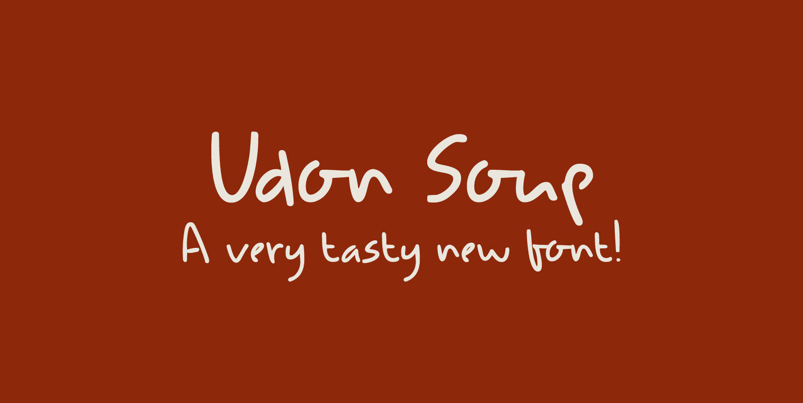
Udon Soup Font
Udon Soup is my all time favourite Japanese food! I like it so much that I decided to name a font after it. Udon Soup font is a handmade script font, kind of messy, kind of weird, but very legible
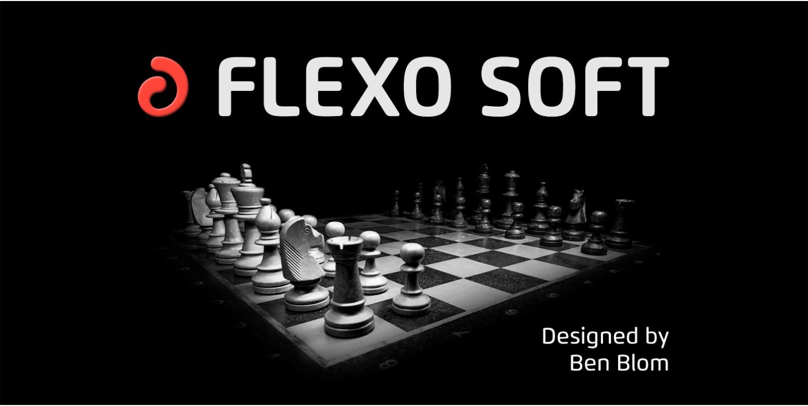
Flexo Soft Font
Flexo Soft is the soft companion of Flexo. In Flexo Soft, the sharp edges of Flexo’s characters have been tempered by a moderate rounding—creating a softer and friendlier typeface. Flexo Soft has a squarish design, making it stand out in
Modernhead Serif Font
Modernhead Serif is a serif font design published by Mcraft Published by McraftDownload Modernhead Serif
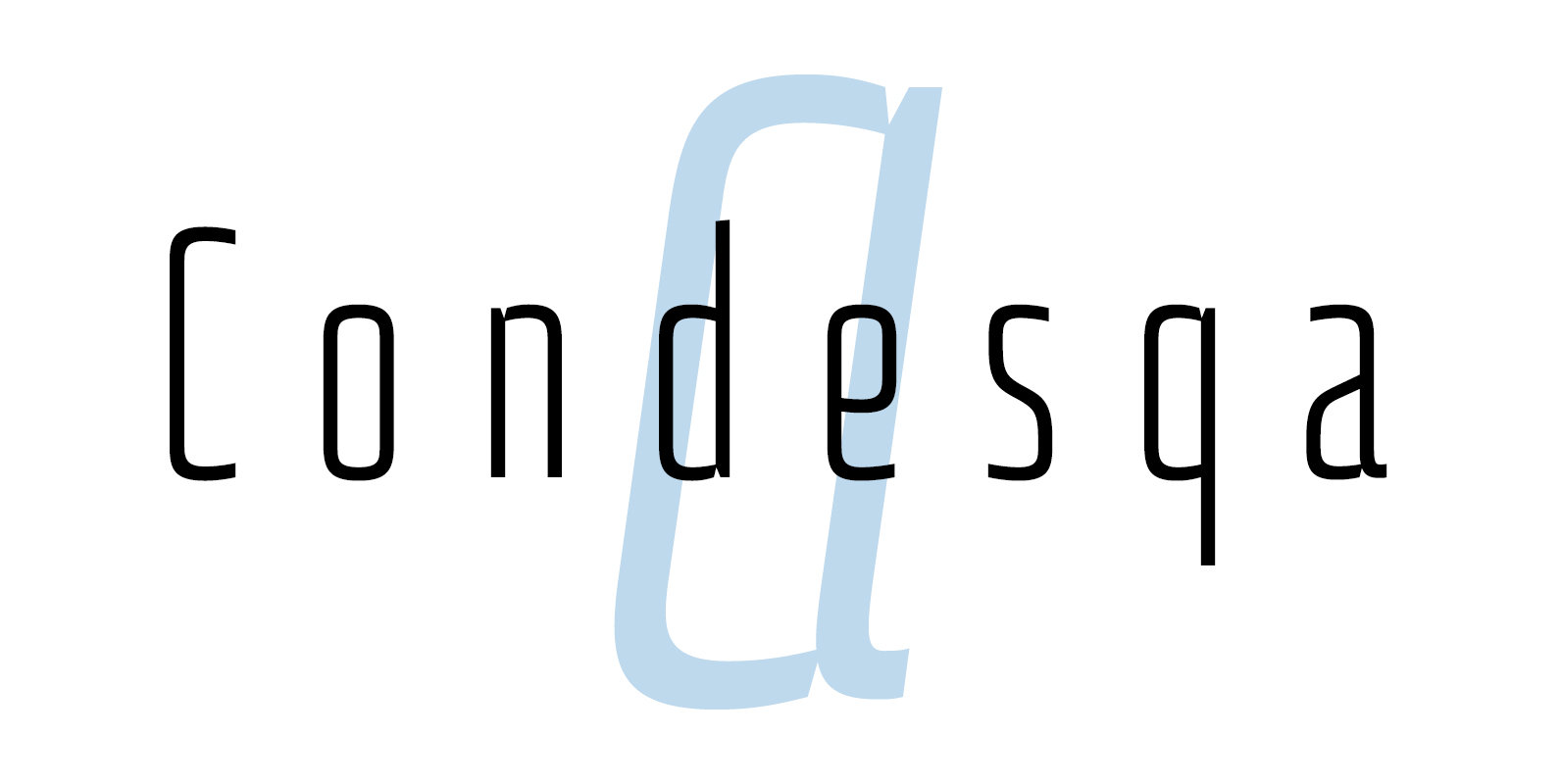
Condesqa 4F Font
Condesqa 4F is a sans serif font design published by Sergiy Tkachenko Published by Sergiy TkachenkoDownload Condesqa 4F
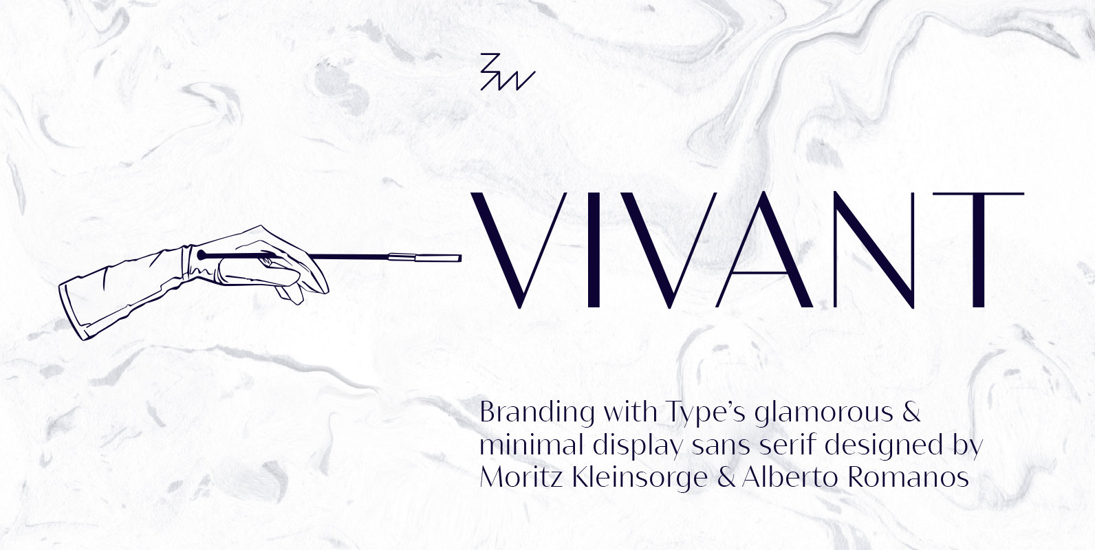
Bw Vivant Font
Designed by Moritz Kleinsorge & Alberto Romanos, Bw Vivant is a glamorous sans serif font family. It marries the visual appeal of deeply modulated serif typefaces with a minimal geometric approach, discarding any accessory element on the hunt for the
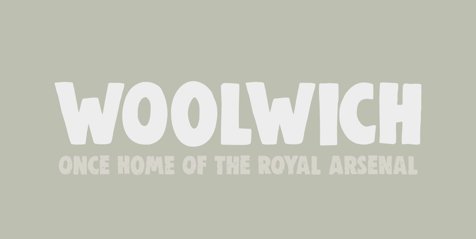
Woolwich Font
Woolwich is a jolly fine display font, named after a district in south-east London. Woolwich, somewhat inspired by Futura condensed, was completely made by hand and comes in a clean and an eroded version. It is highly legible and will
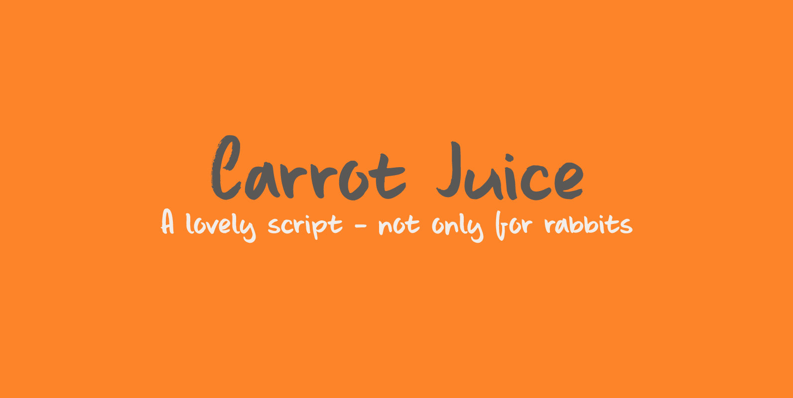
Carrot Juice Font
I like Carrot Juice a lot. I don’t drink it that often (and I should, really), but nothing beats a freshly squeezed glass of cold carrot juice!! Carrot Juice font is a lovely script font: handmade with love (and a
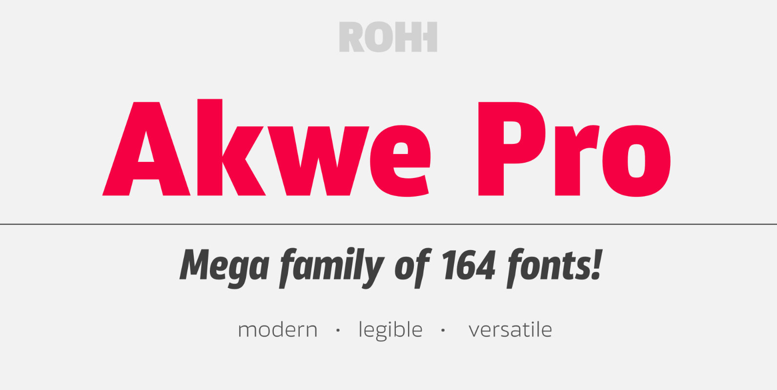
Akwe Pro Font
Akwe Pro is a professional, ultra versatile sans serif typeface characterized by excellent legibility and modern design perfect for all design purposes. It is designed for use in long and short paragraphs of text, headlines and user interfaces. Its distinctive
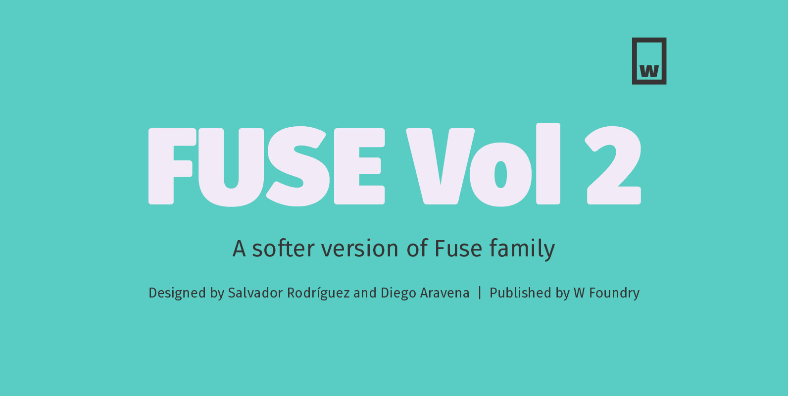
Fuse V.2 Font
Fuse Vol 2 is an extension to our popular Fuse type family. All of the corners of the typeface’s character are rounded, making Fuse Vol 2 friendlier and more amiable variant of the original Fuse. Designed with powerful OpenType features
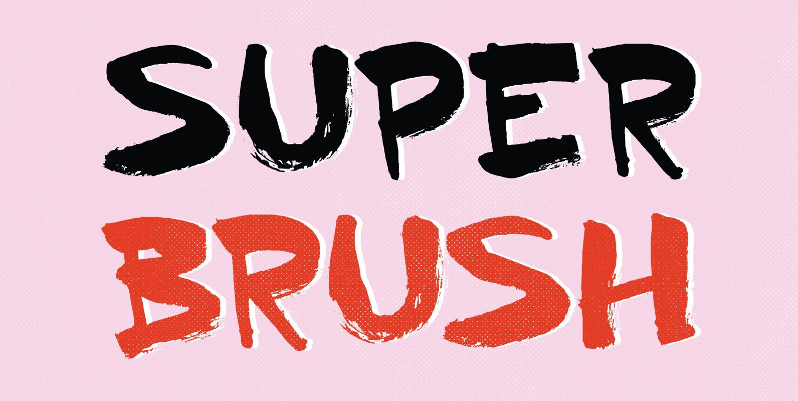
Superbrush Font
Superbrush is, well, a super brush font! Made with Chinese ink, a flat brush and a lot of patience. Superbrush would look great on book covers, product packaging, old school rock albums and T-shirts. Comes with a super amount of
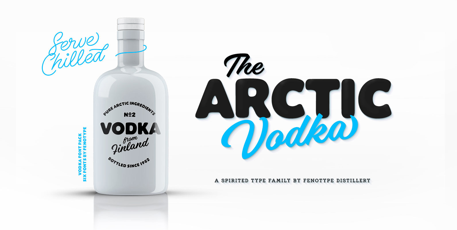
Vodka Font
Vodka is a display combo pack of four styles and six fonts. Vodka fonts are clean but soft. Vodka’s core is two weights of a Brush Script and a Monoline Script with similar characters. Vodka Sans is a bold sans
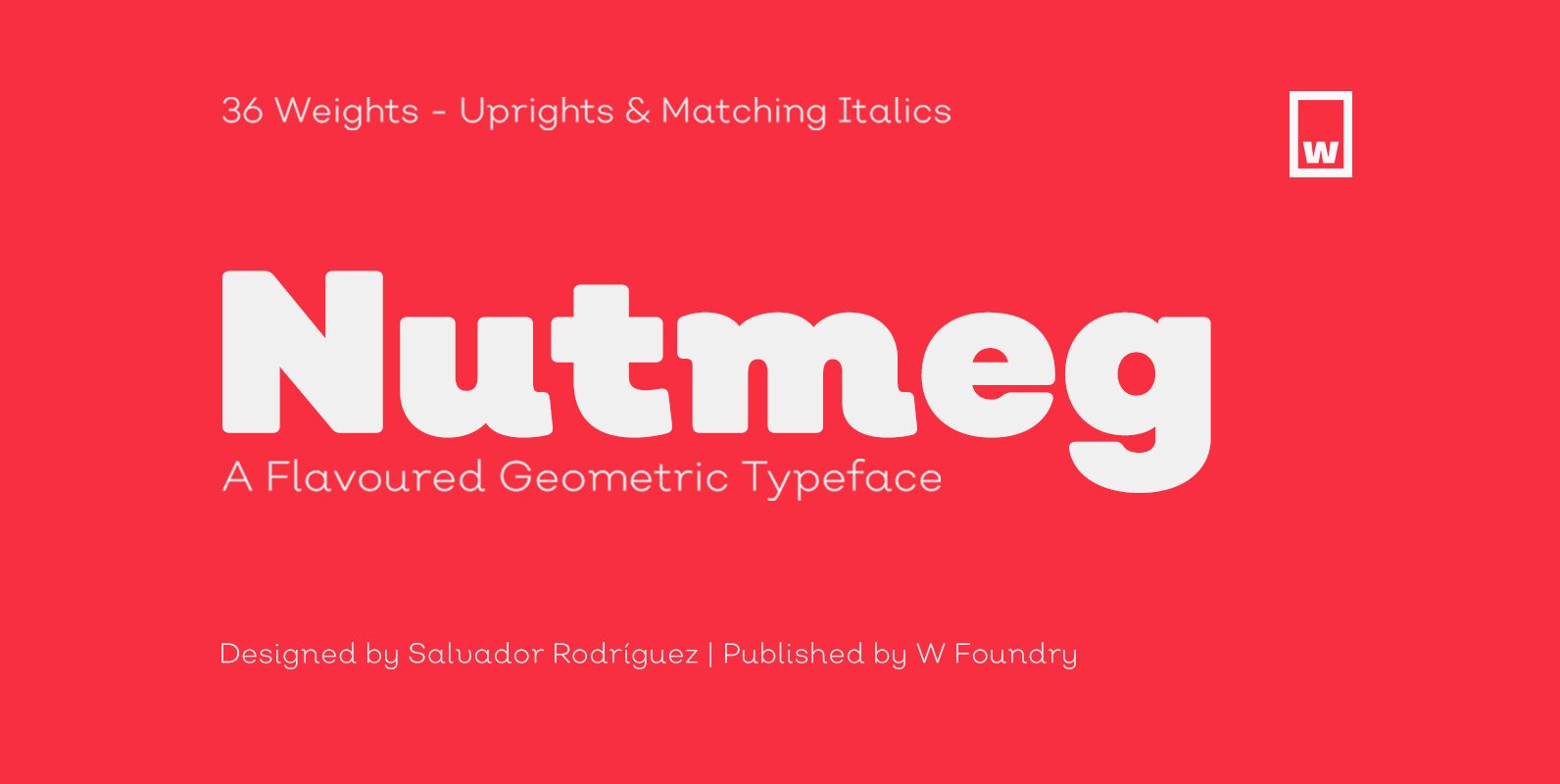
Nutmeg Font
Nutmeg is a geometric typeface with a slight flavored touch. Although its structure is stick to the traditional forms, its details transform this typeface in a boldly project that separates it from other geometric fonts. Nutmeg’s texture can be perceived
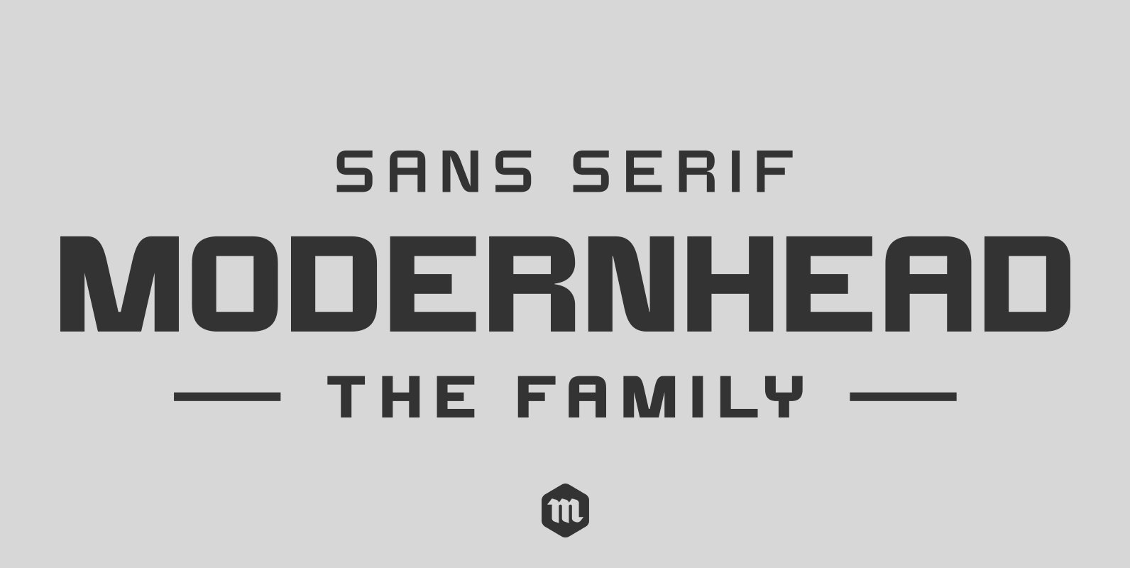
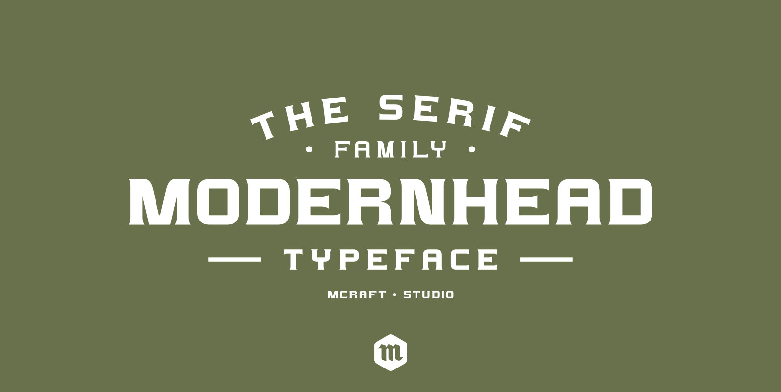
Modernhead Typeface Font
Modernhead is a modern, clean and simple sans serif font. It has 252 glyphs and supports multiple foreign languages. Is perfect for modern logo designs, headers and small amounts of text. It contains an uppercase and lowercase alphabet with numbers
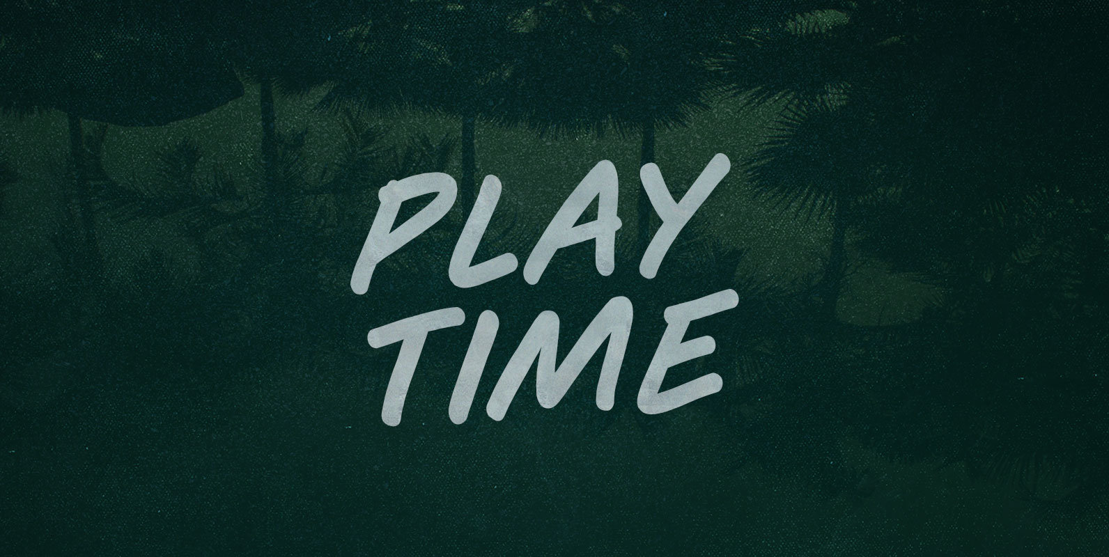
Play Time Font
You can’t Play Time, player. Time does not play. Mess around and it runs out, like quarters on a countdown. Try to hold it and it slips past, greasy and sinuous, leaving you falling, like leaves of a lost season.
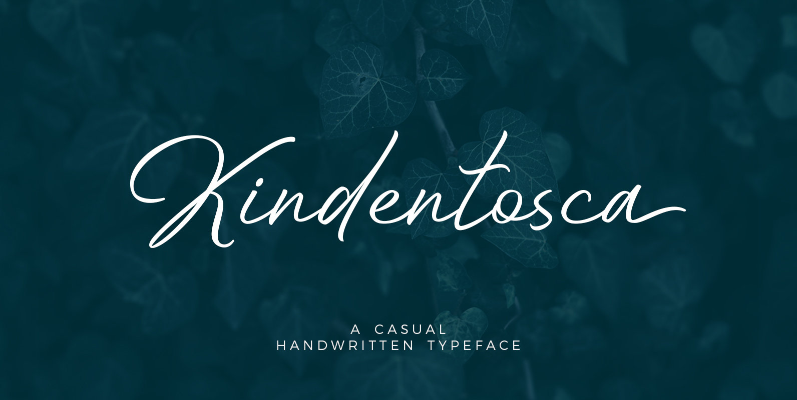
Kindentosca Font
Kindentosca is a handwritten typeface that contains 2 styles: Regular with the distance between letters slightly apart, Condensed with the distance between the letters a little close. Kindentosca Comes with a set of characters that support different languages and is
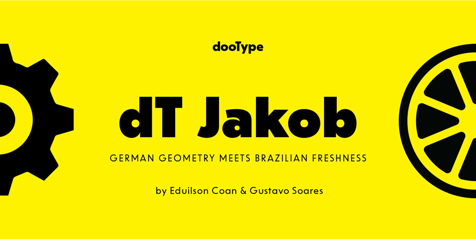
dT Jakob Font
dT Jakob started as a revival by Gustavo Soares for Paul van der Laan’s class at the Type and Media Masters, in The Hague, NL – back in 2007. There are quite a few excellent geometric sans typefaces available, but
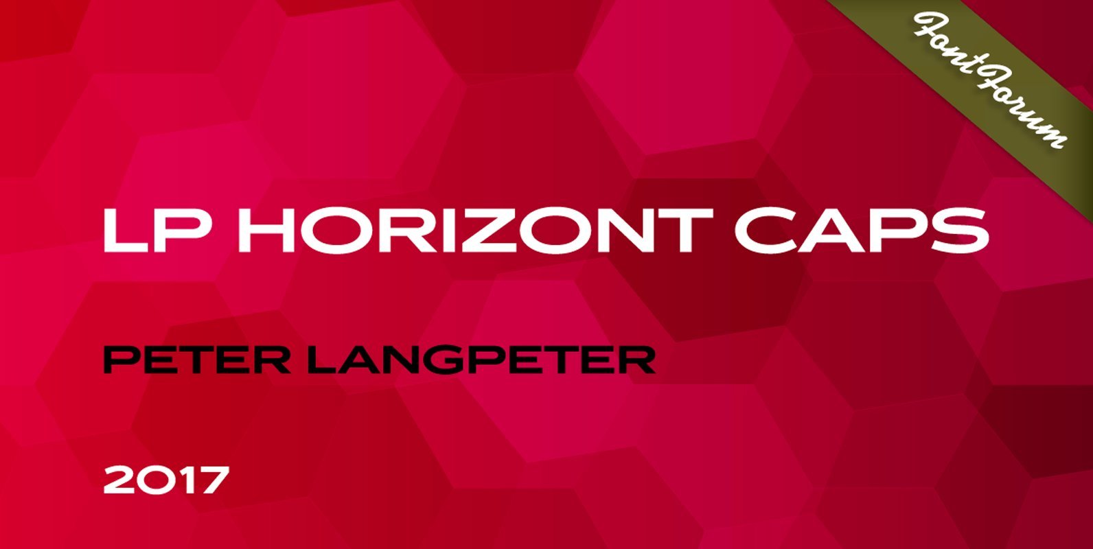
LP Horizont Caps Font
LP Horizont Caps is another new font creation from German designer Peter Langpeter (lp-design.de). LP has been running his own design studio since 1995, working as a typeface and logo designer, as a calligrapher, cartographer and illustrator. During this time