Tag: clear
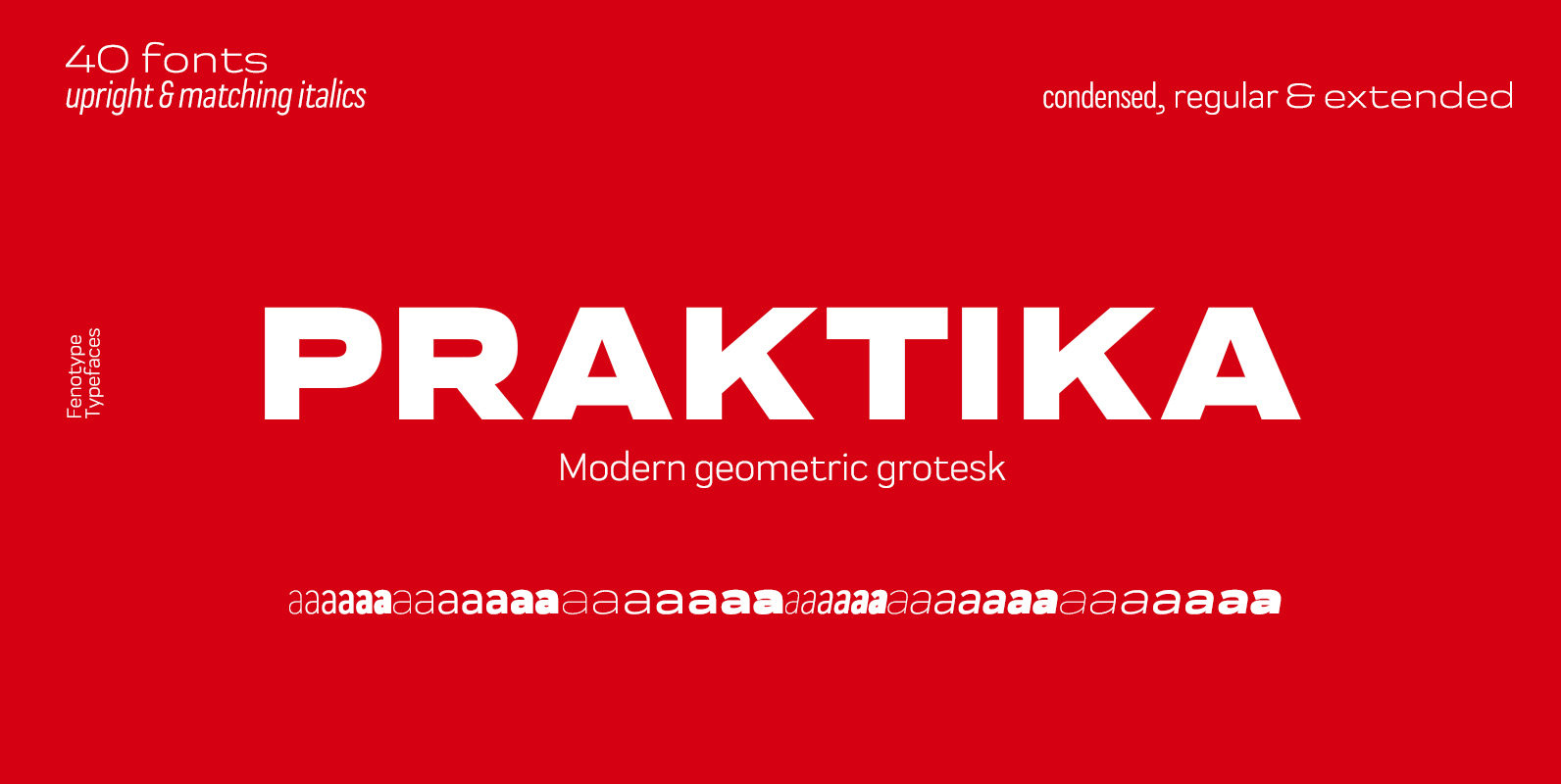
Praktika Font
Praktika is a multifunctional super family of 40 fonts. It consists of three distinct widths and weights from extra light to extra bold. Conceptually, it is a rendition of the familiar early 20th century European grotesque styles, used in road
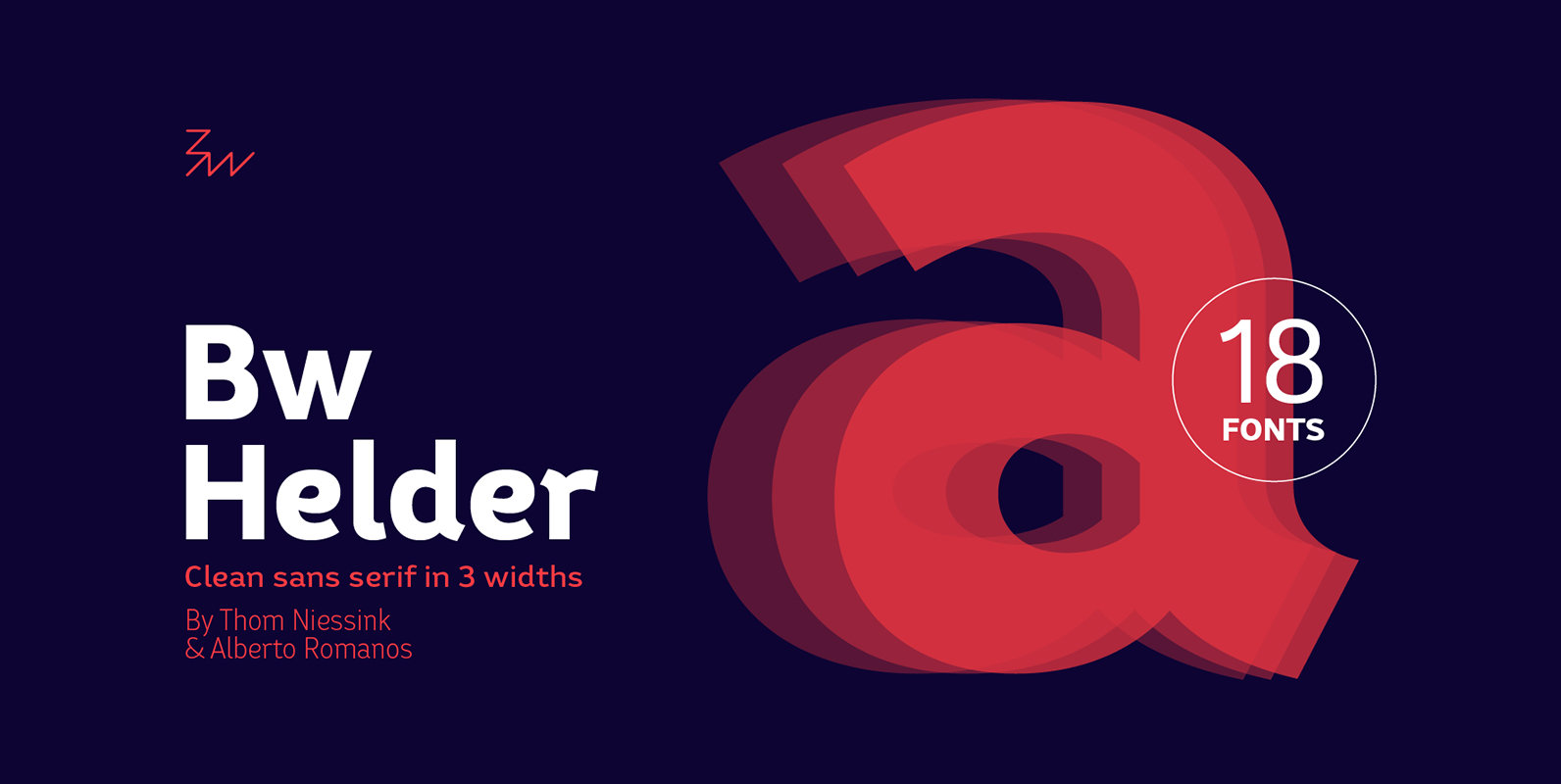
Bw Helder Font
Bw Helder is a clean and versatile sans serif combining gentle subtleties on its curves with remarkable spurs branching off its stems. It instills a friendly yet professional tone of voice, while maintaining the composure when used in longer paragraphs
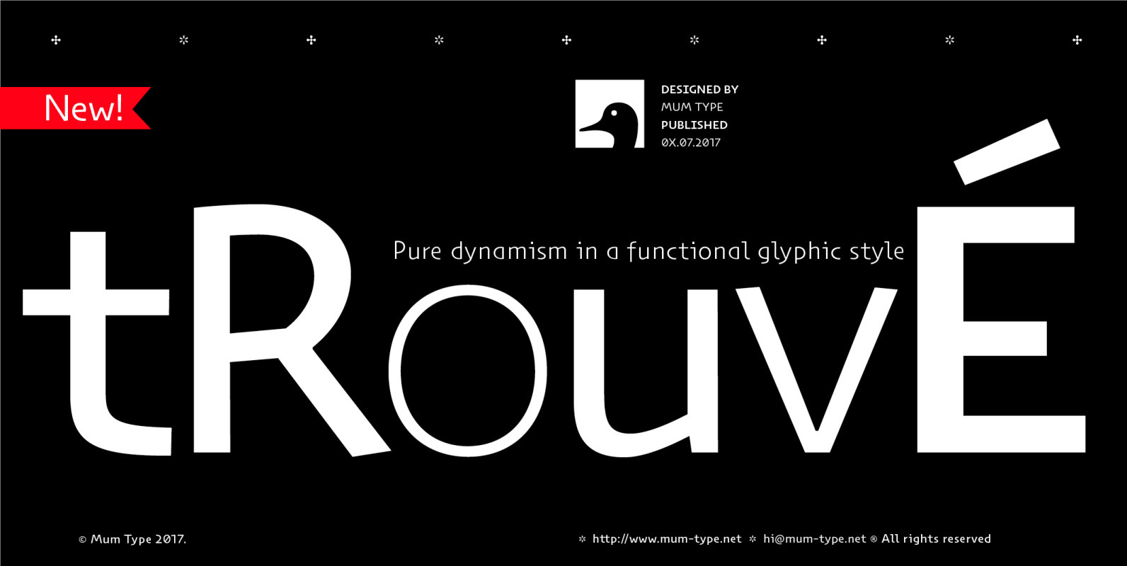
Trouve Font
When we started Trouvé, we read about some old paleontologist who found an old greek inscription back in the days. The anecdote tells that when he found the inscriptions on the stones, he jelled “trouvé! trouvé!.”. Now Trouvé is an
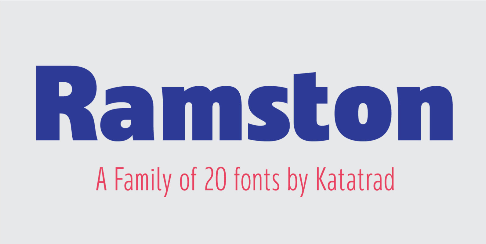
Ramston Font
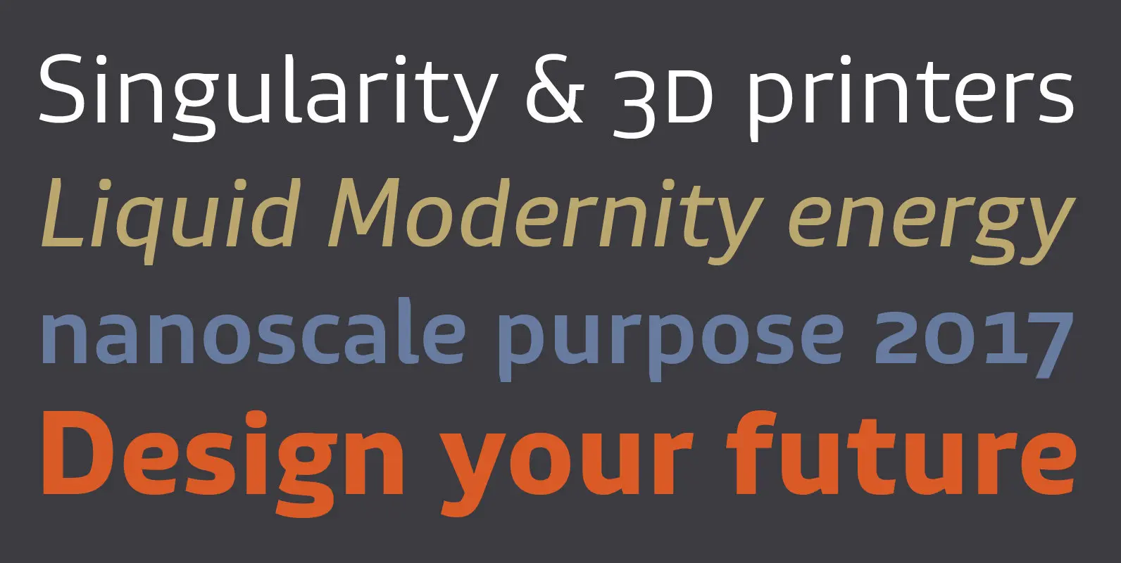
Ramston is a humanist sans serif typeface of 20 fonts in total — a normal and a condensed width in 5 weights with matching italics. The condensed version is designed for space-saving typography but with high legibility in mind. Ramston
URW Form Font
URW Form by Volker Schnebel is the quintessence of a modern sans. Originally inspired by the timeless classic Futura, URW Form is a mix of classic and modern geometric typefaces, yet still incorporates the fundamental rules of design and looks
Bw Gradual Font
Bw Gradual brings together the pragmatic feel of the geometric grotesque genre with the visual appeal of its very deep joins. Pure shapes and fast curves coexist on this versatile font family that claims for attention when used large, but
LP Saturnia Sans Font
Following up on the LP Saturnia, which is a modern interpretation of the classic Roman letterforms, comes the LP Saturnia Sans. While keeping the clear forms, this well-balanced Sans transports the original draft even further in the modern and at
Mitram Font
The Mitram family has 7 weights, ranging from Thin to ExtraBold (including italics) and is ideally suited for advertising and packaging, book text, logo, branding and creative industries, small text, wayfinding and signage as well as web and screen design.
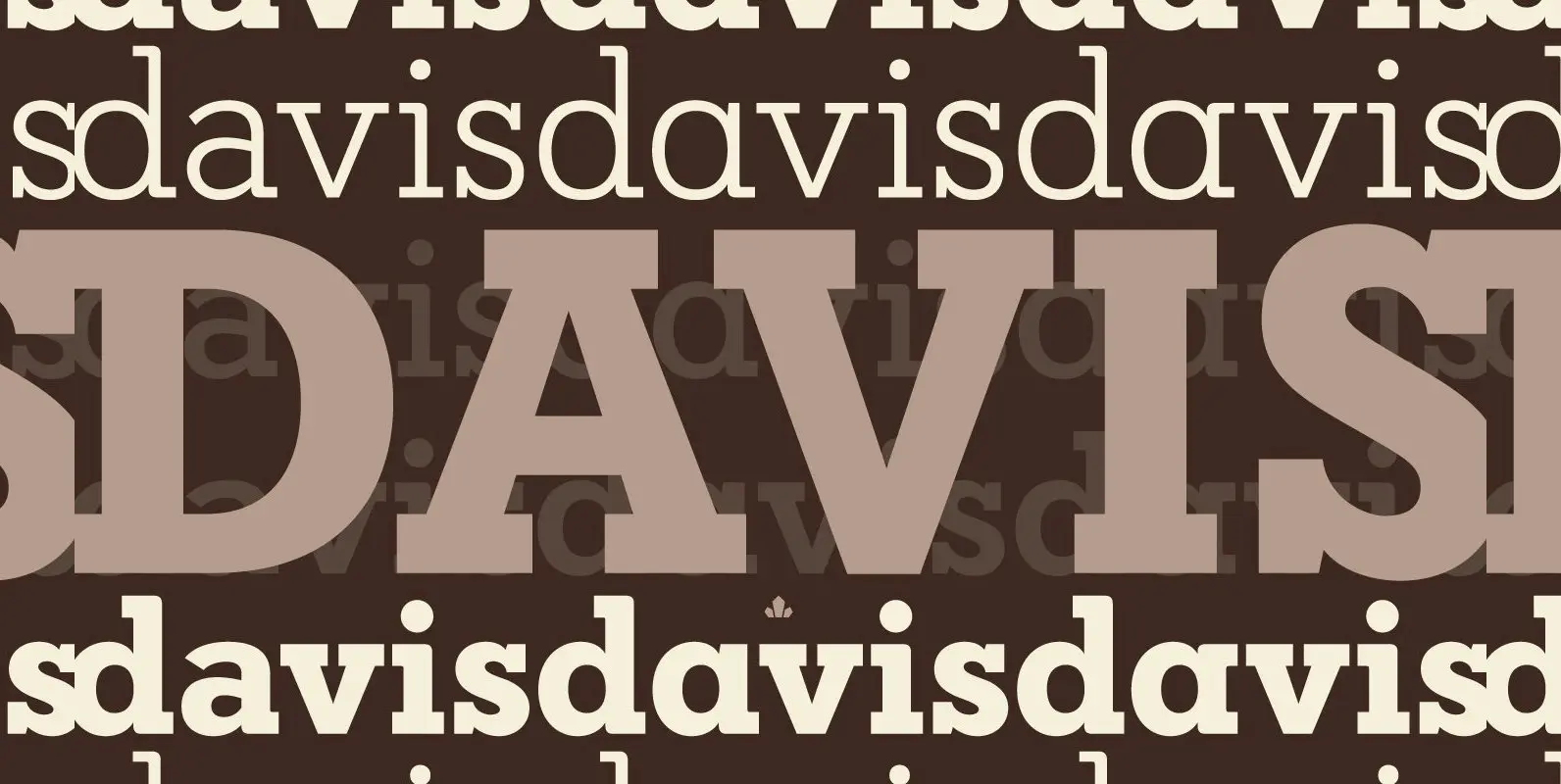
Davis Font
P22 Blox is a modular system of shapes that can build letterforms and abstract patterns. Created as a working prototype for the letterpress P22 Blox project from P22 Analog and Starshaped Press, this system of shapes presents a unique approach
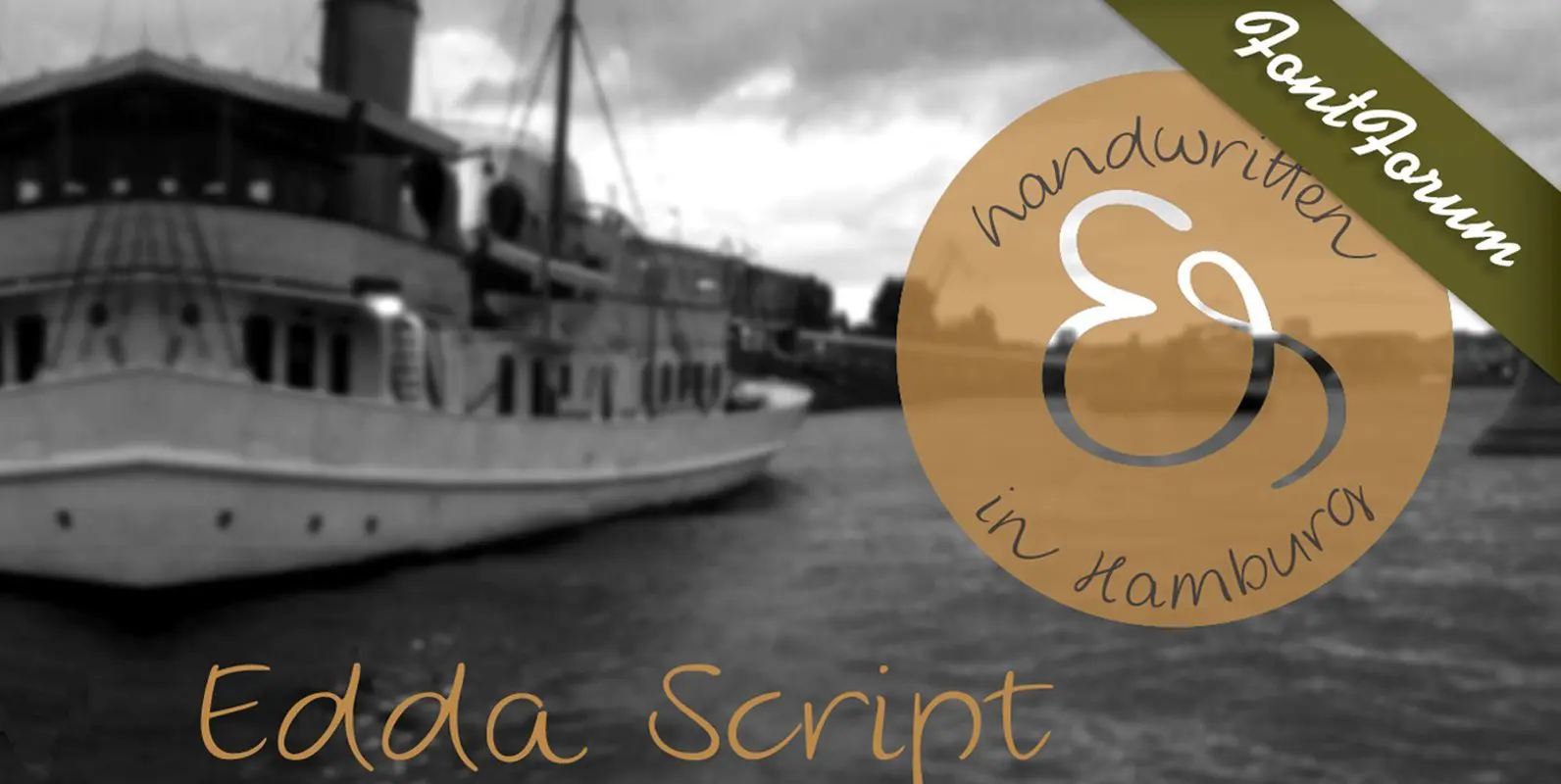
Edda Script Font
Edda Glaser’s digitized handwriting is a beautiful script containing many ligatures and alternates. The first lines were drawn in 2012 – however, there are now over 850 glyphs! The elegant and light typeface combines both connected and separate characters, in
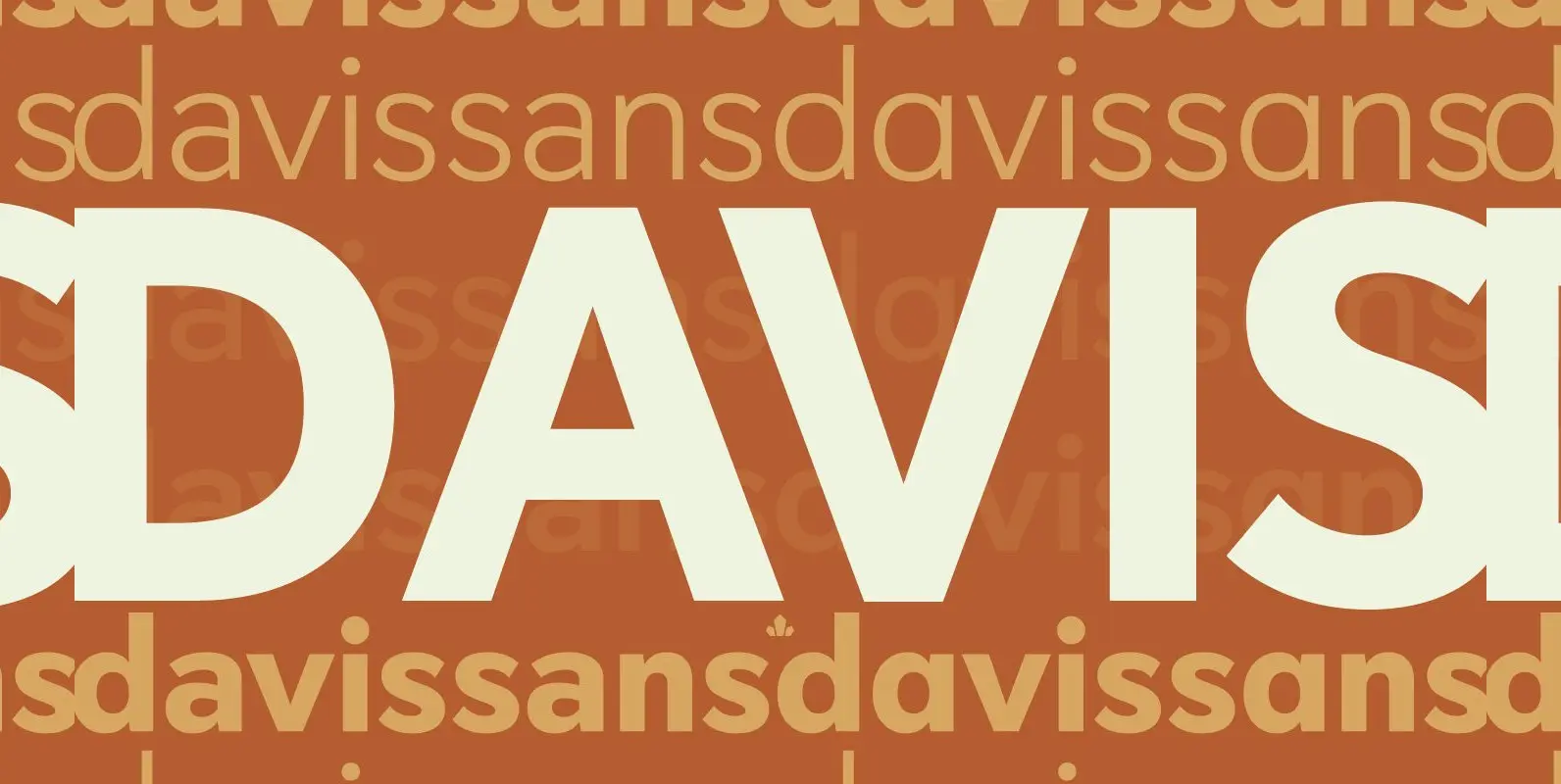
Davis Sans Font
Over the past couple of decades, the many applications that joined print as media requiring design solutions have combined to necessitate a visual evolution that favours controlled optical geometry and careful counter-space consideration over ornamental features traditionally associated with print
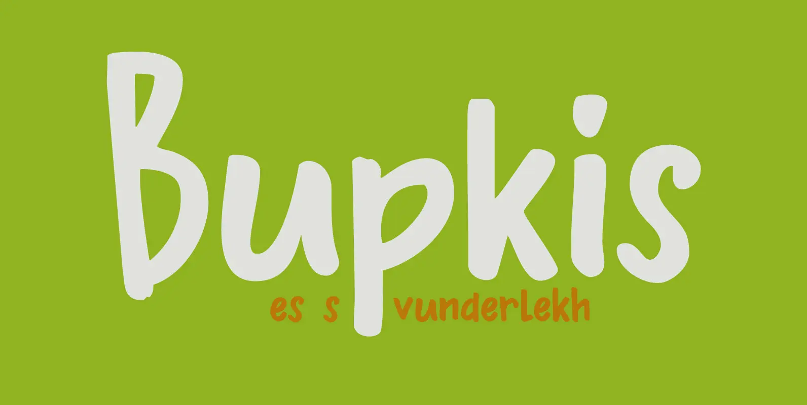
Bupkis Font
Bupkis literally means ‘goat’s dropping’ in Yiddish, but it is used to say ‘nothing, zero, zilch’. Bupkis is a very nice handmade font. A little formal, a little uneven, a little unusual. Use for it whatever you like, but product
Lembra Font
Named after the Portuguese word ‘remember’, Lembra suggests a crossroad between contemporary forms and the calligraphic origins of writing. Hints of the calligraphic pen break the pristine sans-serif shapes, creating an unique overlapping of expressions. This combination of elements also
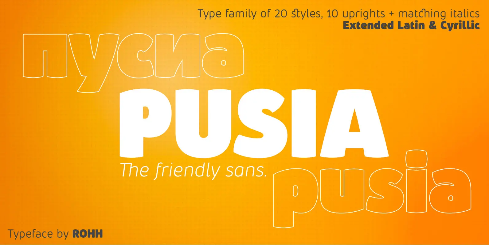
Pusia Font
Pusia is a versatile font family with a lot of character and warmth. It is a professional, contemporary sans serif with original letter forms, friendly and dynamic feel. Its subtle curved shapes and attention to details give Pusia a very
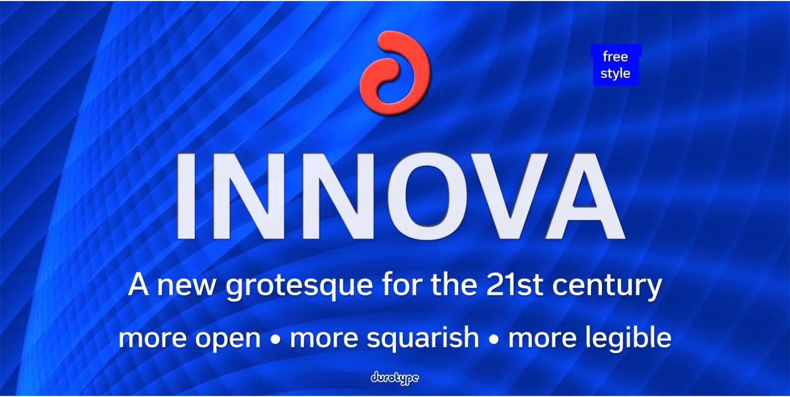
Innova Font
Innova. A new grotesque for the 21st century. More open. More squarish. More legible. After the many grotesques which have been designed over the years, is it still possible to improve this genre? Innova is a new design—a contribution to
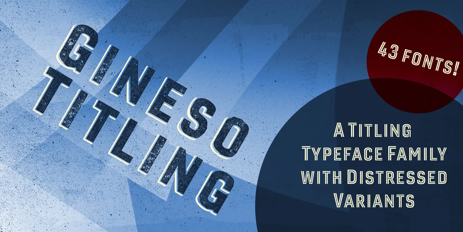
Gineso Titling Font
Before the Great War, there were great posters. Posters of elegance and grandeur. Posters calling people to the pleasures of sunny southern France and to the perfections of northern Italy’s dolce vita. Le Havre, based on a poster by AM

Carina Pro Font
Like Phenix out of the ashes the former Schriftguss hot-metal font “Rautendelein” has come to live again. Carina Pro was carefully extended for multilingual use, and contains a few alternates which can be activated via the swash OpenType feature. Published
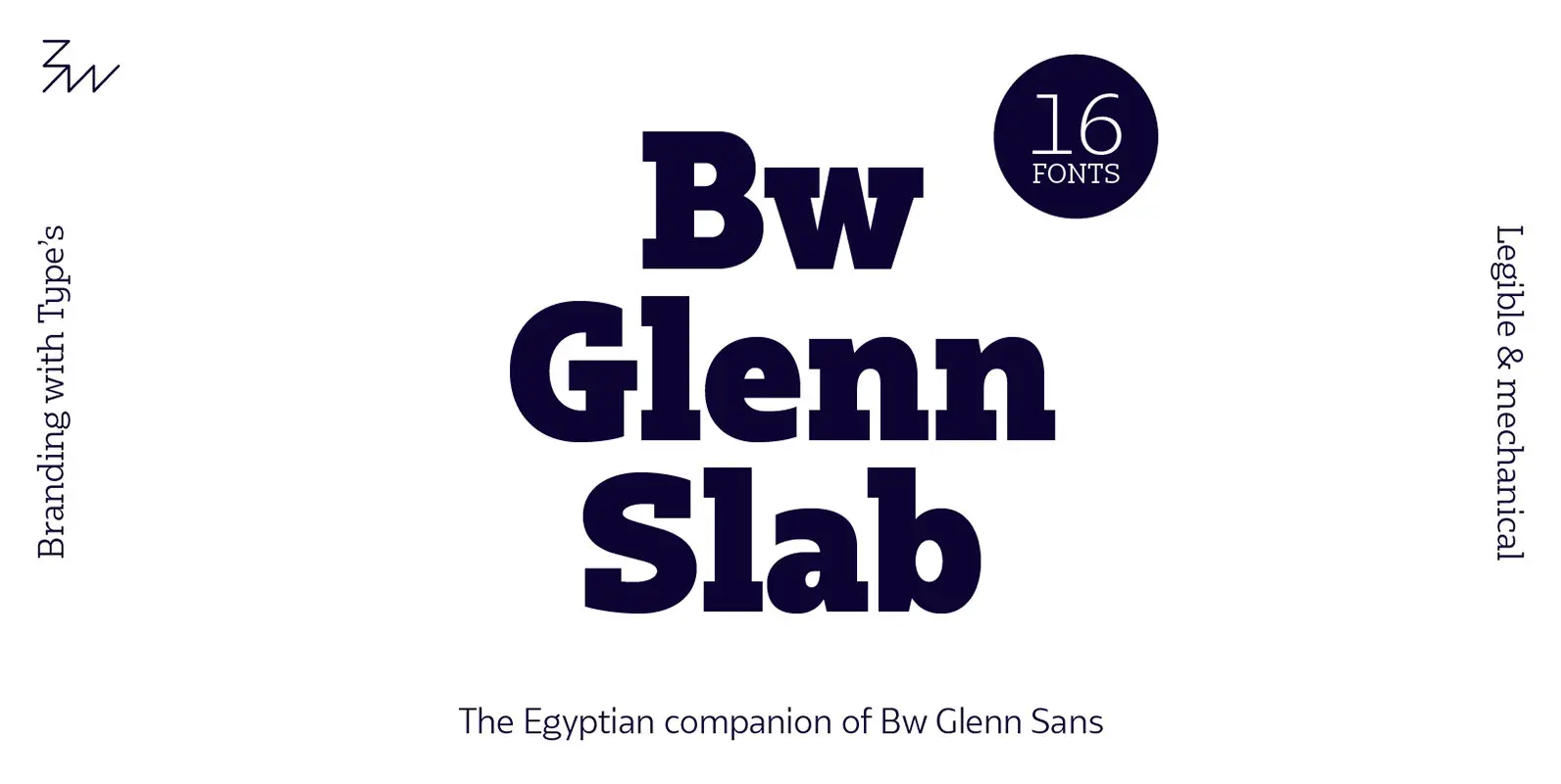
Bw Glenn Slab Font
Bw Glenn Slab is a confident and robust font family with a sturdy feel offering no concessions for ambiguity. Its strict geometry and open shapes provide a very legible and clean texture, performing well on print and screens alike. It’s