Tag: businesscard
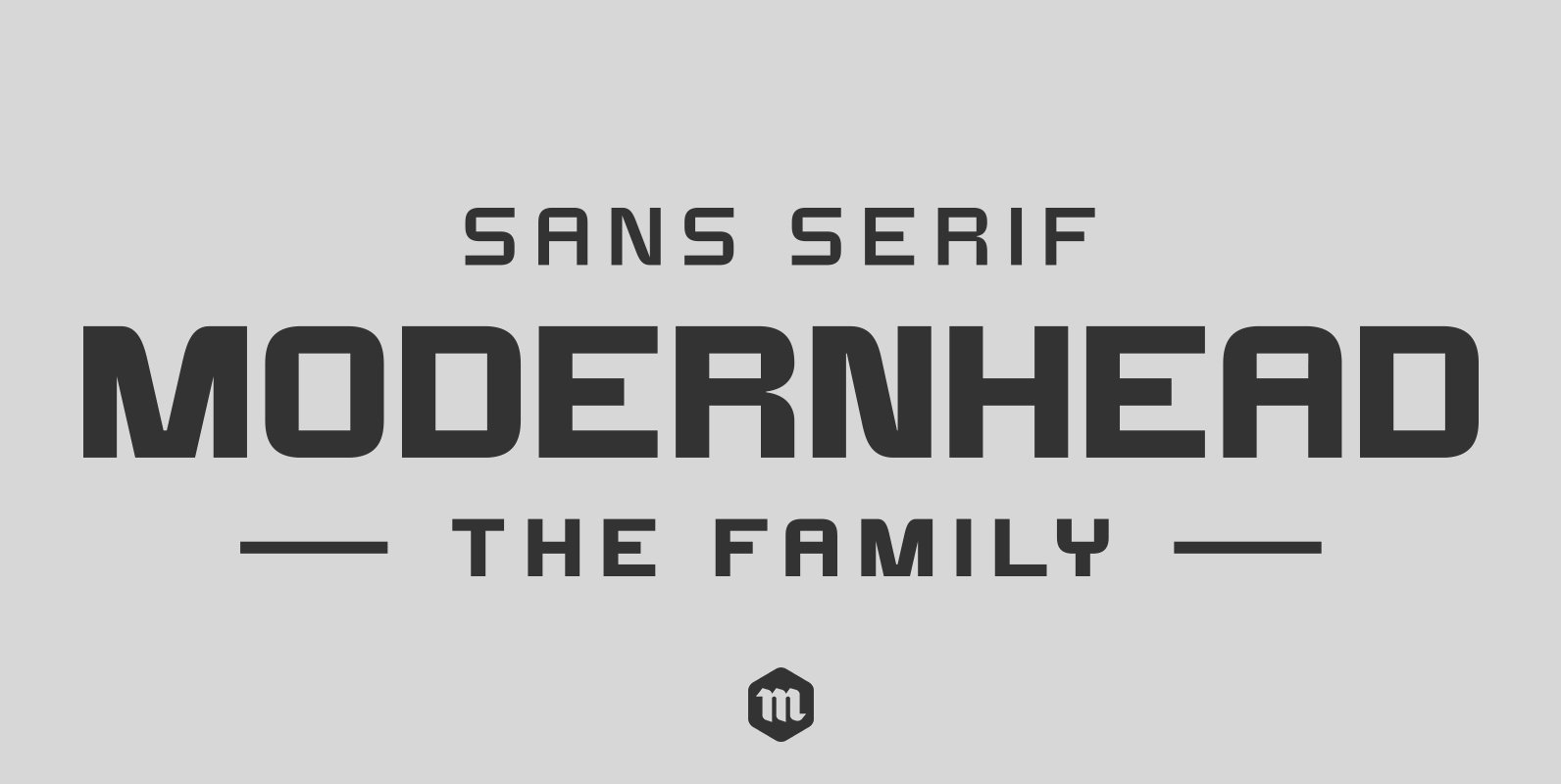
Modernhead Typeface Font
Modernhead is a modern, clean and simple sans serif font. It has 252 glyphs and supports multiple foreign languages. Is perfect for modern logo designs, headers and small amounts of text. It contains an uppercase and lowercase alphabet with numbers
Flathead Round Font
Flathead is a decorative and retro styled font design, published by Mcraft. Published by McraftDownload Flathead Round
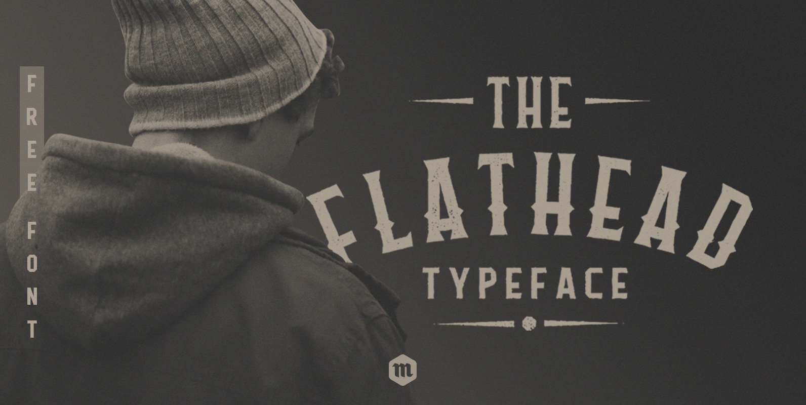
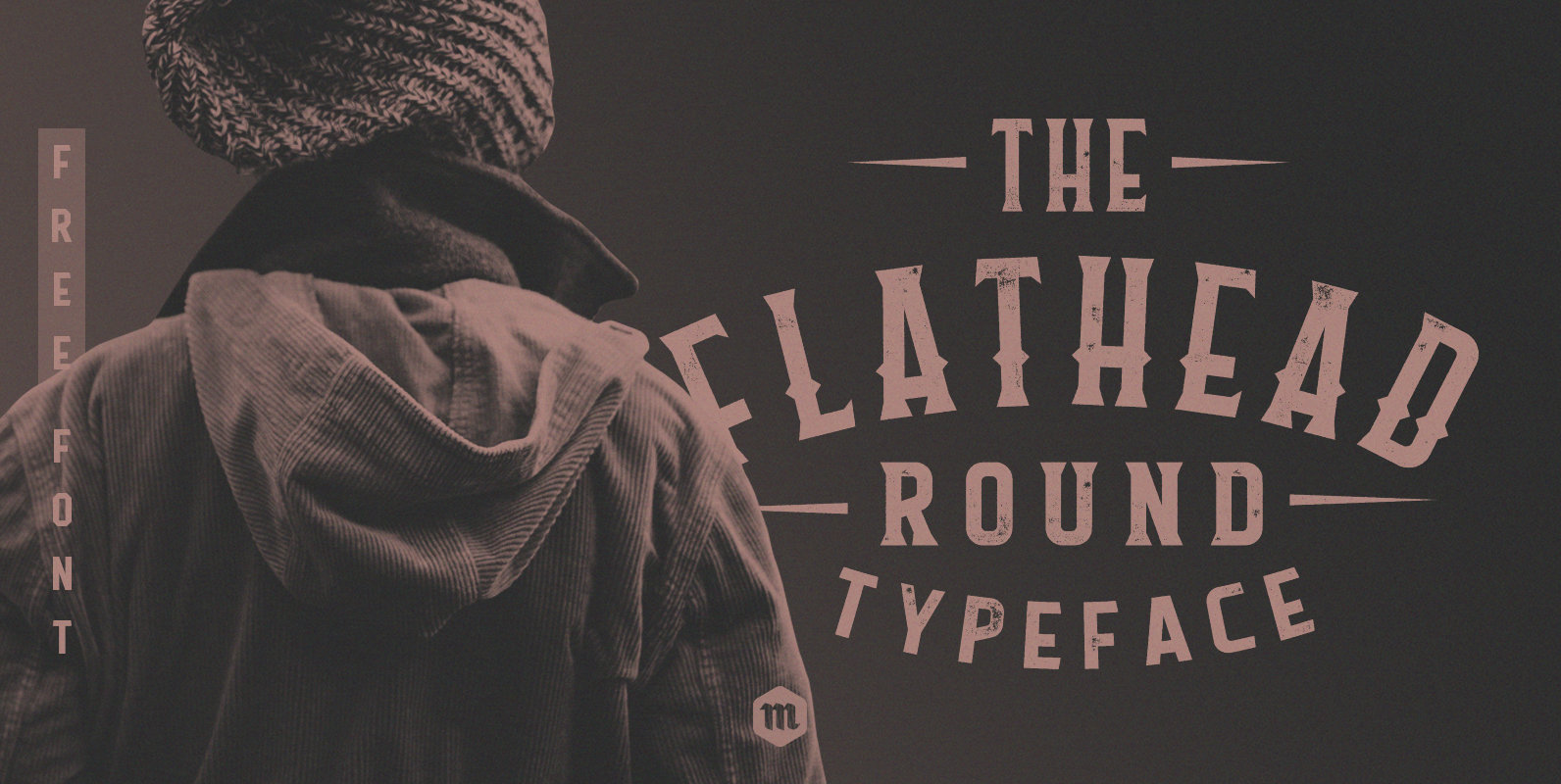
Flathead Font
Flathead is a decorative and retro styled font design, published by Mcraft. Published by McraftDownload Flathead
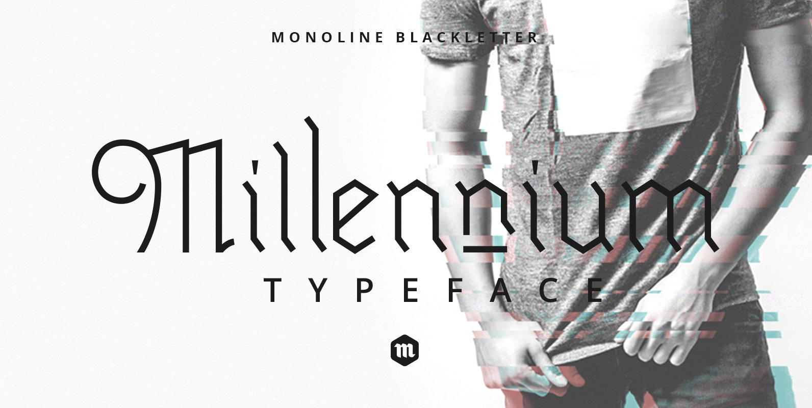
Millennium Font
Millennium is a 2 font family with a mono weight and different decorations. Inspired by gothic culture and monoline illustrations, that's perfect to use in vintage-themed designs. Millennium is suitable for any project that requires an old gothic feel as
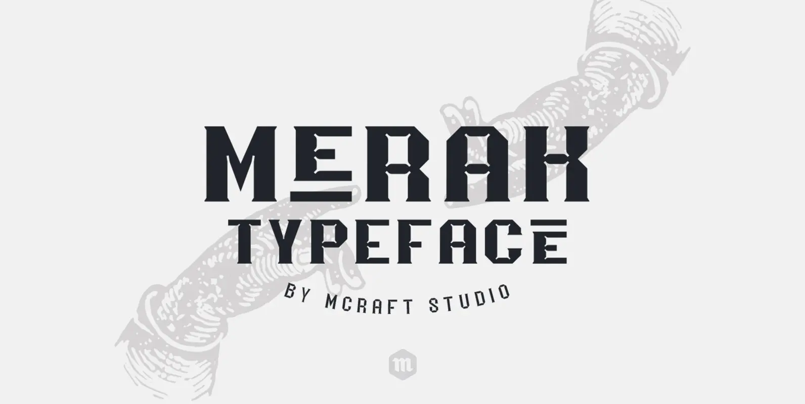
Merak Font
Inspired by science fiction movies and industrial fonts, Merak a font family is perfect for use in modern and industrial-themed designs. Published by Mcraft Download Merak
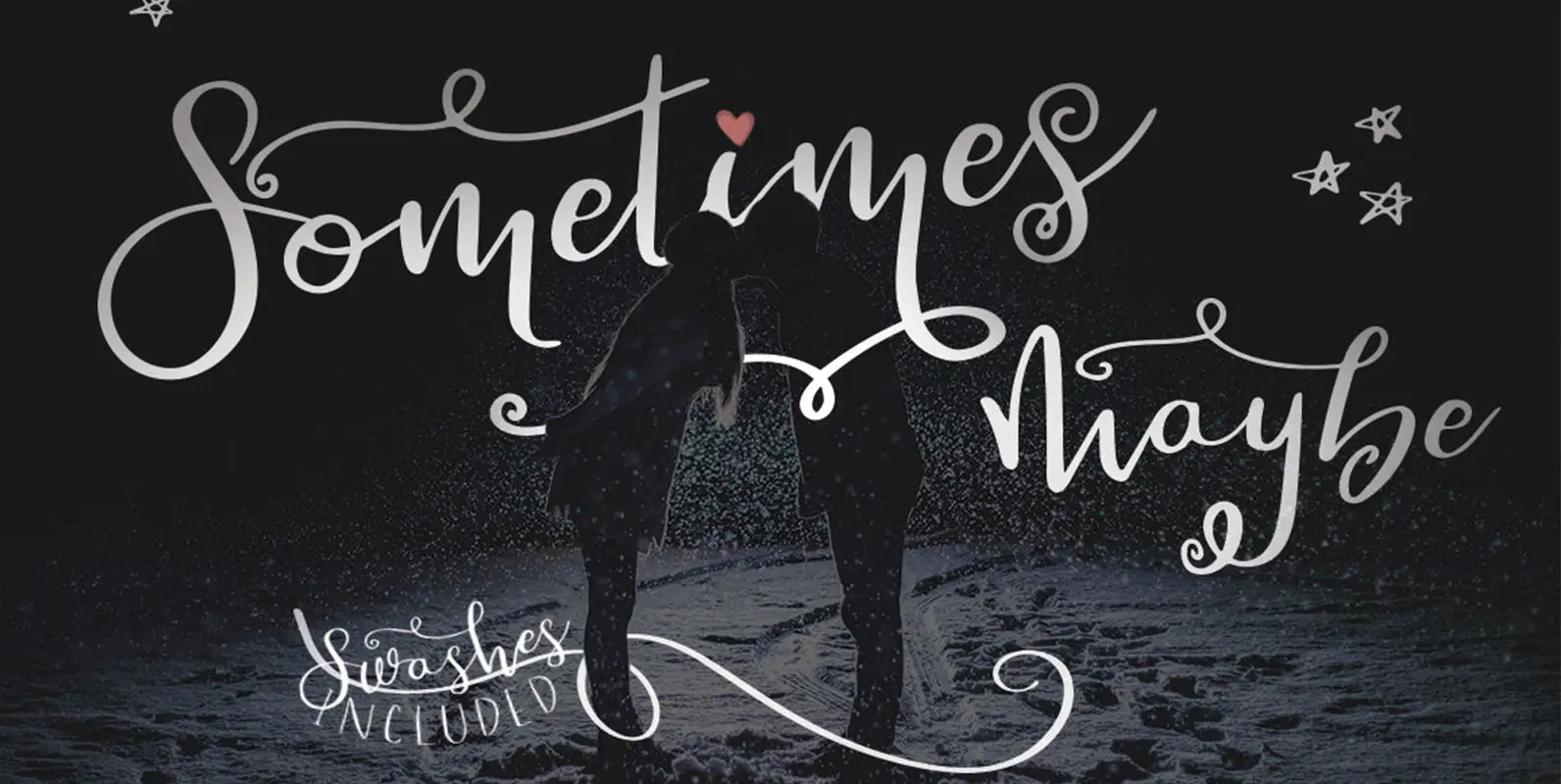
Sometimes Maybe Font
Introducing Sometimes Maybe! Sometimes Maybe is a smooth bouncy hand-drawn script. It includes it’s regular, rough and italic styles, the western characters and 31 alternatives. As a bonus we have included matching decorative swashes to stir into the mix. This
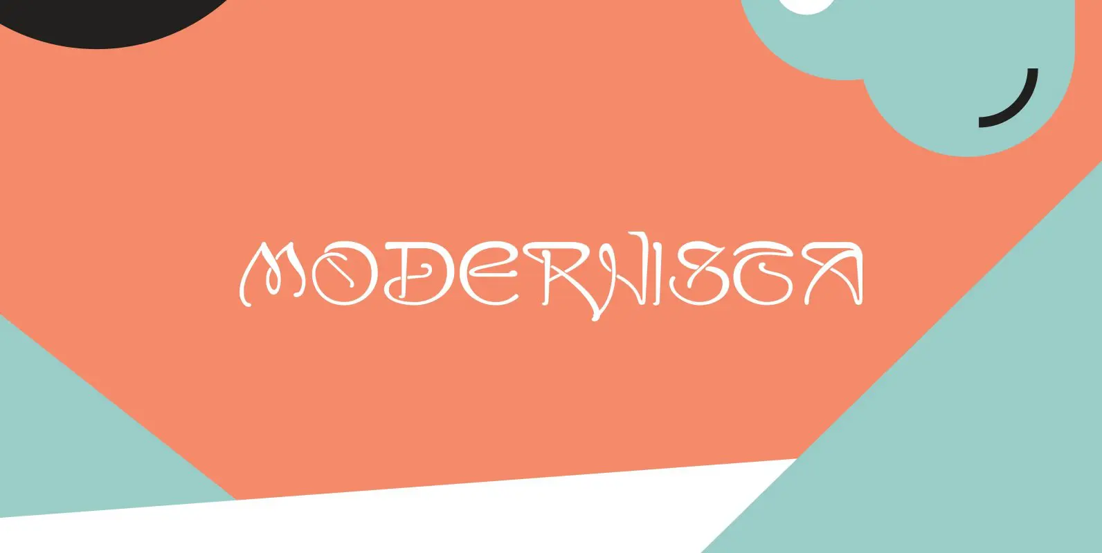
Modernista Font
“Art Nouveau” happened over Europe under different names. They called it “Jugenstil” in Germany, “Le style moderne” in France, »Sezessionsstil« in Austria and Eastern Europe, “Stile Liberty” in Italy and “Modernista” in Spain. “Jugendstil” in Germany is what started modern
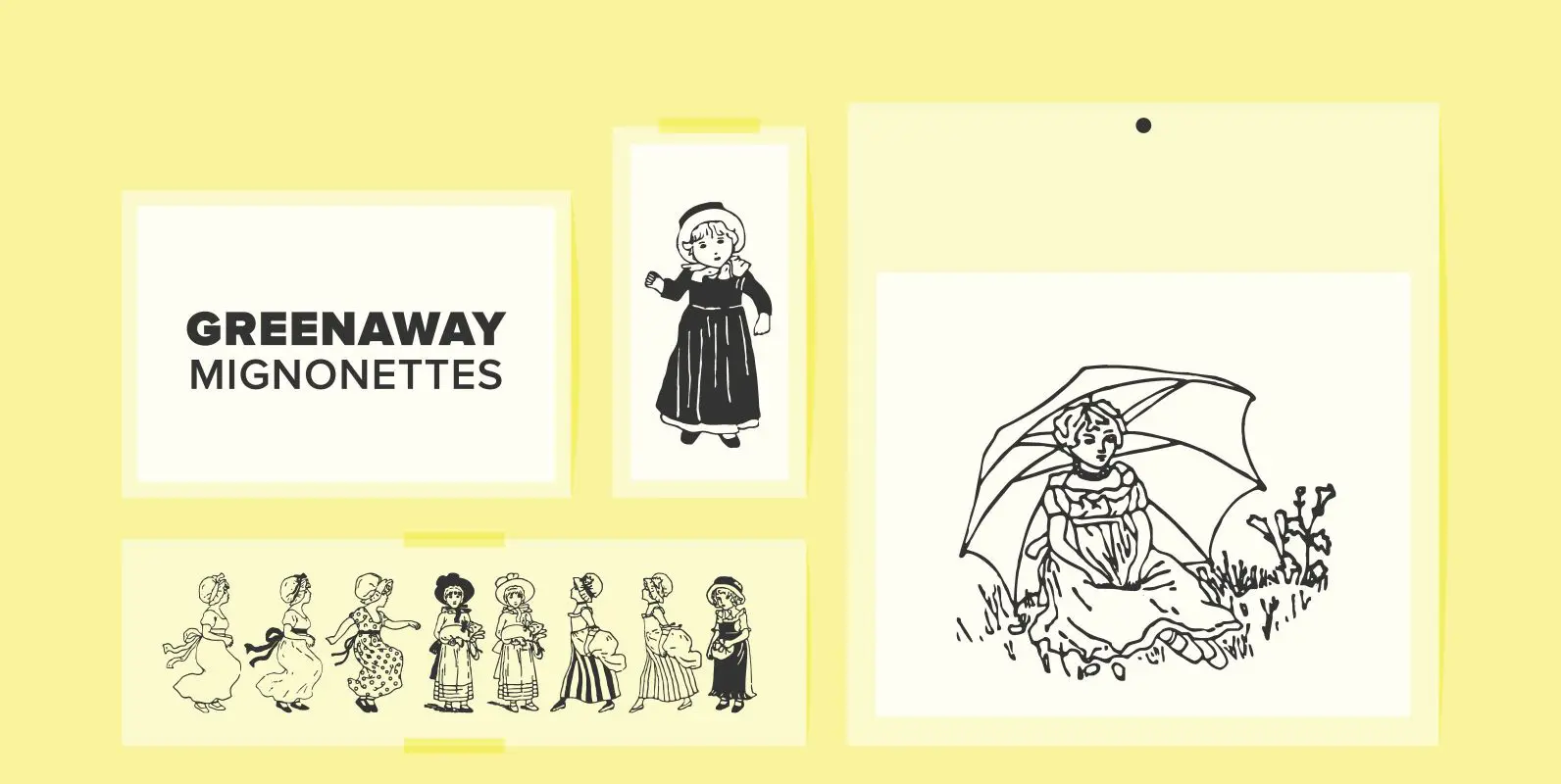
Greenaway Mignonettes Font
Kate Greenaway was a very famous British (1846-1901) author and illustrator of children’s books. Her books were an outstanding success in English publishing during the Victorian period. Recently I found these sweet Mignonettes in an old foundry specimen book. Mignonettes
New Yorker Plus Font
New Yorker Type was one of the first typefaces I tried my hand at in 1985. I meant it as a revival of the typeface used by the New Yorker magazine. I did not scan it in, I just looked
Excelsia Pro Font
“Excelsia Pro” Script is a beautiful narrow script designed in the tradition of Bodoni and Fournier, it has lots of variations. There are for example seven different versions for the uppercase letters that can be accessed with opentype savy software.
Florentina Font
“Fiorentina” is a ecstatic, abundant, embellished script in the Renaissance tradition. It could have been made for the Medicis or Sforzas. But I designed it completely new after being inspired by colorful Florentine wrapping papers. I gave it many different
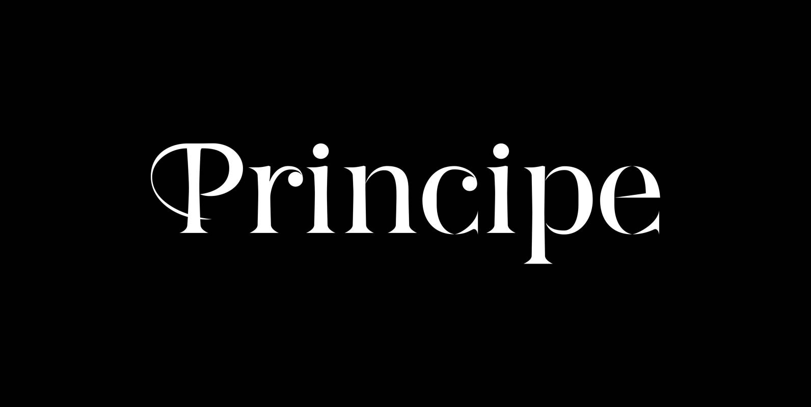
Principe Font
“Principe” is the Bodonian idea driven to the limit by abolishing most of the hairlines! The shape is completed only by the eye of the reader. This gives room for elegant embellishments and makes for a surprisingly new look to
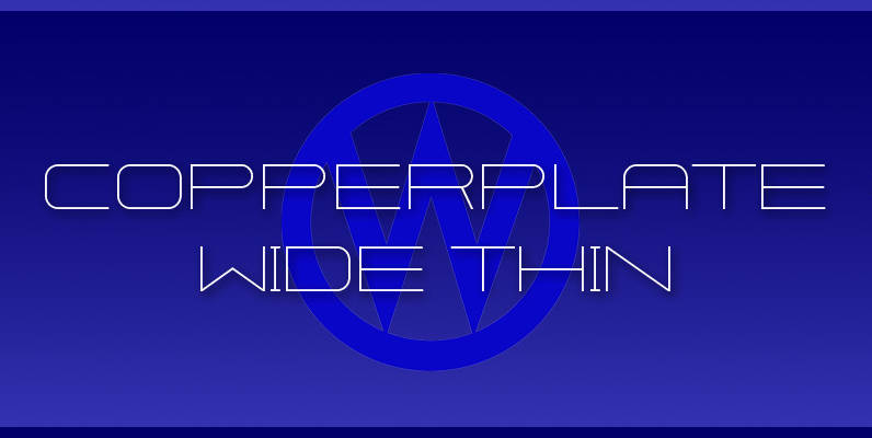
Copperplate Wide Font
“Copperplate Wide” is remotely based on the traditional Copperplate typeface that can be seen on many business cards. I have completely redrawn the typeface in a much wider version and without those stubby little serifs. In the place of the
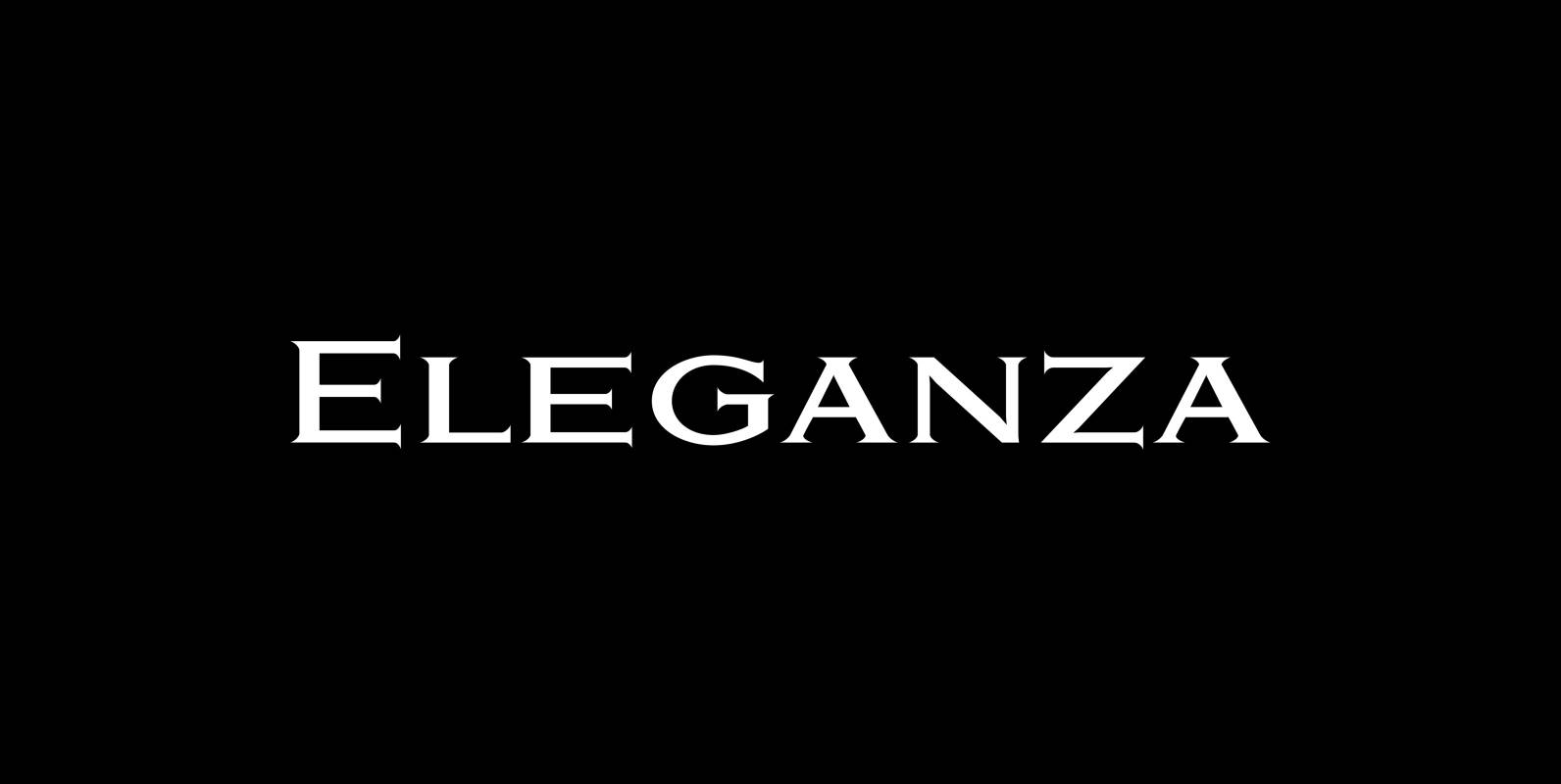
Eleganza Font
“Eleganza” is my most elegant typeface. At least that is what I think! I use it for business cards and everything that has to be elegant with that extra touch. The font comes in pairs for the price of one.
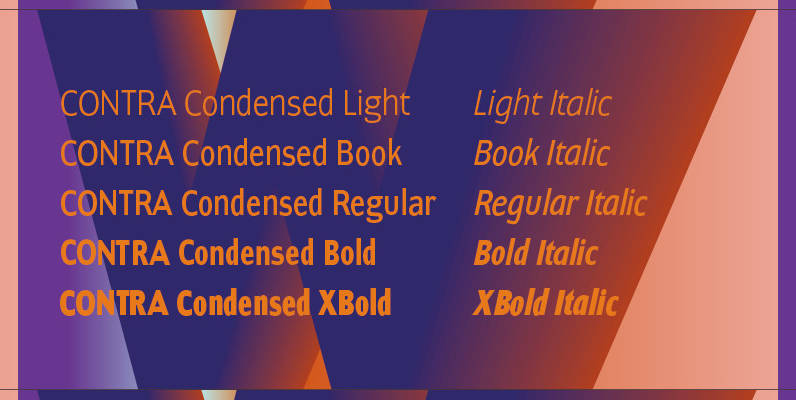
Contra Condensed Font
Contra Condensed is the condensed version of my Contra family of fonts. It is very condensed, but not yet narrow. It is well suited in all situations where one needs to save space. Published by Wiescher DesignDownload Contra Condensed