Tag: bauhaus
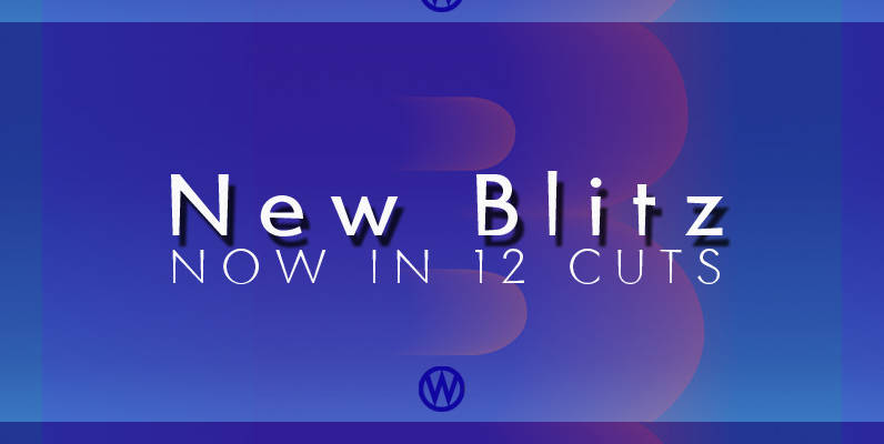
Blitz Font
A very glitzy Blitz! I always wanted to design a typeface that was top heavy, but I never new how not to make it look like Antique Olive, until recently I had an idea. My new family is very readable
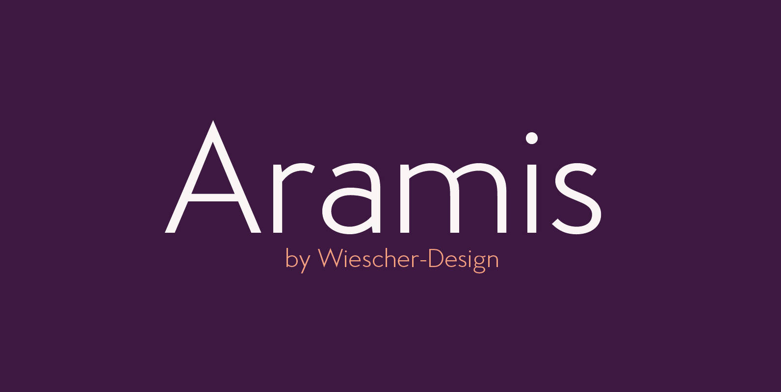
Aramis Font
“ARAMIS” is a new linear Sans with a French touch– designed by Gert Wiescher in 2014 and 2015 – has 7 weights with corresponding italic cuts. The small contrast in the linear Sans makes it not quite so linear and
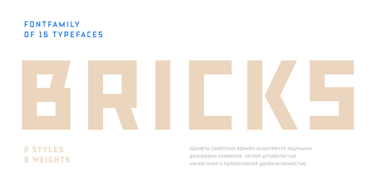
TT Bricks Font
Do you love the early Soviet visual culture as much as we do? We’ve tried going back a hundred years and rethinking the constructivist era. We’ve created an extensive fontfamily that consists of the simplest triangle and rectangle forms. TT
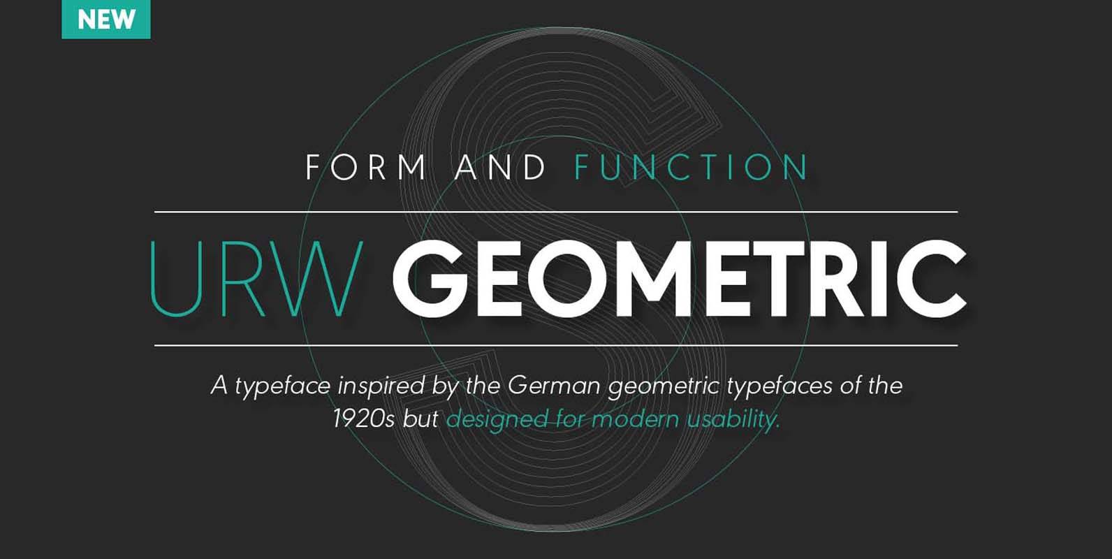
URW Geometric Font
URW Geometric is a sans serif typeface inspired by the German geometric typefaces of the 1920s but designed for modern usability. The character shapes have optimized proportions and an improved balance, the x-height is increased, ascenders and descenders are decreased.
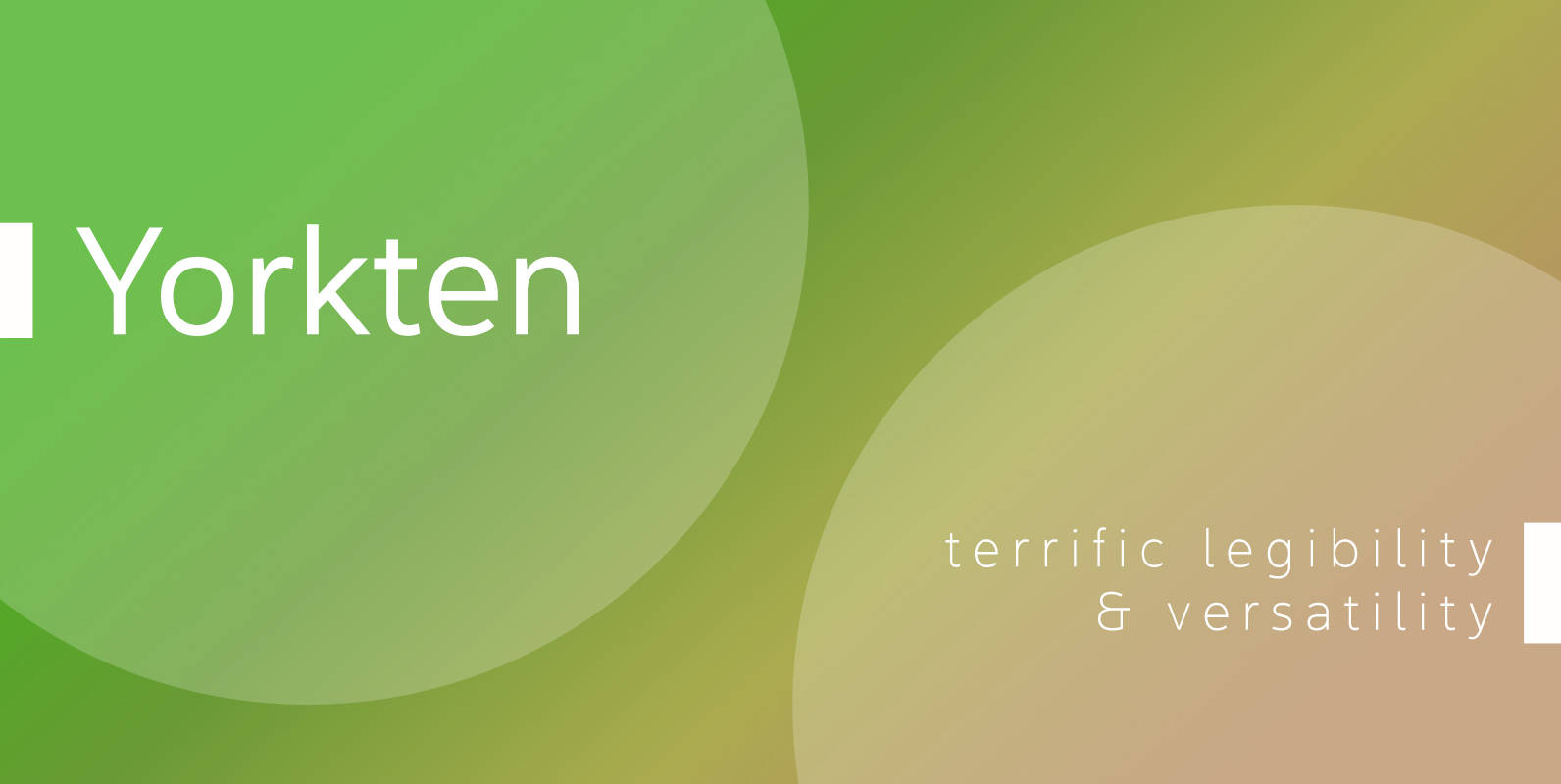
Yorkten Font
Clean and welcoming, the distinct look of Yorkten is remarkably satisfying to the eye. Straight to the point, Yorkton features a fashionable, geometric composition with angled main stems. There are no fewer than fifty-four fonts in the family, all of
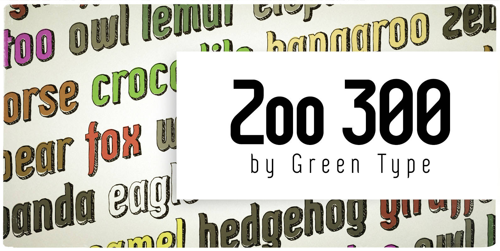
Zoo 300 Font
Zoo 300 is a narrow techno sans font family with handwritten shadow styles. Published by Green TypeDownload Zoo 300
Abrade Font
Abrade is a geometric sans serif with rational design choices for contemporary functionality. The family is designed with a medium x-height to provided great legibility in both display and text sizes. The forms are refined to work well in print

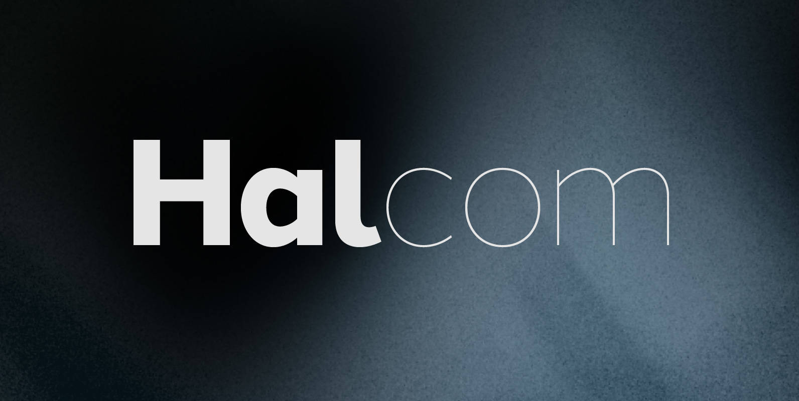
Halcom Font
A modern sans serif typeface inspired by the historic geometric’s of the 1920’s, specifically Futura. The design is not a simple pastiche of what went before this is much more than that. It is a close investigation to how Futura
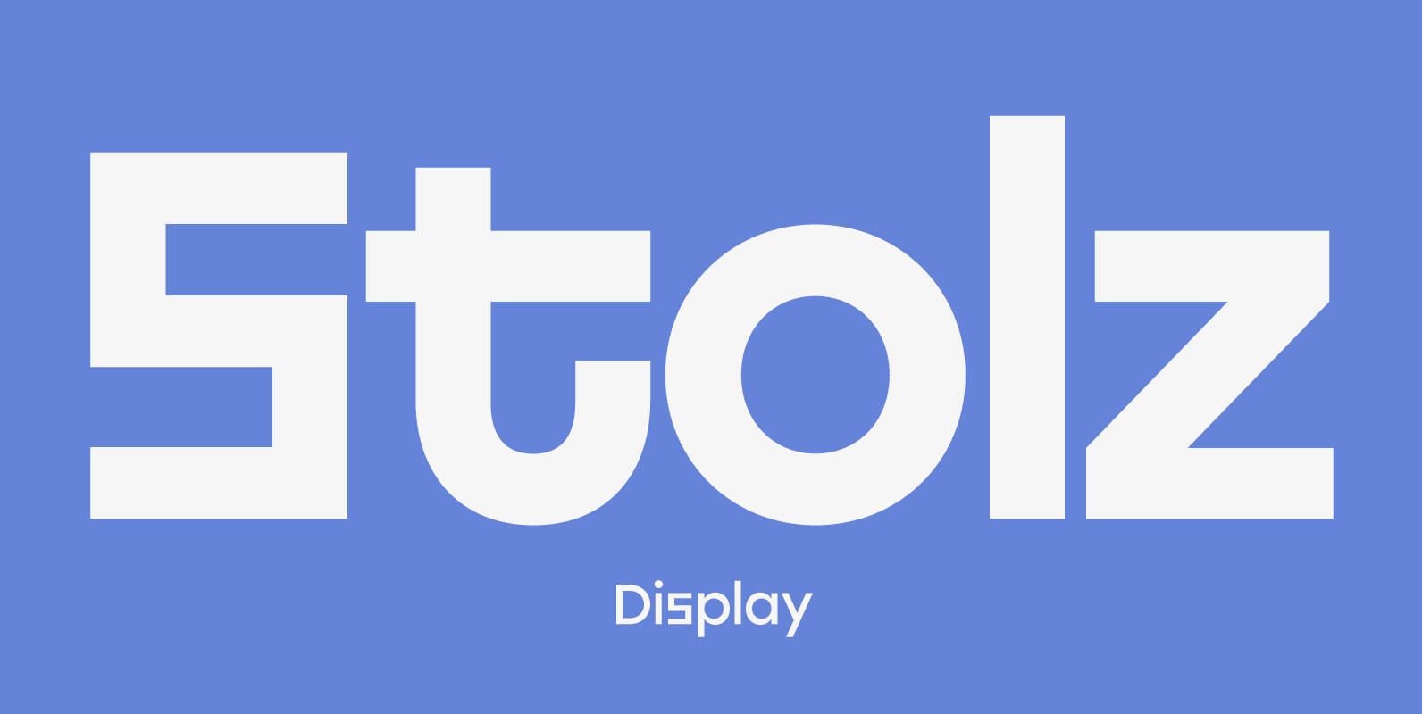
Stolzl Display Font
Stolzl Display is an original font family designed for headlines, titles and subtitles. Based on the combination of contrasting shapes, the harmony of form and rhythm is fundamental to the design. Inspired by Bauhaus, Stolzl represents, not just the significant
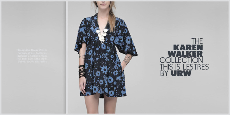
Les Tres Font
German designer Claudia Kipp has stated that she sees design as a “necessity to improve and enrich the visual world,” and her modern and clean sans typeface Les Tres certainly does its share. Working with great efficiency and great impact,

HAUS Sans Font
HAUS Sans is inspired by Bauhaus and historical grotesk typefaces of the 1930s. Available in 6 weights, from “Ultra Light” to “Extra Bold” regular and italic versions. The font includes 389 gliphs, with subscripts, superscripts, ligatures and support almost all
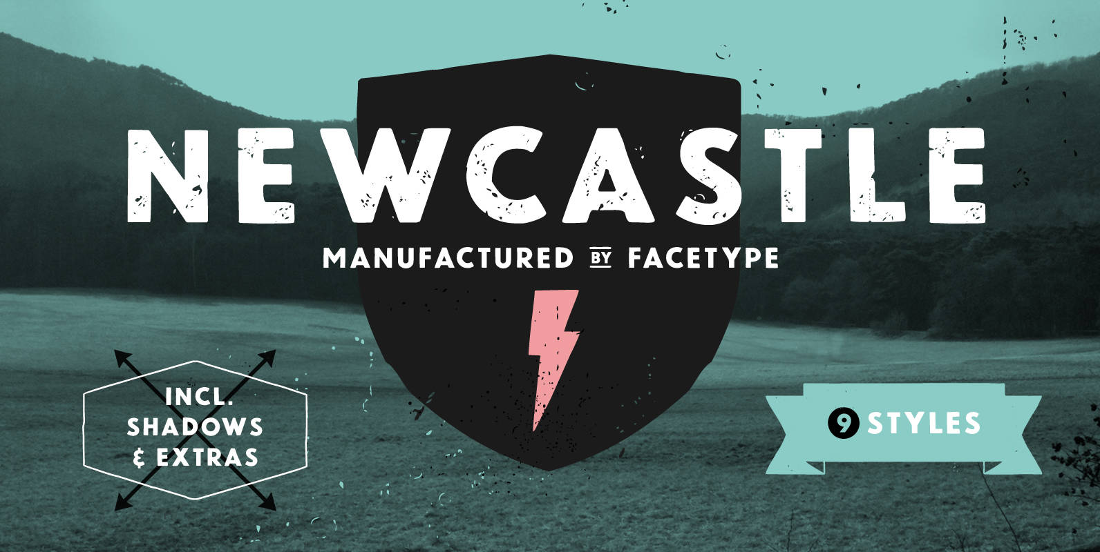
Newcastle Font
Newcastle gives you great opportunities for spicy typography. If you find some similarities to one of our fonts, ‘Blitzplakat’, you are right. We took it to the next level and made it even better: We extended the range of letters,
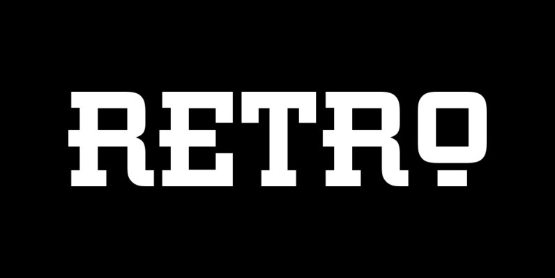
Retro Font
This all capital, slab serif typeface was inspired by elements of early 20th century Constructivist, Bauhaus, Art Deco and Streamline graphic movements. Retro Bold has a strong graphic appearance, a selection of alternative letters and is suitable for a wide
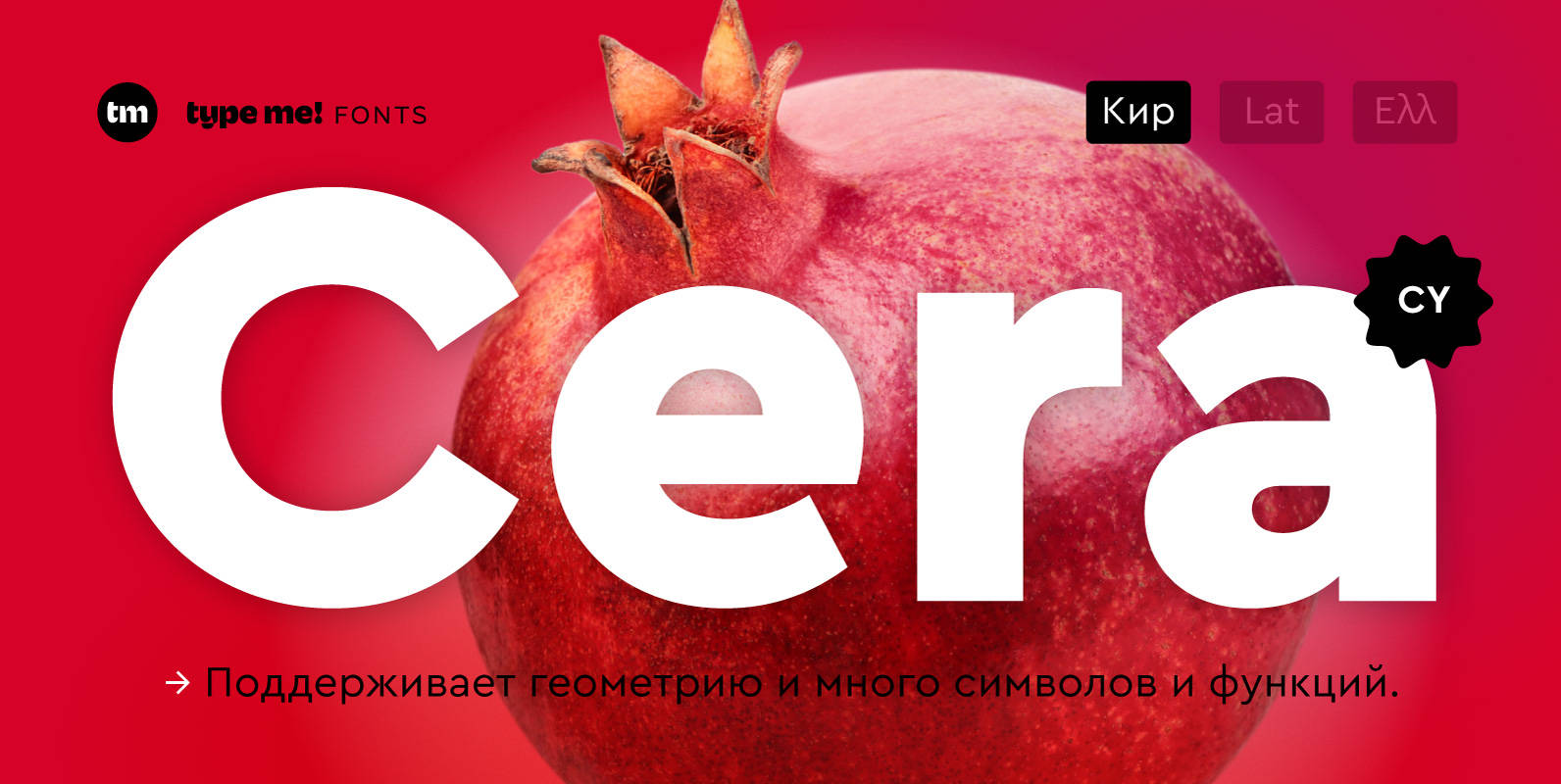
Cera CY Font
The sans-serif typeface – designed between 2013 and 2015 – is supporting pure geometry plus Cyrillic script and basic Latin letters. With over 490 glyphs per weight Cera CY cares about localized letter shapes plus ordinals and provides matching OpenType
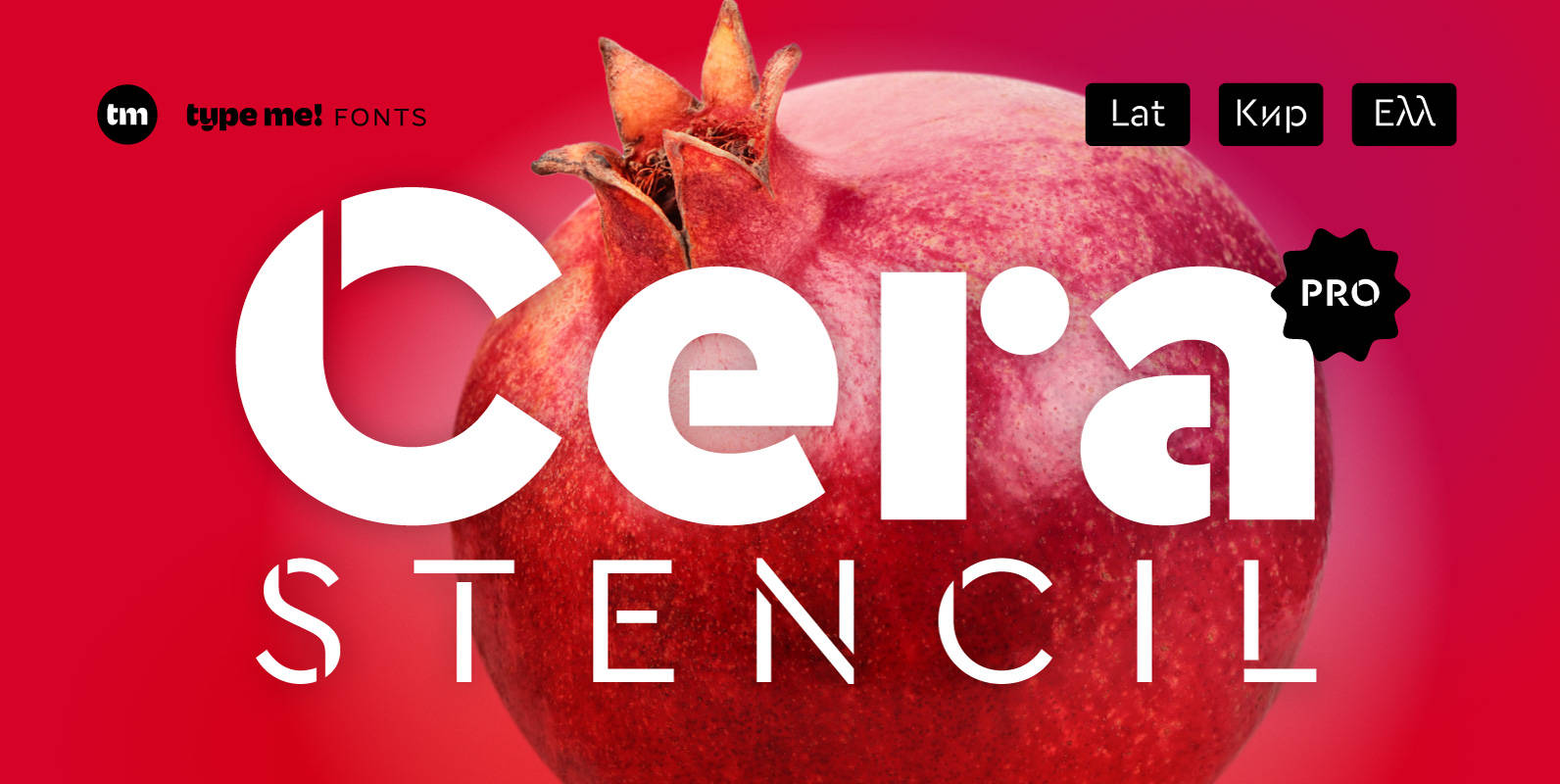
Cera Stencil PRO Font
Cera Stencil Pro is part of the Cera Collection is driven by pure geometry and containing the bestselling Cera, its stenciled counterpart Cera Stencil and the hand-crafted display companion Cera Brush. Cera Stencil, with six weights, useful dingbats and arrows,
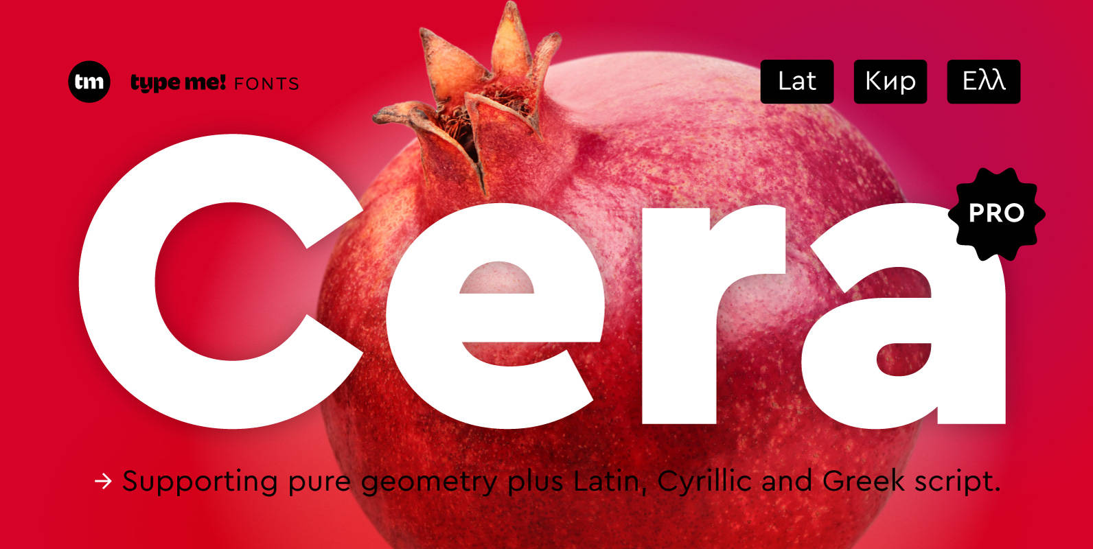
Cera PRO Font
Cera Pro is part of the Cera Collection driven by pure geometry and containing the bestselling Cera, its stenciled counterpart Cera Stencil and the hand-crafted display companion Cera Brush. With six weights, a clean italic – carefully slanted 10 degrees