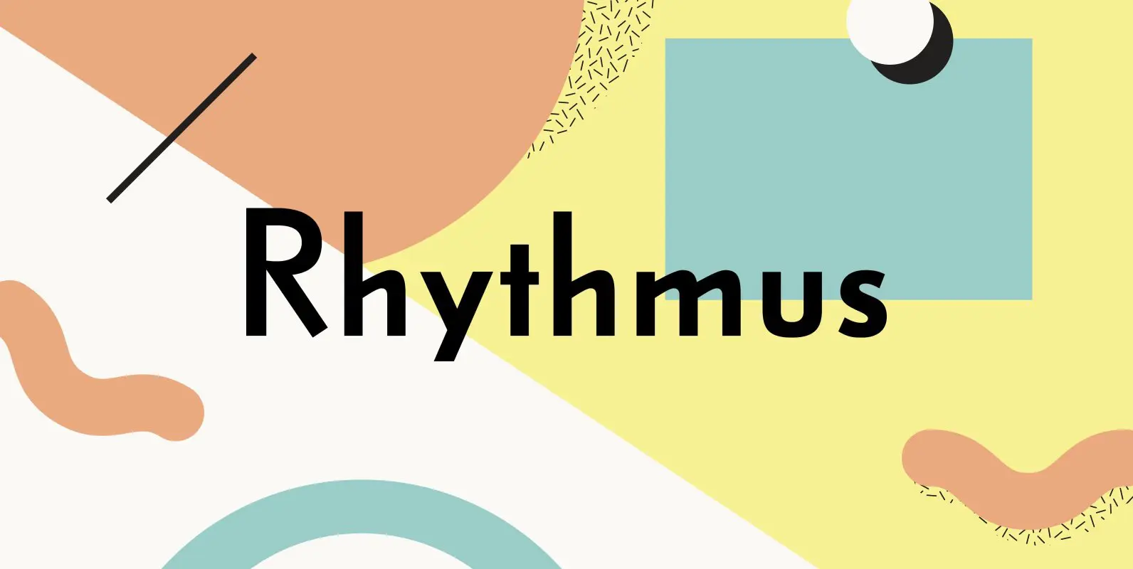
Rhythmus Pro Font
Schelter & Giesecke’s grotesk font family, widely used for their marketing and in-house prints, now revived and extended with a Cyrillic character set and old-style numerals. Published by RMU TypedesignDownload Rhythmus Pro
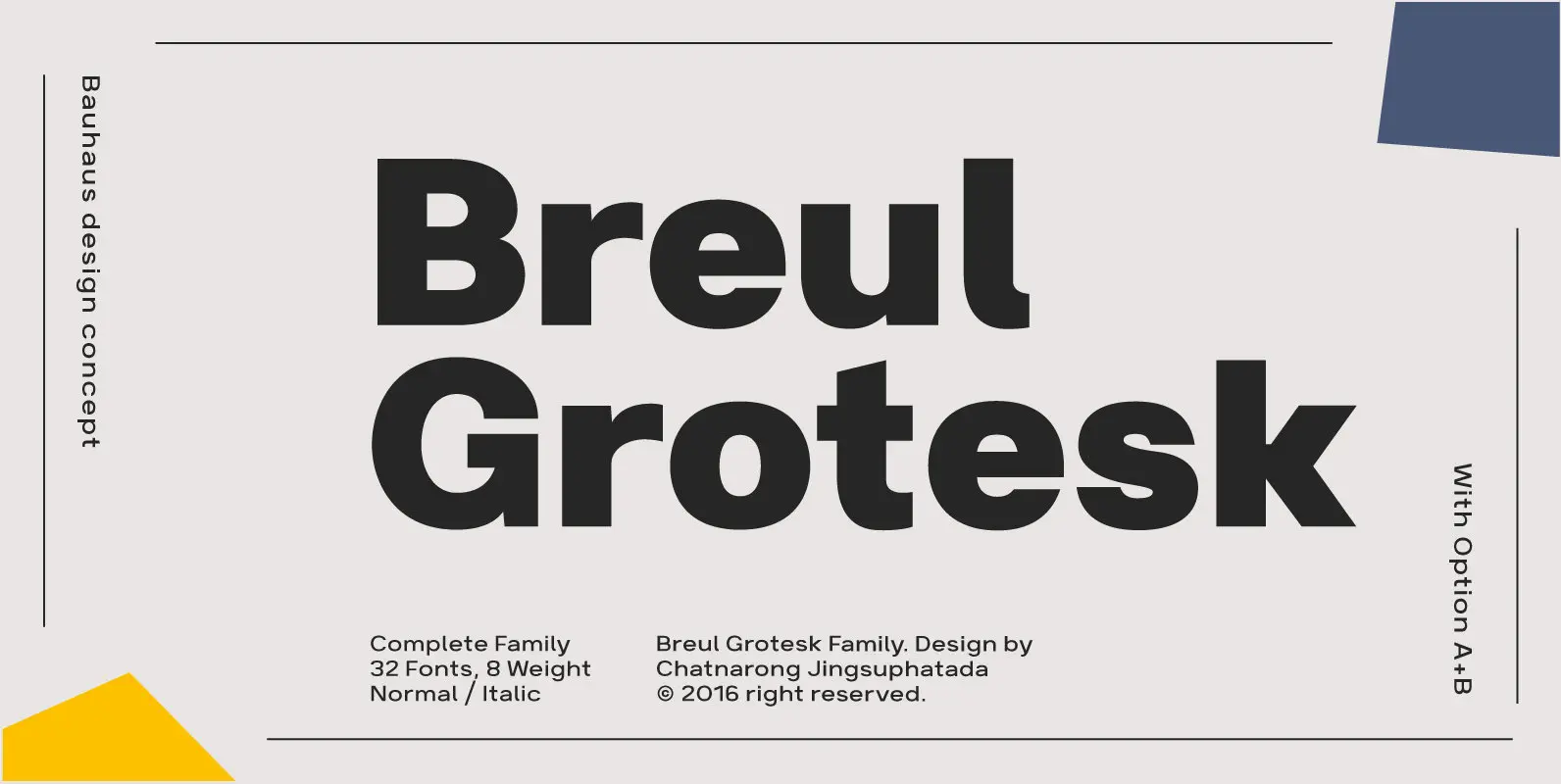
Breul Grotesk is classic and straightforward, sparing nonessential design elements that would otherwise detract from its simplicity. Inspired by Bauhaus design concepts, Breul Grotesk is a sans serif typeface that pairs artistry with innovation. Two distinct variations of the font
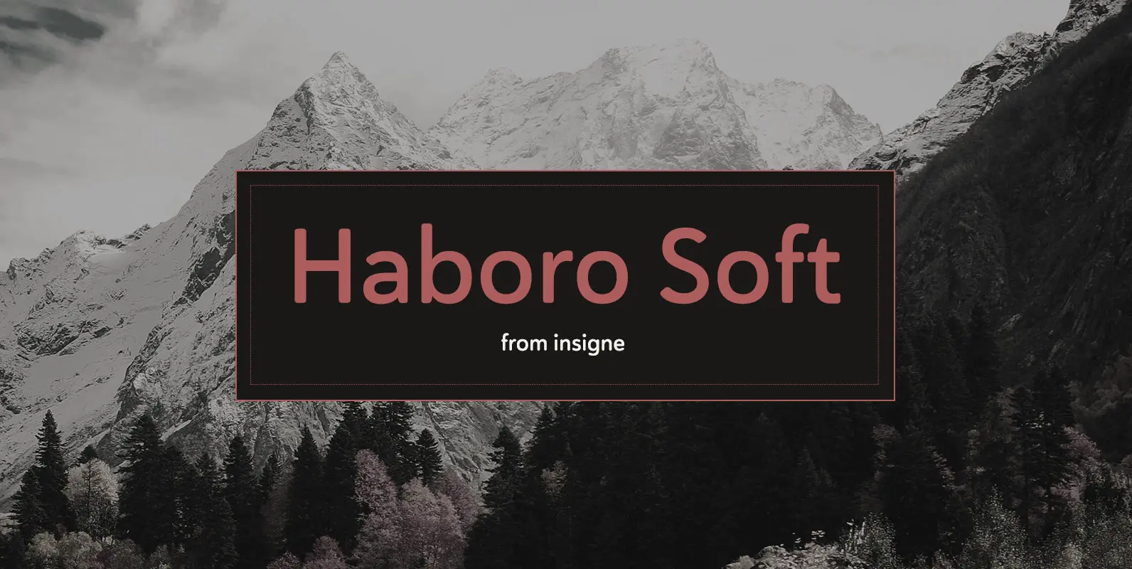
Stop trekking through the thick, wintery font forest, and step lightly into the fresh life of the Haboro hyper family. Though simple in nature, the Haboro hyper family provides you with a variety of options. Take, for instance, Haboro Soft,
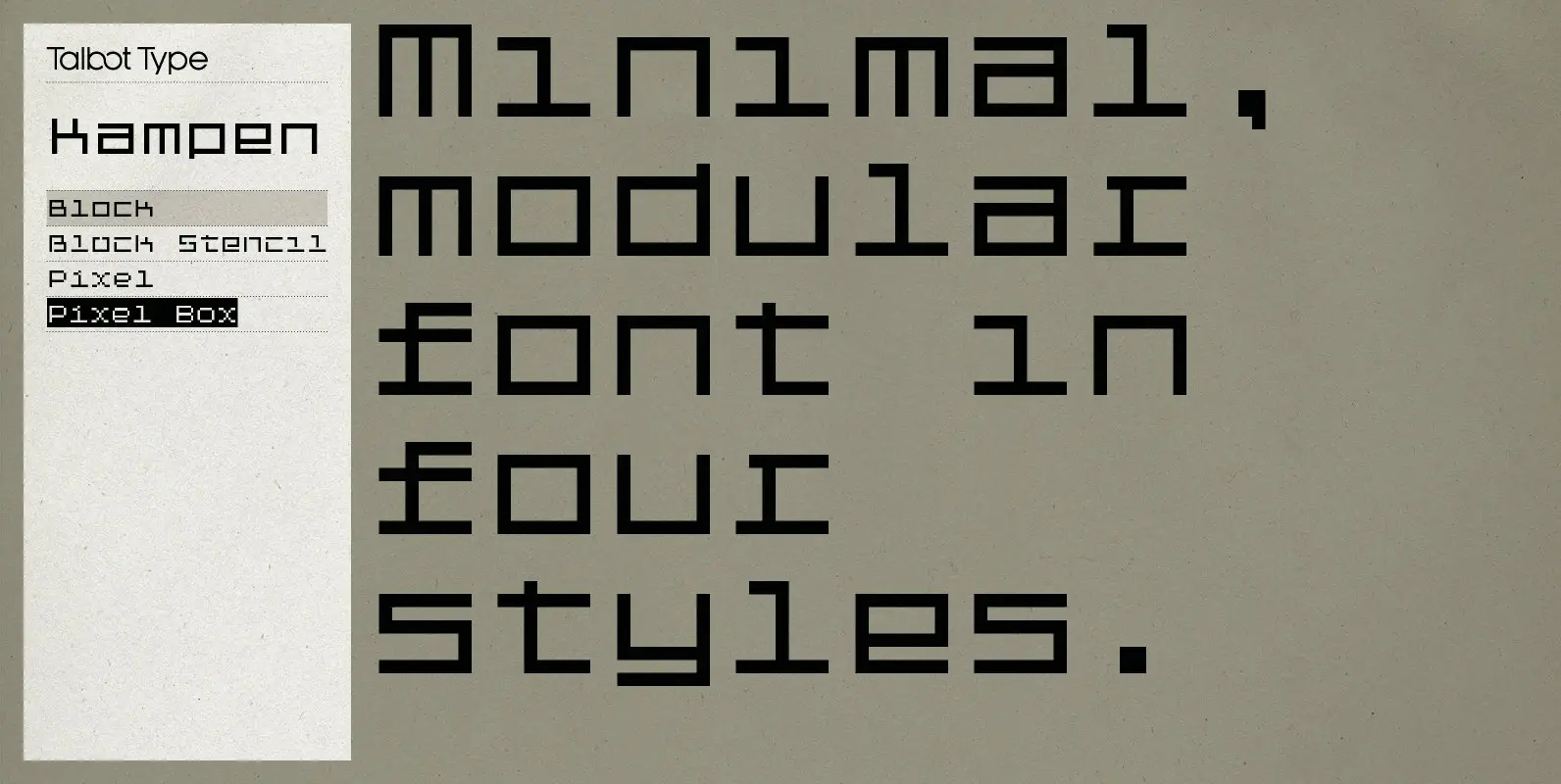
Kampen is a minimal, modular, monospaced font. There are two variants, each available in two styles. The two variants — Block and Pixel — differ considerably in look, however the characters in both are designed using the same 7 x
Schelter & Giesecke’s grotesk font family, widely used for their marketing and in-house prints, now revived and extended with a Cyrillic character set and old-style numerals. Published by RMU TypedesignDownload Rhythmus Pro
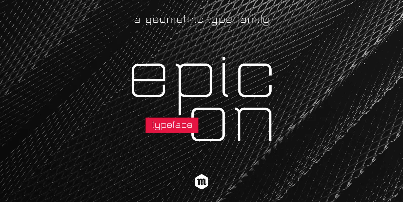
With its geometric shapes and rounded terminals, Epicon Typeface is a modern and functional sans serif family with an air of technology. With 3 weights and their accompanying italics, this contemporary font is well-suited for all kind of application. From
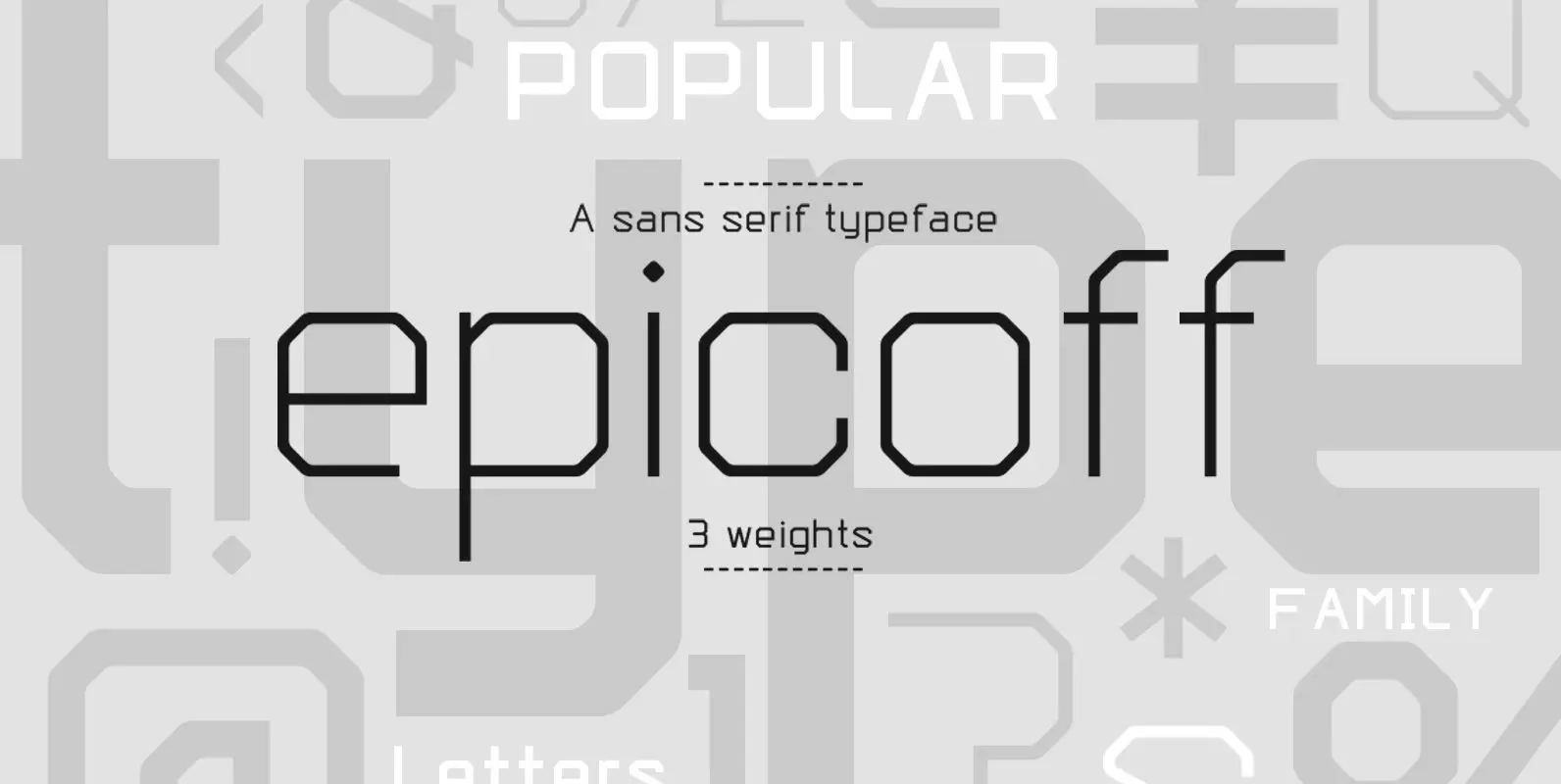
With its geometric shapes and straight terminals, Epicoff is a modern and functional sans serif family with an air of technology. With 3 weights, this contemporary font is well-suited for all kind of application. From packaging to editorial design, from
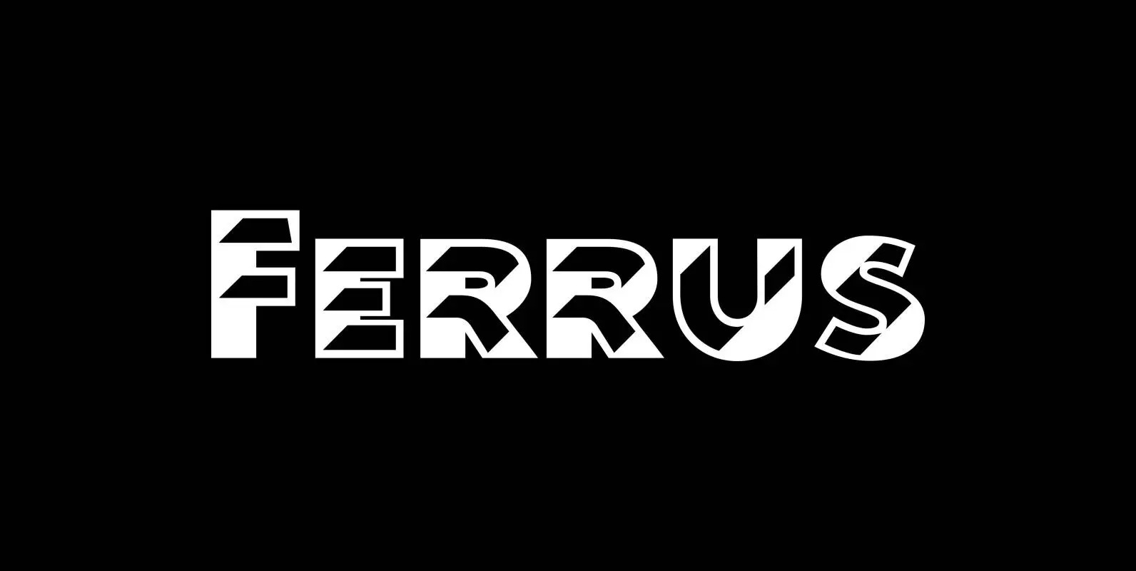
“Ferrus” is named after the location of famous French foundry Deberny & Peignot which was at “18 Rue Ferrus, XIV Paris”. “Ferrus” is inspired by a font named “Acier” of the Twenties of last century. But “Ferrus” is not a
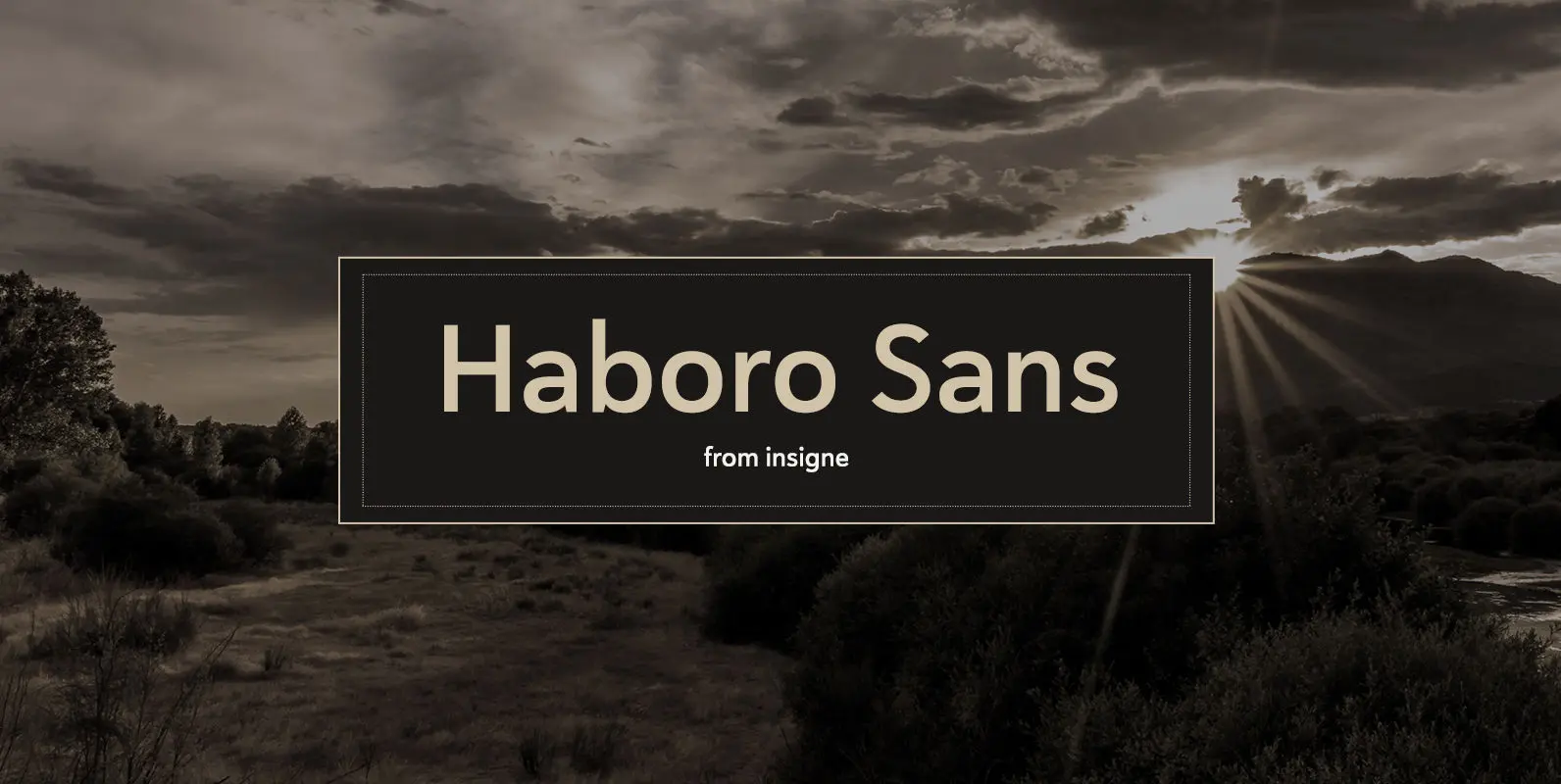
Quit trudging through the thick with encumbering fonts, and spring to the front of the pack with the cutting edge sans serif, Haboro Sans. With nothing to clutter up your work, your editorial designs, websites, and software will be sharp
Dylan is a Sans typeface in the best American tradition. In order to keep corners open and to make the font more readable in small sizes it has deep cuts where curves join straights. I designed 8 finely tuned weights
Dyane is based on monolinear scripts from the Bauhaus time. But it is very special for its counter strokes in the lowercase letters a, h, m and n that gives the script a very distinct rhythm. Published by Wiescher DesignDownload
“Byblos” is the name of a town in Lebanon and the name of a famous hotel in St. Tropez. Some time ago I discovered their old logo in an old french magazine, just 5 by 3 centimeters small without any
“Purissima Bold” and “Purissima Light” is the decorated extension to my “Pura” family. I only offer all 5 cuts together but for a very advantageous price.. The “Bold” and “Light” cut has no embellishments. The “A” and “B” cuts are
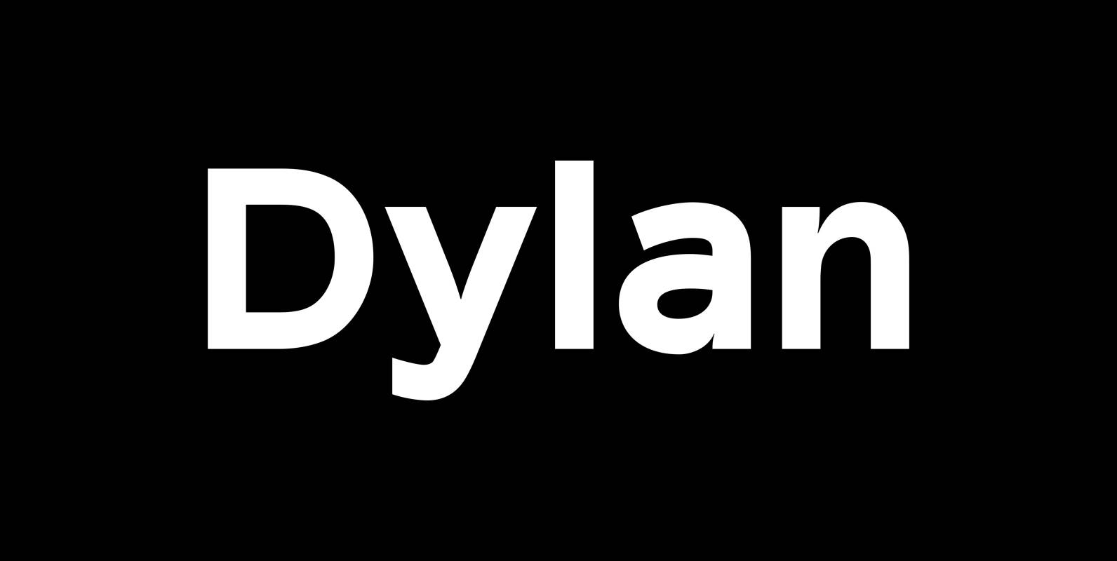
“Dylan” is a Sans typeface in the best American tradition. In order to keep corners open and to make the font more readable in small sizes it has deep cuts where curves join straights. I designed 7 finely tuned weights
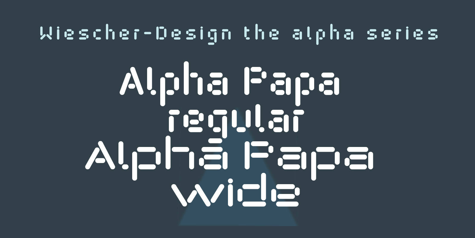
“Alpha Papa” is another font in my alpha-series, the experimental font series. It lents itself very good for all kind of modernistic occasions in all forms. You get 2 fonts (one alternative width set) for the price of one! Published
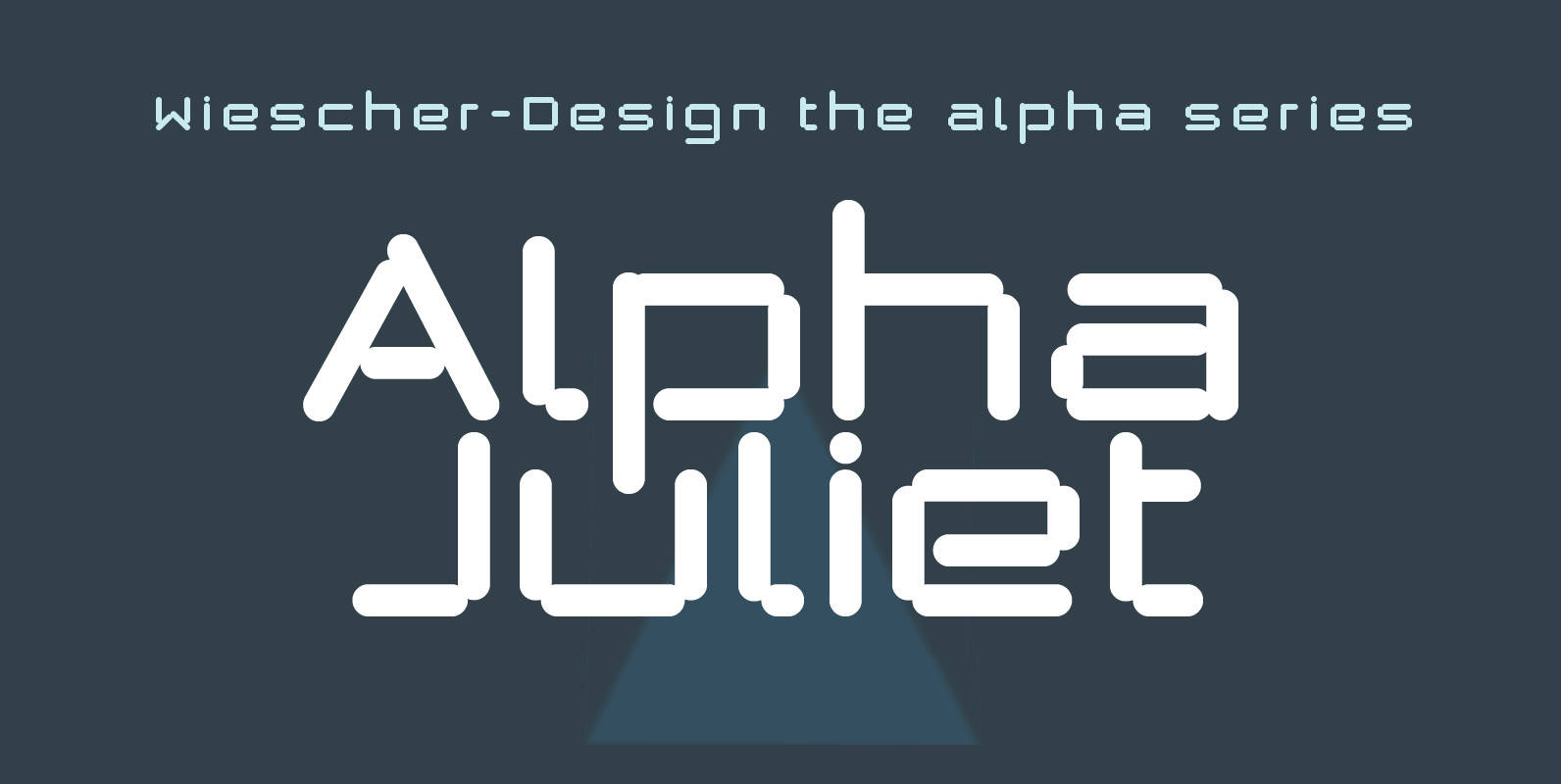
“Alpha Juliet” is another font in my alpha-series, the experimental font series. It lends itself for modern designs in all forms. The font can be used together with “Alpha Papa” since it has the same origins. Published by Wiescher DesignDownload
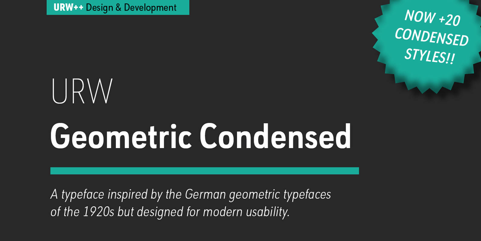
URW Geometric Condensed is the matching complement for the URW Geometric. Including 20 additional condensed styles the URW Geometric Condensed is the space-saving alternative in the URW Geometric family. URW Geometric is a sans serif typeface inspired by the German
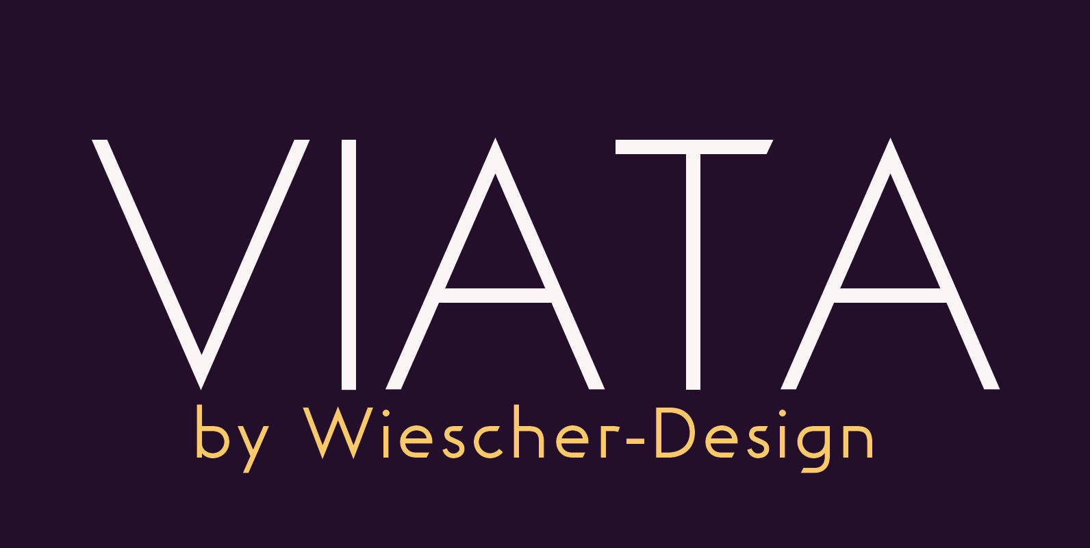
“VIATA” is my new experimental Sans again based on the modernistic, constructivist letterforms of the “Bauhaus” era. The names Herbert Bayer and Paul Renner come to mind as design beacons of that time. “VIATA” has flat tops and round bottoms,
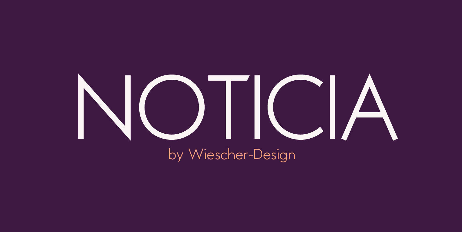
“NOTICIA” is my new Sans based on the modernistic, constructivist letterforms of the “Bauhaus” era. The names Herbert Bayer and Paul Renner come to mind as design beacons of that time. “NOTICIA” is different in its proportions and long ascenders