Tag: Architecture

Erbaum Font
Erbaum is a display square sans serif type family. It is straight-forward in overall structure, simple and rational in details. Erbaum was designed to maximise clarity, with an emphasis on construction and pragmatic aesthetics. The concept behind this typeface was
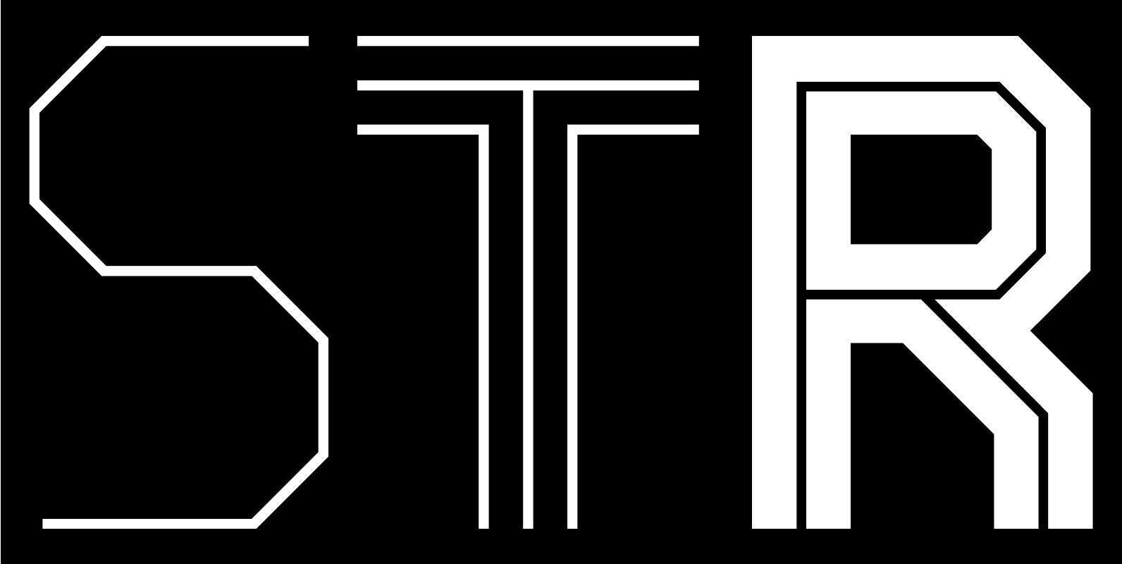
BB Strata™ Font
The font family BB Strata was first designed for the visualization of scientific content of an exhibition and developed for publication. The construction of the letters consists entirely of right angles and 45 °-diagonals only . It contains 506 characters
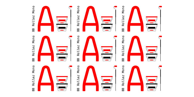
BB Roller Mono Font
BB Manual Mono™ Pro visualizes the work of painters: Craftsmanship, precision, professionalism and their tools. The special features of the Font emphasize the work process. Special characteristics: ● Flow: visible process ● Alignment: contextual monoline ● Accuracy: individual modularity ●
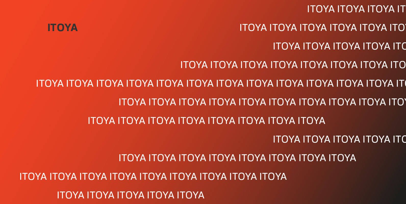
Itoya Font
Itoya is a contemporary sans serif font influenced by Western and Japanese ideologies. A fusion of modern machine-like functions with a warmer, emotional and more spiritual ethic. The marriage of a western precision and eastern expression forms a sharp functional

Stolzl Display Font
Stolzl Display is an original font family designed for headlines, titles and subtitles. Based on the combination of contrasting shapes, the harmony of form and rhythm is fundamental to the design. Inspired by Bauhaus, Stolzl represents, not just the significant

Merel Font
Merel is a modern geometric typeface with humanist attributes. Geometry and logic are at the heart of this 6 weight font family. Humanist touches give it a number of distinctive characteristics, as well as aid legibility. Despite being rational and
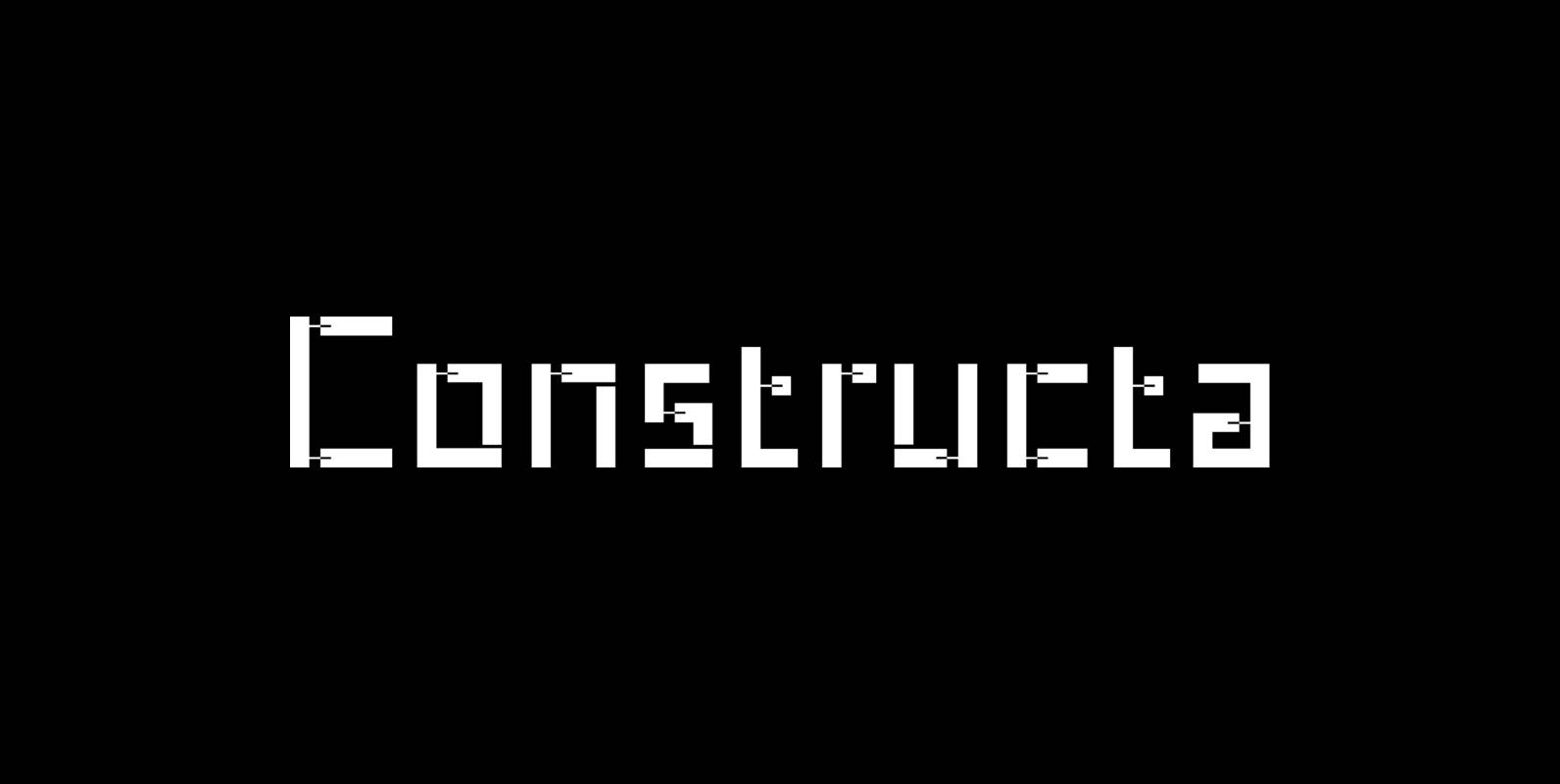
Constructa Font
Marit Otto about Constructa The building typeface. Although the 70ties were very liberating and progressive, still girls played mainly with dolls and sweet things and boys with all kinds of challenging stuff. They did all sorts of basic scientific experiments
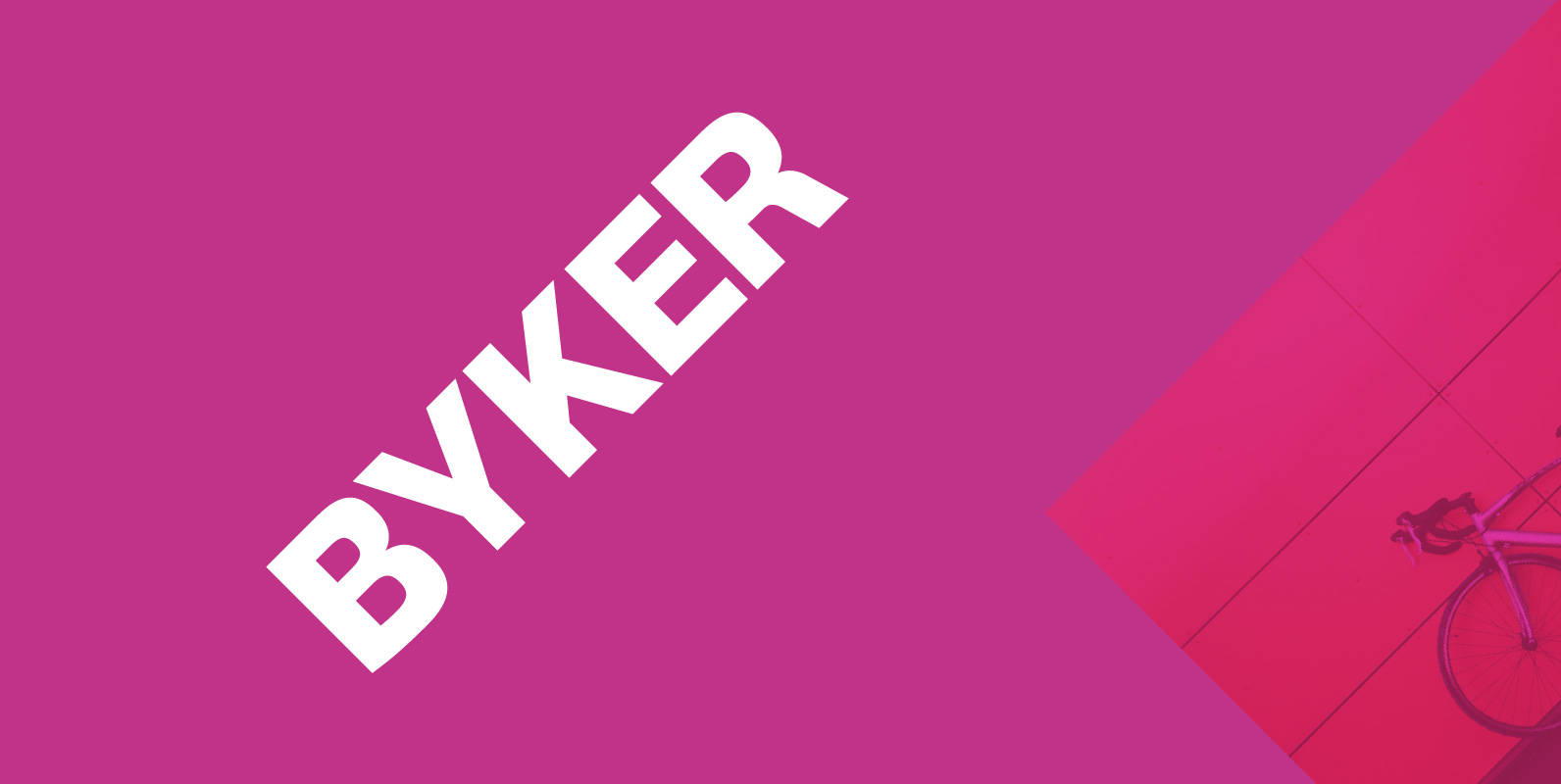
Byker Font
Byker is a geometric sans serif font that blends technology with handcrafted skill. The letterforms are constructed digitally from a technical grid and overlaid with handmade curves. The combination of this process creates a strong, organic font that is precise
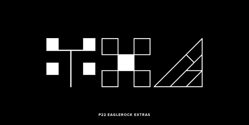
P22 Eaglerock Extras Font
This font set is based on the alphabet designed by Frank Lloyd Wright for the “Eaglerock” project in 1922. Although the project was never built, the lettering has been adapted to become the Eaglefeather® font family. Eaglerock Extras features 52
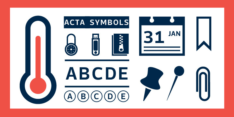
Acta Symbols Font
First designed for chilean newspaper La Tercera in 2010, Acta family is a clean and fresh type system, while enough conservative for newspaper setting. The complete Acta Type System contains Acta and Acta Display both with six weights with matching
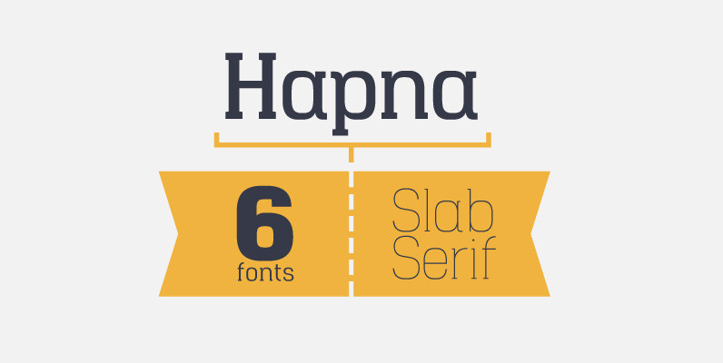
Hapna Font
Hapna is a geometric slab serif designed as an alternative to other slab style fonts available on the market. The typeface was originally released in January 2013 as a free monospaced single weight slab serif called Hapna Mono. This new
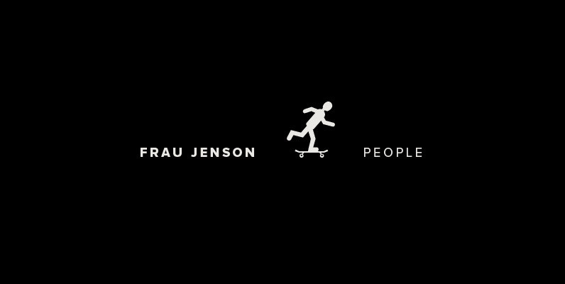
P22 Frau Jenson People Font
A collection of over 70 pictograms featuring people doing all sorts of everyday things—some ordinary, some surprising. Signs for allowing or not allowing these activities are also included. See included PDF for key positions of all characters. To use the
PF Handbook Pro Font
This typeface is the result of an attempt to modernize DIN, by introducing round smooth corners and distinct design elements to several characters like ‘a, g, k, m’, without compromising legibility. In order to retain its sharpness, inner corners as
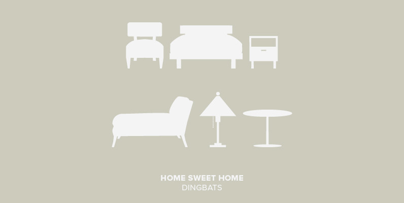
Home Sweet Home Dingbats Font
I could dance with you until the cows come home. On second thought I’d rather dance with the cows until you come home. – Groucho Marx. Published by Outside The LineDownload Home Sweet Home Dingbats
PF DIN Text Condensed Pro Font
The DIN Text series was based on the original standards but was completely redesigned to fit typographic requirements. Completed in 2002, it was first released in 2003 and published in our catalog, as a group of 4 separate families each
PF DIN Display Pro Font
DIN Display was designed as an alternative to Parachute’s Din Text series. While Din Display seems to retain DIN’s basic characteristics, it shines with its sharper corners and contemporary look. Completed in 2002, it was first released and published in
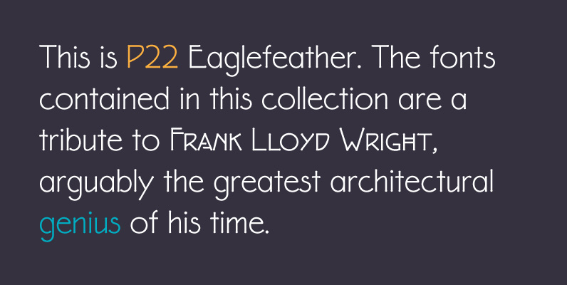
P22 Eaglefeather Family Font
The fonts contained in this collection are a tribute to Frank Lloyd Wright, arguably the greatest architectural genius of his time. Wright produced a vast body of work that defined and redefined American architecture. His talent extended into the creation
PF DIN Text Compressed Pro Font
In 1936 the German Standards committee Deutsches Institut Normung (DIN) proposed DIN 1451 as the standard type of lettering to be used in the field of road traffic. The purpose of this standard was to lay down a style of