Tag: 2000s
YWFT OneCross Font
Comprised entirely of “plus signs” of varying weights, YWFT OneCross had its genesis in YWFT OverCross (2002). When it was reworked later that year in order to create a more integrated blend of positive and negative space, Over became One,
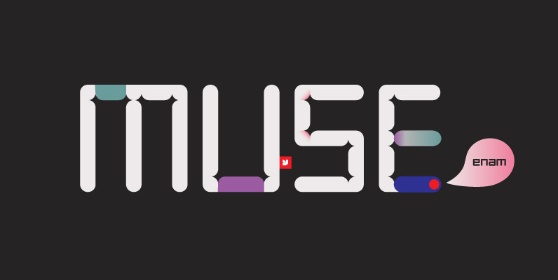
YWFT Enam Font
YWFT Enam’s letterforms were originally created for a branding job, then developed as a font, and finally converted to Opentype format in 2010. Some similarity to past work by Wim Crouwel is evident, which comes as no surprise, given our
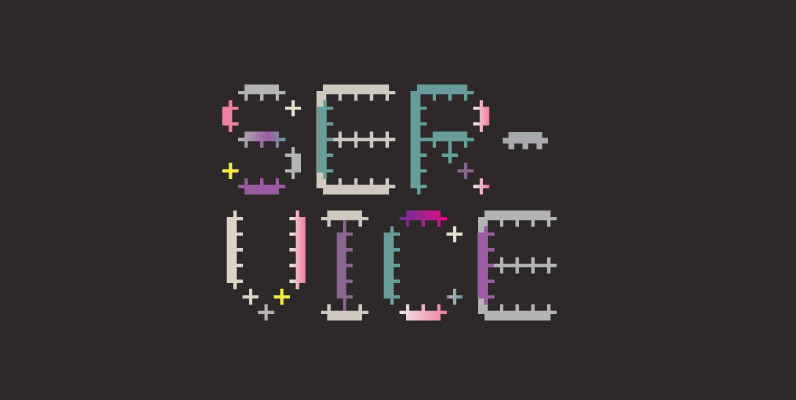
YWFT Service Font
YWFT Service is a display typeface, strongly influenced by electronic music during the late 90s and early 00’s. YWFT Service began as custom-drawn lettering on flyers for various music labels and DJs. Despite its underground origins, however, YWFT Service works
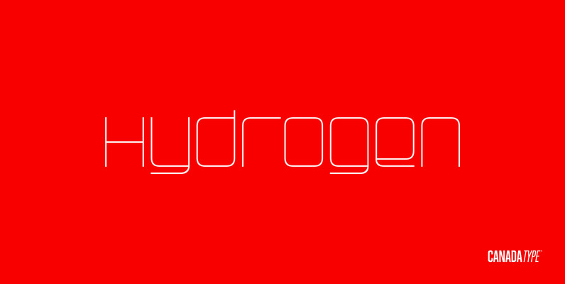
Hydrogen Font
Hydrogen is a clean geometric unicase family that expresses the mechanics, expansive technologies and conflicted ethics of the rapidly changing 21st century. Coupled with the right measure of Oxygen, Hydrogen becomes water, the ace of elements – rhythmic, dynamic, ever-flowing,
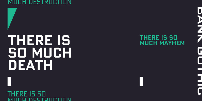
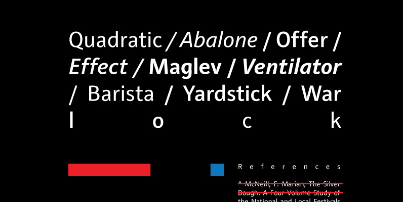
Bank Gothic Pro Font
If there was an American Typeface Hall of Fame, Bank Gothic, designed by the great Morris Fuller Benton would hold a place of special distinction considering this design has survived so many trends in typographic fashion since being introduced in
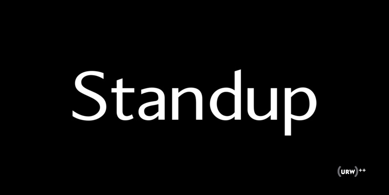
Standup Font
Standup is a clean sans-serif font that was designed by Jens Weigel in 2004. The Standup family contains three weights, including an interesting italic version (Regular, Italic, SmallCaps). Published by URW Type Foundry GmbHDownload Standup
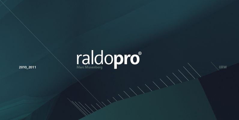
Raldo Re Pro Font
Quite unusual, Musenberg started his Raldo design with the italic. However, he managed to preserve the temperament and vividness of the italic in the roman without questioning the stability of the individual characters. Raldo is a modern Sans Serif family
YWFT OverCross Font
YWFT OverCross originally started as a typeface design that set out to explore visual form while retaining legibility. At close range, YWFT OverCross is visually beautiful but rather unreadable. Take a step back, however, and it becomes completely legible, perfect
Montauk Pro Font
Montauk Pro is named after a small village in Suffolk County, New York on the South Shore of Long Island. It is the easternmost area in Long Island, and thus the easternmost area in New York State. It is home
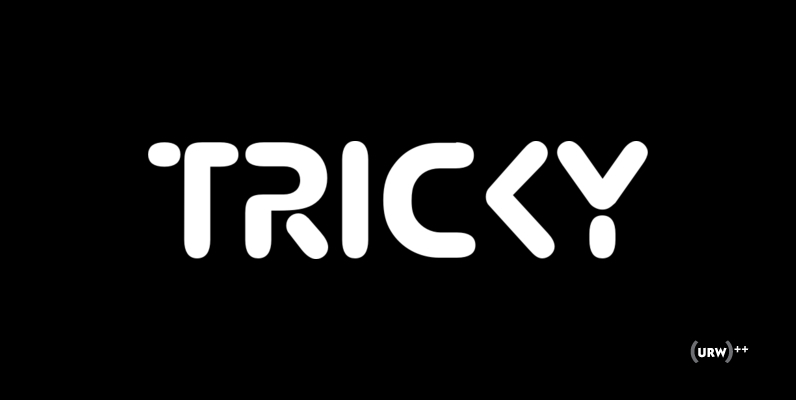
Tricky Font
Designed by Michel M. in 2002, Tricky is a tech/retro style font release by URW. Contains language support for West, East, Turkish, Baltic, and Romanian. Published by URW Type Foundry GmbHDownload Tricky
Dienstag Font
Dienstag is an extended sans-serif and a new companion to insigne’s popular Montag family. Dienstag is a bit more formal than its predecessor as it lacks Montag’s rounded terminators. Dienstag originally included four different weights, and this was expanded to
Raldo Font
Quite unusual, Musenberg started his Raldo design with the italic. However, he managed to preserve the temperament and vividness of the italic in the roman without questioning the stability of the individual characters. Raldo is a modern Sans Serif family
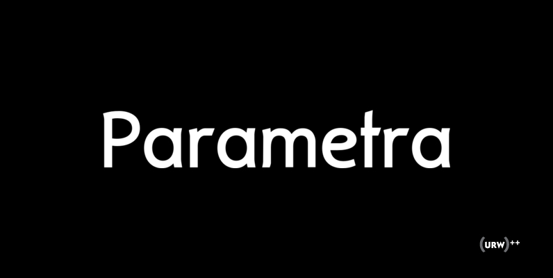
Parametra Font
This humanistic sans serif distinguishes itself by its Japanese calligraphy influence. Being written with a felt tip rather than with a brush, its Japanese connotation is remote and non-dominant, thus providing excellent readability and a charm of its own. Parametra
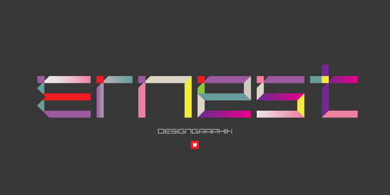
YWFT DesignGraphik Font
YWFT DesignGraphik is a custom typeface that was created for the fifth version of Michael Paul Young’s long-running online art project of the same name. Accordingly, the font has strong family ties with (and carries a strong resemblance to) MPY’s
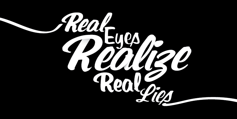
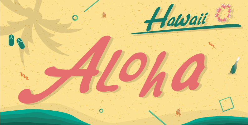
Santa Fe Font
Santa Fe is a profonts script typeface family supplied in the new OpenType Pro format. Santa Fe contains six styles: light, medium, bold and the corresponding italics. The character set covers about 500 glyphs for all Latin European languages, including
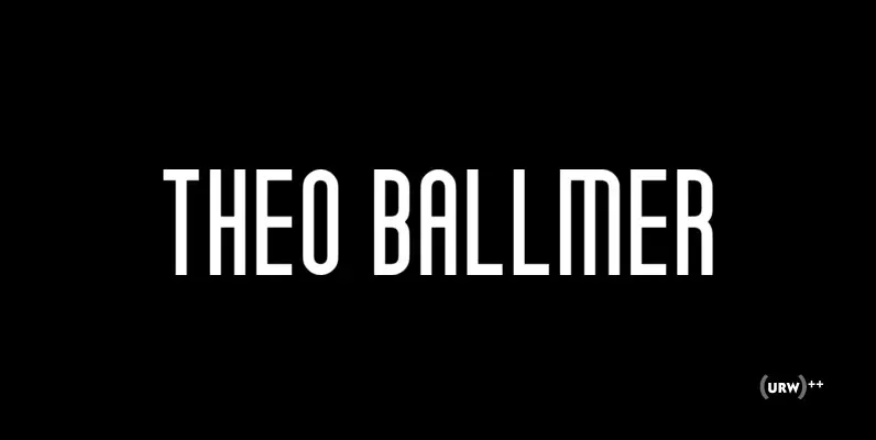
Theo Ballmer Font
The Theo Ballmer font family is based on Theo’s design ideas which were completed by his son Theo Ballmer (Thierry’s father), and digitized by Thierry, with the help of URW++ and their Ikarus technology. Theo Ballmer is available in 3
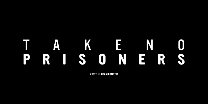
YWFT Ultramagnetic Font
How to make soft-yet-gothic? Countless hours spent researching, and years of refinement, that’s how. YWFT Ultramagnetic was finally mastered to postscript/truetype format in 1999 and has gone on to be one of the most widely-used YWFT exclusives of all time.