Tag: 1970s
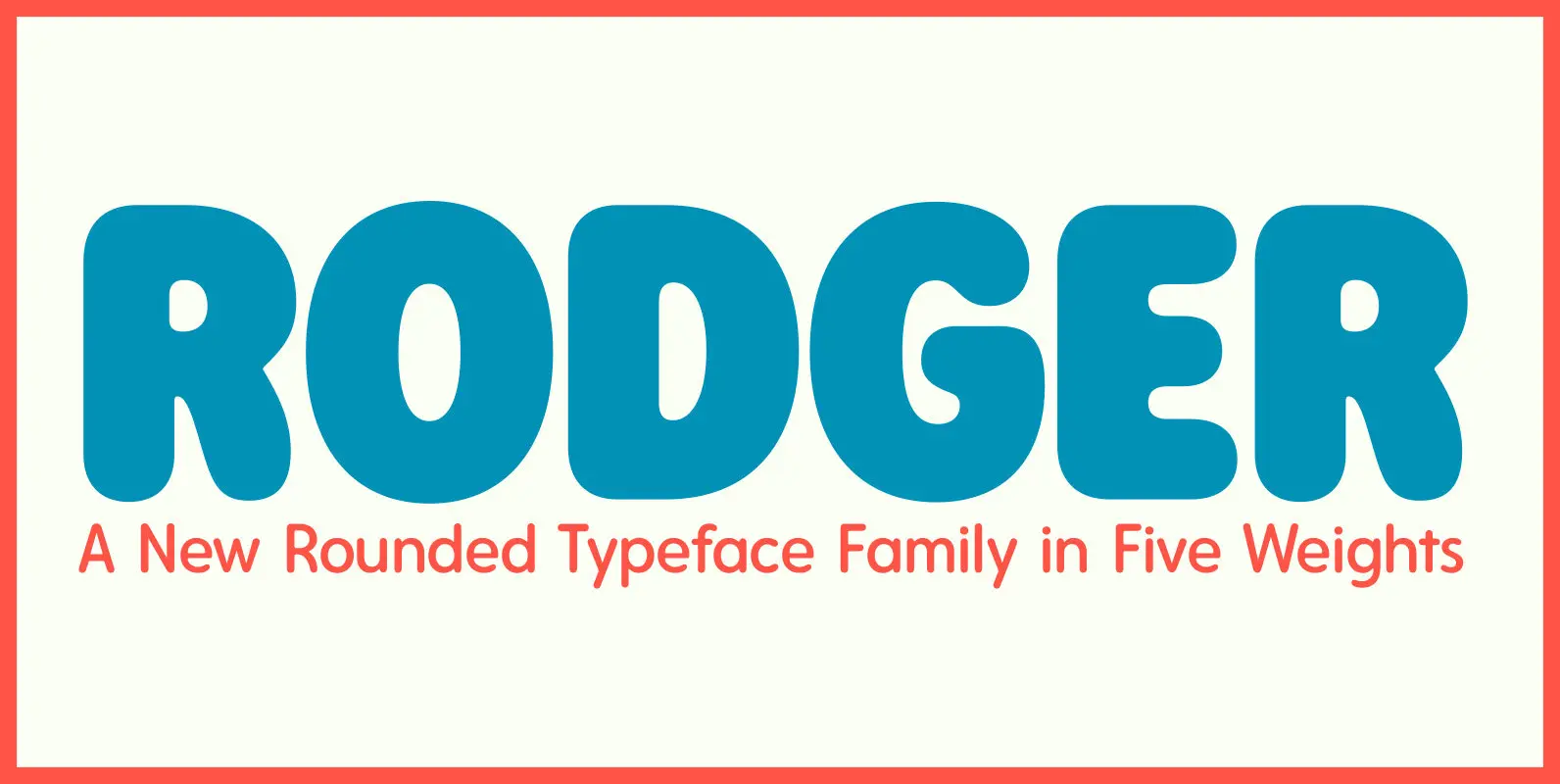
Rodger Font
The Rodger typeface family’s main source of inspiration came from rounded display faces of the 1960s and 70s, but it also references sans serif, rounded typefaces found in wood type collections of the 19th century. Despite its vintage roots, Rodger
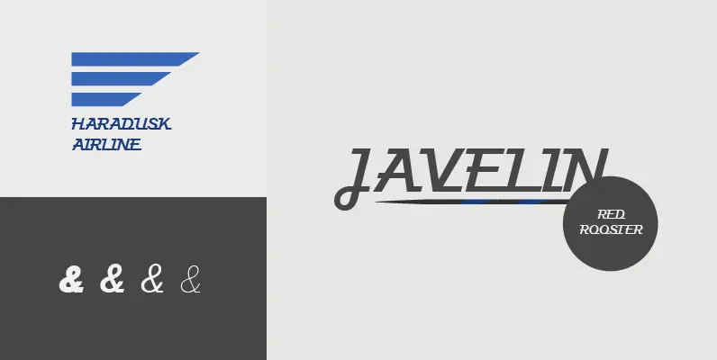
Javelin Font
Designed by A. Pat Hickson, Javelin is a sport-like and retro font design. Published by Red RoosterDownload Javelin
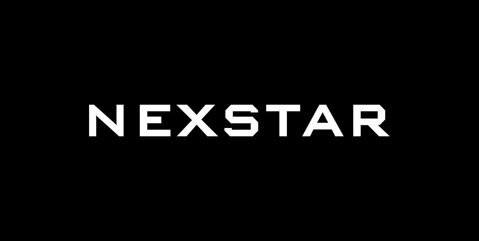
Nexstar Font
A display font in the best american tradition, made for sports, leisure, outdoors and any other occasion of elegant leisure. Published by Wiescher DesignDownload Nexstar
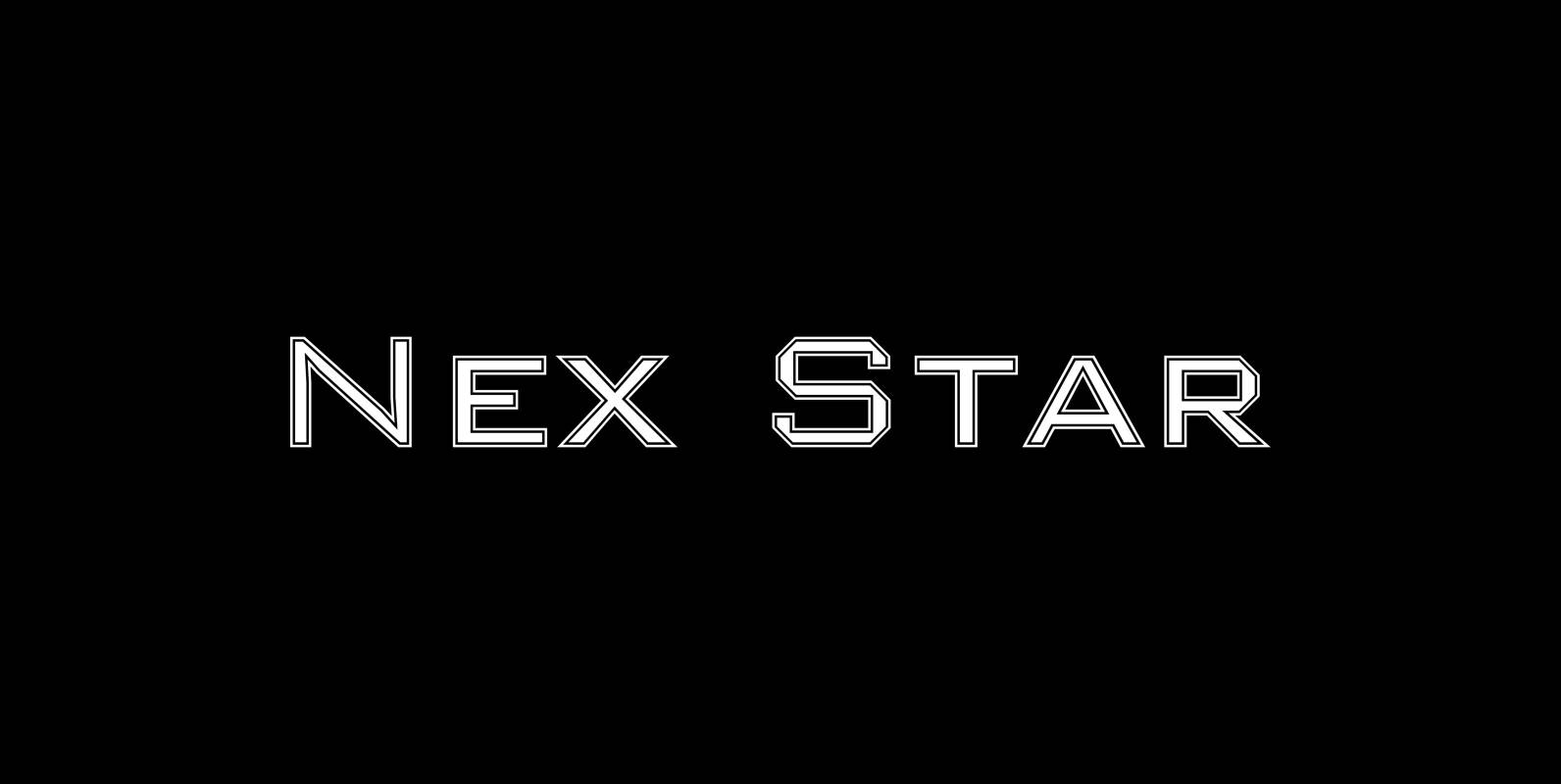
Nex Star Font
A display font in the best american tradition, made for sports, leisure, outdoors and any other occasion of elegant leisure. Published by Wiescher DesignDownload Nex Star
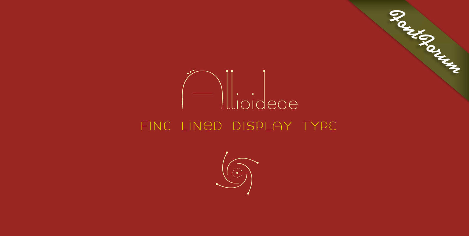
Allioideae Font
This fine lined display type face was named Allioideae because of the ascenders of the lower cases. They are rising upright with a single stroke and are ending – depending on the font style – into a spherical blossom. The
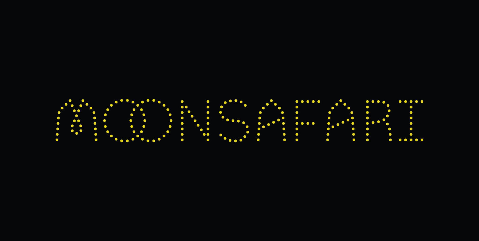
Moonsafari Font
Moonsafari is a 1970’s dotted geometric typeface. Designed for use in branding, signage and editorial. Published by Alley KurganDownload Moonsafari
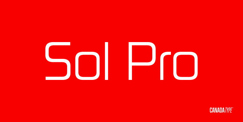
Sol Pro Font
Based on the classic Sol design by Marty Goldstein and C.B. Smith, published by VGC in 1973, Sol Pro goes above and beyond the call of revival/retooling to include plenty of optical improvements to the original design, more weights, italics,
Sitcom Outline Font
Created by Ann Pomery in the early 90s, Sitcom has the look and feel of titling fonts used for popular TV comedy sitcoms of that time. The font is lively and playful. Best used as a display face. Published by
Chopper Font
In 1972, VGC released two typefaces by designer friends Dick Jensen and Harry Villhardt. Jensen’s was called Serpentine, and Villhardt’s was called Venture. Even though both faces had the same elements and a somewhat similar construct, one of them became

Seagull Font
Designed by Adrian Williams & Bob McGrath in 1978, Seagull is a simple, smooth and elegant slab-seerif style font design. Published by URW Type Foundry GmbHDownload Seagull
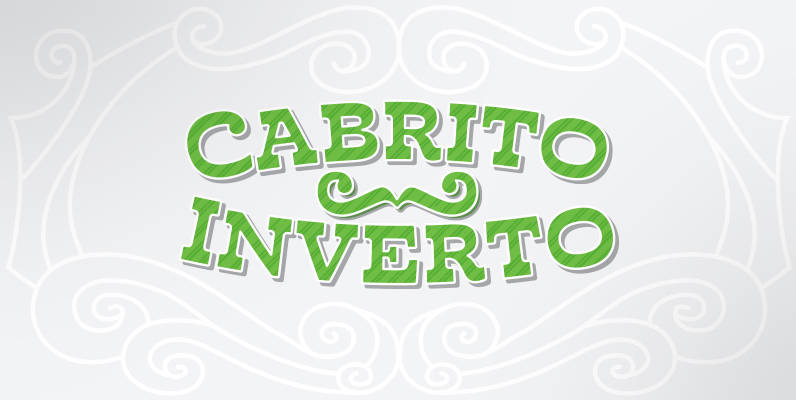
Cabrito Inverto Font
And so now, here it is. Cabrito Inverto, which features the reversed stress of the strokes from a font’s “normal” traits. Inverted stress fonts are most often associated with cowboys and the Old West. The inverted stress gives it a
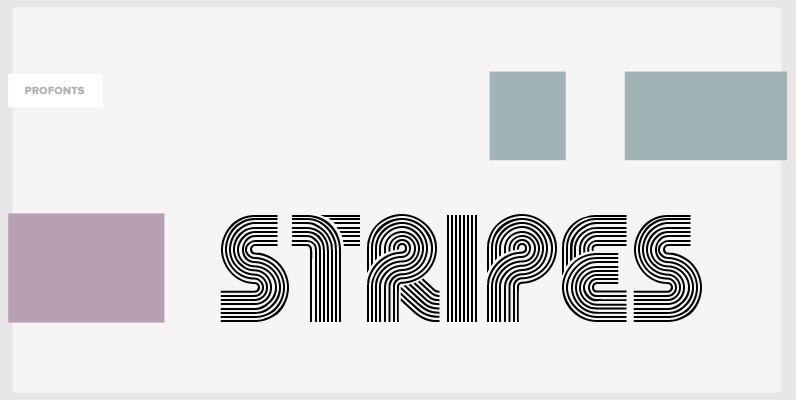
Stripes Font
Stripes is a caps only font and does not contain additional ligatures, because there is an easy way to create as many of them as you like. To form a ligature, convert your word or word string into vectors. Activate
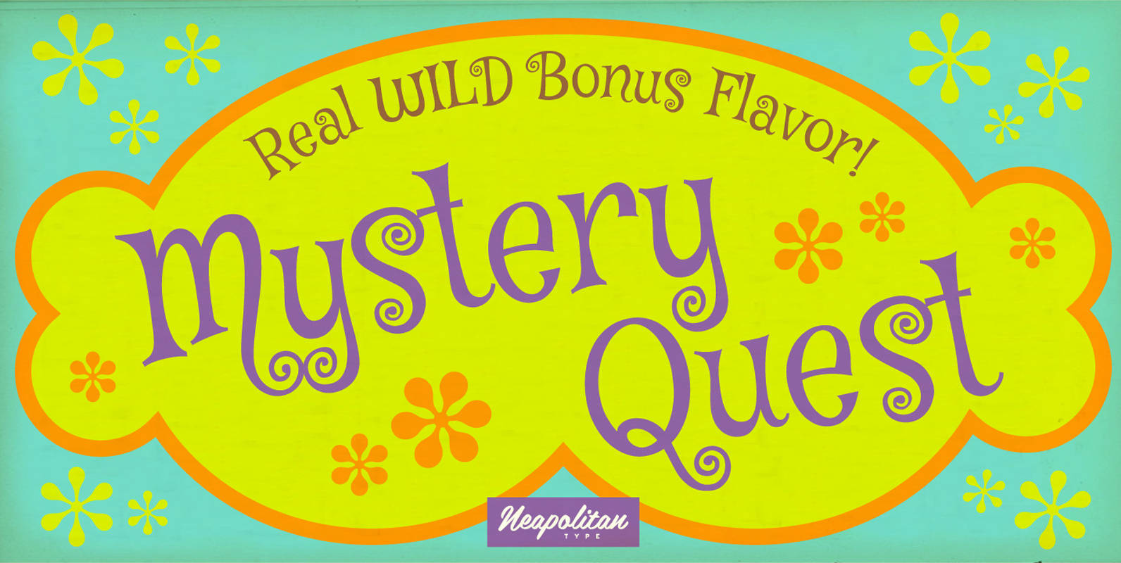
Mystery Quest Pro Font
Grab your gear! Check your nerves! Get ready for Mystery Quest! This far-out funky font brings danger with every curve! You never know what this playful 1960s mod inspired typeface will bring and design adventure is just around the corner!
Fat Face Font
This sophisticated and stylish font is ideal for titles, posters or any other design project that requires an edgy look with sharp lettering. Fat Face was designed by Phil Martin in 1971; it contains West European languages such as English
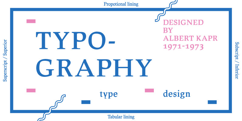
Leipziger Antiqua Font
The original typeface was designed by Albert Kapr between 1971 and 1973 for Typoart in Dresden. Kapr was the font designer and teacher as well as book author on type design of former East Germany. He also was an expert
Springfield Font
Designed by Bob McGrath in 1978, Springfield is a decorative serif release by URW. Contains language support for West, East, Turkish, Baltic, and Romanian. Published by URW Type Foundry GmbHDownload Springfield
Funkydori Font
Like most children of the ‘70s, I rocked the rainbow-striped bellbottoms, decorated her room with black-light posters of unicorns, and watched The Electric Company on TV. Funkydori is my typographic homage to that groovy decade, updated for 21-st century designs.