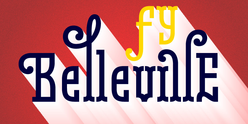
A historic font revival designed by P22 type foundry based on 16th century sources with a lineage going back to Robert Granjon in France and from early Dutch type specimens. Presented in Opentype with several variations. Civilite is a non-connecting upright script font based on 16th century handwriting.
The elegant type styles known as Civilite (civ-il-it-tay) fonts have had a curious history. Robert Granjon, who is more famous for his cutting of what most people know as Garamond Italic, cut the first punches for a cursive gothic based on French handwriting styles of the late 16th century. Granjon’s 1557 “lettre Francoise” was created with a sense of his national pride and was granted a 10 year royal patent for the design. The naming of this style “characteres de civilite” comes from the first popularized use of the types in a book intended to teach children how to read, write and behave in polite society: “La Civilite puerile distribuee par petitz chapitres,et sommaires”. Granjon’s actual type & punches do not survive, but the early punches credited to Flemish engraver Ameet Tavernier and others have been preserved through the collection of J. Enschede en Zonen at Haarlem. The entire historic collection of the Enschede foundry was published in a large volume in 1908 using types cast from matrices struck from the original punches. This book was finally translated into English by Harry Carter seventy years later and exquisitely printed using flawlessly cast type from centuries old punches. The 1978 book, “Type-Foundries in the Netherlands from the Fifteenth to the Nineteenth Century: A history based mainly on material in the collection of Joh. Enschede en Zonen at Haarlem”, and an earlier specimen from Enschede in 1926 entitled “Specimen des Lettres Francoises dites Caracteres de Civilite des XVme et XVIme Siecles dans la Collection Typographique de Joh. Enschede en Zonen” were the main sources for this P22 revival set. The detailed history of these fonts can be found in these two books.
The style known as Civilite continued for many European and specifically French type foundries from the late 16th into the 20th century as reworkings and revivals. Mid 20th century script fonts with an eastern flavor such as Legende and Ondine and the ATF (American Type Founders) Civilite are in the same category as Granjon’s Civilite. The ATF version by Morris Fuller Benton has become what many think of as the Civilite style, but it is much more a creature of the time and is referred to as “deplorable” from a review in the Fleuron #6 of 1927. One of the most recent and more elegant interpretations made was Hermann Zapf’s last metal typeface from 1984 called simply “Civilite”. There are a limited number of digital Civilites, most notably Jonathan Hoefler’s “St. Augustin Civilite” from 1994. This version enhances the rough “antique” outline that might be found from period printing while the P22 versions accentuate a very smooth outline in all of the variations offered.
The P22 Civilite suite of fonts includes the 6 basic Dutch versions of Civilite in both “historical” and “modern” styles in basic OpenType format and Pro versions that combine the historical, modern & sorts into one OpenType font with alternates, expanded language coverage and pro features. OpenType features allow for insertion of swashes and alternates (automatically via stylistic sets, discretionary ligatures and contextual alternates or manually via the glyph palette).
The Civilite font numbering system is based on the inventory numbering of the Enschede & Sons foundry and their publication from 1908. The apparent numbering gaps should not imply missing versions but rather other type styles not relevant to this set. The styles 8, 9, 11, 14 & 32 (historical) are digitized as they were displayed in the Enschede specimens. In many cases there are characters common to more than one version. The modern versions include newly drawn letter-forms that are sympathetic to the historical style, but much more legible to the contemporary reader. The Titling font originates from Initials no. 10 & 13.
Civilite Pro Features include:
Ordinals Historic Alternates (duplicated in Stylistic Set 4)
Historic Ligatures – activated when Stylistic Alternates (duplicated Stylistic Set 1) and Discretionary Ligatures are on, historic longs subs turned on when Historic Forms are on.
Ligatures
Discretionary Ligatures Modern
Swash – Contextual Swash Modern
Stylistic Set 3 – Contextual Swash Historic
Stylistic Set 2 – Additional Stylistic Alternates
Stylistic Alternates (duplicated Stylistic Set 1)
Historic Contextual Alternates
Fractions, Numerator, Denominator, Inferiors, Superiors
Oldstyle Figures
P22 Civilite fonts designed by Colin Kahn with assistance from: Richard Kegler & Milo Kowalski