Tag: european
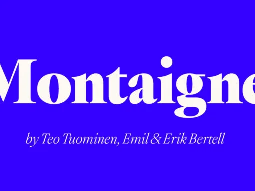
Exploring Timelessness in Typography: An Ode to Montaigne Fonts Sophistication
Immerse yourself in the vista of timelessness and sophistication in digital design and typography with the Montaigne Font. As a graphic or digital designer, there’s nothing more rewarding than stumbling upon a font that effortlessly encapsulates the rich tapestry of
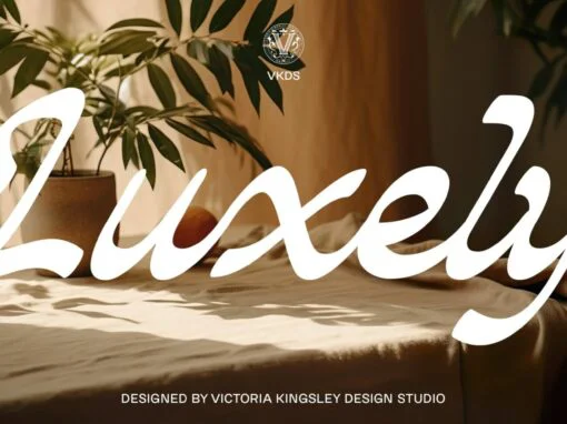
Luxely: A Tone of Artistry, Defining the Future of Typography
Envisioned by Victoria Kingsley Design Studio, Luxely isn’t just a font— it’s a subtle combination of artistry, emotion and intention. A richly textured narrative bound by delicate strokes and curves, Luxely is more than a mere sight. It is an
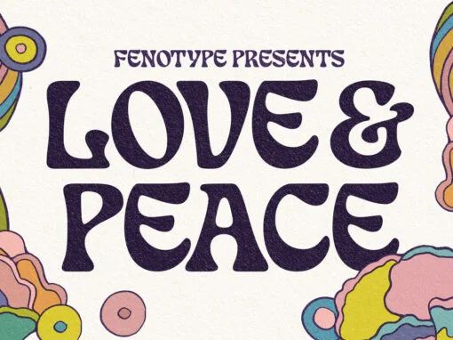
Love And Peace Font
What’s so funny ’bout peace love & understanding? Nothing really. Love and Peace is an Art Nouveau style typeface inspired by Eckmann-Schrift by Otto Eckmann in 1900. Love and Peace is filled with ethereal elegance and it’s great for posters,
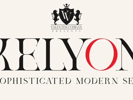
Kelyon Font
Kelyon is a sophisticated and modern serif, inspired by the late Middle Ages and early renaissance period. Kelyon was designed with a very thin hairline and long serifs, this reflects the charm and feel of the 14th century. With over
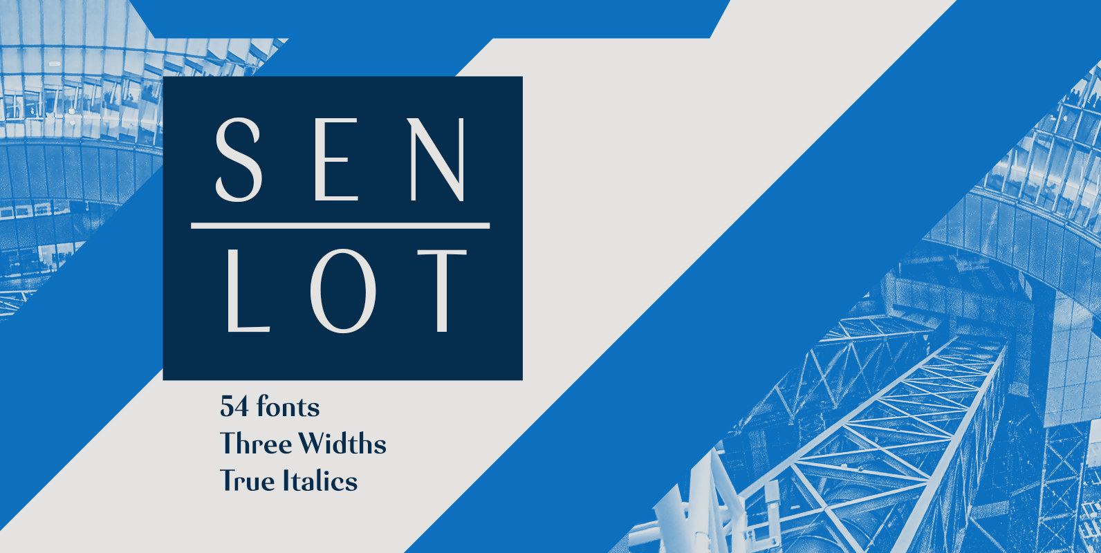
Senlot Font
Steal the spotlight with Senlot. A high contrast sans serif, Senlot’s figure is perfect for enrapturing your audience. The font shows off a unique calligraphic stress, which–with the contrast–makes the face quite usable in luxury and high quality design work.
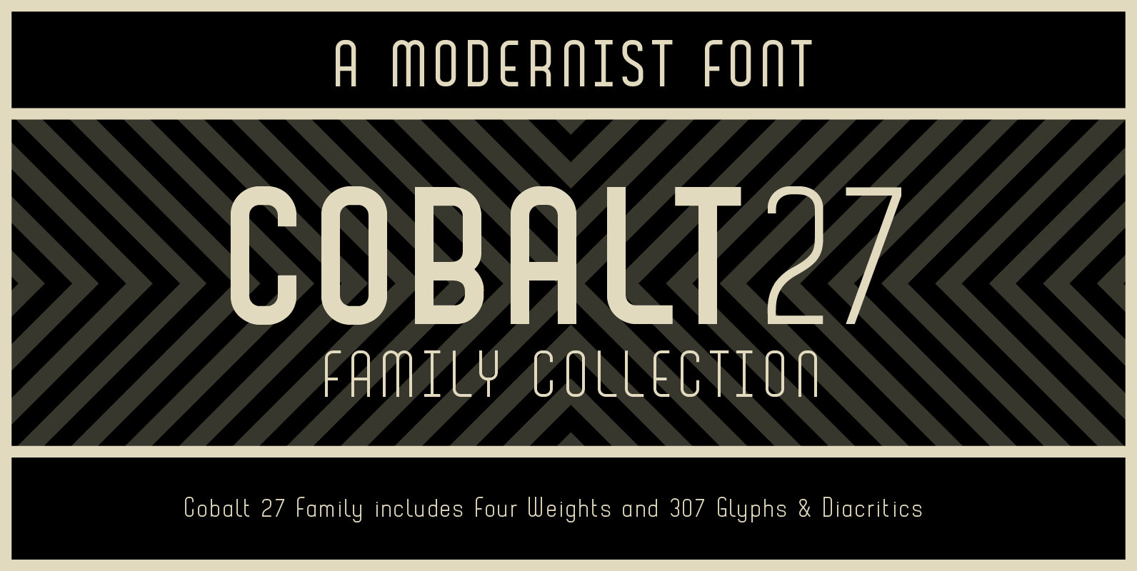
Cobalt 27 Font
Cobalt 27 was inspired by early and mid 20th century typography and graphic art movements, notably Constructivism and 60’s modernism. The family consists of three weights and one alternate text version that have been designed to be used with and
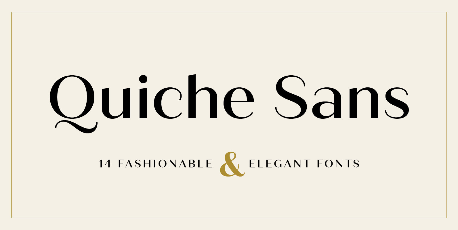
Quiche Sans Font
Quiche Sans is a high-contrast, sans serif typeface with monoline stroke endings, angled stems, and geometric proportions. A sibling to the Quiche family, with the ball terminal endings removed. With weights ranging from thin to black and matching italics, there
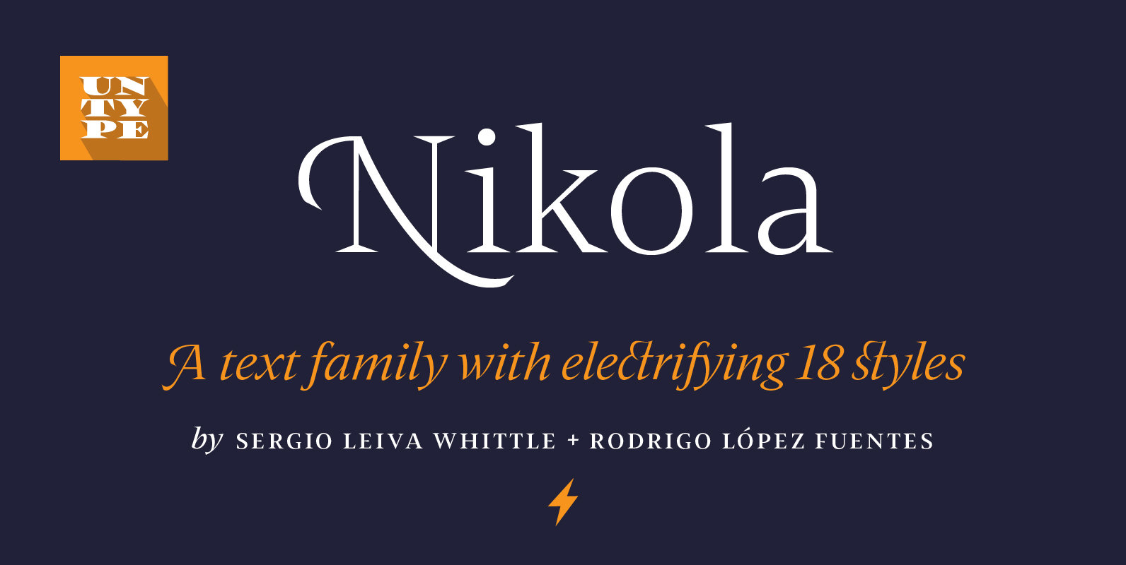
Nikola Font
Nikola is a text typeface that offers a wide range of possibilities. While its regular and medium weights were specially optimized for maximum performance, balanced for excellent legibility and carefully crafted to spread a scent of tradition on long text
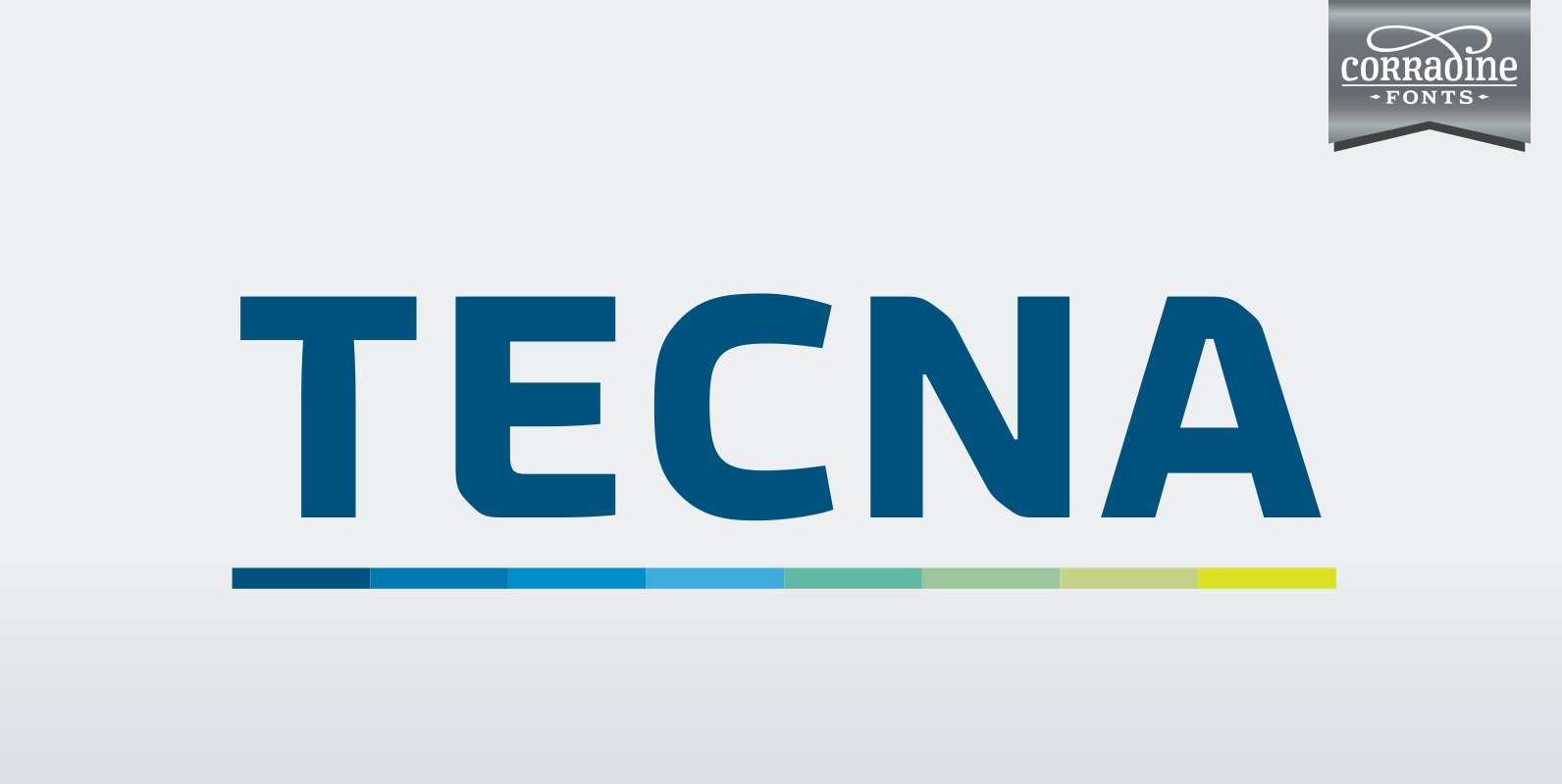
Tecna Font
Tecna is a modern sans typeface with straight cuts, rounded angles and curved thinnings at the endings that make the letter shapes fresher. The rounded characters are squarish giving to the layout a very structural appearance. Its wide proportions give
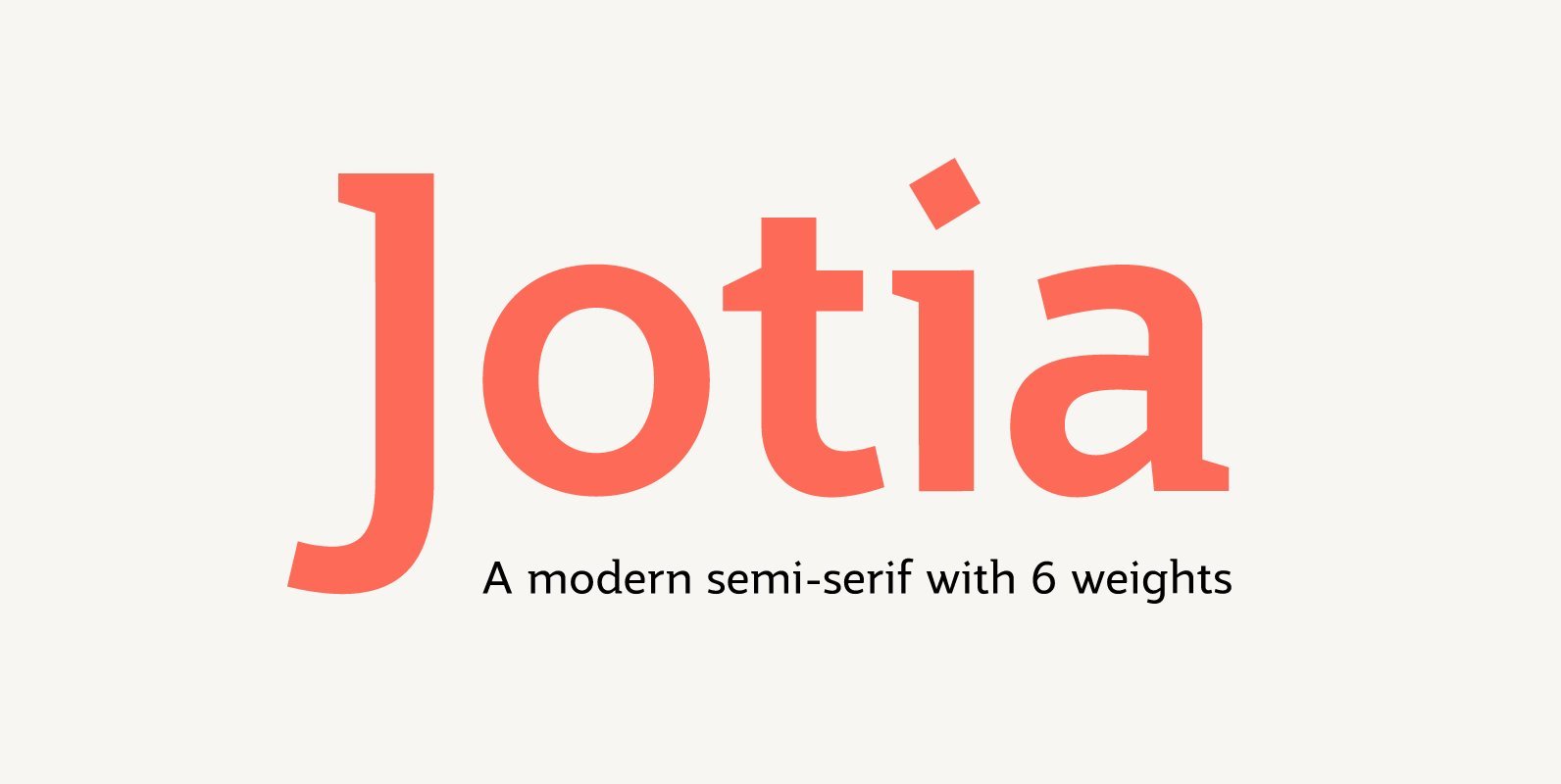
Jotia Font
Creating a combination between serif and sans serif typefaces, Jotia utilises the best of both worlds, resulting in a unique and modern neo-humanist font family. Taking its inspiration from lapidary inscriptions rather than pen drawn text, Jotia uses triangular serif
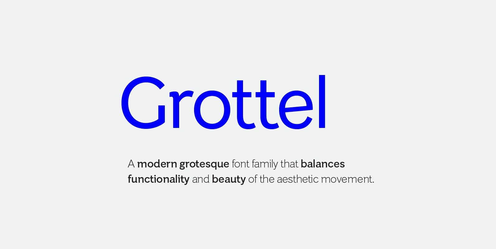
Grottel Font
Grottel is a modern grotesque sans serif font family that follows the philosophy of original grotesque typefaces with enhanced personality. Fine details and tuning, balance functionality and the beauty representative of the aesthetic movement in the 19th century. Details include
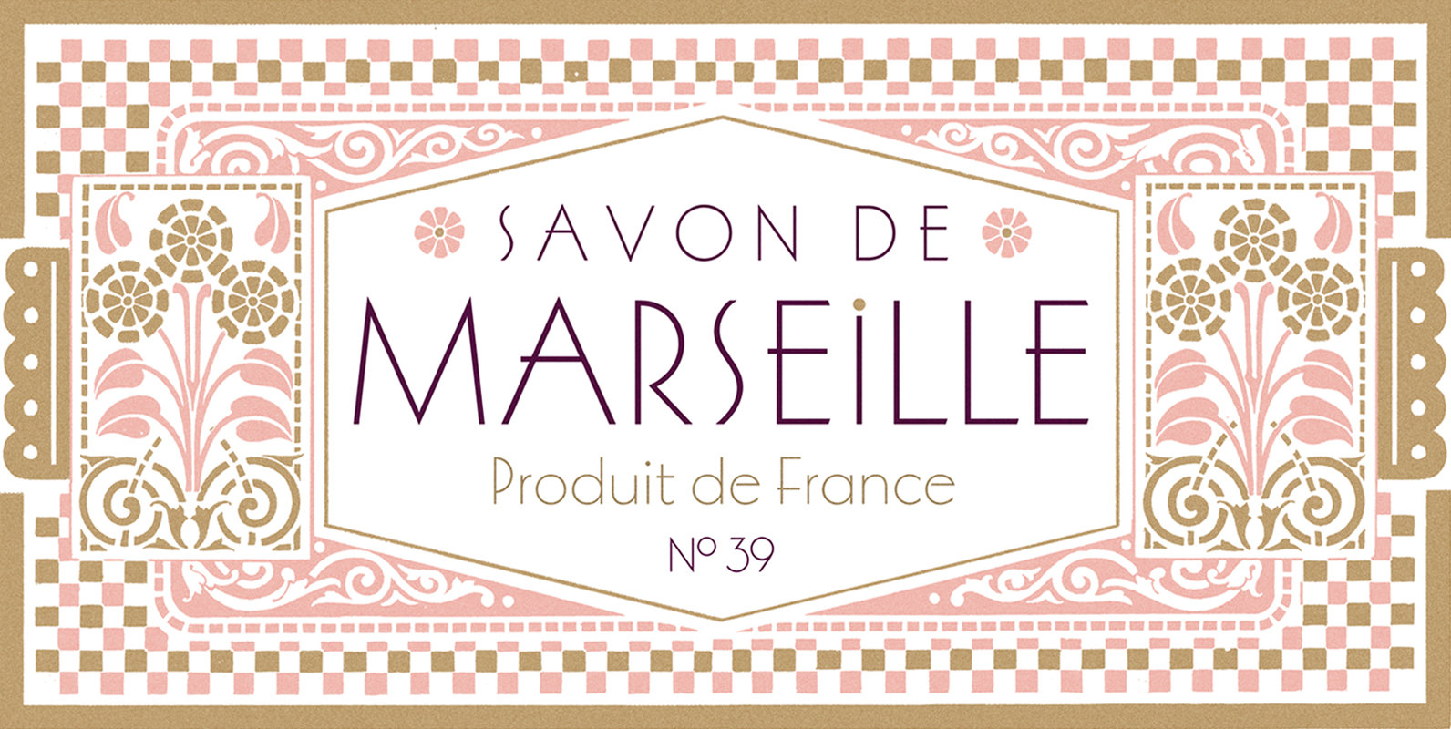
Marseille Font
Marseille is an Art Deco-inspired typeface which is based on Louise Fili’s iconic cover design for the hauntingly beautiful Marguerite Duras novel, The Lover. The font is available in six irresistible weights: thin, light, regular, medium, semibold, and bold. Each
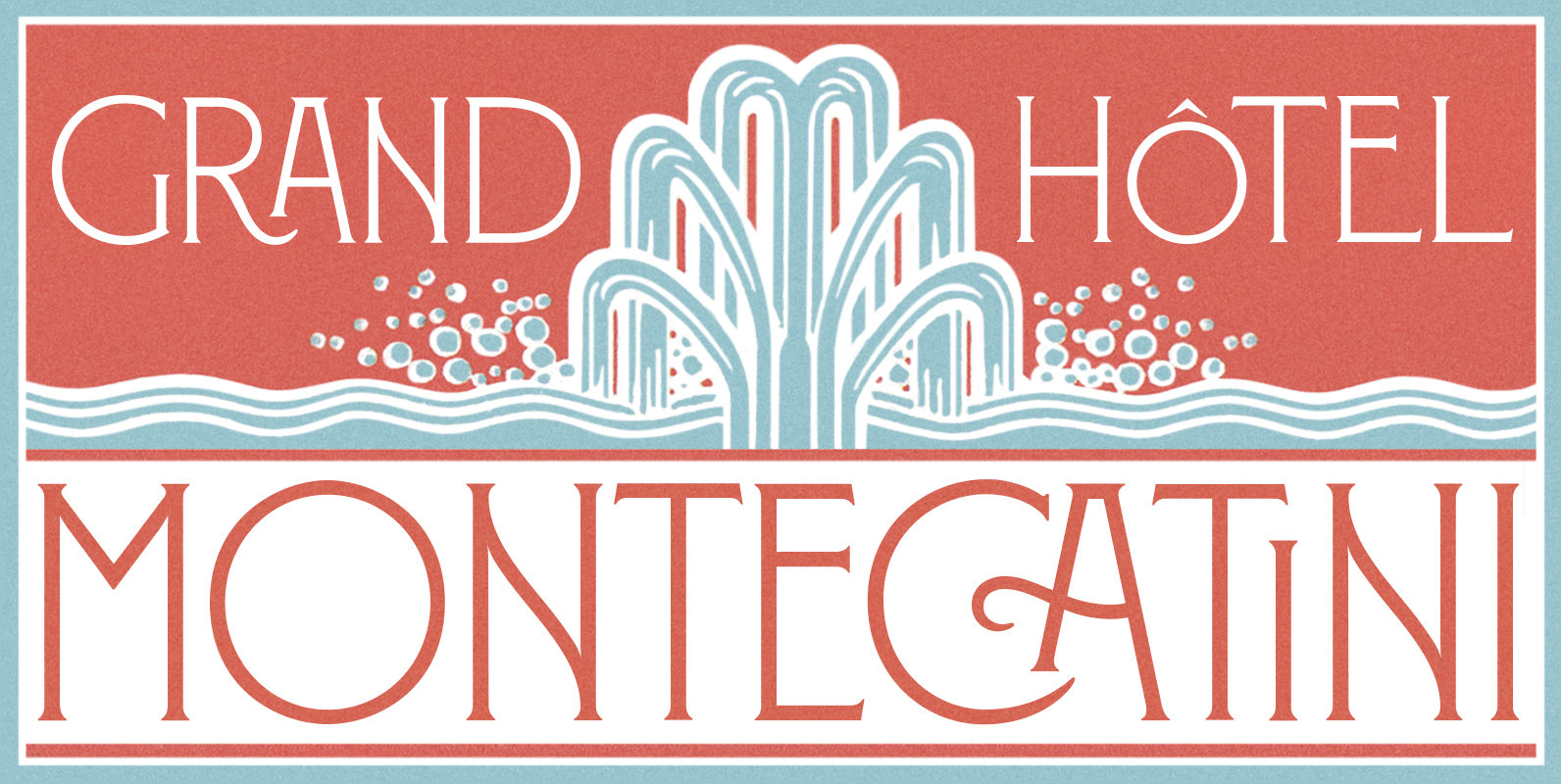
Montecatini Font
Montecatini Pro takes its cues from the elegant Stile Liberty travel posters of Italy in the early 1900s. In its successful first release by Louise Fili Ltd in 2017, the typeface introduced distinctive ligatures typical of the time when Art
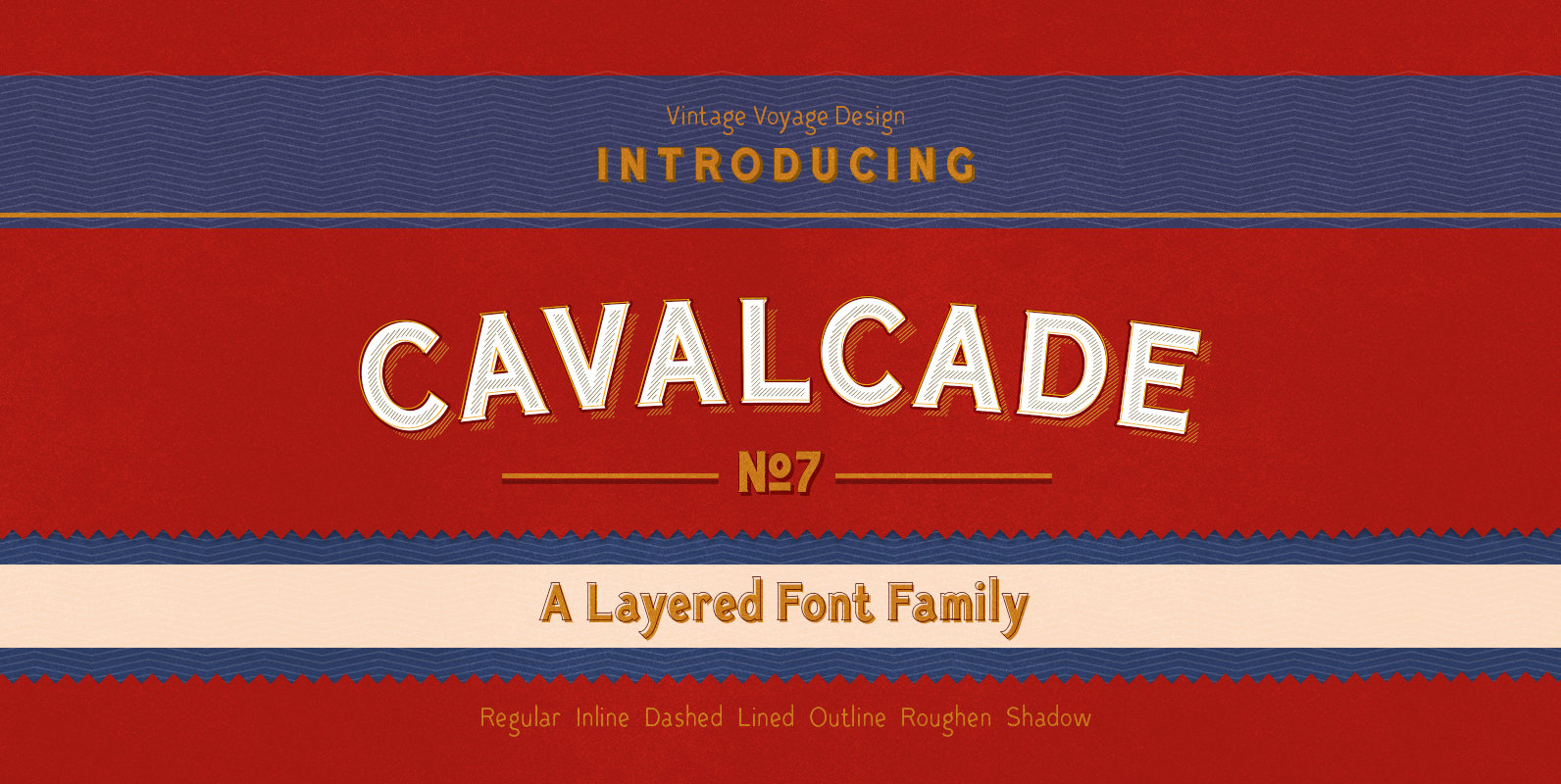
Cavalcade Font
Cavalcade is a layered serif design inspired by American and European Typography of early 20th Century. Designed to be similar to type found on vintage movie posters and vintage alcohol bottles like Martini, Cinzano and Campari. Published by Vintage Voyage
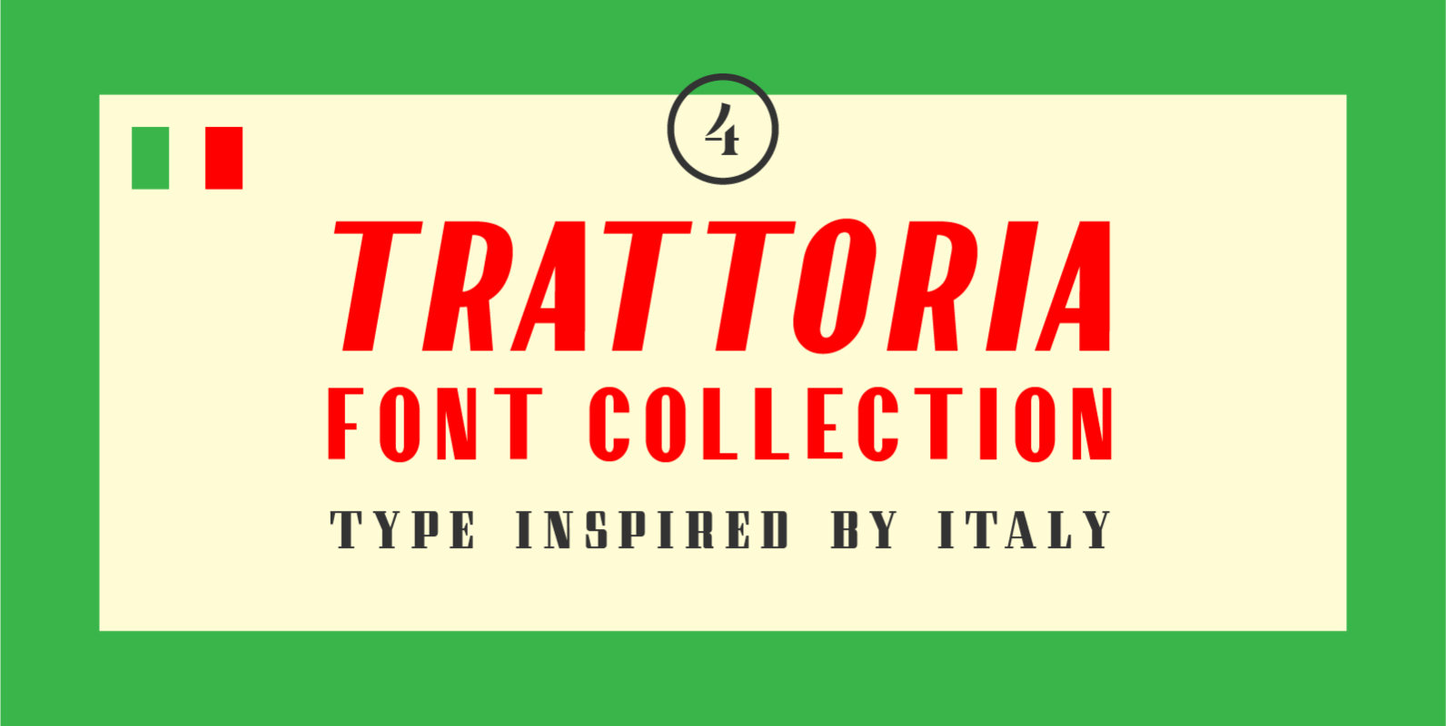
Trattoria Font Collection Font
Inspired by vintage Italian signage, Trattoria Font Collection includes a high-contrast sans serif with corresponding obliques, a charismatic and elegant stencil, and a modular serif. The fonts within this collection complement one another famously, yet they also stand very well
P22 Amelia Jayne Font
P22 Amelia Jayne is Ted Staunton’s updated revision and expansion of his own Amelia decorative cap font. Amelia Jayne started as a Roman font to accompany the Amelia initials but has taken on a new life as a Pro Roman
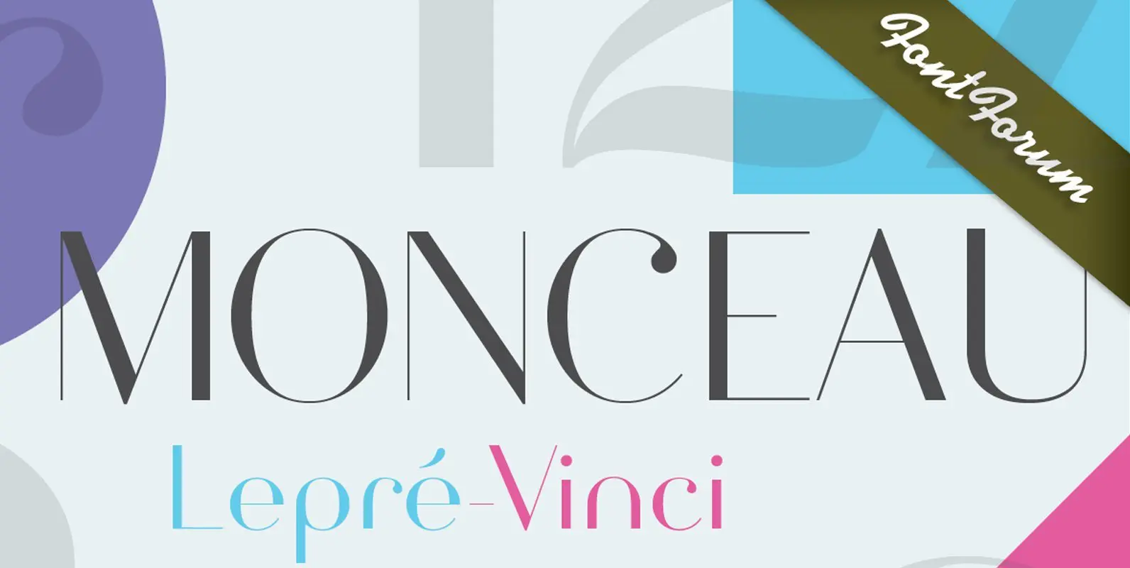
Monceau Font
As a successor of Didots famous font, which marked the beginning of modern typography, the Monceau has inherited the spirit, elegance and sophistication of french style, although in a revamped design, typical for the first years of the 21st century.

URW DIN Font
The digital outline fonts, DIN 1451 Fette Engschrift and Fette Mittelschrift were created by URW in 1984 and are the basis for all DIN font families. Both typefaces were designed for the URW SIGNUS system and were mainly used for