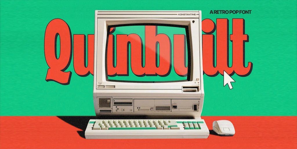
In an era of high-definition and 4k imagery, a sense of profound nostalgia washes over creators and users as they revisit the velvety charm of low resolution era graphics. As the digital design landscape continues to evolve at breakneck speed, it’s noteworthy that a unique trend centers around what many might consider a technologic relic—the earlier, friendlier, lower definition, pixelated aesthetics of CRT displays, akin to old televisions and monitors. Enter, Low Def—a font that exquisitely encapsulates this endearing sentiment.
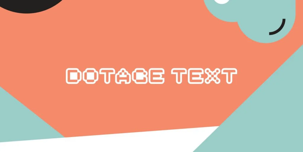
Illuminated by hazy memories of retro video gaming consoles, antiquated home computer displays, and the dim, noisy world of the arcade, Low Def capably harks back to a simpler age of digital communication. These fonts, inspired by the authentic characteristics of older, lower resolution CRT displays, are replete with amusing idiosyncrasies and intriguing aesthetic elements. When manifested through the scanlines hallmark to CRT displays, these characters provide a marvelously smooth appearance, naturally blending together the pixels.
Unboxing the Low Def Family
When you adopt the Low Def family, you aren’t simply acquiring one font style. No, this group spans five different widths— from slender narrow fonts that resonate with minimalist requirements, to an opulent extra-wide offering for the more expressive, expansive applications. This spectrum of choice empowers graphic and digital designers with a versatile toolkit of different widths to apply as needed across their work, ensuring the message not only captures interest but also captivates viewers’ interest through interactive media elements.
Harnessing Low Def’s Multilingual Facets
Emphasizing its utility across a global canvas, Low Def accommodates and supports not just Roman script, but also Cyrillic, Katakana, and Hiragana letters. By breaking the language barrier, these fonts become an accessible tool for designers worldwide that intend to craft a distinctive, refreshingly retro aesthetic for their international audiences.
Replete with fascinating dimensions of illustrative prowess, Low Def paves the way for creative graphic and digital designs that manage to be both retro, yet impressively modern. Embedded within the framework of these fonts is the soul of an age of innocence in digital design. It evokes a time when everything wasn’t so reliant on pixel-perfect, pristine high-definition clarity but instead celebrated the subtle grace of imperfection, echoing the human condition itself.
With just a few clicks, these exclusive fonts can be downloaded and harnessed directly from YouWorkForThem, a platform that serves as a goldmine for creative professionals, often presenting them the very tools they need to breathe life into their inspiring ideas. Amidst the ever-changing landscape of the digital design world, having access to a font family as comprehensive and versatile as Low Def can be the very catalyst that decides the success of your design.
As we continue to flow forward within this digital river of time, let’s take a moment to appreciate how far we’ve come and enjoy the marvels that these designs harbor. After all, as we stroll ahead, it’s worthwhile to occasionally glance over our shoulder, reminiscing about the charming stepping-stones that lead us to where we are.