In the expansive universe of typography, a specific category has recently captivated graphic designers and digital artists alike — the distressed font. This form of type is marked by weathered, textured, eroded, or deteriorated stylization, reminiscent of physical type subjected to the rigors of time, the elements, or manual labor. Its aesthetics, very much in contrast with the polish and sleekness of many modern designs, hold a unique visual appeal. Thousands of distressed fonts are eagerly waiting to be explored, with a vast repository available for download at YouWorkForThem.
The Allure of Distressed Fonts
Scuffed, scraped, and battered, distressed fonts are far more than mere stylistic quirks. They serve as a visual lexicon that speaks to our collective consciousness, evoking a spectrum of emotions that range from nostalgia to contemporary rebellion. These fonts are not just a nod to the past; they are a complex blend of history and modernity, embodying the raw energy of grunge culture while paying homage to the tactile essence of historical artifacts.
The allure of distressed fonts lies not just in their visual aesthetics but also in their ability to convey complex emotional narratives. They serve as a bridge between the tangible world of yesteryears and the digital landscapes of today, offering a textured depth and complexity often absent in the sterile environment of modern digital art. These fonts are like time travelers, carrying with them the weight of history, the spirit of rebellion, and the soul of artisanal craftsmanship.
Moreover, distressed fonts introduce an element of organic imperfection into the realm of digital design. In a world where precision and uniformity are often the norms, these fonts bring a human touch, a sense of individuality and uniqueness that can be both grounding and liberating. They serve as a reminder that beauty often lies in imperfection, in the cracks and crevices that tell a story of use, of life lived.
The textured layers these fonts bring to a design go beyond mere visual appeal; they add a sensory dimension that engages the viewer on multiple levels. The eye is drawn not just to the form of the letters but also to their texture, their materiality, even their imagined history. This multi-layered visual experience creates a resonance, a connection between the design and the viewer that is both immediate and enduring. They are not just fonts; they are storytellers, emotional catalysts, and visual artists, all rolled into one.
Usage of Distressed Fonts in Graphic Design
Graphic designers have long recognized the transformative power of distressed fonts, employing them in a multitude of settings that extend far beyond mere aesthetic appeal. These fonts are not just a stylistic choice; they serve as a functional tool in visual communication. Distressed fonts have found their way into logo design, where they can encapsulate the essence of a brand in a single glance. They are not merely fonts; they are brand ambassadors, encapsulating a company’s ethos and values. For example, a distressed font in a logo can instantly signal to the consumer that the brand has a rustic, artisanal quality, often associated with handcrafted goods or bespoke services.
Distressed Typesettings in Poster Design
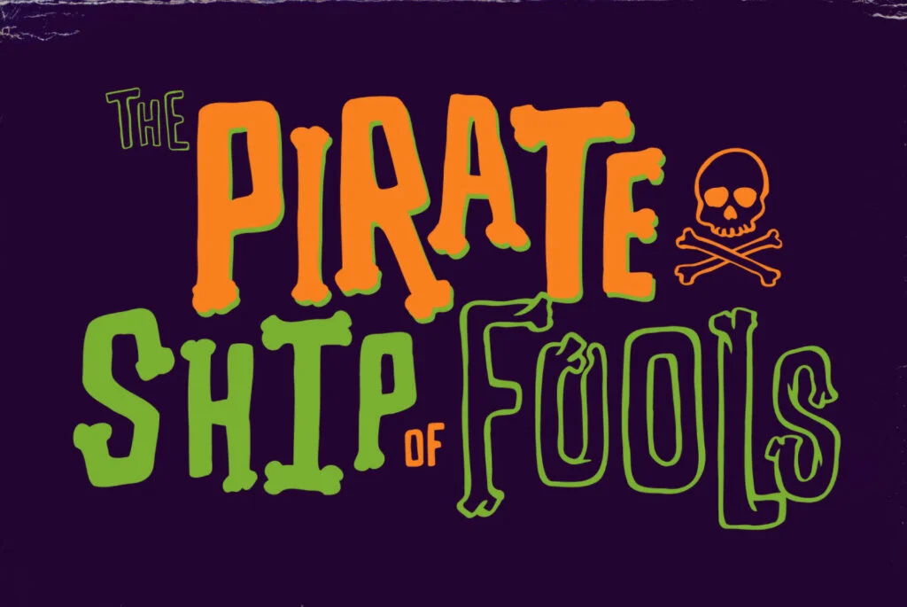
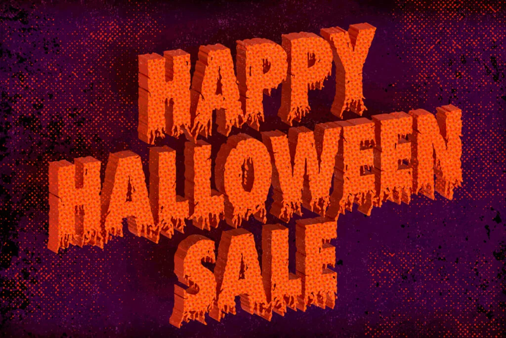
In the realm of poster design, distressed fonts serve as visual magnets, drawing the eye and holding attention. They can transform a simple message into a compelling narrative, turning a poster into a conversation piece. The texture and depth that distressed fonts bring to the table are unparalleled, offering a tactile quality that engages the viewer on a sensory level. This is particularly effective in the music industry, where posters for indie rock bands or underground music events often employ distressed fonts to evoke a sense of rebellion, raw energy, and authenticity.
Packaging Design with Distressed Fonts
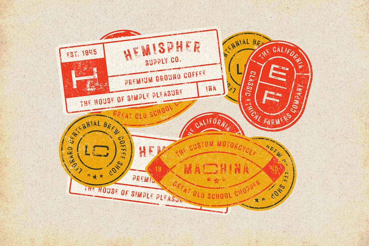
When it comes to packaging, the role of distressed fonts is pivotal. They can make a product stand out on a crowded shelf, offering a visual cue that communicates the product’s unique selling proposition. Whether it’s a craft beer with a rugged, outdoorsy vibe or a line of organic skincare products that promises authenticity, distressed fonts can make the packaging speak volumes, often swaying consumer choice in a competitive market.
Nostalgia and Emotional Resonance in Advertising
In the sphere of advertising, distressed fonts have the power to evoke nostalgia, a potent tool in marketing. They can transport the viewer back to a different era, whether it’s the rebellious spirit of the ’60s or the industrial grit of the early 20th century. This emotional connection can be leveraged to create impactful advertising campaigns that resonate on a deeper level with the target audience.
The Allure of Distressed Fonts in Web and Social Media
Digital mediums are not immune to the allure of distressed fonts either. Websites that aim to project a vintage or artisanal aura often employ distressed fonts to maintain thematic consistency. Social media graphics, particularly those on platforms that skew towards a younger, more alternative audience like Tumblr or Instagram, frequently utilize distressed fonts to convey individuality and edge. These fonts offer a break from the polished, often sterile fonts commonly seen in corporate settings, providing a visual shorthand for creativity and innovation.
A Peek into the History
A peek into the history of distressed fonts reveals a fascinating journey that begins with the tactile imperfections of traditional printing methods. In the days of Gutenberg and beyond, the use of wooden type blocks, metal typefaces, and hand-operated printing presses often led to inconsistencies in ink distribution. The result? A naturally distressed appearance, characterized by uneven ink spots, faded letters, and the occasional smudge. These “flaws,” far from being discarded, were embraced for their unique charm and authenticity.
As technology advanced, the printing industry transitioned from manual to mechanical processes, but the allure of distressed fonts remained. The introduction of phototypesetting in the mid-20th century allowed for more precise and uniform typefaces, yet designers found themselves yearning for the organic imperfections of yesteryears. This led to the intentional creation of distressed fonts, initially through manual techniques like over-inking and under-inking, and later through digital manipulation.
The digital era brought with it a plethora of tools that enabled designers to recreate and even amplify the distressed look with unprecedented ease. Software like Adobe Illustrator and Photoshop offered a range of options to add texture, noise, and irregularities to digital fonts. The aesthetic was further propelled into the limelight by the grunge movement of the late 20th century. As grunge culture, with its raw and rebellious ethos, took the world by storm, distressed fonts found a natural ally. They became synonymous with the anti-establishment sentiments of the time, appearing in everything from band logos to political flyers.
Today, distressed fonts continue to be a popular choice, not just as a nod to nostalgia but as a conscious design strategy. They offer a tactile quality in an increasingly digital world, providing a sense of tangibility that resonates with audiences. Whether used to evoke a vintage atmosphere or to convey a rugged individualism, distressed fonts have secured their place in the annals of design history, proving that sometimes, imperfections can be perfectly appealing.
Expanding the Distressed Font Archive
Today’s digital design landscape is a veritable treasure trove of distressed fonts, each a unique specimen of artistic ingenuity. The sheer volume of available styles is staggering, a testament to the creative liberties that digital tools have afforded modern designers. No longer confined to the limitations of physical type blocks or printing presses, today’s typographers manipulate texture, stroke quality, spacing, and even the degree of ‘wear and tear’ to craft typefaces that range from subtly aged to dramatically eroded.
One of the most comprehensive repositories for these specialized fonts is YouWorkForThem. Here, designers can sift through an extensive collection of distressed fonts, each carrying its unique narrative and aesthetic sensibilities. Whether you’re seeking a font that mimics the weathered signage of a 1950s American diner or one that captures the rebellious spirit of a punk rock flyer, the selection is both broad and nuanced.
In our rapidly evolving design ecosystem, typography serves as a potent tool for conveying nuanced messages and evoking emotional responses. Distressed fonts have transcended their initial perception as deteriorated or ‘damaged’ typefaces to become powerful instruments of artistic expression. They are not merely fonts that have been ‘worn down’ but are meticulously crafted designs that encapsulate specific moods, eras, or cultural movements.
This shift in perception reflects a broader trend in design, where the lines between ‘flaw’ and ‘feature’ have blurred. Distressed fonts are now celebrated for their ability to evoke nostalgia, convey authenticity, or even add a layer of grit and complexity to a design piece. They have become a genre unto themselves, each font a study in controlled chaos, each glyph a tiny canvas of textural art.
Whether you are a seasoned veteran in the graphic design world or a newcomer eager to explore, the realm of distressed fonts offers a rich tapestry of possibilities. It’s not merely an exploration of type but a journey through cultural history, emotional landscapes, and the ever-changing boundaries of artistic expression. In this domain, the distressed and imperfect become not just acceptable but desirable, turning conventional design wisdom on its head in the most spectacular fashion.