Tag: Weights
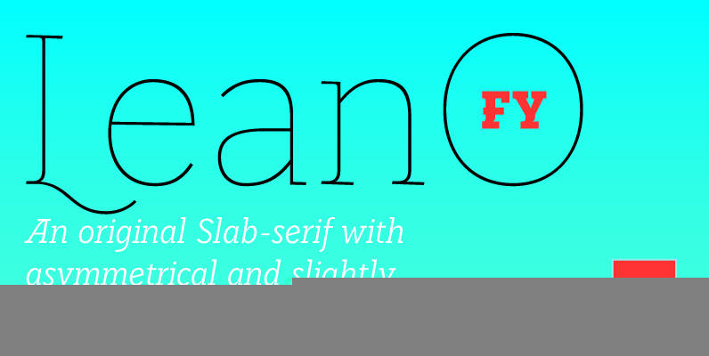
LeanO FY Font
Lean-O FY, an original Slab-serif with asymmetrical and slightly leaned serifs. This unconventional typeface is developed in 5 styles. While the extreme weights like Thin and Black are perfectly adapted for display use, the regular weight presents a good legibility
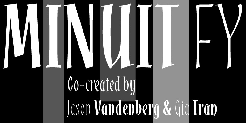
Minuit FY Font
Minuit FY is a new script font inspired by medieval calligraphic elements. The very condensed forms have short ascenders, which affords a high x-height. Comes out in three weights from light to bold, Midnight will certainly bring pleasure to all
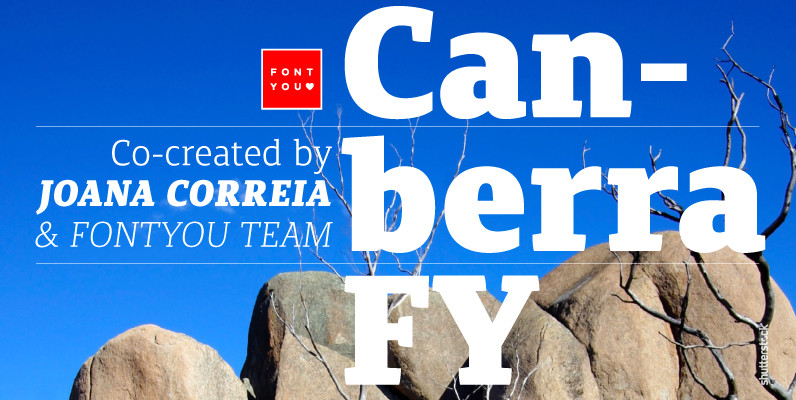
Canberra FY Font
Canberra FY is a contemporary and low-contrast serif typeface that shows legibility with personality. Its asymmetric and short serifs render a versatile look, always usable and friendly. As Canberra FY is very legible with its book style in small sizes,
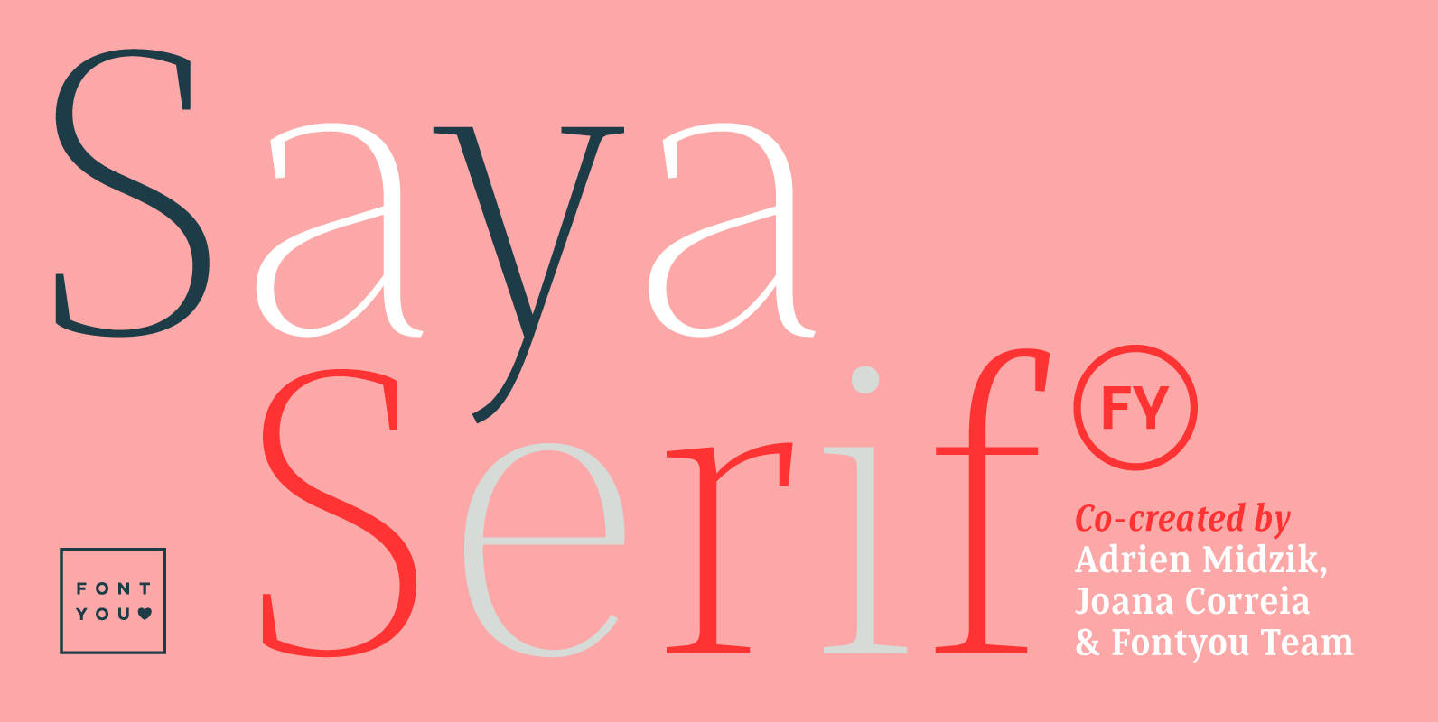
Saya Serif FY Font
Here comes the serif! After her big sisters version, Saya Sans and Saya Semi Sans, meet Saya Serif! With its lightly condensed letterforms and its elegant sharped serifs, this font family is both suitable for text and display use. It’s
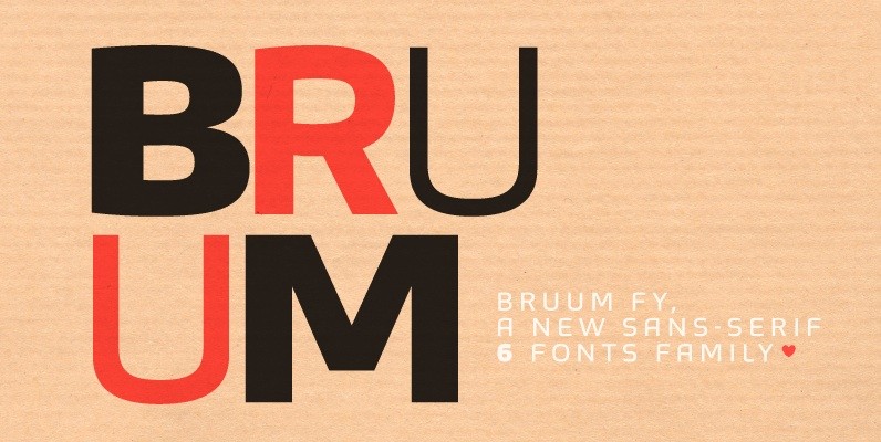
Bruum FY Font
This sans-serif font family alternates between curved and angular shapes, which give its a technical and robust style and make it both legible in small size and powerful in big for headlines. Bruum FY was co-created by Gia Tran, Alisa
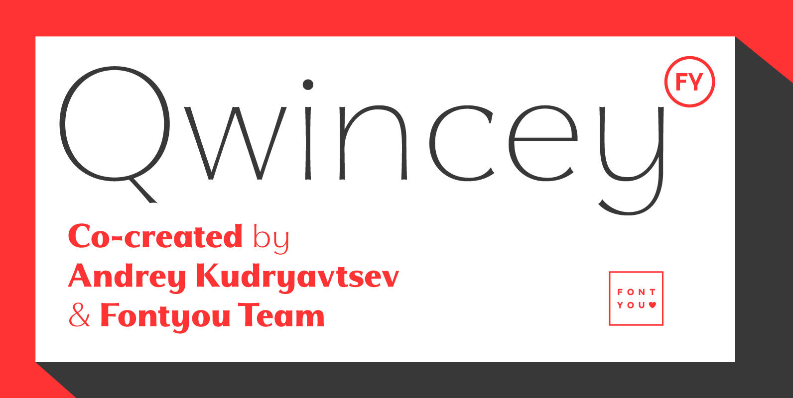
Qwincey FY Font
Qwincey is a new fresh & elegant font family available in five weights. With its flared and sharped endings, this font will give beautiful style to your layouts. With its round and generous proportions, its single storey lowercase a, open
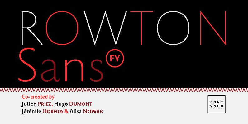
Rowton FY Font
Rowton FY digs its roots in Eric Gill’s views on typography in his book “An essay on Typography”. This typeface has the very British feel of the 20th century. Taking as inspiration the calligraphic illustrations of the book, Julien Priez,
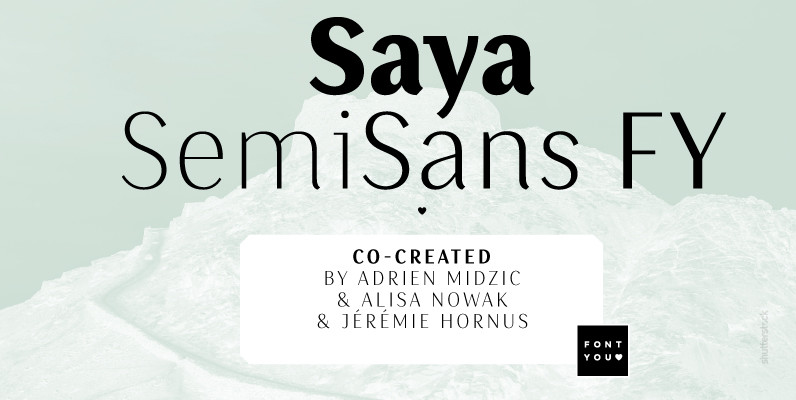
Saya SemiSans FY Font
Our Saya FY family is growing with its new SemiSans version. Like the name already indicates, Saya SemiSans is more contrasted but still keeps its lightly condensed letterforms as well as its beatiful harmonized calligraphic details. As fresh and elegant
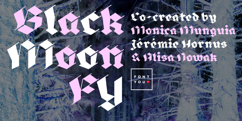
Black Moon FY Font
Blackmoon FY is a modern broken script which is made out with only straight strokes. A beautiful singularity are the very thin in-and-outstrokes accompagnying each letter. This very high contrasted font is less condensed than usual blackletter fonts and has
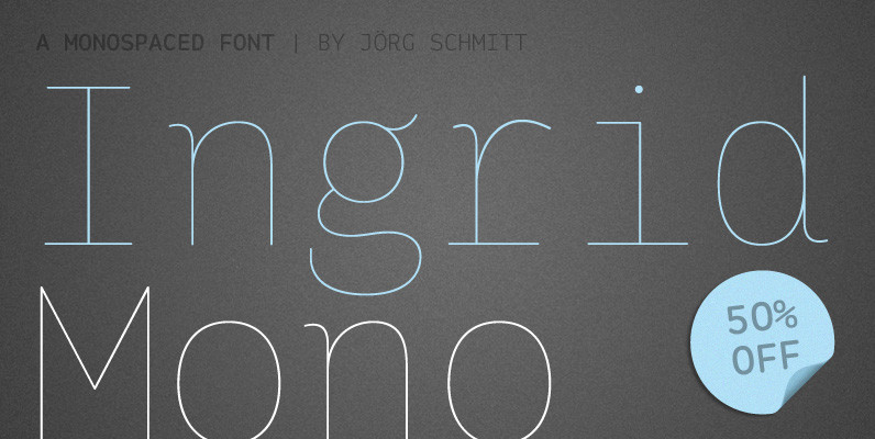
Ingrid Mono Font
The birth of the monospaced types dates back to the past. There was a need for the creation of typesets for typewriters. The difficulty was to align the different glyphs in the same width. This led to particular problems with