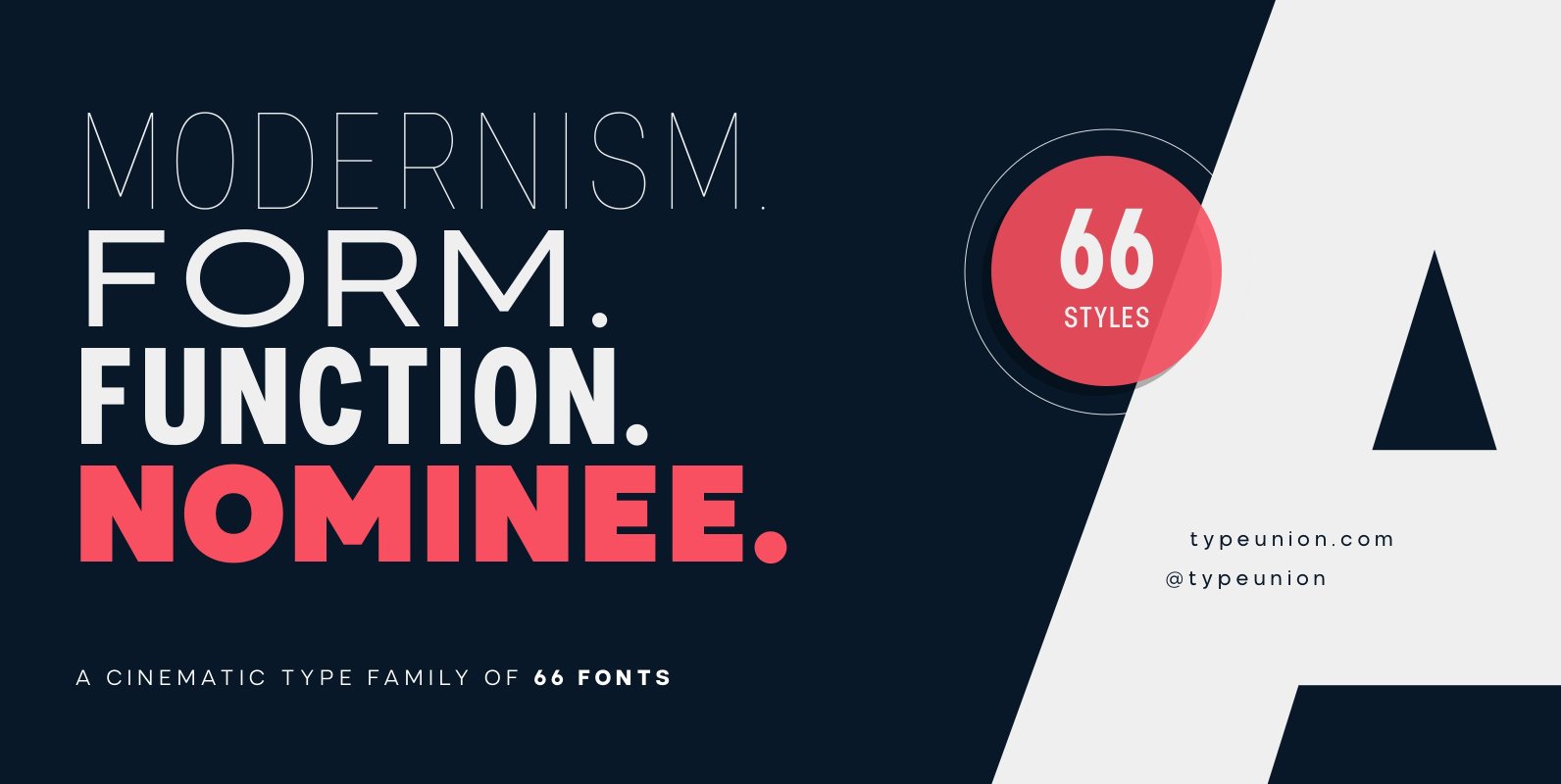
Nominee Font
Nominee is a cinematic font family made up of 11 weights, 3 widths, and matching italics, that equates to a substantial 66 font styles that feel individually crafted but also part of a larger structured system. The versatile font styles
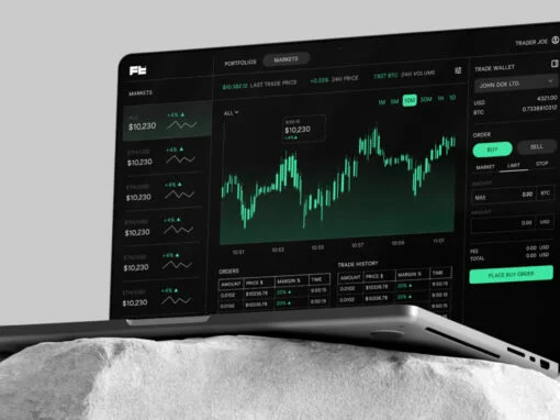
In the digital arena where typography carves out a crucial segment of the graphic and digital design landscape, the YWFT Headliner emerges as a game-changing font. As an unrivaled product, it is a striking revolution in grotesque sans-serif font design,
Within the realm of graphic and digital design, finding the perfect typeface is a quest akin to the hunt for the Holy Grail. The allure of a beautiful font is simply irresistible, providing an undeniably powerful tool in a designer’s
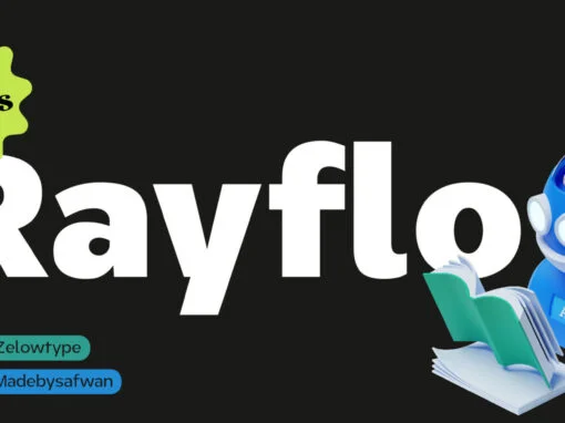
ZT Rayflo is a font that exudes simplicity and style. With its gentle flow and clean lines, it’s the perfect font for those who want to make a statement with their designs without overwhelming them with clutter. This sans serif
Discover Anthro, a unique UI font with a tall x-height, angled terminals, and medium contrast, skillfully crafted by Samuel Oakes. This typeface masterfully blends Grotesque and Humanist styles, striking the perfect balance between legibility and personality. As a bonus, every
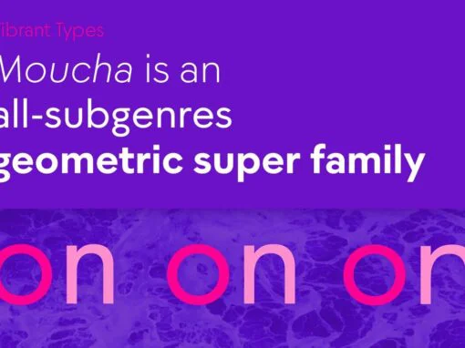
Moucha is a geometric super family offering the proportions of all subgenres. Find a vintage and a modern variant and play with all the sea foam that happens in between. The variable font is your typographic toolbox with the perfect
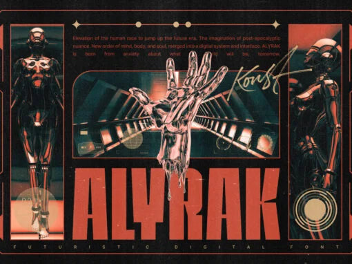
Alyrak is born from the anxiety of the future dystopia of the human race. The fear of Artificial Intelligence, robots, and technology that potentially invade living things. Represented in a font and visual to emulate the vibe every time you
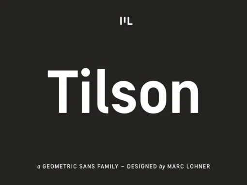
Meet Tilson, a versatile workhorse family for both texts and headlines based on a geometric and straight-lined design. It will give your apps, websites, logos, posters and so much more a techy and masculine look and feel. However, some friendly
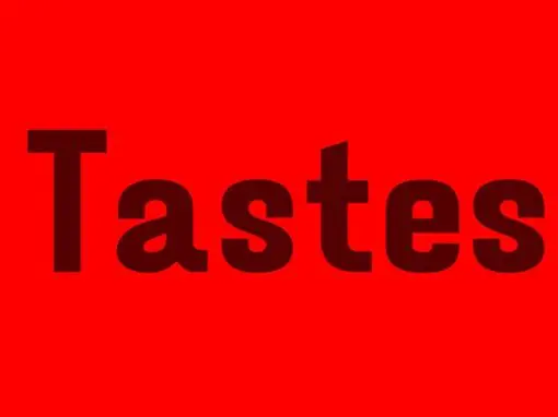
Tastes font is a casual font with an authentic value that it carries, made like a relaxed handwriting and pays attention to authenticity in its creation. suitable for use in casual-themed graphic designs. Published by Arief RochmanDownload Tastes
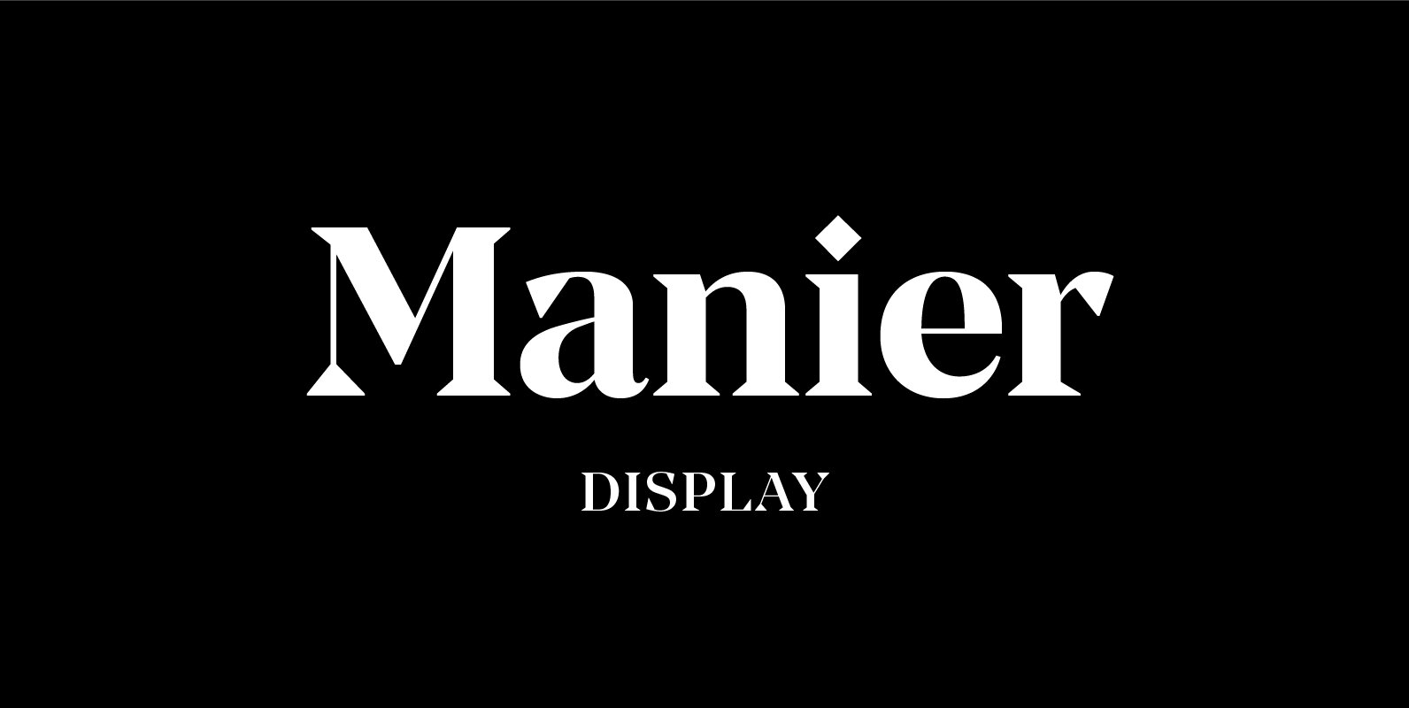
Manier is a fresh, display, wedge-serif font family inspired by transitional and contemporary typefaces. Manier has a big x-height value, modern proportions, sharp serifs and an extreme stroke contrast with a vertical stress. The typeface is a great choice for
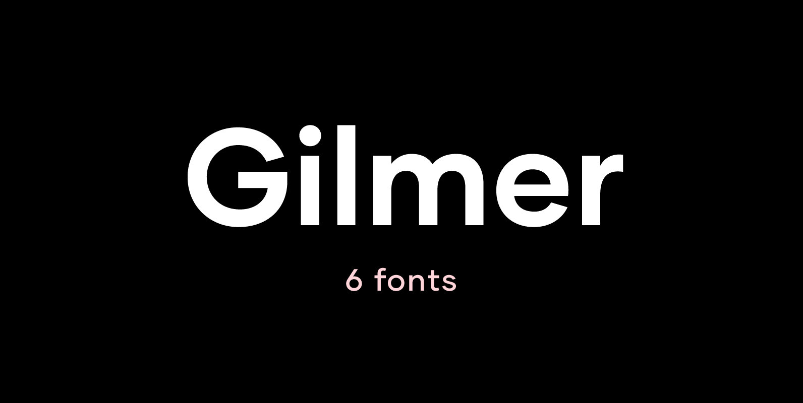
Gilmer is a fresh, geometric, sans-serif font family inspired by the iconic typefaces like Futura and Avant Garde. Gilmer has a big x-height value, geometrical letterforms, sharp edges and very small stroke contrast as the neo-grotesk fonts from 20th Century.
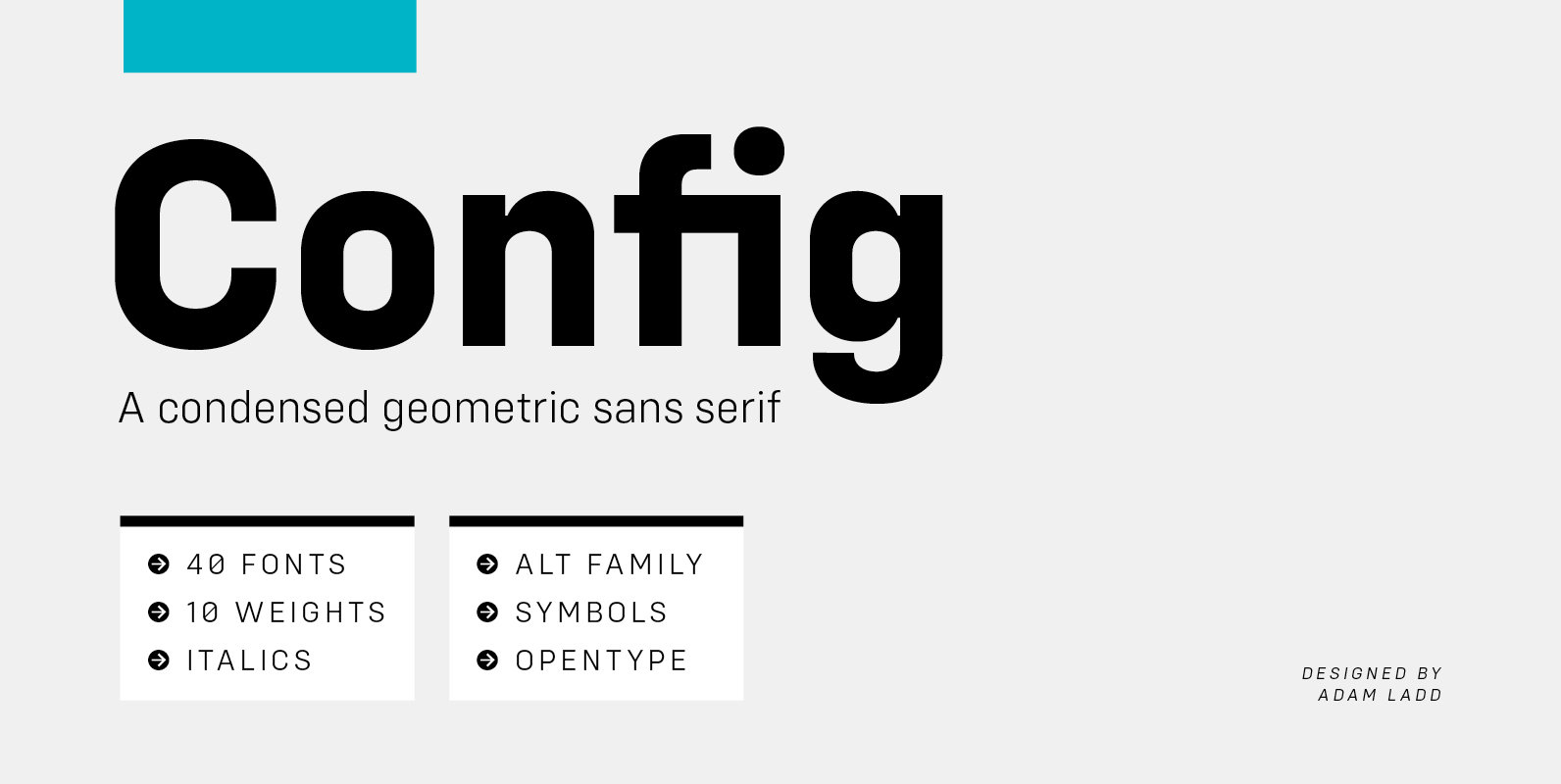
Config is a condensed geometric sans serif family consisting of 40 fonts in 10 weights plus italics. The Config typeface was influenced by geometric sans serifs with circular forms on the tops and bottoms of characters, but the proportions have
Nominee is a cinematic font family made up of 11 weights, 3 widths, and matching italics, that equates to a substantial 66 font styles that feel individually crafted but also part of a larger structured system. The versatile font styles
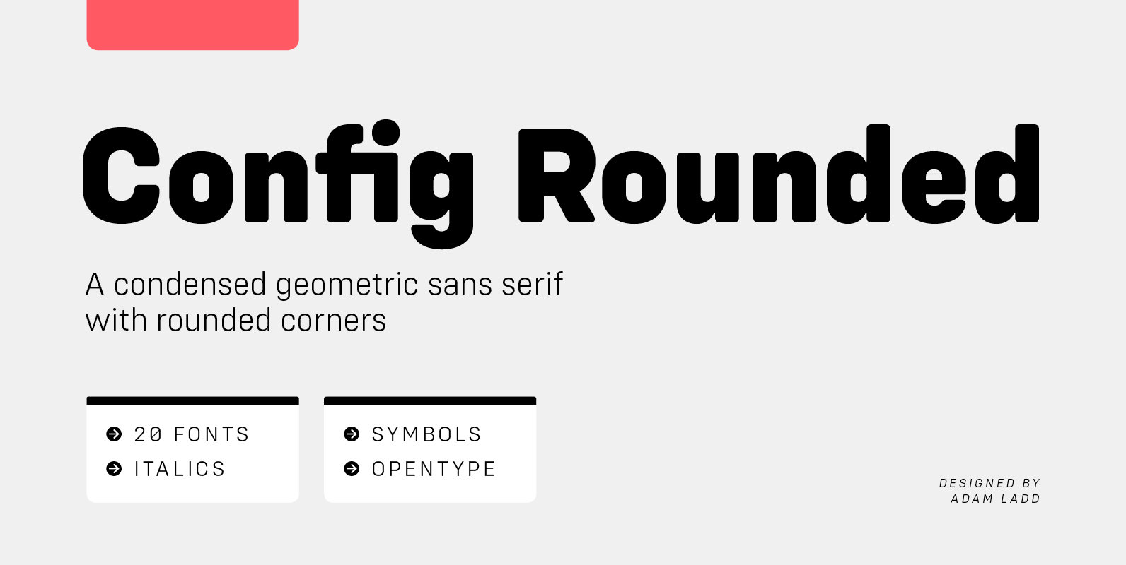
Config Rounded is a condensed geometric sans serif with rounded corners. A sibling to Config, this typeface was influenced by geometric sans serifs with circular forms on the tops and bottoms of characters, but the proportions have been condensed by
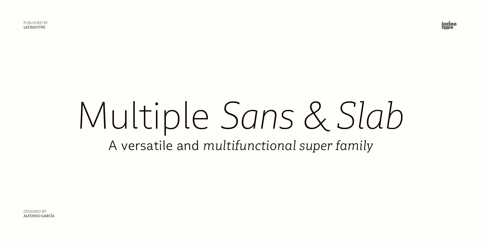
As its name suggests, Multiple is a family with multiple font styles. The idea that sums up the concept behind the typeface is workhorse—the challenge was to develop a useful font fit for any scenario and suitable to any design
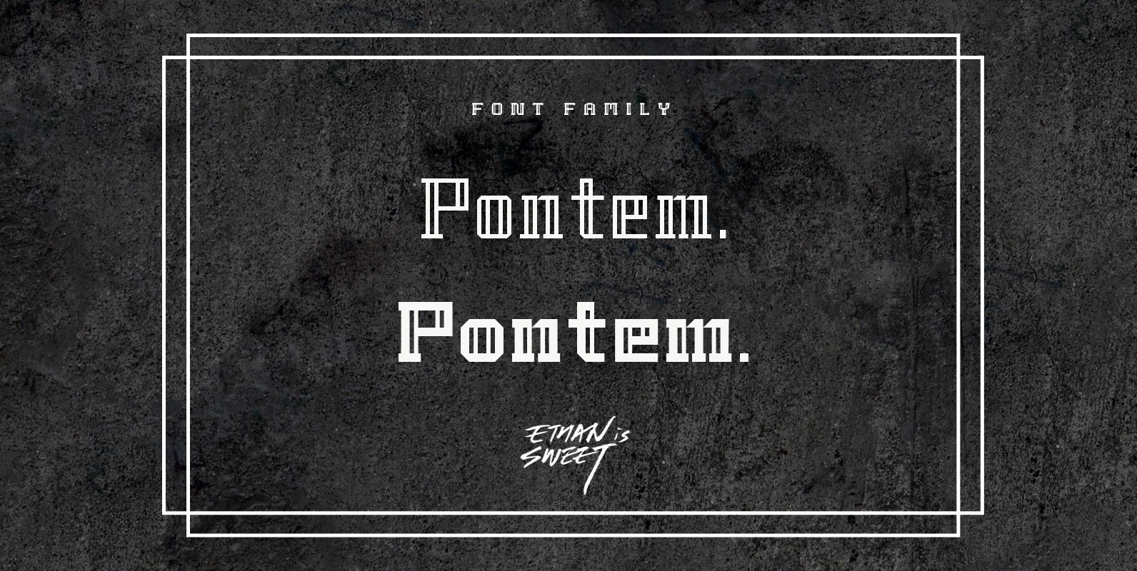
Pontem is a decorative font design published by Ethanissweet Published by EthanissweetDownload Pontem
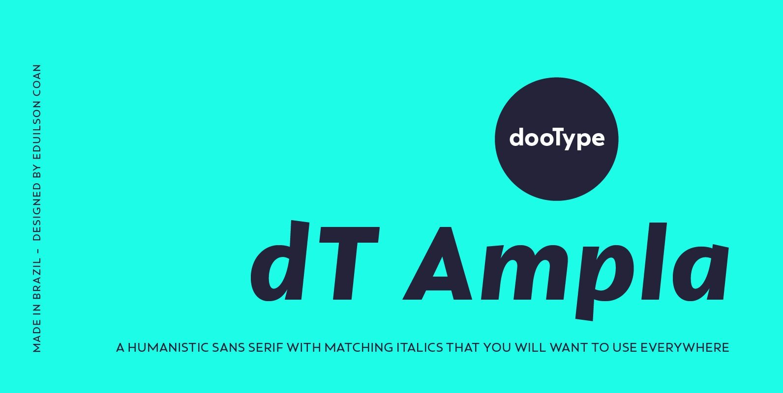
dT Ampla shares many characteristics of the versatile sans typefaces of today: nice range of five weights with matching italics, 40+ supported languages, contemporary upper-to-lowercase proportions and impeccable performance in big and text sizes. However, all these features are designed
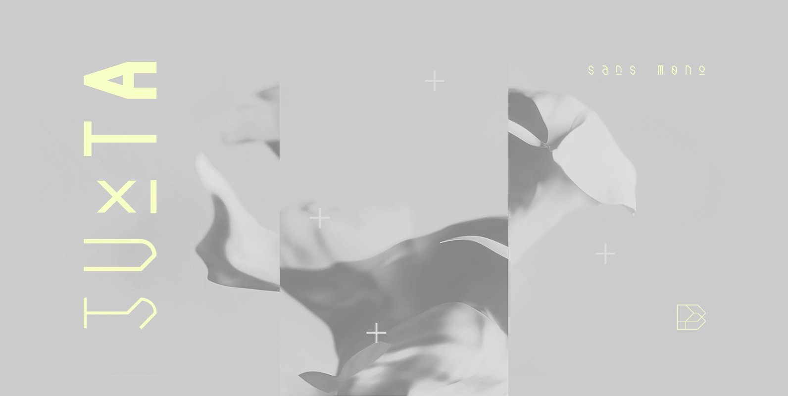
Juxta Sans Mono is a tech font design published by NaumType Published by NaumTypeDownload Juxta Sans Mono
A pragmatic sans-serif which sits in the centre on the grotesque to geometric style spectrum. Equal measures of both letterforms create a neutral type family that is modern, functional, and easy to read without being too distractive. Details include seven