Tag: true italics
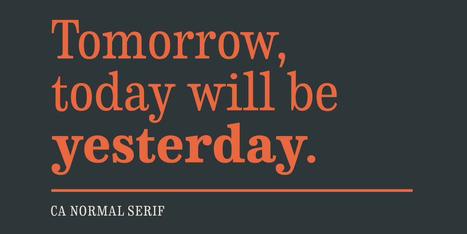
CA Normal Serif Font
CA Normal Serif is the perfect companion to its grotesque brother CA Normal. But it is not just a serifed equivalent. It has a character of its own while preserving the principal proportions and the idea of quirkiness. It was
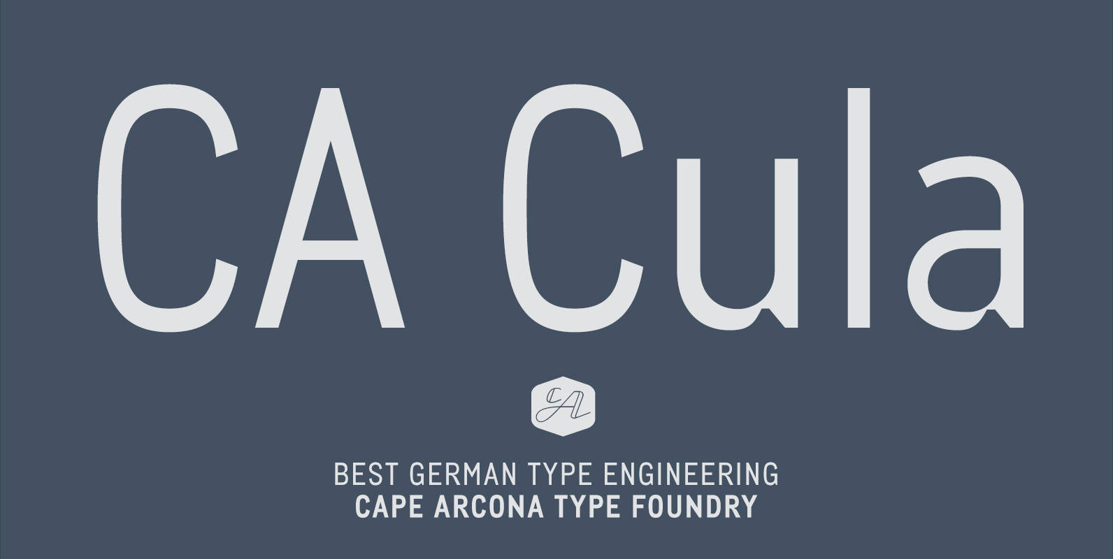
CA Cula Font
CA Cula is standing in the tradition of cool tempered sans serif typefaces like DIN. But at a closer look it reveals a tendency towards rounder reading-friendly forms. The denaturalized ink traps give CA Cula a very special and individual
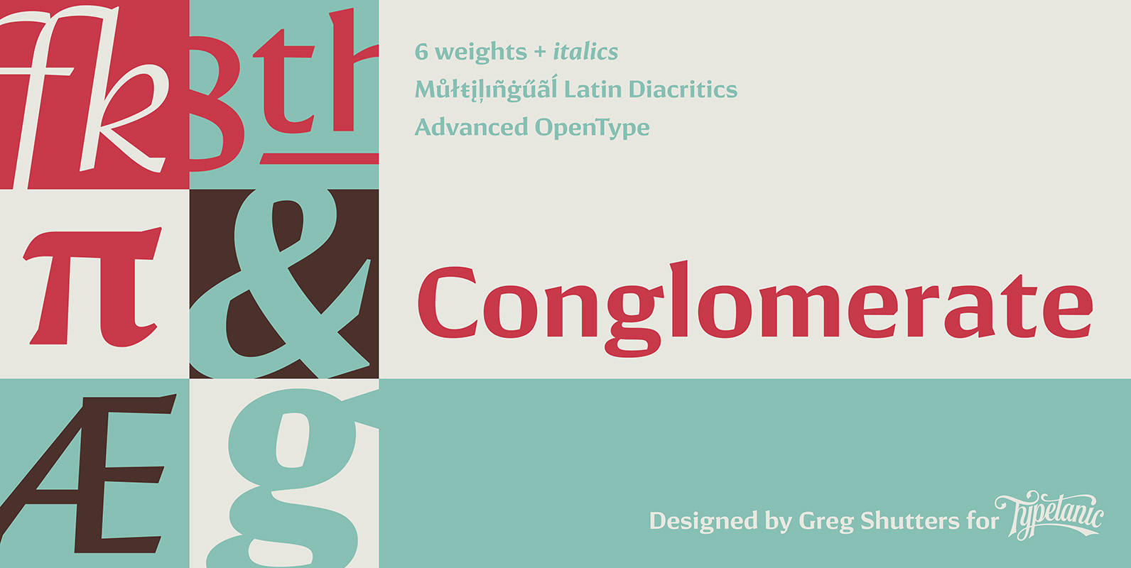
Conglomerate Font
Sans or serif? Square or rounded? Calligraphic or geometric? Conglomerate is both all and none of these things — a subtle yet unorthodox blend of typographic traits resulting in a clean, unique, and versatile font family with large, open counters
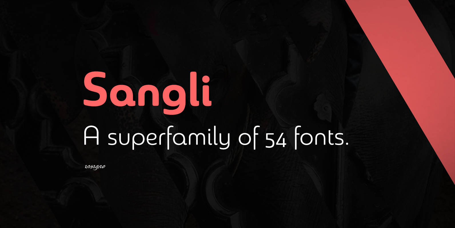
Sangli Font
It started in 2007 with Chennai, the first of a three-part series of sans that I envisioned with slab serif counterparts. Each font would differ from the others in how the stem terminals were expressed. The initial font was extremely
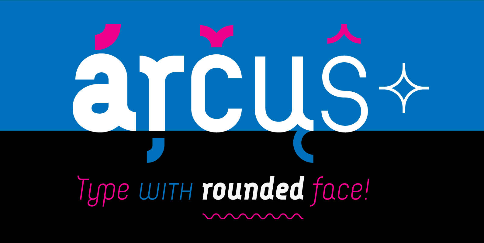
Arcus Font
Arcus is a geometrically constructed typeface. The grounding principle is the round curve. The homogeneous character of this font is guaranteed by using this principle not only in drawings of particular letters but in the shaping of diacritical signs, too.
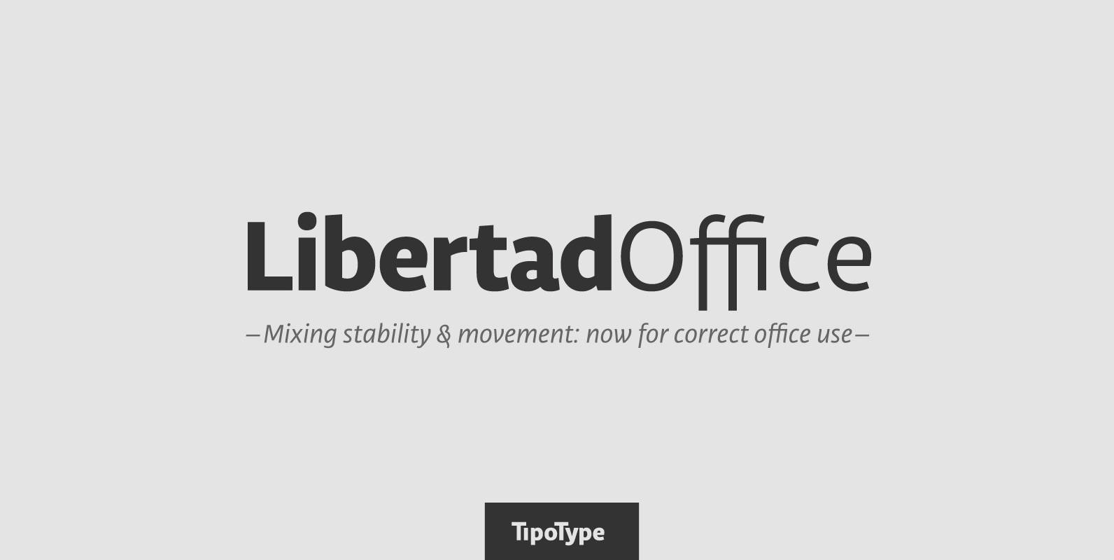
Libertad Office Font
Libertad is a sans-serif typeface that mixes humanist and grotesk models – It’s most interesting feature is the combination of balanced regulars with dynamic italics, which makes it a very versatile font for different uses. This special package is a
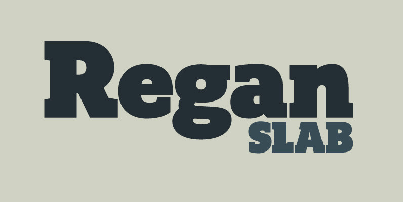
Regan Slab Font
A precision cut slab serif typeface. Simple curves are combined with sharp angles to provide a readable font with subtle characteristics. Regan Slab is ideally suited to a wide range of applications including magazines, newspapers and handheld devices. Details include

Nikaia Font
Nikaia started as an experimental typeface (the script weights) and was then expanded to its logical conclusion (italic & regular), producing the fastest look typeface in the world. Nikaia looks clean and sharp at any size, with 5 weights for
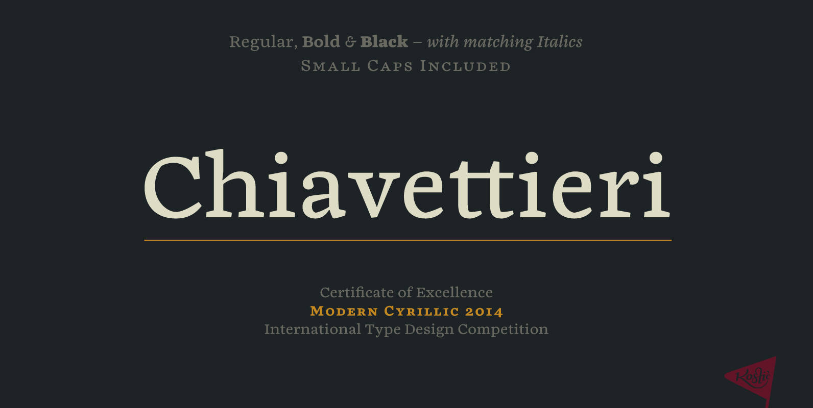
Chiavettieri Font
Chiavettieri draws inspiration from Humanist types, marked by low contrast between thick and thin strokes and the angle of stress in the bowls of letters. On the other hand, generous x-height, clean angled serifs and sharp cuts in the ball
Akagi Pro Font
Akagi Pro is a complete rebuild and expansion of my popular Akagi typeface. Contemporary, clean, simple and friendly continue to serve as the adjectives for an expansion that includes 250 additional characters per weight, many new ligature options, expanded stylistic
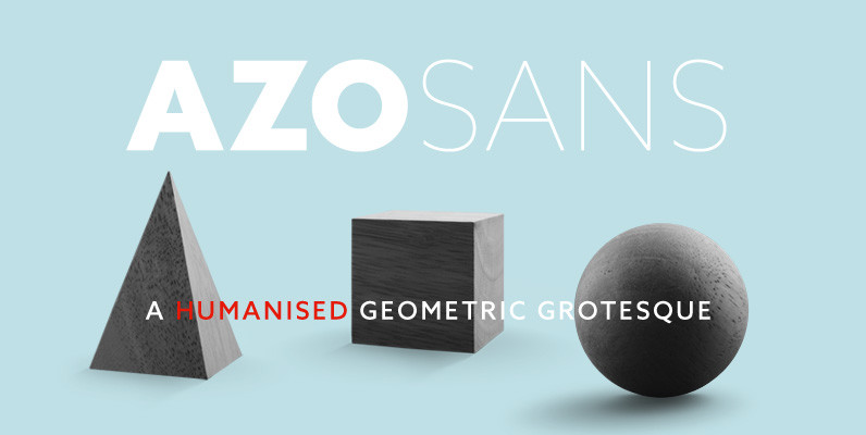
Azo Sans Font
Azo Sans is a new sans serif loosely based on the elementary forms of geometry. It is constructed in a geometric manner and inspired by the constructivist typefaces of the 1920’s, but is instilled with a humanistic quality. Azo Sans
Cavole Slab Font
Cavole Slab is a new slab serif, designed in early 2011, that has a strong influence from Dutch typography. The name is an altered form of the Portuguese word for feather, emphasizing the typefaceís soft and friendly character. Slab serifs
Bommer Slab Font
Bommer project started in January of 2014 and I am happy to announce the first family – Bommer Slab – is now ready for release. This family includes 14 weights – been seven uprights and seven italics. This font has
Verb Complete Series Font
Verb from Yellow Design Studio is a 72-font sans-serif superfamily that’s confident, friendly and energetic. At text sizes it’s highly legible, while at larger sizes it reveals lively shapes and personality. It has four subfamilies including Regular, Condensed, Extra Condensed,
Adagio Sans Font
The Adagio Family is a part of Mateusz Machalski’s, Warsaw Academy of fine arts Master Degree Diploma in multimedia studio, conducted by Professor Stanisaw Wieczorek and his brave PHD Jakub Wróblewski. Adagio is a modern type family. It consists of
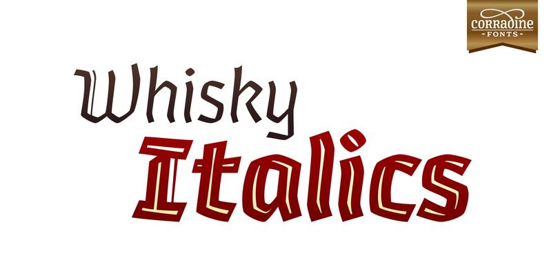
Whisky Italics Font
Whisky is a blackletter font family with a casual touch that makes it look friendly and current. The stroke varies its thickness and angle endings making it form very dynamic bodies of text. Whisky Italics are the corresponding versions to
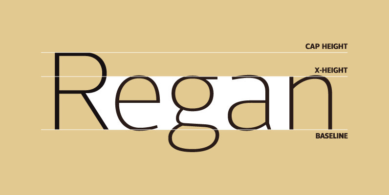
Regan Font
A finely crafted sans serif typeface with an uncomplicated appearance. Soft curves are mixed with minimal angles to create a readable font ideally suited for identity, editorial and online uses. Details include 10 weights with italics, 540 characters, 5 variations