Tag: transitional
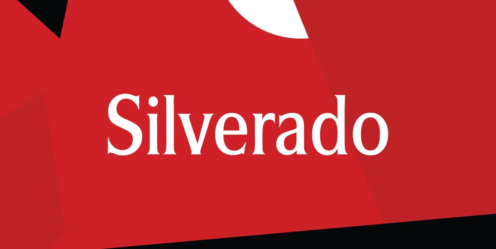
Silverado Font
Designed by Steve Jackaman, Silverado is based on a classic serif type design called Eldorado. Published by Red RoosterDownload Silverado
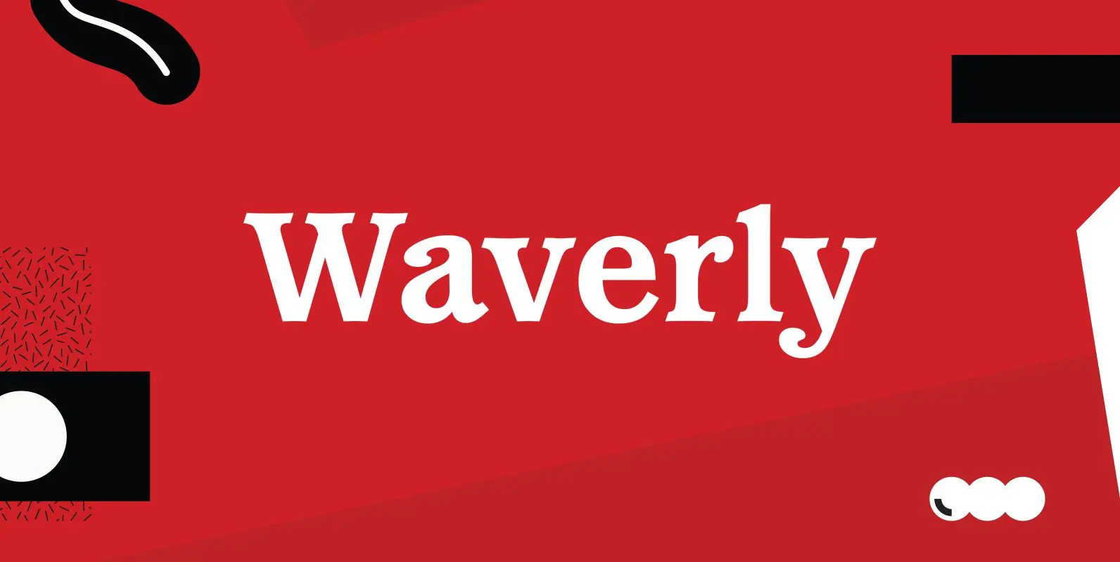
Waverly Font
Waverly is a round and soft serif designed by Les Usherwood, digitally engineered by Steve Jackaman. Published by Red RoosterDownload Waverly

Leighton Font
Designed by Paul Hickson, Leighton is a clean serif based on Lectura, a design by Dick Dooijes of the Amsterdam Foundry (1966). Published by Red RoosterDownload Leighton
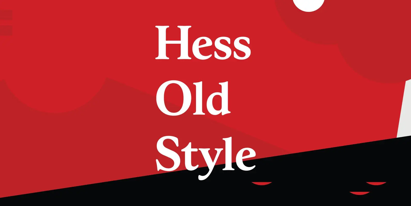
Hess Old Style Font
Designed by Steve Jackaman, Hess Old Style was originally designed by Sol Hess as just a roman and italic for Lanston Monotype, circa 1920-23. Published by Red RoosterDownload Hess Old Style
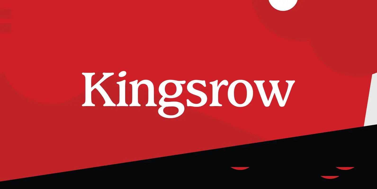
Kingsrow Font
Designed by Les Usherwood. Digitally engineered by Steve Jackaman. Unofficially named No Frills in the early stages of development, his widow Elsie decided that it would be called Kingsrow. Published by Red RoosterDownload Kingsrow
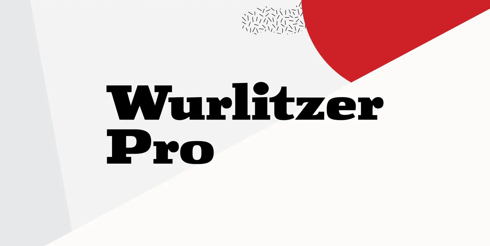
Wurlitzer Pro Font
Designed by Steve Jackaman & Ashley Muir. This design was inspired by an early 20th century woodtype. Wurlitzer contains all the high-end features expected in a quality OpenType Pro font. Published by Red RoosterDownload Wurlitzer Pro
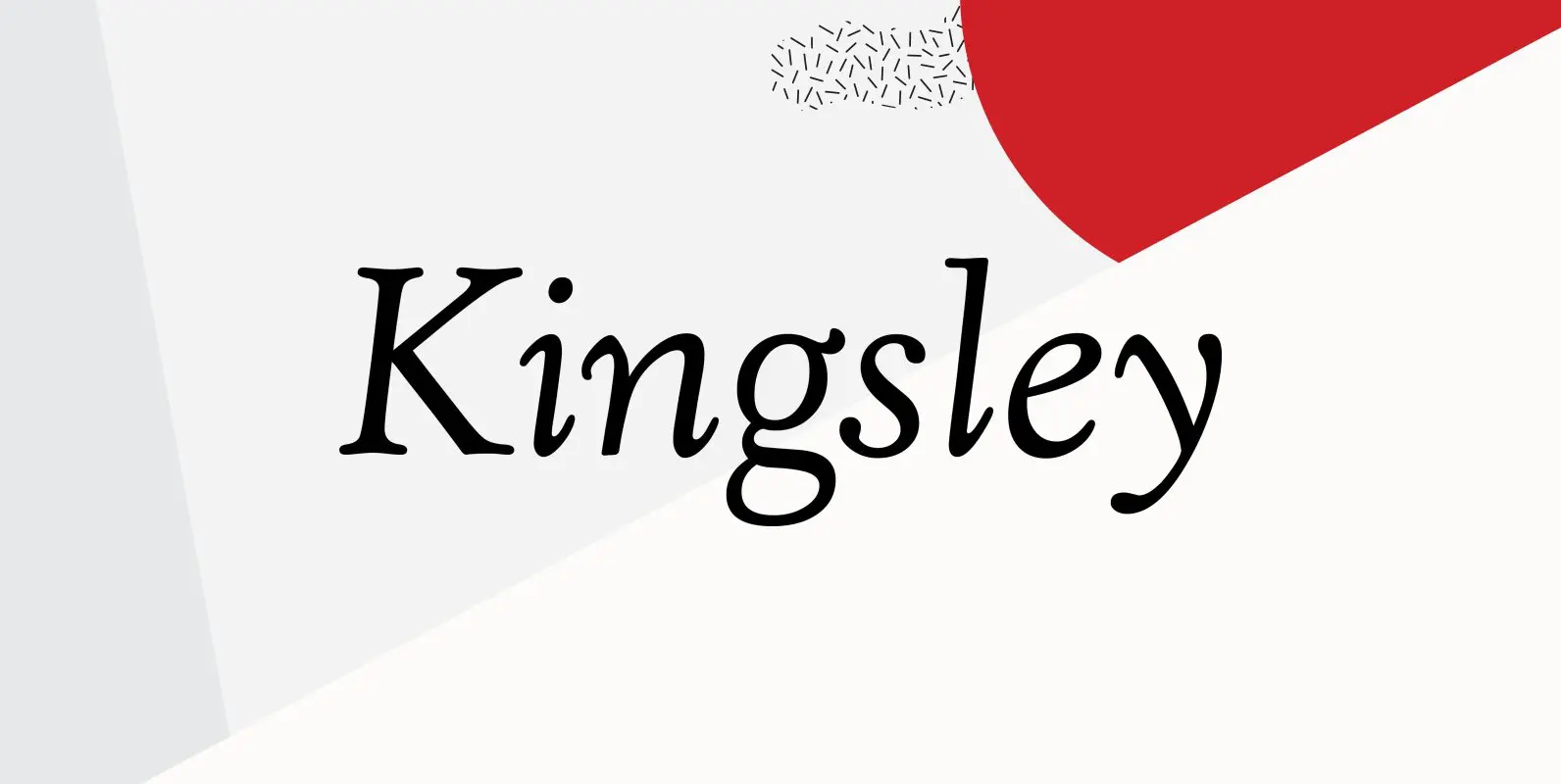
Kingsley Font
Designed by Les Usherwood. Digitally engineered by Steve Jackaman. This beautiful recreation by Les of the Frederick Goudy typeface, Kennerley Old Style, circa 1911-24, may be superior to any other. Published by Red RoosterDownload Kingsley
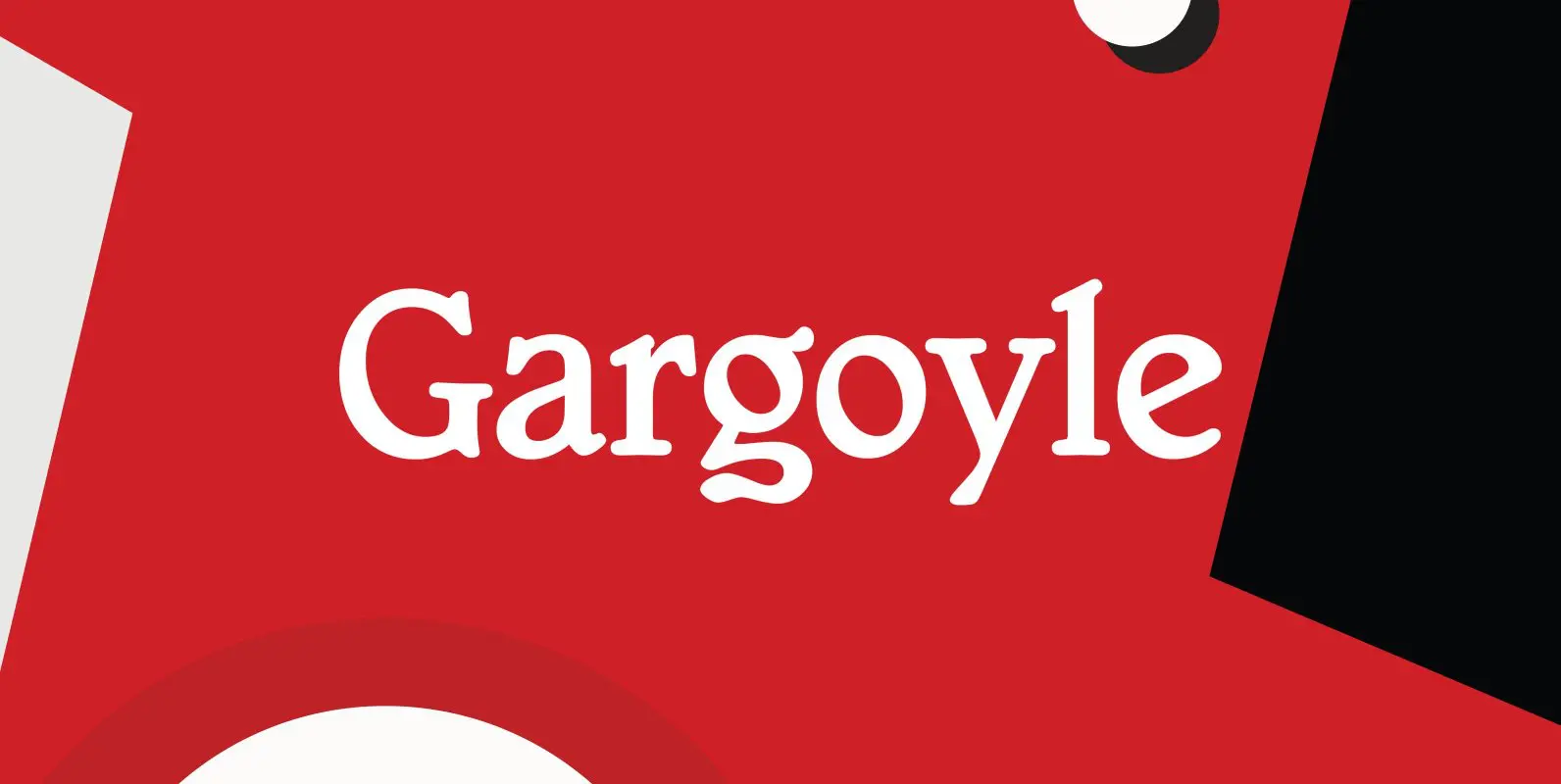
Gargoyle Font
Designed by Steve Jackaman, Gargoyle is based on the original Adrian Williams typeface design, circa 1976 and Brook Type in 1903 designed by Lucien Pissaro. Published by Red RoosterDownload Gargoyle
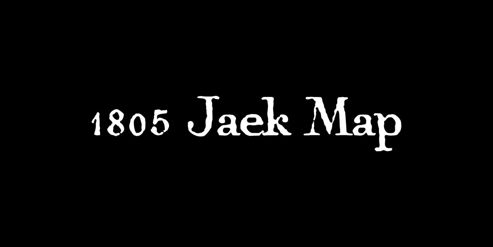
1805 Jaeck Map Font
This “Pro” font is mainly inspired from the engraved characters of a German Map depicting Germany’s roads and parts of surrounding lands, edited in Berlin probably in the end of 1700’s. The engraver was Carl Jaeck or Jaek (1763-1808). The
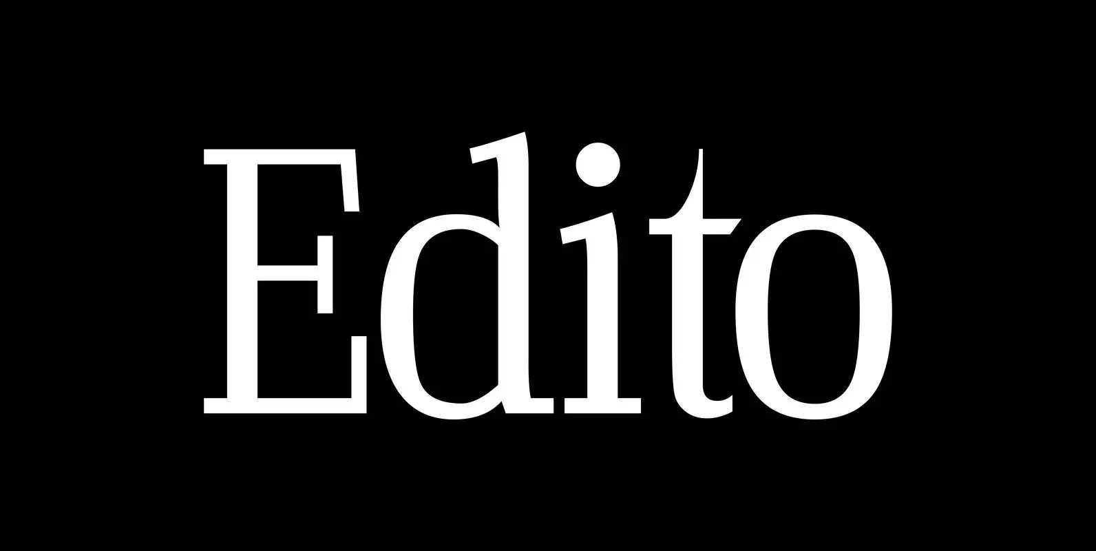
Edito Font
“Edito” is a completely new body copy-font. The special thing about this font is, that all serifs have the same height. So no matter if you take the thinnest cut (A) or the fattest (F), you will always have aligning
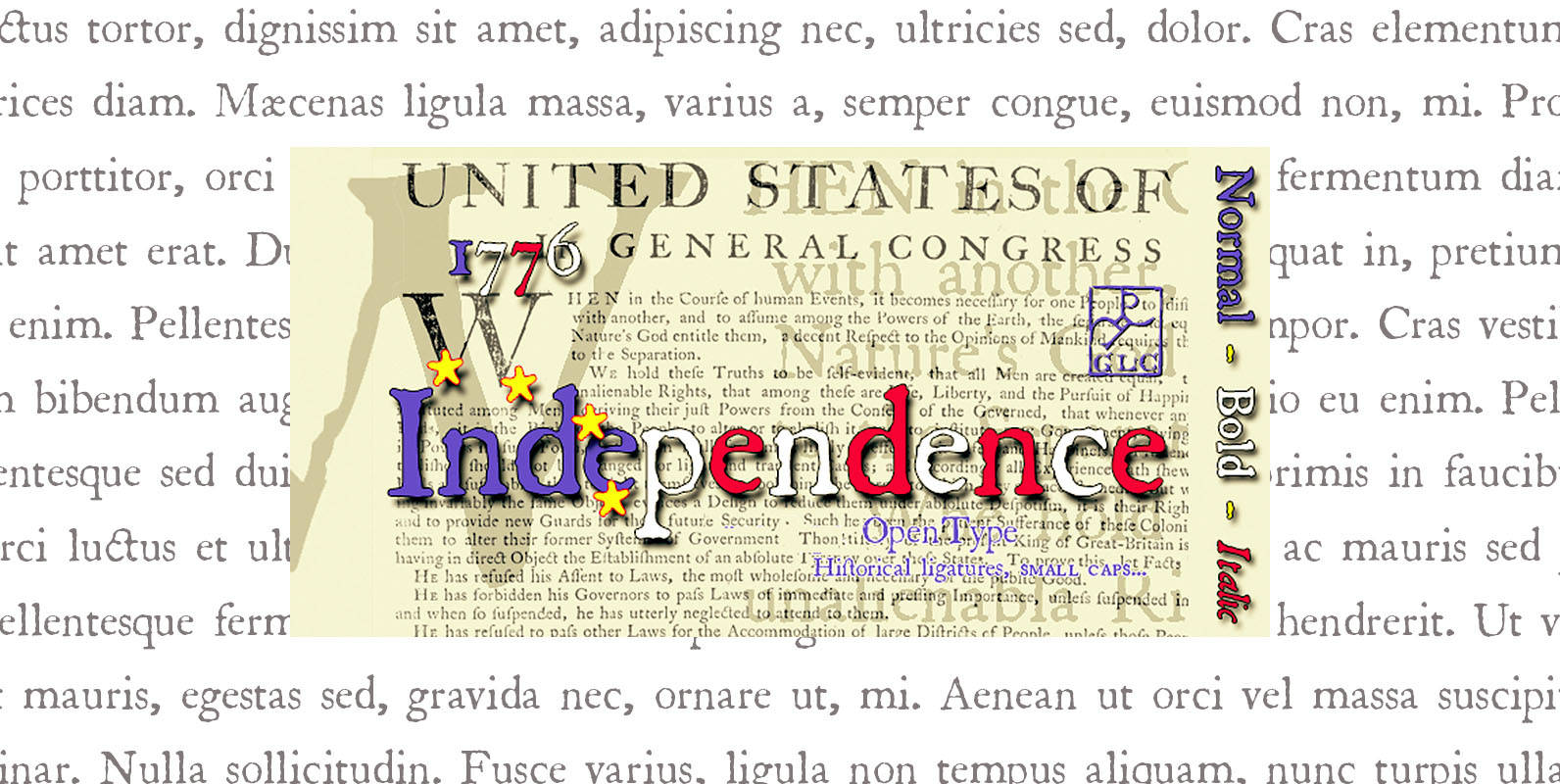
1776 Independence Font
1776 Independence was designed inspired mainly from the font used by John Dunlap in the night of 1776 July 4th in Philadelphia to print the first 200 sheets of the Congress’ Declaration of Independence establishing the United States of America.
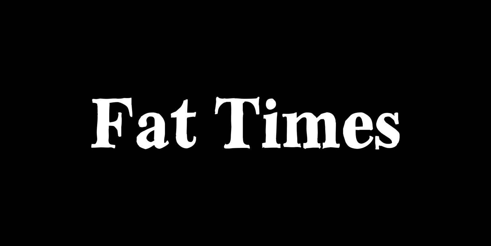
Fat Times Font
“FatTimes” is an extension to my HardTimes family. Times are too hard for boring typefaces, so try the fat one one for a change. Published by Wiescher DesignDownload Fat Times
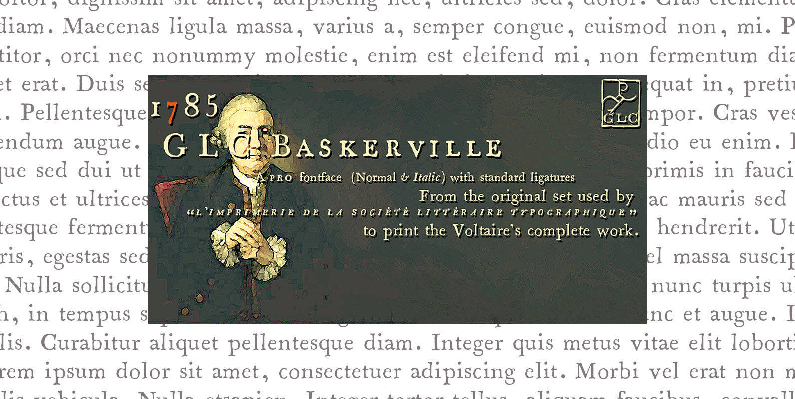
1785 GLC Baskerville Pro Font
This family was created inspired from the well-known Baskerville Roman and Italic typefaces created by John Baskerville, the English font designer. We were inspired from the original family sent by Baskerville’s wife after he was death. The Baskerville’s full collection

Soft Times Font
“Soft Times” has been easy on my nerves after the strain of “Hard Times”. The harder the Times are the more do we need some soft typefaces, this one is the soft counterpart for “HardTimes”. Published by Wiescher DesignDownload Soft
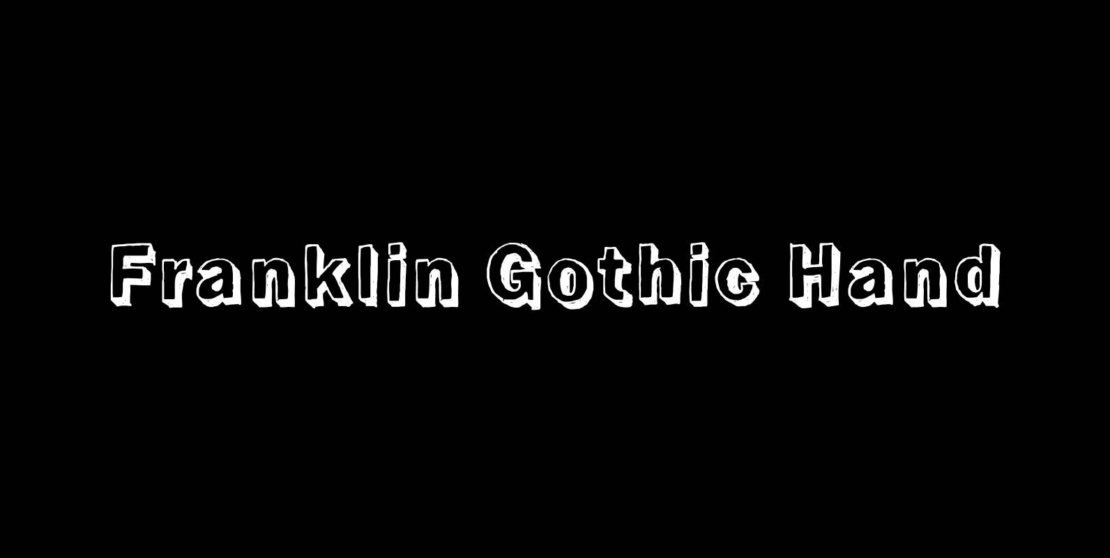
Franklin Gothic Hand Font
Franklin Gothic Hand Demi Shadow is another one in my series of hand-drawn fonts from way back in time – before computers changed the way we worked in advertising. This one was especially used for what we called “pork-belly-ads”: ads

Hard Times Font
“Hard Times” has been hard work, designing a handmade typeface must always have the right balance between rough and smooth, specially with this Times-like face. It has the big European glyph-set, so that it can be used all over the
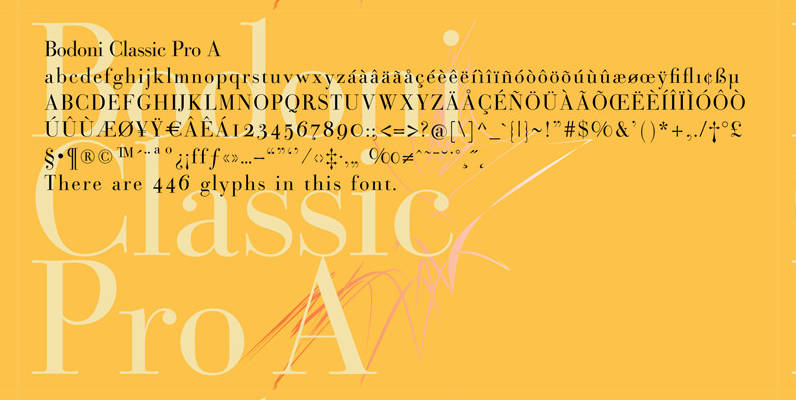
Bodoni Classic Pro Font
This is my new, completely worked over and fine-tuned Bodoni Classic for Europe (no Greek and Cyrillic). I have added a set of elegant Swashes (B) and 2 alternating uppercase swirly Initials (C) as well as two lowercase end-letters (D).
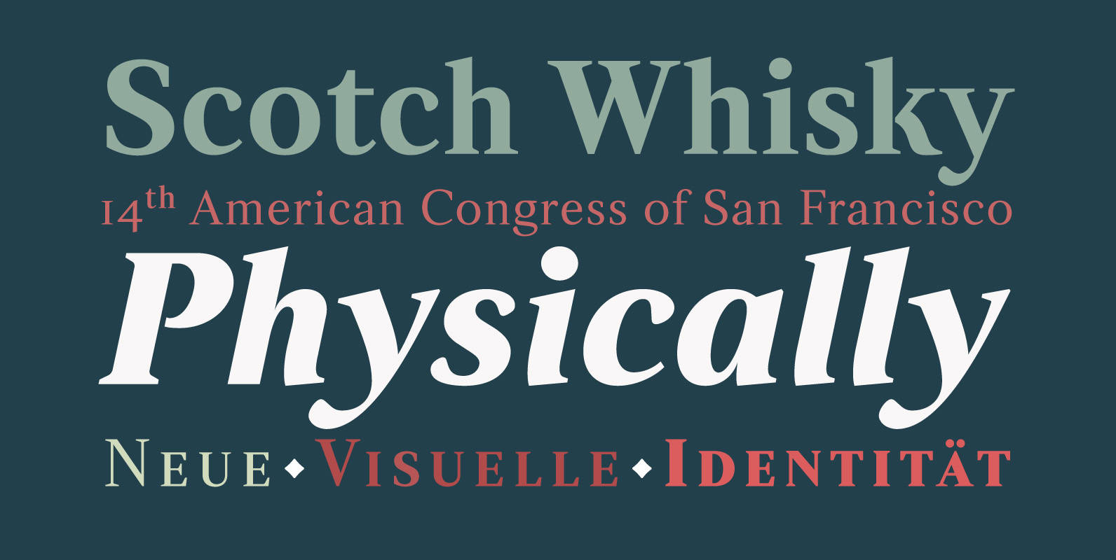
Strato Pro Font
Strato Pro font family is a modern serif typeface family with readability and legibility in mind. Inspired by Classic Roman typeface design, Strato Pro has 16 weights, ranging from book to black with small caps and an ornament set if