Tag: trajan
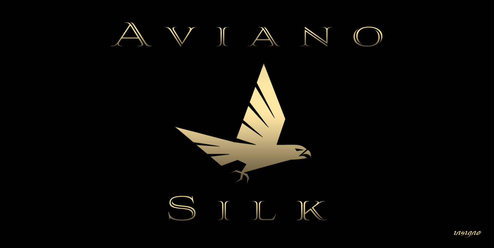
Aviano Silk Font
As part of insigne’s annual tradition in adding to the Aviano family, this modern development of a timeless font was selected the clear leader in a poll of insigne design’s social media followers. Silk refers to the smooth, flowing feel
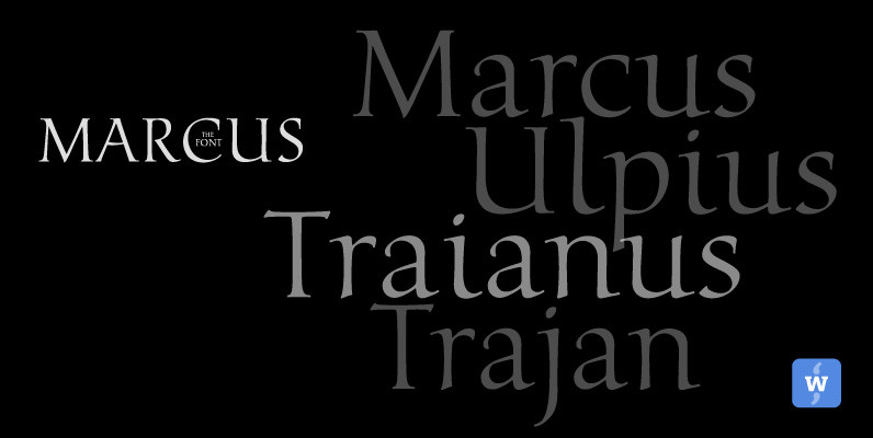
Marcus Font
Marcus, the font, was named after the Roman Emperor Marcus Ulpius Traianus (Trajan) born 18 September 53 in the Roman province of Hispania Baetica (in what is now Spain), a province that was thoroughly Romanized, in the city of Italica.
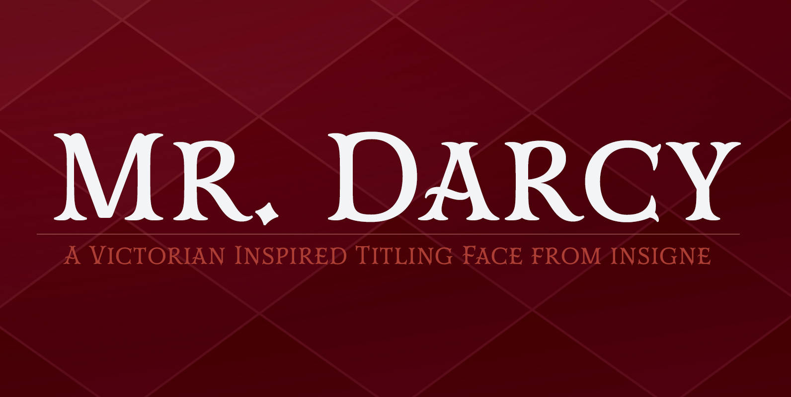
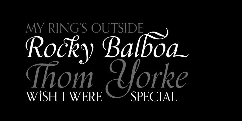
Mr Darcy Font
The elegant and very graceful Mr. Darcy is sufficiently compete with its additional characters–to be stated more precisely, over 136 defining alternates. These optional features are carefully displayed within the supplied brochure. The employ of the Mr. Darcy family moreover
Coliseum Font
Coliseum was designed by A. Pat Hickson/Julie Hopwood. An original design and release by Red Rooster. Published by Red RoosterDownload Coliseum
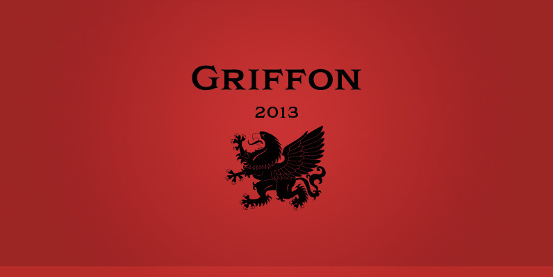
Griffon Font
Griffon, titling face with influence from classic letterforms, inspired by retro faces in the early 20th century. This font family was all redesigned from scratch and now released ranging in 5 weights with small caps from Light to Bold. The
Beckenham Font
Designed by Les Usherwood, Beckenham was digitally engineered by Steve Jackaman. The x-heights are radically different; the x-height on the light version is small, and gets larger as the weights progress. Published by Red RoosterDownload Beckenham
Schneidler Initials Font
This 1957 typeface, designed by F.H.E. Schneidler for the Bauer Type Foundry, was created to compliment his Schneidler Old Style, (also known as Bauer Text). Schneidler Initials have pointed and very small serifs. This font’s beauty and elegant personality is
PF Monumenta Pro Font
Royal, majestic, elegant. These letters are based on Roman and Greek characters carved on stone. They come in 3 different styles. Normal and Shaded are designed to have serifs with a finer thinning. On the other hand, Metallic is bolder
Orpheus Pro Font
The original Orpheus design by Walter Tiemann (1926-1928, Klingspor) was certainly a masterpiece. Unfortunately, like so many typefaces of that between-wars era, it got overlooked when type technology changed over to film, and once again when digital type came around.
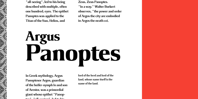
Argus Font
Designed by Steve Jackaman, Argus is a serif design based on the popular 1968 VGC typeface. Published by Red RoosterDownload Argus
Astoria Font
Based heavily on Gill Sans especially in the mid weights, Astoria has a subtle top left serif which makes it not quite a Roman and not quite a Sans. Designed specifically as a text face it still works very well
Kommisar Font
Kommisar is a typeface loosely based on the inscriptions on the Trajan capital in Rome and informed by the structural sensibilities of American signpainter and lettering artist Father Edward Catich. Perfect for use in advertising, movie posters, movie titles, identity
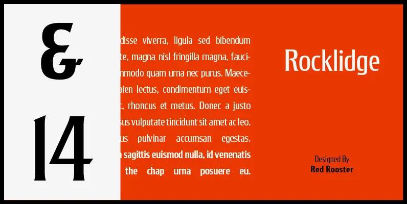
Rocklidge Pro Font
Designed by Steve Jackaman & Ashley Muir. This design was inspired by the 1965 VGC typeface, Jana by Richard D. Juenger. Originally available as a single weight, Rocklidge now has five weights and contains all the high-end features expected in
Forum Titling Font
Designed by A. Pat Hickson. An original design based on the Frederick Goudy design first shown in 1912. Originally a caps only design in one weight. Produced as a foundry face by Lanston Monotype 1924. Published by Red RoosterDownload Forum
Dominus Font
Designed by Steve Jackaman and Ashley Muir. It was our initial intention to develop a suitable lowercase for Les Usherwood’s ‘Elston’ typeface, based on a few characters from an old German typeface called Hermes Grotesque (Woellmer, Berlin). However, the new