Tag: super-family

Interval Sans Pro Condensed Font
The new Interval Sans Pro is a pratical choice when you need a contemporary sans serif for text typography, headlines, signage or brands creation. This new version has many more OT features like small caps, ligatures, stylistic set, localized form.
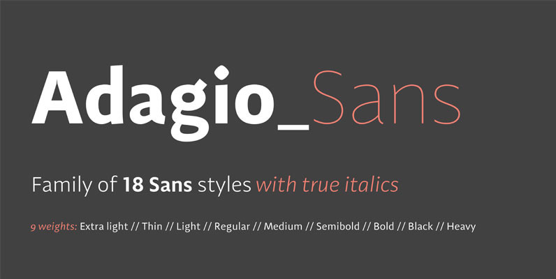
Adagio Sans Font
The Adagio Family is a part of Mateusz Machalski’s, Warsaw Academy of fine arts Master Degree Diploma in multimedia studio, conducted by Professor Stanisaw Wieczorek and his brave PHD Jakub Wróblewski. Adagio is a modern type family. It consists of
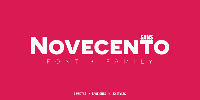
Novecento Sans Font
Novecento sans is an uppercase-only font family inspired on European typographic tendencies between the second half of 19th century and first half of the 20th. It looks rational and geometric. However, it is optically corrected and balanced. This font face

Libertad Font
Design can do without images, but not without typefaces. Libertad is a sans-serif typeface that mixes humanist and grotesk models – It’s most interesting feature is the combination of balanced regulars with dynamic italics, which makes it a very versatile

Air Superfamily Font
In B-movie awesomeness, Air began as Grotesk vs. Grotesque. I was trying to unify the prevailing traits of German and English Grotes(que/k)s in order make something different but familiar. I am NOT trying to reinvent Helvetica (snore), so get that

Interval Sans Pro Font
The new Interval Sans Pro is a pratical choice when you need a contemporary sans serif for text typography, headlines, signage or brands creation. This new version has many more OT features like small caps, ligatures, stylistic set, localized form.
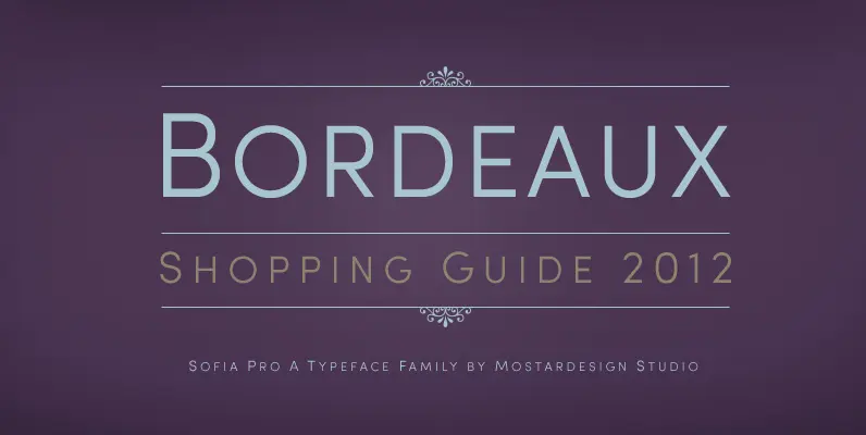
Sofia Pro II Font
Originally designed in 2008 by Olivier Gourvat, this font family gives an impression of modernism, harmony and roundness. These nuances give Sofia a harmonious and sensible appearance for both texts and headlines. Redesigned in 2012, this typeface supports a wide
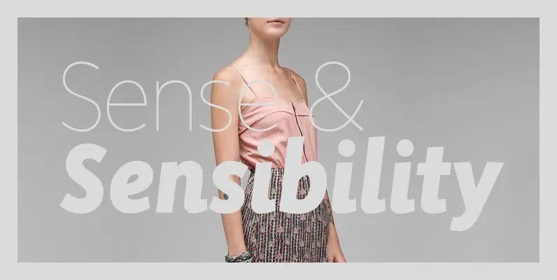
Sense and Sensibility Font
Over time, many of the functors of page layout have become formalized within the concept of typeface as morphic categories, categories being the semantic building blocks of perception at the level of both individual physiology and social production. First case,
