Tag: straight
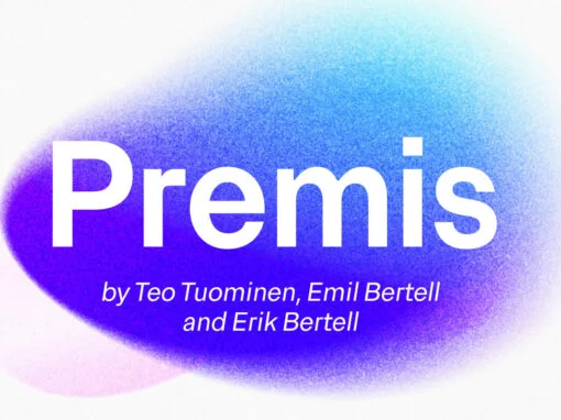
Premis Font
Do you often find yourself looking for a font that is universal and neutral on the one hand, and distinctive and special on the other? Here's one for you. Premis is a fairly broad font family that is suitable for
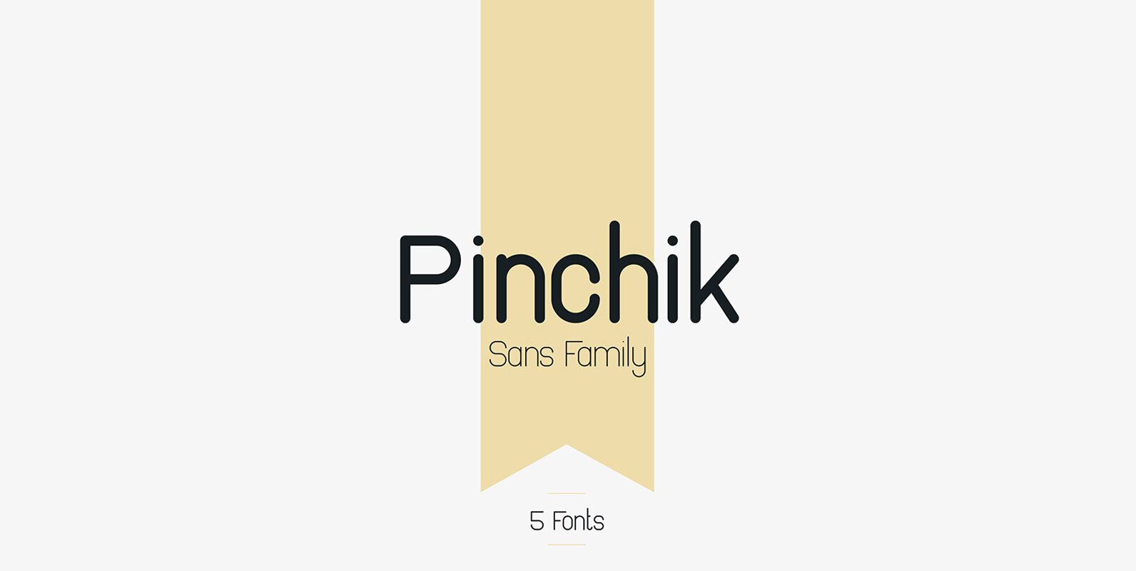
Pinchik Font
Pinchik is clean, rounded sans serif typeface with 5 fonts and multilingual support. It’s a very versatile font that works great in large and small sizes. Pinchik is perfect for branding projects, home-ware designs, product packaging, magazine headers – or
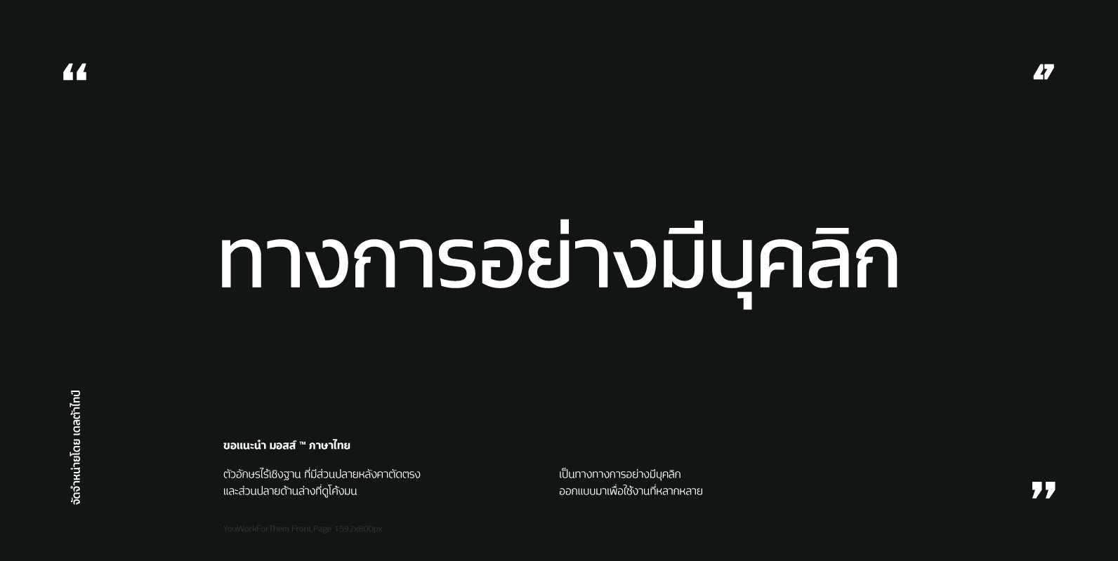
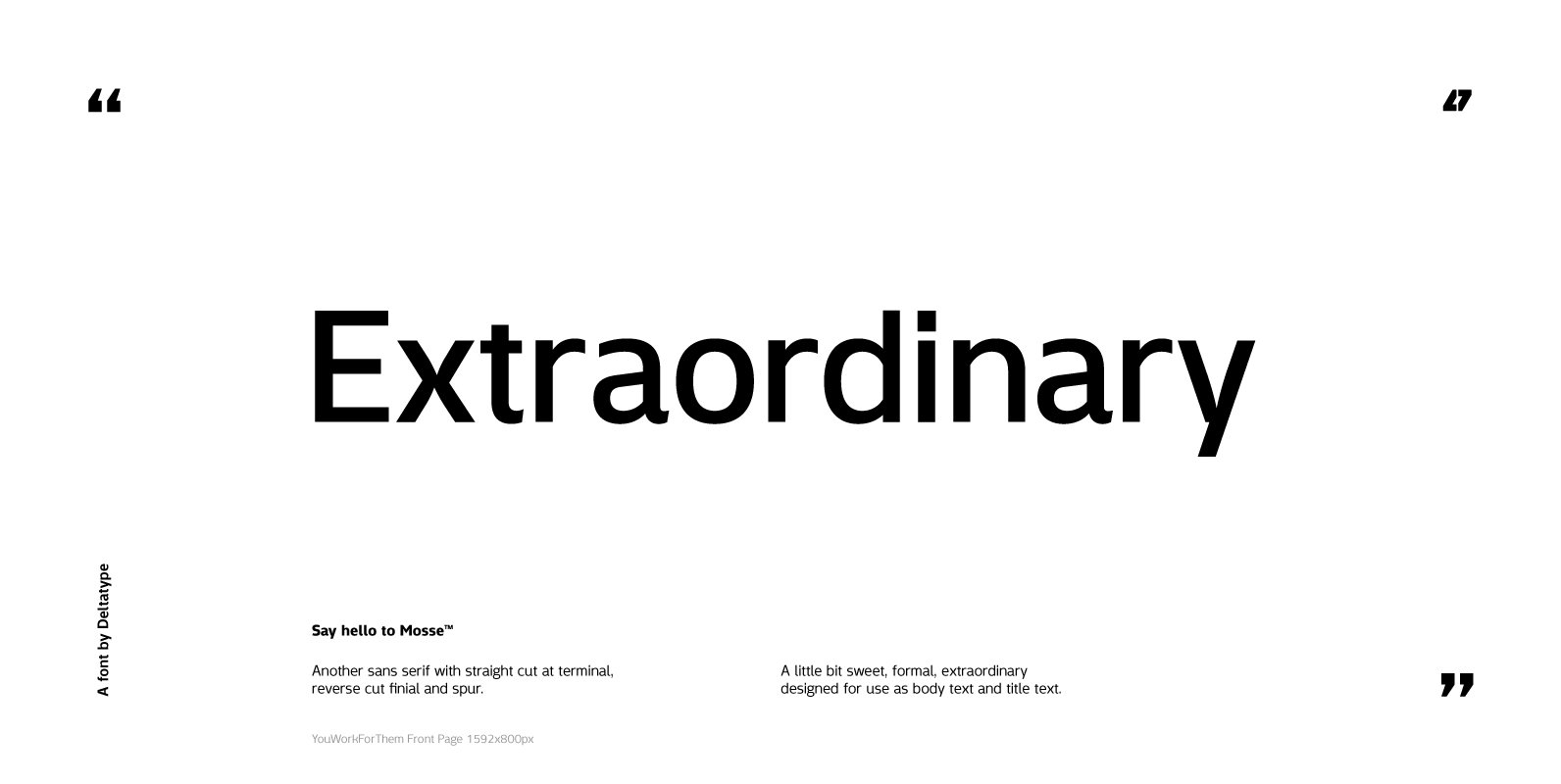
Mosse Thai Font
Mosse Thai is a thai font design published by Deltatype Published by DeltatypeDownload Mosse Thai
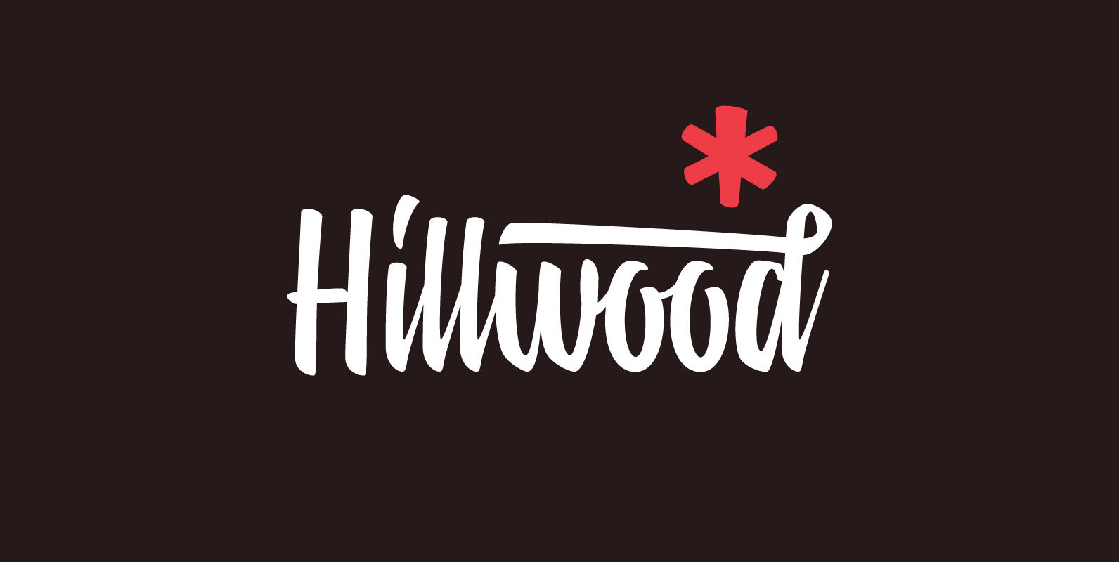
Hillwood Font
Hillwood is a contemporary brush script with perpendicular style. Hillwood built on a combination of high-speed brush lettering and natural balance of each letter. Suitable for urban design style whether it is for sign painting, brand, t-shirt, badge/insignia, etc. Published
Mosse Font
Mosse is a sans serif font design published by Deltatype Published by DeltatypeDownload Mosse
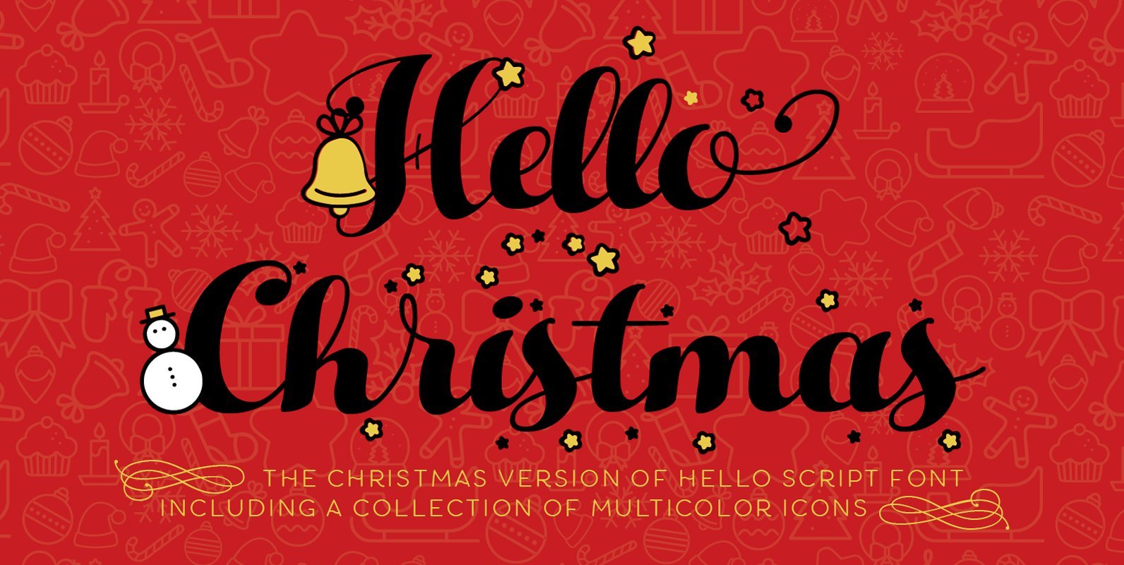
Hello Christmas Font
Hello Christmas is the christmas-themed version of Zetafonts’ Hello Script family including a set of Icons (designed by Cristiana Pezzatini), both featuring multilayer color fill. An high contrast calligraphic script designed by Cosimo Lorenzo Pancini, featuring monoline swashes and terminals
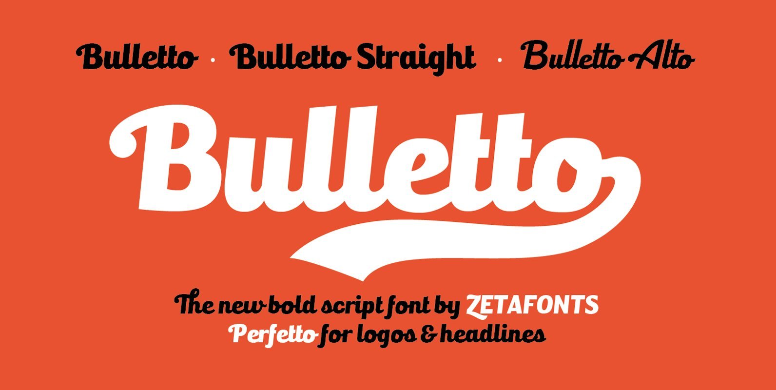
Bulletto Font
Bulletto is a bold display script font. Made for logos and headlines, it features a slight slant, connecting letterforms and a big x-height. Opentype features include ligatures, swashes, alternate finals and a full set of uppercase alternates. The complete family
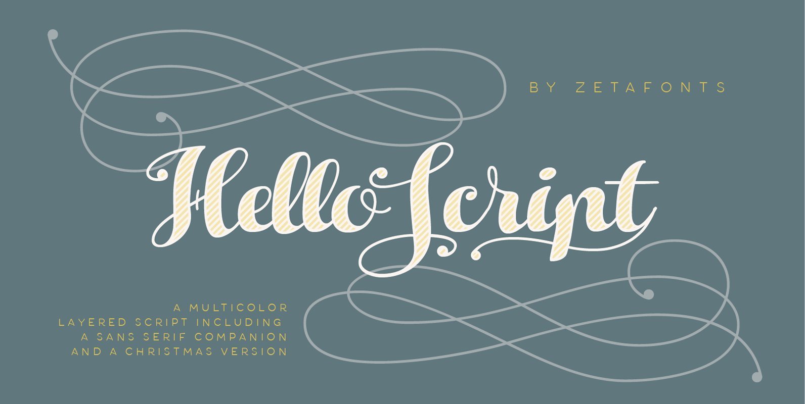
Hello Script Font
Hello Script is a high contrast calligraphic script designed by Cosimo Lorenzo Pancini, featuring monoline swashes and terminals and strong, round body shapes designed with a parallel nib. It covers over 40 languages that use the Latin alphabet, with full
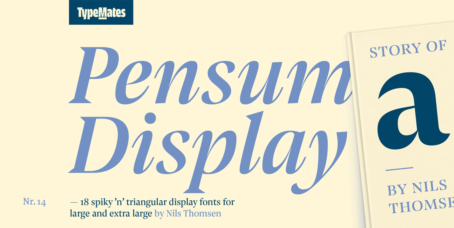
Pensum Display Font
Pensum Display is the triangular and spiky packmate of text monster Pensum Pro. Designed to be used for anything big and for nothing that isn’t big, Pensum Display is a sharp, high contrast design ready to take on display and
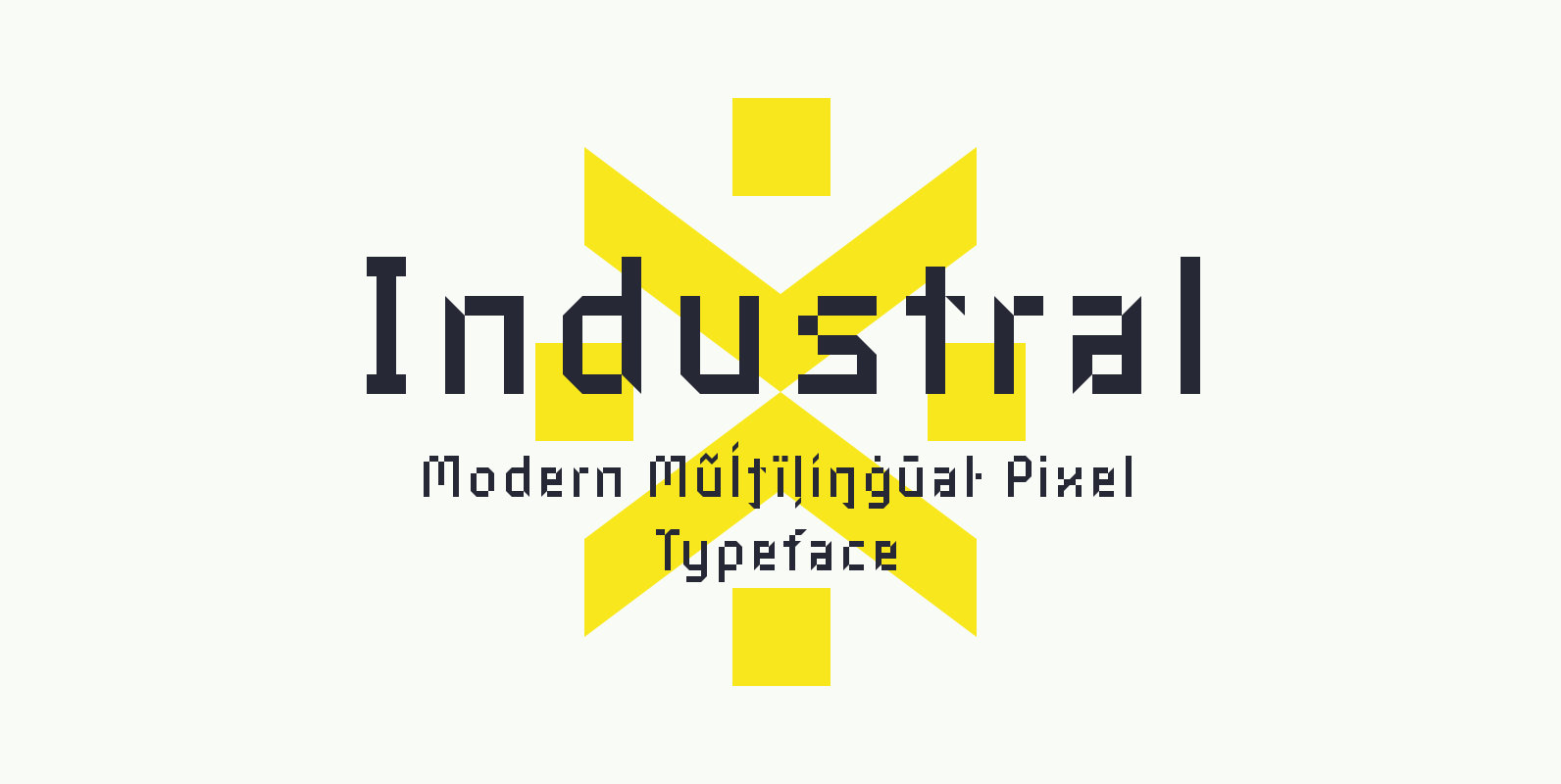
Industral Font
Industral is a “pixel style” typeface for modern use. Highly suitable for small text. The common feature is sharp edges and square base construction which enables legibility for long text paragraphs. Contains a total of 413 glyphs, including latin extended
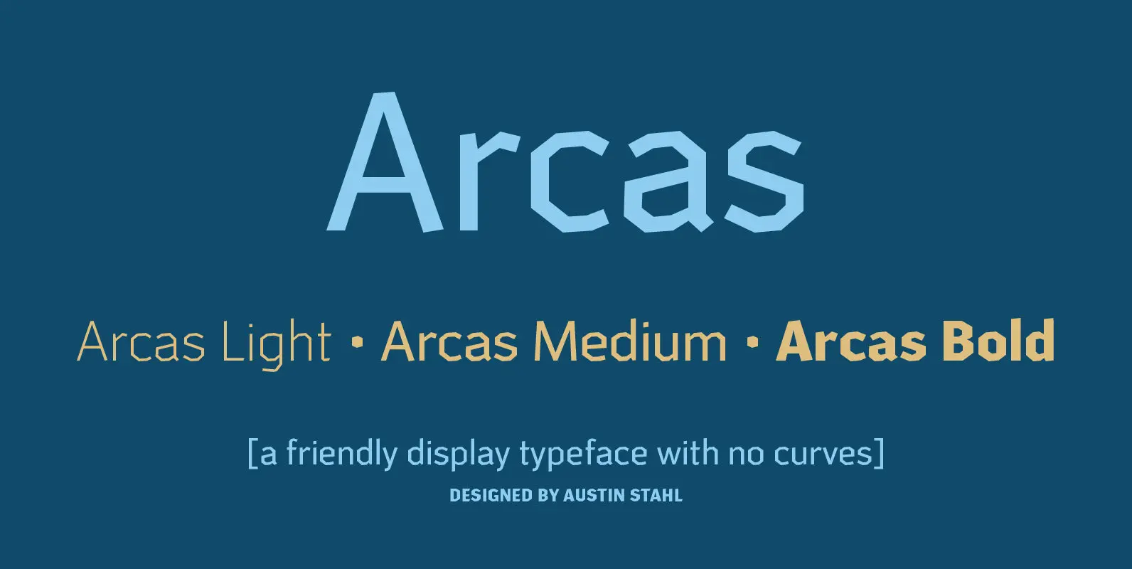
Arcas Font
Arcas is a display sans with no curves — straight lines only. Unlike many other typefaces with this characteristic, however, it’s built with some asymmetry, which helps it avoid the “sports” or “tech” feel that many of those fonts often
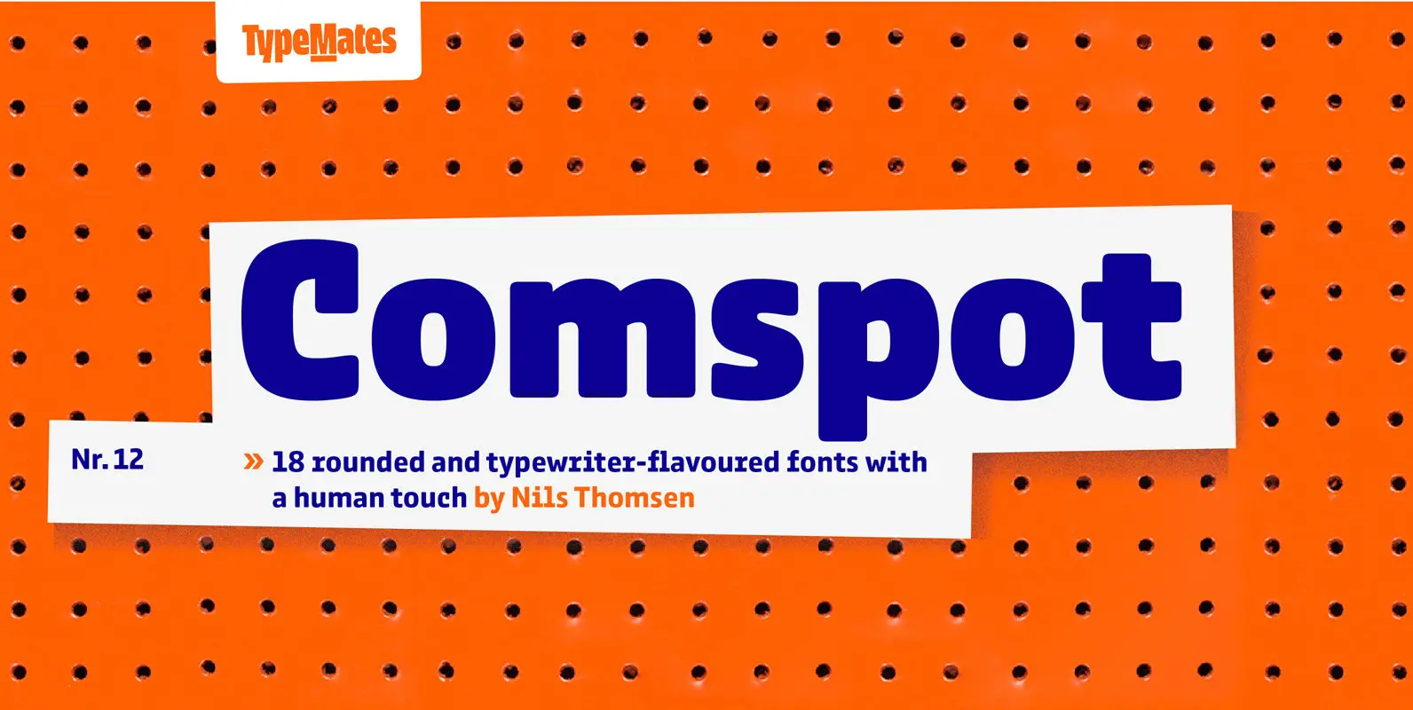
Comspot Font
Comspot is a rounded, typewriter-flavoured font family with a human touch. Originally designed as a custom typeface Comspot’s nine weights — razor-thin hairline to ultra black — and 14 stylistic alternates fulfil every need, from extended to display text. Comspot’s
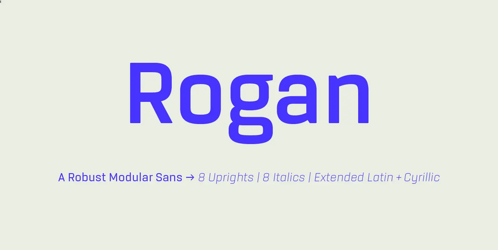
Rogan Font
Rogan: A Robust Modular Sans. Rogans clean lines started out as an exercise in modularity and geometric forms. This initial construction approach was then adapted to improve the functionality of the family; Breaking away from the strictly modular system in
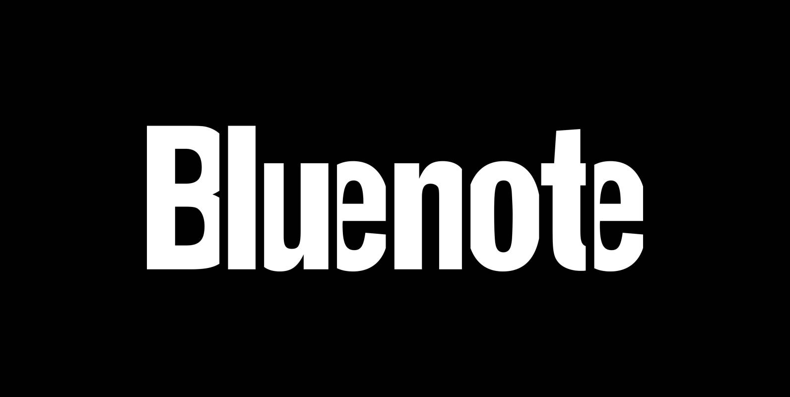
Bluenote Font
“Bluenote” is a font based on “Franklin Gothic condensed”. In the 60s and 70s the record label Blue Note published all those classic jazz records of my youth. Someone at their arts department cut letters to ribbons and designed wonderful
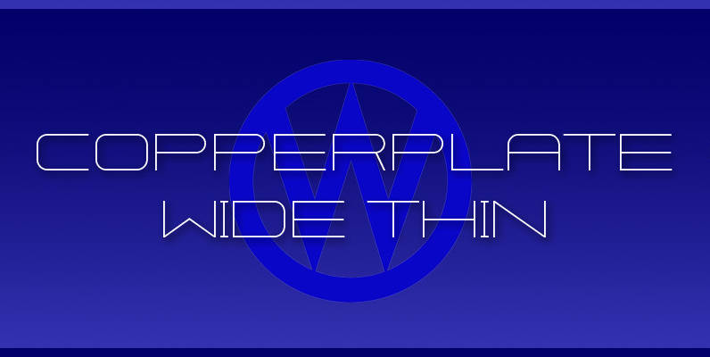
Copperplate Wide Font
“Copperplate Wide” is remotely based on the traditional Copperplate typeface that can be seen on many business cards. I have completely redrawn the typeface in a much wider version and without those stubby little serifs. In the place of the
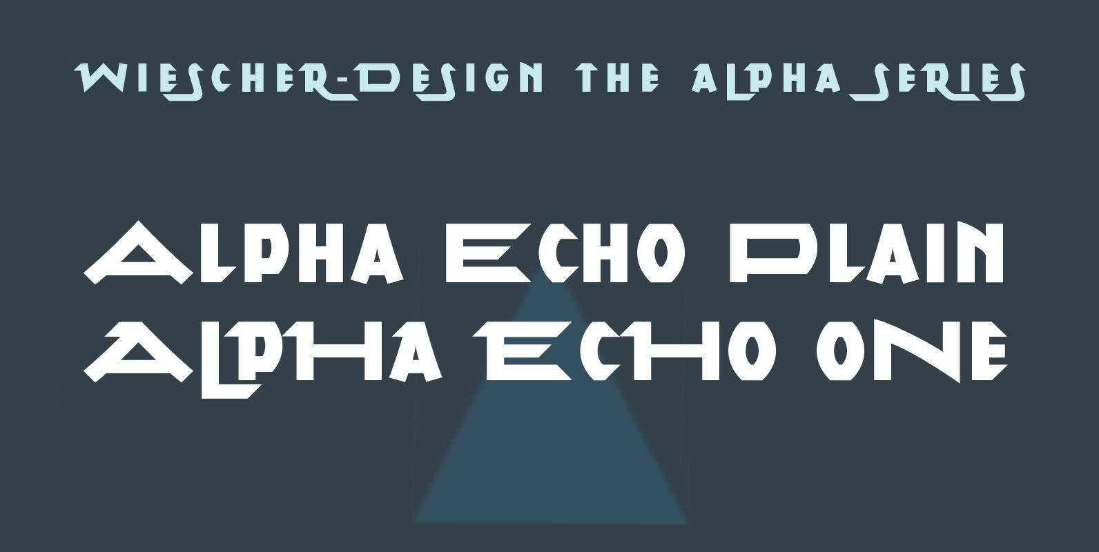
Alpha Echo Font
“Alpha Echo” is another of my experimental typefaces. Very stretched and pointed with wide and narrow capitals only. For additional mixability I designed a set of swashes. Everything mixes with everything. Give it a try, it is very interesting. Published
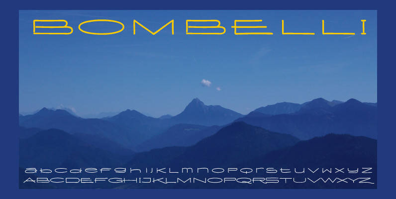
Bombelli Light Hand Font
Bombelli is a font that looks like it has been handwritten by a meticulous architect in one of those hand-drawn blueprints of the old days. I chose the name to honor one of my ex-bosses — a graphic designer-architect who