Tag: static
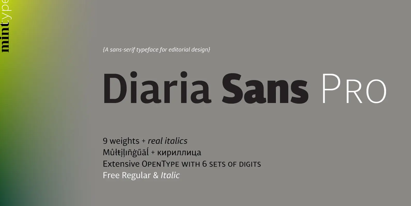
Diaria Sans Pro Font
Diaria Sans Pro is a sans-serif counterpart of Diaria Pro. With its extensive 9 weights and corresponding italics, extensive language support, and various OpenType features it is meant to build visual hierarchies of any detail and complexity in editorial design.
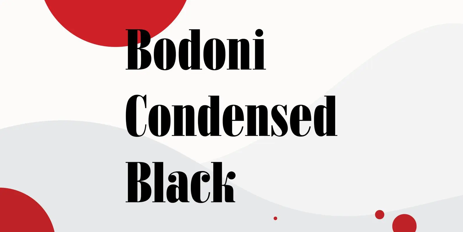
Bodoni Condensed Black Font
Bodoni Condensed Black was designed by R.H. Middleton for Ludlow, circa 1930. Digitally engineered by Steve Jackaman. Published by Red RoosterDownload Bodoni Condensed Black
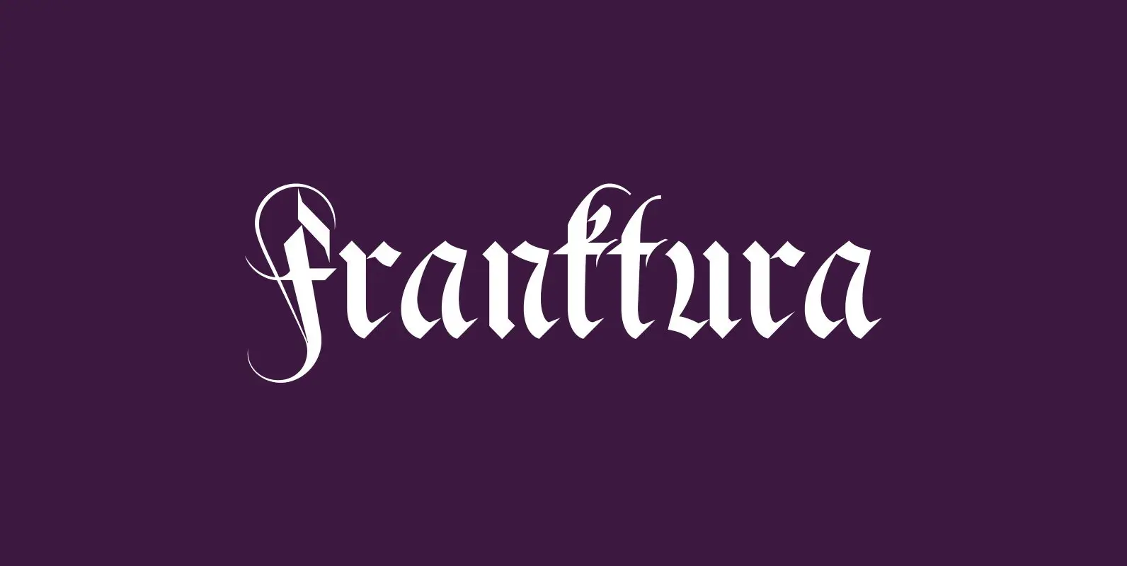
Fraktura Font
“Fraktura” and “Fraktura Plus” is a set of classical Fraktur (Blackletter) in a modern interpretation. The two fonts differ in the amount of embellishments and can and should be mixed. I only sell the pair, but for a fair price.
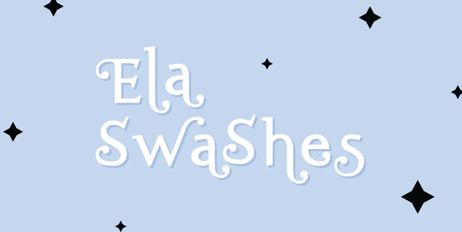
Ela Swashes Font
“Ela Swashes” are not meant to and can not be used as a standalone typeface. Swashes are a set of many different embellished letters to be used together with Ela Demiserif fonts of corresponding weights. Published by Wiescher DesignDownload Ela

Franklin Gothic Raw Font
When drawing a new font, there is a time when the final form is found – almost – but the curves are not slick and clean yet, that’s what I call the “raw” form. Raw – no sweeteners added! In
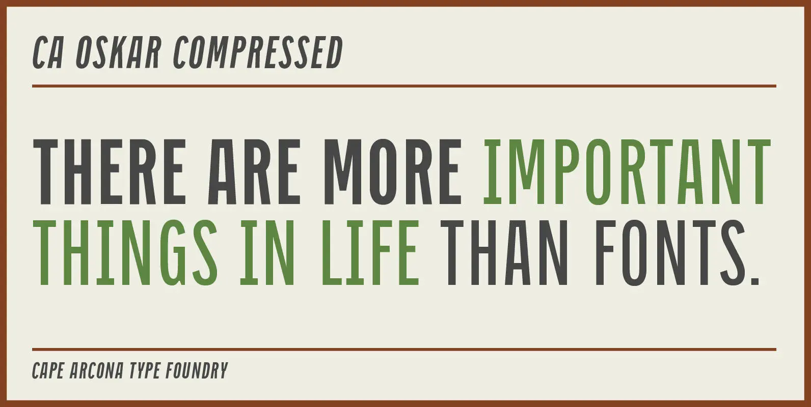
CA Oskar Compressed Font
CA Oskar came into being as a custom typeface for the international Traumzeit music festival. As a substantial part of the new corporate identity, it had to be characteristic, but also flexible in use. Starting with the design of compressed
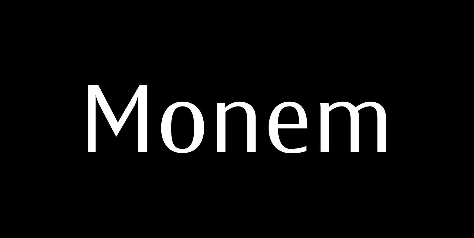
Monem Font
“Monem” is the word for “the smallest significance-carrying part of a language”. I thought that was a good name for a clean, straightforward Sans typeface. “Monem” is very sturdy and usable for lots of occasions. I am using this font
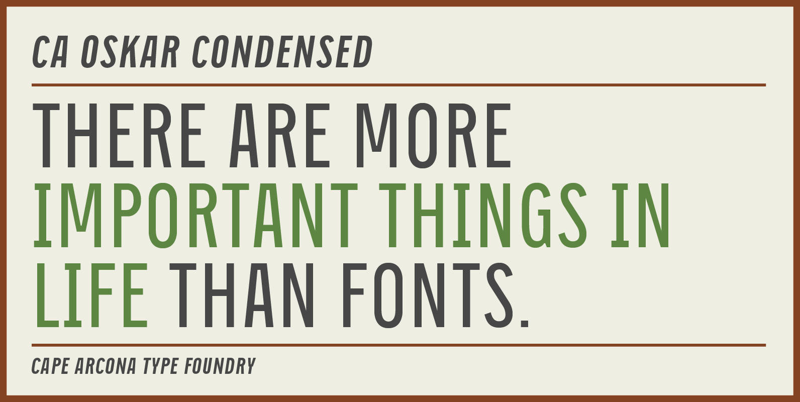
CA Oskar Condensed Font
CA Oskar came into being as a custom typeface for the international Traumzeit music festival. As a substantial part of the new corporate identity, it had to be characteristic, but also flexible in use. Starting with the design of compressed
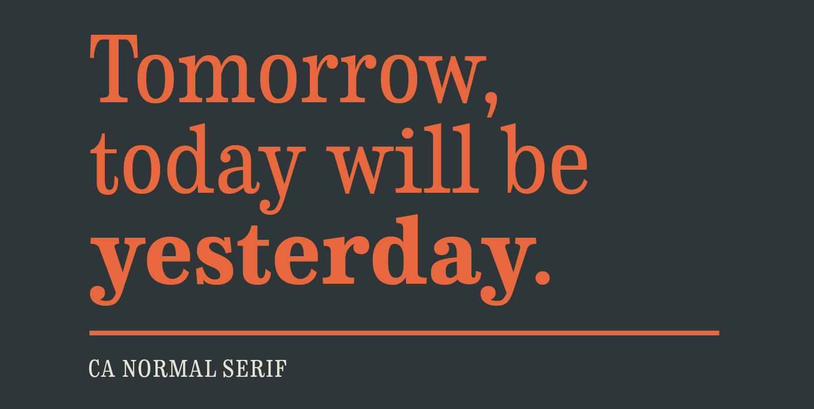
CA Normal Serif Font
CA Normal Serif is the perfect companion to its grotesque brother CA Normal. But it is not just a serifed equivalent. It has a character of its own while preserving the principal proportions and the idea of quirkiness. It was
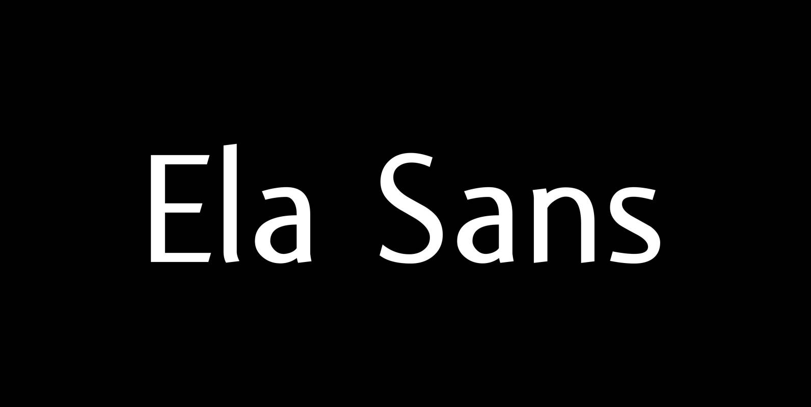
Ela Sans Font
“Ela Sans” is the sister of the typeface I originally designed for the business of my second wife and mother of my two sons, her name is – of course – Michaela. Ela – the typeface – is suitable for
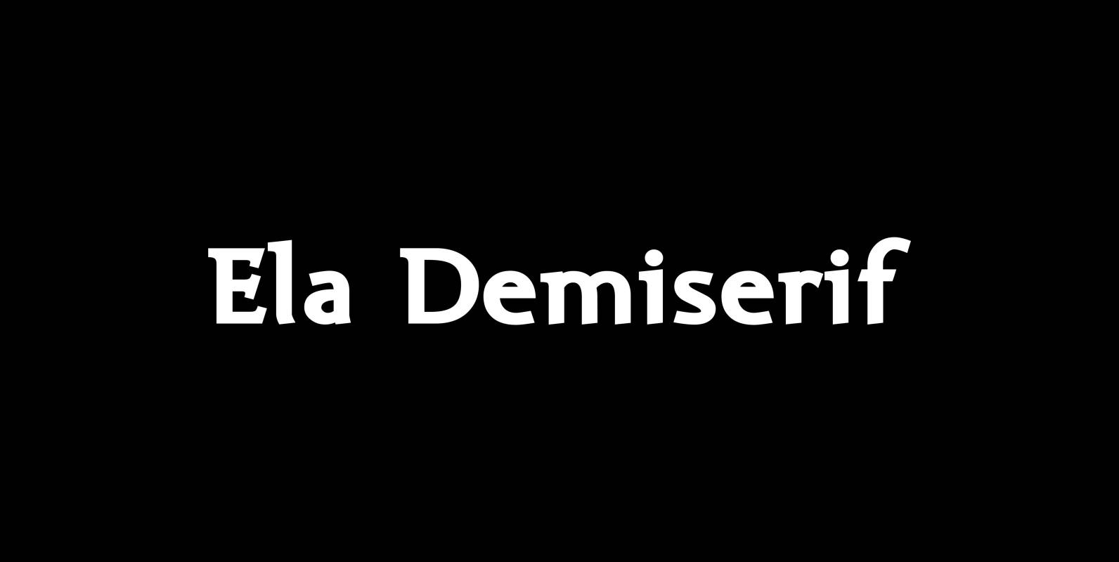
Ela Demiserif Font
Ela Demiserif is the typeface I originally designed for the business of my second wife and mother of my two sons; her name is, of course, Michaela. Ela – the typeface – is suitable for magazines, newspapers, posters, advertisements, books,
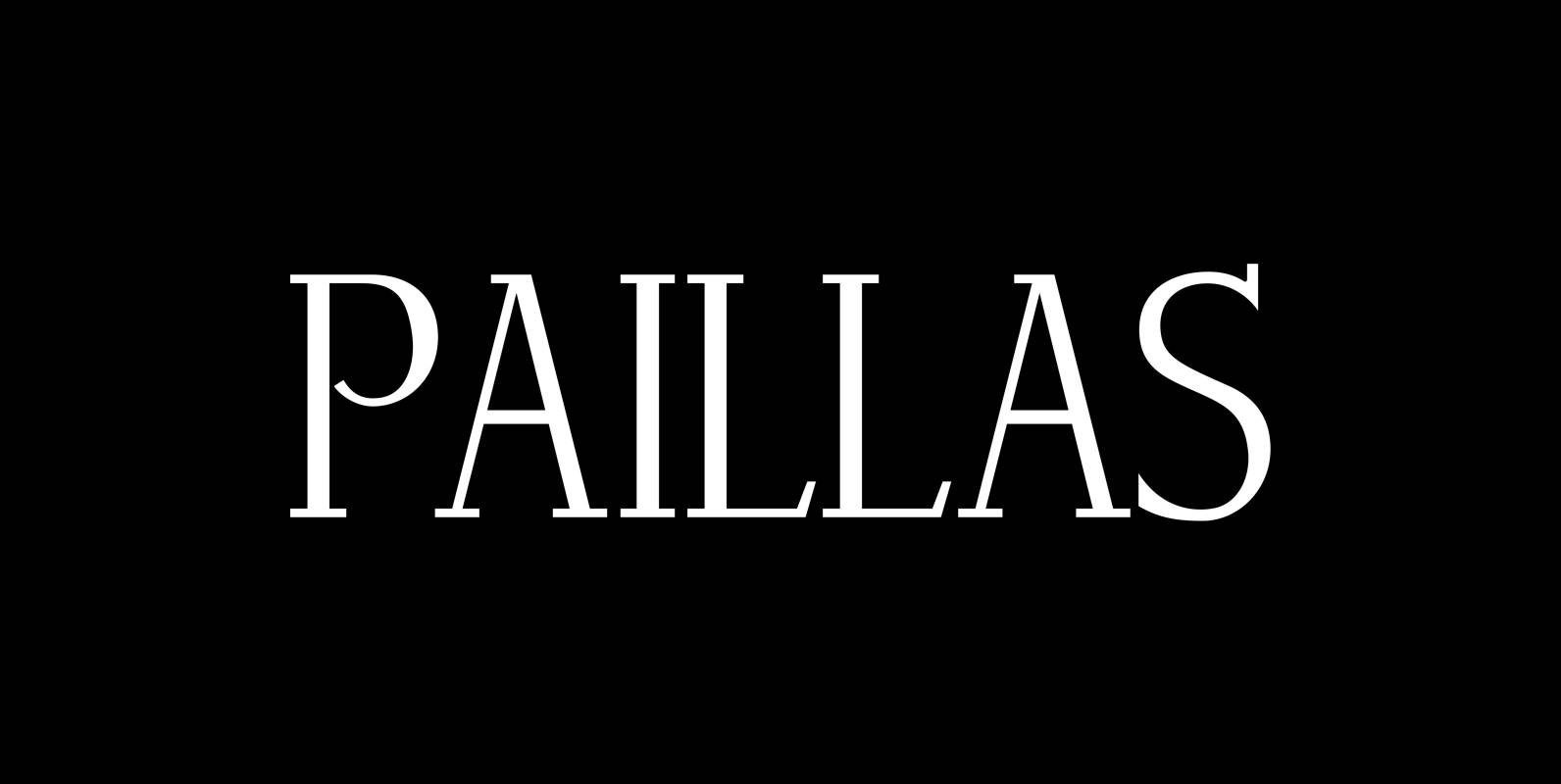
Paillas Font
“Paillas” is a very elegant and unusual Antiqua typeface I have been working on during the last three years. So far I just have the normal and oblique cuts, but eventually I will design a bold version as well. Published
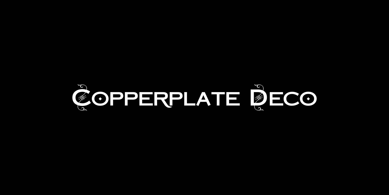
Copperplate Deco Font
“Copperplate Deco” is my sparingly decorated version of my Copperplate fonts. They can be used as stand alone fonts. Published by Wiescher DesignDownload Copperplate Deco
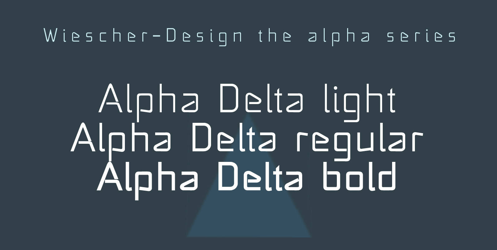
Alpha Delta Font
“Alpha Delta” the standard paperclip is the basic idea behind this font. By working on it, I changed it so that it doesn’t look too much like a paperclip any more. Published by Wiescher DesignDownload Alpha Delta
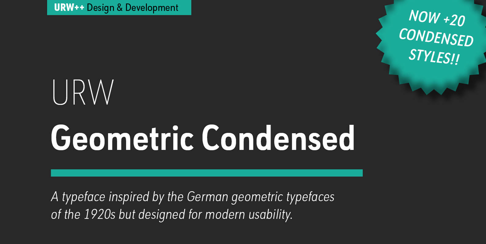
URW Geometric Condensed Font
URW Geometric Condensed is the matching complement for the URW Geometric. Including 20 additional condensed styles the URW Geometric Condensed is the space-saving alternative in the URW Geometric family. URW Geometric is a sans serif typeface inspired by the German
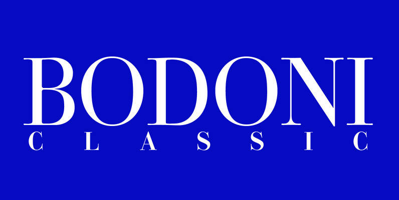
Bodoni Classic Font
I became interested in designing Bodoni Classic because of a lazy graphic designer at Jacques Damase publishing house. He had to change a single letter on a bookcover about J. B. BODONI. The French call him Jean Baptiste instead of
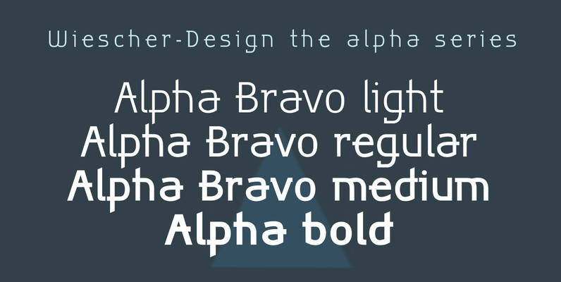
Alpha Bravo Font
Alpha Bravo was born on a napkin. I was just doodling, playing around with letterforms when the ballpoint glided a little bit too far and suddenly I had my first letter with the dash sticking out on the left of
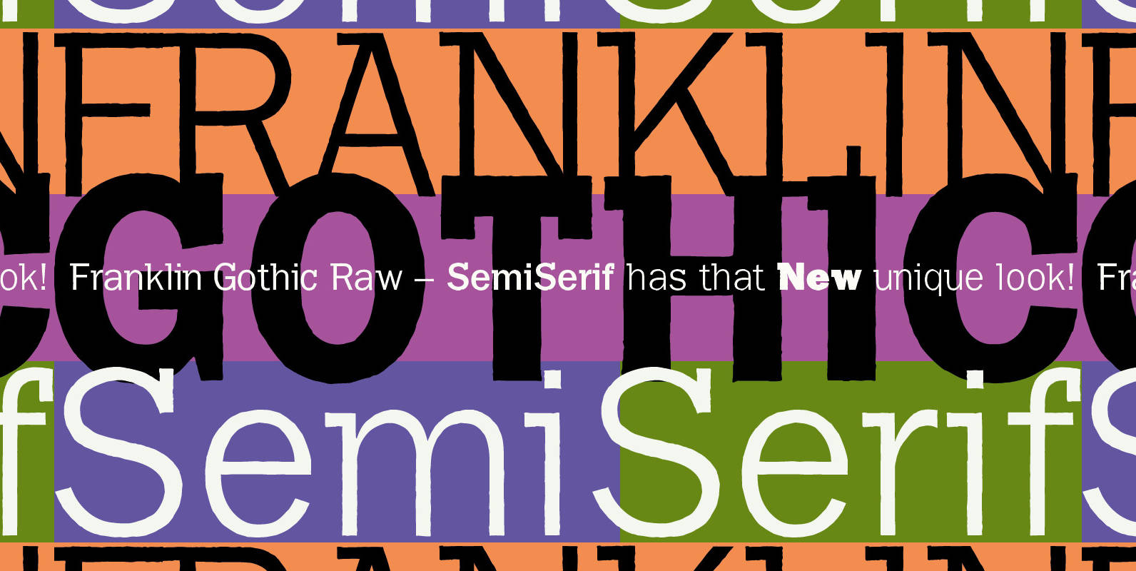
Franklin Gothic Raw Semi Serif Font
When drawing a new font, there is a time when the final form is found – almost – but the curves are not slick and clean yet, that’s what I call the “raw” form. Raw – no sweeteners added! In