Skema Pro Font
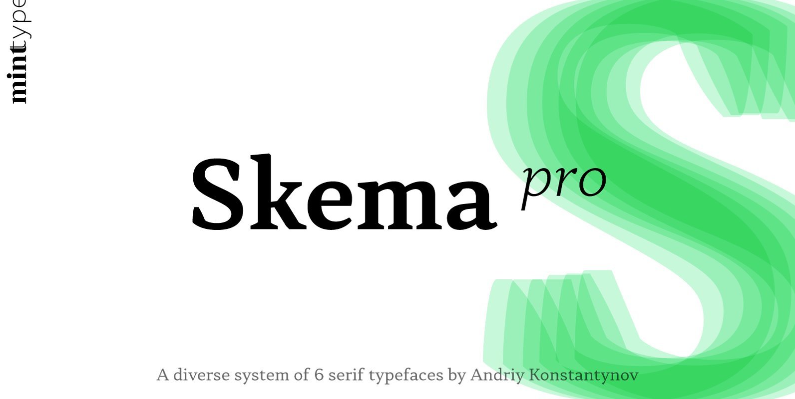
Skema Pro is a versatile system of 6 serif typefaces – each bearing a distinct character and purpose. Together they form a huge superfamily of 84 fonts to fit any imaginable task. Skema Pro Livro is a low contrast, low
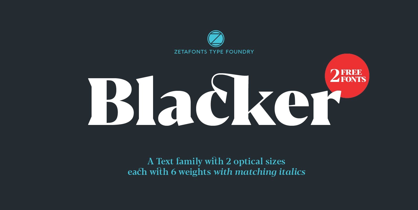
Blacker is a wedge serif type family designed by Cosimo Lorenzo Pancini and Andrea Tartarelli as a take on the contemporary “evil serif” genre: typefaces with high contrast, 1970s-evoking proportions and sharp wedge serifs. Design details have been fine-tuned in
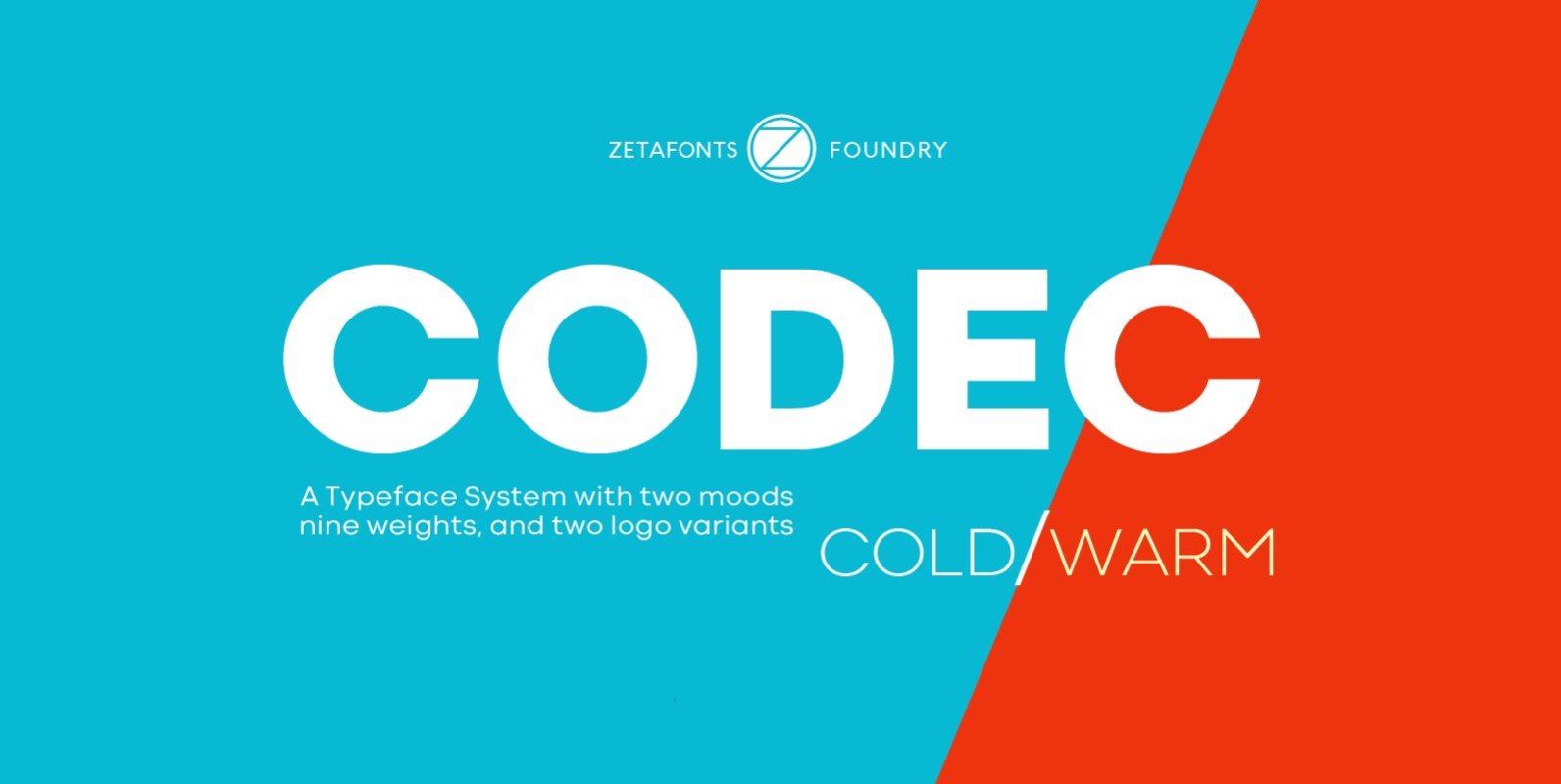
Codec is a geometric sans serif type system, designed by Cosimo Lorenzo Pancini with Francesco Canovaro and Andrea Tartarelli. Codec provides you with two coherent variant fonts built on the same base skeleton: Codec Cold and Codec Warm. In Codec
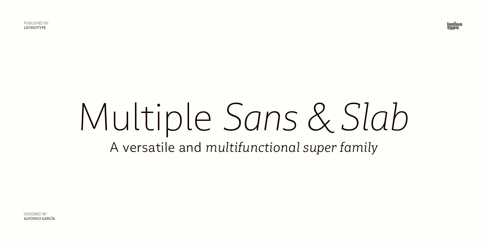
As its name suggests, Multiple is a family with multiple font styles. The idea that sums up the concept behind the typeface is workhorse—the challenge was to develop a useful font fit for any scenario and suitable to any design
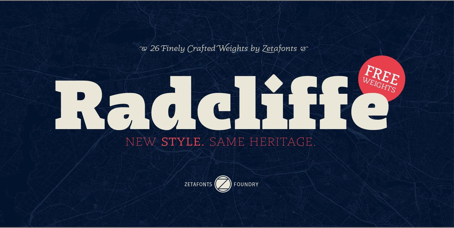
Radcliffe is a typeface family designed in 2018 by Cosimo Lorenzo Pancini and Andrea Tartarelli, as a reinvention of traditional Clarendon design in search of a “contemporary classic” typeface look. Tailor made for elegance, Radcliffe features the strong bracketed serifs,
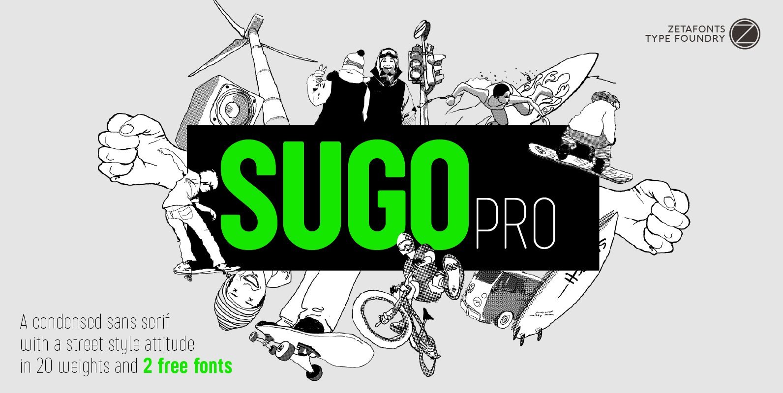
Sugo Pro is a condensed geometric sans serif with a robust body, slightly rounded corners and no-nonsense street style attitude. The sturdy, robust design of Sugo makes it an ideal choice for sports branding and street-style editorial use. Lighter weights
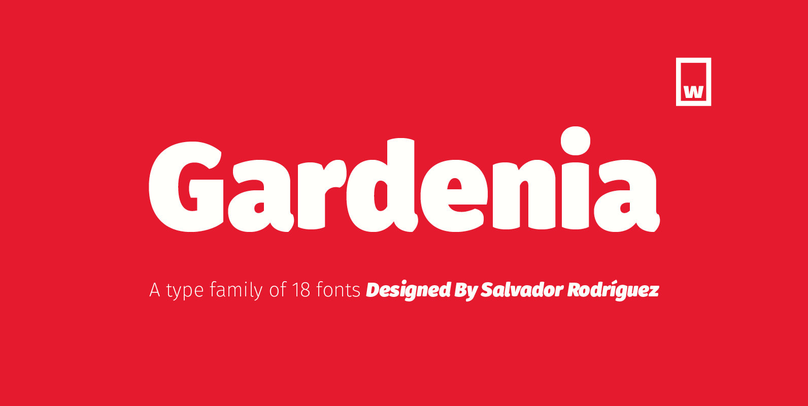
Gardenia is a grotesk sans-serif. It comes in 9 weights with matching italics. It was designed by Salvador Rodríguez in 2015/2016. It is characterized by legibility in the medium sizes, black and thin weights are great performers in display sizes.
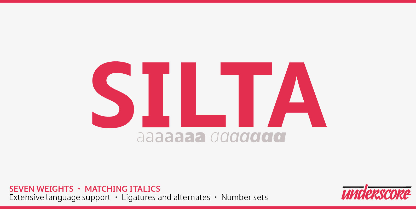
Silta is a humanist sans designed for interface typography and screen legibility. Sharp where it counts, flexible where you need it — and always a friendly tone. With seven weights and matching italics it has the range required for complex
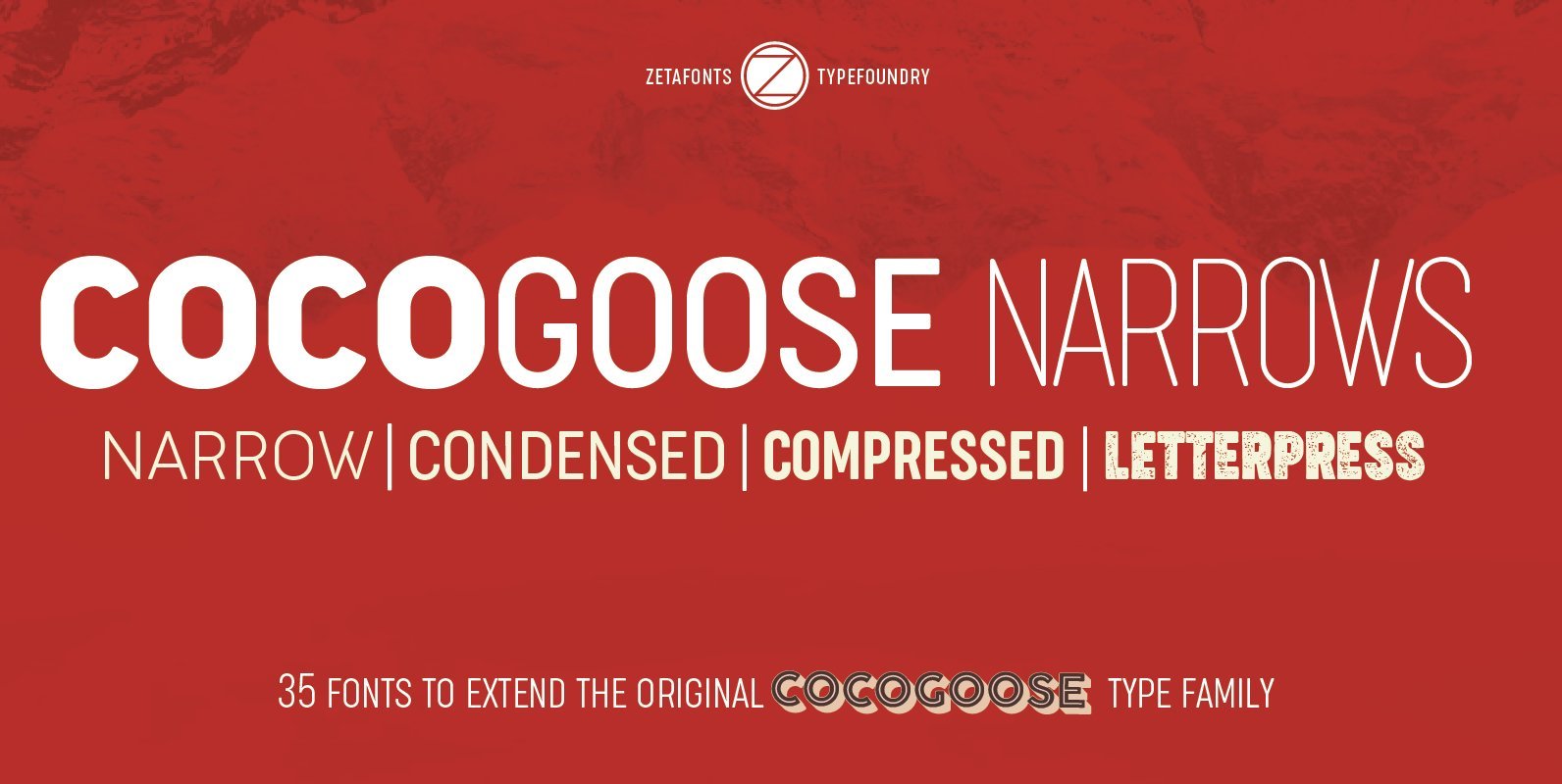
Cocogoose is a geometric sans serif typeface designed with straight, monolinear lines and circular or square shapes. Its strong, modernist look has been softened by rounded corners and slight visual corrections that make Cocogoose not only perfect for logos and
Skema Pro is a versatile system of 6 serif typefaces – each bearing a distinct character and purpose. Together they form a huge superfamily of 84 fonts to fit any imaginable task. Skema Pro Livro is a low contrast, low
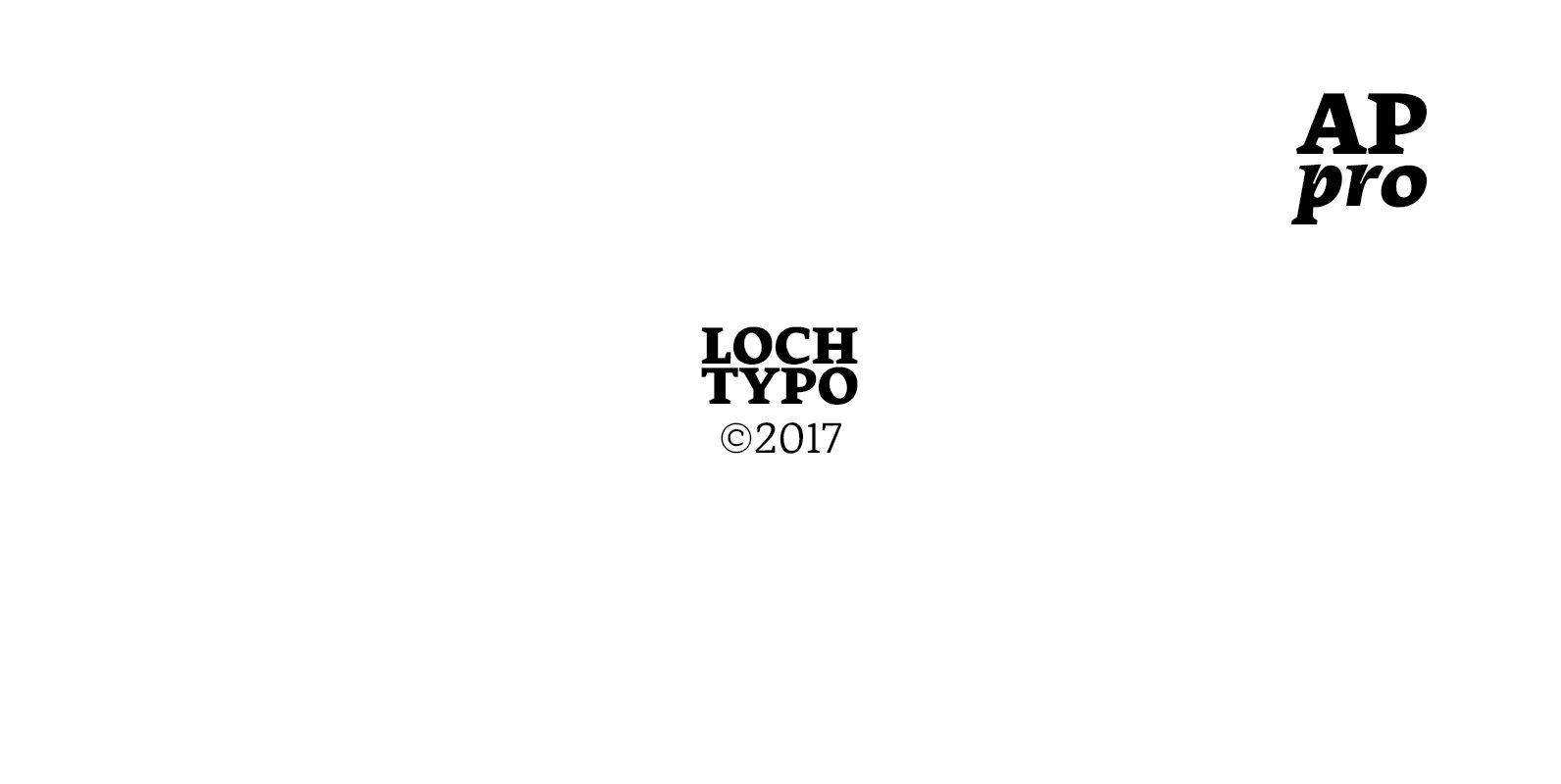
AP pro is Old-Style typeface that has 6 weights and italics. Fit for usage in branding, editorial, title in small or large sizes. Designed for text, this typeface has features small caps, case sensitive, final/terminal form (a, e, m, n,
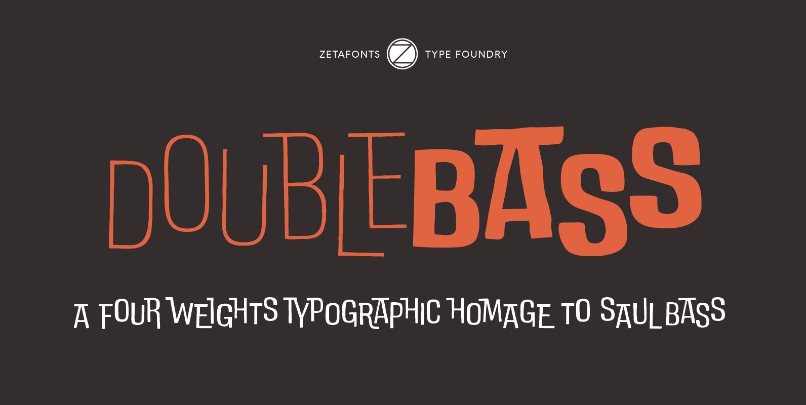
DoubleBass is a four weights display type family with a cartoon modern aesthetic, inspired by the film title design of Saul Bass. Its main feature is the programmed switching between two interlocking sets of uppercases resulting in a bouncy visual
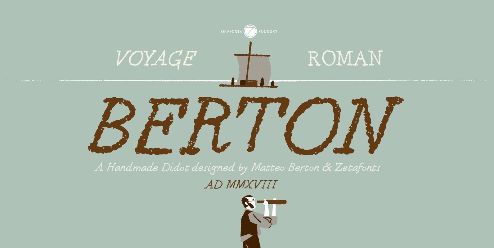
Berton – the third in the Zetafonts Signature artist-designed fonts – was hand drawn by italian illustrator Matteo Berton and lovingly digitized by Zetafonts to be used as main lettering font of the graphic novel “Voyage au Centre de la
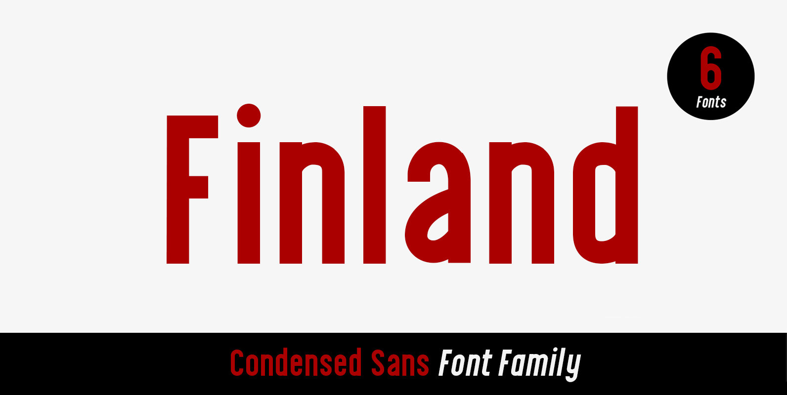
Finland was inspired by European type specimen books, especially Finland type standard. Delivering some glorious vibes of the solid values from the pioneers and keeping one eye on todays demands and technology, Finland is made for high professional use. Finland
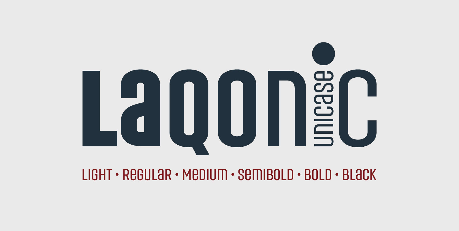
Laqonic 4F is a geometric modular grotesque with a technological character, perfectly suited for signage, logos and loud headlines. Published by Sergiy TkachenkoDownload Laqonic 4F
A pragmatic sans-serif which sits in the centre on the grotesque to geometric style spectrum. Equal measures of both letterforms create a neutral type family that is modern, functional, and easy to read without being too distractive. Details include seven
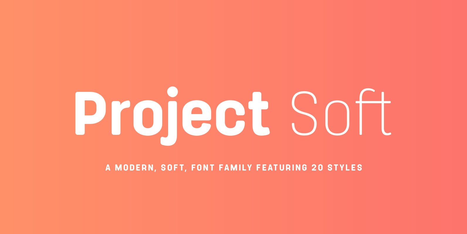
Project Soft is the more playful version of our 2017 release, Project Sans. The font features the same 10 weights and matching italics but while the Sans version was more structured, the Soft version shows a cheeky side that creates
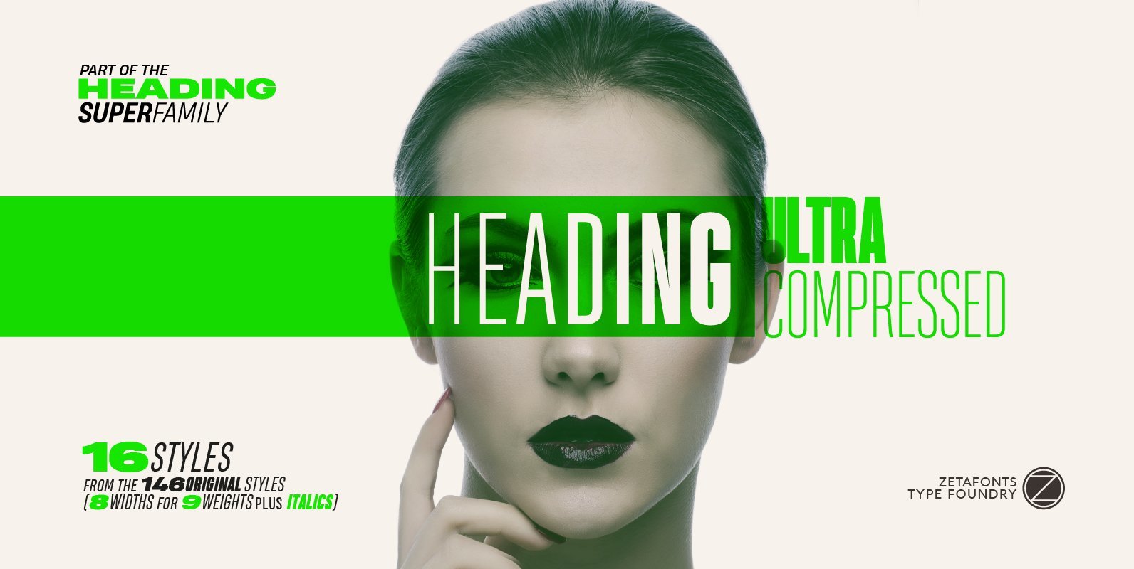
Heading Pro Ultra Compressed is a variant of the original Heading Pro typeface designed by Francesco Canovaro for Zetafonts. Each Heading Pro typeface includes over 800 characters with coverage for 100+ languages using latin, cyrillic and greek alphabets. A full