Tag: sanserif
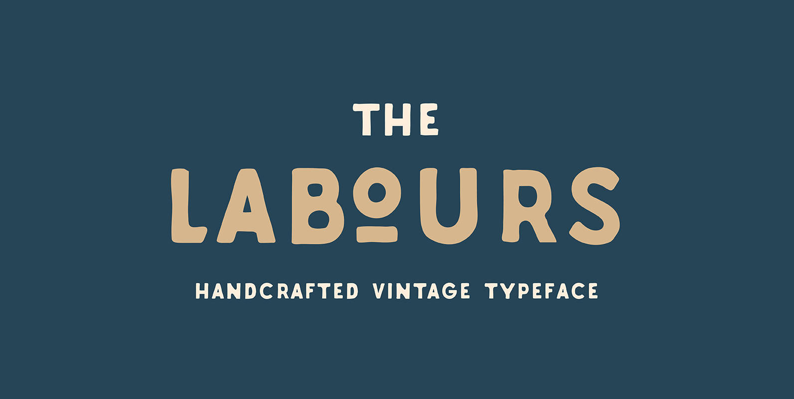
Labours Font
Labours is a bold, caps-only typeface designed with vintage-styled design projects in mind. Published by AkufadhlDownload Labours
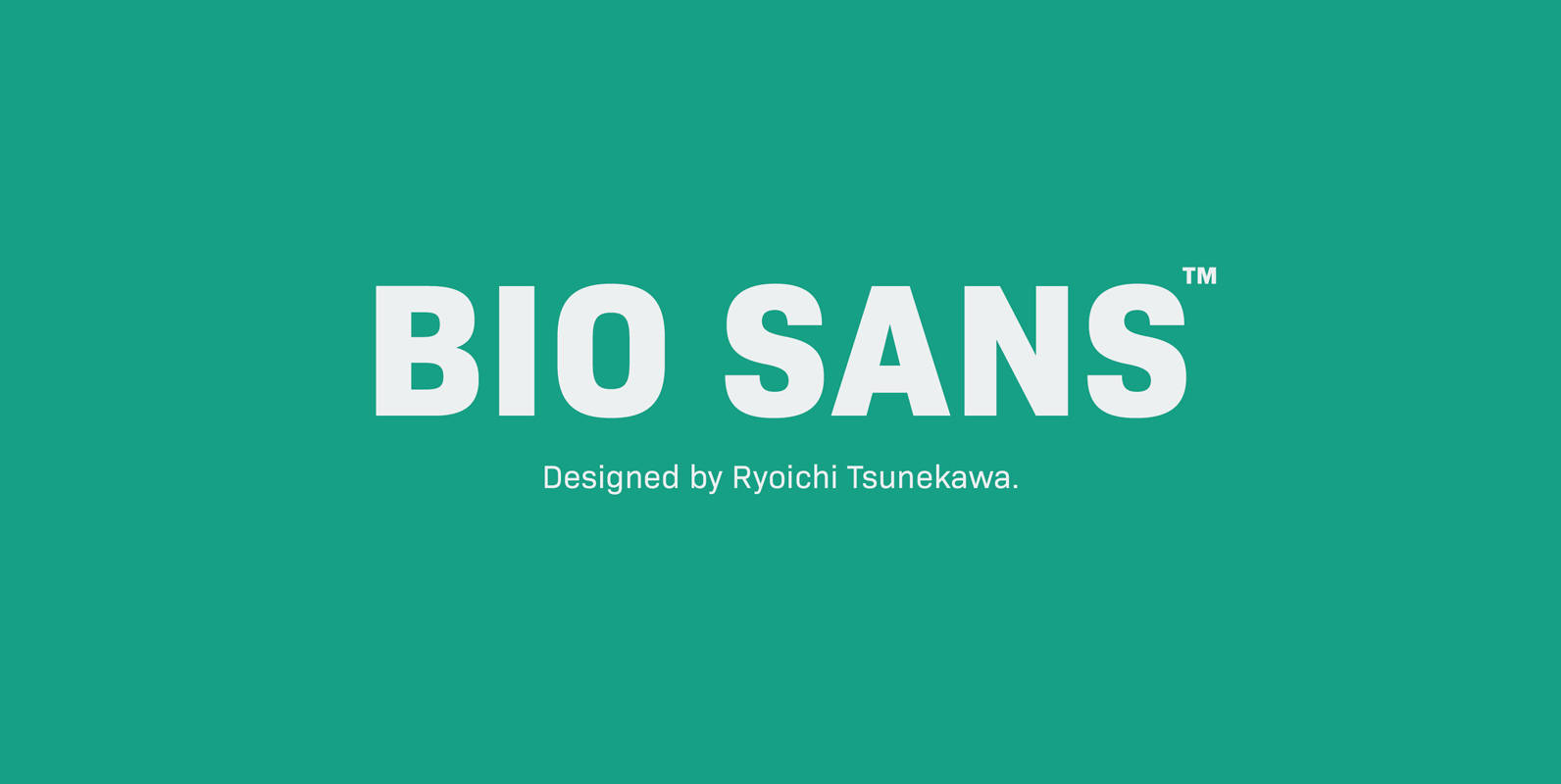
Bio Sans Font
Bio Sans is a super neutral sans-serif family for text designed by Ryoichi Tsunekawa and the whole family consists of 6 weights from ExtraLight to ExtraBold and their matching Italics. The basic concept of this family is the same as
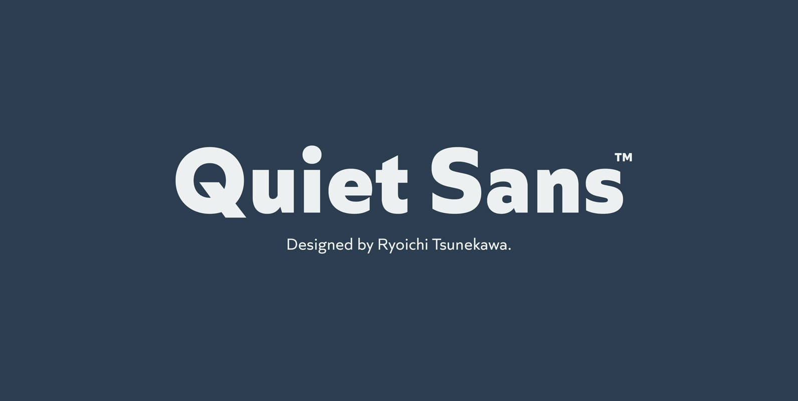
Quiet Sans Font
Quiet Sans is a super geometric sans-serif family for text designed by Ryoichi Tsunekawa and the whole family consists of 6 weights from ExtraLight to ExtraBold and their matching Italics. The basic concept of this family is not only to
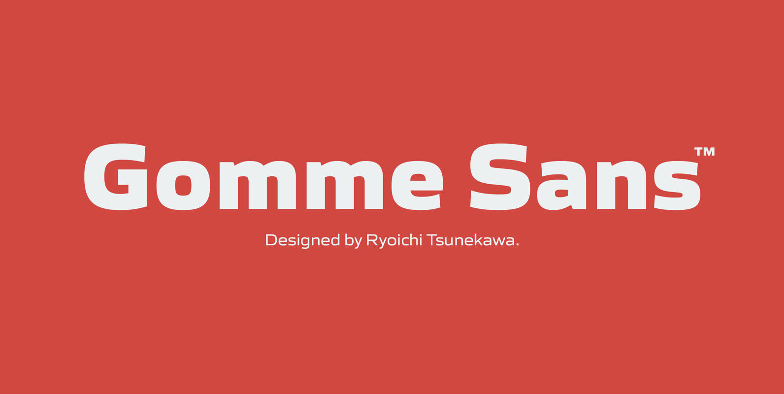
Gomme Sans Font
Gomme Sans is a wide and masculine sans-serif family for text designed by Ryoichi Tsunekawa and the whole family consists of 6 weights from ExtraLight to ExtraBold and their matching Italics. The basic concept of this family is not only
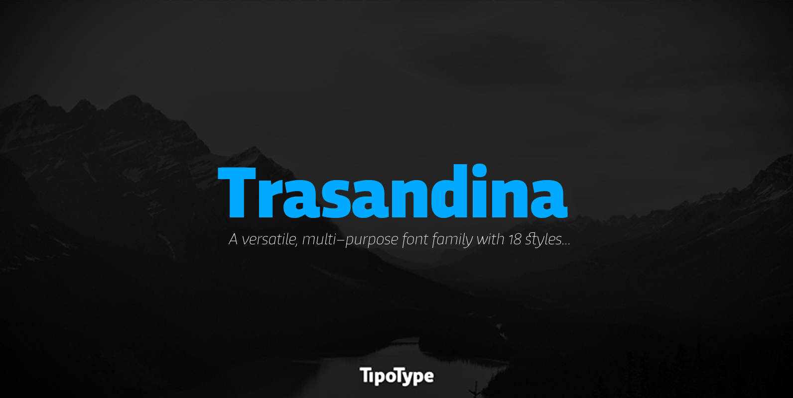
Trasandina Font
Trasandina is a very unique font-family: a modern, versatile, workhorse typeface with a special personality, given by the mix of humanist and geometric models, remaining far from both extremes. This typeface has 9 styles plus their matching italics, it has
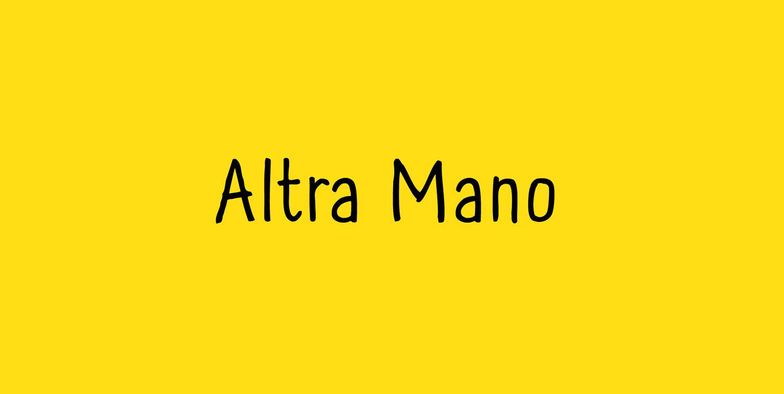
Altra Mano Font
Altra Mano is based on the designer’s second style of handwriting, one that is more refined and controlled. Altra Mano is a decorative display typeface ideal for headlines, logotypes, magazines, posters, and short text. Published by Kate Brankin FoundryDownload Altra
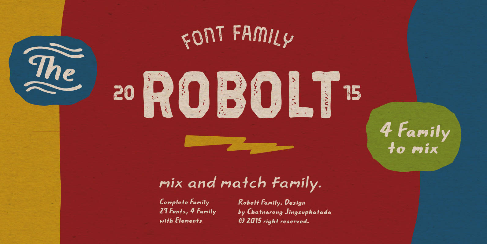
Robolt Font
It starts with the idea that different things can be mixed infinitely. Robolt comprises four designs with multiple options to add variety and playfulness. Battery and Machine have a retro touch which reminds one of toy labels from the 80’s
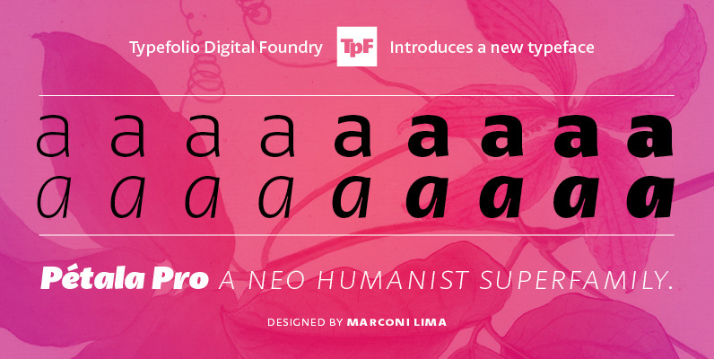
Petala Pro Font
Pétala Pro gave his first steps almost ten years ago. During this time, the quest for perfection had forced several interruptions. It was necessary recalculate the route, tread other ways, discover new maps, and make easy curves. After all, a
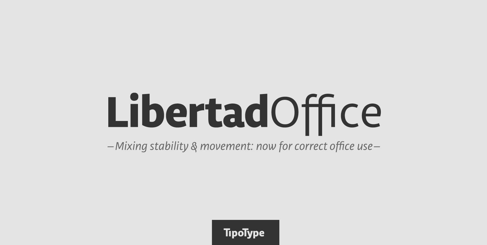
Libertad Office Font
Libertad is a sans-serif typeface that mixes humanist and grotesk models – It’s most interesting feature is the combination of balanced regulars with dynamic italics, which makes it a very versatile font for different uses. This special package is a
BOXDON Titling Font
BOXDON is an extra heavy expanded typeface which was especially designed for VERTICAL layout. Each shape looks like a box and has minimum graphical treatment to distinguish each character. It means that the counter space is not enough to use
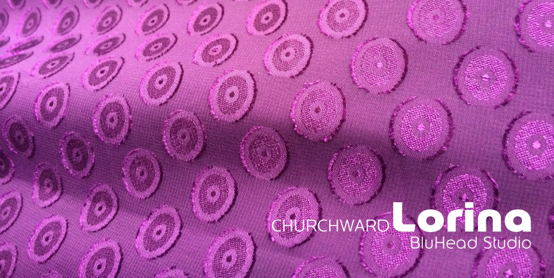
Churchward Lorina Font
Churchward Lorina is a four weight typeface family originally designed in 1996 by New Zealand type designer Joseph Churchward. A personable geometric sans serif, it possesses some of Churchward’s trademark quirkiness but remains highly legible and readable on screen as

Quarca Font
Quarca’s masculine power runs strong across the page with bold self-assurance and a raw energy that courses through its thick veins. Don’t think the continuous, smooth geometry of this semi-modular face is captively chained to the grid, though. Quarca has

Libertad Font
Design can do without images, but not without typefaces. Libertad is a sans-serif typeface that mixes humanist and grotesk models – It’s most interesting feature is the combination of balanced regulars with dynamic italics, which makes it a very versatile