Tag: revival
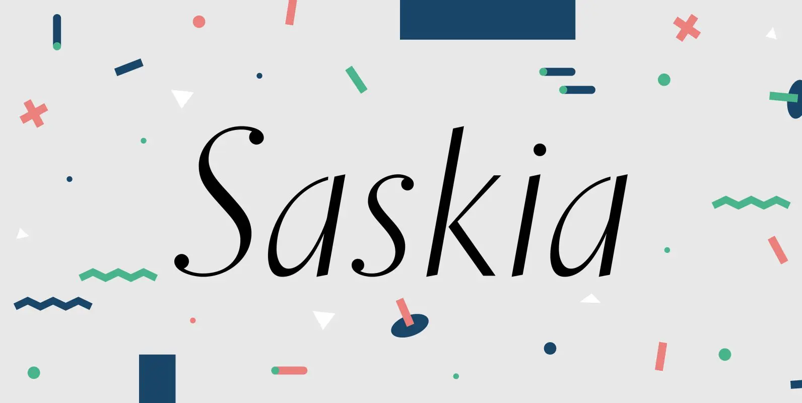
Saskia Pro Font
A tribute to Jan Tschichold. His hot-metal font Saskia was released in 1931 by Schelter & Giesecke. This elegant italic font was finally redrawn, extended and digitized for present-day use. Published by RMU TypedesignDownload Saskia Pro
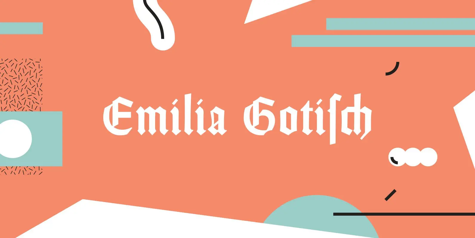
Emilia Gotisch Font
Weiss’ gothic-style blackletter font completely redrawn and redesigned for present-day use. This font contains a bunch of useful ligatures, and by typing ‘N’, ‘r’ and period plus activating the discretionary ligatures you get an oldstyle numbersign. As usual in my
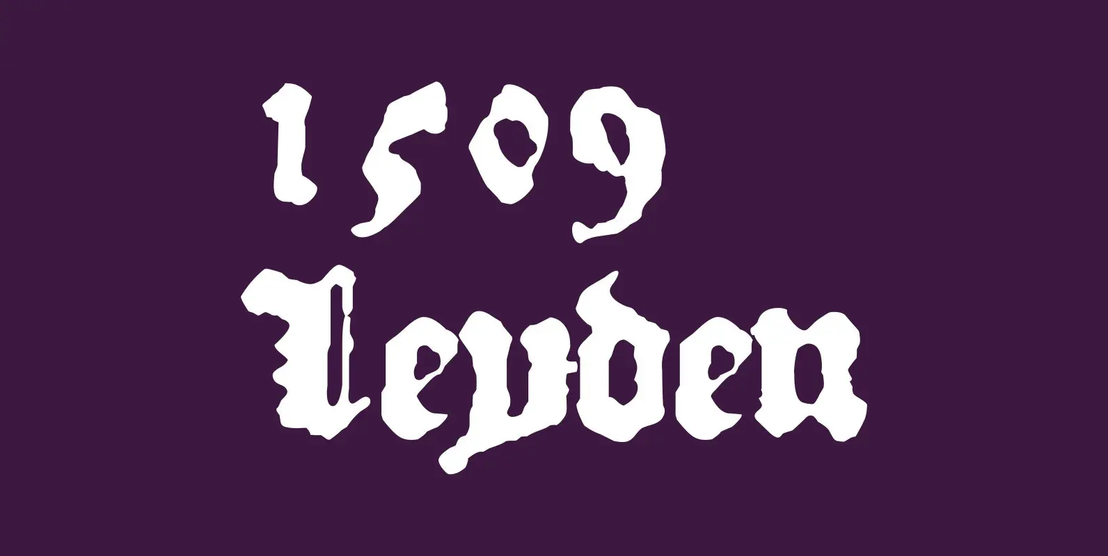
1509 Leyden Font
This blackletter font was created inspired from the set who was used in Leyden by Jan Seversz to print “Breviores elegantioresque epistolae […]”, by author Francesco Filfelo, circa 1509. The original font contains all lower case characters, excepted w, eth,
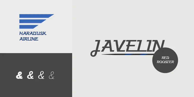
Javelin Font
Designed by A. Pat Hickson, Javelin is a sport-like and retro font design. Published by Red RoosterDownload Javelin
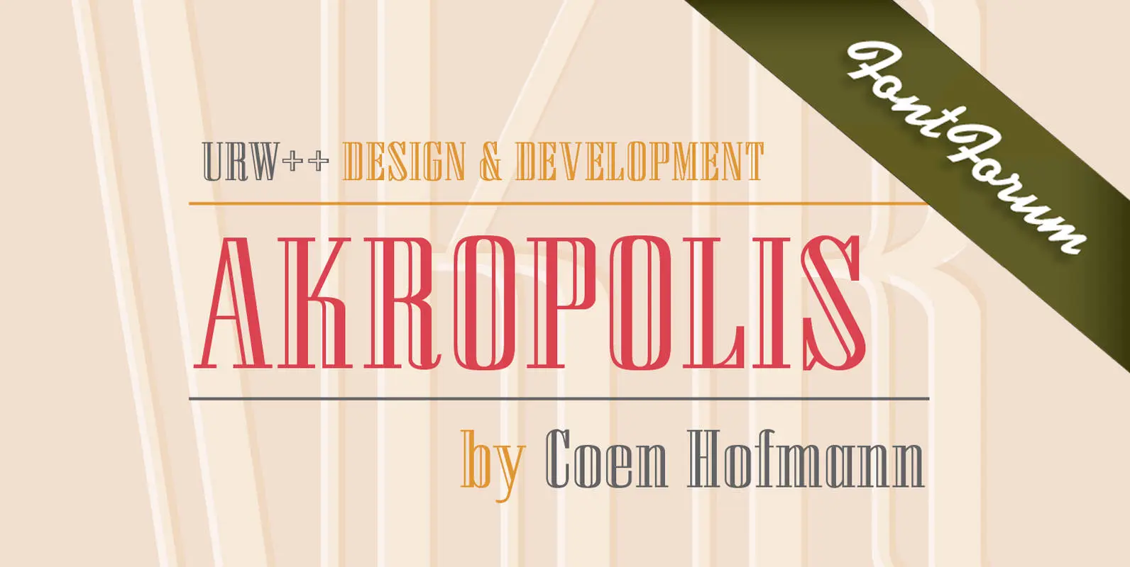
URW Akropolis Font
The design of this display face is based on the hot metal typeface Acropolis, issued by the German type foundry Ludwig Wagner in Leipzig in 1940. To further increase its usefulness a Cyrillic was added to it: URW Akropolis, redrawn
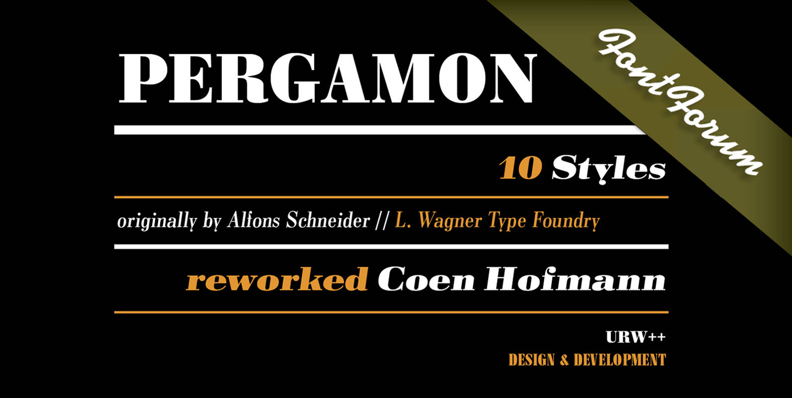
Pergamon Font
The Pergamon series is a creation of Alfons Schneider (1890–1946) and was issued by the foundry of Ludwig Wagner in Leipzig in 1937/1940, though the website of the Klingspor-Museum says that several of the faces were probably produced after the
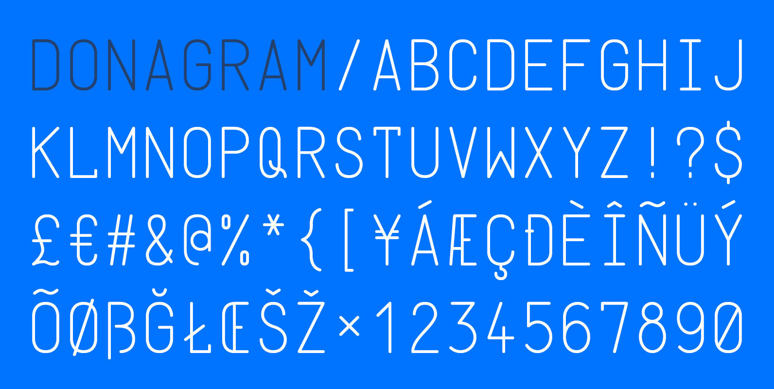
Donagram Font
Donagram is a typeface inspired by telegrams from the 1940s. Available in three weights, it’s roots are in the functional usage of the telegraph machine. Donagram has been developed into a modern, clean and elegant typeface. Published by AtworkDownload Donagram
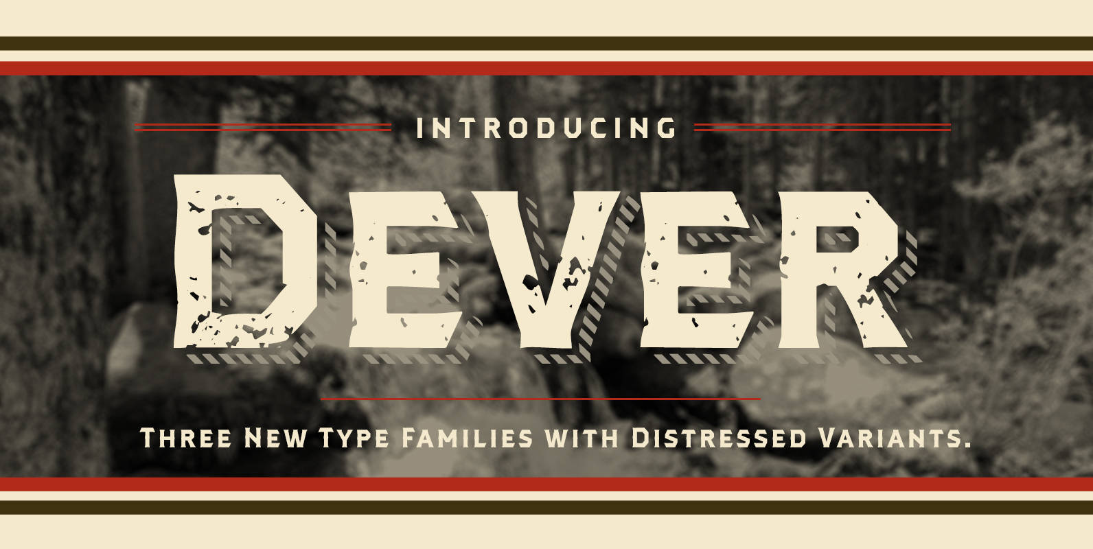
Dever Font
Dever’s brute, industrial lines are rounded up in this new typeface from Jeremy Dooley. Dever combines plenty of inspirations. It’s the flair of the Wild West melded with a shout out to the sign painters and package lettering artists of
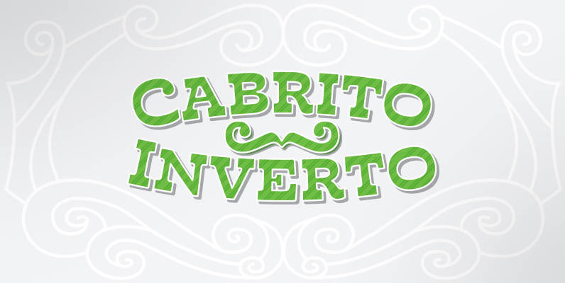
Cabrito Inverto Font
And so now, here it is. Cabrito Inverto, which features the reversed stress of the strokes from a font’s “normal” traits. Inverted stress fonts are most often associated with cowboys and the Old West. The inverted stress gives it a
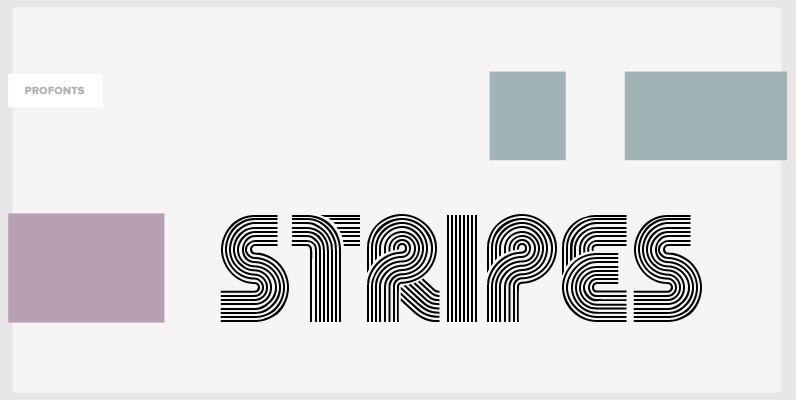
Stripes Font
Stripes is a caps only font and does not contain additional ligatures, because there is an easy way to create as many of them as you like. To form a ligature, convert your word or word string into vectors. Activate
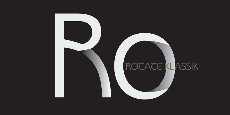
Rotate Klassik Font
Rotate Klassik is a display font originally designed by Hellmut G. Bomm in 2004. Rotate Klassik contains language support for West, East, Turkish, Baltic, and Romanian. Published by URW Type Foundry GmbHDownload Rotate Klassik

Thomas Schrift Font
As Coen Hofmann had only access to a proof in very small font size, the result of this digital version is an interpretation of the original design. Not much is known about the original designer of these two fonts, Friedel
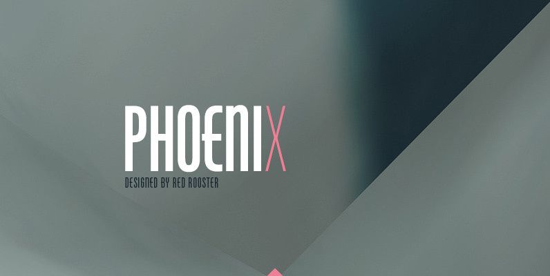
Phoenix Pro Font
Designed by Steve Jackaman and Ashley Muir. The original Phenix typeface was produced in 1935 by Morris Fuller Benton for ATF. Utilizing the original proofs, we have added three additional complementary weights with all the alternate glyphs. Our Phoenix Pro
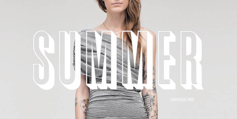
Graphique Pro Font
Graphique was originally created by Swiss designer Hermann Edenbenz in 1945, and issued as hot metal font by Haas’sche Schriftgieberei, Switzerland. German type designer Ralph M. Unger digitally remastered and expanded the typeface for profonts, and the digital OTF Pro

Appeal DT Font
Appeal DT is a decorative font design, published by DTP Types Limited. Published by DTP Types LimitedDownload Appeal DT
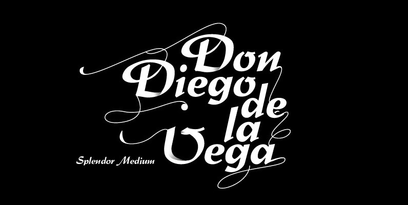
Splendor Font
Splendor was originally produced and released in 1930 by Schriftgub AG, Dresden. The typeface was designed by Berlin designer Wilhelm Berg. Ralph M. Unger, who in the last few years has created a whole series of revivals and redesigns from
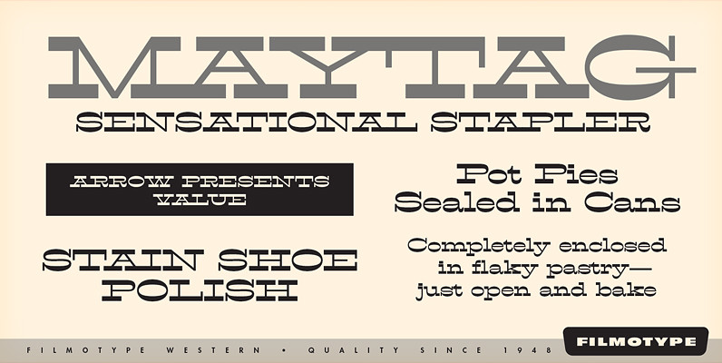
Filmotype Western Font
Inspired by French Antique reverse-stress types of the 1880s, Filmotype Western was released in 1955 to expand its Flat Serif category. Popular in broadsides, circus posters and advertisements at the turn of the 19th century, Filmotype Western will add old
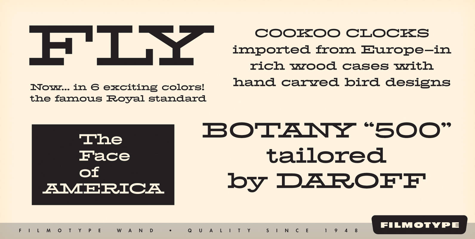
Filmotype Wand Font
Filmotype Wand was introduced in 1955 as part of the Flat Serif category. Inspired by smart slab serifs including Hellenic Wide popular in American television westerns and in heavy use in corporate letterhead and store packaging, Filmotype Wand takes a