Tag: oblique
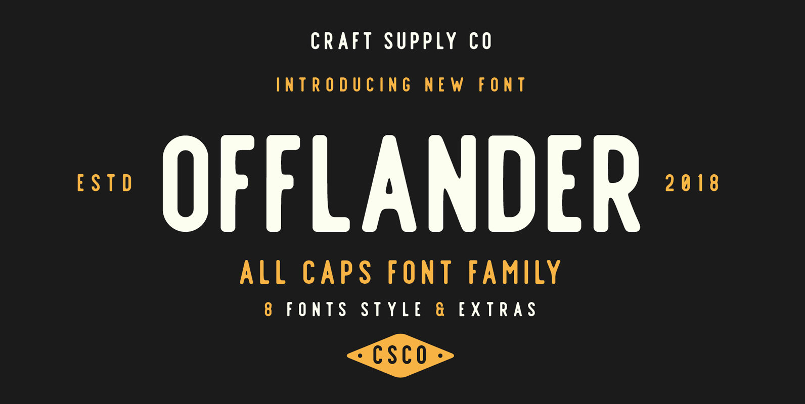
Offlander Font
Offlander is a sans serif font design published by Craft Supply Co. Published by Craft Supply Co.Download Offlander
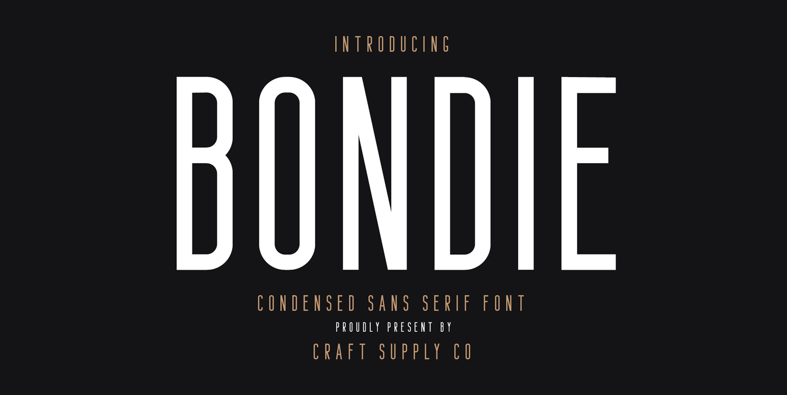
Bondie Font
Bondie is a sans serif font design published by Craft Supply Co. Published by Craft Supply Co.Download Bondie
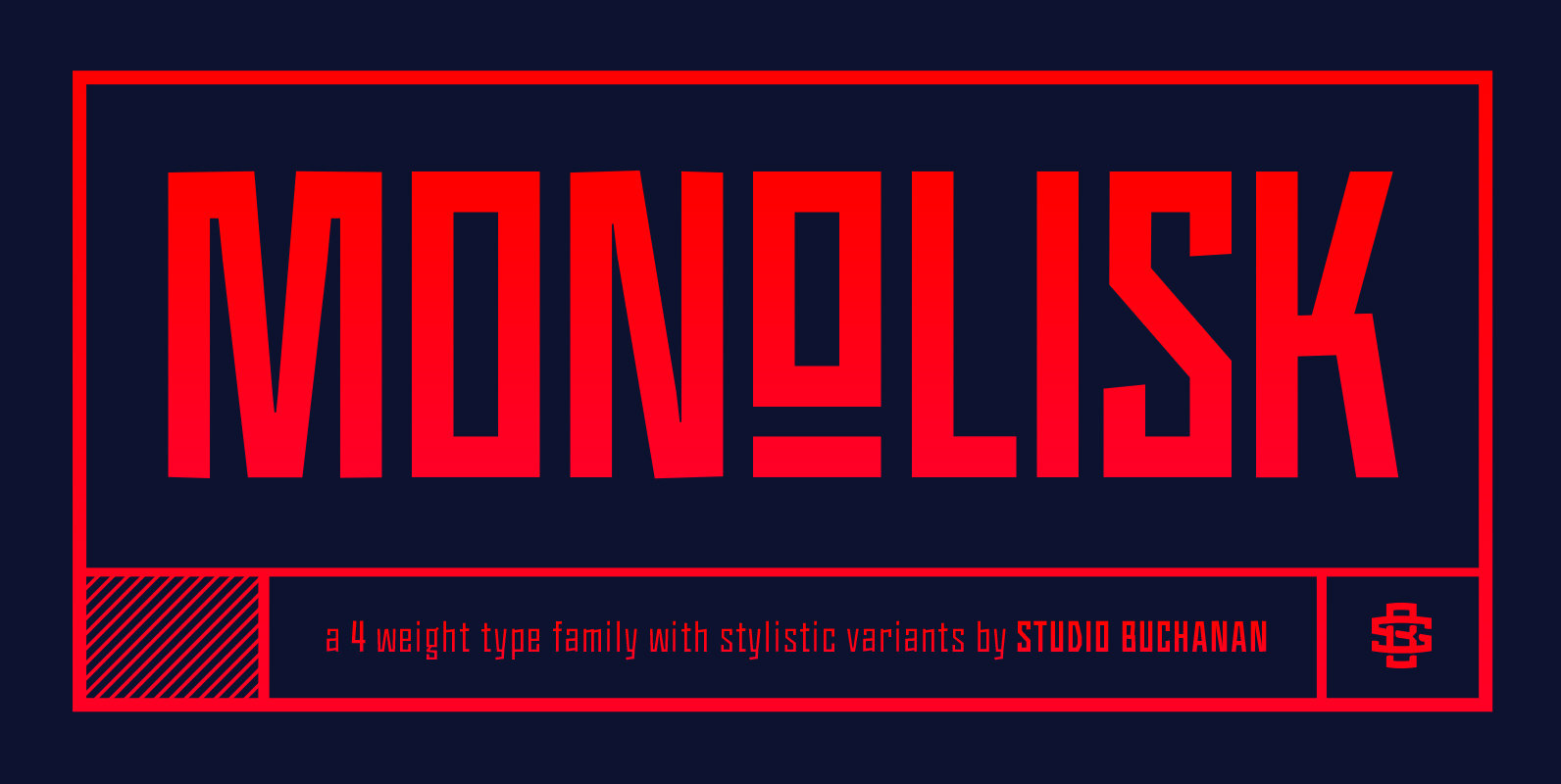
Monolisk Font
Monolisk is a rigid, gothic typeface that draws on inspiration from East modern and Brutalist architecture. It’s monolithic glyphs, resolute and unapologetic in their construction, create a visually striking design that feels bold and arresting. Monolisk delivers a dominant sense
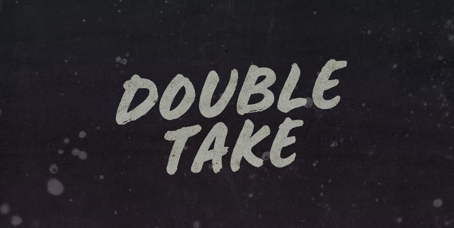
Double Take Font
After I load up with four pieces of country-fried dark meat and hit my plate with gravy, I do a Double Take: Oh, my God. Cheese curds. I eat what I take and after I finish what I take I
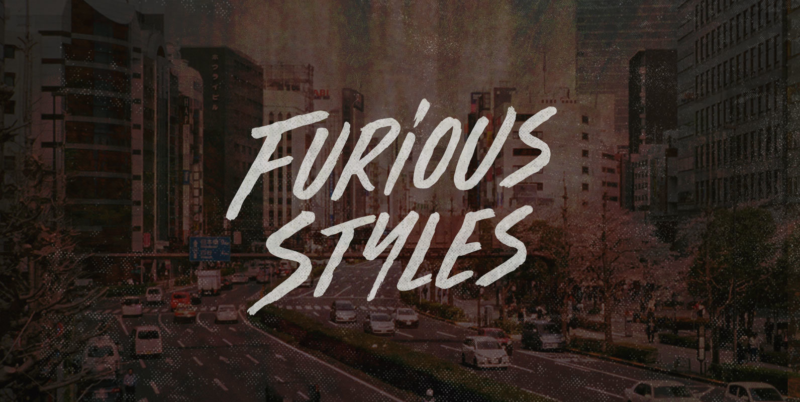
Furious Styles Font
Sweating on a cold day, eyes rolling like their flanks are lathered. Gripped by cold fury and given to furtive glances. White knuckles grip Magnums like mics and visually spit. Furious Styles confront a populace, caught up in a frenzy.
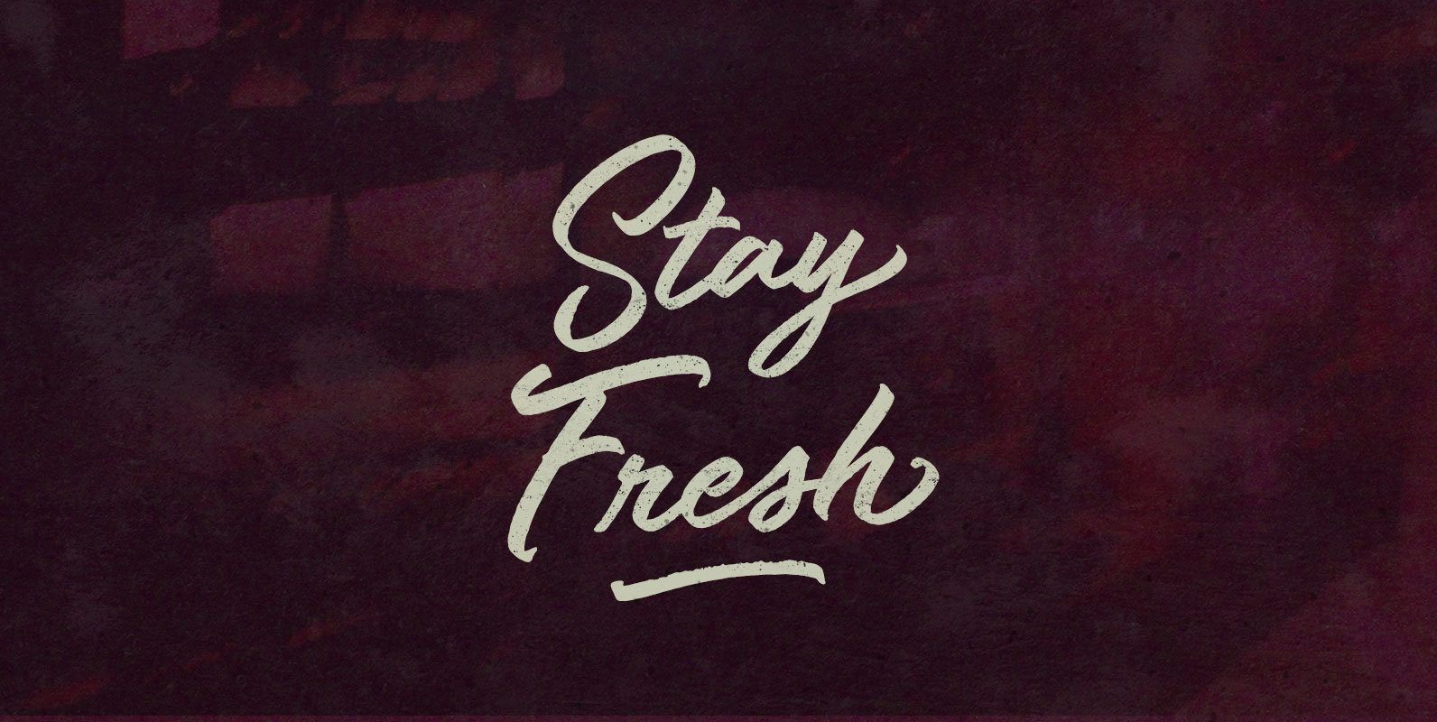
Stay Fresh Font
Crumbs become stale when exposed to open air. Air becomes stale when it’s stagnant and closed to everywhere. We become stale when we stop trying and no longer care. Open up, take a breath, and Stay Fresh like Foreverware. Published
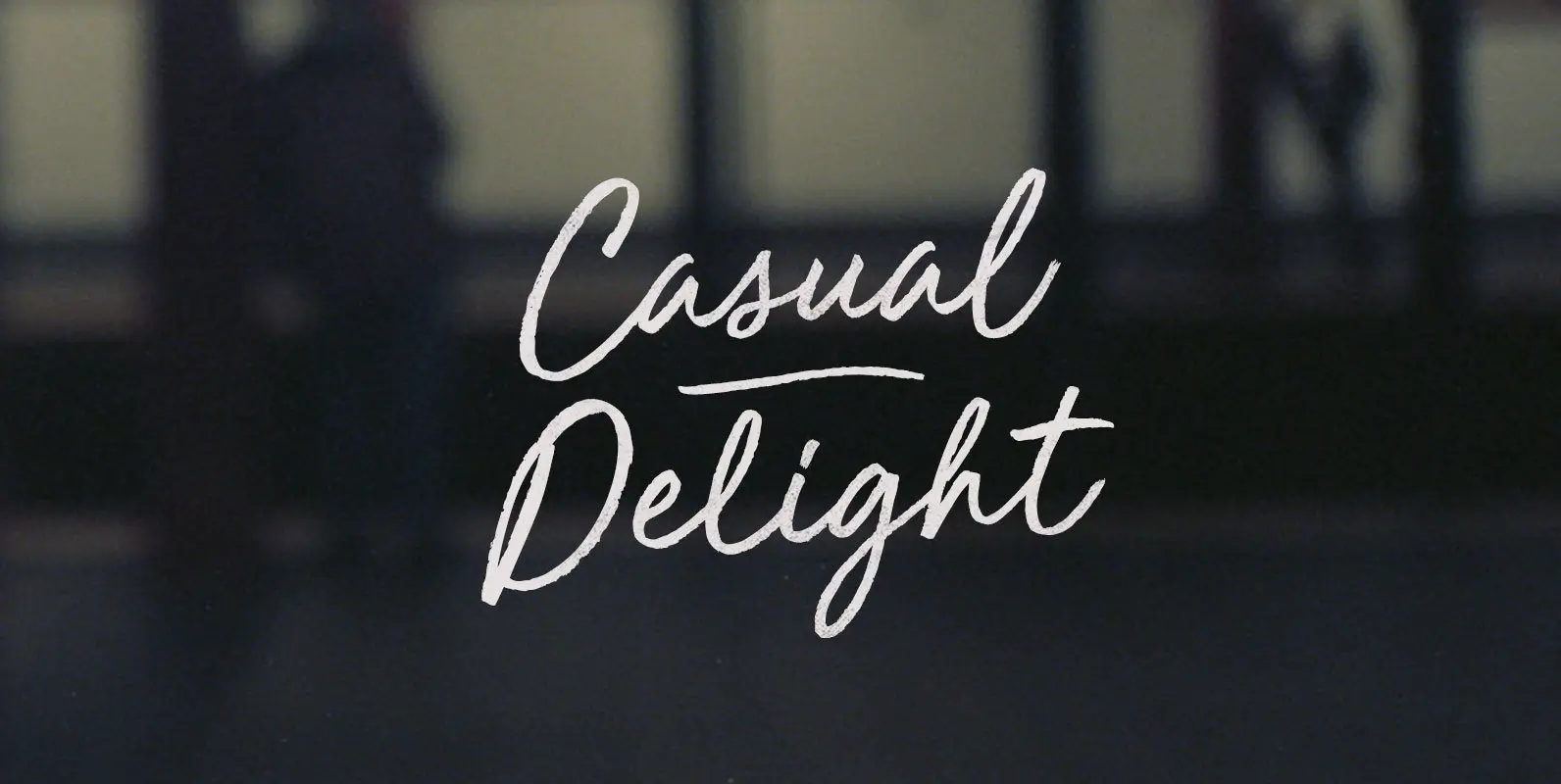
Casual Delight Font
He stood, pinching and pulling the front of his chinos off his Derbys like a still-thin Wilford Brimley. The strained gesture belied our customary Casual Delight. He wasn't born and bred in those clothes–his old man wore sweatpants like the
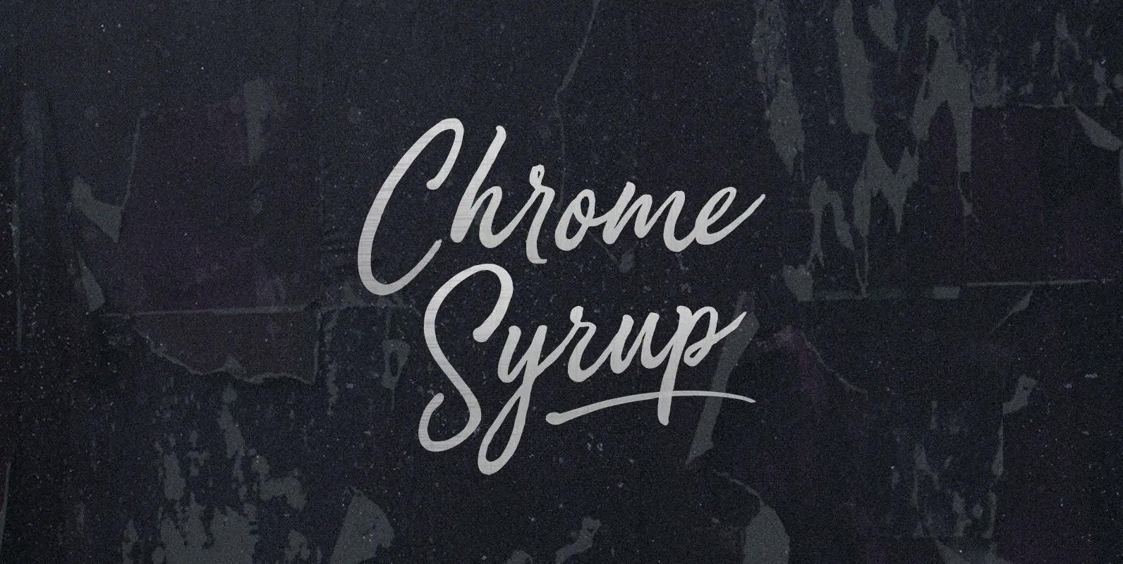
Chrome Syrup Font
Here we are, giving matter mad shine. Mad as bathing hot cakes in mercury, dripping off quick like silver with a sticky sparkle. Chrome Syrup in squeeze bottles, in the door of your fridge, to the door of your car,
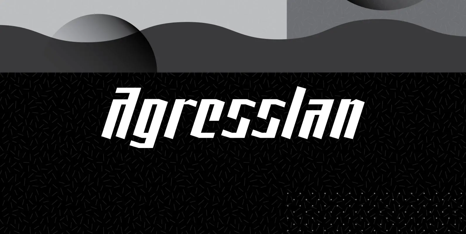
AgressIan Font
AggressIan is the release of the first font I ever drew. It was done by hand with triangle and parallel rule back in the mid-1980s. I originally called it Aggressor, but I never liked it. My local type designer friend,
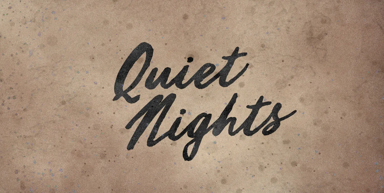
Quiet Nights Font
I was never as lonely as when I was with you. Watching the sky glow orange, punctuated by a police helicopter, on endless sleepless nights, accompanied by the deafening roar of blood in my ears. And always yearning for Quiet
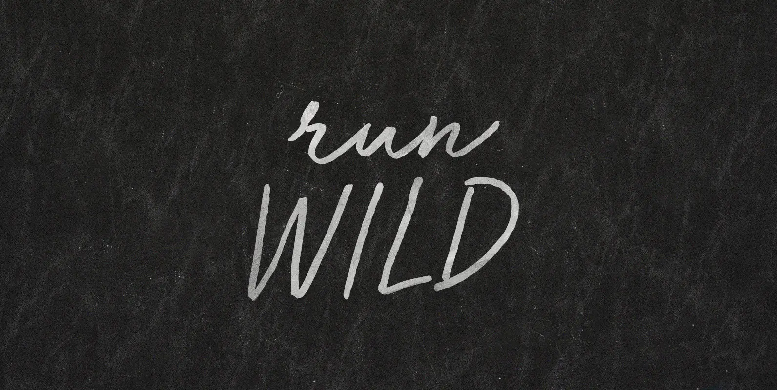
Run Wild Font
Come with the willpower and callouses to run a marathon barefoot. Kick glass and break pavement because this is more than fleet feet. Run fast and run far because the world’s round; Run Wild because conventions can’t keep good feet
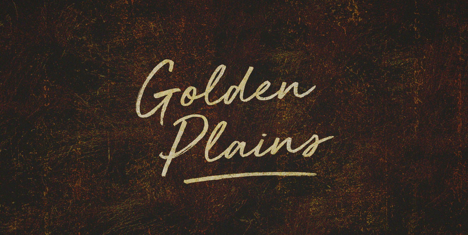
Golden Plains Font
Great shaggy heads and powerful shoulders, herded up against the hundredth meridian or breaking away into the sunset. Give me a home on that Golden Plain, and make my address a redress. For we will roam. Published by BLKBKDownload Golden
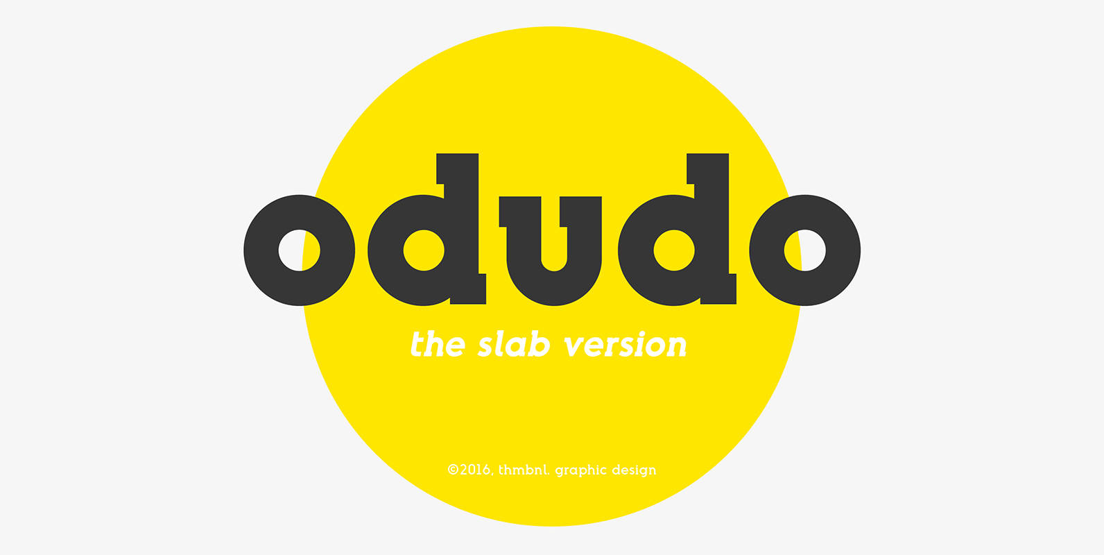
Odudo Slab Font
This slab serif typeface is a new addition to the odudo family. The big and bold serifs will give this addition a more 20th century slab serif tone, without losing the geometric intention and boldness of the original odudo design.
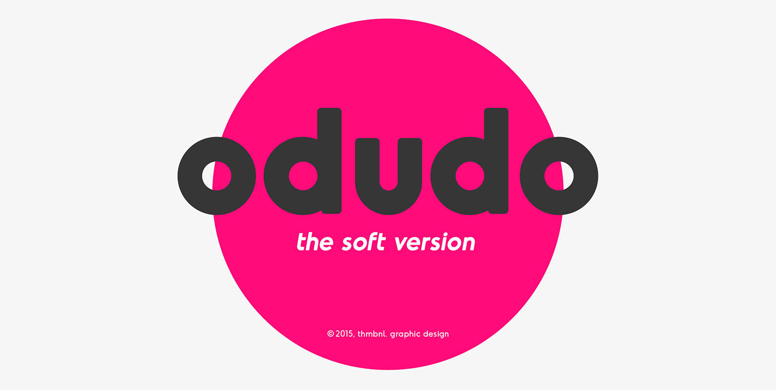
Odudo Soft Font
Just as the name would suggest, odudo soft is pretty much odudo, but less edgy. With the use of very subtle rounded corners, this typeface should make your project a little bit more friendly. Published by Thom NiessinkDownload Odudo Soft
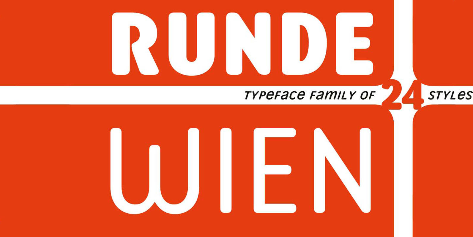
Runde Wien Pro Font
Runde Wien Pro – rounded corners for urban fonts Runde Wien Pro completes the Wien Pro typeface family by the complete font sets with rounded shapes. The more than complete typeface family covers the same weights and styles as the
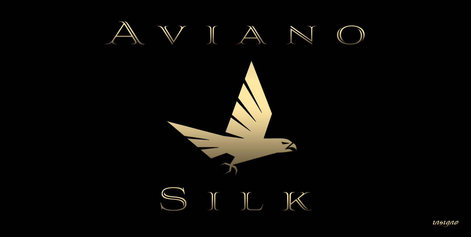
Aviano Silk Font
As part of insigne’s annual tradition in adding to the Aviano family, this modern development of a timeless font was selected the clear leader in a poll of insigne design’s social media followers. Silk refers to the smooth, flowing feel
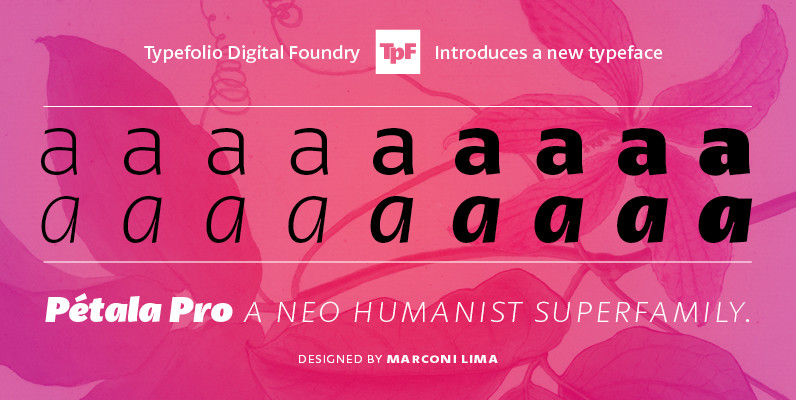
Petala Pro Font
Pétala Pro gave his first steps almost ten years ago. During this time, the quest for perfection had forced several interruptions. It was necessary recalculate the route, tread other ways, discover new maps, and make easy curves. After all, a
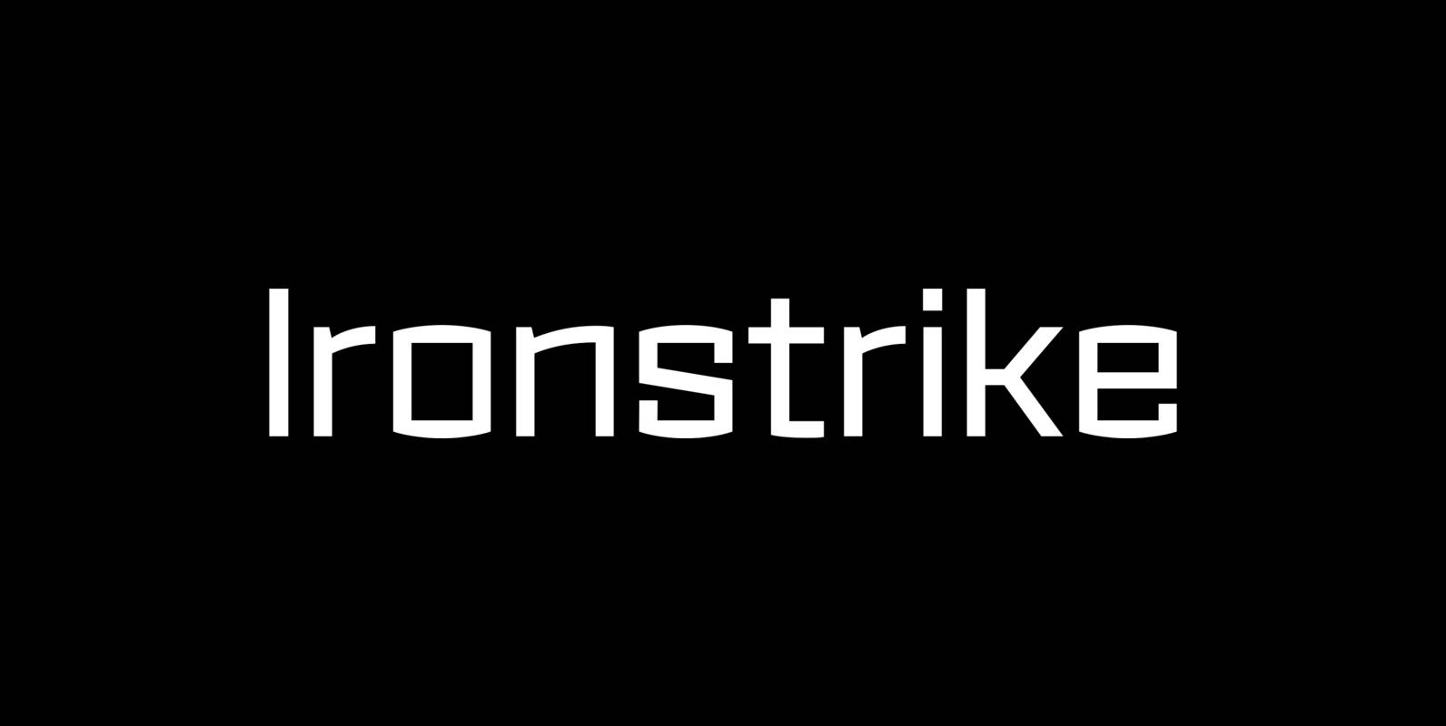
Ironstrike Font
Ironstrike pays homage to industrial and constructivist lettering. Rigid shapes and tall lowercase letters evoke strength and technology. Seven weights with matching italic fonts step up to your tough design challenges. Fine light weights emphasize white space and powerful heavy