Tag: mobile
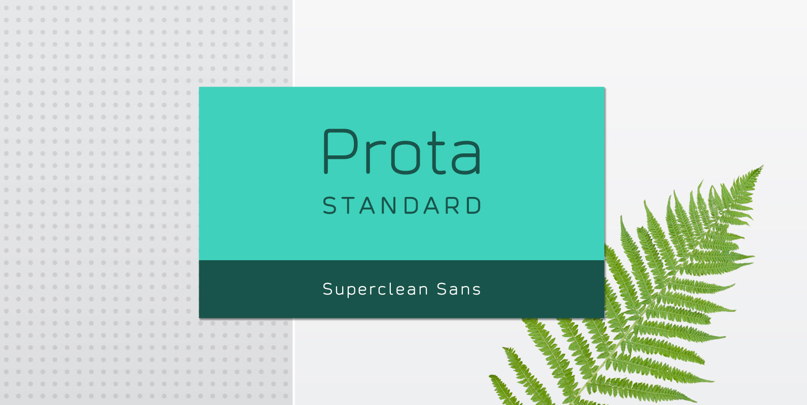
Prota Standard Font
Prota Standard is a new super-clean sans serif font. Using it, you will instantly bring ultramodern and noble-tech look to your artwork (the one like Apple and Tesla have). Do you need a font which will present your business as
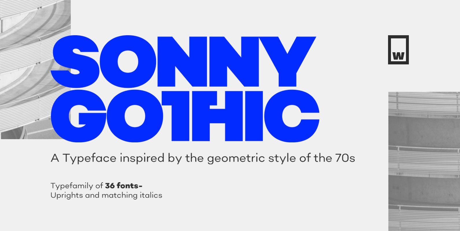
Sonny Gothic Font
Sonny Gothic is our most rational-geometric typefamily until so far. It’s inspired by the geometric style of the 70s, specifically by Herb Lubalin’s work. Since we were students, we have been gazing Lubalin’s logos, typefaces and magazines as inspiration that
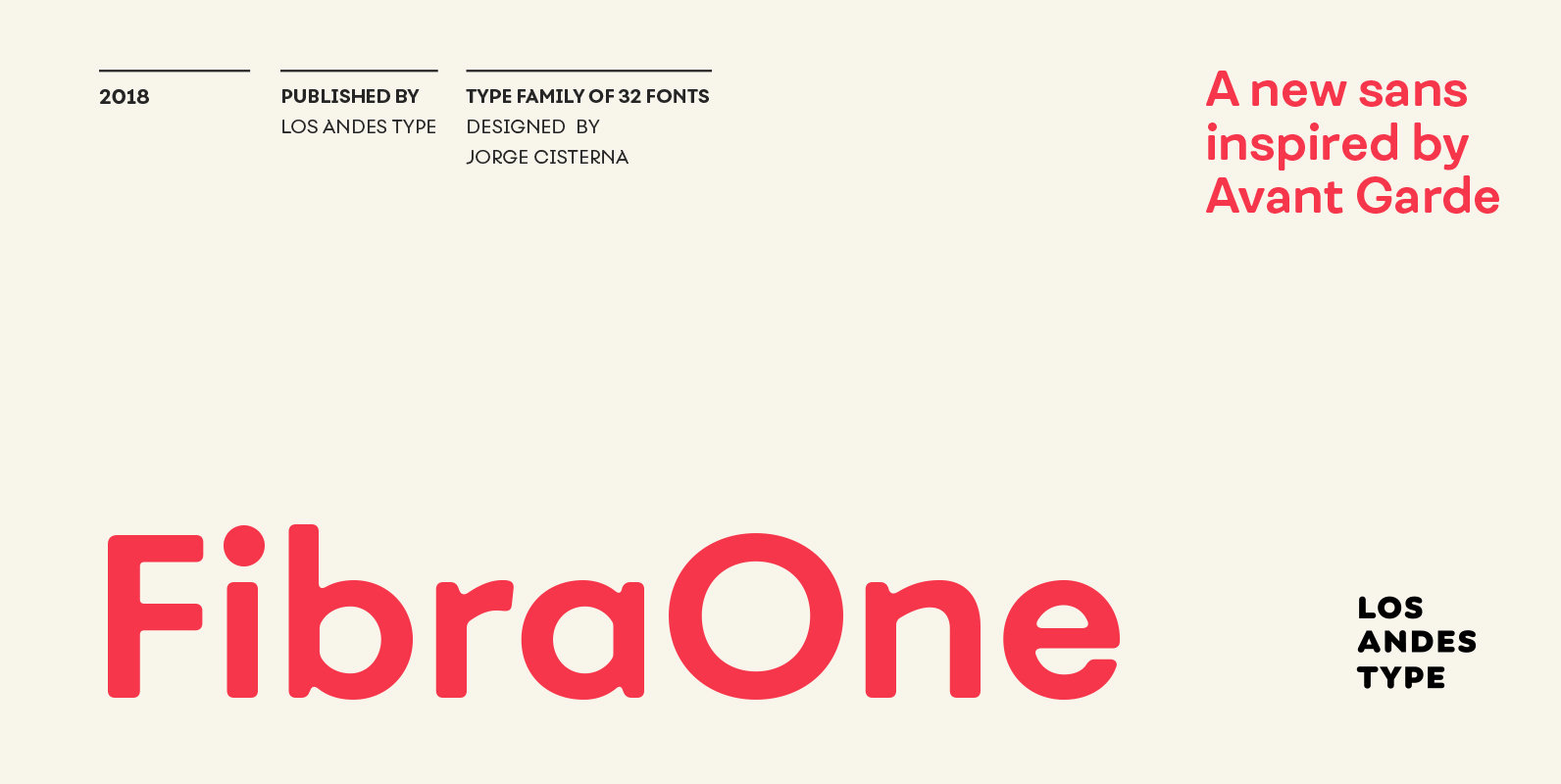
Fibra One Font
Fibra One looks like a “soft” version of the Fibra font, but it is actually more than that—the second part of its name suggests that it is a reinterpretation of the original typeface. While this new version maintains the overall
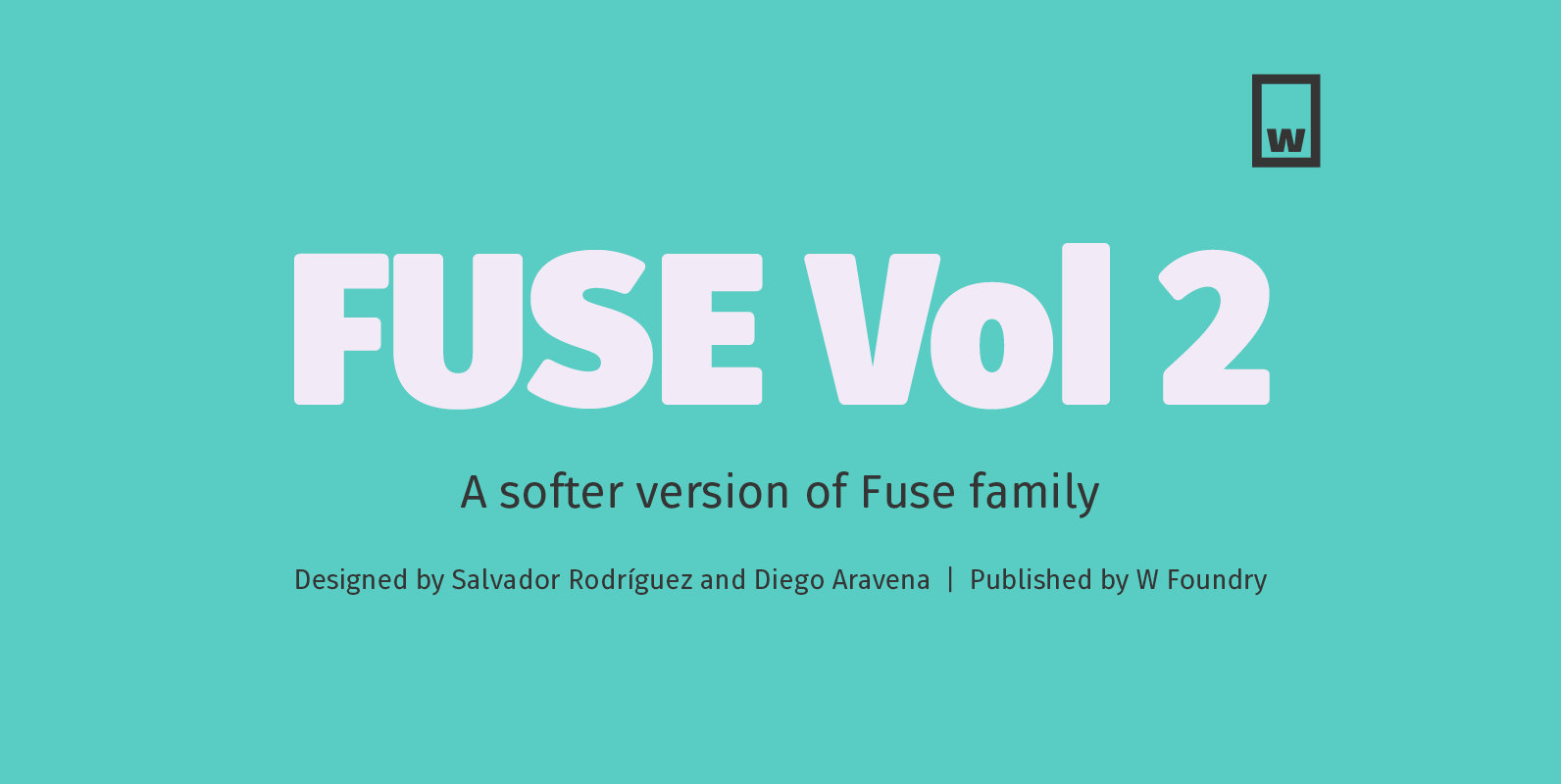
Fuse V.2 Font
Fuse Vol 2 is an extension to our popular Fuse type family. All of the corners of the typeface’s character are rounded, making Fuse Vol 2 friendlier and more amiable variant of the original Fuse. Designed with powerful OpenType features
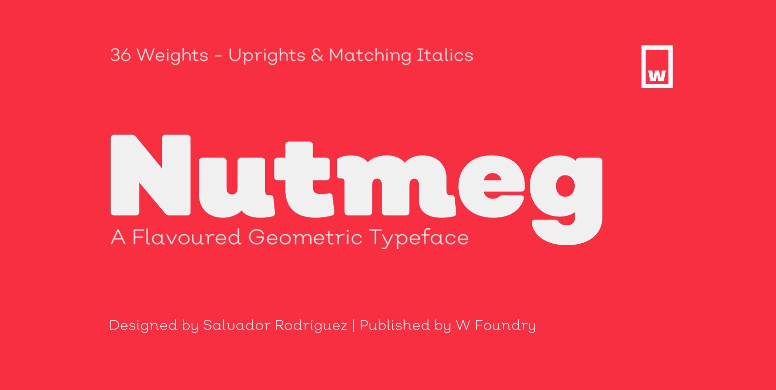
Nutmeg Font
Nutmeg is a geometric typeface with a slight flavored touch. Although its structure is stick to the traditional forms, its details transform this typeface in a boldly project that separates it from other geometric fonts. Nutmeg’s texture can be perceived
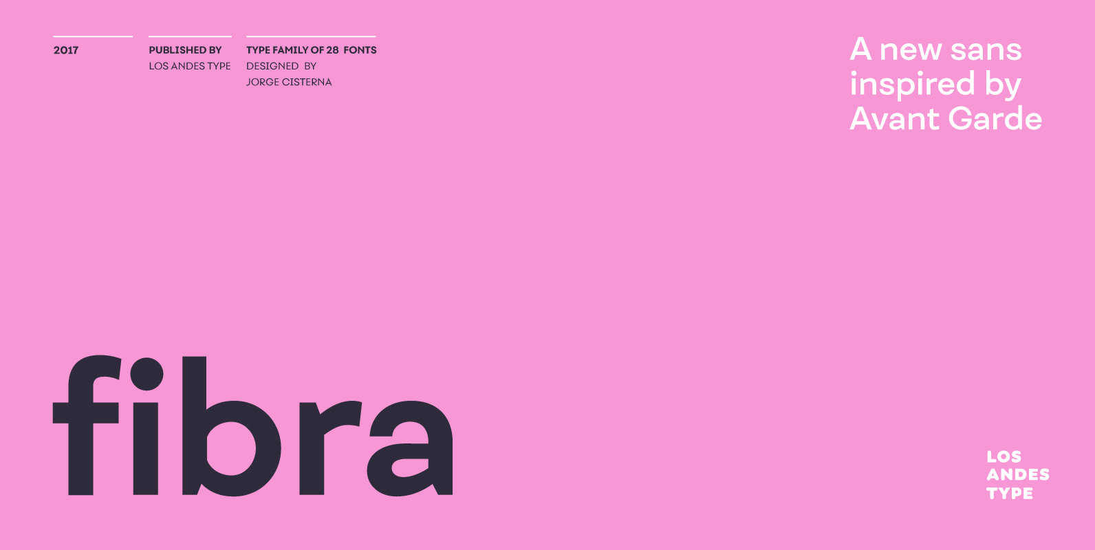
Fibra Font
The font is actually not a revival of ‘Avant Garde’—by Herb Lubalin—but it takes its spirit. Fibra is a geometric sans serif, yet without the typical structural strictness of these kind of fonts, that represents experimental type design. This can
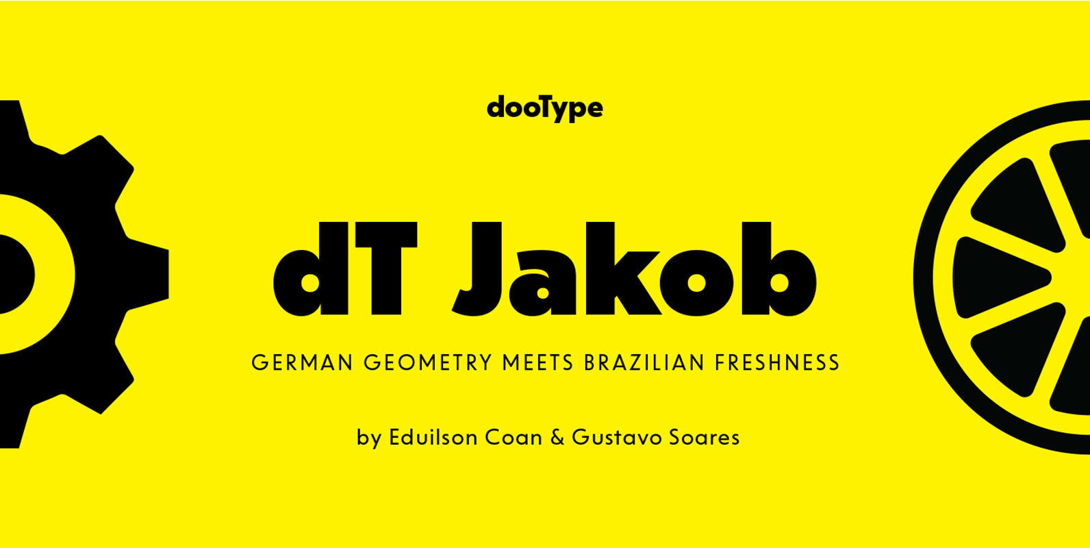
dT Jakob Font
dT Jakob started as a revival by Gustavo Soares for Paul van der Laan’s class at the Type and Media Masters, in The Hague, NL – back in 2007. There are quite a few excellent geometric sans typefaces available, but
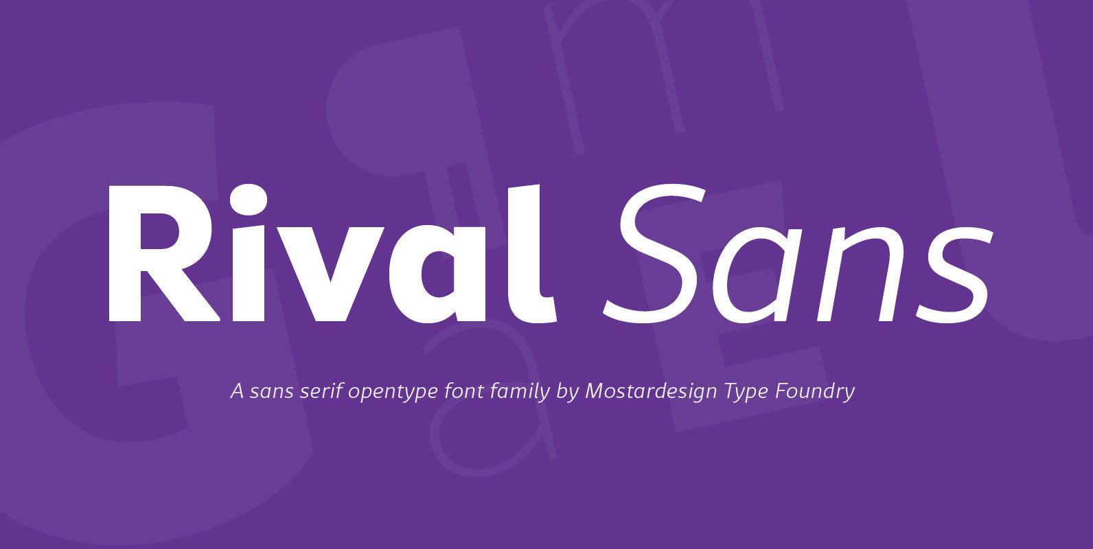
Rival Sans Font
Rival sans is clean sans serif font family and it characterized by excellent readability and its contemporary aspect. It provides advanced typographical support with features such as case sensitive forms, small caps, ligatures, alternate characters, fractions, slashed zero, circled figures,
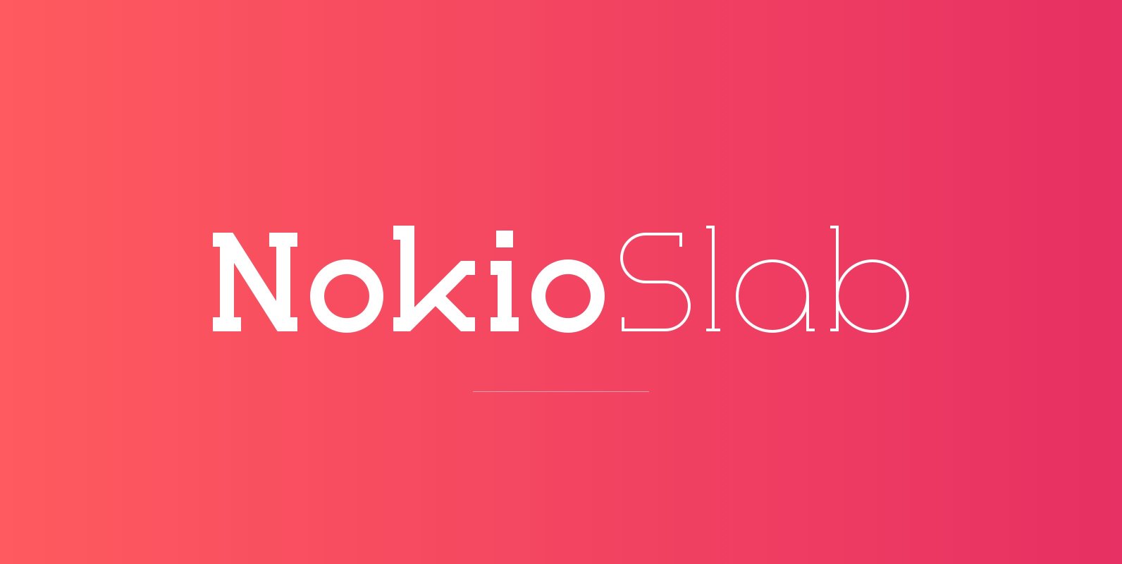
Nokio Slab Font
Nokio Slab is the big brother to the popular Nokio & Nokio Sans fonts and provides even more uses for the Nokio range. Nokio Slab is made up of 5 weights + italics and also features an alternate font that
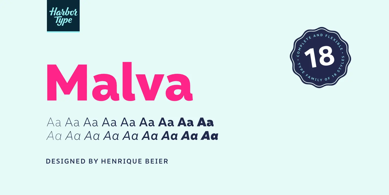
Malva Font
Malva was designed to perform as a branding element, providing a clean look for visual identities and publications. It brings a touch of friendliness to the communication without compromising the professional look every brand strives for. Legibility was one of
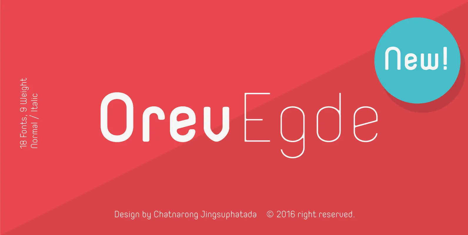
Orev Edge Font
Orev Edge is altered modified from the form of the original “Orev” typeface. We added curved line in both inner and outer edges, including the structure of typeface. Import to be more friendly, the font family has smoother terminals that
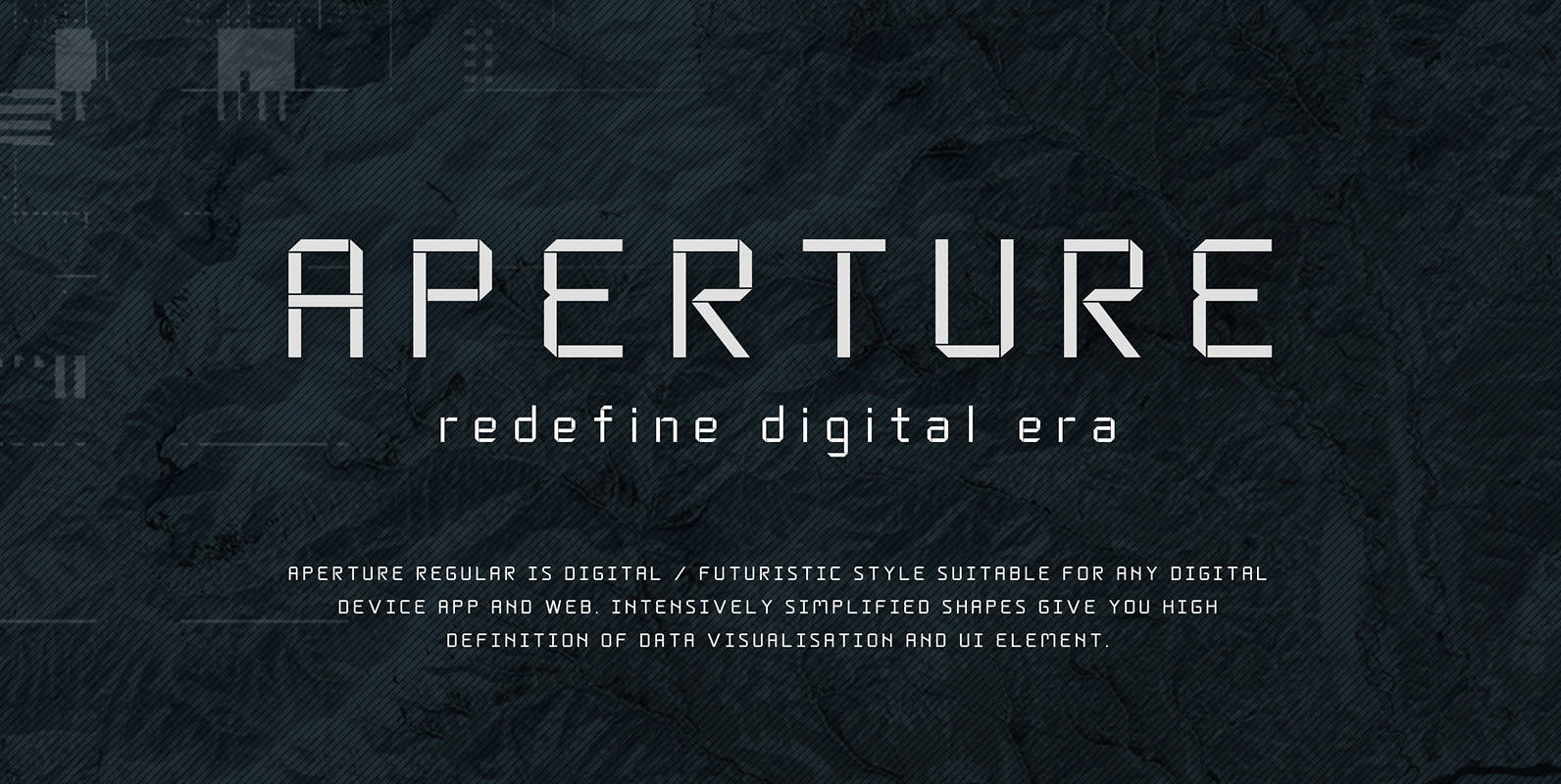
Aperture Font
Aperture Regular is a font featuring a digital / futuristic style, suitable for any digital device app or the web. Intensively simplified shapes give you high definition of Data visualisation and UI element. Optimized for small case, down to 9pt.
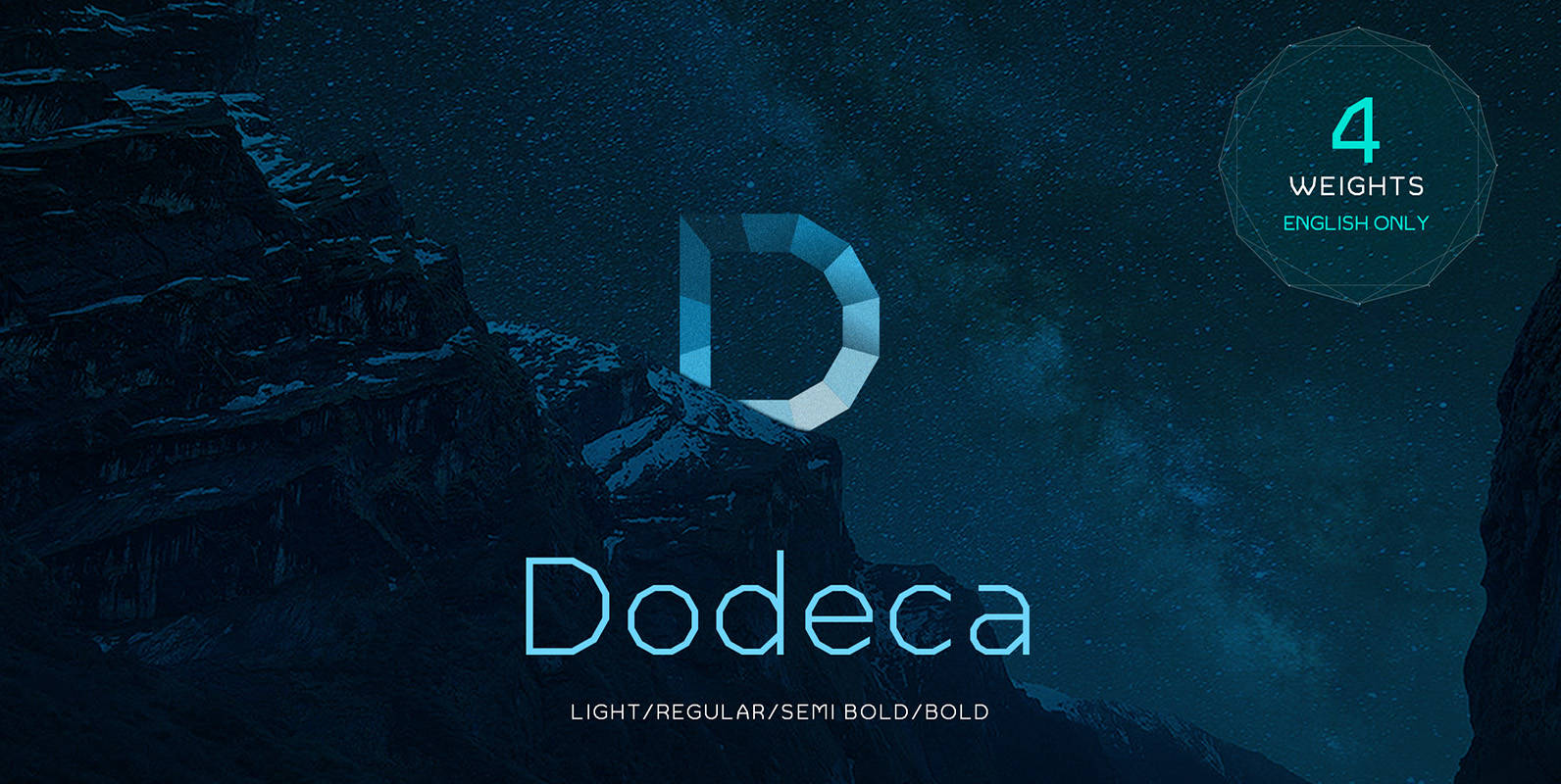
Dodeca Basic Font
Dodeca was born for digital use & for the computer based generation. In lower case, the font looks much smoother, yet the larger the size the more you can see how beautifully this font features 12 angles. Naturally constructed with
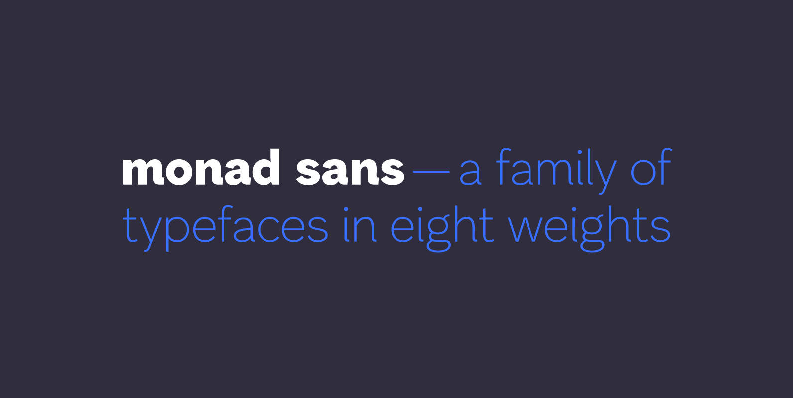
Monad Sans Font
Monad Sans is a typeface that builds on traditional and modern grotesques — aspiring to be a modern workhorse, rugged but not wooden, geometric yet limber. Available in eight weights, it has a medium x-height and generous character width. The
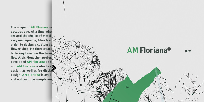
AM Floriana Font
The origin of AM Floriana is already several decades ago. At a time when there was no photo set and the choice of metal type fonts was still very manageable, Alois Menacher received an order to design a custom business
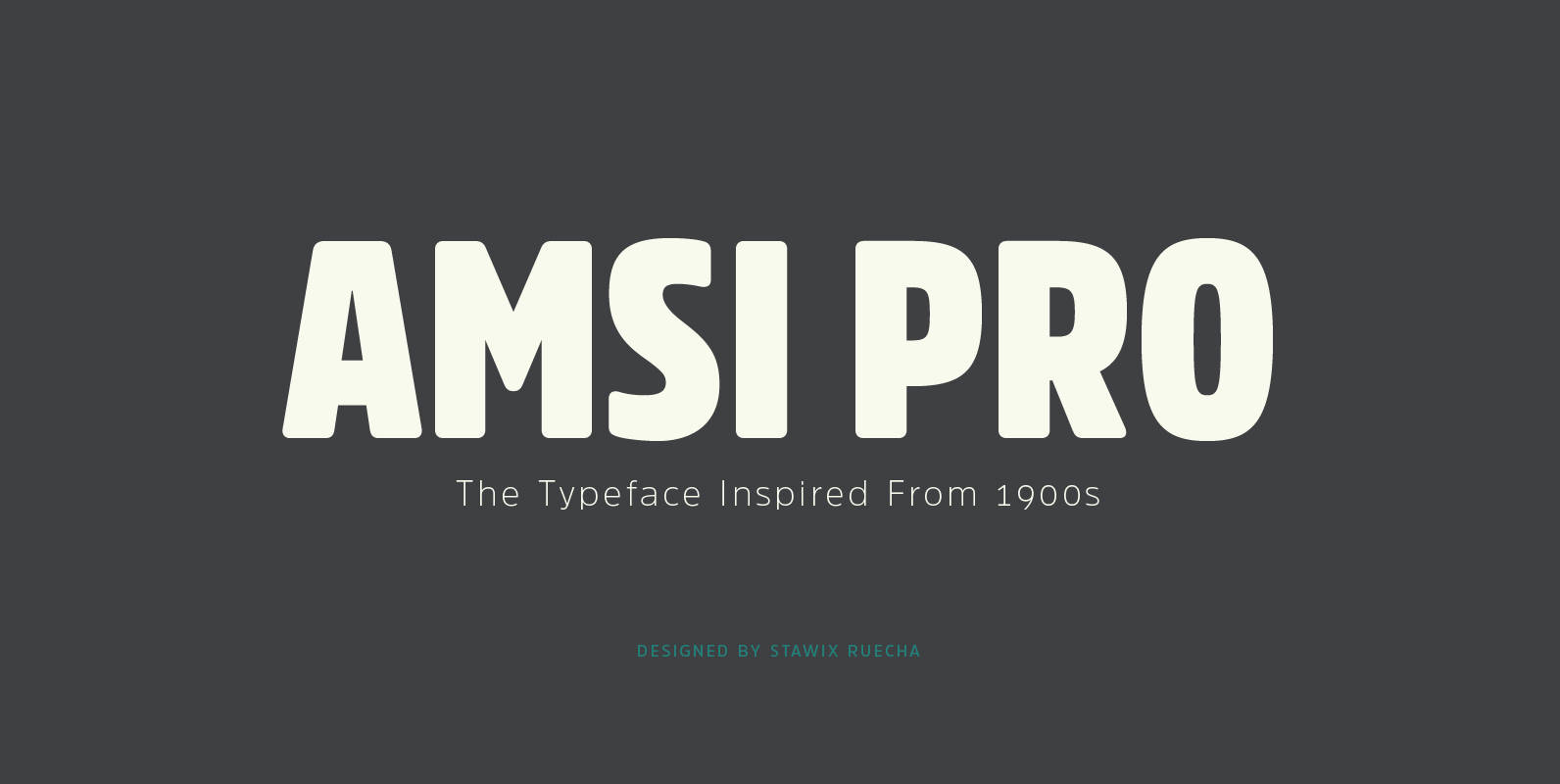
Amsi Pro Font
An unexpected encounter at ArtBasel that uses Block Berthold Condensed as their co-operated logo. It is purely a personal impression towards this particular font. Following the research, it turns out that this font has been around for approximately a hundred