Tag: low-contrast
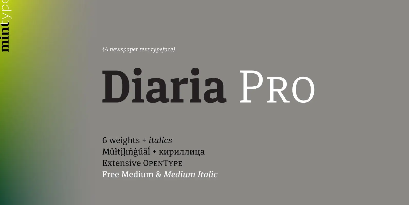
Diaria Pro Font
Diaria started as a project in Typeface Architecture for Master in Advanced Typograghy at EINA, Centre Universitari de Disseny i Art de Barcelona, a course tutored by Laura Meseguer and Íñigo Jerez Quintana. Later it has developed into Diaria Pro,
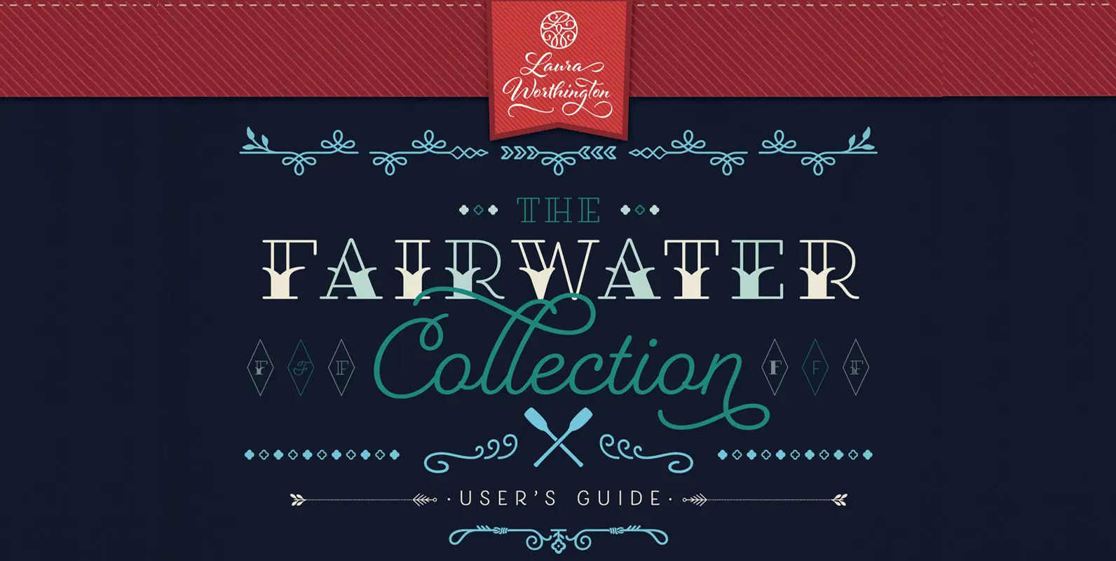
Fairwater Collection Font
Fairwater’s aesthetic derives from three sources: the cursive handwriting styles popularized in the early to mid 1900s, the simplified, forgiving letterforms of tattoo lettering – and the pictorial themes that informed early-to-mid 20th-century naval tattoos. The Fairwater family includes three
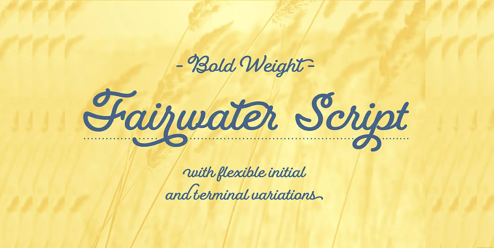
Fairwater Script Font
Fairwater’s aesthetic derives from the cursive handwriting styles popularized in the early to mid 1900s. Friendly, monoline, and casual – available in light, regular and bold weights. As with many of her faces, Laura can’t resist adding a plethora of
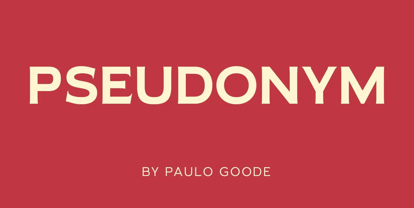
Pseudonym Font
Pseudonym is a low-contrast, subtly-flared serif available in four weights across three styles in both roman and italic. Features: • Full set of small caps with diacritics and figures • 30+ discretionary ligatures, catchwords and alternate characters • Full European
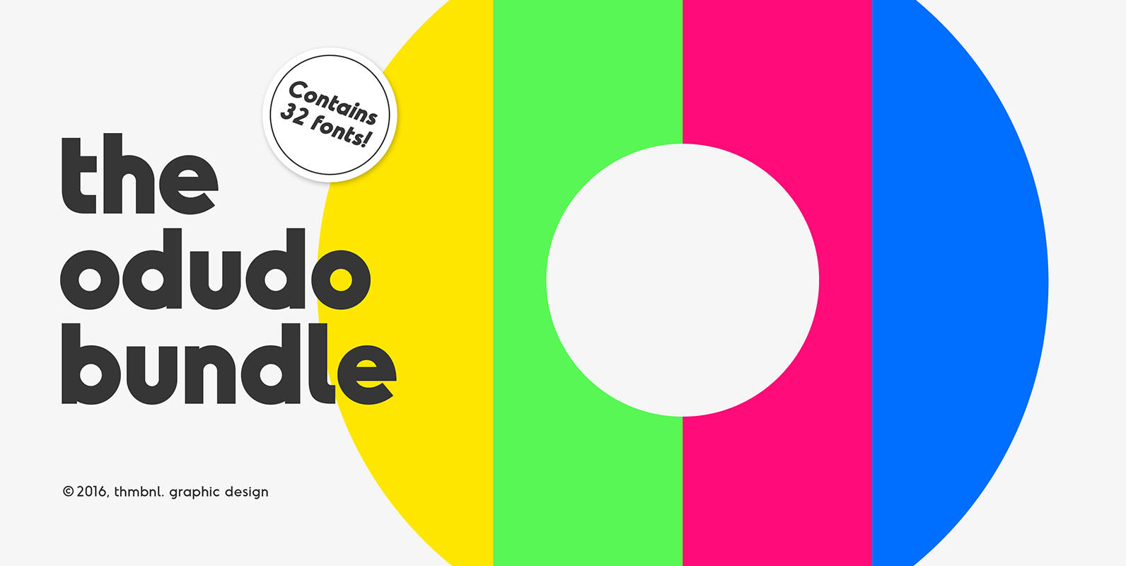
The Odudo Bundle Font
This bundle of fonts contains all the Odudo family members, with a total of 36 font files. A wide range of clean and strong geometric typefaces, designed by thmbnl. graphic design. The typefaces that are included are Odudo, Odudo Slab,
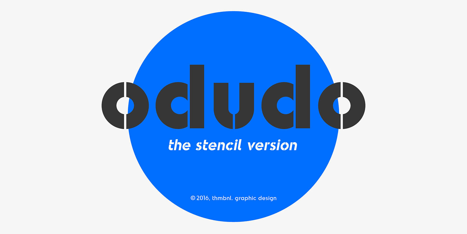
Odudo Stencil Font
This typeface is the stenciled version of the original odudo design and the latest addition to the ongoing odudo family. The subtle and carefully crafted stencil style will give your headlines a more dynamic feel, while keeping the familiar geometric
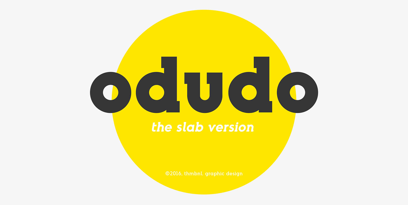
Odudo Slab Font
This slab serif typeface is a new addition to the odudo family. The big and bold serifs will give this addition a more 20th century slab serif tone, without losing the geometric intention and boldness of the original odudo design.
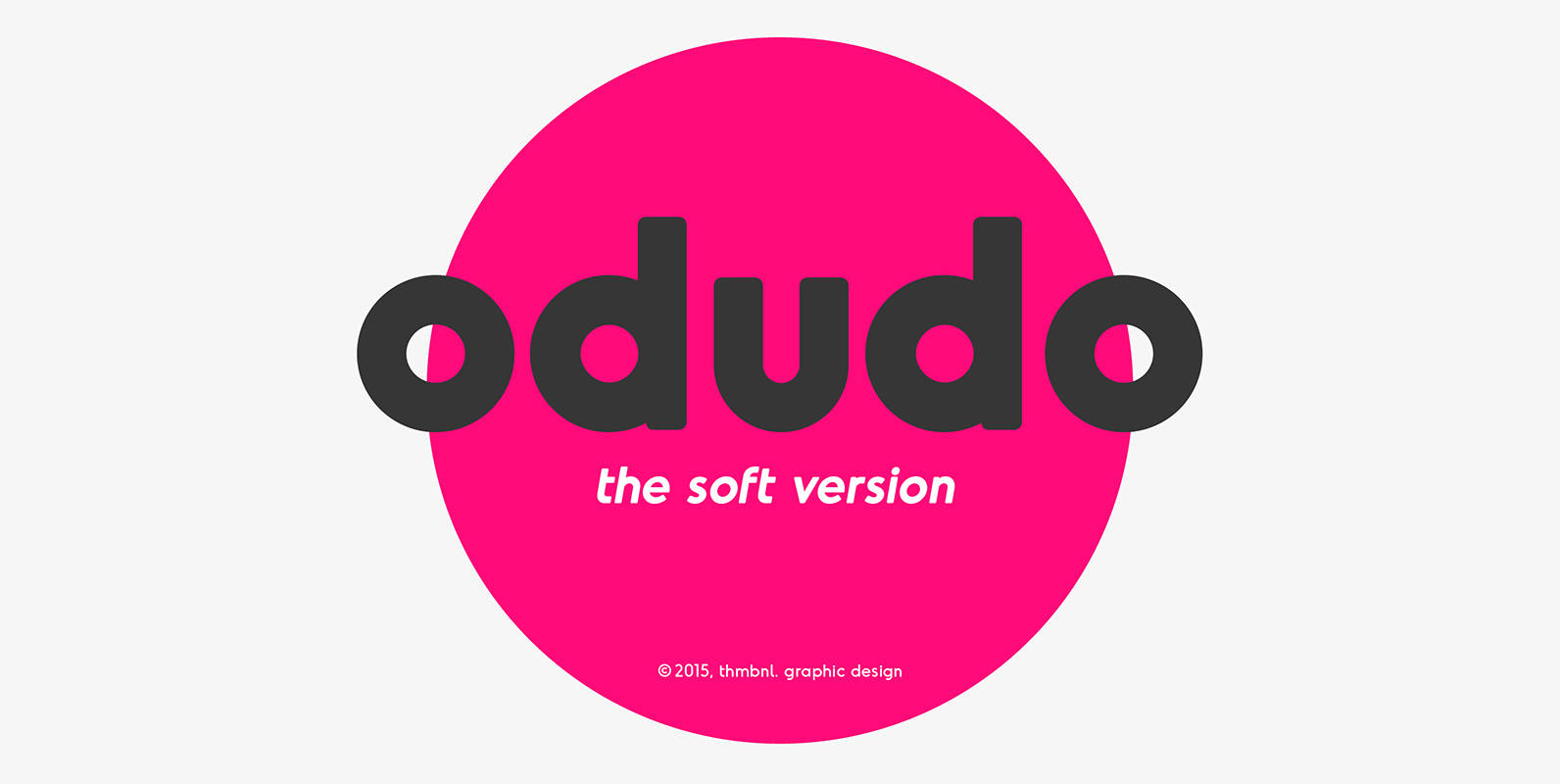
Odudo Soft Font
Just as the name would suggest, odudo soft is pretty much odudo, but less edgy. With the use of very subtle rounded corners, this typeface should make your project a little bit more friendly. Published by Thom NiessinkDownload Odudo Soft
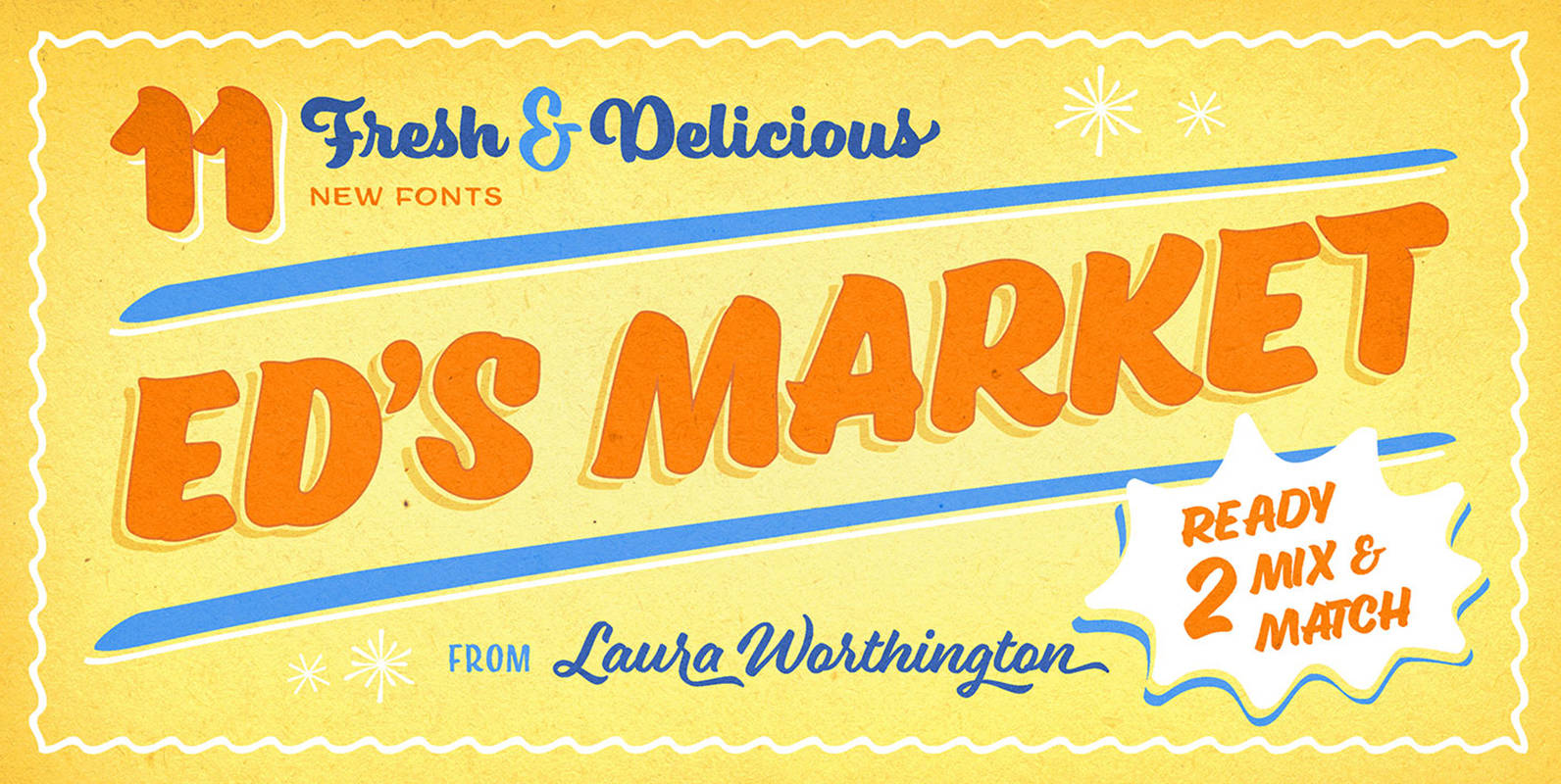
Ed's Market Collection Font
It’s like hiring your own professional sign painter with a solid repertoire of styles. Each one is distinctive, yet clearly by the same hand – in this case, Laura Worthington’s, holding a pointed brush. No variants were created on the
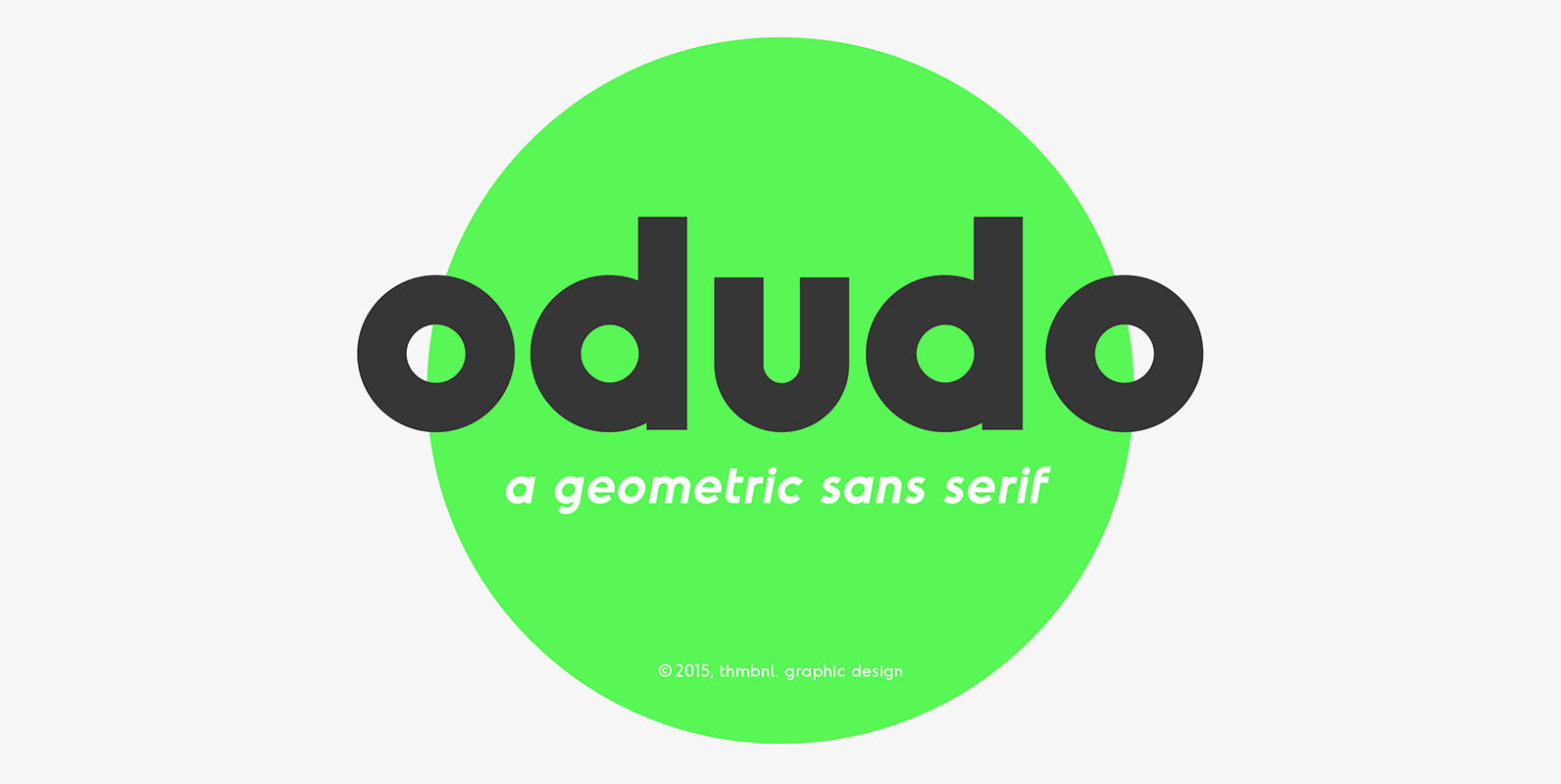
Odudo Font
With almost the same geometric construction and proportions, Odudo is the new edgy brother of the rounded typeface oduda, designed in early 2015. Without the chubby rounded look, this typeface finds inspiration in some classic geometric fonts (Futura, ITC Avant
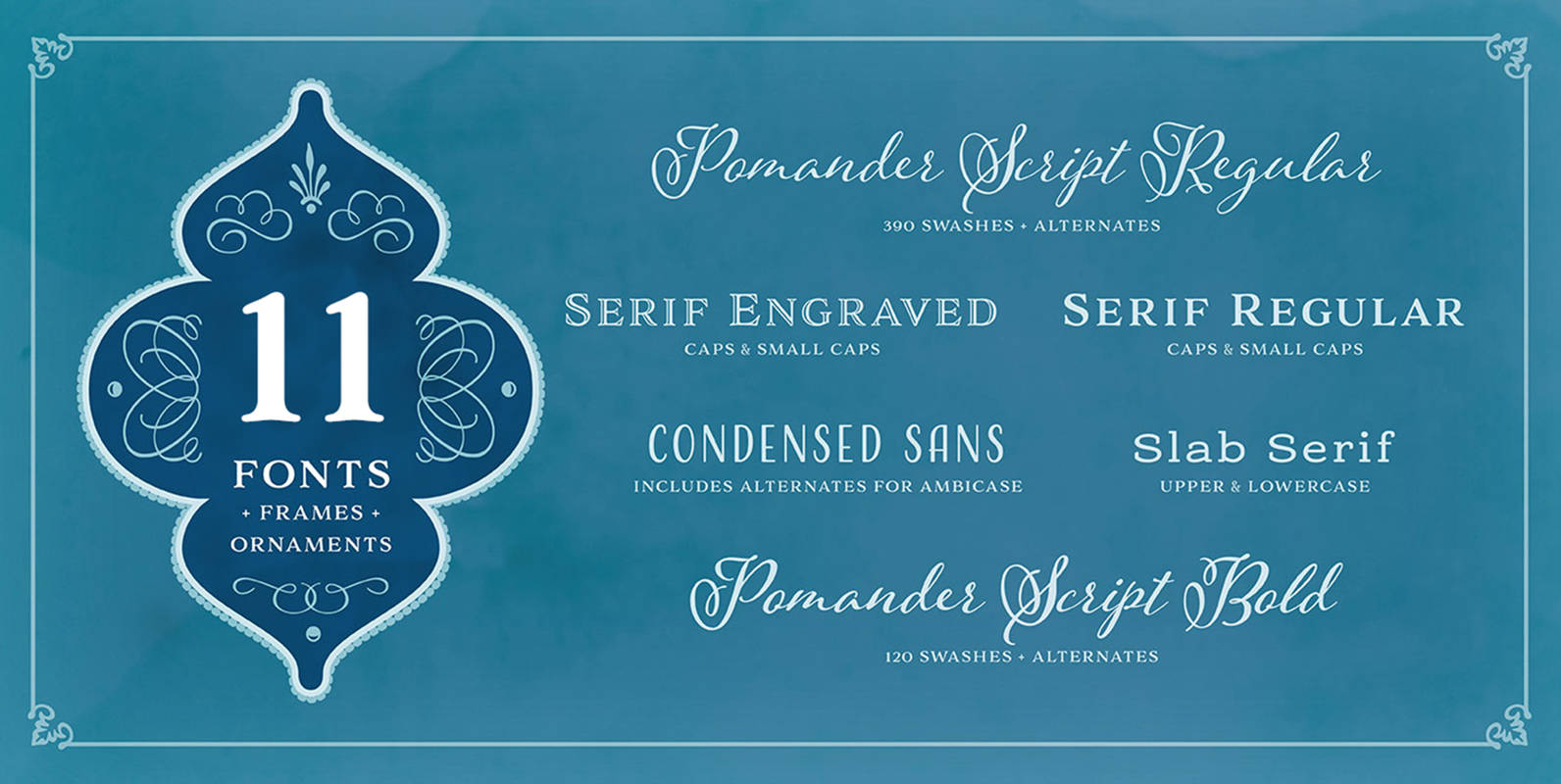
Adorn Pomander Smooth Collection Font
Like the original Adorn family on which it’s based, Adorn Smooth provides a suite of distinctive typeface designs designed to complement each other rather than match exactly. Adorn Smooth revisits 6 faces from Adorn — Pomander, Serif, Slab Serif, Engraved,
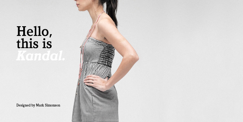
Kandal Font
Kandal is a wedge-serif face with old style or antique qualities. It has low contrast in weight between thicks and thins, even as it gets bolder. Its proportions are slightly condensed, and the color and texture of Kandal Book is
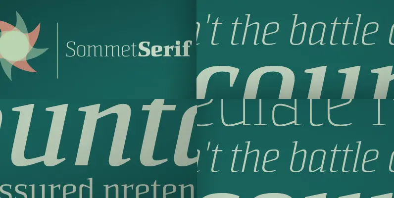
Sommet Serif Font
The Sommet superfamily has been updated with a new serifed member. Expanding on Sommet’s successful design principals, Sommet Serif is there when you need legibility for continuous text. Its interesting forms lend it to use as headlines as well. Sommet
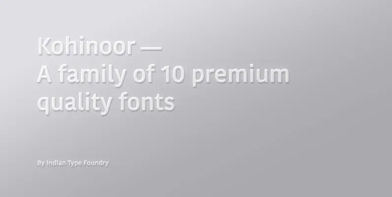
Kohinoor Font
Kohinoor is an elegant, low contrast humanist sans-serif typeface suitable for both body and the display text. Kohinoor comes in 5 upright styles with their complementary italics. Published by Indian Type Foundry (ITF). Download Kohinoor