Tag: inline
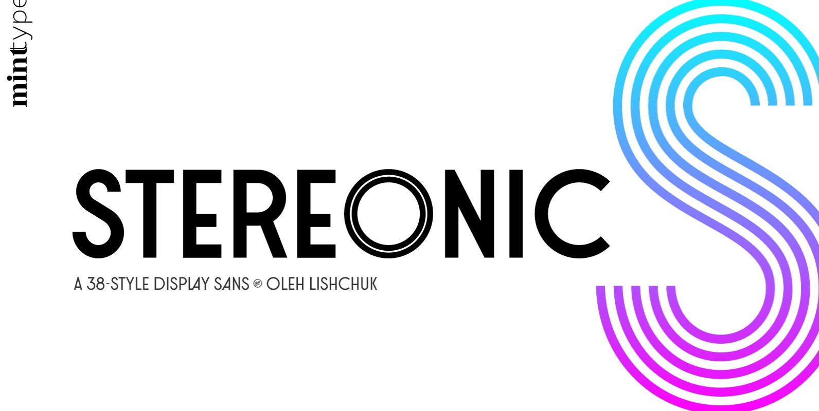
Stereonic Font
Stereonic is a geometric display sans influenced by Art Deco style. Its 38 fonts across 5 weights offer the possibility to convey numerous moods and styles typical for different decades. As the name suggests, the music posters were considered as
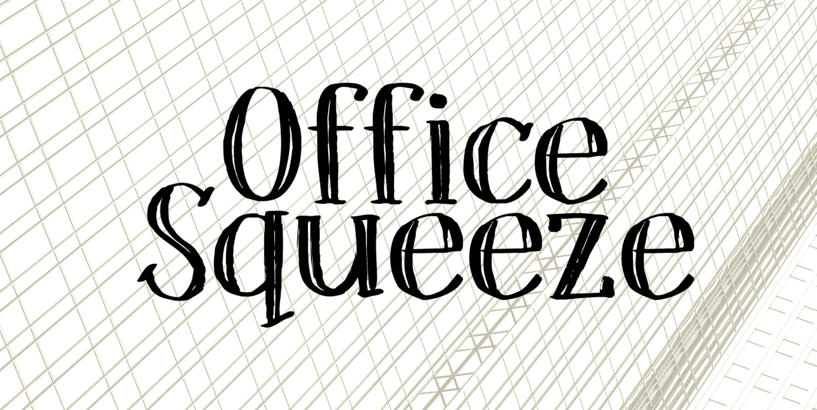
Office Squeeze Font
Office Squeeze was made with a Japanese brush pen. I kind of like the fact that, despite its roughness, Office Squeeze still maintains a very neat appearance. Office Squeeze can be used for just about anything, but product packaging, logos
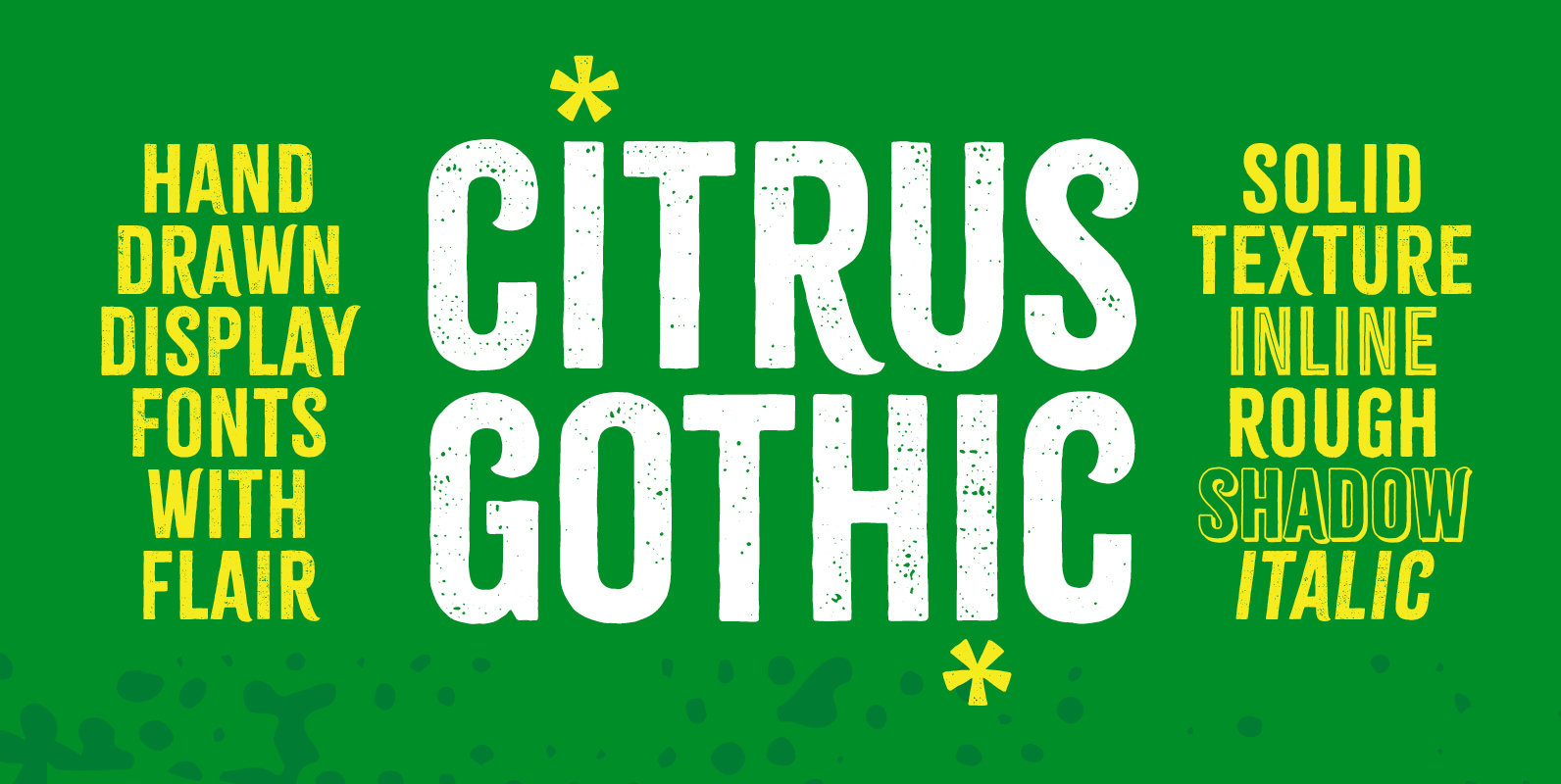
Citrus Gothic Font
Citrus Gothic is a hand drawn, distinct gothic sans font family featuring solid, texture, inline, rough, shadow, and italic styles. It’s design leans on the classic, condensed gothic appearance but adds flair with the irregular details and curled terminals. An
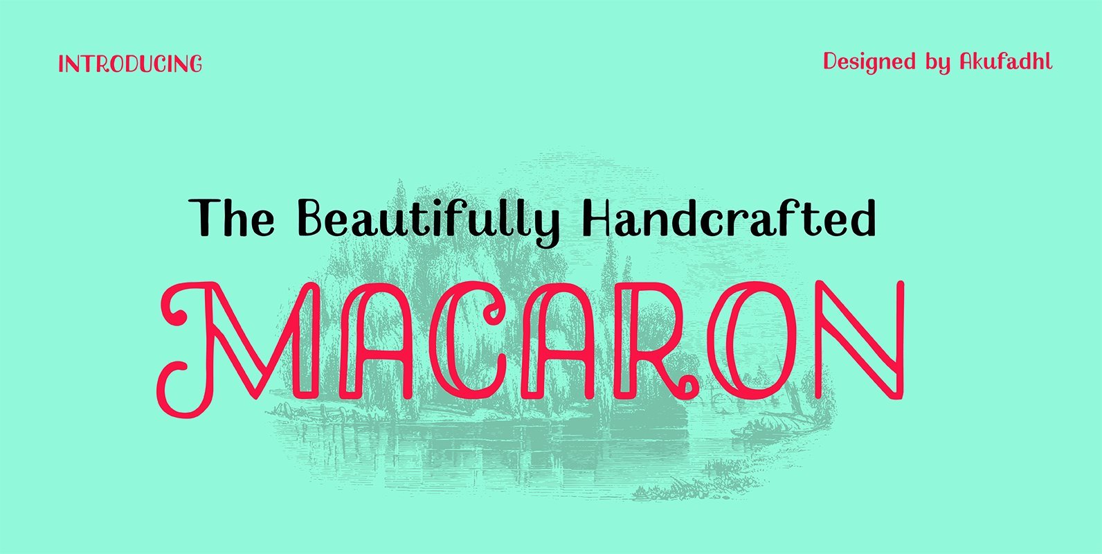
Macaron Handcrafted Font
Macaron Handcrafted is a decorative font design published by Akufadhl Published by AkufadhlDownload Macaron Handcrafted
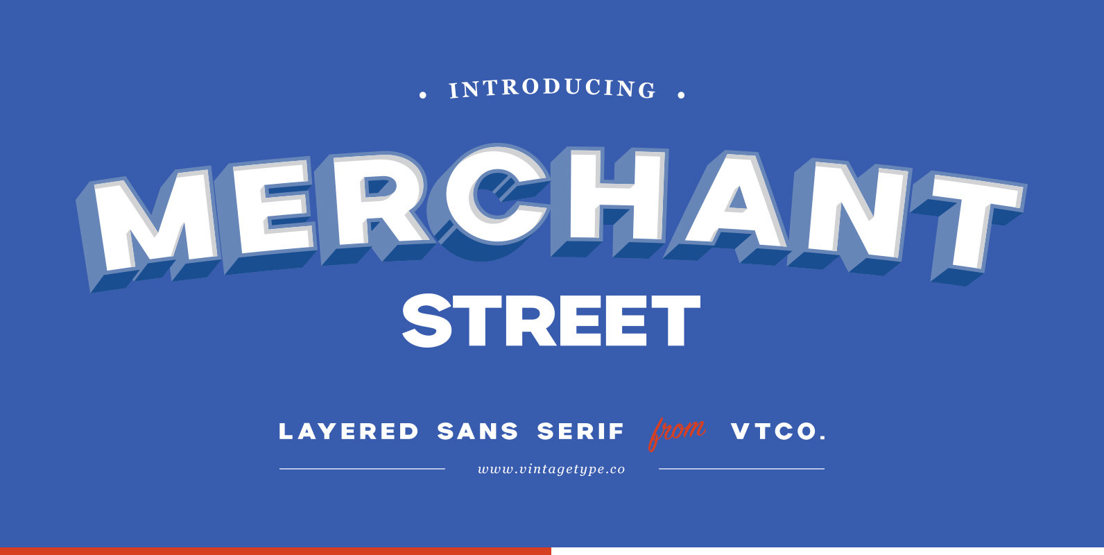
Merchant Street Sans Font
Merchant Street Sans is a big, bold, all caps sans serif that comes in a family of 8 stackable fonts. The concept comes from old hand-painted signage & facades and is the perfect font choice for sign painters. Stack different
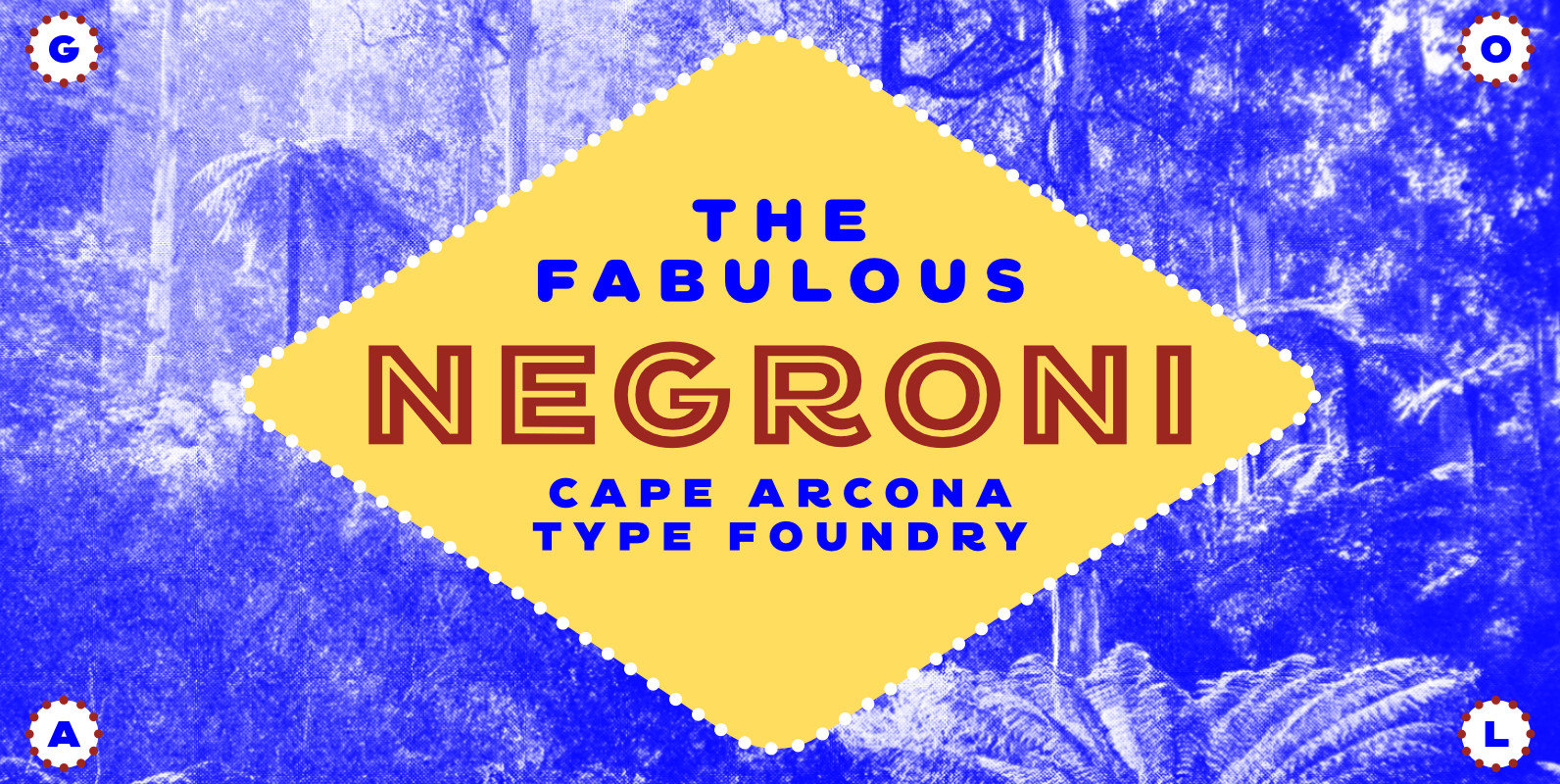
CA Negroni Font
A dinner is not complete without a fine appetizer. Whatever you dinner will be, CA Negroni is the perfect introduction. Delivered in three flavors, Normal (with Light + Black + Fill), Inline and Round. Versatility is proved by the extensive
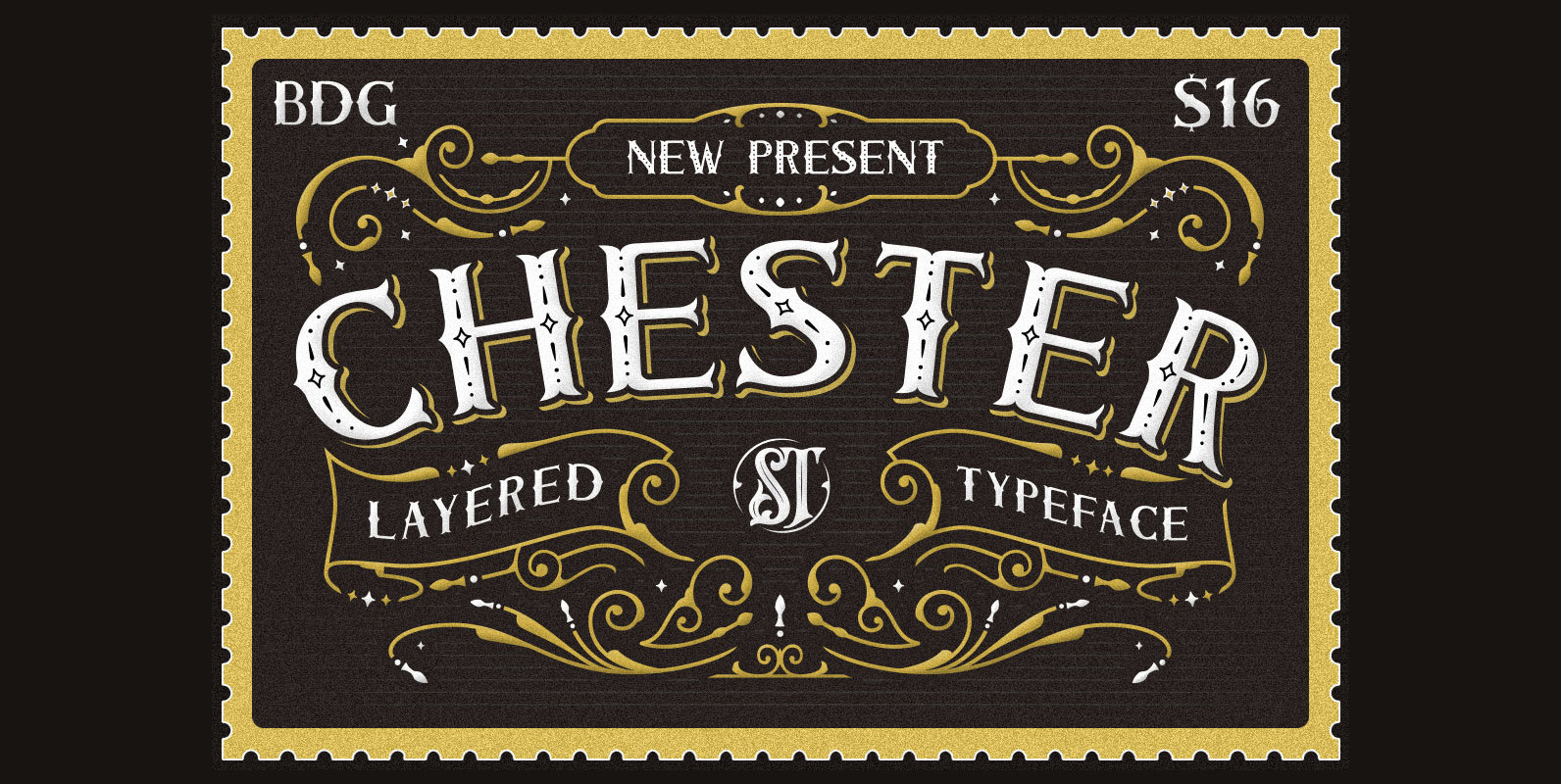
Chester Font
Chester is a serif font design published by Panji Nugraha Published by Panji NugrahaDownload Chester
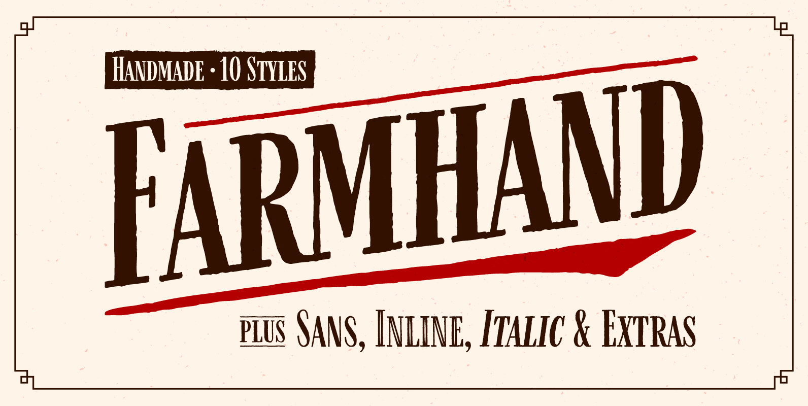
Farmhand Font
Farmhand is a textured, hand drawn, condensed font family featuring serif, sans, inline, italic, and extras styles suited for display titling. An all-caps typeface with individually drawn small caps for lowercase (they are not just scaled down copies of the
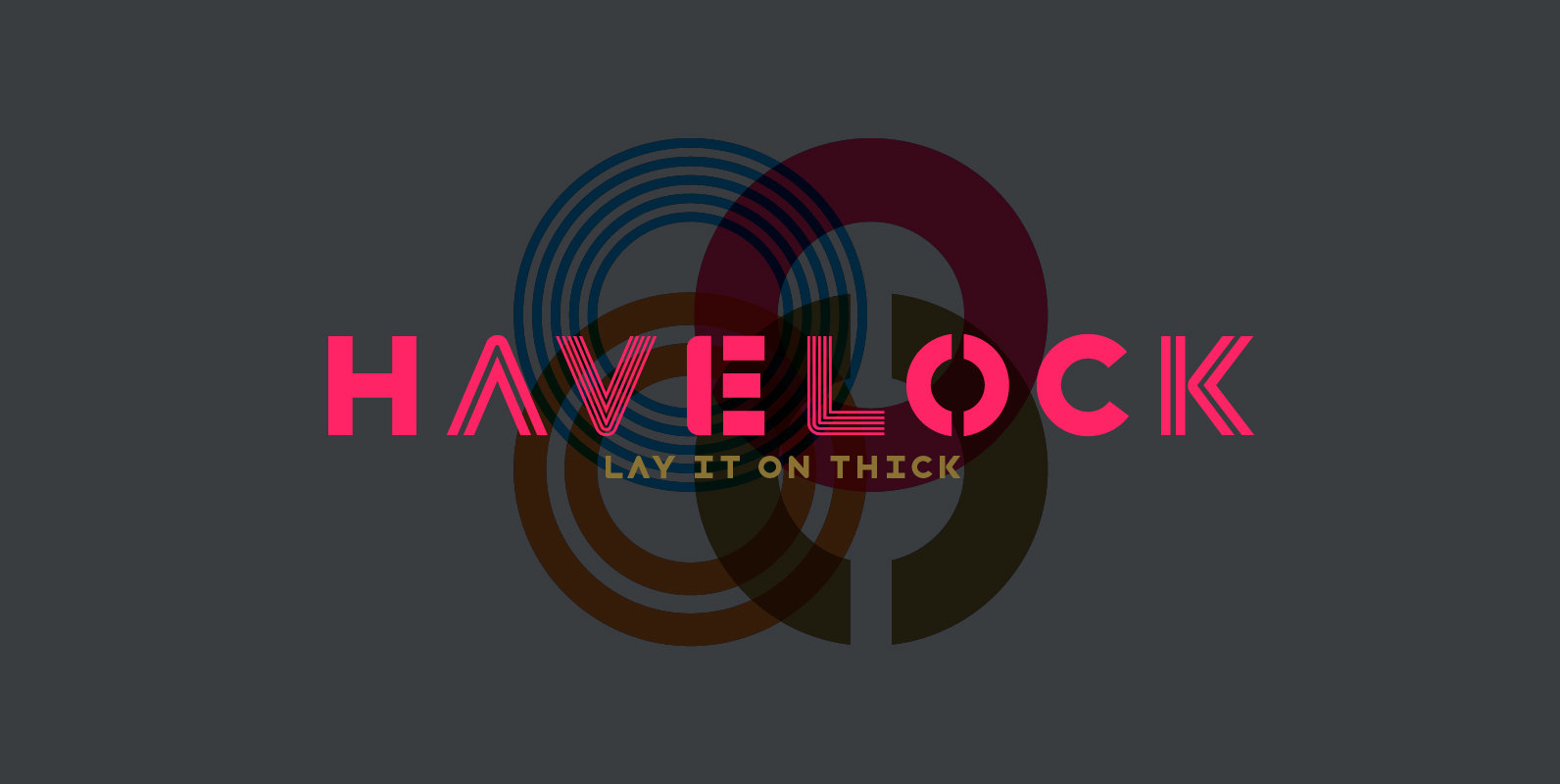
Haveock Font
Four interchangeable all-caps typefaces, made specifically for designers to layer and play with. It combines hard and soft, geometry and pattern. Layer and mix styles within a single word, retaining coherent visual tone. Havelock Solid operates as a background layer,
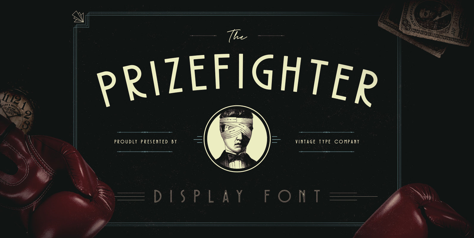
Prizefighter Font
Prizefighter Display Font is the newest display font from Vintage Type Company. This font is a clean, smooth, deco display font with 4 different styles that you can mix and match for a variety of uses. Prizefighter sports a condensed
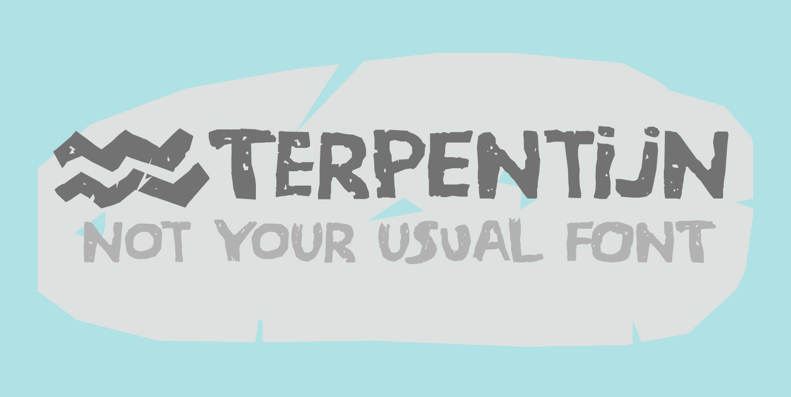
Terpentijn Font
Terpentijn is Dutch for Turpentine. If you say it out loud, it actually sounds quite similar!Here you thought you were just buying a font, but you get to learn some Dutch too! Terpentijn is a handmade typeface with a serious
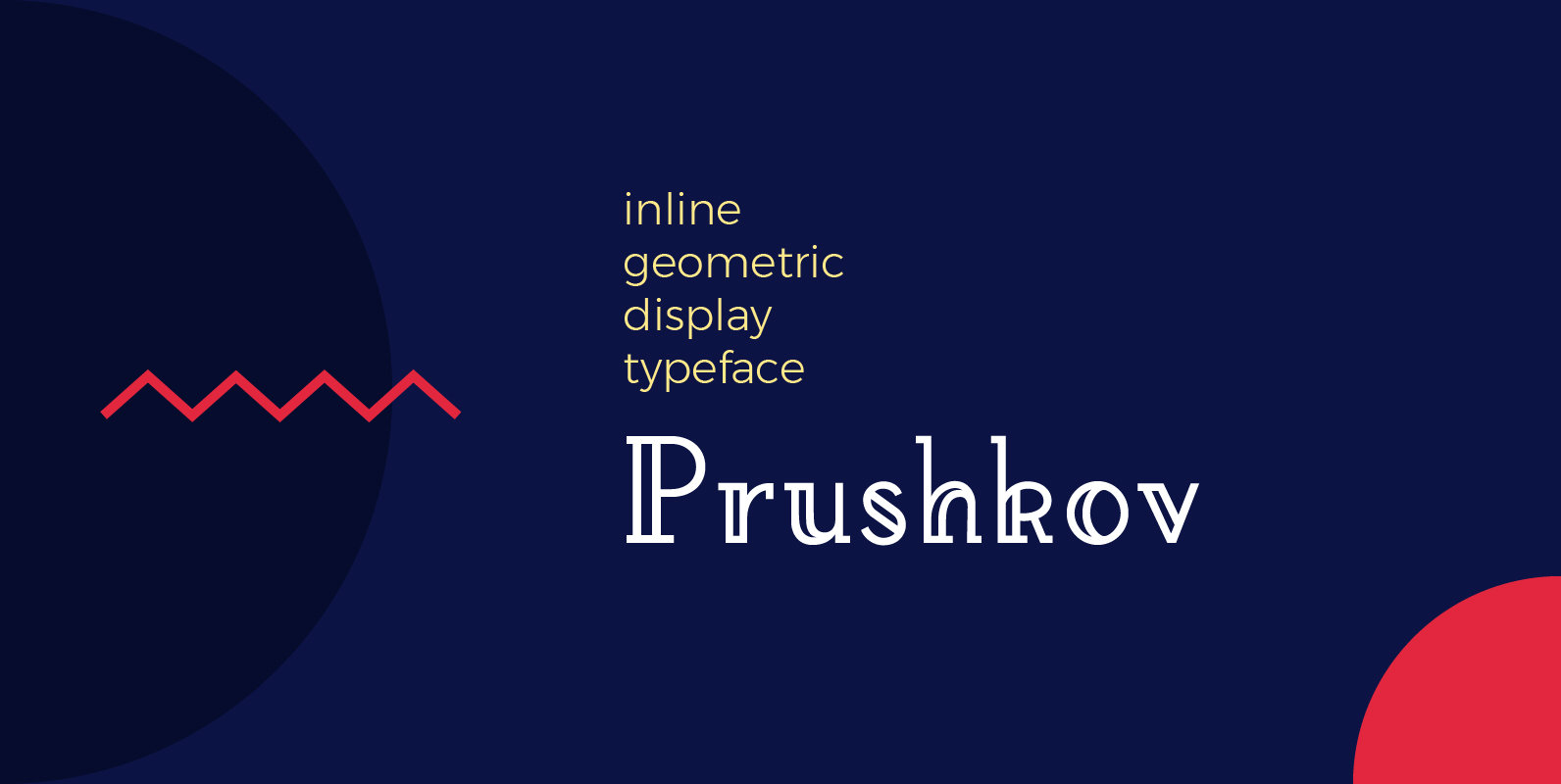
Prushkov Font
Prushkov is the first typeface that I have made. Its name comes from the town I currently live in. The design was inspired by both geometric typefaces like Futura, and didone type like Bodoni. Its aim (perhaps quite bold) is
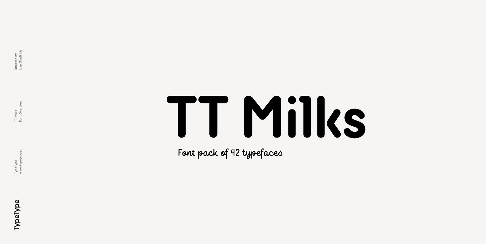
TT Milks Font
Initially the idea for TT Milks was to create a collection of typefaces to be used for packaging and branding of dairy products. We’ve started by creating a main sans-serif and a supporting script, worked on their compatibility, and created
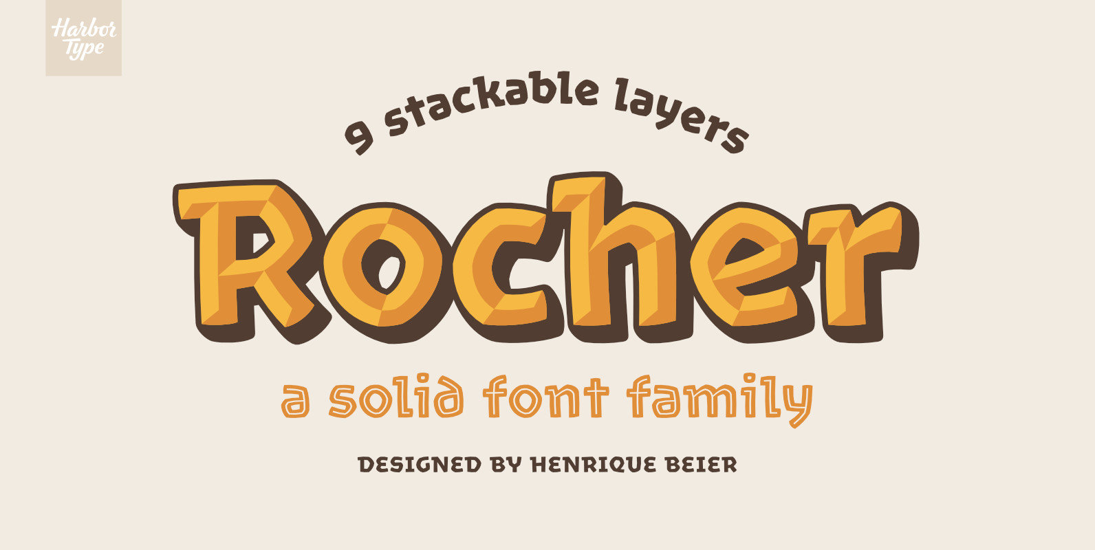
Rocher Font
Rocher was designed while looking for an answer to a simple question: what would a typeface look like if it was made of stone? It certainly would look solid, but did we have to add cracks and rubble so it would
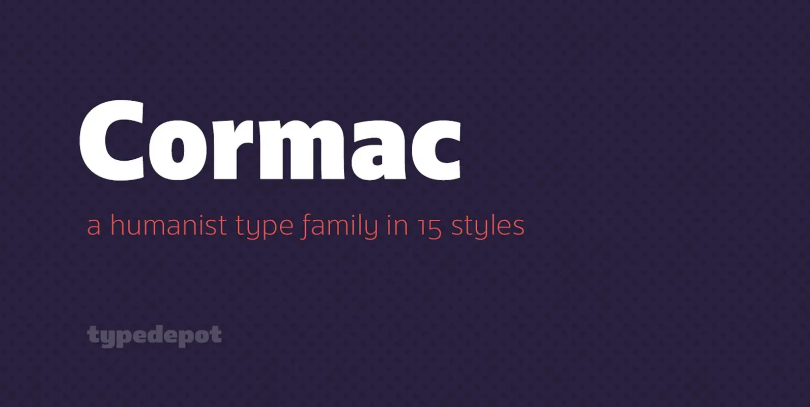
Cormac Font
Cormac is a humanist typeface characterized with it’s large x-height and slightly flared stems. The word that best describes our ideas in the beginning of the project is “simple” – the idea behind it was to strip the letter forms
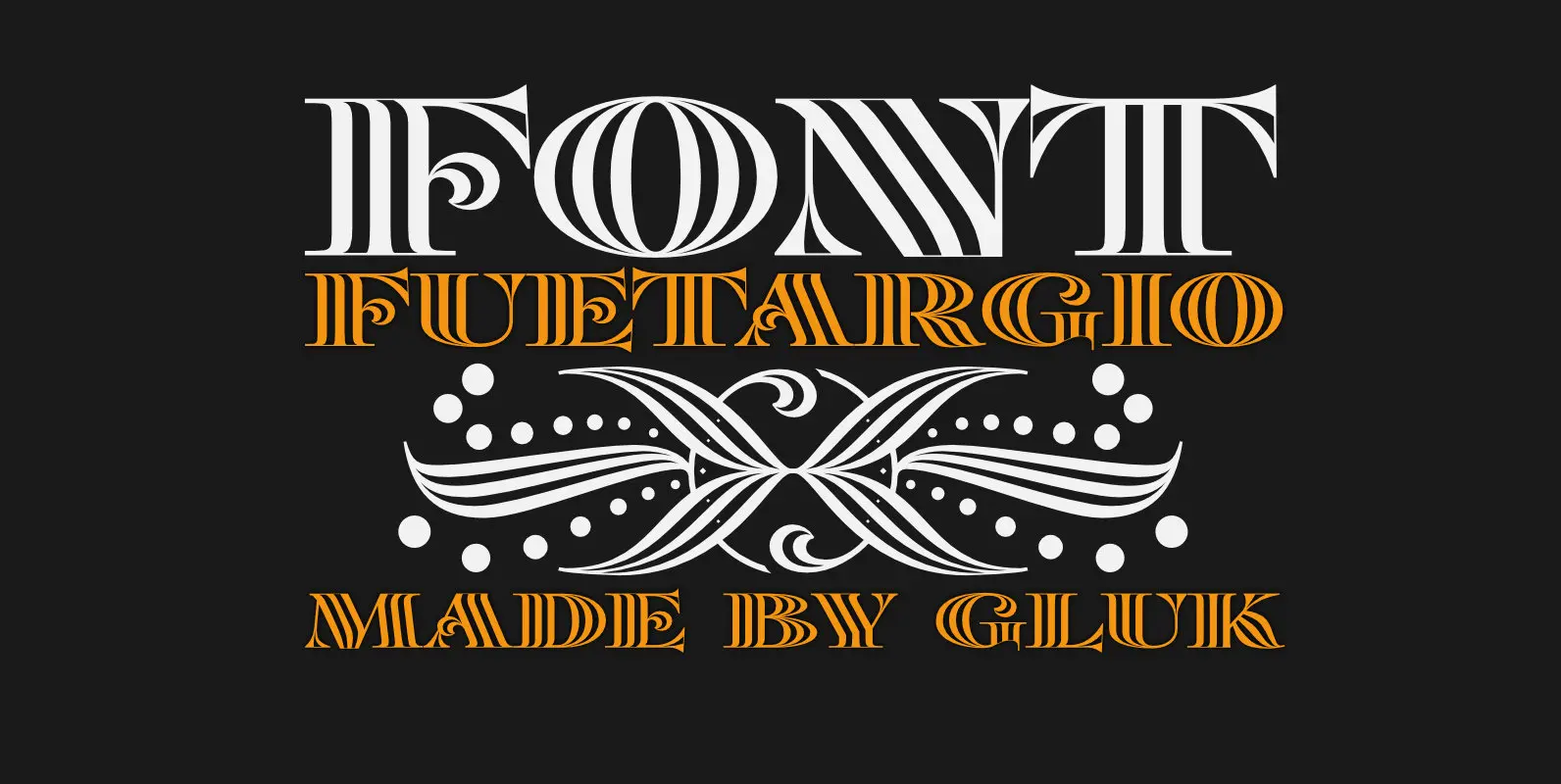
Fuetargio Font
Fuetargio is an elegant and decorative font design, published by Grzegorz Luksza. Published by Grzegorz LukszaDownload Fuetargio
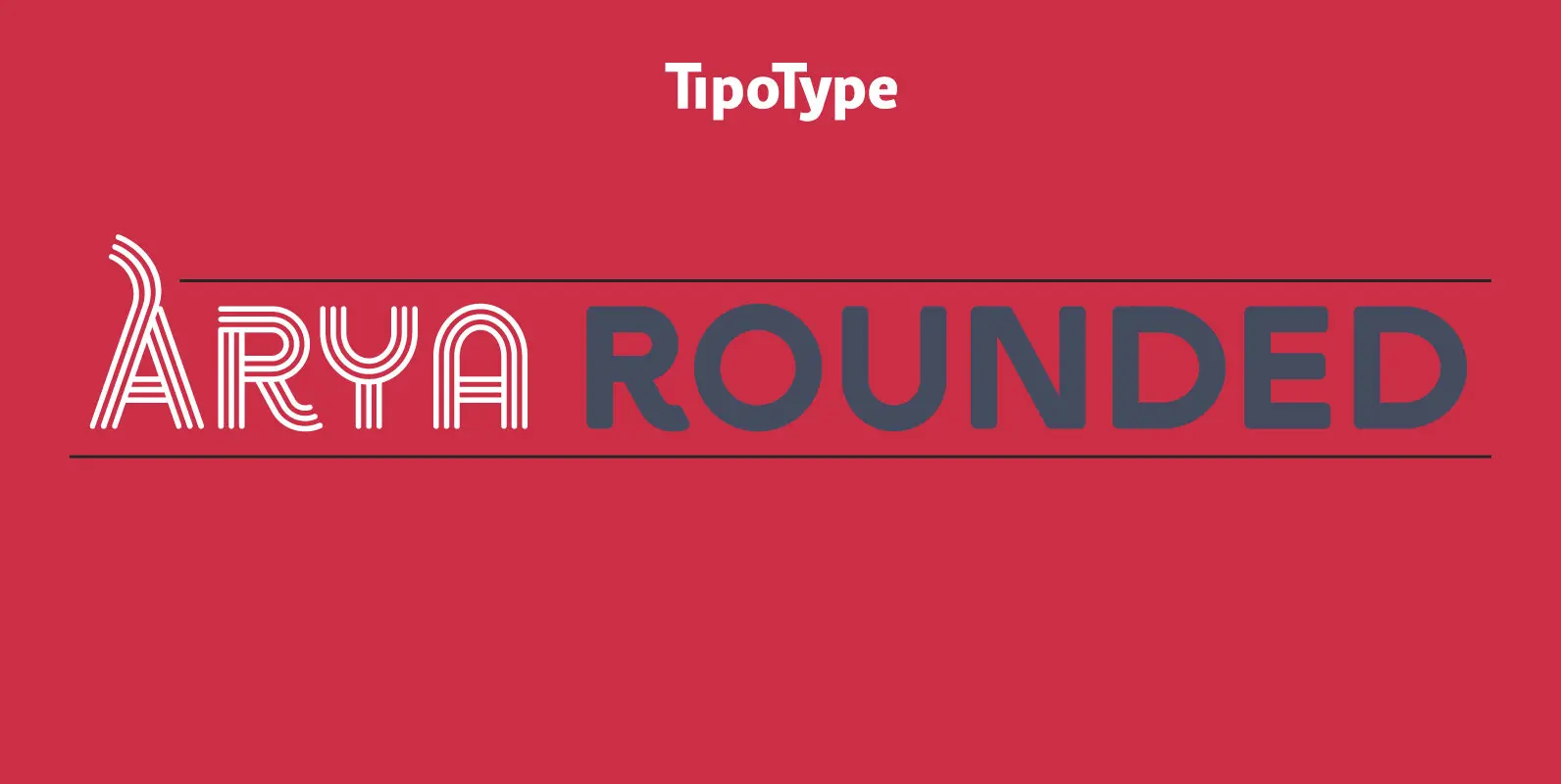
Arya Rounded Font
Arya Rounded is a display typeface, based on Roman proportions. It has three versions, differentiated by the amount of the drawn lines. Single is solid. Double is sturdy but light. Triple is versatile and includes alternatives. They can be combined