Tag: Identity

Naiad Font

A neoclassical fancy, questioning the convention that decoration is a superficial veneer of style. Here, ornament and function are combined in flourishes integral to the structure of (almost) every glyph. Much Victorian display type had a similar goal, to move

Gambado Font

‘Bounced’ is the traditional term for a higgledy-piggledy style of lettering in which characters are shaken up by a combination of rotation and vertical displacement from the presumed norm of upright stance on a baseline. Now, by utilizing pseudo-random contextuality

Worldwide Font

Proven in scores of magazines and newspapers around the globe since 1999, Worldwide is a semi-condensed, large x-height Century revival designed to elegantly fit large amounts of text into compact spaces while retaining maximum readability and apparent size. Its Regular

Pratt Nova Font

Shaped by constraint to accommodate a large character count, Pratt Nova has massive form: semi-condensed, large x-height, short descenders and capitals. And yet it transcends its restrictive origins in abundance, expressing a spirit of visual and semantic opulence, equipping the

Goodchild Font

Goodchild Pro is a pragmatic text face, equipped for sophisticated academic typography. The face has a large x-height, as there is little point in adding to the stock of rangy “book” Jensons. Despite this departure from the archetype, in other

Parity Sans Font

There is a lot to choose from in this unicase megafamily, with roman and italic, six weights, text and display styles, and both proportional and monowidth versions! Published by ShinntypeDownload Parity Sans

Panoptica Font

Monowidth, unicase: the alphabet imprisoned in cell blocks. With current concern over surveillance and identity as backdrop, Shinn suggests that there are no exemptions, the universality of this proposition indicated by the diversity of genres to which the Panoptic effect

Morphica Font

This critique of the utilitarian is a perverse and disjunctive mash-up of thematic devices: sans mixed with serif, stroke contrast applied to techno armature, body parts displaced and elided. We are asked to admire the virtuosity that conjures the sweet

KT Nirma Font

KT Nirma Sans Nirma is a typeface with 9 Weight Sans Serif from thin to Black, inspired by Founders Grotesk, This project start from April 2022 and start from the stretch until shaped the solid character to represent the Dynamic

Guthen Jaqueline Font

Guthen Jaqueline is a handwriting font design published by Allouse.Studio Published by Allouse.StudioDownload Guthen Jaqueline

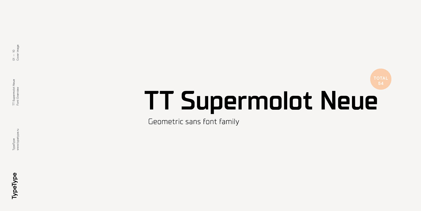
TT Supermolot Neue Font

TT Supermolot Neue 2.0 is the embodiment of elegant design, greater functionality and use versatility. TT Supermolot Neue 2.0 in numbers: • 4 Widths: Condensed, Regular, Expanded, Extended • 73 styles: 36 upright, 36 italics, 1 variable font • 749