Tag: German
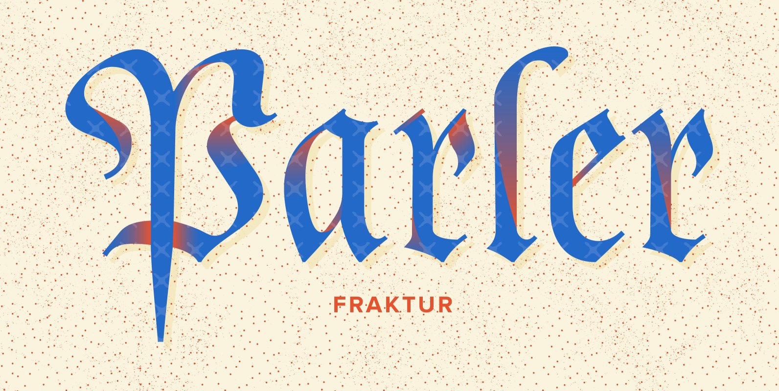
Parler Fraktur Font
Parler Gotisch has got a companion – Parler Fraktur. Friedrich Poppl’s beautiful and harmonious blackletter font was completely redrawn and redesigned for modern use. The font contains also a ‚long s‘ which can be reached either by the OpenType feature
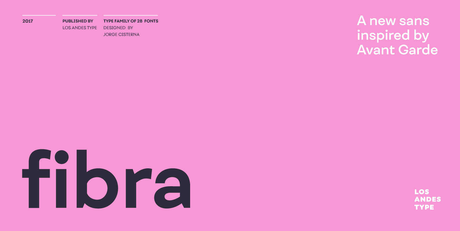
Fibra Font
The font is actually not a revival of ‘Avant Garde’—by Herb Lubalin—but it takes its spirit. Fibra is a geometric sans serif, yet without the typical structural strictness of these kind of fonts, that represents experimental type design. This can

Tablica Font
Inspired by Typoart’s Minima, Tablica is a condensed sans serif font family, ideal for news-papers, magazines, advertisements and on the web. Even in small sizes the fonts maintain their high legibility. Since all numerals are monospaced, the fonts are perfect

Hoyer Script Font
Hoyer Script is a fresh redesign of Hans Hoyer’s Schoenschrift, a slender vintage italic with a calligraphic touch. This font should be used like my blackletter fonts. Published by RMU TypedesignDownload Hoyer Script
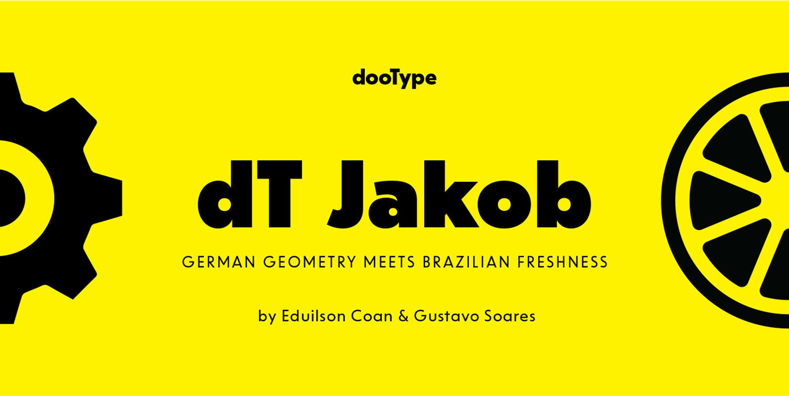
dT Jakob Font
dT Jakob started as a revival by Gustavo Soares for Paul van der Laan’s class at the Type and Media Masters, in The Hague, NL – back in 2007. There are quite a few excellent geometric sans typefaces available, but
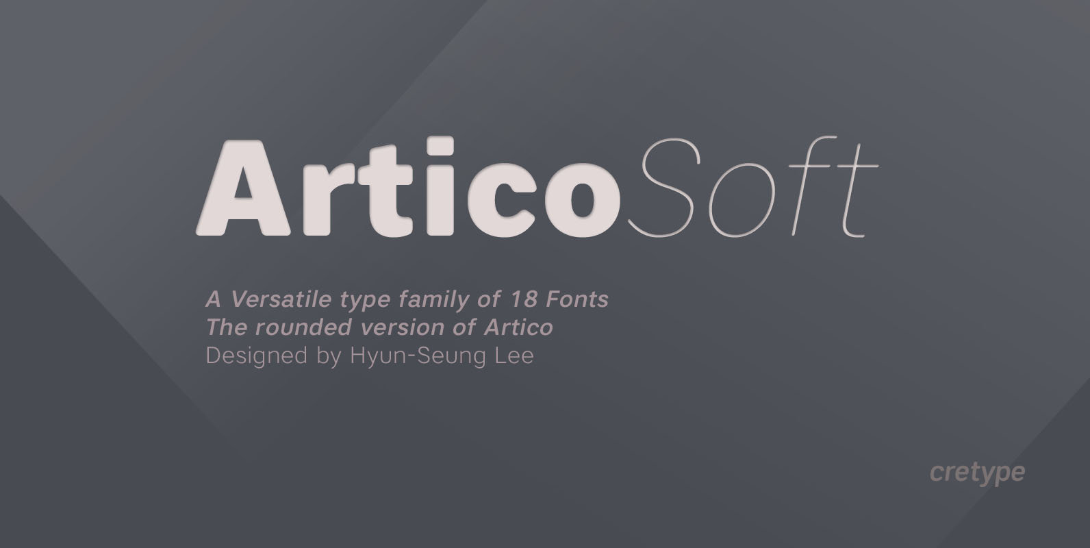
Artico Soft Font
Artico Soft is the rounded version of Artico. Artico Soft Family is a modern sans-serif typeface that is clean, simple and highly readable. Letters in this type family are designed with genuine neo-grotesque and neutral shapes without any decorative distractions.
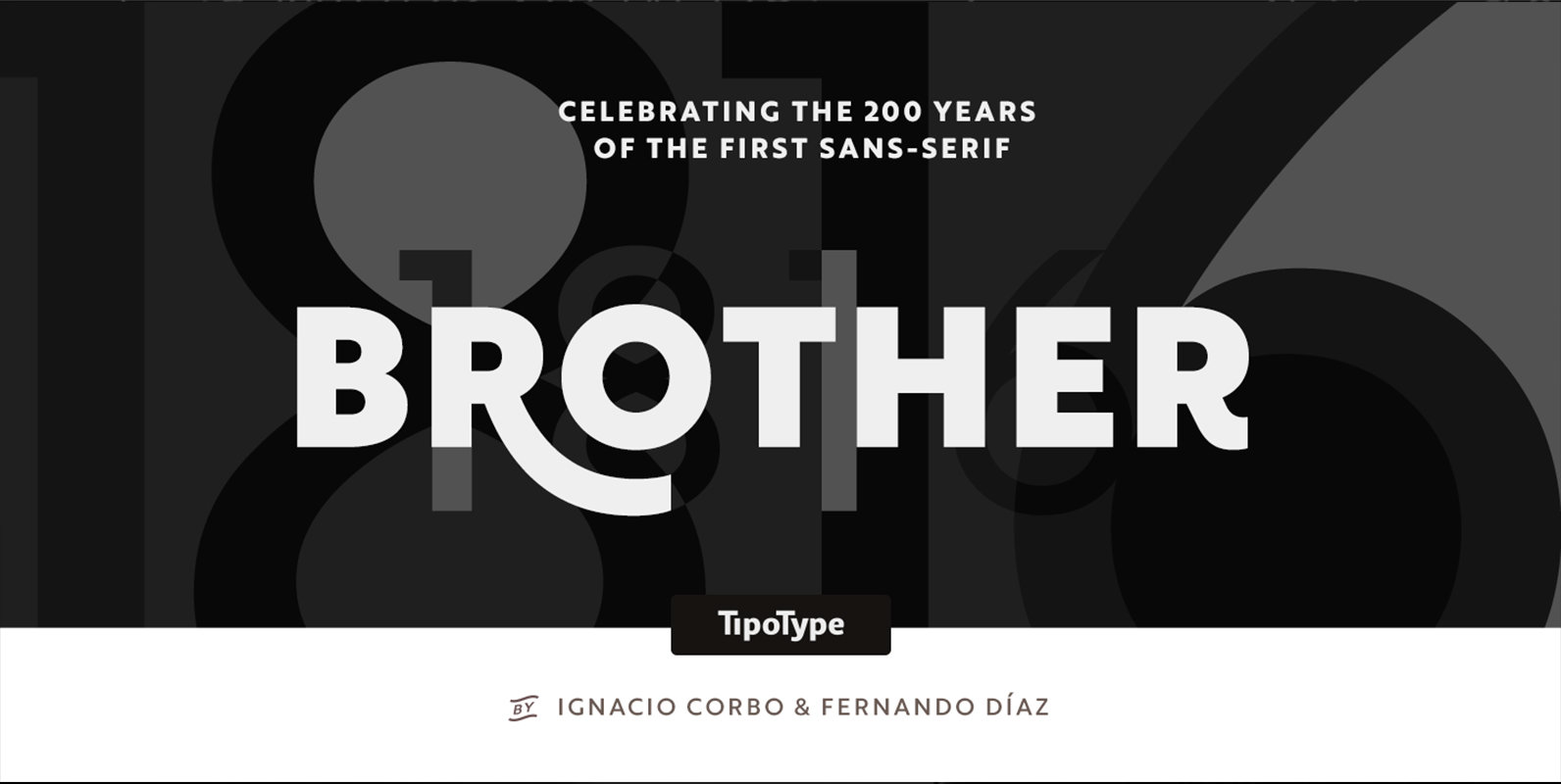
Brother 1816 Font
This year we commemorate the 200th anniversary of the first sans-serif typeface. and what better way to celebrate, than to design our own sans-serif! Brother 1816 is a very flexible, multifaceted and solid typeface, mixing Geometric shapes with Humanistic strokes
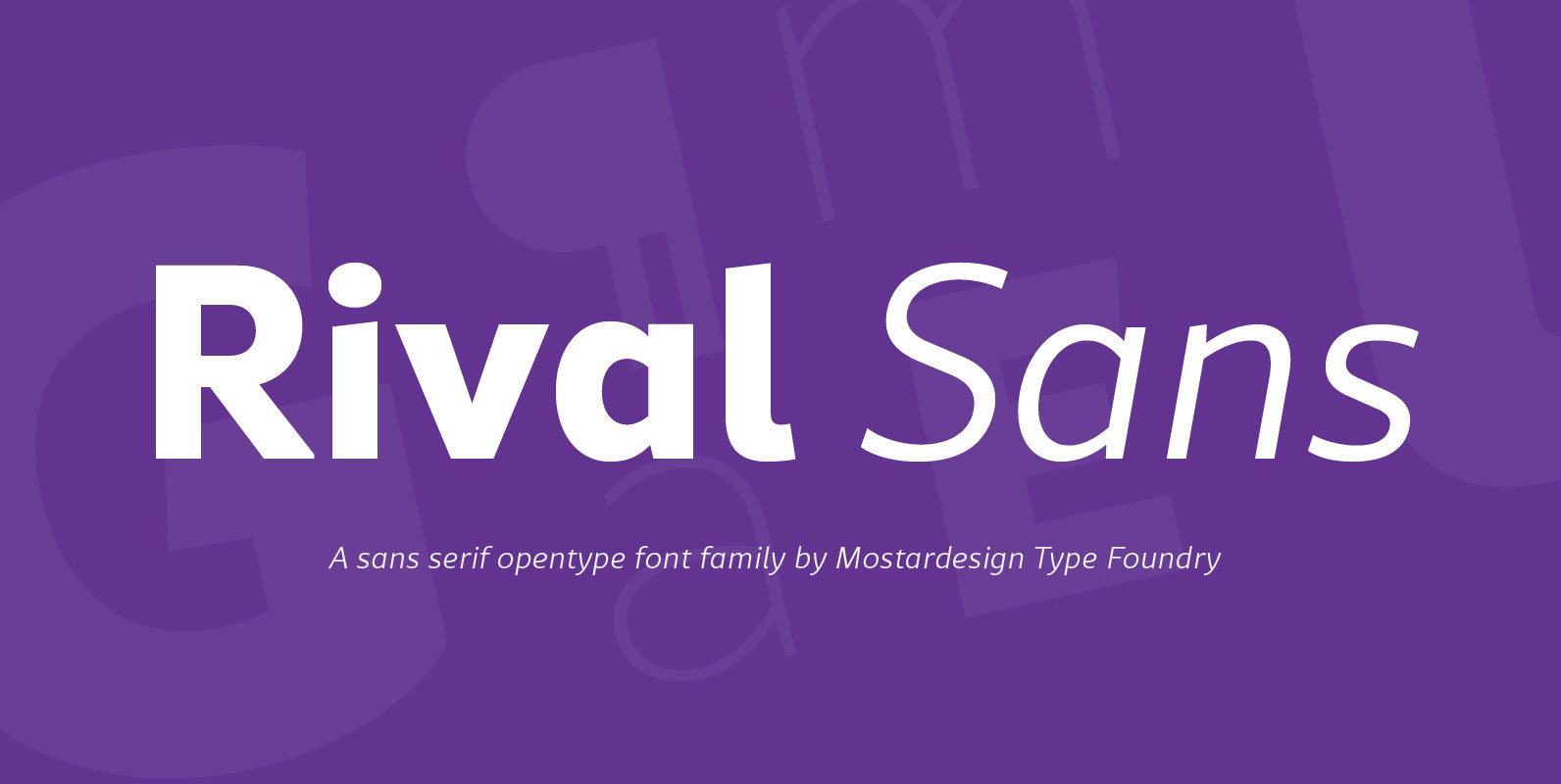
Rival Sans Font
Rival sans is clean sans serif font family and it characterized by excellent readability and its contemporary aspect. It provides advanced typographical support with features such as case sensitive forms, small caps, ligatures, alternate characters, fractions, slashed zero, circled figures,
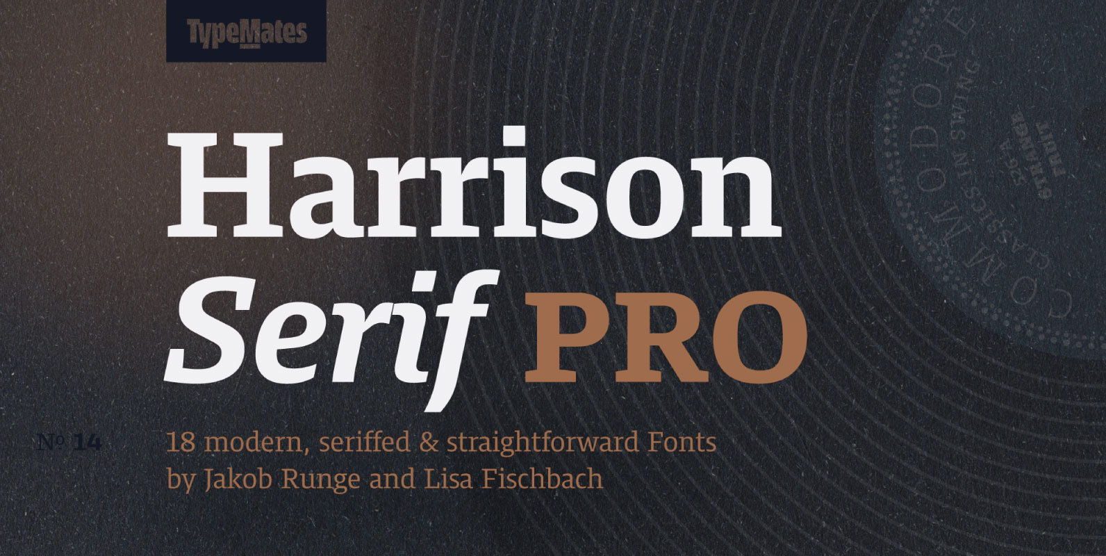
Harrison Serif Pro Font
Harrison Serif Pro is a sturdy yet contrasted slab serif that combines a rational and efficient approach with a warm voice. A typeface of nuances, the slightly carved and occasionally extended serifs evoke the friendly side of Harrison Serif and
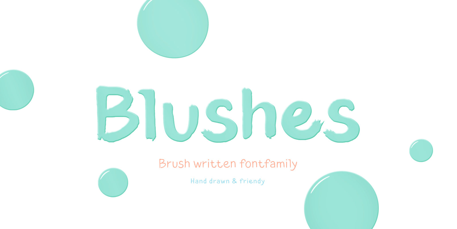
Blushes Font
Glitter, flashing cameras and fame – now you know how to deal with this stuff! Freshness and brightness is what defines the Blushes font family, which is created for beauty and fashion industries. Blushes is a vibrant part of you
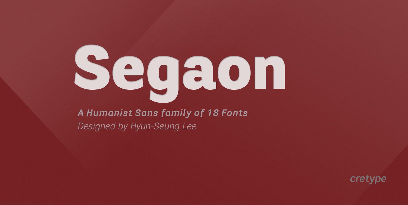
Segaon Font
Segaon Family is a humanist sans-serif typeface that is clean, simple and highly readable. The spaces between individual letter forms are precisely adjusted to create the perfect typesetting. Segaon is versatile type family of 18 fonts. Segaon family consists of
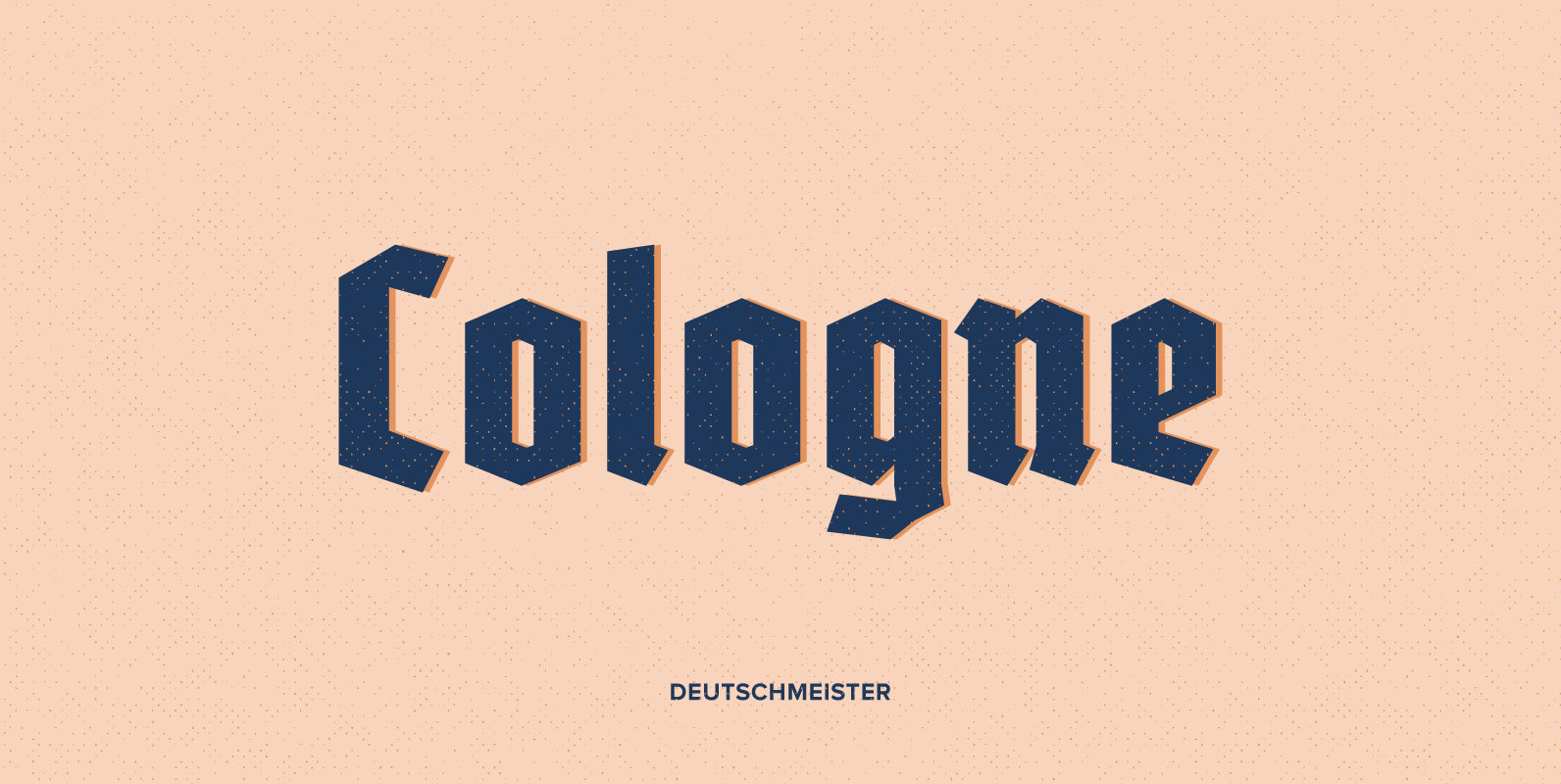
Deutschmeister Font
This crisp and constructed Ludwig Wagner, Leipzig, blackletter font in textura style had been originally designed by Berthold Wolpe. Freshly redrawn and redesigned, it adds now to the treasure trove of historic typefaces. This font contains a bunch of useful
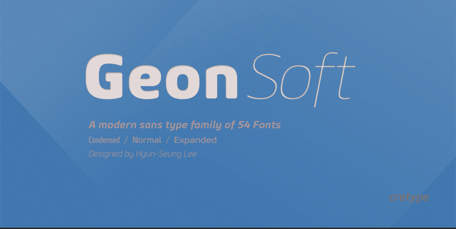
Geon Soft Font
Geon Soft is the rounded version of Geon. Geon Soft Family is a modern sans-serif typeface that is clean, simple, soft and highly readable. Letters in this type family are designed with geometric shapes without any decorative distractions. The spaces
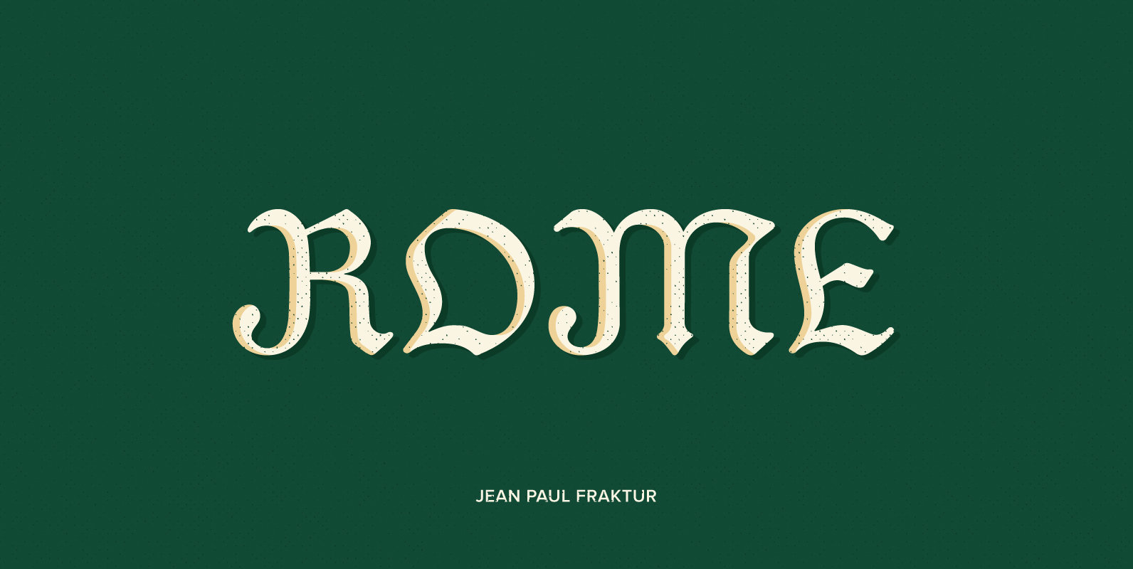
Jean Paul Fraktur Font
A typographic treasure, originated in the Biedermeier epoch at the beginning of the 19th century, had been brought back to life. With its charming touch it makes a wonderful font for reprints and historically relevant projects.This font contains a bunch
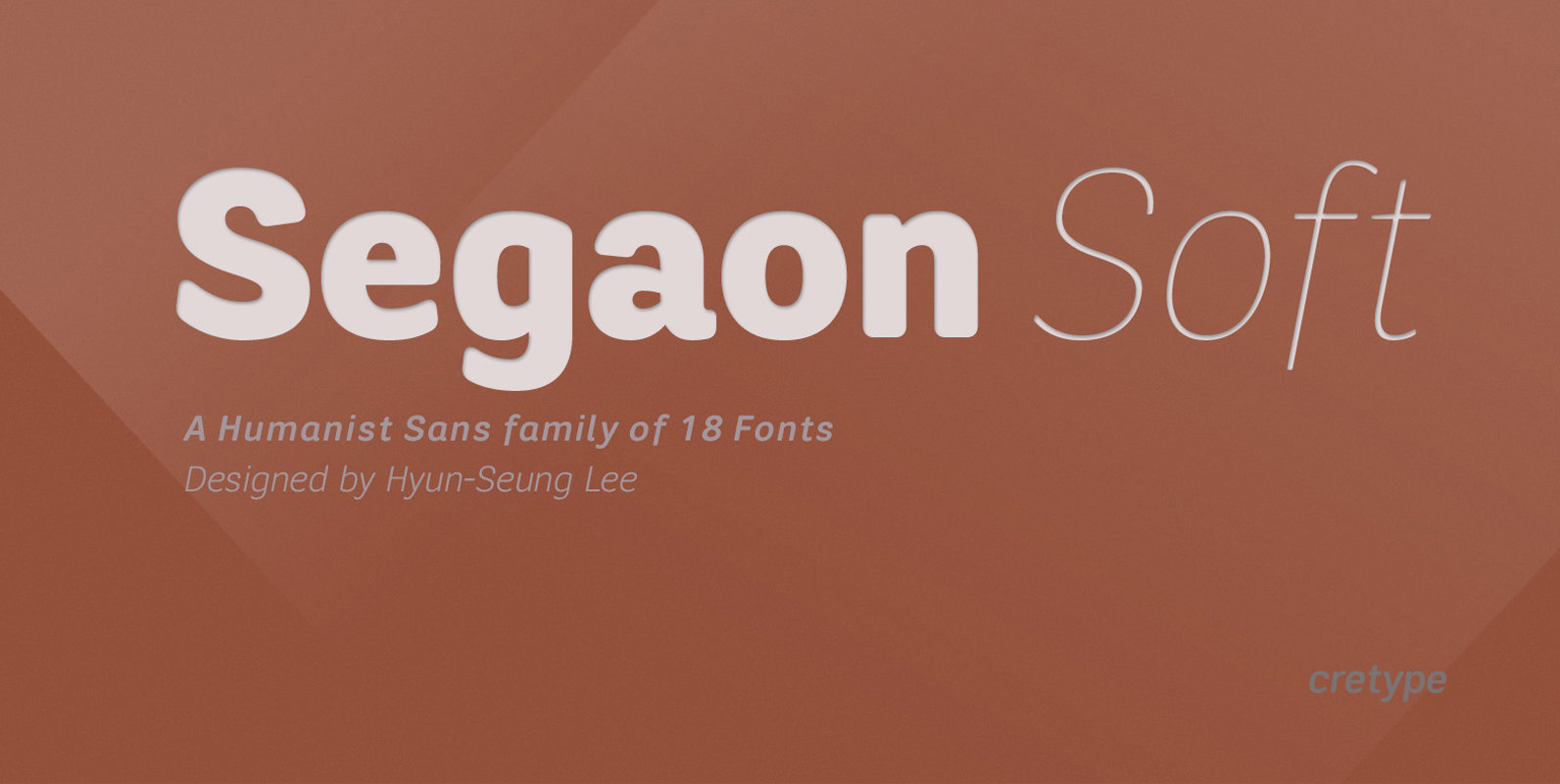
Segaon Soft Font
This family is the rounded version of Segaon family. Segaon Soft Family is a humanist sans-serif typeface that is clean, simple and highly readable. The spaces between individual letter forms are precisely adjusted to create the perfect typesetting. Segaon is
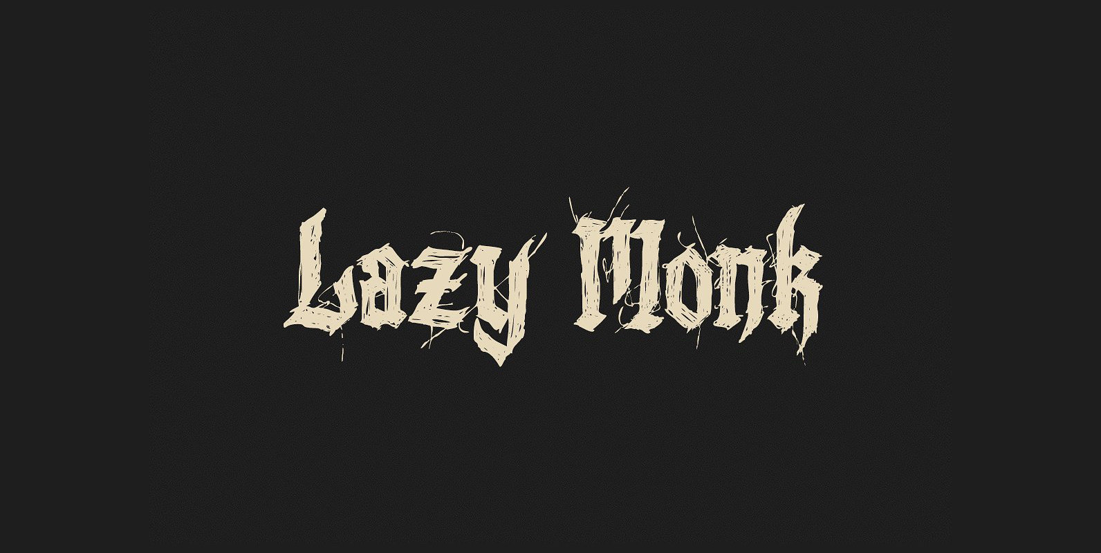
Lazy Monk Font
In the past it was the monk’s duty to duplicate the bible, as they wrote everything by hand. The “Lazy Monk” font shows how these replica could have appeared if the monks had been too drunk or too lazy to
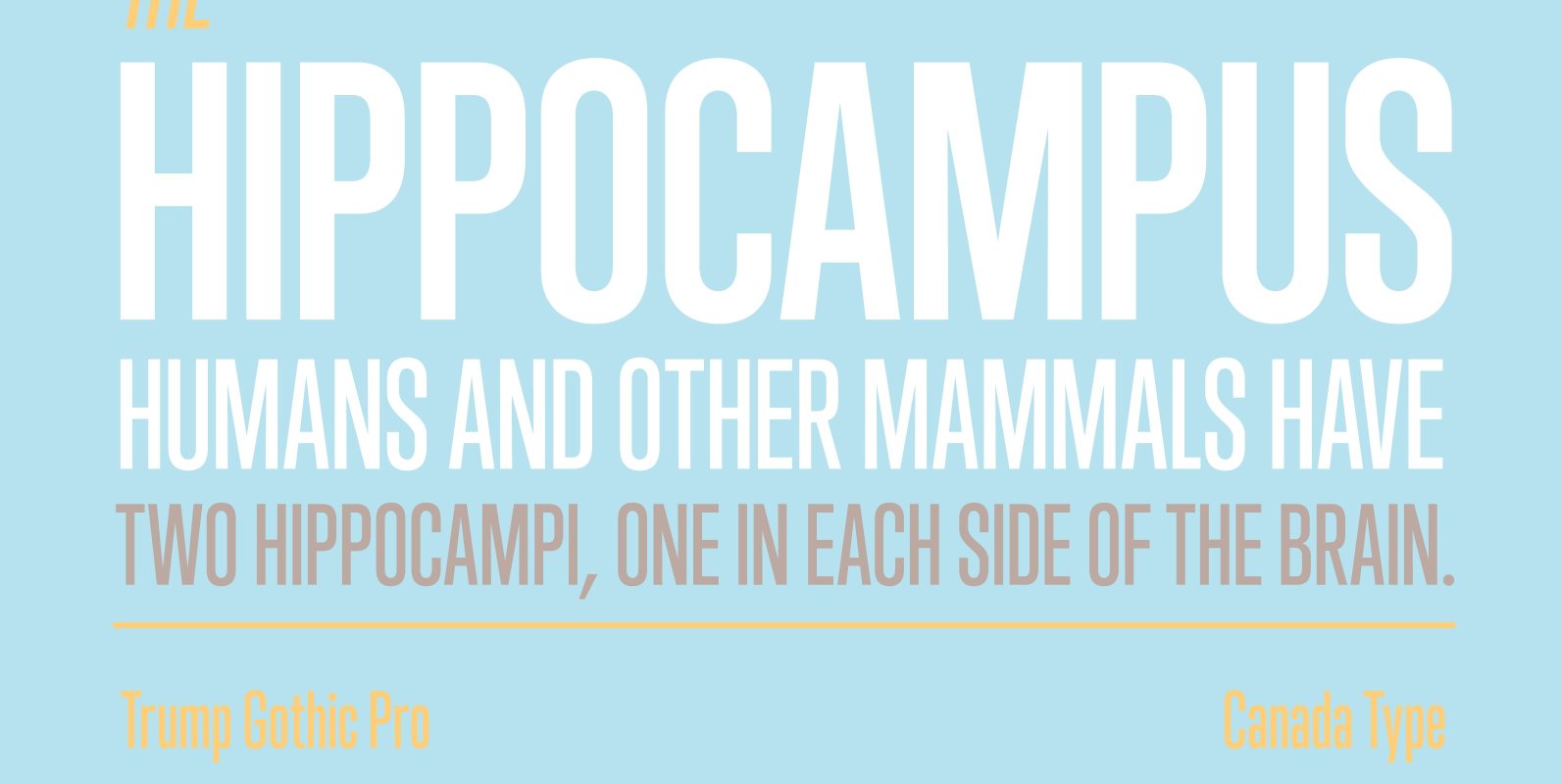
Trump Gothic Pro Font
Trump Gothic is a reconception of ideas from Georg Trump's seminal 1955 Signum typeface and its later reworking (Kamene) by Czech designer Stanislav Marso. Originally cobbled together for a variety of film projects in the late 1990s and early 2000s,
