Tag: fraktur
Black Edge Font
Black Edge is a strongly stylized blackletter font, inspired by modern and minimalistic typography. It is particularly suitable for headlines, logos, packaging and t-shirts. This font-family also contains several ornamental elements, which are provided without charge when you acquire the
Emilia Gotisch Font
Weiss’ gothic-style blackletter font completely redrawn and redesigned for present-day use. This font contains a bunch of useful ligatures, and by typing ‘N’, ‘r’ and period plus activating the discretionary ligatures you get an oldstyle numbersign. As usual in my
Monkeytails Font
I don’t know what other type designers call those long swirling embellishment, but I call them “Monkey tails”. So when I decided on this version of my good old “Royal Bavarian”, I decided to call the new font Monkeytails. I
Flipflop Font
This font makes the impression to be a blackletter font (Fraktur) but it really only is little squares and triangles stuck together in a flip or flop way to form the glyphs. Only a few times did I have to
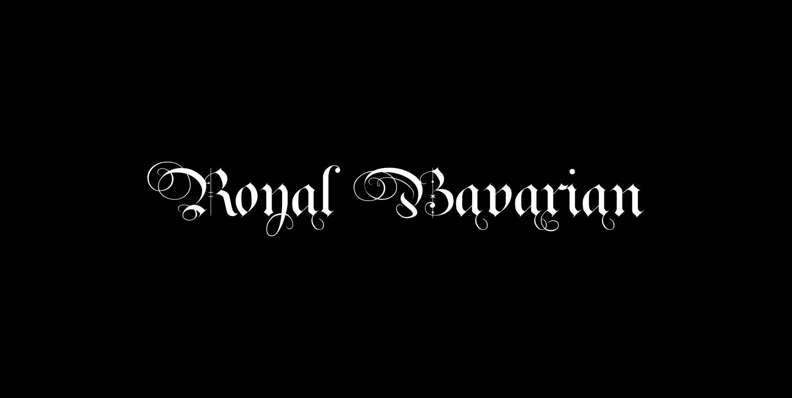
Royal Bavarian Font
“Royal Bavarian” was commissioned by King Ludwig 1st of Bavaria round about 1834. He was probably the greatest king Bavaria ever had, but he fell in disgrace for a short affair with the famous infamous “Lola Montez” and subsequently had
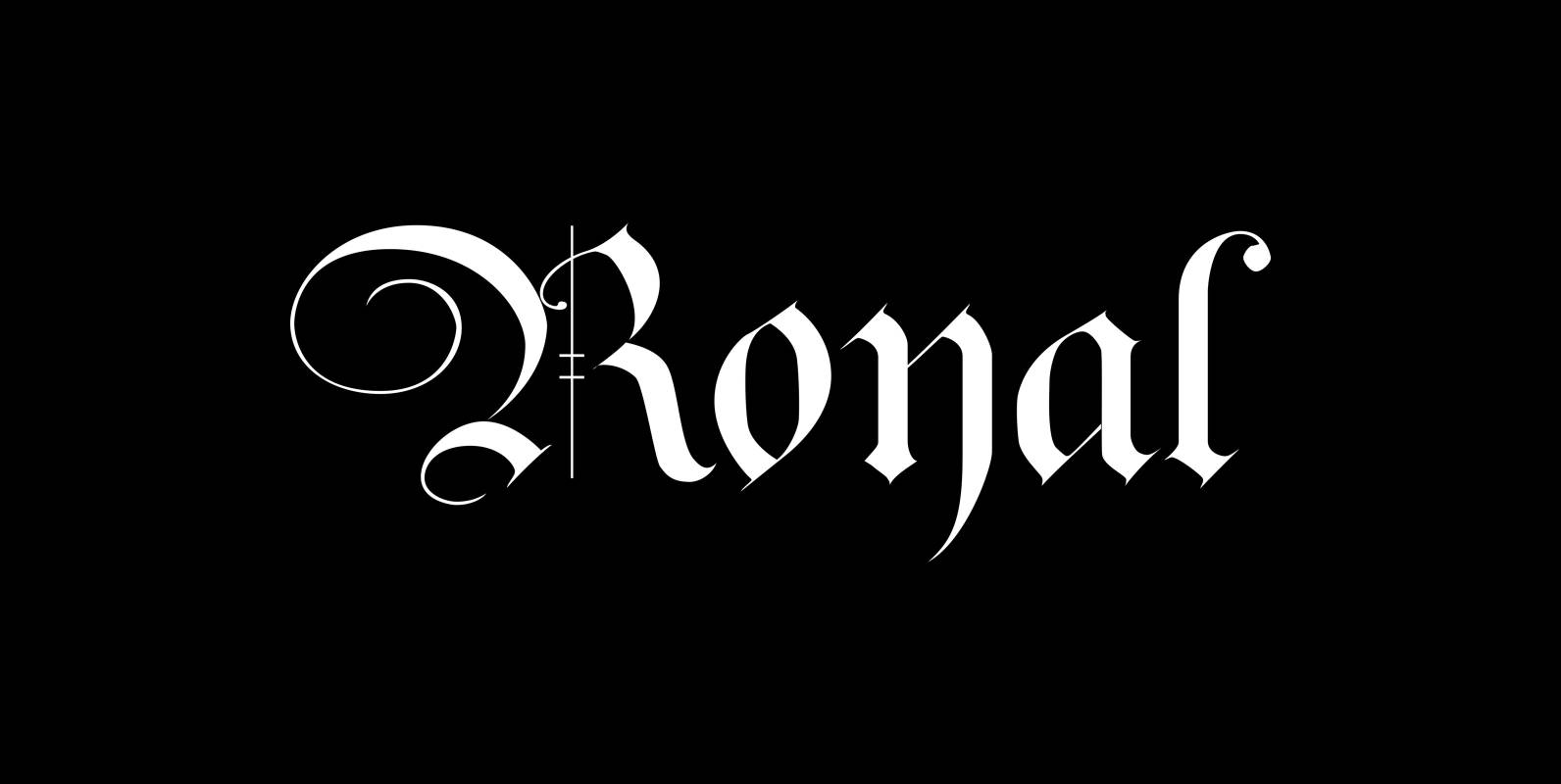
Royal Font
The “Royal Fonts” value pack contains the famous blackletter “Royal Bavarian”, “Ayres Royal”, “Royal Blossom” and “Monkey Initials”. Plus “Romain Royal” in two cuts, this used to be the text face once designed exclusively for the king of France, the
Blackletter Fonts Can Add Powerful Meaning to Your Project Font
Down go the house lights, and with an explosion of fire, the brutal assault of YWFT Fraktur washes over the congregation at sonic pressure levels that rattle teeth and break glass. This is the power of the deadlest elegance this
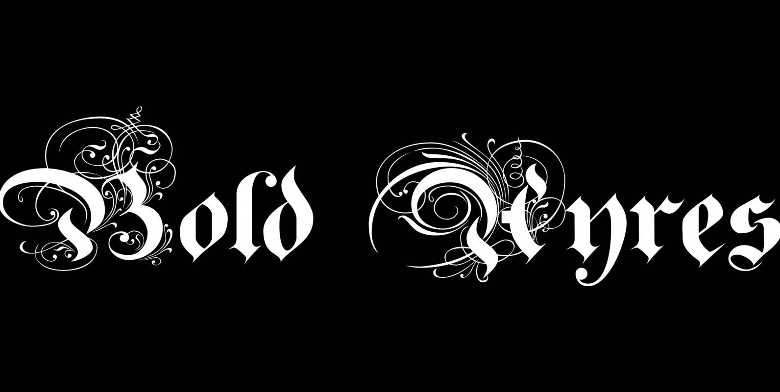
Bold Ayres Font
BoldAyres is the heavy version of my Ayres Royal that was inspired by famous calligrapher Ayres and a little bit by a Bavarian King. Published by Wiescher DesignDownload Bold Ayres
Coop Blackletter Font
Coop Blackletter’s core concept was to create a more friendly blackletter typeface by pulling together two very different sources of inspiration. The design is a synthesis of the rounded, affable features and heavier weight of Cooper Black with the underlying
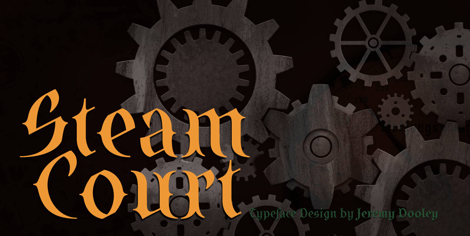
SteamCourt Font
A bit of background if you will: In early 2014, some friends from my college days banded together to form their own game company. Their first launch? A current Kickstarter they named SteamCourt. I love Kickstarter. It’s a fantastic platform,
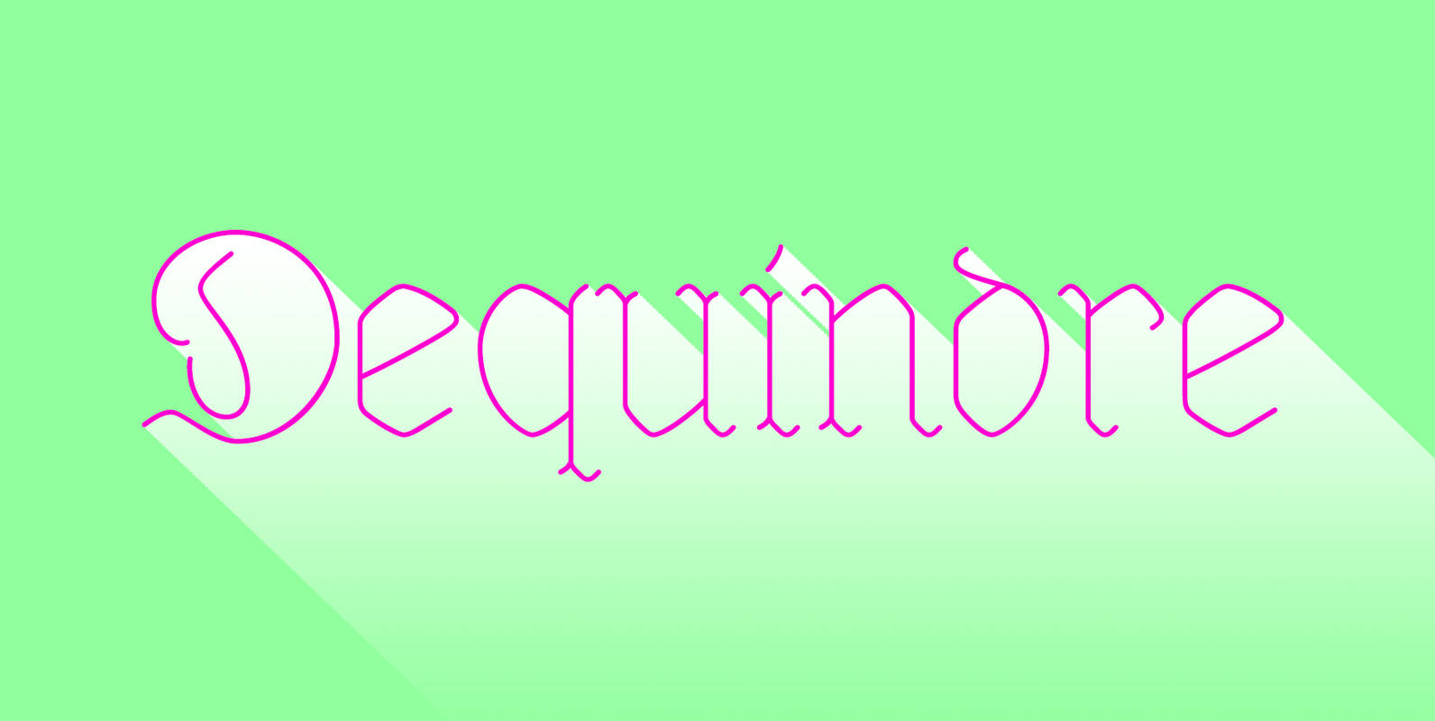
Dequindre Font
Dequindre is a monolinear blackletter typeface, and was drawn as if grade school handwriting practice sheets came in a blackletter variety. Dropping the thin/thick calligraphic contrast of traditional blackletter glyph construction and instead sticking to the bare skeleton of the
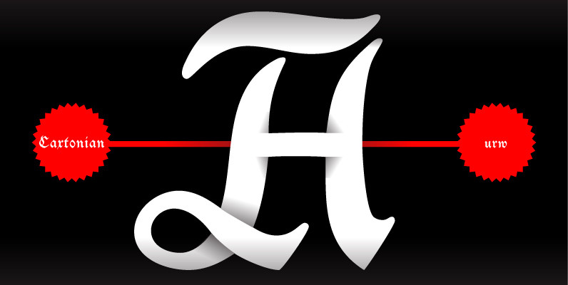
Caxtonian Black Font
Coen Hofmann has rediscovered Blackletter font design and enriches URW’s FontForum with two new and very beautiful fonts: Caxtonian Black and Holland Gothic. Caxtonian Black is a remarkable classical Fraktur inspriced inspired from the fonts used by the famous first
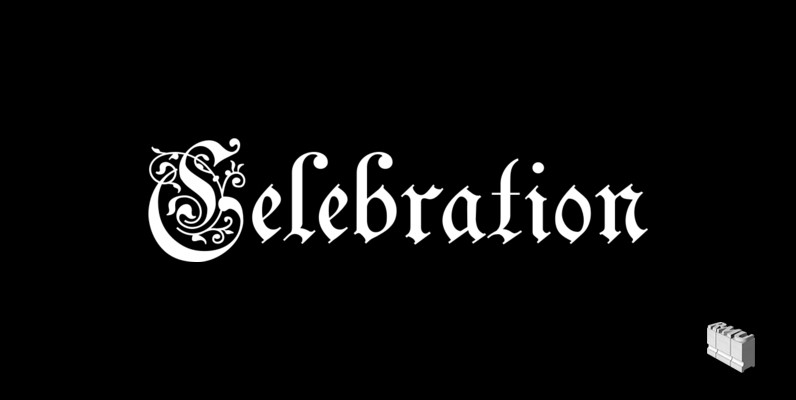
Celebration Font
A blackletter font of decorative style and of obscure origin which was rescued for all devotees of these old hot-metal letters. This font contains a bunch of useful ligatures, and by typing ‘N’, ‘r’ and period you get an old-style
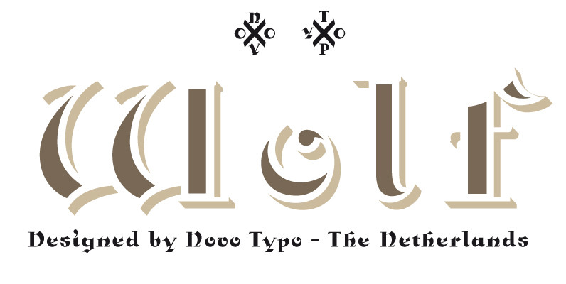
NT Wolf Font
Wolf is a package of four fonts. Wolf is perfect for multi-layered typography and the use of color in type. Wolf allows the user endless possibilities in color. Wolf is perfect for designing sophisticated logo’s, fashionable headings or other beautiful
Holland Gothic Font
Blackletter fonts are timelessly beautiful and still very popular. At some point, it seems that every type designer discovers the beauty of these forms and the great pleasure in creating blackletter characters. Like also Dutch designer Coen Hofmann who, after
Unger Fraktur Font
In the wake of the Enlightenment and the French Revolution there was a desire for a clear classical blackletter font without frills. That is why in 1793 the famous printer and editor Johann Friedrich Unger and his partner Johann Christian
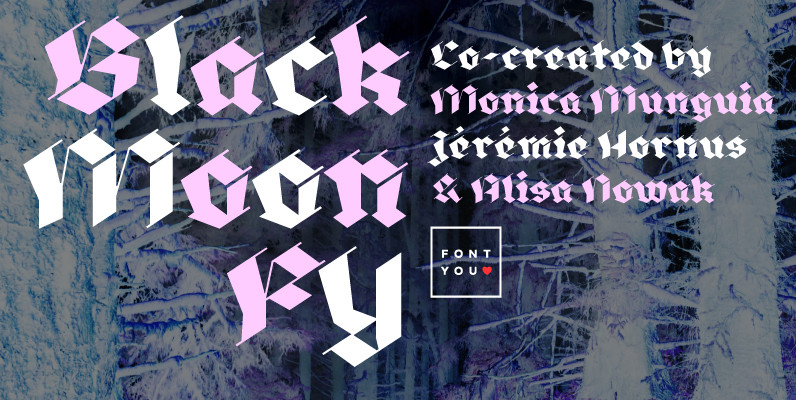
Black Moon FY Font
Blackmoon FY is a modern broken script which is made out with only straight strokes. A beautiful singularity are the very thin in-and-outstrokes accompagnying each letter. This very high contrasted font is less condensed than usual blackletter fonts and has
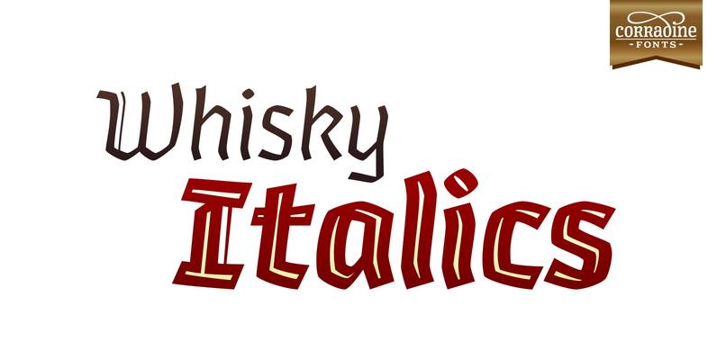
Whisky Italics Font
Whisky is a blackletter font family with a casual touch that makes it look friendly and current. The stroke varies its thickness and angle endings making it form very dynamic bodies of text. Whisky Italics are the corresponding versions to