Tag: expanded
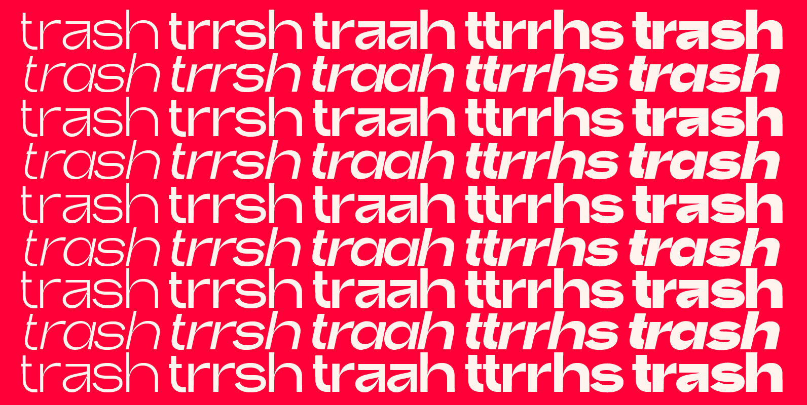
Trash Font
Trash is an experiment of typographic creation. I’ve tried to explore the limits of what is right and what is wrong in type design, to push the contrasts and the metrics to extreme values and try to have fun doing
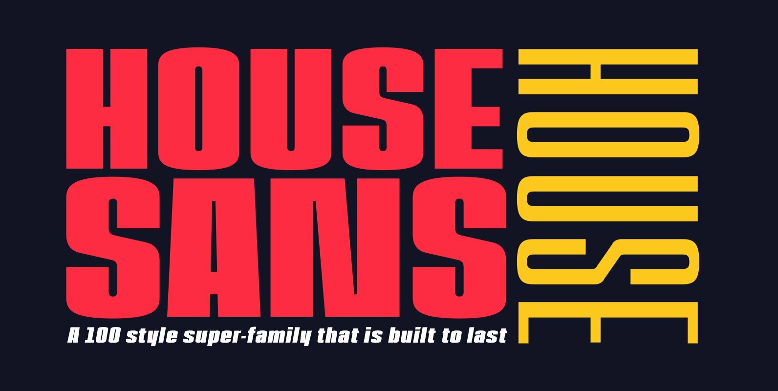
House Sans Font
House Sans is a 100 style super-family made up of 5 widths, 10 weights plus matching italics in two design approaches through stylistic alternates to the E, F, L and e characters. The weights range from compressed to expanded, from
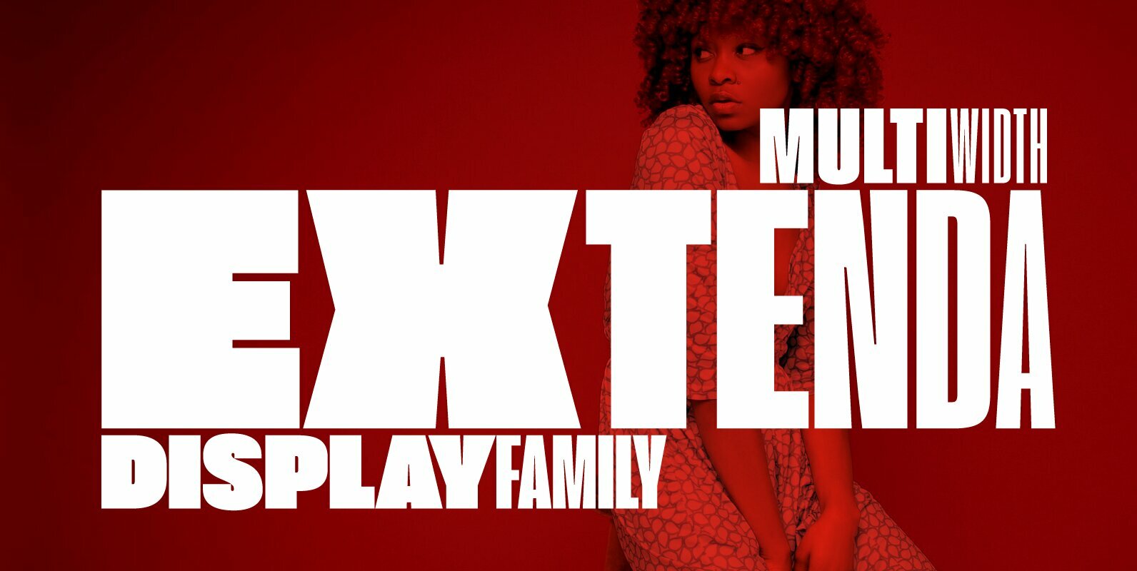
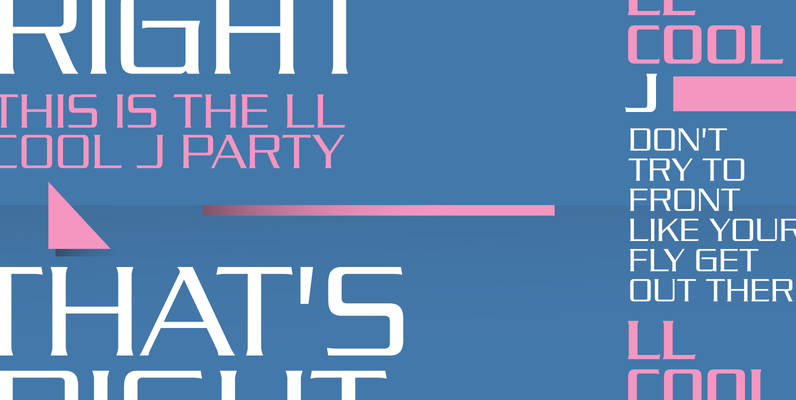
Extenda Font
Extenda is a variable width sans serif type family designed by Francesco Canovaro with Andrea Tartarelli and Cosimo Lorenzo Pancini.It been created to provide designers with a powerful but flexible tool to create strong headlines, logos, and display text with
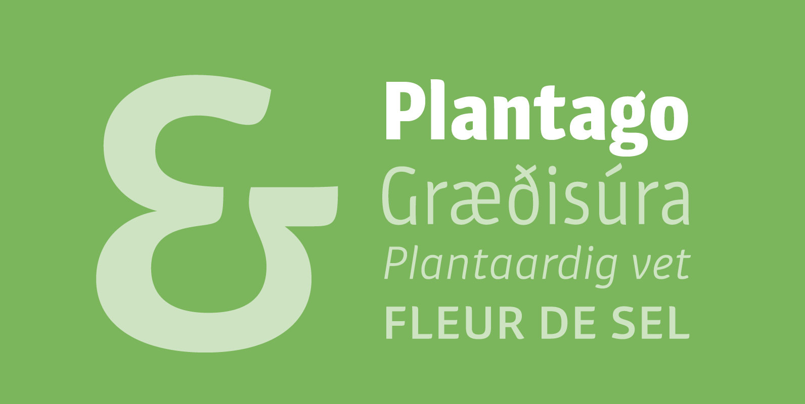
Plantago Font
Viktor Solt-Bittner drew logo sketches for an insurance company. Luckily for Schriftlabor, they rejected the design, and he turned the sketches into a font family. Years later, Plantago was expanded, developed and completed by Schriftlabor’s type directors Franziska Hubmann and
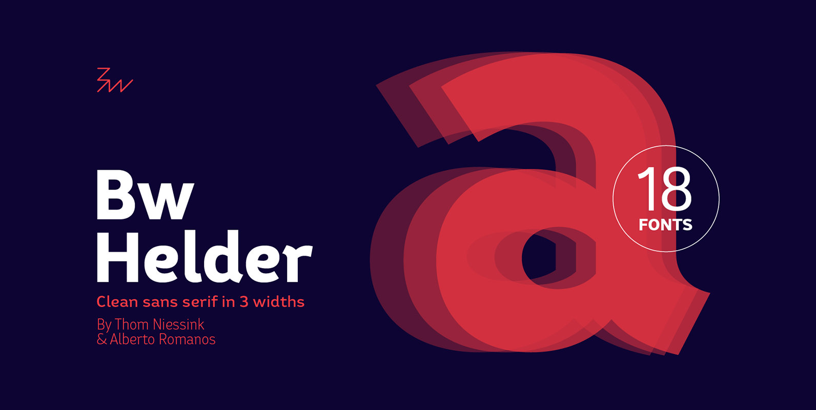
Bw Helder Font
Bw Helder is a clean and versatile sans serif combining gentle subtleties on its curves with remarkable spurs branching off its stems. It instills a friendly yet professional tone of voice, while maintaining the composure when used in longer paragraphs
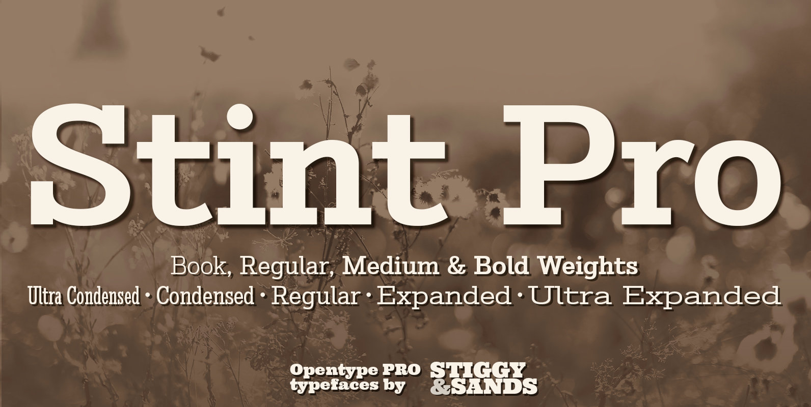
Stint Pro Font
Our Stint Family was originally influenced by extra wide letterform styles and developed later to create an ultra condensed range of fonts and the widths in-between. Highly legible throughout its width & weight ranges, the Stint Pro Family is both
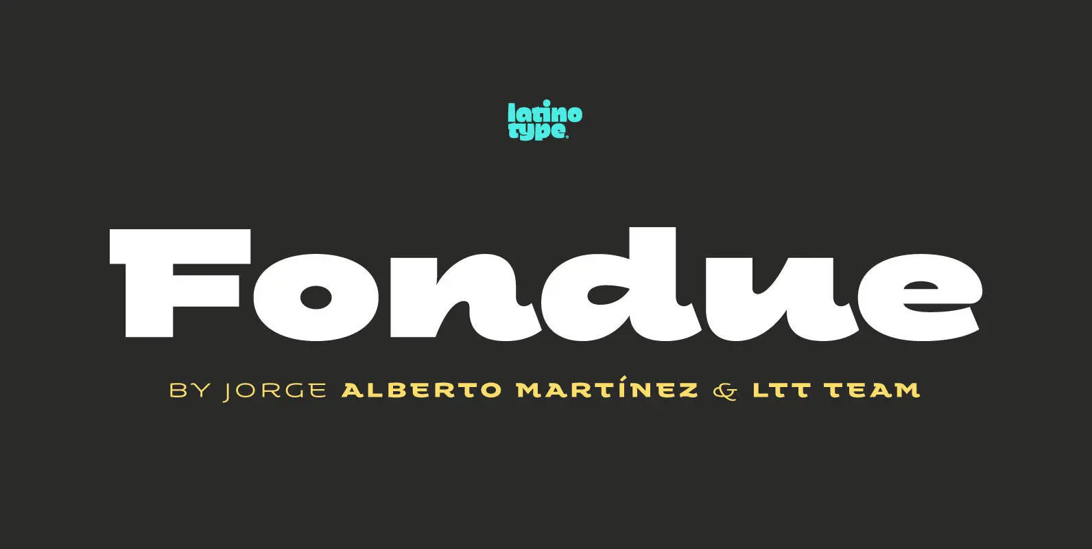
Fondue Font
Fondue: an eclectic-flavoured contemporary typeface. Designed by Jorge Alberto Martínez and Latinotype Team. Fondue is a type family of eclectic shapes, inspired by Art Deco designs, in particular, the lettering used by the Mexican cartoonist Ernesto “El Chango” Cabral on
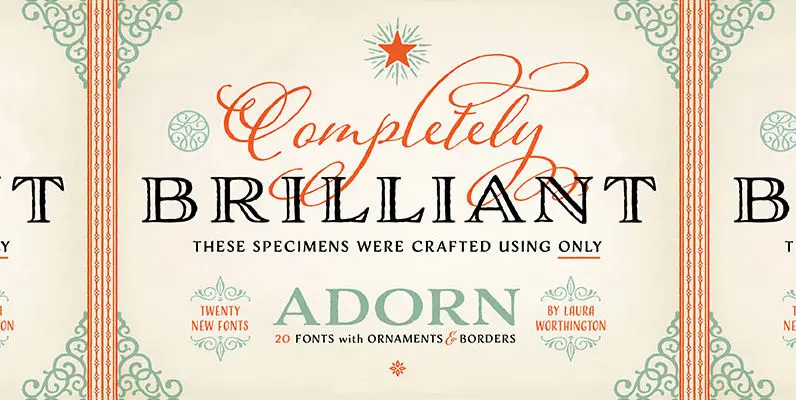
Adorn Collection Font
What can be more lovely than a wedding, an intimate invitation, a gift from the heart? One whose presentation uses the warm and welcoming family of typefaces, Adorn. With a modern and sometimes quirky twist on the staid, almost corporate
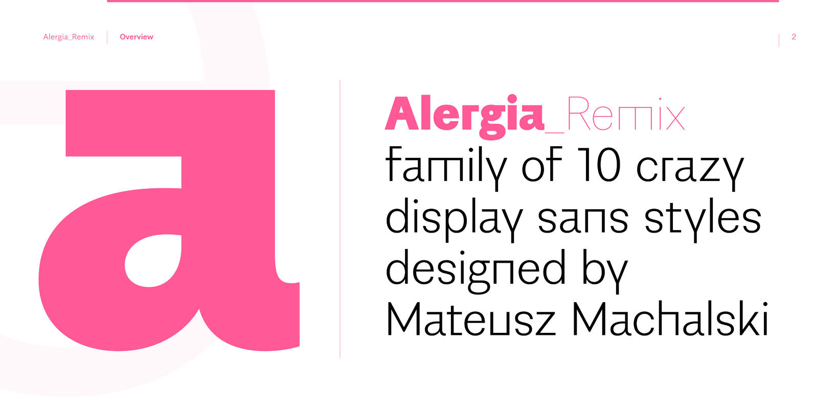
Alergia Remix Font
Alergia_Remix designed by Mateusz Machalski is younger sister of Alergia_Grotesk. Remixed styles was made as a hybrid between a linear antiqua and a geometric display typeface. Alergia_Remix is characterised by a lot of details, which gives it a strong character.
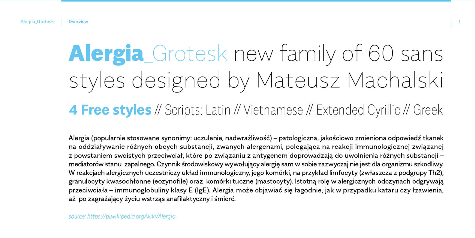
Alergia Grotesk Font
Alergia_Grotesk was made as a hybrid between a classical geometric grotesque and a linear antiqua. Typeface is characterised by a lot of details, which gives it a strong character. Unpredictable cuts in a letters “a” and “s”, or a double
Archie Font
Archie is a wide attention-grabber based on a simple geometric alphabet drawn in the early 1930s by Dutch calligrapher and lettering artist Martin Meijer. This digital family expands considerably on the original letters, adding biform shapes, small caps, italics across
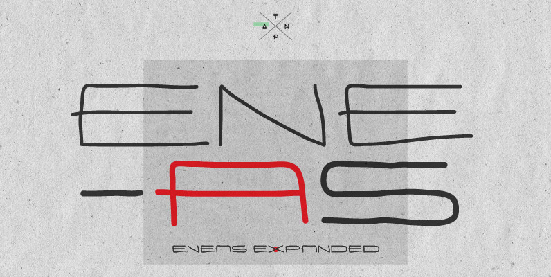
Eneas Expanded Font
Eneas Expanded is a decorative artistic poster handwritten font. It’s an sans serif, wide, rounded monoline font which will provide an informal, funny and fancy look to your work. It’s recommended for display usage for its glyph quality. Published by
BOXDON Titling Font
BOXDON is an extra heavy expanded typeface which was especially designed for VERTICAL layout. Each shape looks like a box and has minimum graphical treatment to distinguish each character. It means that the counter space is not enough to use
Dungeon Font
Designed by Steve Jackaman, Dungeon is a type design based loosely on a VGC design, Serpentine, circa 1970. Published by Red RoosterDownload Dungeon
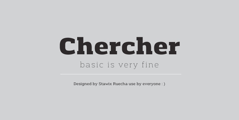
Chercher Font
Chercher Slab Serif was designed by Stawix Ruecha. The design is neat, basic and simple. Chercher has 16 styles with 8 weights and supports for general use. Published by STAWIXDownload Chercher