Tag: egyptian
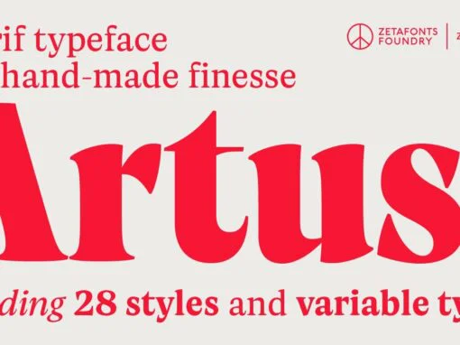
Artusi Font
Pellegrino Artusi was a celebrated Italian food writer, who is credited with the creation of one of the most influential cookbooks in the history of Italian cuisine. Taking inspiration from his legacy, Francesco Canovaro decided to work on a typographic

Rahere Slab Font
Part of the extended Rahere typeface family, Rahere Slab is a humanist slab serif (or Egyptian) in six weights from light to extra bold with corresponding italics. Rahere Slab – like its siblings Rahere Sans & Rahere Informal – features
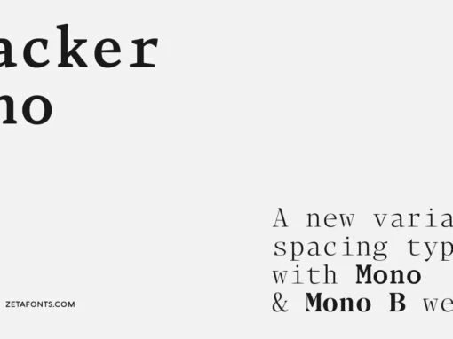
Blacker Mono Font
Blacker Mono was developed out of a brief by Isabella Ahmadzadeh, by Cosimo Lorenzo Pancini and Francesco Canovaro for the editorial project “A beautiful mistake” by OFFF Tlv in 2022. It is a monospaced version of our typeface Blacker, bringing
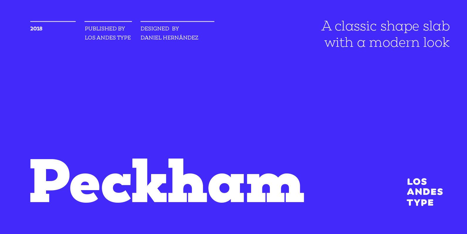
Peckham Font
Peckham, designed by Daniel Hernández, is a contemporary and versatile slab serif of 8 weights (and matching italics)—ranging from an elegant Thin to a heavy Black—with strong serifs that give it a playful look while preserving the overall geometric structure
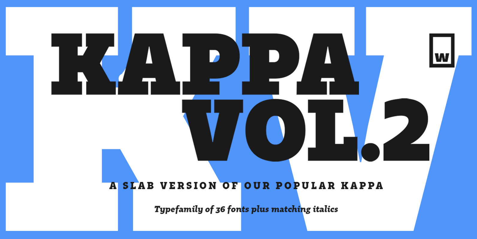
Kappa Vol.2 Font
Kappa Vol.2 is the serif version of our popular Kappa. Just as Kappa sans, this font has a slight narrowed structure and a prominent ascender height, therefore this font is suitable for a large range of platforms. Moreover, due to
Electrica Font
Electrica is a contemporary monospaced typeface family; a tribute to classic typewriters, while designed for today’s needs and media. In spite of taking inspirations from several typefaces used in typewriters (most notably the IBM Selectric), Electrica is far from a
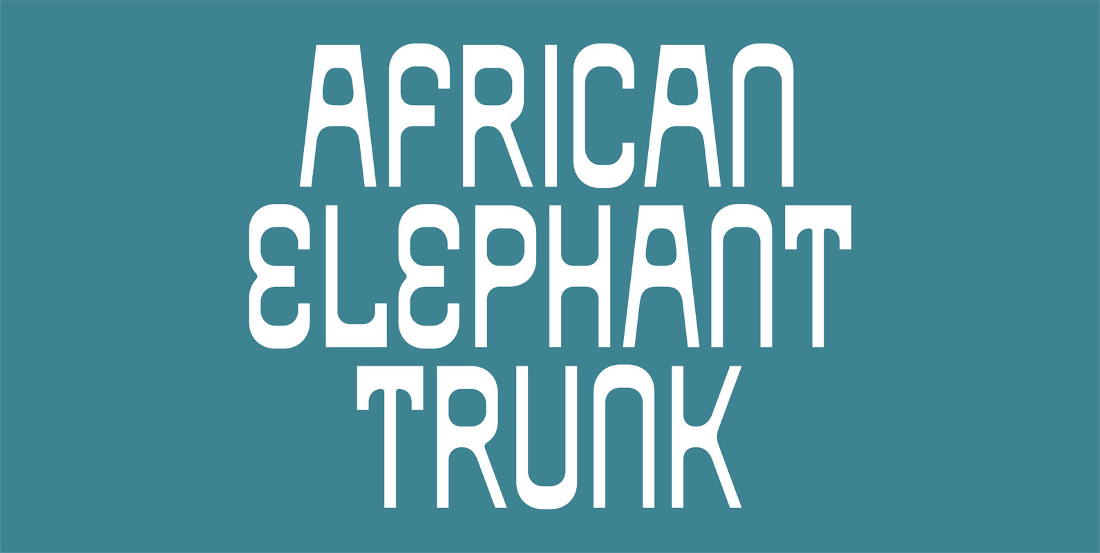
African Elephant Trunk Font
Based on retro vinyl records in the early and middle of 20th century. This font include small capital for advanced typography. Published by Dharma TypeDownload African Elephant Trunk
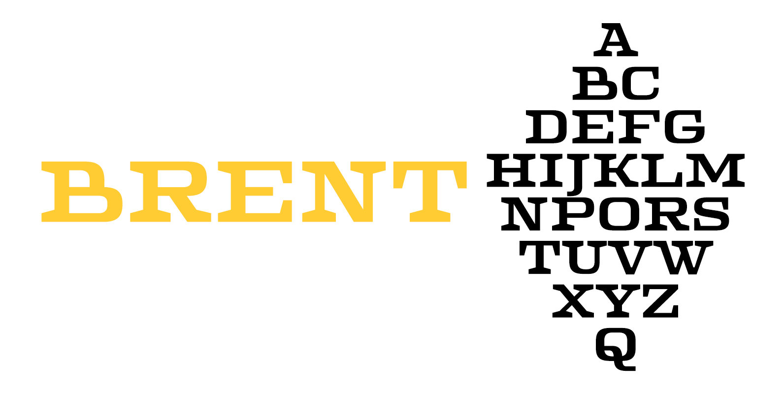
Brent 4F Font
Brent 4F is a serif font design published by Sergiy Tkachenko Published by Sergiy TkachenkoDownload Brent 4F
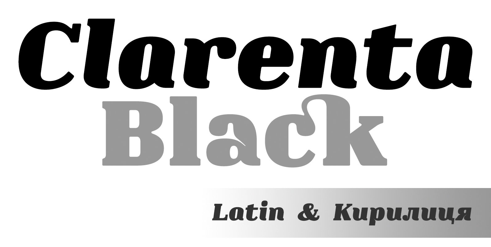
Clarenta 4F Font
Clarenta 4F is a serif font design published by Sergiy Tkachenko Published by Sergiy TkachenkoDownload Clarenta 4F
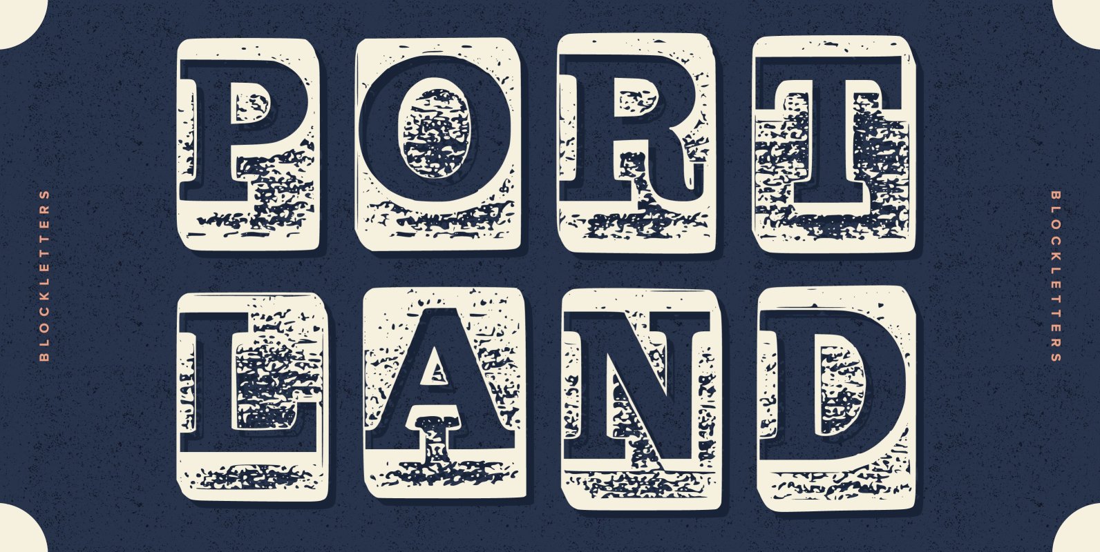
Blockletter Font
Blocky set of letters, Influenced by printers fonts. Greta for a bold impact design that looks rough and inky. Use for posters and vintage feel. Messy, turn-of-the-century black letter style type, great to use for your own designs or print
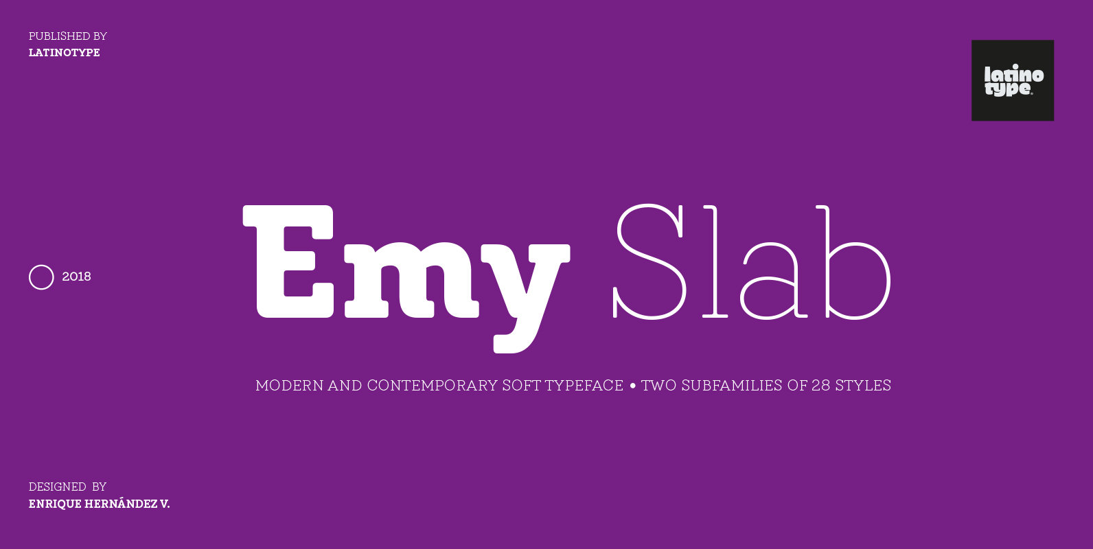
Emy Slab Font
Emy Slab is a slab serif based on the classical proportions of Egyptian typefaces but with soft terminals that give the font a more friendly and modern look. Emy Slab consists of two subfamilies of 7 weights, ranging from Thin
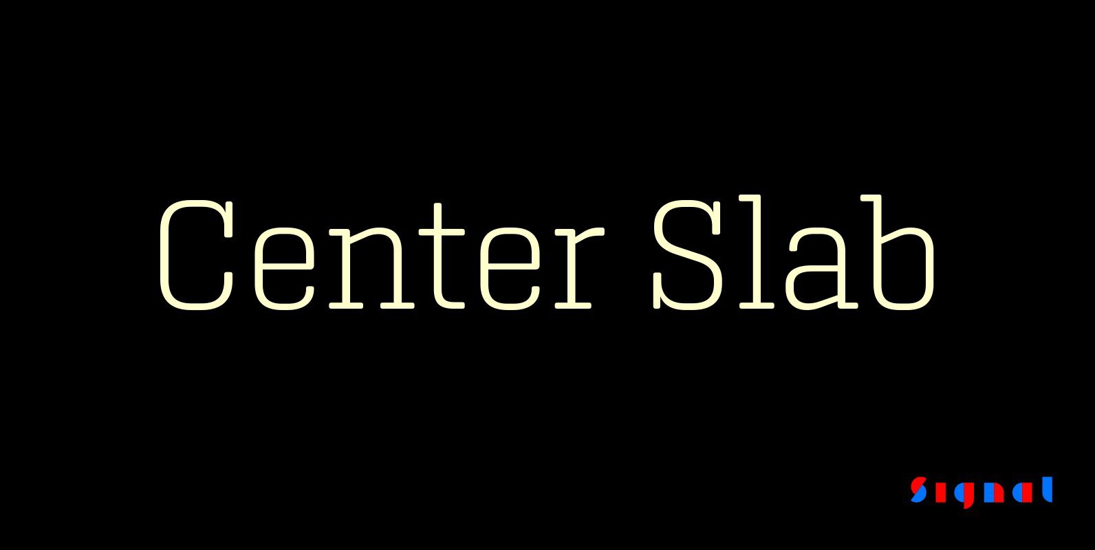
Center Slab Font
A funny thing happened when we added serifs to our best-selling Center family: its look went from digital to analog. Maybe it’s because slab serifs have their roots in 19th Century ‘Egyptians,’ or because monoline serif faces inevitably suggest typewriters.
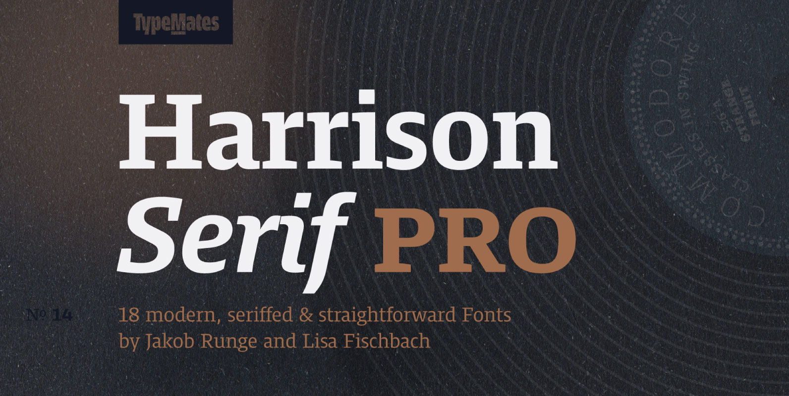
Harrison Serif Pro Font
Harrison Serif Pro is a sturdy yet contrasted slab serif that combines a rational and efficient approach with a warm voice. A typeface of nuances, the slightly carved and occasionally extended serifs evoke the friendly side of Harrison Serif and
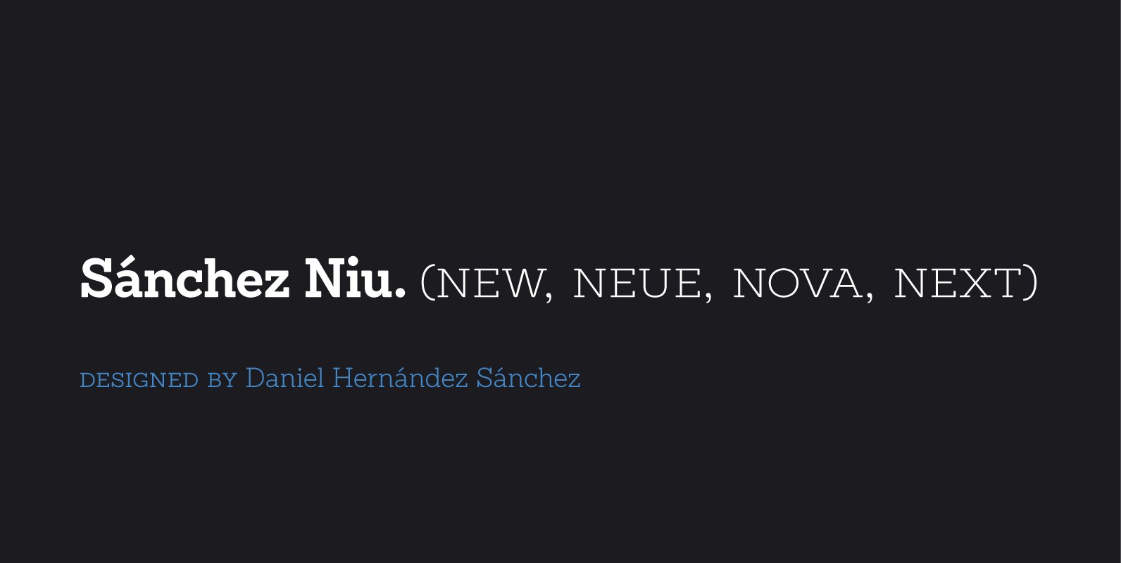
Sánchez Niu Font
Sánchez Niu is a redesign of Sánchez—one of the first font families by Latinotype designed in 2011. This new version includes improvements that make it work well with longer text. Such improvements have not had a major effect on the
Moon Star Soul Font
Based on retro vinyl records in the early and middle of 20th century. The mixture of funky, hippie and mid-century’s futuristics. Published by Dharma TypeDownload Moon Star Soul
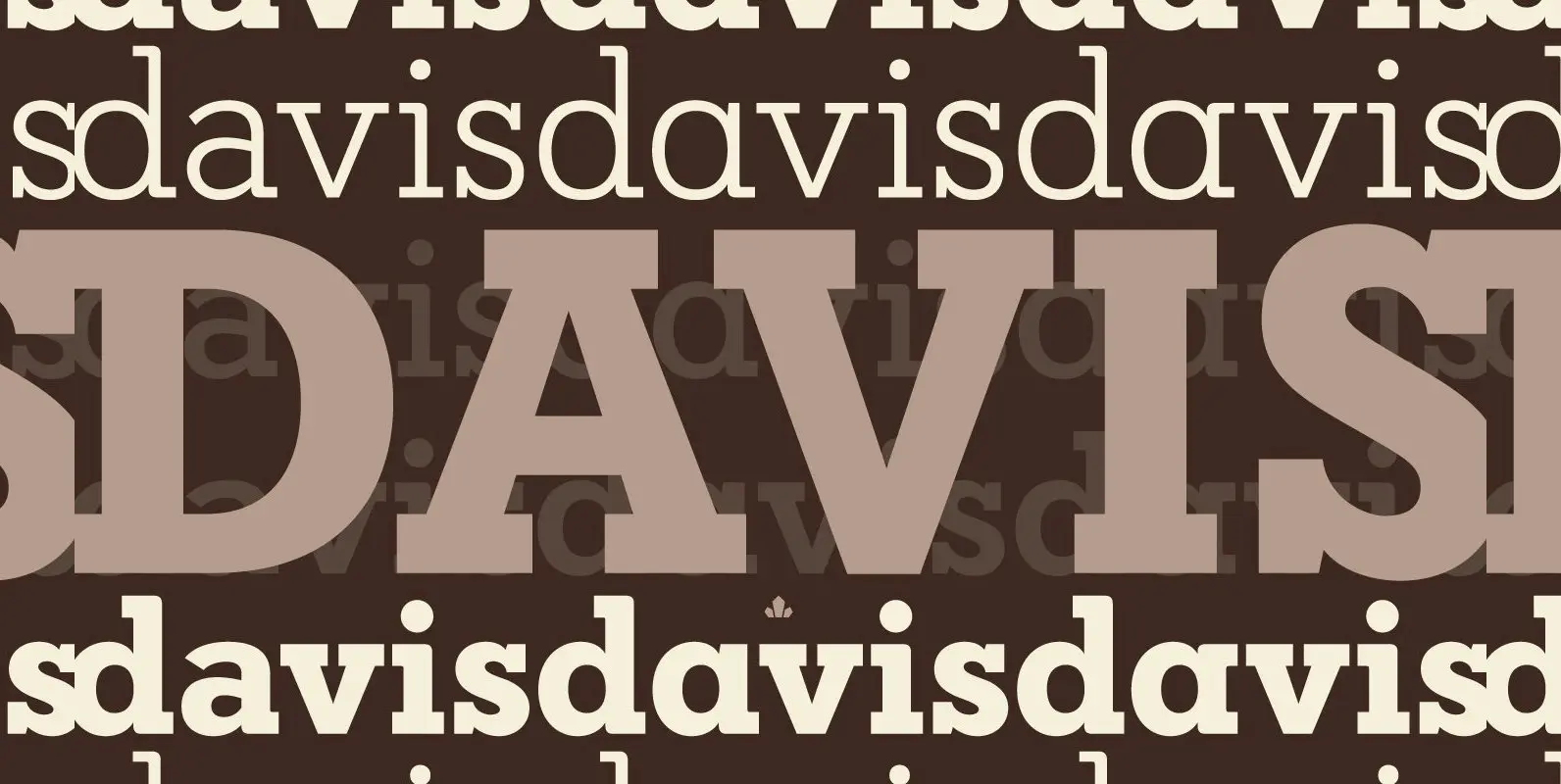
Davis Font
P22 Blox is a modular system of shapes that can build letterforms and abstract patterns. Created as a working prototype for the letterpress P22 Blox project from P22 Analog and Starshaped Press, this system of shapes presents a unique approach
Hand Stamp Slab Serif Rough Font
The typeface “Hand Stamp Slab Serif Rough” is designed for the Typo Graphic Design font foundry in 2017 by Manuel Viergutz. The display font with a classic slab serif type for headlines, based on real rubber stamp letters for a