Tag: economic
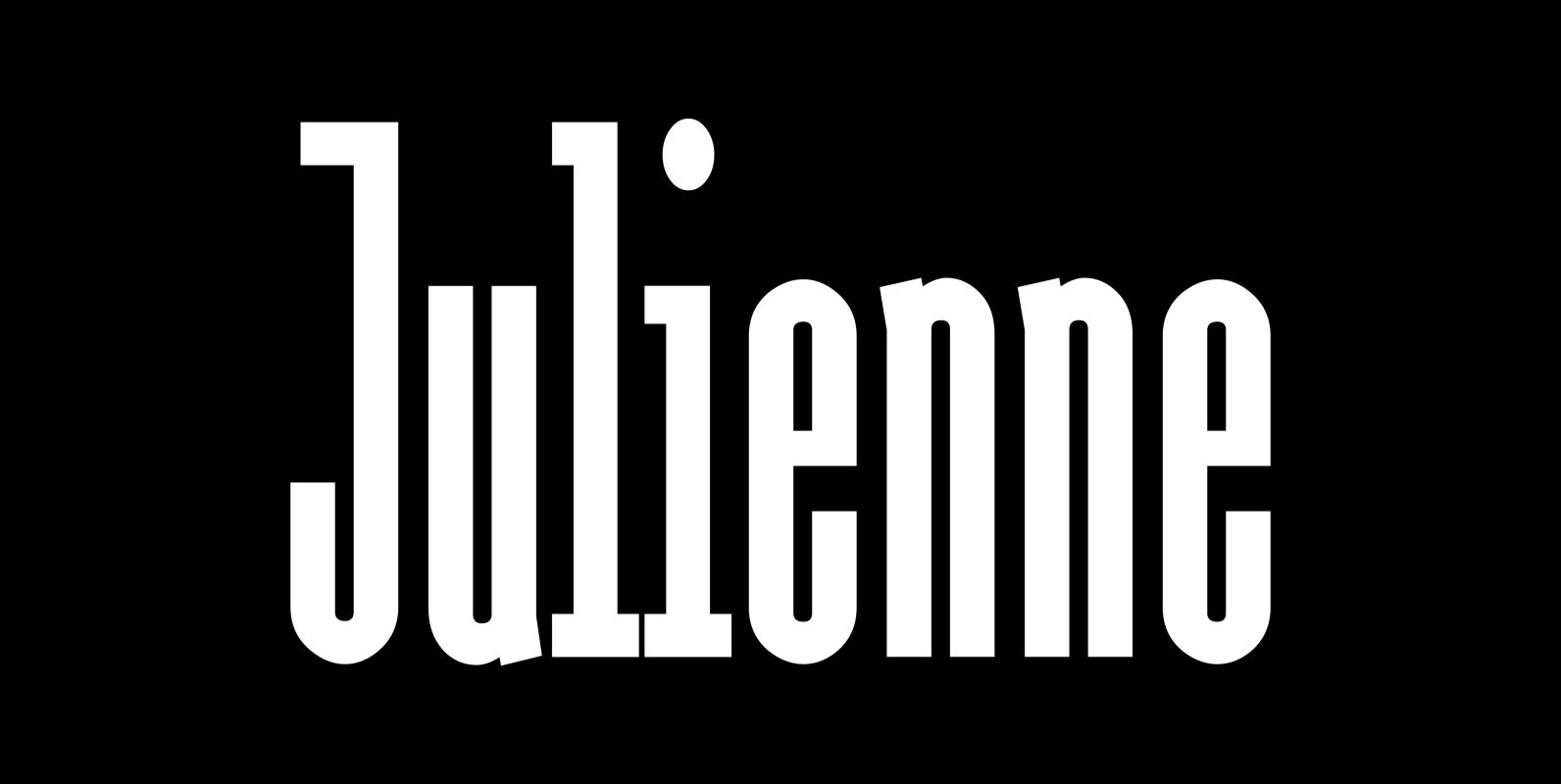
Julienne Font
Cooks call thinly cut – like matchsticks – vegetables »Julienne«. I found that was a fitting name for this very narrow typeface. Julienne Slim is the extreme cut of the two. Personally I do not use narrow typefaces very often,
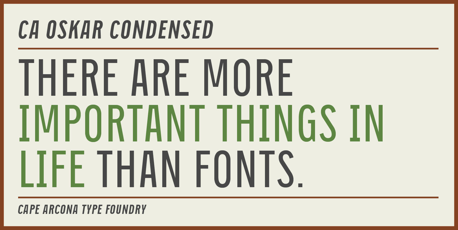
CA Oskar Condensed Font
CA Oskar came into being as a custom typeface for the international Traumzeit music festival. As a substantial part of the new corporate identity, it had to be characteristic, but also flexible in use. Starting with the design of compressed
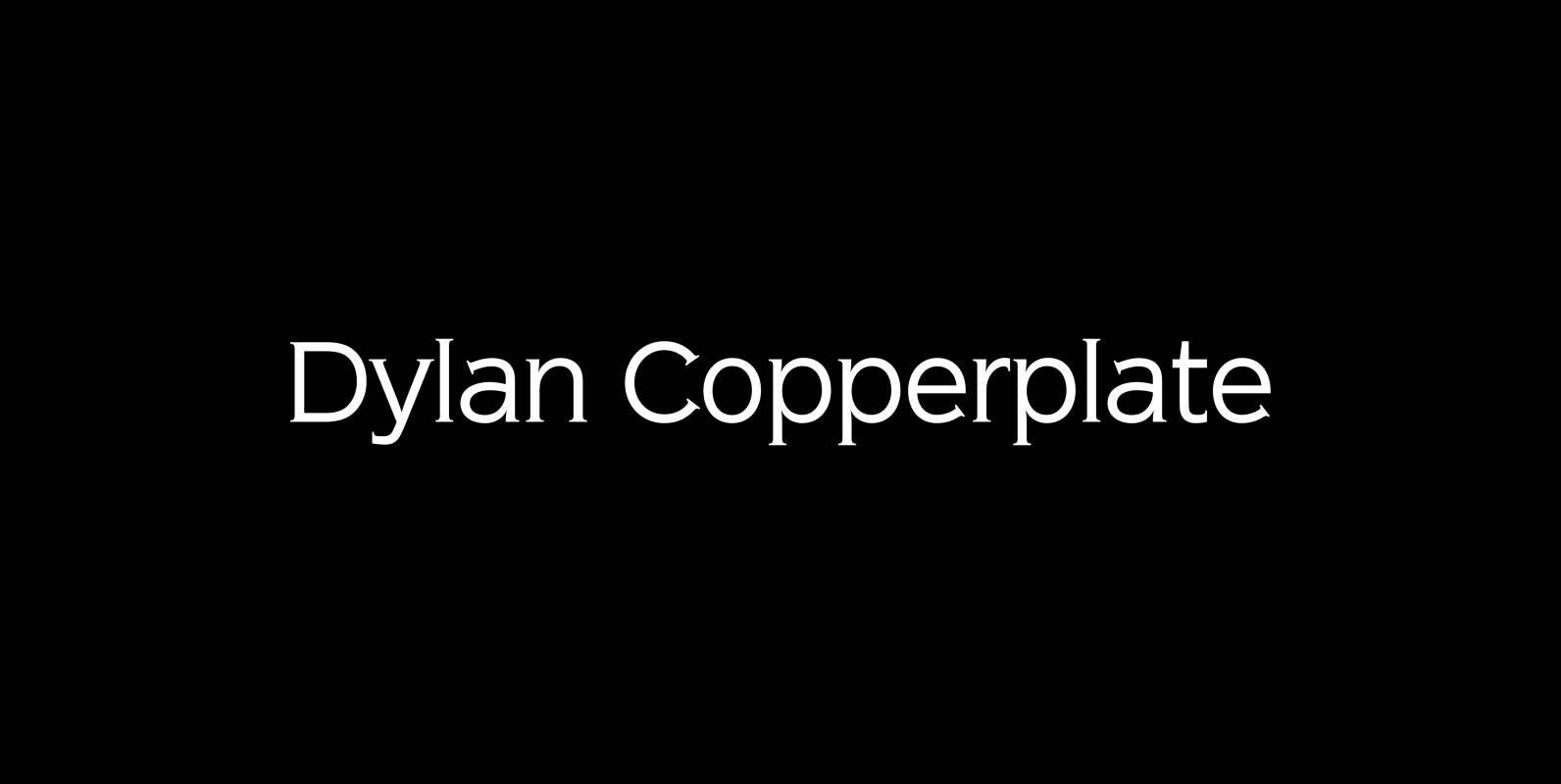
Dylan Copperplate Font
Dylan Copperplate is my newest addition to the ever growing family. The small flicks of the burin add an elegant touch to the solid font-design. Very handsome and useful for all kinds of invitations and business-cards as well as for
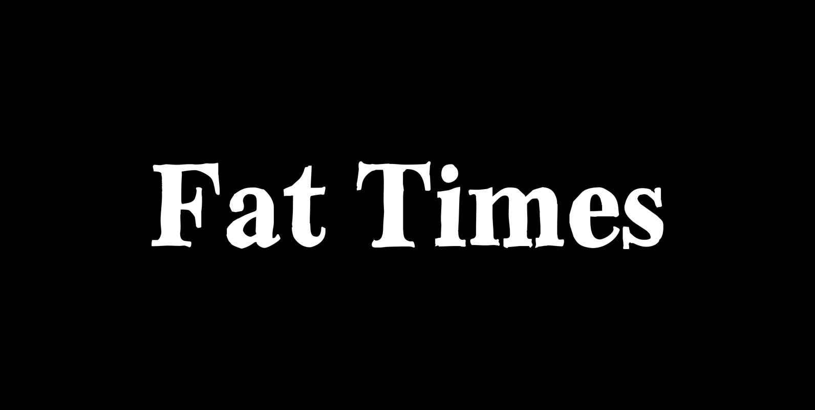
Fat Times Font
“FatTimes” is an extension to my HardTimes family. Times are too hard for boring typefaces, so try the fat one one for a change. Published by Wiescher DesignDownload Fat Times
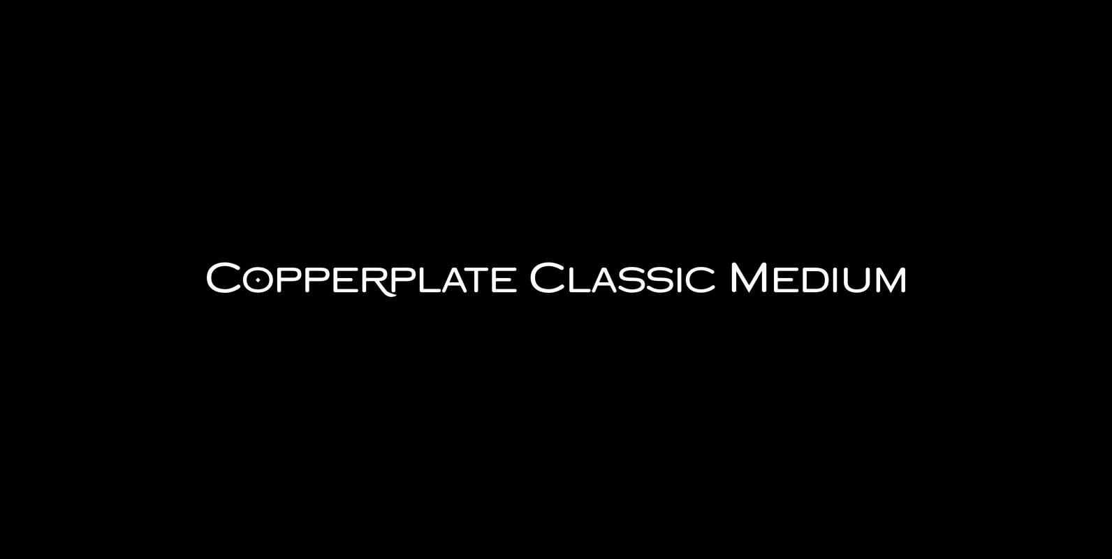
Copperplate Classic Medium Font
“Copperplate” was the classic nineteenth century engravers typeface, consisting of capitals and small caps only. Among others (for example Deberny & Peignot) F. W. Goudy’s cut for ATF around 1901 is probably the most widely known. Copperplate typefaces are traditionally
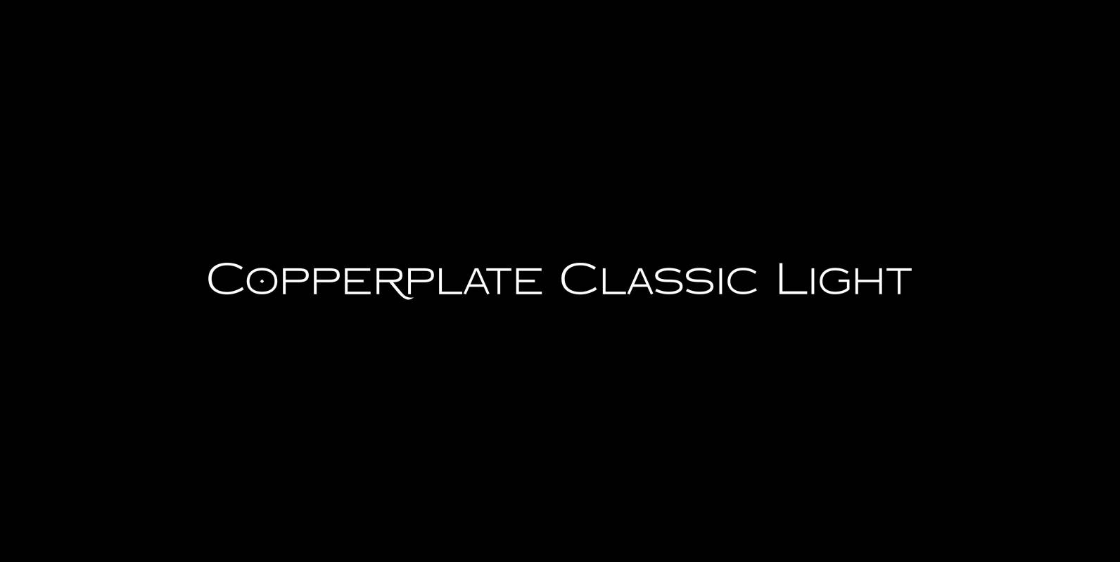
Copperplate Classic Light Font
“Copperplate” was the classic nineteenth century engravers typeface, consisting of capitals and small caps only. Among others (for example Deberny & Peignot) F. W. Goudy’s cut for ATF around 1901 is probably the most widely known. Copperplate typefaces are traditionally
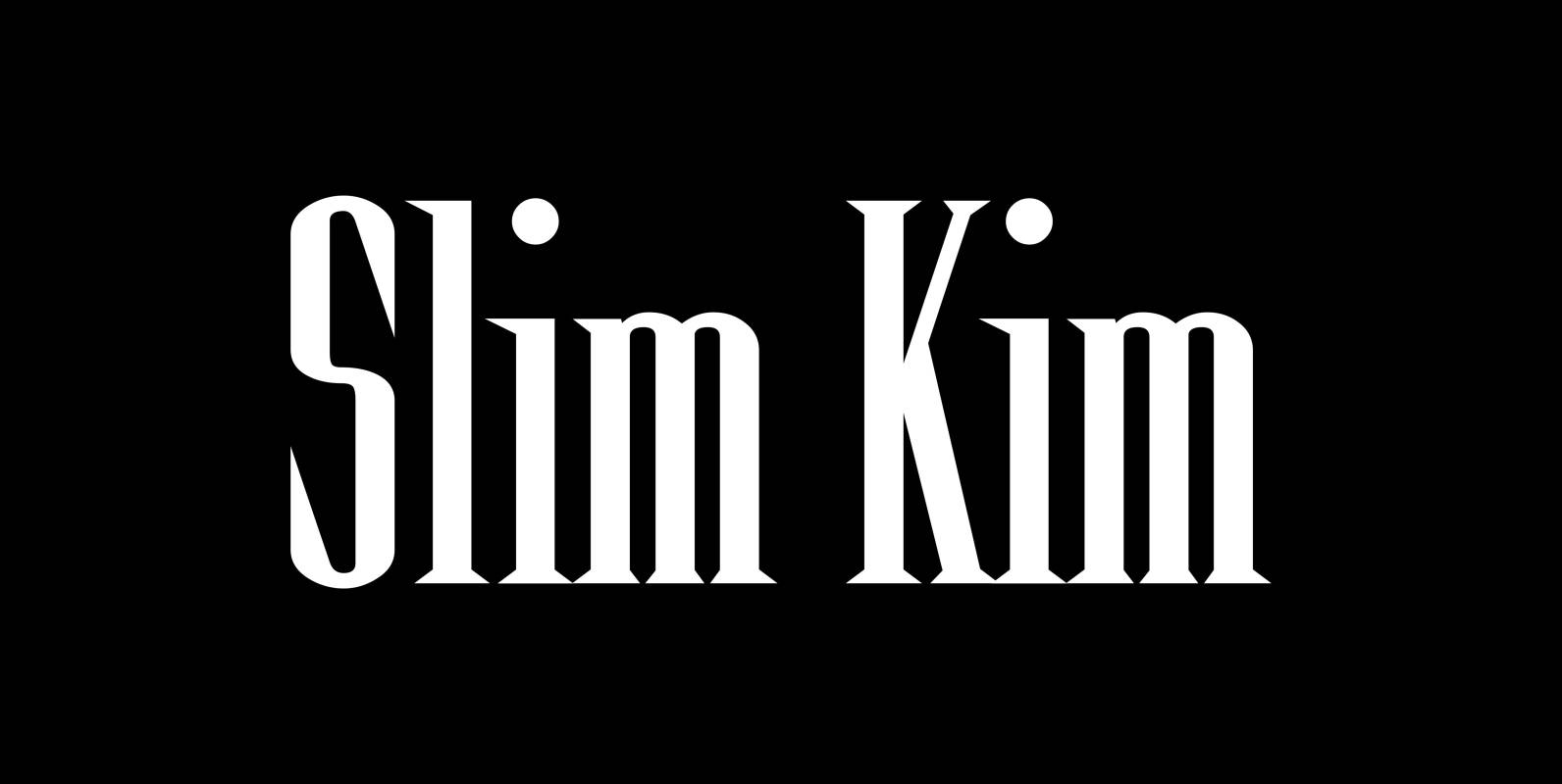
Slim Kim Font
“Slim Kim” is the sister font of “Julienne”. This font has very spiky serifs, so I did not want to make an extra slim version. This font mixes perfectly with “Julienn”. So whenever you need an especially slim serif font

Soft Times Font
“Soft Times” has been easy on my nerves after the strain of “Hard Times”. The harder the Times are the more do we need some soft typefaces, this one is the soft counterpart for “HardTimes”. Published by Wiescher DesignDownload Soft
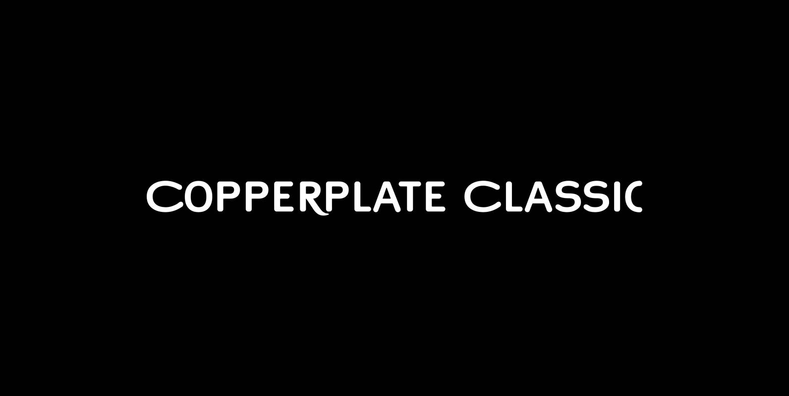
Copperplate Classic Font
“Copperplate” was the classic nineteenth century engravers typeface, consisting of capitals and small caps only. Among others (for example Deberny & Peignot) F. W. Goudy’s cut for ATF around 1901 is probably the most widely known. Copperplate typefaces are traditionally
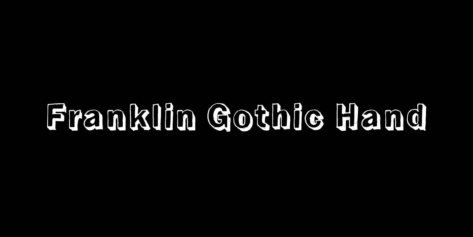
Franklin Gothic Hand Font
Franklin Gothic Hand Demi Shadow is another one in my series of hand-drawn fonts from way back in time – before computers changed the way we worked in advertising. This one was especially used for what we called “pork-belly-ads”: ads

Hard Times Font
“Hard Times” has been hard work, designing a handmade typeface must always have the right balance between rough and smooth, specially with this Times-like face. It has the big European glyph-set, so that it can be used all over the
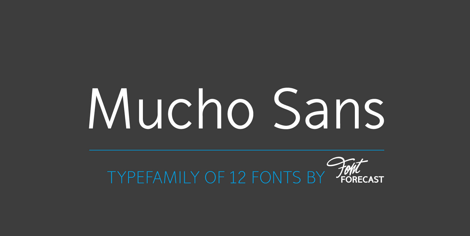
Mucho Sans Font
Mucho Sans is a geometric sans serif type family that comes in six weights with matching Italics. The design is very clean, yet friendly and modern. Some of its characteristics are the generous x-height, the Ascender-height that matches the Cap-height,
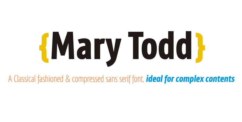
Mary Todd Font
MaryTodd was created for small texts with a variety of hierarchies. Is condensed to save space. It has a rich set of glyphs: small caps, old style figures, monospaced numbers, numerators and denominators for fractions, etc. It is ideal for
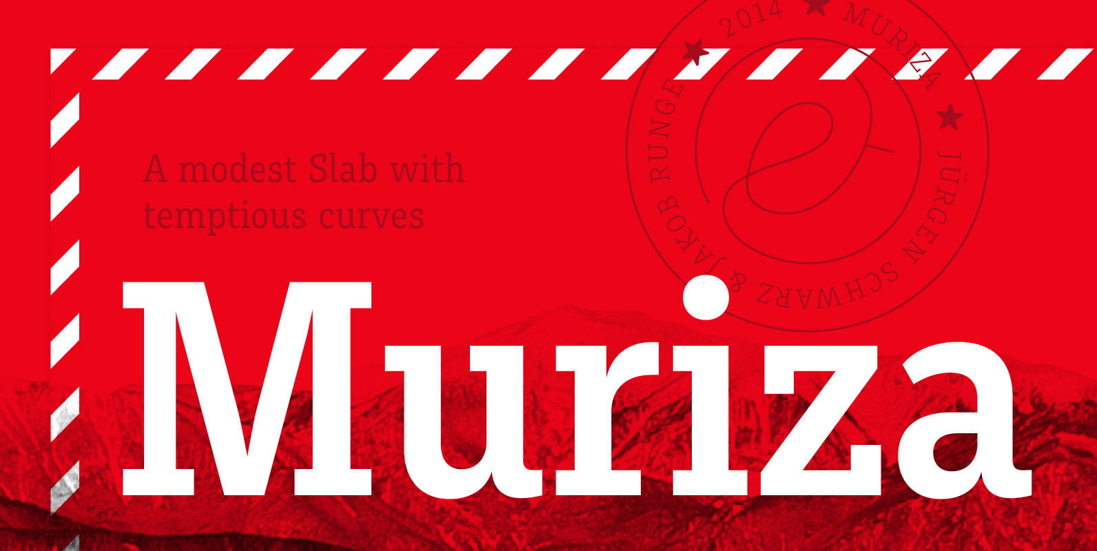
Muriza Font
Muriza is rooted in Styria and comes with a name dedicated to a region with soft rocks, forested mountains, narrow valleys and clear air, a modest slab serif with tempting curves. Its clear and economic typographic forms are linked to
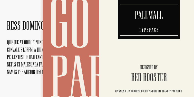
Pall Mall Font
Designed by Steve Jackaman, this fashionable and tall serif is based on the early Pall Mall typefaces. Published by Red RoosterDownload Pall Mall
Fat Face Font
This sophisticated and stylish font is ideal for titles, posters or any other design project that requires an edgy look with sharp lettering. Fat Face was designed by Phil Martin in 1971; it contains West European languages such as English

Martin Gothic Font
A modern and clean sans-serif originally designed by Phil Martin in 1987, works great in body and headline usage. Published by URW Type Foundry GmbHDownload Martin Gothic