Tag: correspondence
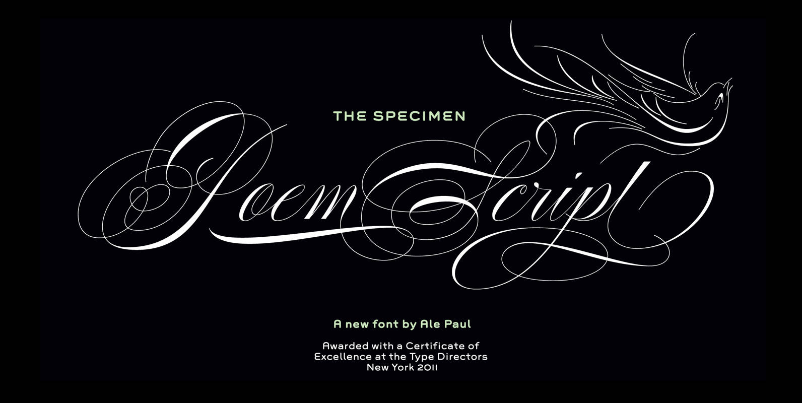
Poem Script Font
Poem Script is a mixed collection of interpretations conjuring a late nineteenth century American pen script style. Though not an actual Italian letterform, this style was called “Italian Alphabet” stemming from an old penman’s term for an alphabet where the
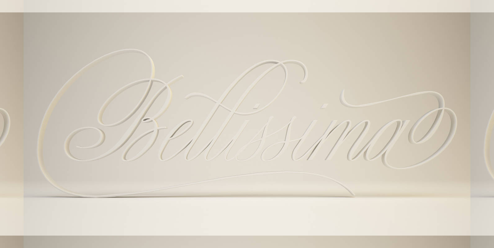
Bellissima Script Pro Font
While in the same vein and spirit as Burgues and Compendium, Bellissima began from an entirely different thread as those fonts. It started with Alex Trochut generously showing me a gorgeous lettering book from his grandfather’s library: Bellezas de la
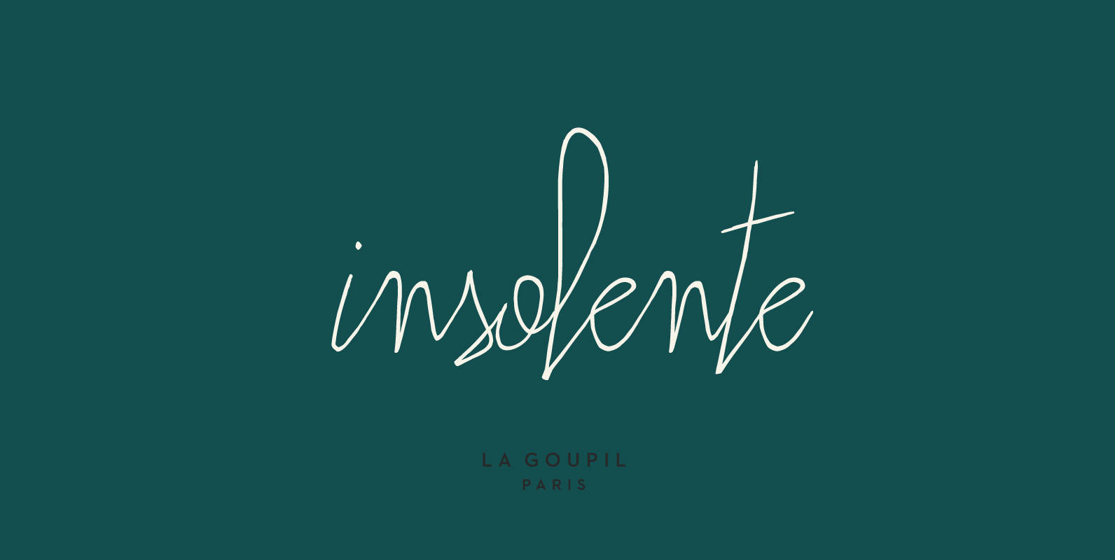
Insolente Font
Insolente is a versatile and realistic human script designed by Fanny Coulez and Julien Saurin in Paris, perfect for giving your designs a personal touch. The family includes two fonts: Insolente Regular, with ligatures and double-letter ligatures, and Insolente Alternates,

Chelsea Font
Designed by Les Usherwood, Chelsea is a serif design digitally engineered by Steve Jackaman. Published by Red RoosterDownload Chelsea
Register Serif Font
Register Serif is a typestyle inspired by the clean generic handwriting specimens from an old Speedball booklet modified for more friendliness and finesse. This typestyle offers a range of weights and also comes with a series of smallcaps versions allowing
Balladeer Font
Balladeer is an elegant, classical script design coming in three styles as Light, Medium and Bold. Published by URW Type Foundry GmbHDownload Balladeer
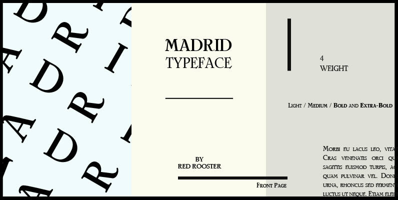
Madrid Font
Designed by Steve Jackaman, Madrid is based on the typeface Nacional by Carlos Winkow from the Spanish foundry, Nacional (1941). Published by Red RoosterDownload Madrid
Seashore Pro Font
A feminine, graceful script whose thicker horizontals create a wave-like rhythm — hence the name. Seashore is loosely based on an “eccentric” (left-leaning) penmanship style of the late 19th century. Used mainly by professional “engrossers” in certificates and tributes, or
Copacabana Font
Copacabana is heavily based on one of my favourite typefaces Goudy Old Style Italic. It is sharper and more clearly defined than Goudy yet still retains it old style characteristics. The face is slightly angled so is basically upright whilst
Profonts Bureau Font
profonts Bureau is a modern, very legible typeface for business correspondence, memos, faxes, etc. Published by URW Type Foundry GmbHDownload Profonts Bureau
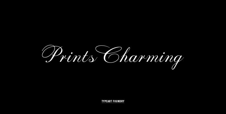
Prints Charming Font
Many of the Prints Charming™ individual character designs are based on script letters which were originally created by assorted New York typographers during the 1940s and 50s and 60s, with some flourish variations added. Some of the best aspects of
Charlotte Sans Font
The Charlotte Sans family of typefaces was designed specifically to co-ordinate with Charlotte roman typefaces in style, weight, and color. Designer Michael Gills created Charlotte Sans on screen with FontStudio software, and has achieved a perfect balance between the humanistic
Coliseum Font
Coliseum was designed by A. Pat Hickson/Julie Hopwood. An original design and release by Red Rooster. Published by Red RoosterDownload Coliseum
Brigade Font
In searching for a Roman to use there were bits of Bembo,Times,Garamond etc., that I liked and bits that I did not. So I set out to take the best bits of all my favourite Romans and tried to create

Diane Script Premiere Font
Designed by the legendary French designer Roger Excoffon in 1956, this remarkable script has never been faithfully recreated until now. In close collaboration with Mark Simonson, FontHaus and Mr. Simonson painstakingly researched rare type books, publications, European metal type services,
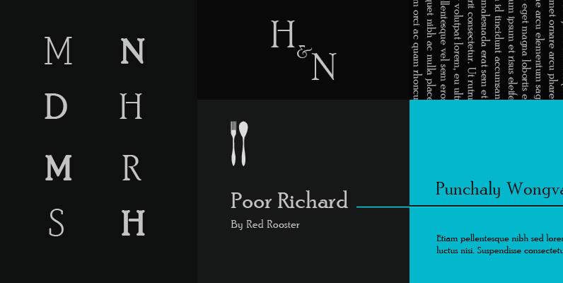
Poor Richard Font
Designed by Paul Hickson. Based on the Keystone Type Foundry design, circa 1919. The l/c ‘g’ appears as an alternate character in our font. Published by Red RoosterDownload Poor Richard
Caslon Extra Condensed Font
Designed by Steve Jackaman, Caslon Extra Condensed is based on the Ludlow/ATF versions of this great typeface. Published by Red RoosterDownload Caslon Extra Condensed
Horizontes Script Font
Horizontes Script is the result of Panco is personal experimental calligraphy project. Designed with the goal of finding a balance between spontaneity, elegance and beauty, his first typography was born and inspired on the horizon´s blue line from the city