Tag: Communication

URW DIN Font
The digital outline fonts, DIN 1451 Fette Engschrift and Fette Mittelschrift were created by URW in 1984 and are the basis for all DIN font families. Both typefaces were designed for the URW SIGNUS system and were mainly used for
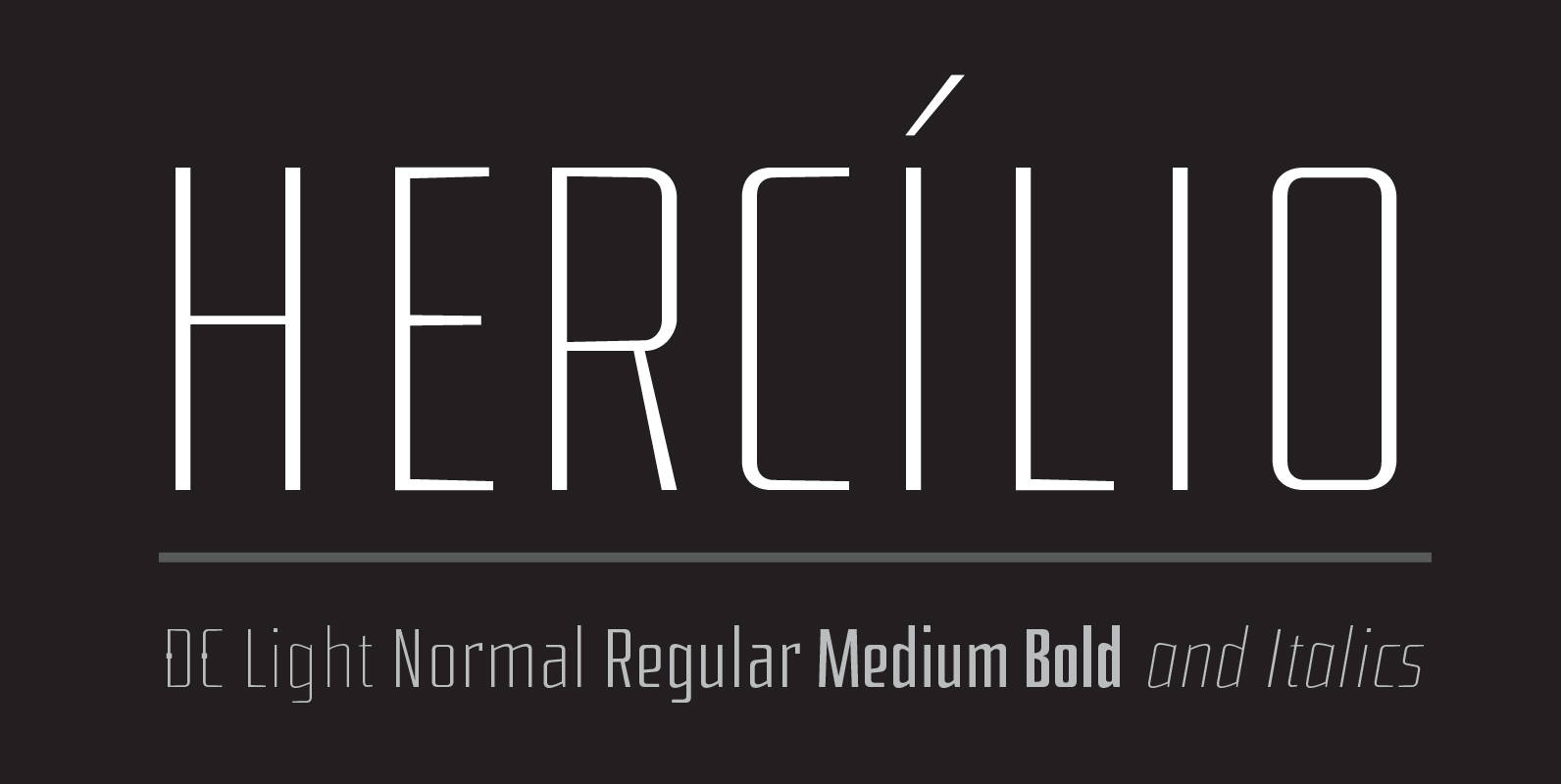
Hercílio Font
Hercilio is a typographic family without condensed serif, modern and geometric inspired by the architectural forms of the Hercílio Luz Bridge in Florianopolis | Brazil Comprising eleven (11), weights of which ten (10) business are: Five weights Romans: Light, Normal,
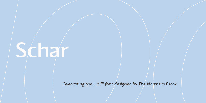
Schar Font
A humanist sans designed like a serif with high-stroke contrast, but without serifs. Calligraphic forms and consistent angle axis are combined to create a fluid and dynamic personality. Schar is a balanced sans serif with classic proportions ideally suited for
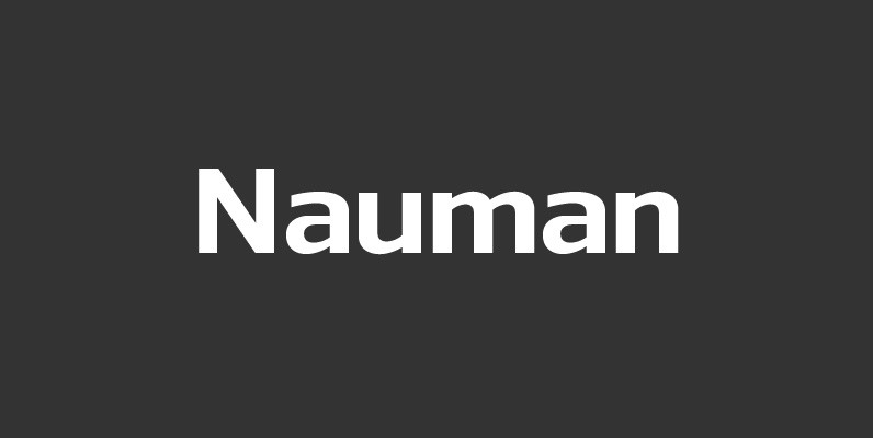
Nauman Font
A modern humanist sans serif made for the screen. Broad open letter forms are combined with precise geometry to create a functional and legible font that’s ideally suited to the web and on-screen applications. To reinforce readability and create more
Hapna Font
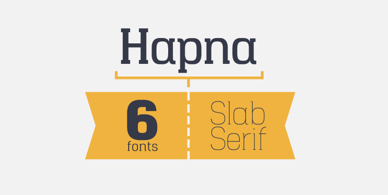
Hapna is a geometric slab serif designed as an alternative to other slab style fonts available on the market. The typeface was originally released in January 2013 as a free monospaced single weight slab serif called Hapna Mono. This new
PF Handbook Pro Font
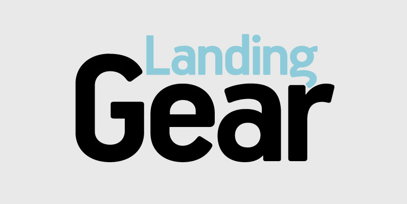
This typeface is the result of an attempt to modernize DIN, by introducing round smooth corners and distinct design elements to several characters like ‘a, g, k, m’, without compromising legibility. In order to retain its sharpness, inner corners as
Modum Font
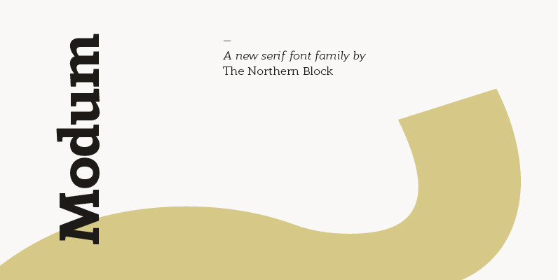
A contemporary serif font family. The design takes influence from traditional serif forms to develop a precise, highly functional text face with a low contrast. Smooth radius details are blended with carefully drawn angles that give a crisp, distinctive aesthetic
Baufra Font
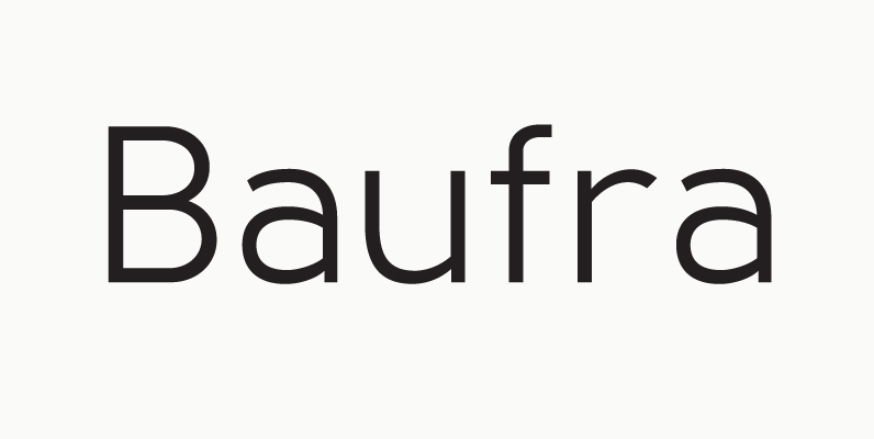
Baufra is a humanist sans-serif typeface. It is based on the sans-serif typefaces of the early 20th century. A characteristic feature of Baufra is its geometric design combined with an earthy naturalism. Baufra family includes 6 weights, 435 characters, manually
PF DIN Text Condensed Pro Font
The DIN Text series was based on the original standards but was completely redesigned to fit typographic requirements. Completed in 2002, it was first released in 2003 and published in our catalog, as a group of 4 separate families each
PF DIN Display Pro Font
DIN Display was designed as an alternative to Parachute’s Din Text series. While Din Display seems to retain DIN’s basic characteristics, it shines with its sharper corners and contemporary look. Completed in 2002, it was first released and published in
