Tag: charming
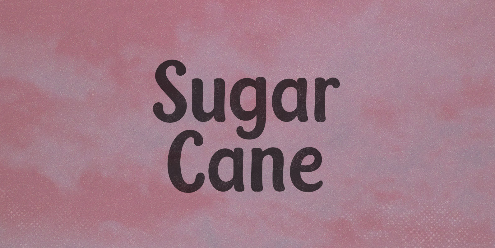
Sugar Cane Font
Machetes by the millions, cutting Sugar Cane like straw, overgrown in the tropical sun. La Gran Zafra: a whole country stacking sticky sticks in their GDP tally, mobilized behind a ten million ton harvest. Published by BLKBKDownload Sugar Cane
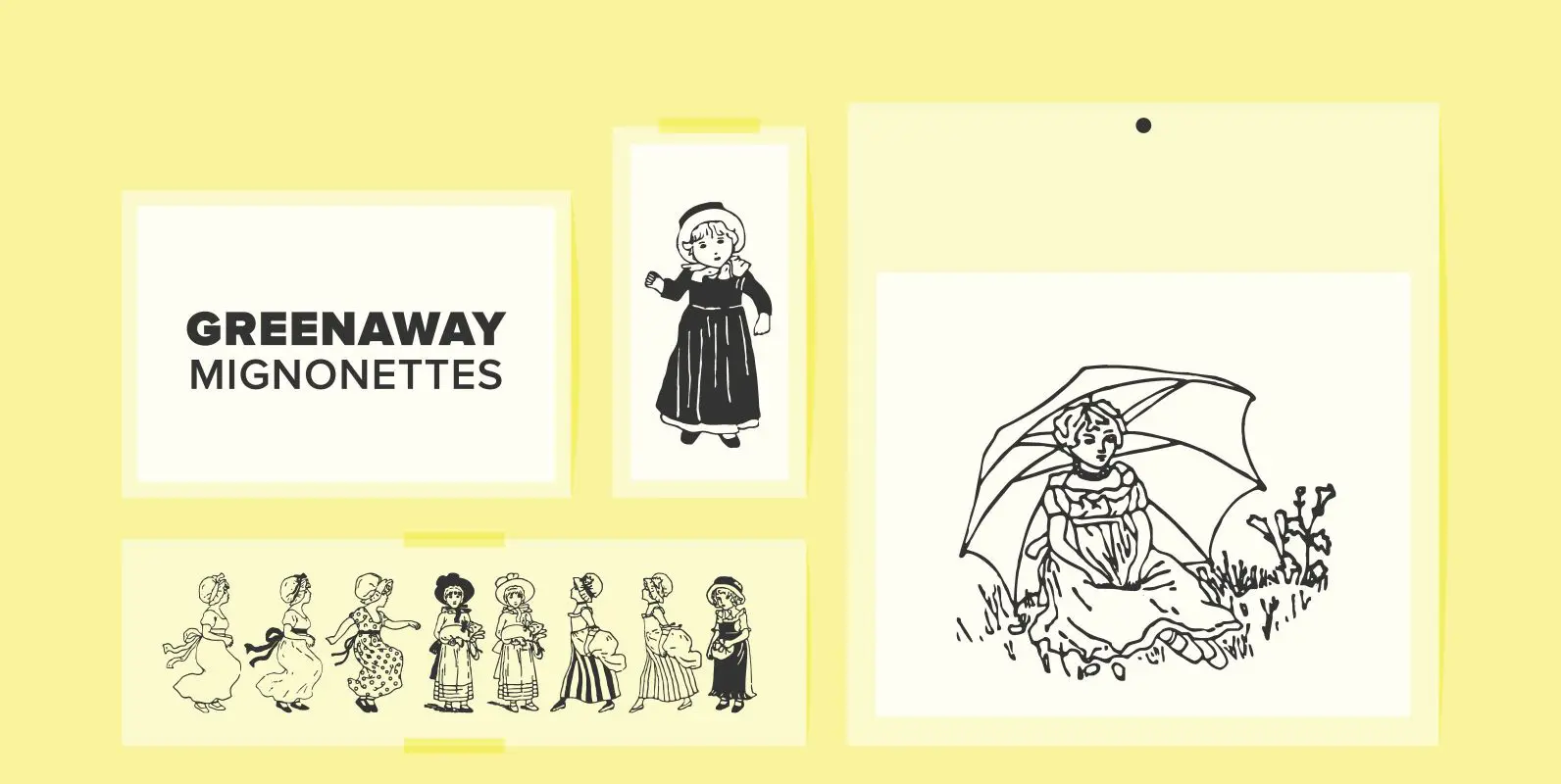
Greenaway Mignonettes Font
Kate Greenaway was a very famous British (1846-1901) author and illustrator of children’s books. Her books were an outstanding success in English publishing during the Victorian period. Recently I found these sweet Mignonettes in an old foundry specimen book. Mignonettes
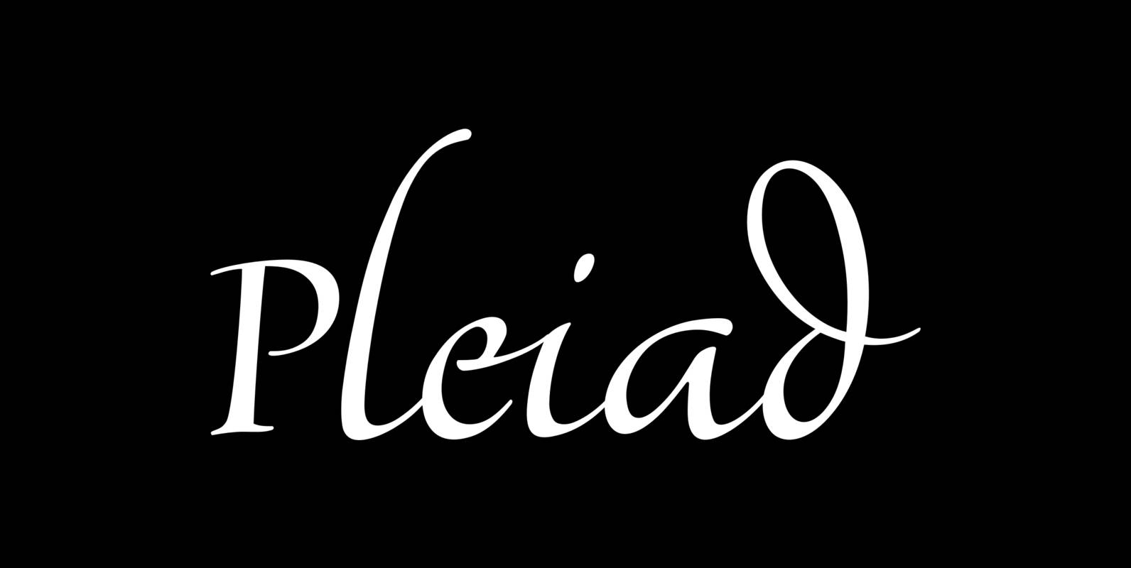
Pleiad Font
Seven superb scripts, to be freely mixed with one another. Alone, each of them flows nicely, but combined they reach ultimate vitality and grace. The Pleiades are one of the most beautiful constellations in the sky, and in Greek mythology
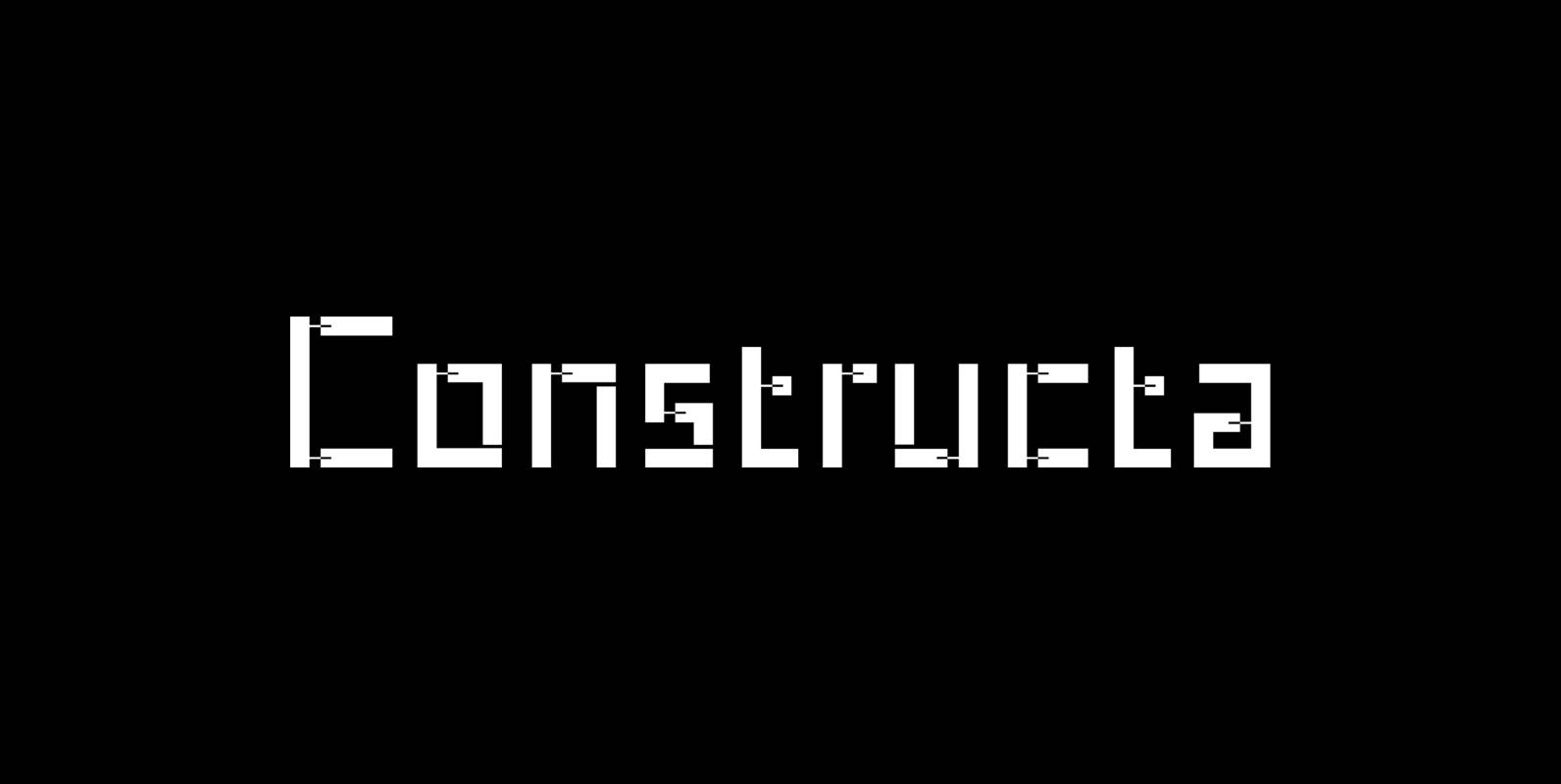
Constructa Font
Marit Otto about Constructa The building typeface. Although the 70ties were very liberating and progressive, still girls played mainly with dolls and sweet things and boys with all kinds of challenging stuff. They did all sorts of basic scientific experiments
Hernandez Bold Font
Hernandez bold is a ‘slab serif display’ font. It has a unique feature, it gives the possibility of composing words in different rhythms. It has a big number of alternates, which allows the user various combinations within a text. It’s
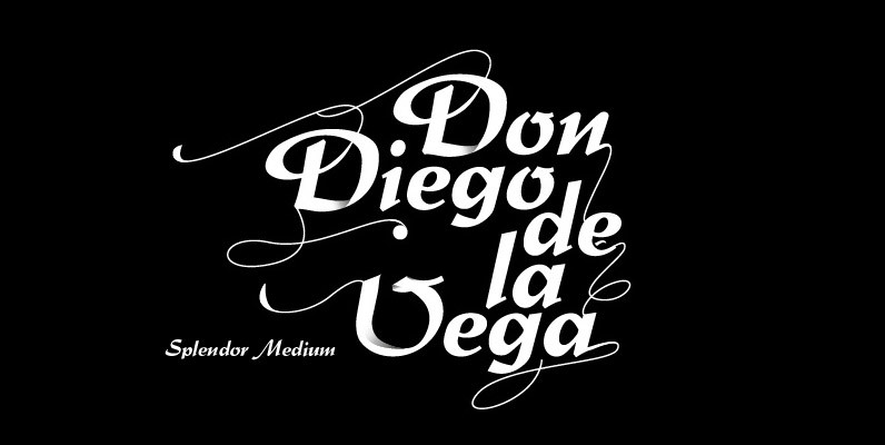
Splendor Font
Splendor was originally produced and released in 1930 by Schriftgub AG, Dresden. The typeface was designed by Berlin designer Wilhelm Berg. Ralph M. Unger, who in the last few years has created a whole series of revivals and redesigns from
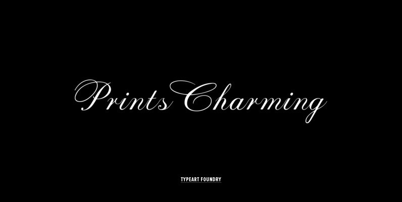
Prints Charming Font
Many of the Prints Charming™ individual character designs are based on script letters which were originally created by assorted New York typographers during the 1940s and 50s and 60s, with some flourish variations added. Some of the best aspects of


Martin Font
Martin, a condensed semi-serif with rounded edges and friendly serifs, shows its charme best in short, pointed sentences, in headlines set in about 20 to 36 point. The playing with serifs in a condensed, very characteristic type design is attractive
Somewhat Font
Somewhat retro, somewhat amusing, somewhat handsome, totally handy. This hand-drawn family counts 4 fonts plus a whimsical set of ornaments. Suitable for both display and text sizes, it will add an extra charming feel to your creations. Published by PintassilgoPrints.
PF Lindemann Sans Font
Lindemann Sans is an immediately inviting typeface with a pleasing distinct visual voice grounded by geometry and golden proportions. This modern geometric san serif typeface serves the interpretive needs of modern design through its legibility. This legibility is achieved through

Gentil Font
Gentil is a charming hand-drawn typeface. It comes in two weights along with two handy accessory fonts, one packed with darling doodles and the other loaded with lovely frames. Versatile, this very friendly family will certainly fit easily a wide